My first deviation from just using SVGs merely for their shapes came while trying to create a color legend. I was looking for a way to create a legend that would smoothly go from one color in my color scale to another. It wasn’t really necessary to read the exact value each color represented. It was more about seeing trends and getting a general sense of the numbers, so chopping the colors up into 5 or 6 bins wasn’t what I wanted. And that’s how I got into SVG gradients.
SVGs beyond mere shapes blog series
This blog is part of the SVGs beyond mere shapes tutorial series. It’s based on the similar named talk. My goal with the talk was to inspire people to experiment with the norm, to create new ways of making a visual more effective or fun. Even for a subject as narrow as SVG filters and gradients, there are more things possible than you might think. From SVG gradients that can be based on data, dynamic, animated gradients and more, to SVG filters for creating glow, gooey, and fuzzy effects. You can find links to all the other blogs in my kick-off article here.
Traffic accident data
I think a heatmap is a very good example where you can use a smooth color legend. The one below is based on a similar dataset that I used for my Traffic Accidents project, but with data from 2014 instead of 2013. Looking at the data from a different angle than I did in my previous project, this visual (based on Miles McCrocklin’s Heatmap block) shows the number of traffic accidents that occur on each given hour throughout the week. No surprise to see the numbers jump up during the morning and evening rush hours. With the evenings being even worse than the mornings. And if you look longer, you’ll see more interesting trends.
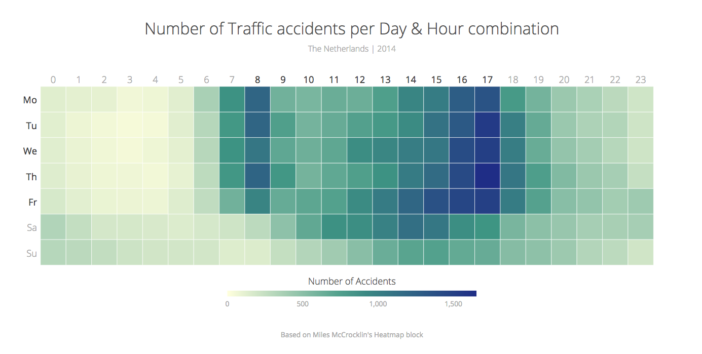
It’s the colored rectangle below the heatmap that I want to focus on. It shows a smooth transition between all the colors of my color scale together with numbers designating broadly what each color means in terms of the number of accidents. The darker the color, the more accidents that happened. And it’s nothing more than an SVG rectangle filled with a linear gradient. So how to create an SVG gradient?
Creating a Linear SVG gradient
There actually exists a linearGradient element. But this must be nested within a defs element, where defs is short for definitions. It contains special elements such as gradients (and filters). It’s very important that the gradient gets a unique id that can be referenced later when we set the fill of the rectangle.
//Append a defs (for definition) element to your SVG
var defs = svg.append("defs");
//Append a linearGradient element to the defs and give it a unique id
var linearGradient = defs.append("linearGradient")
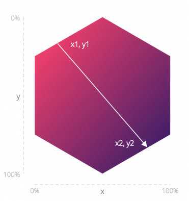
.attr("id", "linear-gradient");Next we have to define the direction of the gradient. Do we want it to go from left to right (horizontal), top to bottom (vertical) or along an angle? To set this, we use the x1, y1, x2 and y2 attributes in the same manner as an SVG line. These values define a vector, an arrow, from the starting point [x1,y1] to the end point [x2,y2] along which the gradient should run.
The bounding box is the smallest rectangle that can enclose the entire shape.
In the default setting, these values apply to the bounding box of the element onto which the gradient will be applied. And that makes life very easy. Furthermore, we can supply the values in both percentages or exact pixel locations. For example, if we have a rectangle that is 300px wide, then 0% for the x attributes would have the same result as 0px and 100% would be the same using 300px. In most cases, it is easier to work with percentages. A horizontal gradient would thus have x1 at 0%, x2 at 100% and both y1 and y2 the same (so 0% is fine).
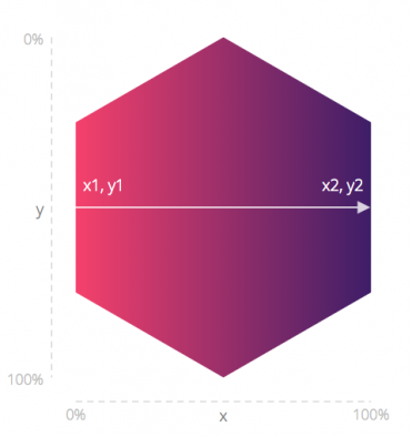
//Horizontal gradient
linearGradient
    .attr("x1", "0%")
    .attr("y1", "0%")
    .attr("x2", "100%")
    .attr("y2", "0%");
If we want a vertical gradient from top to bottom, we only have to switch the values of x2 and y2
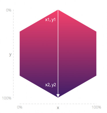
//Vertical gradient
linearGradient
    .attr("x1", "0%")
    .attr("y1", "0%")
    .attr("x2", "0%")
    .attr("y2", "100%");
But we can create a gradient along any angle that we want
//Diagonal gradient
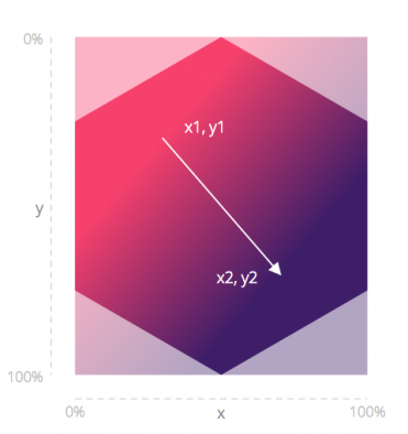
linearGradient
.attr("x1", "0%")
.attr("y1", "0%")
.attr("x2", "100%")
.attr("y2", "100%");But wait, the image above isn’t true! Because, just to make it extra clear, it’s actually the smallest enclosing rectangle, the bounding box, that is taken into account when setting the direction. Thus, the diagonal version would actually look like this if I also show the bounding box a little bit
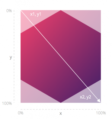
For the hexagon in the examples, the 0%,0% starting point would actually lie outside of the visible part of the hexagon itself in the top left section of the rectangle enclosing the hexagon. And the same for the 100%,100% location in the bottom right. This means that, at the point where the gradient becomes visible inside the hexagon, it has already changed color a bit from the bright pink to purple.
This might not give the desired effect, perhaps you want the light-pink color to be as intense in the visible hexagon as it would be at the top left corner. Since the x and y attributes can be set to any percentage, we can pull them inward and set x and y to any number we want. A bit extreme, but let’s set x1 and y1 to 30% and x2 and y2 to 70%. What happens to the region of the hexagon before the 30% and after the 70%? This is padded with whatever color is present at the start and end point.
//Diagonal gradient where the start and end point have been pulled in
linearGradient
.attr("x1", "30%")
.attr("y1", "30%")
.attr("x2", "70%")
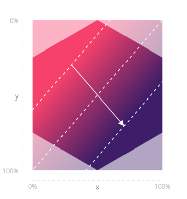
.attr("y2", "70%");Note that the gradient front (I’m not quite sure how to call it), the angle along which the gradient changes color, is not necessarily perpendicular to the arrow that you’ve defined with the x and y attributes.
Thanks to the elaborate comment by Amelia Bellamy-Royds, I now understand why. The image below shows the directional arrow and the dotted lines show along which angle the gradient is truly changing color. All the points along any of the dotted lines are the same color. The arrow and dotted lines are not perpendicular in this case.
Amelia’s thorough explanation (thank you!):
The reason that the gradient stops aren’t properly perpendicular to the x1,y1→x2,y2 vector is because the entire coordinate system for the gradient is stretched to fit the shape’s object bounding box. The bounding box for the hexagon is taller than it is wide, so the gradient gets stretched unevenly, creating the distorted angles. As you note, this means that if you have a gradient along one diagonal, the colour stops will be parallel to the opposite diagonal; the gradient is drawn as if the box was a square, and the diagonals of a square are perpendicular.
If you need greater control over the angle of the gradient, you can use userSpaceOnUse units, instead of the default objectBoundingBox units for the gradient. This option (as a keyword string) is set using the gradientUnits attribute.
With userSpaceOnUse, the x1, y1, x2, and y2 attributes are all measured in the coordinate system that you use to draw the shape (as opposed to % of the box size). There is no extra distortion effect. An extra benefit is that the gradient doesn’t collapse when trying to paint the stroke of a straight line (which has an empty bounding box). The downside is that you can’t re-use the same gradient to paint multiple shapes of different sizes, or positioned at different coordinates (unless they are positioned/scaled using coordinate system transformations).
I’ve got examples of d3 code for user-space gradients in this StackOverflow answer. If anyone just wants to look at the different options in SVG code, you may want to explore the examples from the relevant chapter of my book on SVG gradients and patterns.
Defining the Colors
Now that we’ve set the direction of the gradient, we can continue to define the colors of the gradient. You need at least two colors to have a gradient. However, there is no upper limit to the number of colors that you can use. For each color along the gradient, you have to append a stop element. And a stop element can have 3 attributes:
stop-color: the color you want to have in the gradientoffset: at what location along the directional vector/arrow that you defined with thexandyattributes should thestop-colorbe its exact color (i.e. the pure color). This is set in percentages along the directional arrowstop-opacity: the opacity of thestop-colorat theoffsetlocation. This is very useful if you want a gradient that goes from a color to transparent (the default is 1)
So if we want to use a light blue at the start of a rectangle and dark blue at the end, our code looks as follows
//Set the color for the start (0%)
linearGradient.append("stop")
    .attr("offset", "0%")
    .attr("stop-color", "#ffa474"); //light blue

//Set the color for the end (100%)
linearGradient.append("stop")
    .attr("offset", "100%")
    .attr("stop-color", "#8b0000"); //dark blue
And that was it for the gradient definition. It’s now ready to be used. So let’s create a rectangle and fill it with the gradient. For this, we use the id of the gradient and set the fill using url(#gradient-id). Then we have a rectangle which changes smoothly from light blue to dark blue.
//Draw the rectangle and fill with gradient
svg.append("rect")
    .attr("width", 300)
    .attr("height", 20)
    .style("fill", "url(#linear-gradient)");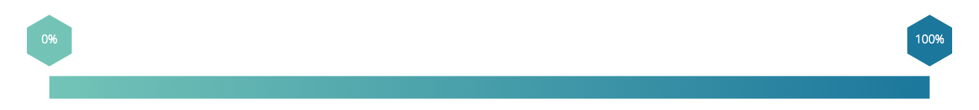
Quickly setting multiple Colors
We can append multiple colors faster by using D3’s data().enter() step and seeing the colors as a dataset. Instead of normally appending circles to a scatterplot with data().enter(), we are now appending stop elements to the linearGradient. Below you can see one way of quickly setting 9 colors along the gradient.

//Append multiple color stops by using D3's data/enter step
linearGradient.selectAll("stop")
    .data([
        {offset: "0%", color: "#2c7bb6"},
        {offset: "12.5%", color: "#00a6ca"},
        {offset: "25%", color: "#00ccbc"},
        {offset: "37.5%", color: "#90eb9d"},
        {offset: "50%", color: "#ffff8c"},
        {offset: "62.5%", color: "#f9d057"},
        {offset: "75%", color: "#f29e2e"},
        {offset: "87.5%", color: "#e76818"},
        {offset: "100%", color: "#d7191c"}
      ])
    .enter().append("stop")
    .attr("offset", function(d) { return d.offset; })
    .attr("stop-color", function(d) { return d.color; });
This can be done even faster and less hard-coded if you want the colors spread out evenly by using a color scale. This is probably something that you’ve defined anyway for the colors of you data visualization elements, such as circles in a scatterplot or hexagons in a heatmap.
//A color scale
var colorScale = d3.scale.linear()
    .range(["#2c7bb6", "#00a6ca","#00ccbc","#90eb9d","#ffff8c",
            "#f9d057","#f29e2e","#e76818","#d7191c"]);

//Append multiple color stops by using D3's data/enter step
linearGradient.selectAll("stop")
    .data( colorScale.range() )
    .enter().append("stop")
    .attr("offset", function(d,i) { return i/(colorScale.range().length-1); })
    .attr("stop-color", function(d) { return d; });
Examples
Besides the Traffic Accidents example, I created two more data visualizations where I felt that you could use a smooth color legend. Where it wasn’t imperative to read the exact value of each color, but where you’d want to see overall trends and get a general feeling for what the colors mean.
I created a small blog series on these SOMs. You can find all 4 blog posts on my archive page amongst the blogs of 2013.
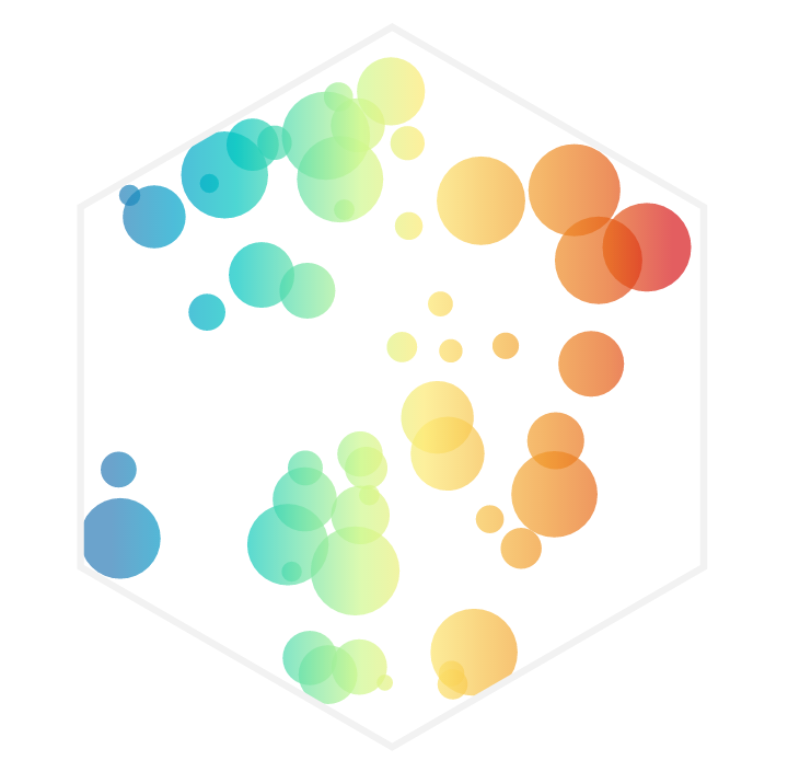
I have a love for hexagons and that all came from a machine learning technique to cluster data called Self Organizing Maps (SOM), which I’ve used a lot during my time as a data scientist at Deloitte. It has a very visual output for analysts to interpret, so perhaps that’s why I like it so much.
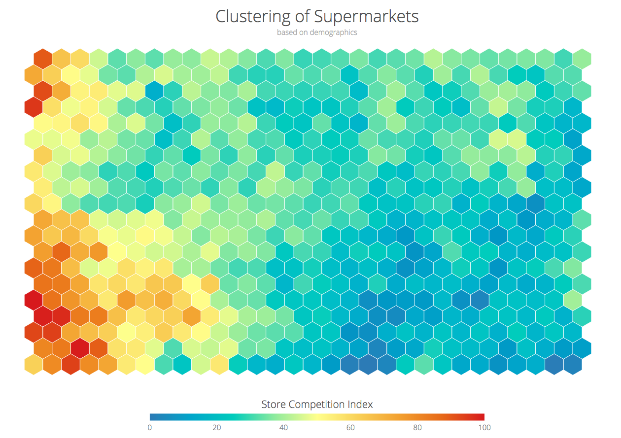
Above you see a so-called heatmap. It comes from a clustering done on all supermarkets in the Netherlands based on the demographics of the neighborhood in which they lie, such as average income, average age, the number of competitors, etc. For each numeric variable that you have, a heatmap is created. The one above is for the store competition index, i.e. how many competitors are there around you. I won’t go into the details, but you primarily want to investigate the overall trend that you see, where are the areas of high or low competition, and how does this compare to the heatmaps of other variables. I learned how to analyze the heatmaps with this rainbow palette, and even though the rainbow palette is not advised for good data visualization, I’m now so used to looking for and comparing the locations of red hotspots and blue coldspots across different variables, that I actually still prefer this palette.
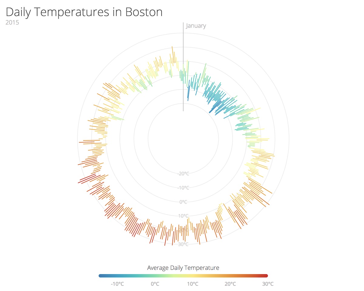
The other example was a recreation of a weather radial of Boston temperatures in 2015. The original idea (and beautiful poster) can be found on weather-radials.com. I downloaded the data from wunderground.com. Each bar represents one day and the bar runs from the minimum to maximum temperature. The bar is colored according to the average temperature of that day and this is what the legend below the weather radial refers to.
SVGs beyond mere shapes blog series
If you’re interested in seeing more examples of how SVG gradients or SVG filters can be used to make your data visualization more effective, engaging or fun, check out the other ±10 blogs that are available. You can find links to all of the blogs in my kick-off article here.