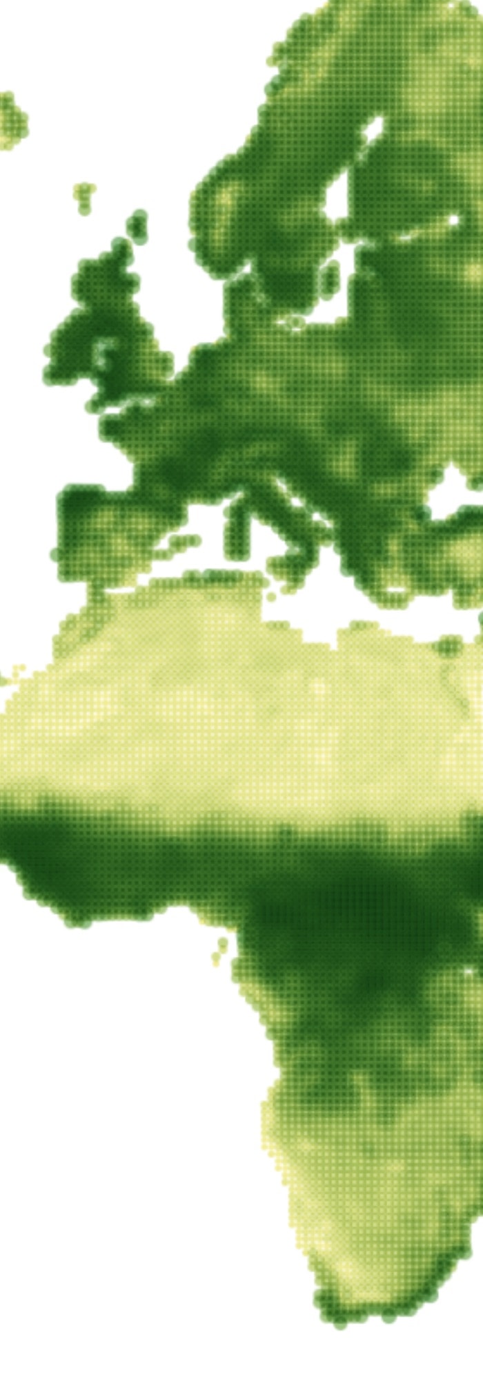
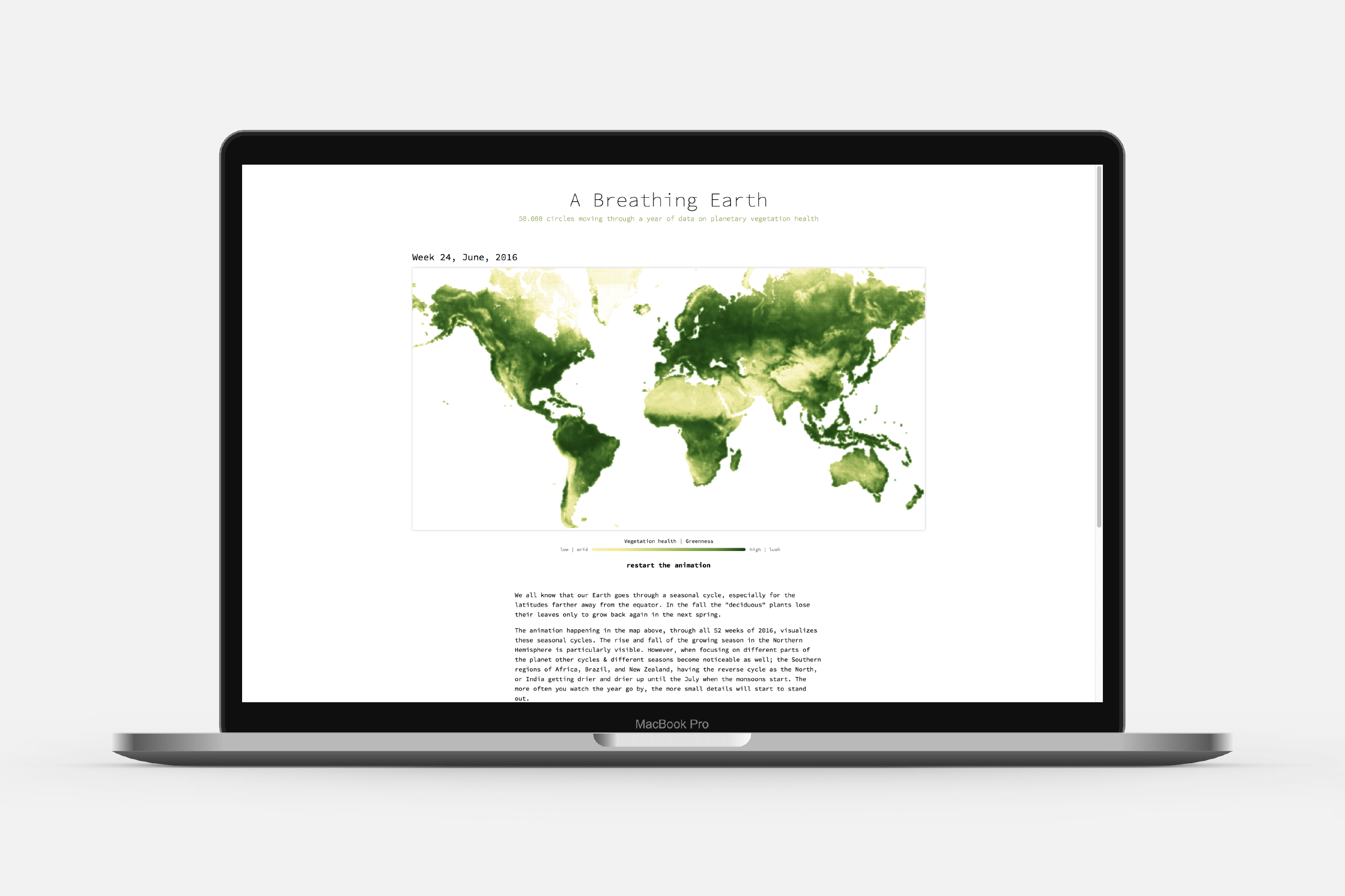
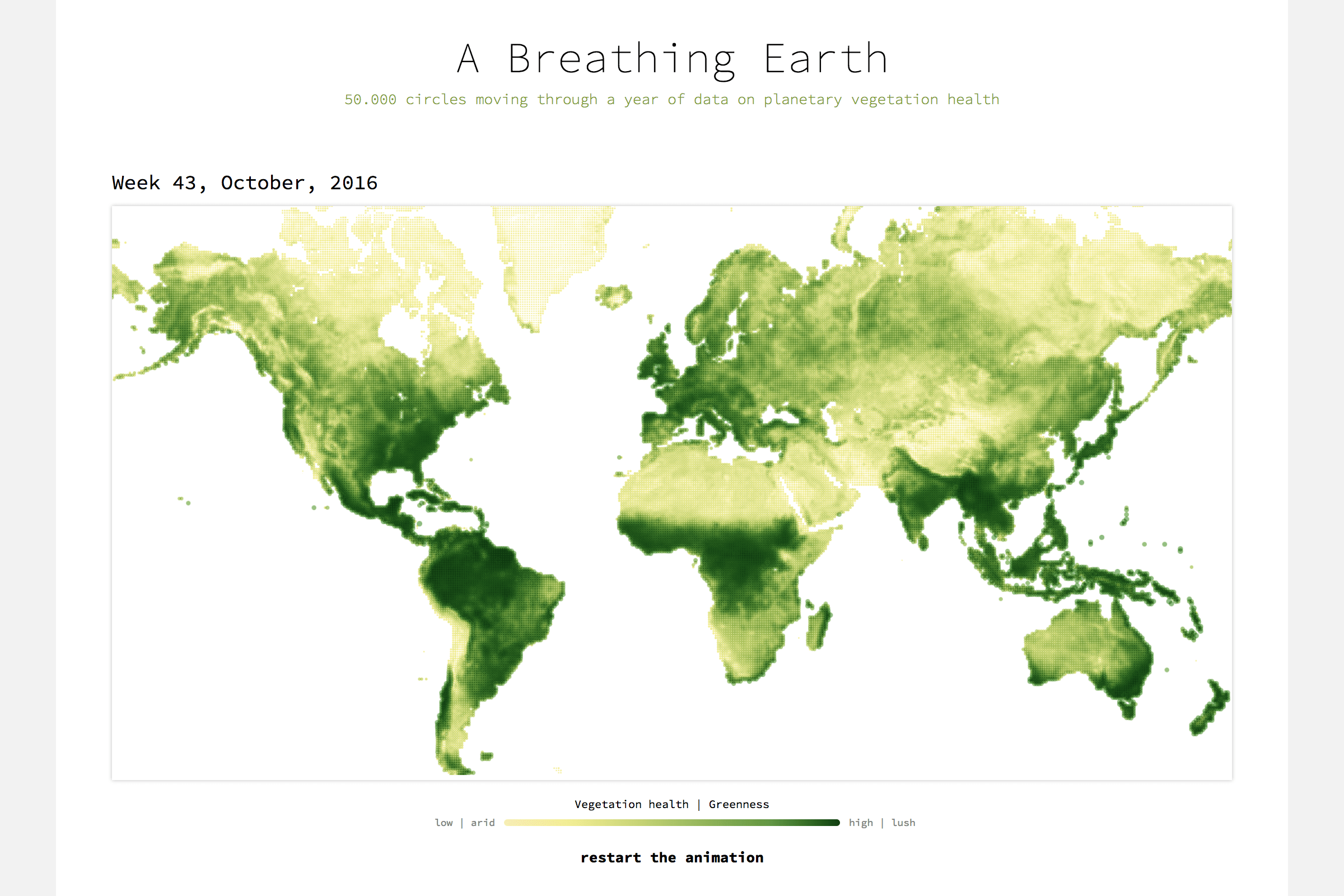
We all know that our Earth goes through a seasonal cycle, especially for the latitudes farther away from the equator. In the fall the “deciduous” plants lose their leaves only to grow back again in the next spring. The animation happening in “Breathing Earth” shows how 50.000 circles move through all 52 weeks of 2016 and visualize the seasonal cycles. Thereby displaying the how vegetation health changes throughout the year and how plant growth & decline occur on different times and scales in the many regions across the Earth.
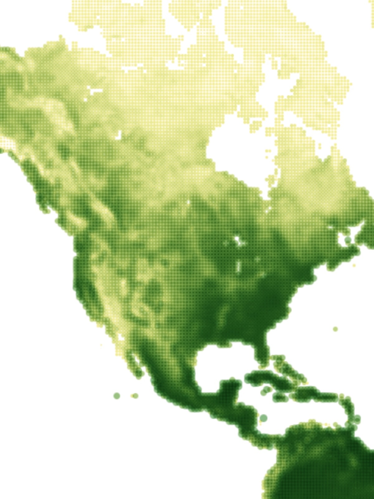
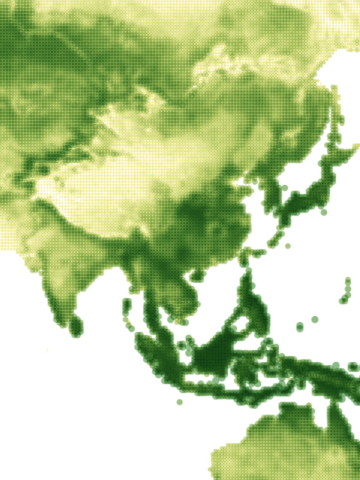
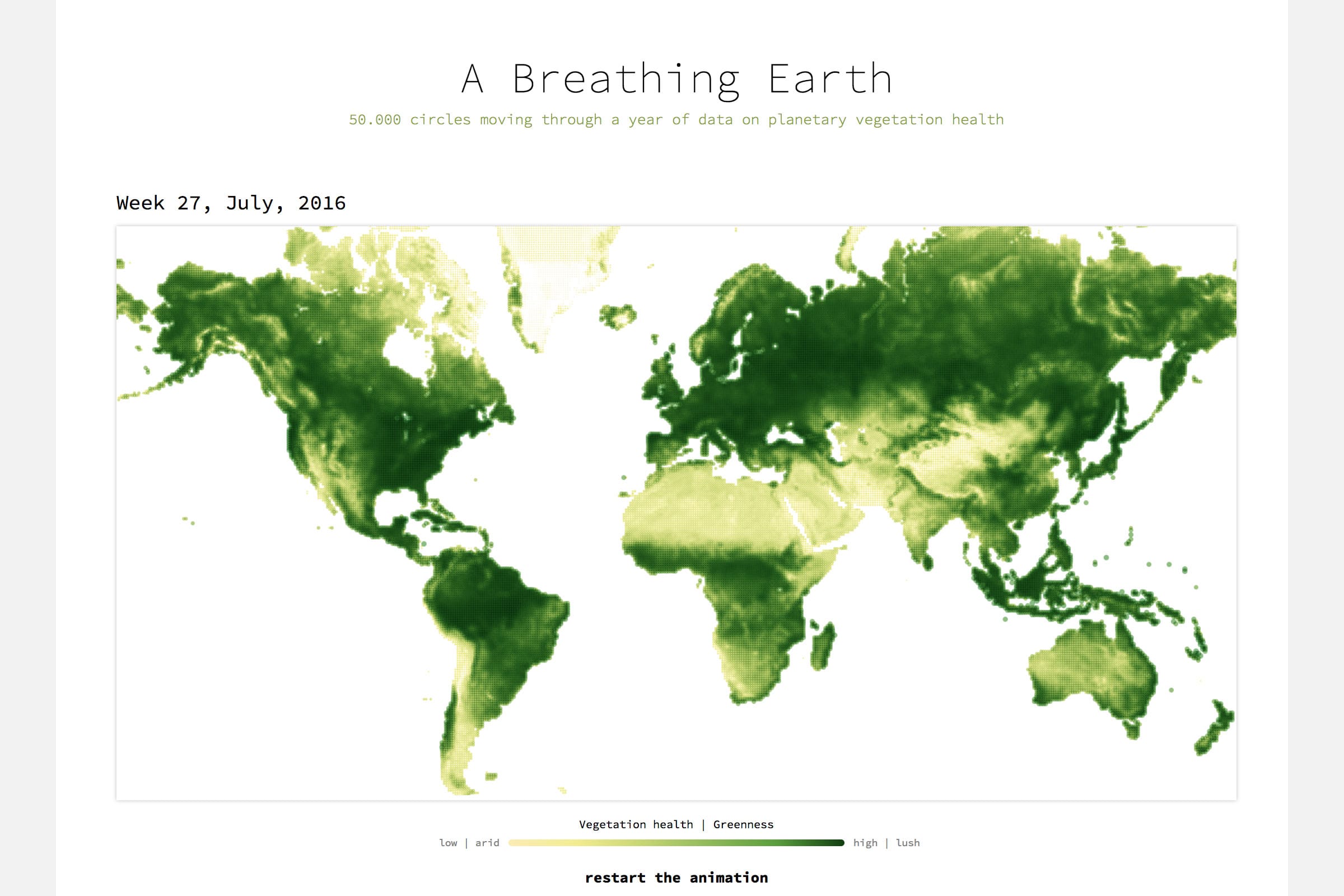
For the April community-themed month of Data Sketches I wanted to something about our Earth. Eventually I ended up on the website of NOAA STAR, where I saw an interesting image of the vegetation health, or greenness, across the planet.
I downloaded & converted the immense satellite data (Geo-Tiff files) and chose to make the final visualization an actual on the spot drawn visualization. Thus using circles on the screen, instead of turning the 52 weeks into a pre-rendered video. This meant that I had to learn some new coding languages, since d3 + SVG cannot handle 50k circles animating continuously. I dove into both Pixi.js and Regl.js, both based on WebGL.
Because the shape of the landmass on Earth is so intuitive for people, and the idea of a variable called greenness is as well, I kept the visual design very minimalistic. The animation across 52 weeks is the main thing that should draw all of the attention. You can read more about data, design & coding in this write-up.