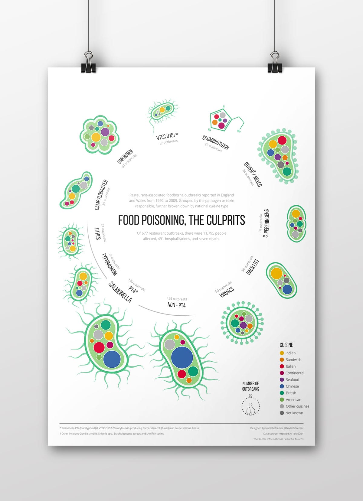
This infographic is about restaurant-associated food borne outbreaks reported in England and Wales from 1992 to 2009. The outbreaks are split first by their pathogen, toxin & virus. Each of these are shaped to look approximately like the actual pathogen (when available). Within each of these culprits the outbreaks are split by cuisine type, where the area of the circle represents the number of outbreaks.
I created this infographic as an entry for the Information is Beautiful Awards challenge Food Poisoning where it was chosen as one of the 11 shortlisted static designs. See the complete shortlist here.
I created the circles by using a very basic nested d3.js bubble packing layout. I then imported the resulting SVG circles into Illustrator. From there I placed the circles in groups around the center and created the virus/pathogen shapes around them. This was quite a nasty task because I had to look up images of the actual things which is not something I hope to do ever again.
