Even though R has been my favorite language to program in since a few months, one thing it is not designed to do is make your plots look anywhere near good. With this I mean that those plots are not the stuff I can just save and put into a client presentation.
Luckily, I am not the only one with this opinion, and therefore there are some amazing packages out there that give you the ability to create very nice plots. In one of my previous client assignments I invested quite some time to learn more about the ggplot2 package. Even though it took me some time to understand its workings, I found that it has one of the best online help sites of any R package. In the end my manager even preferred my ggplot2 plots above those that PowerPoint could create (as in, created with ThinkCell). Such as this one (you can use your own imagination on what I actually plotted here).
Survival Analysis
Survival analysis, deals with time until occurrence of an event of interest. However, this failure time may not be observed within the relevant time period, producing so-called censored observations.
On my most recent project for an insurance company I made several survival analyses to show the impact of customers leaving after one year versus those that stay loyal. Clients could only renew or lapse after exactly one year, which made for a nice stepwise Kaplan Meier plot. Even though the survival package makes it extremely easy to do the analysis itself, after seeing the standard Kaplan Meier plot of the package, I knew I had to try and make an alternative in ggplot2.
A Kaplan Meier plot represent the proportion of the population still surviving (or free of disease or some other outcome) at successive times. It’s an estimate of the Survivor Function.
I found this amazing post by Stat Bandit on how they made a function that uses ggplot2 to create a Kaplan Meier plot. Let me just show you the comparison between using the standard R plot. First set up the needed survival analysis with
library(survival)
data(colon)
fit = survfit(Surv(time,status)~rx, data=colon)
This calculates the survival curves for all levels in the variable ‘rx’. Call the standard plotting function in R with:
plot(fit, xlab="Time", ylab="Survival Probability", main="Kaplan-Meier plot")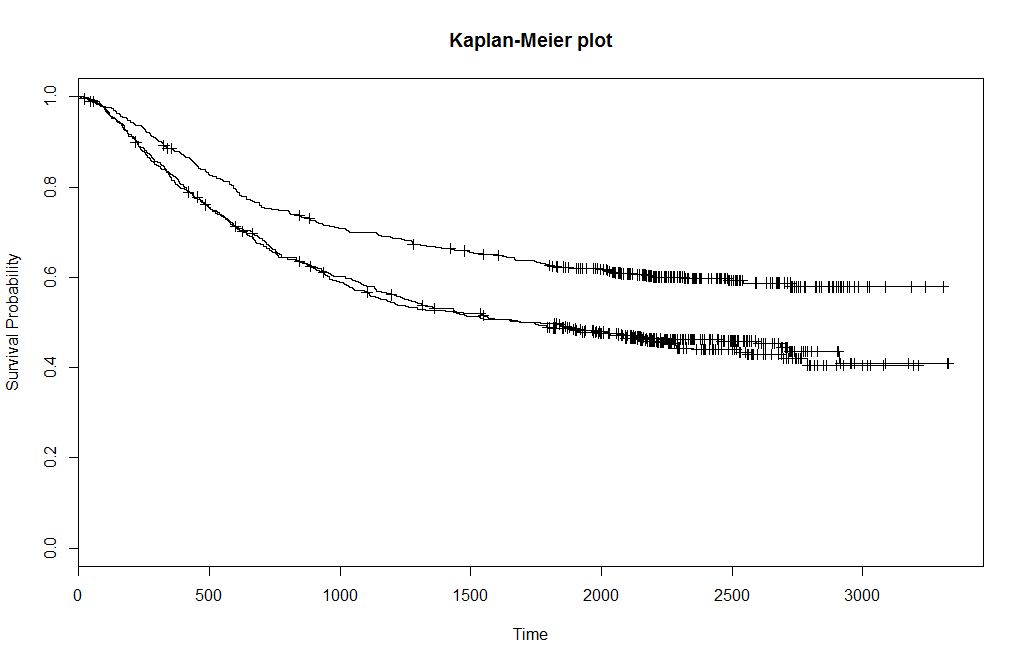
The plot above is the resulting plot, where each line represents one level of rx. Now call the following ggkm (ggplot - Kaplan Meier) function of Stat Bandit with the following line, where timeby indicates where to plot the x-grid and calculate the numbers at risk.
ggkm(fit, timeby=500)The following plot should appear on your screen. I do remember some issues with the version of Stat Bandit regarding an update of ggplot2, but I cannot remember exactly what I did to adjust the code at the bottom of the post to cope with it.
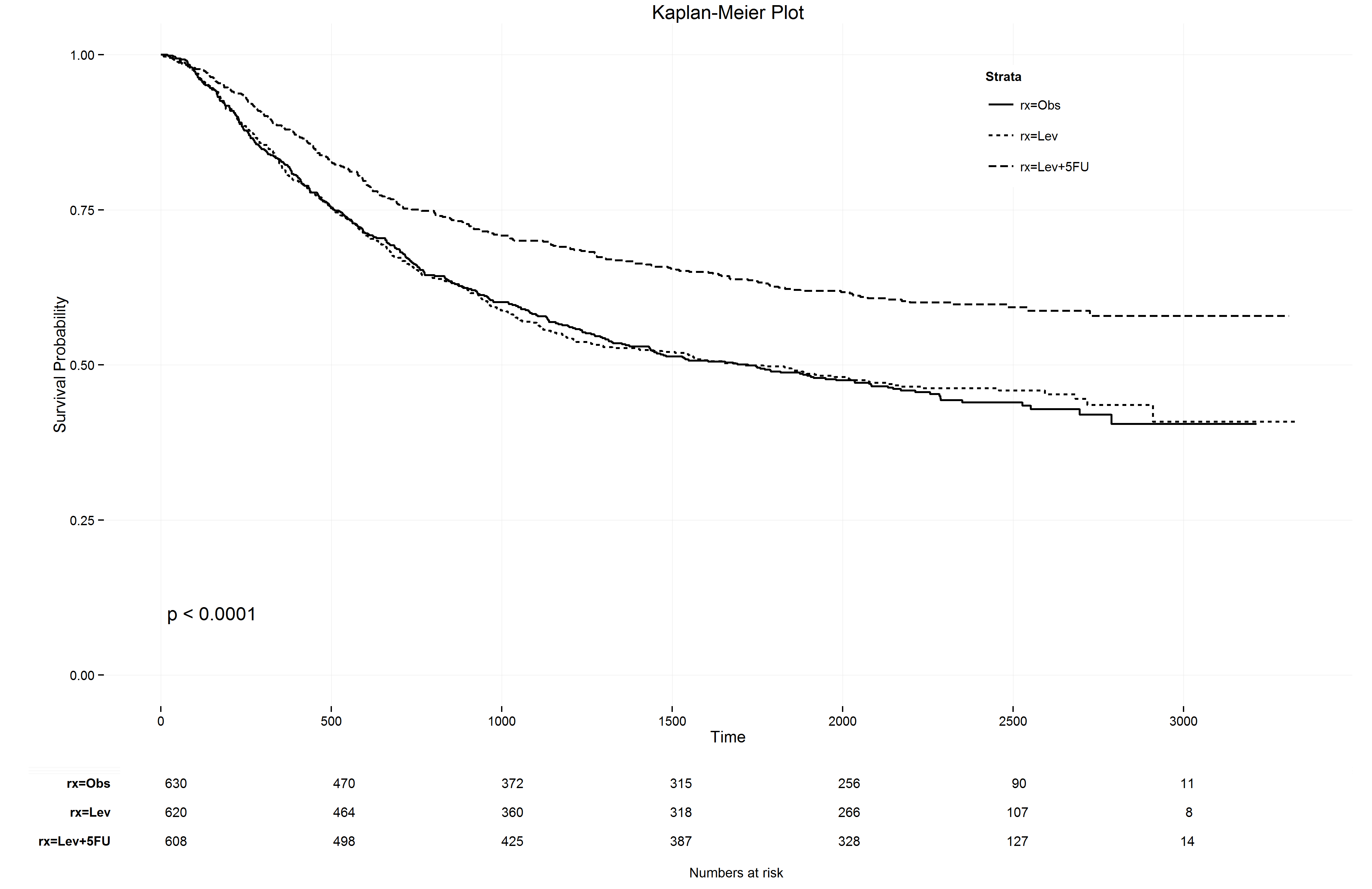
It even prints the numbers at risk below the KM plot! So, many kudo’s to the creators of the ggkm function. And don’t worry, if you also give the argument return=TRUE and save the ggkm function into a variable, say p, you can save a very nice and sharp png with the ggsave function.
p = ggkm(fit, timeby=500, return=T)
ggsave("Survival Analysis - Kaplan Meier plot.png", p)
There was just one small thing I wasn’t able to plot with ggkm, which is the most basic survival analyses, namely one without any strata. In terms of code this is the same routine as above, except that
fit = survfit(Surv(time,status)~rx, data=colon)
#becomes
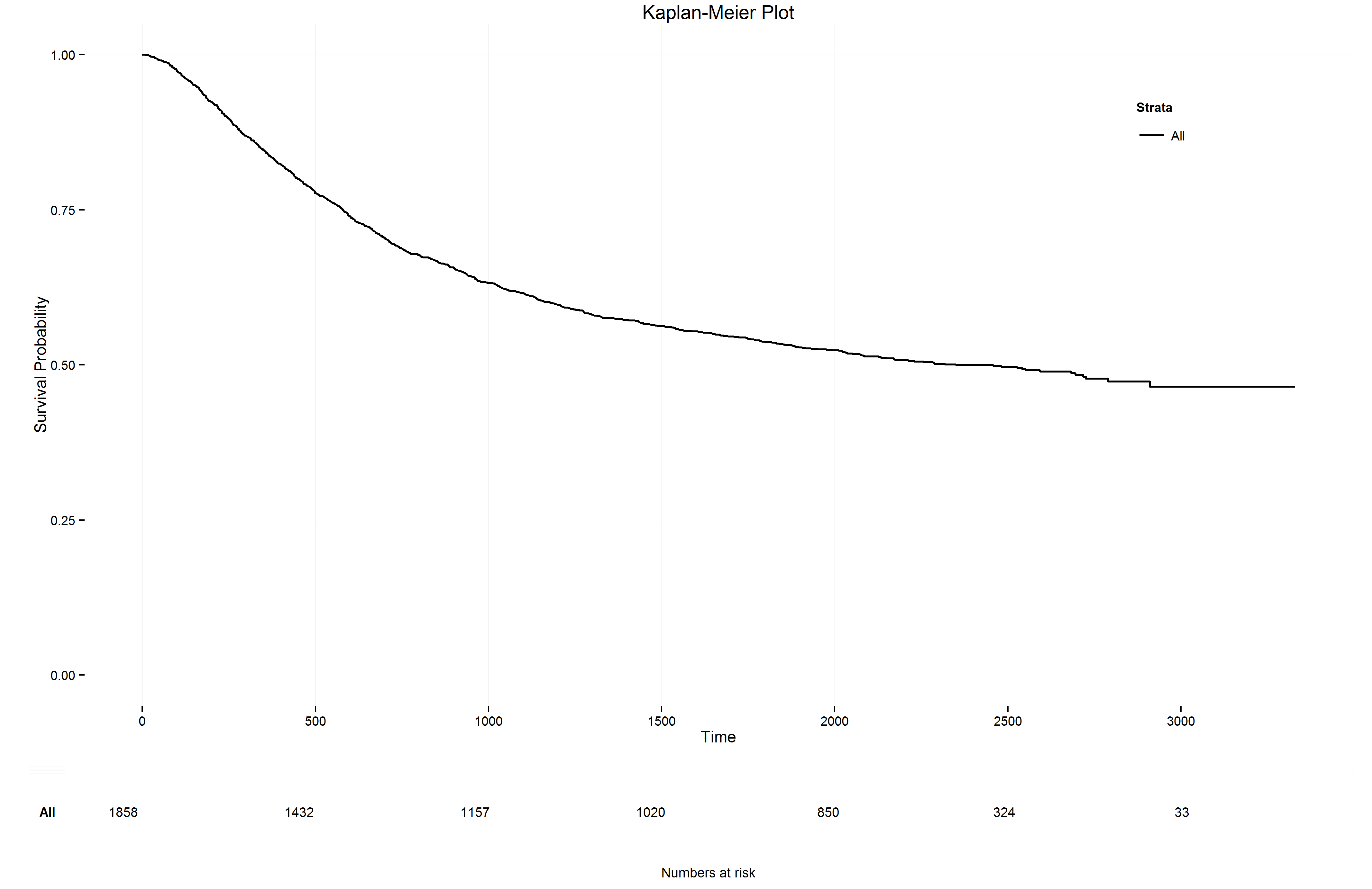
fit = survfit(Surv(time,status)~1, data=colon)See the ~1 instead of the ~rx. I still do not know if I was doing something wrong with the ggkm function but I decided to go into the code of the function and create the required adjustments to handle a basic survival curve.
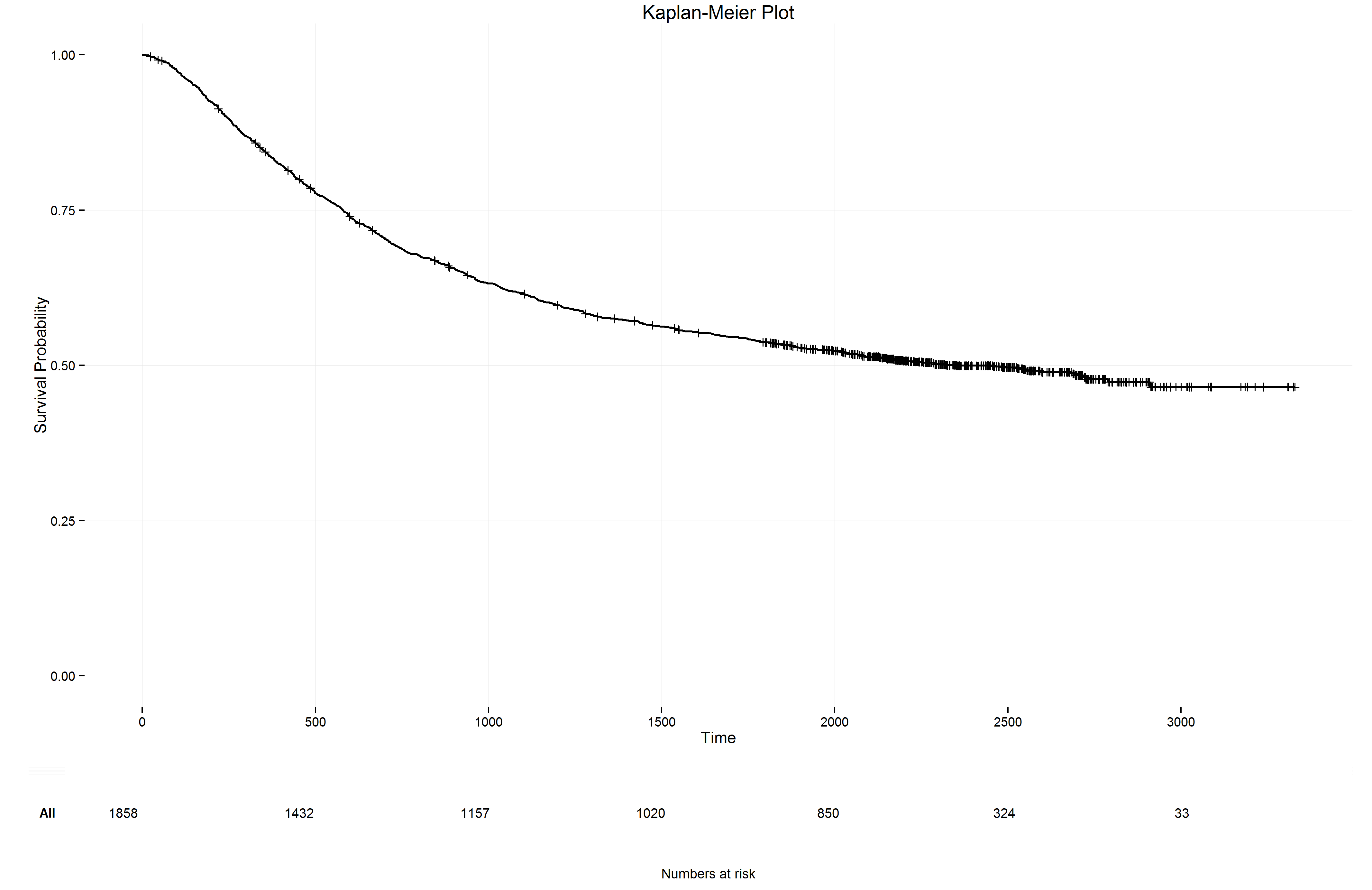
It took some if-else statements but now I can run the lines above with ~1 instead of ~rx and the ggkm function produces the following plot
Here you can find a link to the code for the ggkm function that can handle both the most basic and any strata that have been created in the survfit function (these are just some adjustments to the work from Stat Bandit). I also made some other minor adjustments, such as loading/installing the required packages. Have fun making your own survival analyses!
EDIT I’ve added a two new options to the ggkm function. You can now choose the show or not show a legend and also to show or not show the censoring marks like the ones you see in the most basic survival plot above.
- Use the new argument
legend = FALSEto not plot a legend - Use the argument
marks = TRUEto mark the censoring locations - Use the shape argument to change the marks of the censoring locations. The default is a vertical line
Here is an example of without a legend but with censoring marks, using the following line
p = ggkm(fit, timeby=500, return=T, legend=F, marks=T)