The last few weeks I’ve been spending some of my time on creating several visualizations of the data from a Global Mobile Consumer Survey that my company, Deloitte, performed during the spring. The results are being analysed right now and will eventually be published. I was given a free reign on what those illustrations should be, as long as they looked cool and would engage the reader. Well, what better opportunity to play around some of the more exotic d3 graphs and get paid for it!
Note Since writing this blog I’ve created a radical redesign & improvement of the d3 based radar chart. You can check out that blog instead here.
Some other names for radar charts are spider chart or star diagram.
I’ve made chord diagrams to show provider switching behavior, circular heatmaps, bubble charts, network graphs, but also a radar chart. A graph that isn’t very new, but is often forgotten. Luckily, I didn’t have to start from scratch, because somebody already made a reusable function that can create radar charts. See the example here and the code can be found here.
The standard d3 radar chart
I used R to prepare my data for the RadarChart function, took the examples as a starting point and just pasted my data over the example data. This gave me the following result:
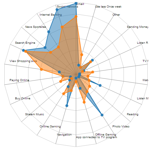
I have to admit, it creates an intricate plot, with nice interactive features with little extra effort from my side in terms of scripting! However, this plot needs some more tweaks before it could be placed in a publication. For instance, my titles on the right are cut off and the text on the left and bottom side seems to be positioned too far inside the graph. There were some extra things I wanted to change as well, more in terms of coloring and the format of the tooltip.
Adding some tweaks
The code for the RadarChart is nicely structured. Therefore, it wasn’t very difficult to figure out what each section did or created and where I should focus for each of my adjustments.
- I figured out how to align the text a bit better with the ends of each spoke
- Decided that I didn’t want to plot the last circle around the spokes
- Made the circular lines less pronounced
- Added numbers that showed what % each circular line/loop represents
- Added the extra option
ToRightin the radar chart call which specifies how far to the right from the top spoke the numbers should be printed - Formatted the tooltip to show the result in %’s
- Added a legend. Although the legend is all done outside of the adjusted radar chart
- Made some extra options for the adar chart call, to specify if the SVG needs to be wider/taller than the exact circle (to prevent the text from being clipped)
ExtraWidthXandExtraWidthYmake the SVG bigger than radius of the radar chartTranslateXandTranslateYcan move the radar chart within the SVG in the case the top or left part of your plot was being clipped
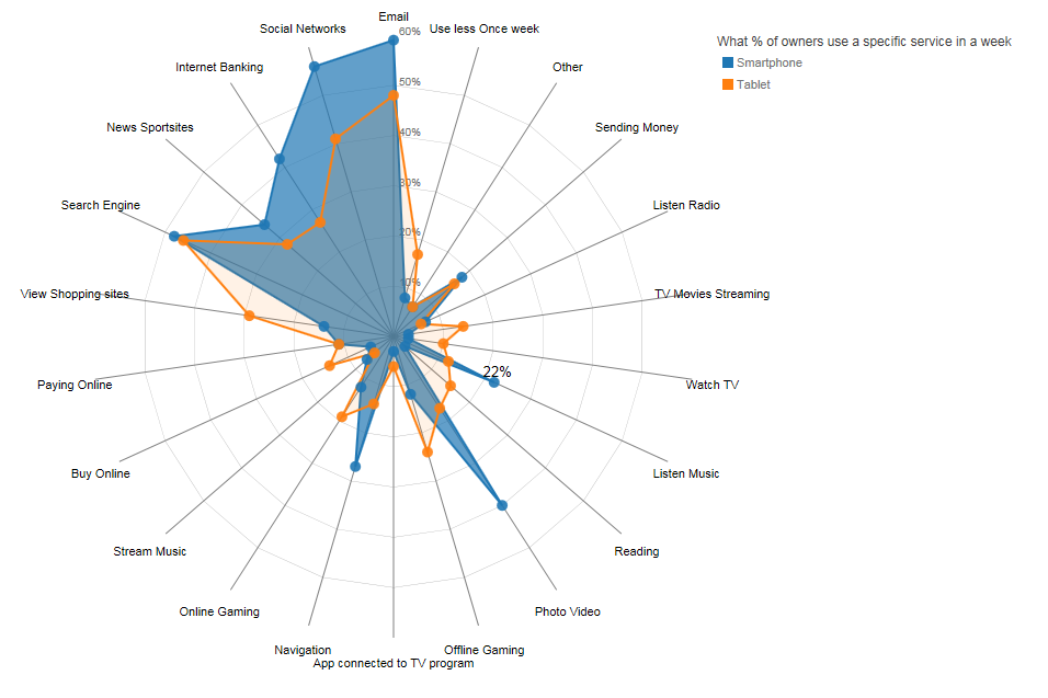
And this is how the radar chart is looking now:
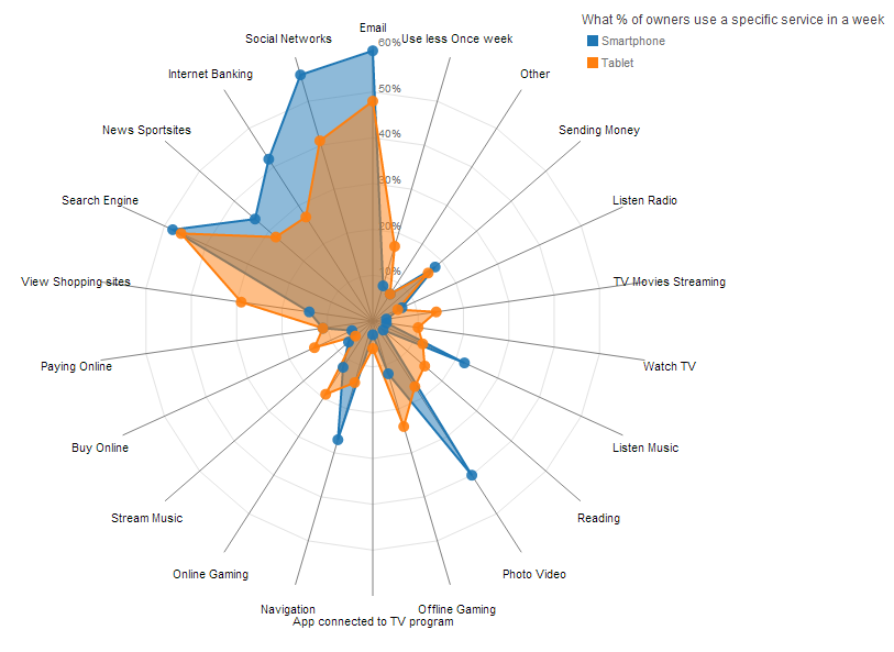
And it still has the neat interactive feature to highlight one particular polygon. Although another good idea would be if you can also highlight a polygon when you mouseover the square/text in the legend
Do not forget to look at the options section of the RadarChart function to see which variables are easy to adjust:
var RadarChart = {
    draw: function(id, d, options){
        var cfg = {
            radius: 5,
            w: 600,
            h: 600,
            factor: 1,
            factorLegend: .85,
            levels: 3,
            maxValue: 0,
            radians: 2 * Math.PI,
            opacityArea: 0.5,
            ToRight: 5,
            TranslateX: 80,
            TranslateY: 30,
            ExtraWidthX: 100,
            ExtraWidthY: 100,
            color: d3.scale.category10()
        };
    }//function
}//RadarChart
And you can give values other than the defaults described above by using the following code in your script:
//Options for the Radar chart, other than default
var mycfg = {
    w: 500,
    h: 500,
    maxValue: 0.6,
    levels: 6,
    ExtraWidthX: 300
}

//Call function to draw the Radar chart
RadarChart.draw("#chart", d, mycfg);
You can find the code for the adjusted RadarChart.js and the example for the plots above here and a working example here. Again, most of the code isn’t from me. I just made some adjustments.
Hopefully, I’ll get the chance to also talk a bit about the other visualizations that I made from the Global Mobile Consumer Survey data of the Dutch consumer. There are some very interesting insights in there.