Like I wrote in one of my previous posts on the creation of a “self organizing map” program in R, I really wanted the results of a SOM visualized in a hexagonal heatmap, so I wrote my own piece of code for it.
I’m sorry, but I’m not allowed to share the code. It is intellectual property of Deloitte Netherlands because I created it while working for them (although mostly in my own time).
I have received several requests to share the code, but sadly I’m not allowed to share it. However, I do not see any harm in posting a small piece of the code. Although, I think it is one of the most useful pieces to share! So without any further ado, let me show you how you can create hexagonal heatmaps in R!
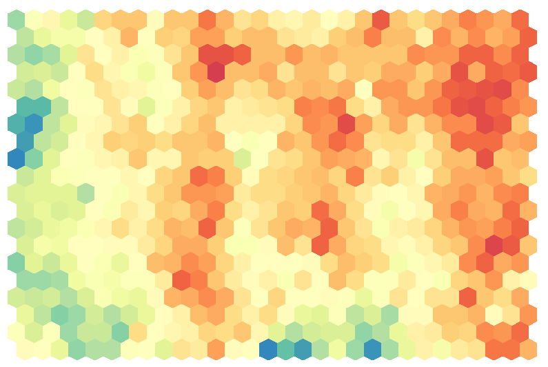
The code is a stripped down piece from the program, but it has all the basics needed to create nice looking map like the one above. But there is one variable that you will have to create yourself from the results of a self organizing map (SOM). The input variable Heatmap_Matrix variable is a matrix that would be the numerical representation of you heatmap.
So the matrix has the same number of rows as the SOM map and the same number of columns as the SOM map and each value in the Heatmap represents the value for one hexagon. Here [1,1] will become the lower left node (1st row, 1st column), [1,2] will become the node to the right, [2,1] will be the first node to the left in the second row, etc. So visually you work your way from bottom left to top right in the Heatmap, while in the matrix you work from top left to bottom right
Code
library(RColorBrewer) #to use brewer.pal
library(fields) #to use designer.colors

#Function to create the polygon for each hexagon
Hexagon <- function (x, y, unitcell = 1, col = col) {
  polygon(c(x, x, x + unitcell/2, x + unitcell, x + unitcell,
            x + unitcell/2), c(y + unitcell * 0.125,
                               y + unitcell * 0.875,
                               y + unitcell * 1.125,
                               y + unitcell * 0.875,
                               y + unitcell * 0.125,
                               y - unitcell * 0.125),
          col = col, border=NA)
}#function

#Start with a matrix that would be the numerical representation of you heatmap
#called Heatmap_Matrix
#This matrix has the same number of rows as the SOM map
#and the same number of columns as the SOM map
#and each value in the Heatmap represents the value for one hexagon
#Here [1,1] will become the lower left node (1st row, 1st column),
#[1,2] will become the node to the right
#[2,1] will be the first node to the left in the second row
#So visually you work your way from bottom left to top right
x <- as.vector(Heatmap_Matrix)

#Number of rows and columns of your SOM
SOM_Rows <- dim(Heatmap_Matrix)[1]
SOM_Columns <- dim(Heatmap_Matrix)[2]

#To make room for the legend
par(mar = c(0.4, 2, 2, 7))

#Initiate the plot window but do show any axes or points on the plot
plot(0, 0, type = "n", axes = FALSE, xlim=c(0, SOM_Columns),
     ylim=c(0, SOM_Rows), xlab="", ylab= "", asp=1)

#Create the color palette
#I use designer.colors to interpolate 50 colors between
#the maxmimum number of allowed values in Brewer
#Just replace this with any other color palette you like
ColRamp <- rev(designer.colors(n=50, col=brewer.pal(9, "Spectral")))

#Make a vector with length(ColRamp) number of bins between the minimum and
#maximum value of x.
#Next match each point from x with one of the colors in ColorRamp
ColorCode <- rep("#FFFFFF", length(x)) #default is all white
Bins <- seq(min(x, na.rm=T), max(x, na.rm=T), length=length(ColRamp))
for (i in 1:length(x))
  if (!is.na(x[i])) ColorCode[i] <- ColRamp[which.min(abs(Bins-x[i]))]

#Actual plotting of hexagonal polygons on map
offset <- 0.5 #offset for the hexagons when moving up a row
for (row in 1:SOM_Rows) {
  for (column in 0:(SOM_Columns - 1))
    Hexagon(column + offset, row - 1, col = ColorCode[row + SOM_Rows * column])
  offset <- ifelse(offset, 0, 0.5)
}

#Add legend to the right if you want to
image.plot(legend.only=TRUE, col=ColRamp, zlim=c(min(x, na.rm=T), max(x, na.rm=T)))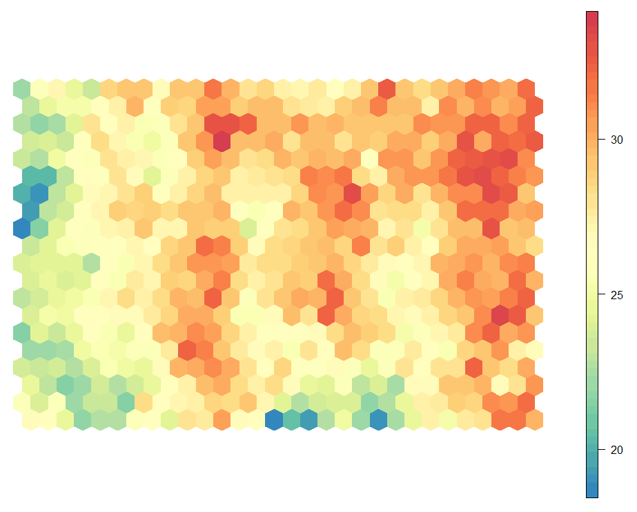
With the last line of code run, to create a legend, you will end up with a heatmap similar to the image above.
I hope my explanation and code will help you to create your own beautiful heatmaps in R. Maybe I should start focusing on more things outside self organizing maps before all my posts become SOM related (*^▽^*)ゞ