In this tutorial, I’ll show you how you can add an invisible voronoi grid over a scatterplot which will improve the experience of the viewer when hovering over the plot. And I’ve actually updated this tutorial in August 2016 when Franck Lebeau came with a great improvement on the final step.
I’ve taken a dataset from the Worldbank database that contains the total GDP & GDP per capita (current US $) and the life expectancy at birth for all countries in the world in 2010. I choose these indicators because they are known for most countries. I just needed a dataset with a few hundred datapoints to have a nicely filled scatterplot, so using something with countries suffices.
The legend is only visible for non-mobile viewers
In the example below you can see the end result that we are after: a scatterplot with a tooltip visible on a hover or mouseover event. There are also some extra elements that are not truly necessary but make the scatterplot easier to play with: lines attached to the hovered over circle & selecting a region by hovering over the legend.
Notice how your mouse does not necessarily need to be placed over a circle to see a tooltip. As soon as your mouse comes reasonably close to one of the circles, there will already be a tooltip associated with the country that is closest to the mouse.
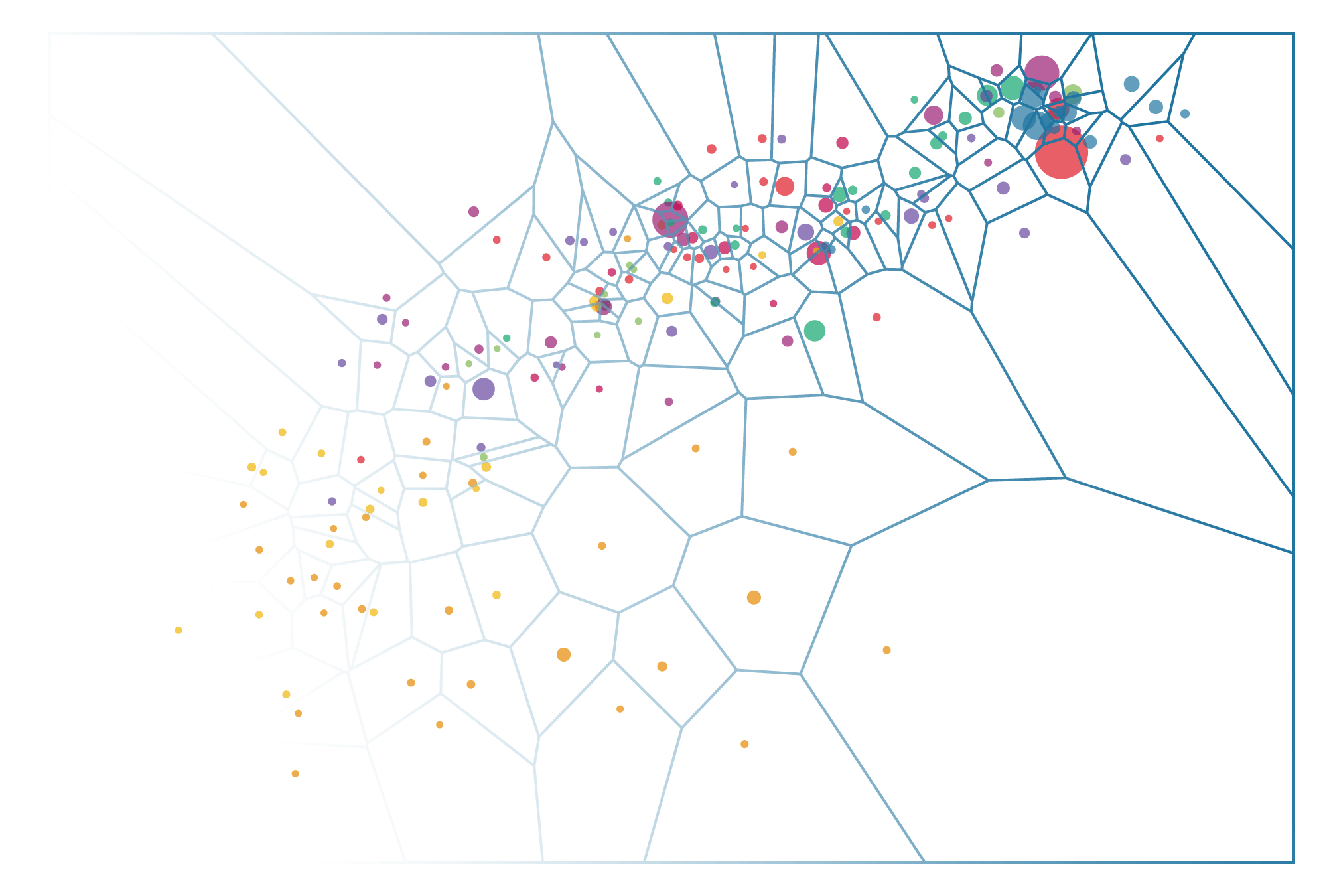
Voronoi clipped circles - Final
I also deleted the extra (not critical) interactive options from the scatterplot below to reduce the code to the minimum
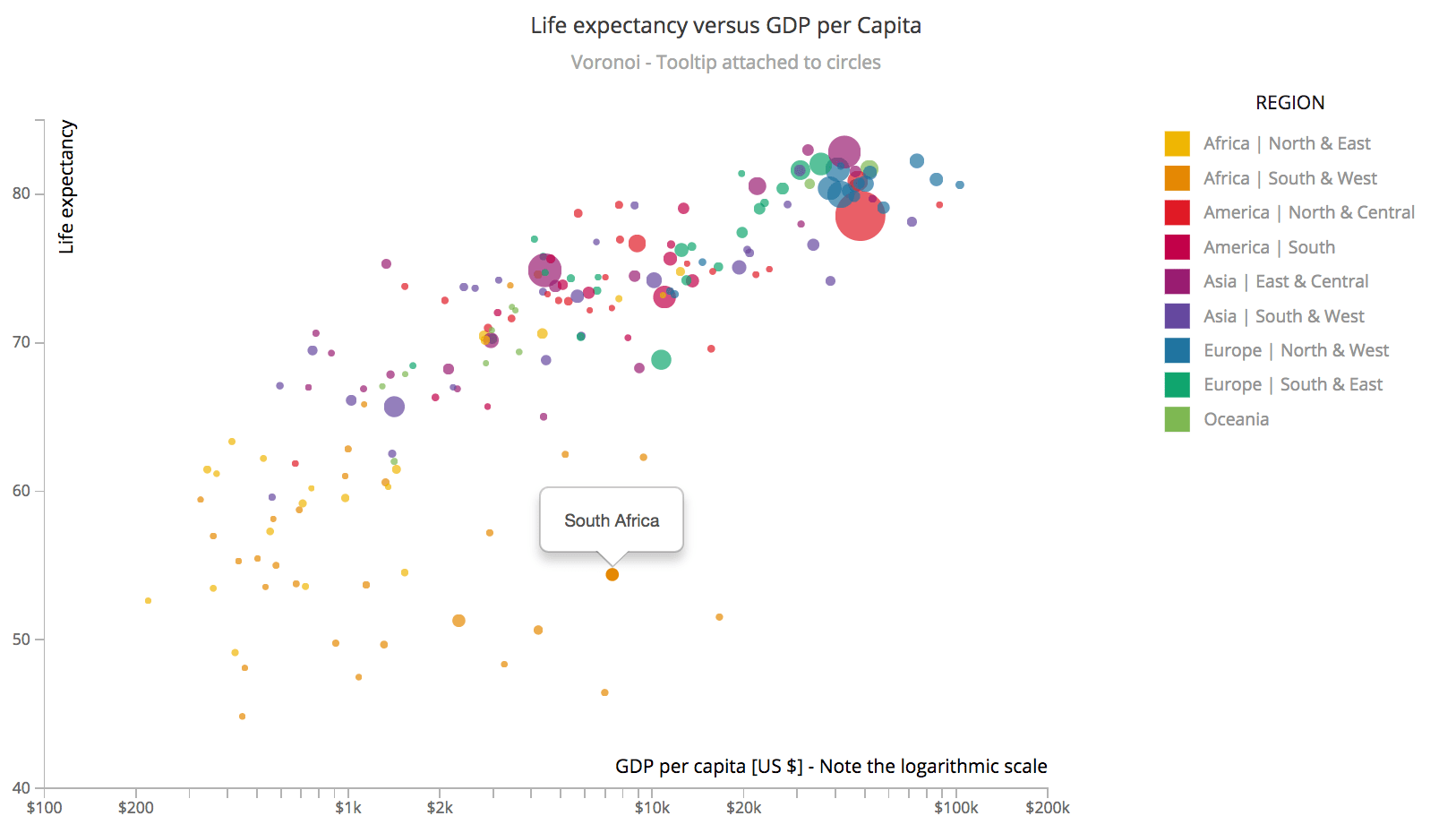
The scatterplot below might look the same, but here I’ve not used a voronoi grid. Instead, I went back to the default and attached the tooltip functionality to the circle. Here you have to really place your mouse over a circle to see which country it is. That might not be such a problem for the larger circles, but try and see which country has the lowest life expectancy. And then try the same in the voronoi version of the scatterplot above. I hope you’ll find that it is a lot easier and feels less frustrating in the voronoi version of the scatterplot.
Another benefit of the voronoi version is that it’s easier to get a sense of a region, especially a rather empty region. If you want to investigate the yellow region in the bottom left, you have to move your mouse to each of these circles to see the tooltip in the non-voronoi version. In the voronoi scatter plot, it’s much easier to see which countries are present, because there will always be a tooltip visible for the country that is nearest to the position of the mouse, no matter how small the circle itself. Try to get a feeling for the yellow region. I’m sure it’s a lot easier and gives a better user experience in the Voronoi version.
Simple scatterplot
I hope the two examples above were able to convince you of the benefit of using voronois when dealing with hover effects on (small) discrete items in your d3 chart. For those that I’ve managed to convince, read on to see how you can append a voronoi to you chart, which is much simpler than you might think.
Voronoi
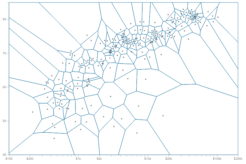
Let me first explain what a voronoi grid or layout actually is and when you can use it. A voronoi diagram separates a field of seeds, such as the country circles in the scatterplot, into regions where each point/location within a region is closest to the seed of that region. The edges of each voronoi cell are thus drawn at locations where the distance to the two nearest points is the same.
It’s probably best to look at the image below to see what I mean. It’s the same scatterplot that we’ve been looking at, but now I’ve made all the countries grey and the same size and I have given the Voronoi cells a blue stroke. Here you can see that for each blue line, there are two points on opposite sides of the line that are at exactly the same distance from that line. Try with a ruler if you’re not convinced this is true.
By creating these cells, we can attach a mouseover event to them that fires as soon as the voronoi cell is being hovered over, not just the circle inside the cell.
For me it was the amazing visual of the Tax Rates in the New York Times that first introduced me to the use of voronoi. I tried to study the source code to see how it was created and the d3.geom.voronoi() function was one of the things that were new to me. Here are some fun examples of the usage of d3.geom.voronoi():
- NYT | Across U.S. Companies, Tax Rates Vary Greatly
- Voronoi Tessellation
- Voronois that do not split up the entire chart area
- Rotating Voronois
- A Spherical Voronoi Diagram (so you can Voronoi the Earth)
- The Spherical Voronoi applied to all airports Worldwide (truly amazing)
- Combining Voronoi with Leaflet to show supermarkets
But circles are not the only chart type that you can use voronoi on. Any data that is discrete will do. Line charts actually exist of many points strung together to form a line. But the underlying data is still discrete, so you can put this data into the d3.geom.voronoi() function as well.
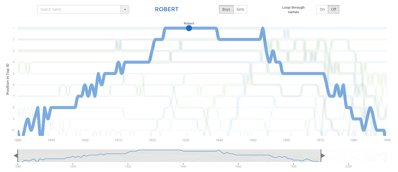
For example, I’ve used this approach in my Top 10 babynames project. When your mouse moves into the big chart region, it’s actually a voronoi that registers what is happening. A circle is placed on the location of the nearest line point, a name is added to the circle and all the other lines become almost invisible. This way you do not physically have to place the mouse on top of a line before something happens.
How to add a voronoi grid
You can find the complete code to the simple scatterplot here
We’ll start with the scatterplot example above that does not yet have a voronoi. In a basic scatterplot we have to create an svg (perhaps add a g element), define the x, y, color and radius scales. Create and draw the x and y axis and then we will draw the circles. Here you can find a very simple example. The drawing of the circles can look something like this
//Draw the circles
svg.selectAll("countries")
    .data(data)
    .enter().append("circle")
    .attr("class", "countries")
    .style("opacity", 0.7)
    .style("fill", function(d) {return color(d.Region);})
    .attr("cx", function(d) {return xScale(d.GDP_perCapita);})
    .attr("cy", function(d) {return yScale(d.lifeExpectancy);})
    .attr("r", function(d) {return rScale(d.GDP);})
    .on("mouseover", showTooltip)
    .on("mouseout", removeTooltip);
As a note, you can only create a class or id that does not start with a number
This section needs two slight adjustments. For the first one, we can take away the .on("mouseover", ) & .on("mouseout", ) lines because we will be attaching these to the voronoi grid later. The second one is to create a class for each circle that will be unique to that circle. This is needed so we can link the voronoi cells back to the circles once we create the tooltip again. You can use the index i but I went for the country code since this is a 3 letter unique code as well. Below is the new code for the circles:
//Draw the circles when doing a voronoi
svg.selectAll("countries")
    .data(data)
    .enter().append("circle")
    .attr("class", function(d,i) { return "countries " + d.CountryCode; })
    .style("opacity", 0.7)
    .style("fill", function(d) {return color(d.Region);})
    .attr("cx", function(d) {return xScale(d.GDP_perCapita);})
    .attr("cy", function(d) {return yScale(d.lifeExpectancy);})
    .attr("r", function(d) {return rScale(d.GDP);});
Next, we can add the voronoi cells on top. We need to take two steps. The first one will calculate the voronoi grid which will be needed in the second step where the voronoi cells are drawn. In the first step we use the d3.geom.voronoi() function and tell it what should be used for the x and y axes:
//Initiate the voronoi function
//Use the same variables of the data in the .x and .y as used in the
//cx and cy of the circle call.
//The clip extent will make the boundaries end nicely along the chart area
//instead of splitting up the entire SVG (if you do not do this it would
//mean that you already see a tooltip when your mouse is still in the axis
//area, which is confusing)
var voronoi = d3.geom.voronoi()
    .x(function(d) { return xScale(d.GDP_perCapita); })
    .y(function(d) { return yScale(d.lifeExpectancy); })
    .clipExtent([[0, 0], [width, height]]);
A useful addition is the set a clipExtent on the voronoi grid. This will limit the voronoi cells to the rectangle that is formed by the arguments supplied with clipExtent. From the d3 wiki:
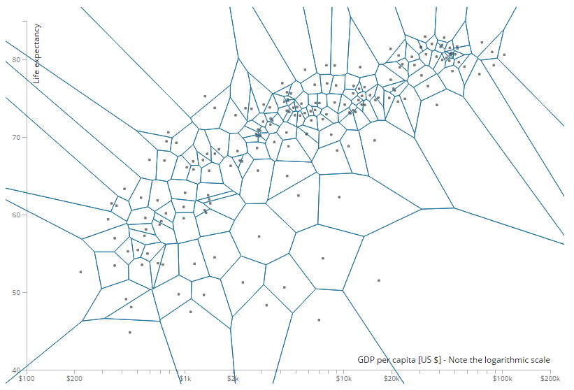
[ [x0, y0], [x1, y1] ], where x0 is the left side of the extent, y0 is the top, x1 is the right and y1 is the bottom.In most cases, if you have been using margins and width and height in the normal sense, this means that you can practically always set it to [[0, 0], [width, height]]. By not setting a clipExtent the entire SVG will be used, also the regions outside the chart area, such as the axes. The image below shows the results without a clipExtent. In this version a mouse would trigger a hover over tooltip even when the mouse is still left of the y-axis or below the x-axis (which is sloppy).
The code below shows the second step. After creating the voronoi variable we can use this in the call to create polygons (the voronoi cells) on top of the circles that are already drawn. Calling voronoi(data) will return an array of polygons that can be used in the .data() step. The .attr(d, ..) step draws the polygon, where M is used in SVG paths to signal the starting point (move to), L is a line command and Z is a closing command which draws the line from the last point to the first point again.
The class statement is going to be very important. Just as with the circles we need to make a unique class for each voronoi cell. To be more precise, the voronoi that will fall over the corresponding circle will have to have this same unique class. This is how we can match the mouseover trigger of the voronoi cell back to the correct circle later on. Usually this means we can just use the same technique to create the class as we did with the circles since it is based on the same dataset; here that means setting the class equal to the country code.
A few style codes are added to make sure that the voronoi cells become invisible and that they will capture all mouse over events, even when there is no fill, or to quote MDN on pointer-event: all
Finally, in the last two lines we find those two mouseover events that were previously attached to the circle creation statement. We will look at these two functions next. But just with this code, you will have created the voronois on top of your circles. Just uncomment the stroke line to see how they actually look in your image.
//Create the voronoi grid
svg.selectAll("path")
    .data(voronoi(countries)) //Use vononoi() with your dataset inside
    .enter().append("path")
    .attr("d", function(d, i) { return "M" + d.join("L") + "Z"; })
    .datum(function(d, i) { return d.point; })
    //Give each cell a unique class where the unique part corresponds
    //to the circle classes
    .attr("class", function(d,i) { return "voronoi " + d.CountryCode; })
    //.style("stroke", "#2074A0") //If you want to look at the cells
    .style("fill", "none")
    .style("pointer-events", "all")
    .on("mouseover", showTooltip)
    .on("mouseout",  removeTooltip);
How to attach a tooltip to the circles
The voronoi grid won’t actually be of any use to us if we don’t use it for some kind of interactive event such as a mouseover. The only issue that makes this slightly more complex than a simple tooltip is that right now it’s the voronoi cell that triggers the event. Thus placing the tooltip right over the circle is not as simple as using the d3.select(this) statement anymore.
You do need to add a call to the Bootstrap JavaScript and CSS in your header.
Below you can find an example code for a type of tooltip that I like to use because it’s so simple, a Bootstrap tooltip. Here I am just using the default method of attaching the tooltip to the object by using this.
//Example of a default tooltip where you make use of "this"
//Show the tooltip on the hovered over element
function showTooltip(d) {
    $(this).popover({
        placement: 'auto top', //place the tooltip above the item
        container: '#chart', //the name (class or id) of the container
        trigger: 'manual',
        html : true,
        content: function() { return d.Country; } //the content inside the tooltip
    });
    $(this).popover('show');
}

//Hide the tooltip when the mouse moves away
function removeTooltip() {
    //Hide the tooltip
    $('.popover').each(function() {
        $(this).remove();
    });
}
The screenshot of the scatterplot below shows the result when I add these two functions to the script (with the voronoi grid created). I’ve made the cells visible again so it becomes clear what the tooltip is attaching itself to
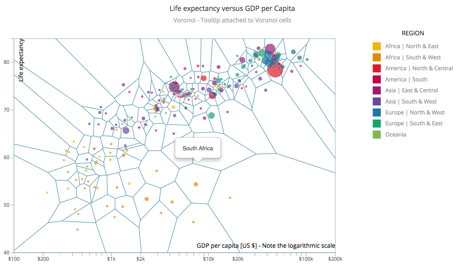
As you can see, the tooltip is nicely placed above a voronoi cell, just like it was told to do, since this now refers to the voronoi cells. Luckily, thanks to the unique classes that we created, it’s rather easy to change this behavior. Instead of using this, we need to save the circle element that corresponds to the voronoi cell in a variable.
Since the voronoi cell and the circle that falls inside this cell are based on the same data, they (should) have the same unique class identifier that we created earlier. I can therefore use d.CountryCode which will give me the country code of the voronoi cell and use that to select the circle that is created with the same country code.
In the code below you can see the same tooltip functions as above. We only need to add one extra line; a line in which we create the variable element that will contain the circle that has the same d.CountryCode class structure as the voronoi cell that triggers the mouseover event. We then need to replace all this in the function by element. And that’s it! That was actually pretty easy right.
//Show the tooltip on the hovered over circle instead of the Voronoi grid
function showTooltip(d) {
    //Save the circle element (not the voronoi which is triggering the hover event)
    //in a variable by using the unique class of the voronoi (CountryCode)
    var element = d3.selectAll(".countries."+d.CountryCode);

    //Show the tooltip over the "element" variable (the circle) instead of "this"
    $(element).popover({
        placement: 'auto top',
        container: '#chart',
        trigger: 'manual',
        html : true,
        content: function() { return d.Country; }
        });
    $(element).popover('show');
}

//Hide the tooltip when the mouse moves away
function removeTooltip(d) {
    $('.popover').each(function() {
        $(this).remove();
    });
}
And below is the result that we get. Now the tooltips are placed right above the circles even though the mouse is moving over the voronoi cells and voila, improved user experience!
Extra improvement
Franck also turned his technique into a plugin, in case you’d just like to use this technique without coding it, which you can see in action here.
After writing this blog, Franck Lebeau came with another version which uses large circles combined with the voronoi cells to define the tooltip region. This makes it seem a bit less odd to see a tooltip when your mouse is nowhere near a circle, like in the lower right corner. I thought this was a great idea! But I made a variation on his approach that is more in line with the rest of the code that came before it.
Below you see the idea. Instead of the entire voronoi cell acting as a trigger for the tooltip only the light blue region within a cell will trigger the tooltip. Making this update requires two changes compared to the set-up of the last example in the section above; turn the voronoi cells into clip-paths and add large background circles.
Voronoi clipped circles
Let’s start with the voronoi cells. Because the light blue circles will now act as the trigger, we only need the voronoi’s as a use to clip each blue circle. The code below shows you how to change the old voronoi creation into a voronoi clipPath creation
//Old way to use the voronoi cells
//svg.selectAll("path")
//    .data(voronoi(countries))
//    .enter().append("path")
//    .attr("d", function(d, i) { return "M" + d.join("L") + "Z"; })
//    .datum(function(d, i) { return d.point; })
//    .attr("class", function(d,i) { return "voronoi " + d.CountryCode; })
//    .style("fill", "none")
//    .style("pointer-events", "all")
//    .on("mouseover", showTooltip)
//    .on("mouseout",  removeTooltip);

//New way: turn the cells into clip-paths
//(which should be appended to a defs element)
svg.append("defs")
    .selectAll(".clip")
    .data(voronoi(countries))
    //First append a clipPath element
    .enter().append("clipPath")
    .attr("class", "clip")
    //Make sure each clipPath will have a unique id (connected to the circle element)
    .attr("id", function(d) { return "clip-" + d.point.CountryCode; })
    //Then append a path element that will define the shape of the clipPath
    .append("path")
    .attr("class", "clip-path-circle")
    .attr("d", function(d) { return "M" + d.join(",") + "Z"; });
Creating the large circles that will capture the hover is very similar to creating the normal, visible circles. You only have to set the clip-path attribute (& style for Safari), give it a nice big radius and move the mouseover and mouseout events that used to be attached to the Voronoi cells to these circles. By setting them to be invisible, but still capture all pointer-events they will do their job. The working example all the way at the start of this blog uses this technique.
//Append larger circles
svg.selectAll(".circle-catcher")
    .data(data)
    .enter().append("circle")
    .attr("class", function(d,i) { return "circle-catcher " + d.CountryCode; })
    //Apply the clipPath element by referencing the one with the same countryCode
    .attr("clip-path", function(d) { return "url(#clip-" + d.CountryCode + ")"; })
    //Bottom line for safari, which doesn't accept attr for clip-path
    .style("clip-path", function(d) { return "url(#clip-" + d.CountryCode + ")"; })
    .attr("cx", function(d) {return xScale(d.GDP_perCapita);})
    .attr("cy", function(d) {return yScale(d.lifeExpectancy);})
    //Make the radius a lot bigger
    .attr("r", 50)
    .style("fill", "none")
    .style("pointer-events", "all")
    //Notice that we now have the mousover events on these circles
    .on("mouseover", showTooltip)
    .on("mouseout",  removeTooltip);
The code to all separate steps
Even though the only code that needs to be changed or added is provided in the sections above, I know from my own experience that I like to see this inside working examples. I’m guessing I’m not the only one, so here are all the links to the intermediate steps
- Step 1 - The scatterplot without a Voronoi grid but with a tooltip
- Step 2 - The scatterplot with a Voronoi grid and the tooltip attached to Voronoi grid
- Step 3 - The scatterplot with a Voronoi grid and the tooltip attached to the circle
- Step 4 - Same as 3 with added interactivity events, such as lines, legend hover and click
- Step 5 - The distance limited circle approach with visible circles
- Step 6 - The final result with all unnecessary code removed and only the nice UX remaining
I hope this tutorial was able to first show you the benefit of using a Voronoi when dealing with mouseover events and of course then teach you how to create one. And thanks again to Franck Lebeau for his idea to get from step 4 to steps 5 & 6!