We’re picking up right where I left you in my blog on Hacking a Chord diagram to visualize a Flow where I turned a Chord Diagram into a more circular flow diagram. Even with the chords now having been turned into a “bat-plot” I still wanted to emphasize more that we were dealing with a flow from left to right, from Education to Occupation. So, I thought, why not try to use a gradient and animate a movement/flow towards the right.
SVGs beyond mere shapes blog series
This blog is part of the SVGs beyond mere shapes tutorial series. It’s based on the similar named talk. My goal with the talk was to inspire people to experiment with the norm, to create new ways of making a visual more effective or fun. Even for a subject as narrow as SVG filters and gradients, there are more things possible than you might think. From SVG gradients that can be based on data, dynamic, animated gradients and more, to SVG filters for creating glow, gooey, and fuzzy effects. You can find links to all the other blogs in my kick-off article here.
From education to occupation
Below you can see the stretched chord diagram example that I was referring to in the intro. It shows how students from different educational sciences end up in their occupational sectors a year after graduation. On the left, we see the different educational tracks and on the right are the occupational sectors. Thus, there is a flow from left to right. The thickness of a line represents the number of students. There’s also a gradient of light-dark grey moving within the chords from left to right to mimic this movement towards occupations.
Setting up the (static) gradient
You start with a linear gradient. If you want a bit more background on the basics of linear gradients, please see my earlier post in which I show how to create smooth color legends by using a gradient.
There are two things that are different from a normal gradient. Since we’ll be moving the gradient, we need whatever comes before (or after) to look exactly the same as the gradient itself. This can be achieved by setting the spreadMethod attribute of the filter to reflect.
The spreadMethod indicates what happens if the gradient starts or ends inside the bounds of the object onto which the gradient is applied. In the horizontal gradient case, it is what happens if x1 is set > 0% or x2 is set < 100%. The default, pad, just uses the first color of the gradient to fill the remainder at the start and the last color to fill the remainder at the end of the object. Using reflect, as the name suggests, will mirror the gradient over and over: start-to-end, end-to-start, start-to-end, …, until the object is filled.
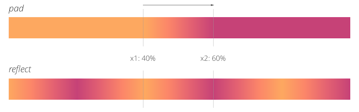
NOTE In Safari the spreadMethod is broken and can only handle pad, not reflect. In my SVGs beyond mere shapes slides, I’ve made adjustments so it seems as if the gradient is moving even in Safari. You do this by creating multiple sets of the colors that you want the gradient to move through to fill up (at least) the entire shape. Please check the code for the animated gradient intro slide to see how this can be achieved.
In the examples below I will only focus on those cases where reflect does work (Chrome and Firefox at least). Hopefully, Safari will fix this problem soon.
The second slightly odd thing to do is to create a color palette for your gradient that is symmetrical. The first color is also the last, the second color is also the before-last color, and so on. This will make sure that the start of the gradient will join smoothly with the end. There is a way to avoid having to do this, but it makes the next step just a bit harder to explain. Nevertheless, you can find the other technique at the end of the blog.
//Container for the gradient
var defs = svg.append("defs");
//Append a linear horizontal gradient
var linearGradient = defs.append("linearGradient")
    .attr("id","animate-gradient") //unique id for reference
    .attr("x1","0%")
    .attr("y1","0%")
    .attr("x2","100%")
    .attr("y2","0")
    //Make sure the areas before 0% and after 100% (along the x)
    //are a mirror image of the gradient and not filled with the
    //color at 0% and 100%
    .attr("spreadMethod", "reflect");

//A color palette that is 4 colors
//(the last 3 colors are the reverse of the start)
var colours = ["#FDA860", "#FC8669", "#E36172", "#C64277",
               "#E36172", "#FC8669" ,"#FDA860"];

//Append the colors evenly along the gradient
linearGradient.selectAll(".stop")
    .data(colours)
    .enter().append("stop")
    .attr("offset", function(d,i) { return i/(colours.length-1); })
.attr("stop-color", function(d) { return d; });When applied to a rectangle we get the result below
Adding some animation
If you want to learn how to do it with attrTween, you can learn how to use it in my previous post on adding motion blur to you visualization.
Animating a gradient is very easy. We could try to do something with d3 and a transition (actually a custom attrTween function), but let’s do it differently here. We’ll add an animate element to the gradient which is very easy to understand. After appending an animate we have to set several attributes to make sure the element knows what to do, to what attribute, and for how long. The names of the attributes almost explain themselves, but I’ll walk you through the code below just to be sure.
//Animate the 'x1' attribute from 0% to 100% in 7 seconds
//And do this indefinitely
linearGradient.append("animate")
    .attr("attributeName","x1")
    .attr("values","0%;100%")
    .attr("dur","7s")
.attr("repeatCount","indefinite");First and foremost, it needs to know which attribute of the gradient to animate. In this case, it’s the x1 and x2 attributes; the locations along the rectangle along which the gradient should run. Let’s start with animating x1 first. The values that x1 should run between are set with the values attribute. You can set more than two values by just separating the values with a semicolon, but we only need it to change from 0% to 100%. The duration of the animation is set with the dur attribute, which is now 7 seconds. And finally, we want this animation to repeat forever, so I’ve set the repeatCount attribute to indefinite. And after those 4 attributes, we get the result below.
Creating a smooth flow
That’s not exactly what I was going for. However, that’s because I’ve only animated x1, but kept the end point, x2, at the same location. In 7 seconds x1 is animated to lie closer and closer to x2 thereby reducing the length of the gradient. With the spreadMethod set to reflect you get the effect above. Therefore, we also have to animate the x2 attribute to make sure there is always a difference of 100% in between them. Then it looks as if the gradient is just moving from left to right.
We can add another animate element to the linear gradient which is practically the same as for x1, but with different numbers for the values attribute; from 100% to 200%.
//Animate the 'x2' attribute from 100% to 200% in 7 seconds
linearGradient.append("animate")
    .attr("attributeName","x2")
    .attr("values","100%;200%")
    .attr("dur","7s")
.attr("repeatCount","indefinite");And with that addition, the gradient in the rectangle seems to run smoothly from left to right. You do not even notice a jump after 7 seconds when the values of x1 and x2 jump back to their starting values of 0% and 100%, respectively. It’s just an indefinite stream moving in from the left.
Extra - Animation without a symmetrical color variable
In the previous sections, we used a symmetrical color variable to create a symmetrical gradient. But this is not truly necessary. In the code below I’ve used the same set-up as before, with 3 changes. The first is the color variable, it’s now only 4 (different) colors long. The other two changes are in the values attribute of the two animate steps. To make the gradient run smoothly even after its duration of 7 seconds, we need to animate x1 from 0% to 200%, instead of just to 100%. By using reflect as the gradient’s spreadMethod, this ensures that the starting yellow color will have been reflected to appear back at the start again. Since x2 should always be 100% greater than x1, this means that x2 needs to be animated from 100% to 300%.
//Four different colors
var colours = ["#FDA860", "#FC8669", "#E36172", "#C64277"];

//Append the colors evenly along the gradient
linearGradient.selectAll(".stop")
    .data(colours)
    .enter().append("stop")
    .attr("offset", function(d,i) { return i/(colours.length-1); })
    .attr("stop-color", function(d) { return d; });

linearGradient.append("animate")
    .attr("attributeName","x1")
    .attr("values","0%;200%") //let x1 run to 200% instead of 100%
    .attr("dur","7s")
    .attr("repeatCount","indefinite");

linearGradient.append("animate")
    .attr("attributeName","x2")
    .attr("values","100%;300%") //let x2 run to 300% instead of 200%
    .attr("dur","7s")
.attr("repeatCount","indefinite");If you let everything else be the same, this gradient (below) will seem to “flow” twice as fast as the one above, since x1 moves twice as far in the same 7 seconds.
Examples
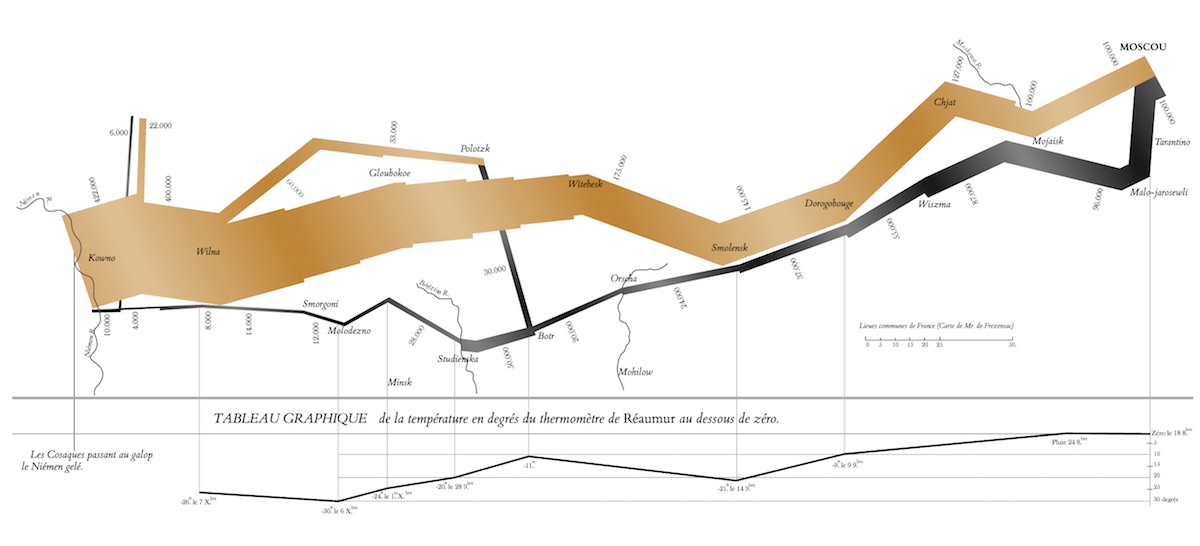
Besides the stretched chord diagram to show the movement from education to occupation I wanted to show one more example in my talk. When I started thinking about the slides for my presentation, I wanted to see if I could at least have some of these things in my slides as a tongue-in-cheek: a rainbow color palette, a cat animated gif or Minard’s famous chart of the movement of Napoleon’s troops towards and away from Moscow. The first one was easy since I have worked a lot with the rainbow colored Self-Organizing Maps. The second didn’t fit the style of my slides, but I felt the last one would go very nicely with an animated gradient.
So I took the SVG version from Wikipedia. Unfortunately, the text wasn’t in the nice old font and it was all saved as paths, not text, so I spend about 3 hours on a Friday evening meticulously replacing all the text (and some other stylings that I felt could better reflect the actual image) in Sketch and then pasting it back into an HTML page. I could then use d3 to select the large paths by their IDs and append moving gradients by resetting the fill styles.
.svg)
These paths represent the troops and I added animated gradients because I wanted to make it a bit more intuitively clear in what direction the troops were moving. The brown section is moving towards Moscow and the black sections are moving back to France. I always find it sad to see that of the ±422,000 men that started this campaign, only ±10,000 made it back alive.
The Code
The code and examples used in this blog can be found in my bl.ocks collection as usual
- The animated rectangle
- The final stretched chord diagram with animated flow
- Minard’s famous map of Napoleon’s march to and from Moscow
Good luck with animating those gradients!
SVGs beyond mere shapes blog series
If you’re interested in seeing more examples of how SVG gradients or SVG filters can be used to make your data visualization more effective, engaging or fun, check out the other ±10 blogs that are available. You can find links to all of the blogs in my kick-off article here.