In this short tutorial I want to introduce you to those wonderful color blending modes that you have (in Photoshop for example) where two colors overlapping each other can create another color. I actually started out trying to recreate this effect with SVG filters. But then I found out that it be done with just two lines of CSS.
SVGs beyond mere shapes blog series
This blog is part of the SVGs beyond mere shapes tutorial series. It’s based on the similar named talk. My goal with the talk was to inspire people to experiment with the norm, to create new ways of making a visual more effective or fun. Even for a subject as narrow as SVG filters and gradients, there are more things possible than you might think. From SVG gradients that can be based on data, dynamic, animated gradients and more, to SVG filters for creating glow, gooey, and fuzzy effects. You can find links to all the other blogs in my kick-off article here.
Color blending
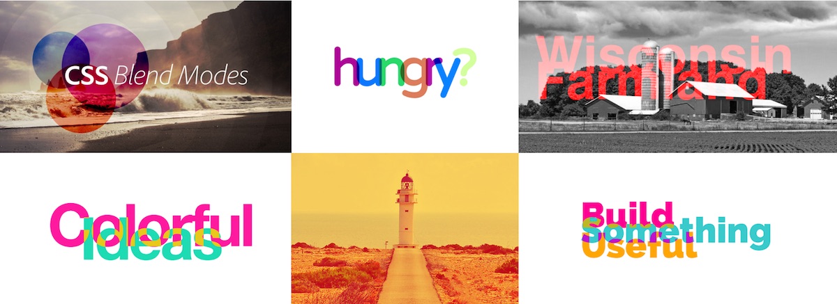
You can create really wonderful results by using one of the 16 different blend modes(at the time of writing) available with CSS. When you use color blending, you want images that overlap each other to interact with each other, instead of one image only blocking the other. Below you can see some examples of using different types of blend modes.
Setting a blend mode on your SVG elements is very easy. Just set the mix-blend-mode CSS style of the elements to any of the 16 available options. You can do this in your CSS file or inline with d3. My two favorite blend modes right now are screen and multiply. The best explanation of what these two modes do that I could find are
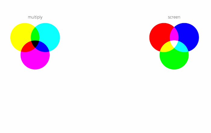
multiply: as the name suggests, multiplies the base pixel by the blend color, resulting in a darker color. Multiplying black results in black, and multiplying white leaves the image unchanged.screen: multiplies the inverse of the two-pixel colors. Screen is the opposite ofmultiplyand usingscreenon white will result in a white image and on black will leave the image unchanged.
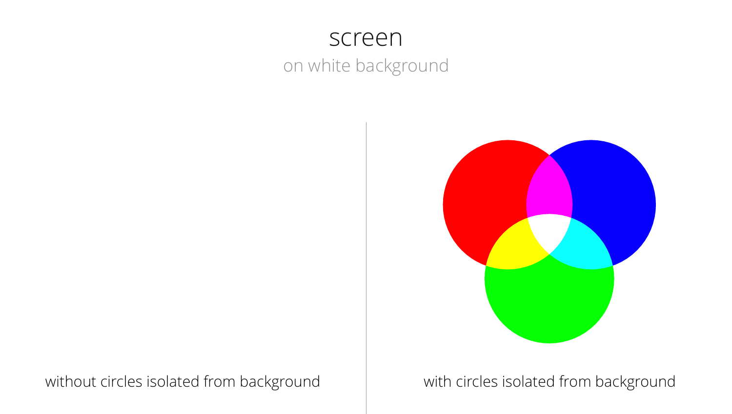
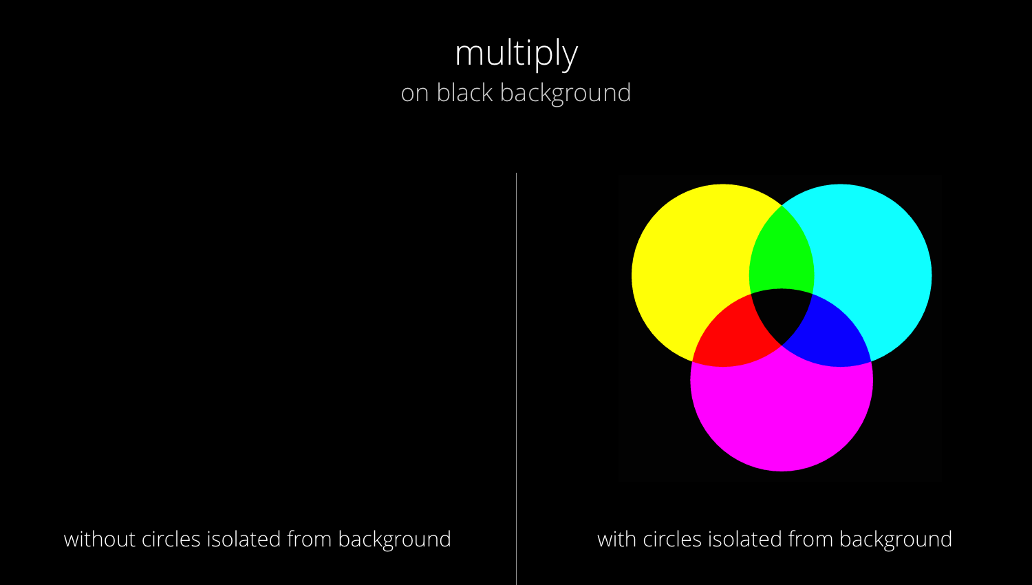
One important thing to note is that the background color will also be taken into account because the elements look at everything that lies below it (in the hierarchy from the element upward to the body). As is already said in the explanation below, this has some consequences: for the screen mode, you will not see anything on a white background and for the multiply mode you will not see anything on a black background.
/*Set isolate on the group element*/
.circleWrapper { isolation: isolate; }

/*Set blend mode on SVG element: e.g. screen, multiply*/
.circle { mix-blend-mode: screen; }Luckily, we can place our SVG elements in a group and then set the isolation style of that group to isolate, so the color blending will only take into account the elements in the group. I wasn’t aware of this isolate property for quite some time and just couldn’t figure out why my color blending experiments with screen were giving me a completely white browser window without any error messages visible ಥ_ಥ
In the animated gif below, you can see the results of setting the isolation style to either isolate or auto and playing around with a black or white background
The images below show the same idea of what happens when you do or don’t set the isolation style with multiply and screen.
Examples
I was just looking for something with lots of overlap
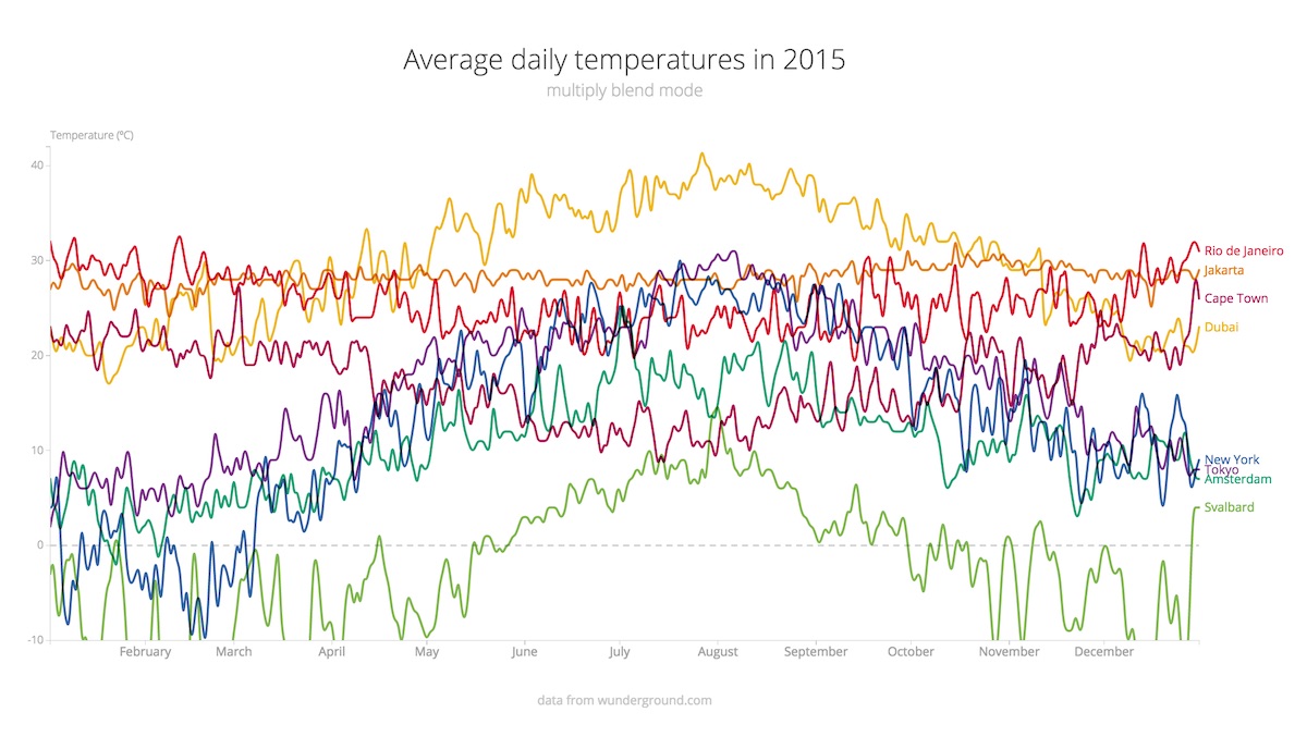
I tend to use these color blending effects if I have cases of minor overlap. Lines that cross, circles that partially overlap. The reason is that, usually when I create a line chart for example, the categories representing the lines are equally important. Take the line chart below. It shows the average daily temperature in 2015 for 8 cities across the world. But why should Amsterdam always lie on top of New York or Cape Town, just because it was plotted later?
Usually you try to use opacities to reduce the effect of one thing lying on top (and thus blocking) of something else. However, especially for line charts, I don’t want the line to be less visible when it’s not being overlapped. Furthermore, even with opacities applied, Amsterdam would still be the color on top. Therefore, I give the the lines a multiply mix-blend-mode instead. In regions with overlap it is now not apparent anymore which line is on top and I feel that it also usually gives the chart something “extra” I guess.
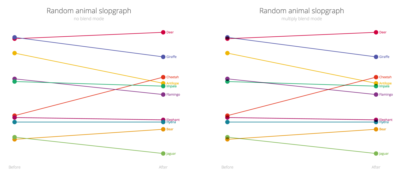
But you can also use the blending for circles, but only if you the circles are partially overlapping. (not completely) Some of the true color has to be visible of course. In the example below, which is a completely random slopegraph of animals, you can see several circles that are overlapping. However, in the left example, the purple Giraffe is equally important as the red Deer, so why should the giraffe lie on top? Therefore, I apply a mix-blend-mode: multiply in the example on the right to make it less obvious which circle is drawn on top. Plus, I feel that it adds a nice touch to the visual.
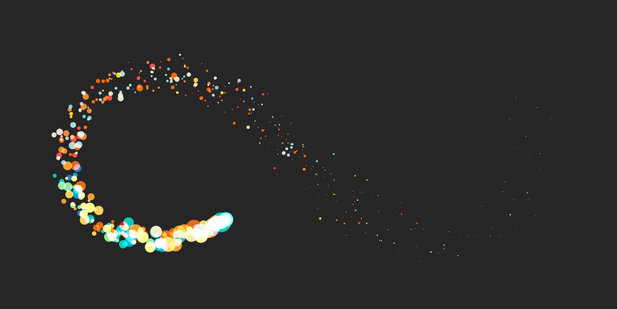
This subject was the last one of the nine in my talk and that’s why I made an example I can just look at for a long time and be mesmerized. And it gave me a nice background slide to reiterate the conclusion and point of my talk.
The example is heavily based on the wonderful particle demo of Sketch.js. I fell in love with it when I first saw it and really wanted to use it in my presentation. Because I already thought it was perfect I only made the changes to make it run in an infinity symbol (SVGs to infinity and beyond) instead of attaching it to a mouse. It also loops through several sets of colors and both the screen and multiply blend modes. Finally, since I was giving a talk of using SVGs in non-standard ways in d3, I had to adjust the code and make it work with d3 alone of course. Performance wise, not the better option I know.
I’m sure you can find other creative idea where this technique will be just what you needed in order to make your visual even more effective. Think of all the Venn-diagrams you can make!
The Code
You can find the code for the examples used above right here
If you are looking for more information about all the color blending possibilities and some nice examples, take a look through this list
- CSS Blend Modes could be the next big thing in Web Design
- Compositing And Blending In CSS
- Basics of CSS Blend Modes
- 15 CSS blend modes that will supercharge your images
- mix-blend-mode
- A Close-up Look at the CSS mix-blend-mode Property
And a last gorgeous example of using the Multiply mode to make a rainbow flower
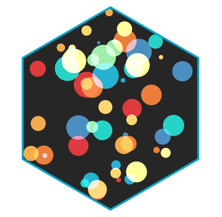
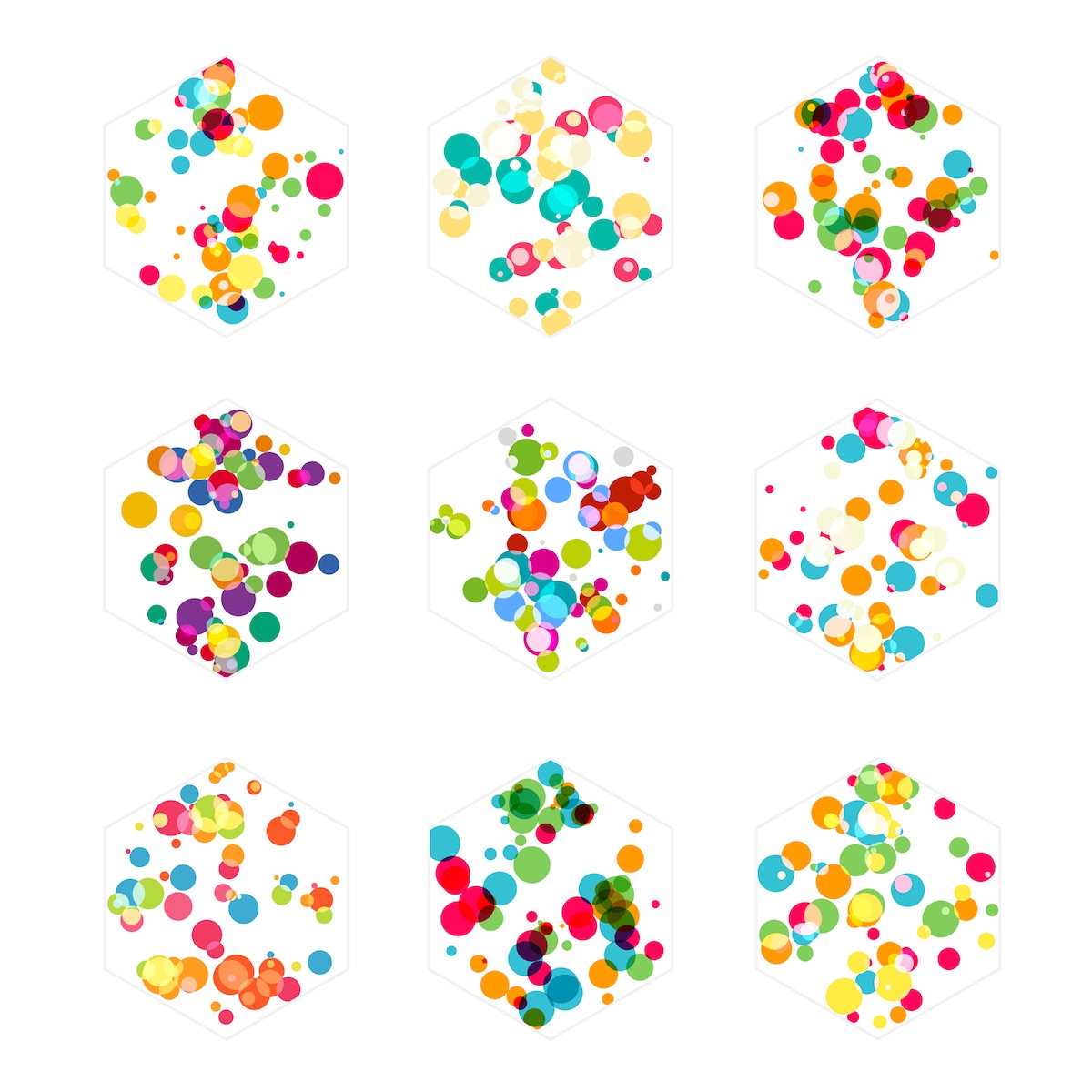
Behind-the-scenes bonus: For the hexagon slide that was the introduction to the color blending section of my presentation, I went through quite a few color iterations to see which would yield the most beautiful results
SVGs beyond mere shapes blog series
If you’re interested in seeing more examples of how SVG gradients or SVG filters can be used to make your data visualization more effective, engaging or fun, check out the other ±10 blogs that are available. You can find links to all of the blogs in my kick-off article here.