In the past few weeks, several tutorials about SVG gradients in data visualizations have come to pass already. But those were mostly focusing on creating one gradient. In this tutorial, I want to show you how you can create a gradient for each of your datapoints. And how to adjust each of these gradients using some aspect of your data, so each gradient will become unique.
SVGs beyond mere shapes blog series
This blog is part of the SVGs beyond mere shapes tutorial series. It’s based on the similar named talk. My goal with the talk was to inspire people to experiment with the norm, to create new ways of making a visual more effective or fun. Even for a subject as narrow as SVG filters and gradients, there are more things possible than you might think. From SVG gradients that can be based on data, dynamic, animated gradients and more, to SVG filters for creating glow, gooey, and fuzzy effects. You can find links to all the other blogs in my kick-off article here.
Exoplanets
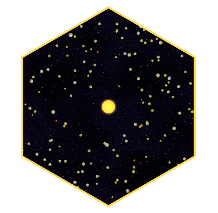
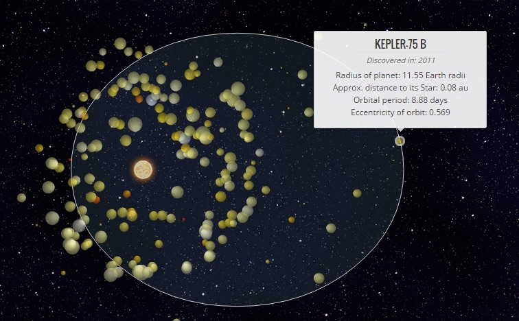
Being an Astronomer I of course wanted to join the club of people who made a visual about exoplanets. My set-up was a bit of data storytelling in which I explain how wonderful and weird these exoplanets really are. I made sure the planets were not rotating in perfect circles, but in the elliptical orbits that they truly have. Orbits that hold true to Kepler’s 2nd law. Figuring out how to program that turned out to be a bit of a mathematical puzzle, but you can see what this means during the introduction piece of my exoplanets project.
To make these exoplanets/circles all rotating around one generic star a bit more…, well more than flat circles, I made them look like tiny spheres that were shined upon by using a radial gradient. This is the second gradient option available besides a linear gradient which we already saw in a previous tutorial. Instead if using 1 generic gradient, each planet got its own version because I wanted to base the color on the planet’s data.
Radial gradients
Before we look into the data-based section of creating gradients, let me first quickly take you through the typical settings for initiating a radial gradient. A radial gradient looks exactly like you might expect, it starts from a central point and then moves outward in a circular fashion.
Setting up a radial gradient is a combination of the code used to create a linear gradient and an SVG circle. Like for a linear gradient, we have to start by appending a defs element to the SVG to which we can then append an actual radialGradient element. As with all gradients (and filters), we have to supply a unique id so that we can reference the specific gradient when we set the fill on our SVG element.
//Append a defs (for definition) element to your SVG
var defs = svg.append("defs");

//Append a radialGradient element to the defs and give it a unique id
var radialGradient = defs.append("radialGradient")
    .attr("id", "radial-gradient")
    .attr("cx", "50%")    //The x-center of the gradient
    .attr("cy", "50%")    //The y-center of the gradient
    .attr("r", "50%");   //The radius of the gradient
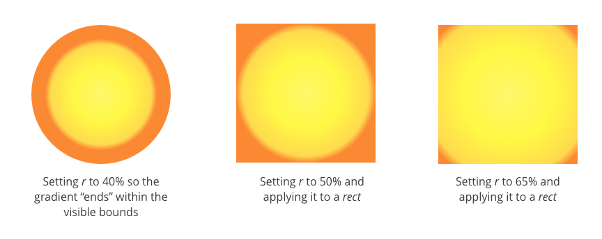
The similarity to SVG circles comes next because we now have to supply the general location characteristics. We use cx and cy for the center of the gradient. Both of these default to 50%, the exact center of the object. This percentage refers to the bounding box of the element onto which you will apply the gradient; the smallest rectangle that can enclose the entire shape. Thus, 0% for cx is at the left edge, 50% is halfway and 100% is at the right edge.
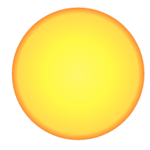
The radius of the gradient, set with r, can be seen as the end point; at what location from the center of the gradient should the offset of 100% be located? Outside this region, the colors will no longer change (if you keep the default spreadMethod attribute set to pad). The default for r is 50% so that, when you apply a radial gradient to a circle and keep cx, cy and r to their defaults, the gradient will exactly fill up the shape. See the Sun example at the start of this section for example. Below you can see some examples where I changed either r or the shape to show the effects more clearly.
After setting the location attributes you only have to supply information about the colors that you want to use in the gradient. This is done by appending a stop element for each of the colors. You then supply the color with stop-color and the location where this color is pure with the offset attribute (see my first SVG gradient blog for a more elaborate explanation about color stops).
//Add colors to make the gradient appear like a Sun
radialGradient.append("stop")
    .attr("offset", "0%")
    .attr("stop-color", "#FFF76B");
radialGradient.append("stop")
    .attr("offset", "50%")
    .attr("stop-color", "#FFF845");
radialGradient.append("stop")
    .attr("offset", "90%")
    .attr("stop-color", "#FFDA4E");
radialGradient.append("stop")
    .attr("offset", "100%")
    .attr("stop-color", "#FB8933");

//Apply to a circle by referencing its unique id in the fill
svg.append("circle")
    .attr("r", 100)
.style("fill", "url(#radial-gradient)")There are a few more, less often used, options that you can use to adjust the appearance of the gradient (besides setting colors) which you can read about in Jenkov’s gradient tutorial, SVG basics or MDN.
Data-based gradients
Now that we know how to make a radial gradient, let’s create a different one for each of the planets. However, instead of ±400 exoplanets, I’ll use the 8 planets in our Solar System as a simpler example. In a very schematic approach, I’ve approximated each planet by one color. I want to create a radial gradient for each planet that makes it look like a 3D sphere using that one color per planet.
//All of the "official" planets in our Solar System
var planets = [
    {planet: "Mercury", diameter: 0.383, color: "#A17F5D"},
    {planet: "Venus", diameter: 0.949, color: "#E89624"},
    {planet: "Earth", diameter: 1, color: "#518E87"},
    {planet: "Mars", diameter: 0.532, color: "#964120"},
    {planet: "Jupiter", diameter: 11.21, color: "#F8800F"},
    {planet: "Saturn", diameter: 9.45, color: "#E0B463"},
    {planet: "Uranus", diameter: 4.01, color: "#D1E3F4"},
    {planet: "Neptune", diameter: 3.88, color: "#515CA8"}
];Creating data based gradients is actually very easy with d3.js since we can use the data step just like we normally do to append circles to a scatterplot. However now we append gradients instead of circles. Therefore, the start of the code below looks just like that of any D3 data appending step.
- Select all the (non-existent)
radialGradients, supply theplanetsdataset, enter them and appends aradialGradientelement for each planet in the dataset. - We are now creating 8 distinct gradients, thus, the
idof each gradient has to depend on the data somehow. Normally, you can just use the indexibut in this case, I use the planet’s name. - From all of the examples I’ve seen, a typical 3D computer generated sphere is usually lighted diagonally from above as if the Sun was the light source. Therefore, I move the center location of the gradient towards the top left with
cxandcyat 35%. - Due to the movement of
cxandcyI find that increasing the radius of the gradient,r, to about 60% gives better results
//Create a radial gradient for each of the planets
var planetGradients = svg.append("defs").selectAll("radialGradient")
    .data(planets)
    .enter().append("radialGradient")
    //Create a unique id per "planet"
    .attr("id", function(d){ return "gradient-" + d.planet; })
    .attr("cx", "35%") //Move the x-center location towards the left
    .attr("cy", "35%") //Move the y-center location towards the top
    .attr("r", "60%"); //Increase the size of the "spread" of the gradient
That was it for the general appearance/location attributes. Next, I append 3 color stops that will turn the flat circle into a 3D sphere. Just like you are used to when creating charts in d3.js, you can use the data to set any attribute or style using anonymous functions. In this case I use d3.rgb().lighter() for the top left region at 0% offset. Next the actual color around the middle at 50% offset and d3.rgb().darker() to create a darker ring around the outside at 100% offset.
//Add colors to the gradient
//First a lighter color in the center
planetGradients.append("stop")
    .attr("offset", "0%")
    .attr("stop-color", function(d) {
        return d3.rgb(d.color).brighter(1);
    });

//Then the actual color almost halfway
planetGradients.append("stop")
    .attr("offset", "50%")
    .attr("stop-color", function(d) {
        return d.color;
    });

//Finally a darker color at the outside
planetGradients.append("stop")
    .attr("offset",  "100%")
    .attr("stop-color", function(d) {
        return d3.rgb(d.color).darker(1.75);
    });

//Fill each circle/planet with its corresponding gradient
d3.selectAll(".planet")
    .style("fill", function(d) {
        return "url(#gradient-" + d.planet + ")";
});Finally, when creating or selecting our 8 flat but correctly sized, relatively speaking, circles in a row, I set the correct fill of each by referencing the gradient’s unique id using the planet’s name.
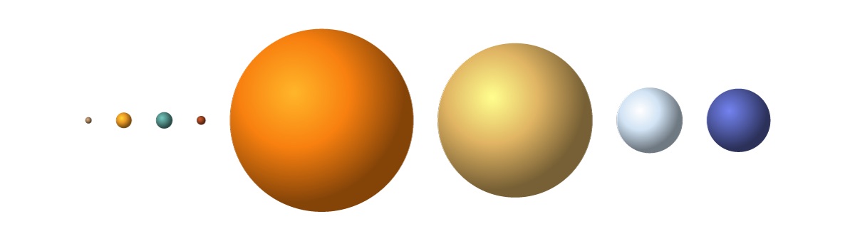
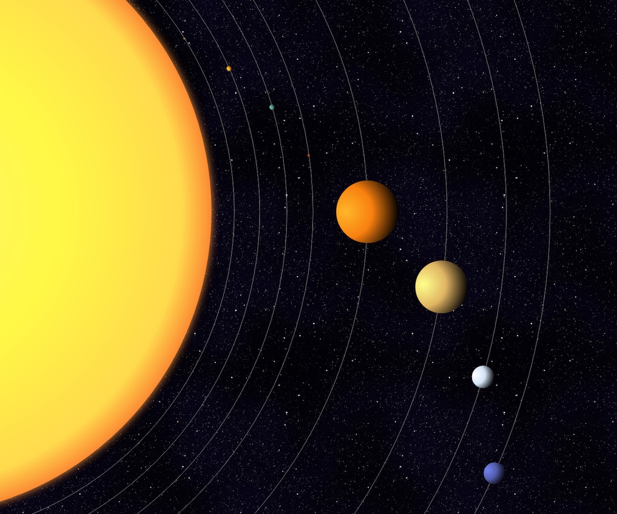
Or in a slightly more visually appealing set-up. Although you can hardly see the first 4 planets against the starry background (*^▽^*)ゞ
Examples
Even thought the HR-diagram reveals an exceptional amount of fascinating insights into stellar evolution, I don’t think it’s really known outside of those studying Astronomy (╥_╥)
Besides the small exoplanet snippet seen in the intro slide, I wanted to show one more data visualization example. I found this to be the perfect opportunity to show a visualization that I think is one of the most important data visualizations in Astronomy. I also understand that the first of its kind, from 1912, might have been the first scatterplot ever made/published! I’m talking about the Hertzsprung–Russell diagram (or HR-diagram).
In this diagram stars are plotted according to their luminosities (or the related absolute magnitudes) versus their effective temperatures (or related spectral classifications). Many interesting discoveries around stellar evolution were speculated from this chart even before much was known about what happens in the interior of stars by looking at the positions of stars on the diagram.
The data comes from the HYG database. I took a subset of 400 stars that lie relatively close to us. Betelgeuse, for example, is the darkest red one in the top right corner. Below you can see the screenshot from my SVG presentation, but I’ve now also made a version for bl.ocks where the visual shows the same steps but in an infinite interval; from 3D spheres to true relative sizes to a gradient that more resembles a glowing orb (since they’re stars after all) and back to 3D spheres.
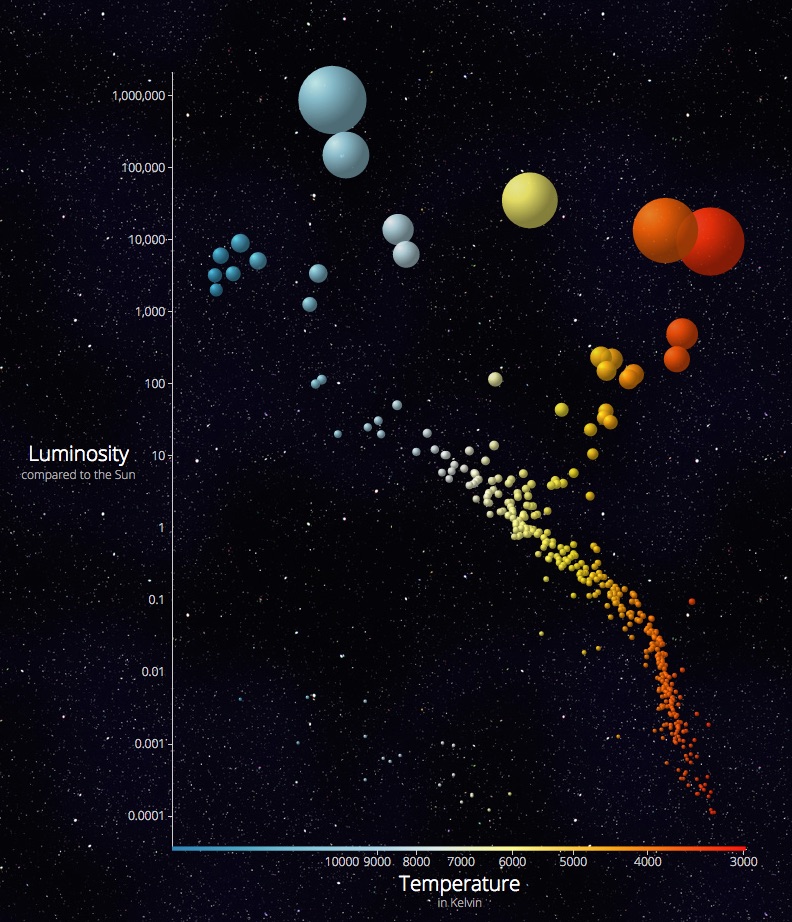
Maybe I’m alone in this, but I find the HR-diagram to be one of the most perfect scatterplots out there. The colors that they have in this chart are the colors in which we actually see them. Also, stars are spheres, so even the shape is true. Thus the stars that are visualized require very little visual encoding. But then again, I might just be biased towards the Astronomy related subject (*≧▽≦)
The Code
My intention is not for a revival of 3D spheres. That was just an easy way to connect the first time I used this technique on my exoplanets project to several other fun Astronomy based examples. You can create data based gradients for anything that can be filled or stroked with a color, such as lines, paths, rectangles and circles. Just keep your mind open for a good opportunity. In different blogs, for example, I’ll show you how to create data based gradients in Chord diagrams and Bump charts.
Finally, you can also use the same technique to create multiple filters, one for each datapoint, which already came to pass in some of the motion blur examples in a previous tutorial (but that I skimmed over then).
The code for the radial and data based gradient examples can be found here:
- A simple radial gradient - the Sun
- Data based gradients - the Solar System
- Our nearest stars in a Hertzsprung-Russell diagram
- Data storytelling with exoplanets
I hope you liked this Astronomy-themed tutorial!
SVGs beyond mere shapes blog series
If you’re interested in seeing more examples of how SVG gradients or SVG filters can be used to make your data visualization more effective, engaging or fun, check out the other ±10 blogs that are available. You can find links to all of the blogs in my kick-off article here.