Let’s get right to it. You can find the slides to my SVGs beyond mere shapes talk here. It might take ±10 seconds to load since everything is loaded at the start. The reason for this is that I didn’t want any lagging to happen during the presentation itself and on a local host it loads in 1-2 seconds. Here is the corresponding Github repo with the code and where I explain a bit about the animations and bonus events that might not be apparent if you click through the slides.
At very different resolutions the text sometimes seems to “twitch” when you go to a different animation / fragment within a slide.
Please look at the slides in Chrome, preferably at a resolution of 1920x1080. Although everything should work in Firefox and Safari as well, it just looks best in Chrome. Many people asked me what I used to create my slides, so below you can find my resources, some learnings and a few screenshots of things that never made the cut.
SVGs beyond mere shapes blog series
This blog is part of the SVGs beyond mere shapes tutorial series. It’s based on the similar named talk. My goal with the talk was to inspire people to experiment with the norm, to create new ways of making a visual more effective or fun. Even for a subject as narrow as SVG filters and gradients, there are more things possible than you might think. From SVG gradients that can be based on data, dynamic, animated gradients and more, to SVG filters for creating glow, gooey, and fuzzy effects. You can find links to all the other blogs in my kick-off article here.
The video of the talk
If you’re interested to know more about what I said with each of the slides (they are rather word-empty) you can look at a video of the talk that Bocoup has made available below. If you also want to play around with a cool visualization & analysis that was made about all of the talks at OpenVis, check out the video section at OpenVisconf.com
Creating the slides
I knew that I wanted to show data visualizations. And although making videos for use in KeyNote or PowerPoint is fine in most cases, I also wanted to be able to interact with some of the visualizations. Furthermore, I really wanted the highest possible resolution, which you can only get with the real thing. So any static slide making program was out of the question.
I started looking for browser based presentation tools, asked friends about their experiences. Eventually, I chose RevealJS for several reasons:
- The GitHub repo has a very good documentation
- It seemed very straightforward to use (and that turned out to be true)
- There are many options to adjust the presentation functionality to your liking and many plugins
- RevealJS also has a very long list of example presentations to get inspiration from. Both visual and code.
- There is a plugin, called external, that lets you load external files into the presentation. I knew that the visualization code would become unwieldy long if I had to put it all in one file. Therefore, to have any kind of order, each slide had to be placed in its own file & folder
- I found an example where somebody was using d3.js in their presentation which updated to a new state by clicking the arrow button. You can find a bit more about that here
In RevealJS you can hide the navigation buttons, which I did.
BTW, I wasn’t the only one using RevealJS or its easy-to-use almost-code-free online counterpart slides.com. Maybe 30% - 40% of the presenters at OpenVis were using it actually. Both RevealJS and slides.com are easily recognizable by the navigation block in the lower right. I’ve used slides.com before, but I really needed to add custom JavaScript, which you can’t really do in slides.com.
I don’t even want to think about the number of hours that I invested to create the presentation. I truly started with RevealJS about 1.5 months before the conference and then it took up about all my free time. It feels as if it took at least 10 times longer than I typically spend on Keynote presentations. And that’s taking into account the fact that I already had the basis for several of the data visualization examples. But I am very happy with the result (๑•̀ㅂ•́)ง✧
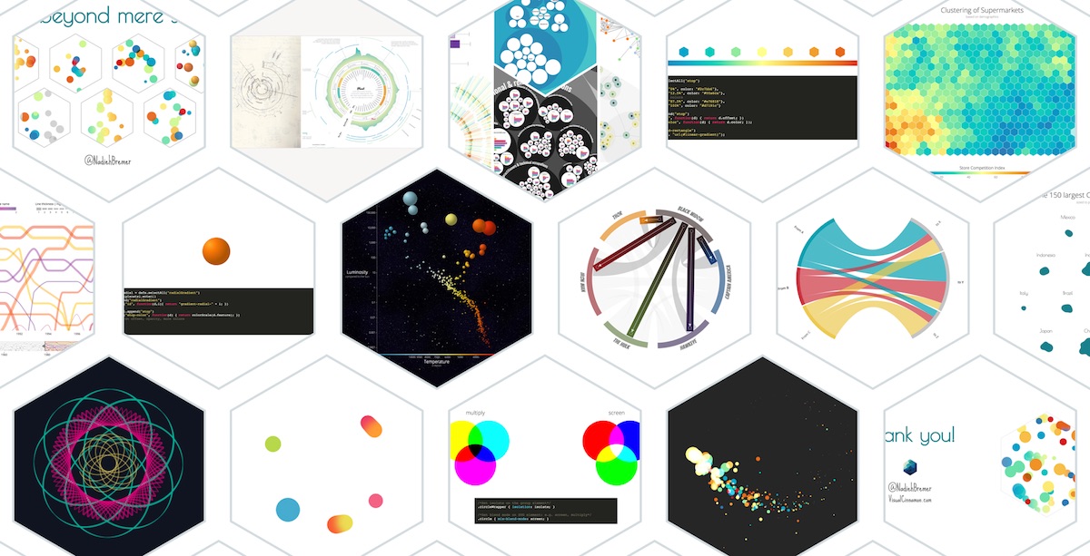
Hexagon intro slides
Something that might become clear after going through my slides is that I have a thing for hexagons. It all started when I was heavily using/writing an R program to make Self-Organizing Maps. And for this presentation, I decided very early one to use hexagons as my main shape.
One of the most fun things to do was to figure out how to make a bunch of circles bounce around inside a hexagon. I remembered a bl.ock by Maarten Lambrecht in which circles move inside in a rectangle. I started with that example and then kept on making changes. The hexagon move function now looks rather different than the rectangle move version of Maarten, but in an abstract sense, it’s still the same idea: slowly transition the circles to a randomly chosen new edge of the hexagon.
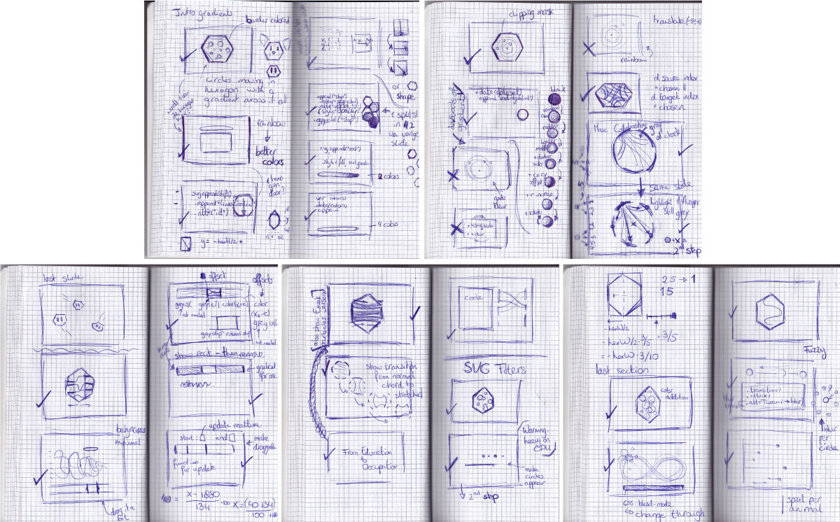
It turned out that a hexagonal shape is not quite so easy as a circle or rectangle, you have to find the formulas of the angled lines to be able to calculate when a circle hits an edge. The image below shows my scribbles on trying to figure out the y = ax + b formulas for each line. I would like to note here that not all of the formula’s on this note are correct. I kept messing up the +/- combinations. But you only notice that once you get it into code and your circles are moving in unexpected ways (*^▽^*)ゞ

Experimenting and Iterating
As with data visualizations, I started to design my slides on plain paper. Some of them didn’t make it, or were changed a bit, but many of the sketches were turned into actual slides. I had a small notebook that I’d take out during my morning and evening commutes where I found it most easy to not be distracted. I didn’t draw out all the slides before moving onto code. I first drew a few sections to see if this was the way that I wanted to go. Then I started coding up a section at home and drawing a new section while on the train.
In my first full iteration of the presentation, I had a lot more code. I wanted to explain each of the 9 examples in detail as I would normally do in a tutorial. However, talking through all the slides on my first try took 40-50 minutes… So I needed to trim a bit. I showed the slides to my manager and asked him what to take out. His advice was to take out the code and leave as many examples as possible. And I fully agreed, my goal was to showcase the possibilities of experimenting with non-standard dataviz things. You can’t really remember the code anyway afterwards, but hopefully, the examples stick. And I’m writing a tutorial for each of the examples anyway.
I think I tried out all of highlight.js styles to see which would fit the best with the different visualizations in terms of colors. And at least 20 different fonts for the title slide before settling on Poiret One. Here are a few more screenshots that eventually turned out differently in the end result
Below you can see the (functioning) first iteration of my title-slide. Luckily, we have a design team where I work, so I showed it to the Creative Director and he gave some tips for improvement which turned into the eventual slide where the title is no longer hiding the hexagons.
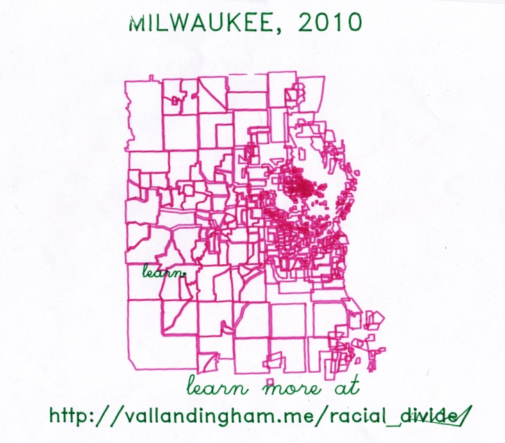
And for the attendees who know what the image below means. I was lucky enough to get a hold of the amazing Jim Vallandingham’s Racial Divide image made by the pen plotter who worked tirelessly throughout the conference.
And that was it for this bonus blog in the “SVGs beyond mere shapes” series!
SVGs beyond mere shapes blog series
If you’re interested in seeing more examples of how SVG gradients or SVG filters can be used to make your data visualization more effective, engaging or fun, check out the other ±10 blogs that are available. You can find links to all of the blogs in my kick-off article here.