I’ve already shown the diversity of using gradients in data visualization in several other blogs in this series. But you don’t even have to use gradients as something that runs smoothly from one color to another. They can be very handy for abrupt changes as well. The first time I ended up using this technique was when I became interested in the popularity of baby names.
SVGs beyond mere shapes blog series
This blog is part of the SVGs beyond mere shapes tutorial series. It’s based on the similar named talk. My goal with the talk was to inspire people to experiment with the norm, to create new ways of making a visual more effective or fun. Even for a subject as narrow as SVG filters and gradients, there are more things possible than you might think. From SVG gradients that can be based on data, dynamic, animated gradients and more, to SVG filters for creating glow, gooey, and fuzzy effects. You can find links to all the other blogs in my kick-off article here.
The most popular baby names
Many very fascinating analyses of baby names have been done in the last few years, such as The name voyager by Martin Wattenberg, The most poisoned names by Hilary Parker, and The most unisex names plus The most trendy names by FlowingData. However, I was interested in something much simpler. I wanted to know how the most popular names had risen to fame and dropped again over the years. I was surprised to see that the data available went back to 1880. But a typical screen isn’t wide enough to do justice to 135 years of volatile change.
So I employed the focus + context technique. With this technique you can select a certain time period from a small chart below in which all the years are visible. The larger chart above shows you the small window you’ve selected (in the chart below) in which you can see much more detail. You can move the box in the small chart and adjust the left and right side to change the years that become visible in the larger chart. A very useful and fun technique as well.
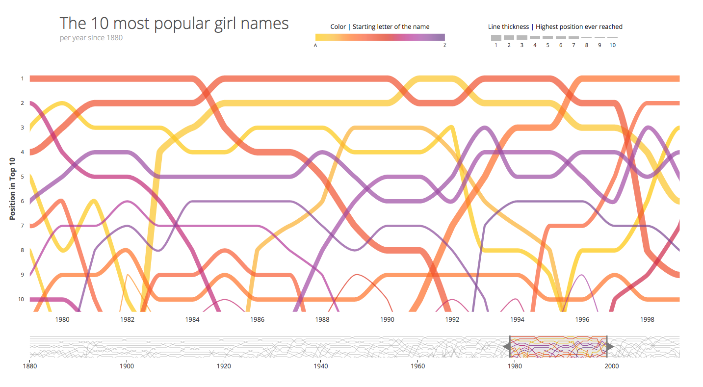
For greater intuition about the connection between the two charts, I wanted to have the smaller chart below colored the same for the section that is visible above and be grey outside of it. But you can only stroke a line with one color. However, I didn’t want to have to cut these lines up into 3 sections; before, in and after the chosen period and update these lines dynamically if somebody moved the box. Instead, I tried to see if this could be done with a simple gradient instead.
Setting up the gradient
If you want more information about the basics of gradients, please see my earlier blog about smooth colored legends.
It turned out to be easier to do, and even make it dynamic, than I thought. Let’s first set up a normal linear horizontal gradient.
//Set up a horizontal gradient
var linearGradient = svg.append("defs").append("linearGradient")
.attr("id", "linear-gradient")
.attr("x1", "0%")
.attr("y1", "0%")
.attr("x2", "100%")
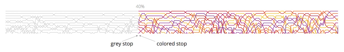
.attr("y2", "0%");To get a clean jump from grey to a color we have to append two color stops at the same offset percentage. We want it to start with grey and then become whatever color belongs to the girl’s baby name. In this case it’s good to be aware of the default behavior of legends:
If the first color stop is placed at a location that is greater 0%, for example at 40%, then the region to the left of (or smaller than) 40% is filled with the color set at 40%. This is called padding.
The same of also true, but reversed, at the other side. Thus, if the largest offset is 40%, then region to the right of (or greater than) 40% will be filled with the color defined at 40%.
In this case, the region before 40% becomes grey and the region after it gets a color. For simplicity, I’ll show the code for creating one gradient with a purple-pink color in. However, the images will show the results where we have one unique gradient for each line (mostly because it looks better (⌐■_■) ). The code below is meant for creating the gradient for one of the lines visible in the images.
//First stop to fill the region between 0% and 40%
linearGradient.append("stop")
    .attr("class", "left") //useful later when we want to update the offset
    .attr("offset", "40%")
    .attr("stop-color", "#D6D6D6"); //grey

//Second stop to fill the region between 40% and 100%
linearGradient.append("stop")
    .attr("class", "left") //useful later when we want to update the offset
    .attr("offset", "40%")
    .attr("stop-color", "#BD2E86"); //purple-pink
Now it looks like we have two sections, but we need three. So repeat the same steps at a higher offset percentage, but in reverse. Append a stop with the purple-pink color and then a grey stop at the same location again, say 60%. Everything after 60% will now be filled with the color of the last stop, which is grey. Everything in between the 40% and 60% is the same purple-pink color.
//Third stop to get the same color from 40% to 60%
linearGradient.append("stop")
    .attr("class", "right") //useful later when we want to update the offset
    .attr("offset", "60%")
    .attr("stop-color", "#BD2E86"); //purple-pink

//Fourth stop to fill the region between 60% and 100%
linearGradient.append("stop")
    .attr("class", "right") //useful later when we want to update the offset
    .attr("offset", "60%")
    .attr("stop-color", "#D6D6D6"); //grey
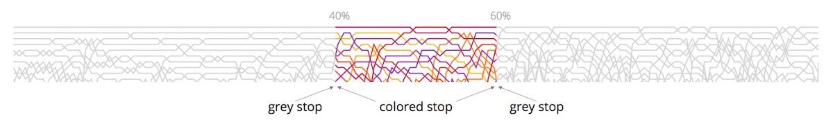
And now it seems as if the lines are colored for a very specific region. For clarity, I can also take a rectangle and fill it with that purple-pink gradient we just created above. It may seem as three separate rectangles, but it really is only one.

Dynamic updates of the offsets
In the standard focus+context technique, the window in the small chart can be dragged and increased or decreased in size. While the user is adjusting the window a brushmove function is called. To make the gradient follow along with the extent of the two handles, making it seem as if the colored region always lies in between the handles, we only have to add a few lines of code to the brushmove function.
First, we have to calculate at what percentage of the chart’s total width the left handle is located and at what percentage the right handle is located. These numbers are saved in newStart and newEnd. Then it’s a matter of calling the left (first two) color stops and setting the offsets to newStart and calling the right (last two) color stops and setting their offset to newEnd. And since we’ve conveniently given all these color stops a class (remember, left or right) this is all done in two lines of code:
//The standard brushmove function in the context+focus charts
function brushmove() {
    var extent = brush.extent();

    //Reset the x-axis brush domain
    xBrush.domain(brush.empty() ? xAll.domain() : brush.extent());

    ///// New section ////
    //Calculate at what % along the width of the
    //rectangle the new brush's domain lies
    var newStart = (xBrush.domain()[0] - start)/range*100,
        newEnd = (xBrush.domain()[1] - start)/range*100;

    //Reset the offsets of the gradient
    d3.selectAll(".left").attr("offset", newStart + "%");
    d3.selectAll(".right").attr("offset",  newEnd + "%");

}//brushmove

/*
Note:
- start is the starting value of your context chart (such as 1880)
- range is the total width of you context chart (such as 135 years)
*/
Which will result in the visual below. Try to play with it, it’s not a screenshot, but an actual interactive visual. Drag the handles or drag the whole window from left to right. The purple section will always lie between the handles and this is all done with a gradient, not with 3 rectangles
Move the purple block below!
Other examples
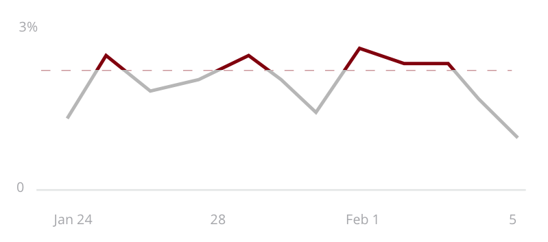
I should really only say example since I only made one, but it’s more a testament to the fact that this technique can be used for many more things than just the focus+context idea. For example, say you have a threshold above which something is bad; a temperature, a water level, something like that. You can make the line change color when it reaches above that threshold by filling it with a vertical gradient that has an abrupt change. Something like the very schematic image below.
Instead of a hard threshold, you can also use it to display a change in category. For example, according to health organizations you have a healthy weight if your BMI, Body Mass Index, is between 18.5 and 25 points. Whereas between 25 and 30 you are overweight and above 30 you’ve become obese. Of course, you don’t suddenly become unhealthy when you jump from 24.9 to 25.1. In reality, it is a smooth change. But nonetheless, health organizations have split these regions up discretely.
I’ve taken a dataset from the NCD RisC that holds that average BMI for men and women separately in a country between 1975 and 2014. It contains data from ±200 countries which I’ve visualized as lines. The image below shows the overall increase of BMI for men in the last 40 years.
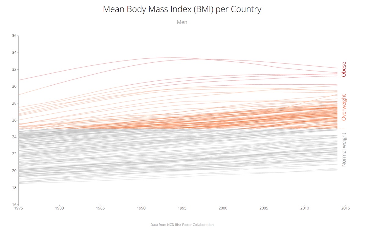
You have a few options to make the BMI categories more apparent in this chart. You can color the region behind all the lines according to the categories. Thus a rectangle between a BMI of 25 - 30 that is, say, orange, and another that is red for the region above a BMI of 30. There is nothing against doing this. However, by using a gradient we now have another option. Maybe you don’t want any rectangles behind your chart. In that case, create one vertical linear gradient with the threshold changes at 25 and 30 and fill all the lines with this same gradient. Now it is the lines that change color, not any region behind the chart.
One of the disadvantages of this technique is that you loose the option to color the lines according to something else. I can’t color the lines to highlight from what continent they are. Although it is possible to make a blend of sorts. You could create a linear gradient for each continent that goes from a light to dark color, each continent in a different hue. But it is also important to ask yourself what the true goal is of the chart. To show the difference between continents or to show that we’re all getting more and more overweight? For me, it was the last one. Therefore, I didn’t need (or actually want) to highlight the continents, even though I had the data to do it.
The Code
You can find the code & results of the 3 examples used above here:
- The top 10 baby names since 1880
- The simple slider with adjusting gradient
- The evolution of the average Body Mass Index
Using gradients for abrupt color changes is something that I haven’t seen anywhere, but that I think can make the right data visualizations even more effective. I hope I’ve been able to convince you of its use and that I’ll be seeing this technique once in a while in the future.
SVGs beyond mere shapes blog series
If you’re interested in seeing more examples of how SVG gradients or SVG filters can be used to make your data visualization more effective, engaging or fun, check out the other ±10 blogs that are available. You can find links to all of the blogs in my kick-off article here.