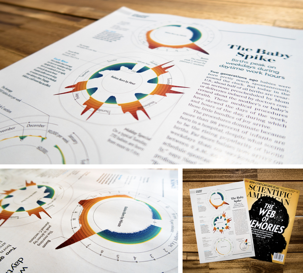
On the Graphic Science page of the July edition of Scientific American you could find three large circular charts about when babies are born. In this blog, let me take you along on the data & designs process that me, Zan Armstrong & Jen Christiansen went through to create this piece.
Before the “official” start
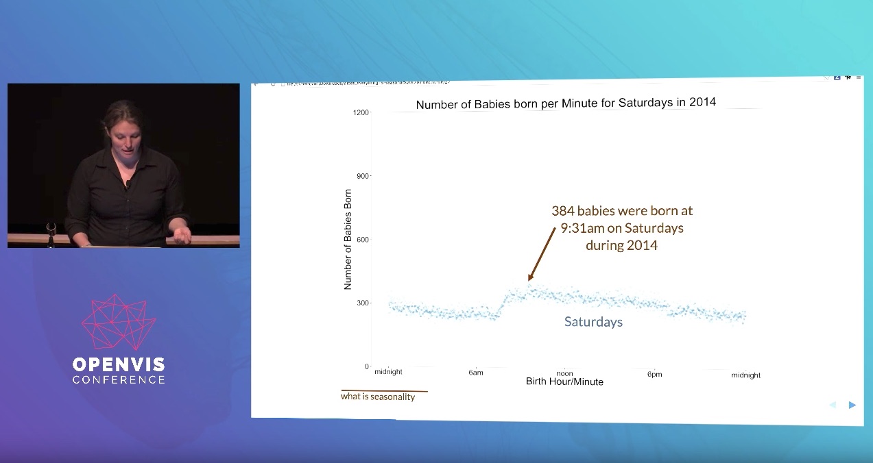
During OpenVisConf, April 2016, Zan Armstrong gave a great talk titled Everything is Seasonal. I was in the IMAX theatre where this conference was held. And amazed by the ways that Zan showed so many fascinating (seasonal) insights from widely different datasets. What I didn’t know at the time was that Amanda Montañez, Assistant Graphics Editor at the Scientific American, was also one of the 400 attendees. And she, like me, had also been fascinated by the stories that Zan told. She even asked if Zan wanted to turn one of the topics into a fully fledged graphic + story for the Scientific American. About when babies are born in the US and the seasonal/time trends visible there. Can’t say no to that of course! Due to marriage, a world-crossing trip and such “trivial” things, it took several months before Zan managed to sit down and actually take on the piece. And that’s when I came into the picture.
In January of 2017 Zan reached out to ask me if I wanted to collaborate with her on the piece. I can’t tell you how happy I was to get asked :D Being able to create something that would appear in the Scientific American (SciAm), such an honor. Furthermore, collaborating with Zan was something that I knew would be a great experience as well. So, of course I said yes to helping out! I would fit this into my schedule even if I was already fully booked! At the end of March, Zan had figured out the schedule with SciAm and we started to talk about concretely getting together and working on it.
Luck had it that I was in San Francisco, where Zan lives, during the first two weeks of April due to conferences. So, instead of time zone headaches and Skype calls, we actually got together for a Saturday morning-afternoon and another evening a few days later to get the major points aligned.
Figuring out the “story”
It’s been several months since our first get together in a lovely neighbourhood of San Francisco, so things are somewhat fuzzy. But I do remember that the first hour or so we were mainly trying to figure out how we wanted to get the seasonality insights across to the audience, what aspects to focus on. Zan had analysed the data more extensively to prepare for our time together. So we knew how many babies were born on per week, per weekday, per hour and per minute, across an entire year in the US.
I started up R and created some simple line charts of the data across a year. It’s easier to discuss ideas when you see the data. We quickly moved to a radial line chart, the data we were using was cyclical after all. I don’t even have screenshots of a straight line chart. However, it isn’t necessarily an obvious choice because it’s more difficult to compare differences in height in a radial layout, due to the baseline being circular. Nonetheless, in this case it made sense to start with a circular layout so December would be visually near January. If our explorations would show that circular just wasn’t going to work, we could always go back to a straight design.
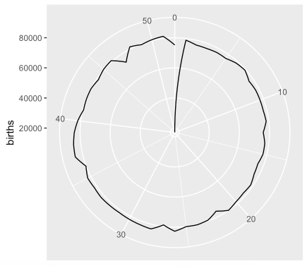
Below you can see a super simple plot about the number of babies born per week, I think it was for 2014. These kinds of plots are meant to be seen by Zan and me, not looking pretty in any way. It helps us get a sense of what we’re dealing with and getting a better grip on the data. I’m not even sure I would call this the design phase already. It’s more the general “figuring out the question the final visual should answer” or “figuring out the goal of this visualization” phase.
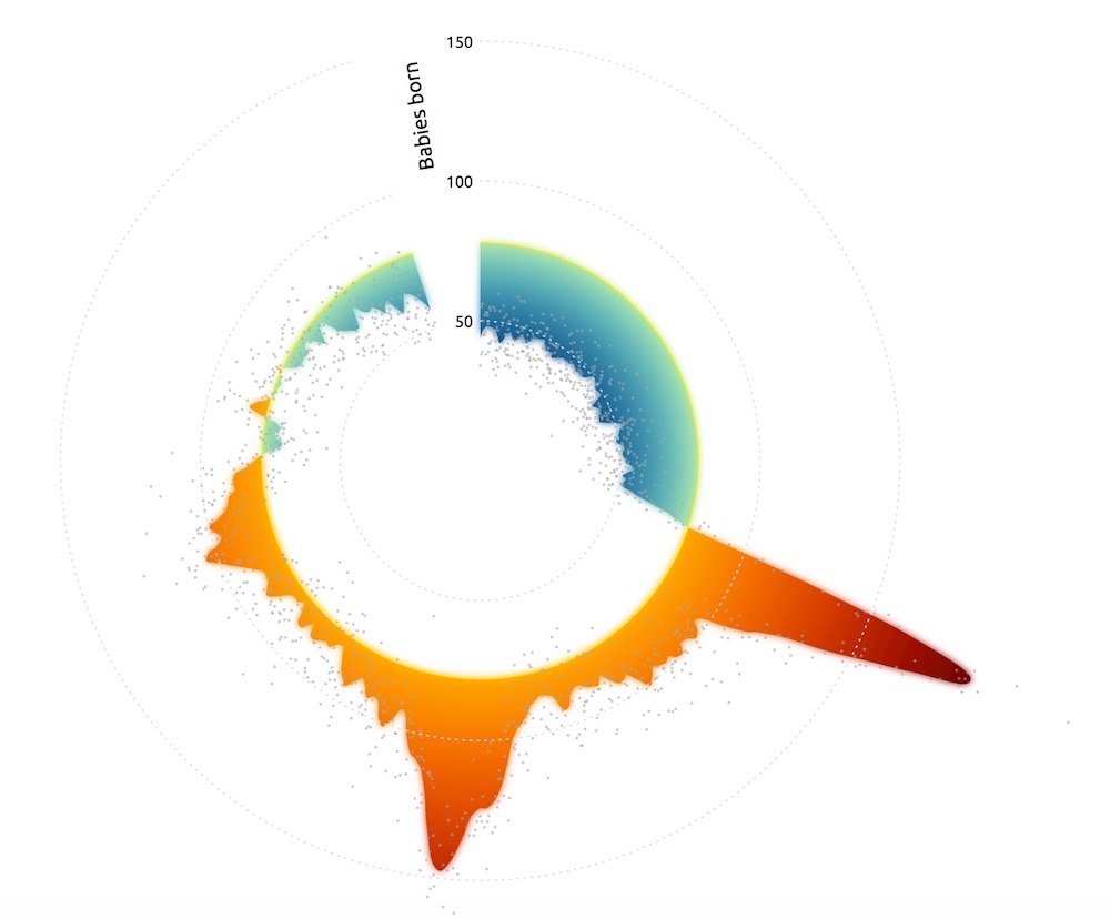
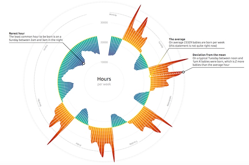
We also visualized the same data on the other granularities that Zan had available; the days per week and the minutes in a day. However, there are only 7 days in a week, which wasn’t enough context to be interesting. Therefore, we moved to hours per week. It might show some repetition of shapes across the days and a similarity with the minute-per-day version, but we both found that there were more interesting insights to prefer it over the days-per-week version. Such as how the weekends differ from the days of the week and how even within the days of the week there are smaller changes.
Most of the deviations from the average number of babies being born per minute is thanks to advances in medicine, such as inducing births or c-sections.
As shown in Zan’s talk, the more detailed the time granularity, the larger the spikes became. And that is what also makes this data so interesting, besides the seasonality that is happening on different levels of time. People generally believe that we only really have a say about when babies are made, but not that much on when babies are born. But these charts indicate that the more granular the time scale, the closer to the actual minute of a baby being born, the bigger the deviations. We, as humans, actually seem to have more say about the precise birth moment of a baby that one would think. Therefore, these became the questions guiding us while thinking about the design aspects: there are some dramatic seasonal trends in when babies are born, especially on smaller time scales & we have a lot more to say about when babies are born than we might think. You can read even more about the nuances and choices that were made in the blog post that Zan wrote about this project.
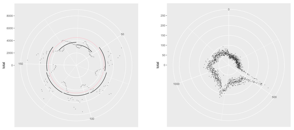
The deviation from the average became the main point that we wanted to use to get the insight across. This would make it easier to see both the (enormous) peaks that existed, but also highlight were the dips were, even if these weren’t as pronounced as the peaks. In the “hours per week” image above-left we started thinking of how exactly to add the average. The pink line represents the overall average. The black lines are the average of that day in the week. But using one average line per time granularity made more sense in the end.
We were both still liking the look of the circular versions of the charts. Especially with the average lines added in. Therefore, I thought it was about time to take the data into the browser and see how to style the charts using d3.js.
Finding the design
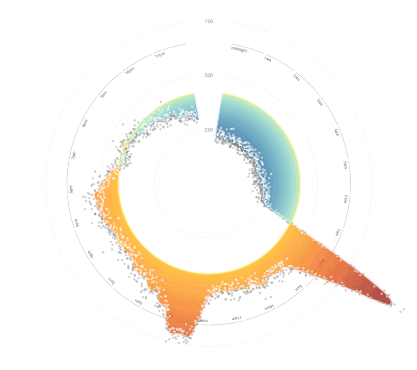
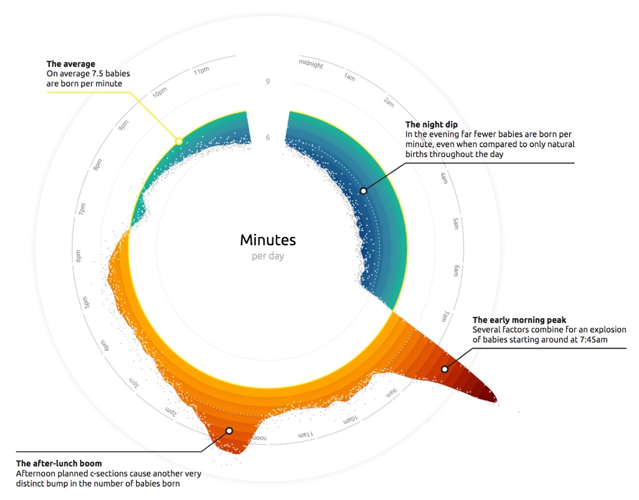
I started with the minute per day chart, because it had the most datapoints. Once we figured out the design for that chart, the other two (hours and weeks) would basically follow. I can’t remember why I already had the gradient fill in there so soon. But I do love gradients, and have written several tutorials about them, so maybe I shouldn’t be that surprised with my past myself.
The main unique selling point of our charts is already visible here, comparing to the average. Instead of filling in the area between 0 and whatever value the data has, it is filled between the average and the data point’s value. This means that for values above the average it looks quite like a normal area chart. But for those below the average, the inverse of what is typically filled is now given a color. That might seem a bit weird, but not when you think about the goal that we had. We wanted to show the deviation from the default, that it got stronger the more granular it looked. So from that perspective, using the average line as our “base” instead of 0, made perfect sense.

I won’t go into the details of loess here. It’s a pretty standard technique used in statistics and there are tons of websites explaining it.
However, the visual above looks extremely spiky. You can see the overall trend, and the two major peaks, but there is too much noise overall. And that’s because there are (60 * 24 =) 1440 minutes in a day, which translates into 4 points per angle of a circle, quite a lot! Therefore, I calculated a so-called loess curve (locally weighted smoothing). Below is the resulting chart ((except for the “below average” part, which I broke temporarily).

The loess smoothing looked much better than the spiky version, but I didn’t want to lose the more detailed information of the minutes per day. Therefore, I plotted the minute per day values on top of the filled area as small circles. This shows some of the noise around the averaged loess line. In the image below you can also see that I was getting a better handle on the gradients to use within the areas. Having moved away from that eye-hurting yellow :)
And most of my time on any data visualization is spent on the details. Typically I have the basic shape of the visual standing in a few hours. Then way more hours go into the details; choosing the colors, adding annotations, dotted or solid lines, sizes, etc. And things such as axes, legends, you know, things you make so other people can actually understand your chart ;)
The gif makes it look as if the filled areas are actually concentric circles, but that’s just the bad quality of the gif. Each image in the loop originally contains a smooth gradient like the image above.
Below you can see a small collection of some of the detailed things that were tested. I’m glad the Zan was as interested in getting these details right as well. We discussed subtle things such as big or small circles, grey or yellow average lines and more. In the end it’s just easiest to actually see the result, so I made a whole collection of small changes to share with Zan and get her feedback.
A tiny thing that I also added in the versions above, has to do with the circles. You can see it best in the versions with the large circles of the animated gif above. The circles have to be visible on both the white background and the gradient filled sections. Therefore, I wanted those on the white background to be a dark grey, while those on the colored gradients should be more white. And those that were on top of both? Well, the part on the white background dark grey, while the portion that lies on the colored section should be white.
That might sound like something very difficult to achieve, but it isn’t actually. To get a bit more technical: First I plot a dark grey version of all the circles. Next, draw the gradient areas on top. This already makes sure that the dark grey (portions of the) circles are only visible when they are on the white background. Finally, I plot the same circles again in white on top everything. However, I place this group of circles in a clipping path, using the shape of the gradient filled area. That way all the (portions of the) white circles that lie outside of the colored area are clipped away. This clipping path is exactly the same as the area shape, so there’s practically no extra work involved.
When it just doesn’t feel right
See one of the blooper images at the bottom of this blog for the moire-effect
Although I really do love gradients, I just wasn’t quite happy with them in this particular chart. It made the result feel too “polished” in a way. My first attempt at trying to find something else, was to use bars. To replace the filled area by a bar going outward or inward. Completely unexpected from my side, but this was actually non-trivial. It was extremely easy to get a moire-effect…
I also use a donut chart to make a radial bar chart in one of my presentations. Use the arrow keys to move 1 step forward and see the animation from donut chart to radial bar chart.
Since these are bars that are placed on a circle, I actually didn’t create them with rectangles. Instead, they are very thin slices of a donut chart. The “bars” pointing inward get slightly narrower the farther they point inward and the reverse happens for the outside bars. The main reason for doing this is to avoid overlapping bars, especially in the inner section of the circle.
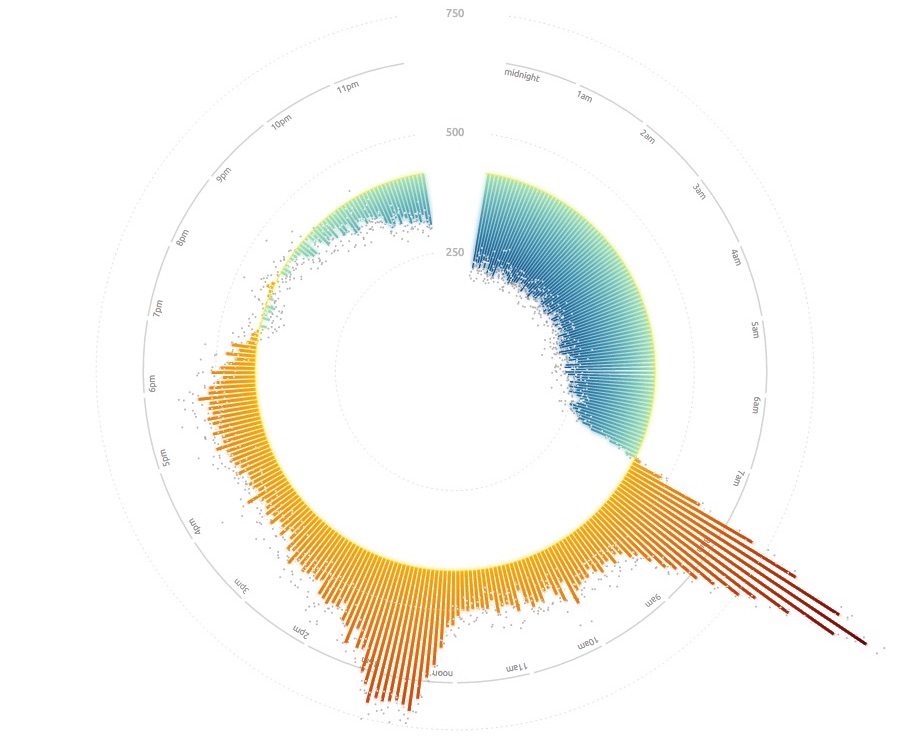
I did like the visual result more, it wasn’t as smooth as before. But the bars now introduced too much clutter. There was so much going on with the bars and the dots. Combined with the possibility of the moire-effect once finally printed, it was obvious to try a different angle.
Zan and I wrote exceptionally long emails to each other to discuss her work with the data analysis and my progress with the design aspects. I read all again before starting to write this blog.
I got the next idea while lying in bed. Instead of areas filled with a gradient, I filled the area with concentric circles. Each was a slightly different color and when placed together they would sort-of convey the idea of a gradient. I also added a drop-shadow to each circle to give the effect of the circles being “stacked” in a more 3D way. As if cut paper circles were placed on top of each other, casting a shadow on the one below.
In the image above you can also see that I started using the amazing d3-annotation plugin by Susie Lu to highlight some interesting aspects of the data.
I liked how this made it easier to compare distance from the average across the chart. Not being able to easily compare the distance from the baseline is one of the main reasons that circular charts are often not the ideal candidate for a line chart. But with the concentric circles you could check the number of rings that were visible at one location and see if that was about the same somewhere else in the visual.
In essence, the concentric circle effect is created by drawing a lot of circles, each one slightly smaller than the one before. The area that was used before and filled with a gradient is now used as a clipping-mask on top of these circles instead.
I truly have no idea why I then continued to make the version below. I seem to have tried to reproduce the idea of “bars” by overlaying the concentric circles by white line radiating outward. I guess sometimes you just need to see how things look, know it’s horrible and move on, haha.
The final results send to Scientific American
Jen spent extra time getting the visuals into the Scientific American style and into the general page layout. Using their fonts and changing some other small things for readability and style.
Below you can see one of the final images that I sent to Jen Christiansen, our editor at the Scientific American. I used SVG Crowbar to get an SVG version into Illustrator. And even though the crowbar is amazing, it can’t get every aspect across to Illustrator. Things such as fonts and filters (i.e. the drop-shadow) aren’t included (correctly). This therefore takes some extra time to recreate in Illustrator.
There wasn’t any room left on the page for extra charts with the three weeks, hours and minute visuals already there. However, Zan and I also looked into the trends that occur when focusing on one type of delivery; natural, induced and c-section. And they also showed some fascinating insights that we really wanted to share. Luckily, Zan got the opportunity to write a more extensive blog for the website of the Scientific American. In the blog Zan dove more into the details which included room for the three extra mini charts that we made about the delivery types.
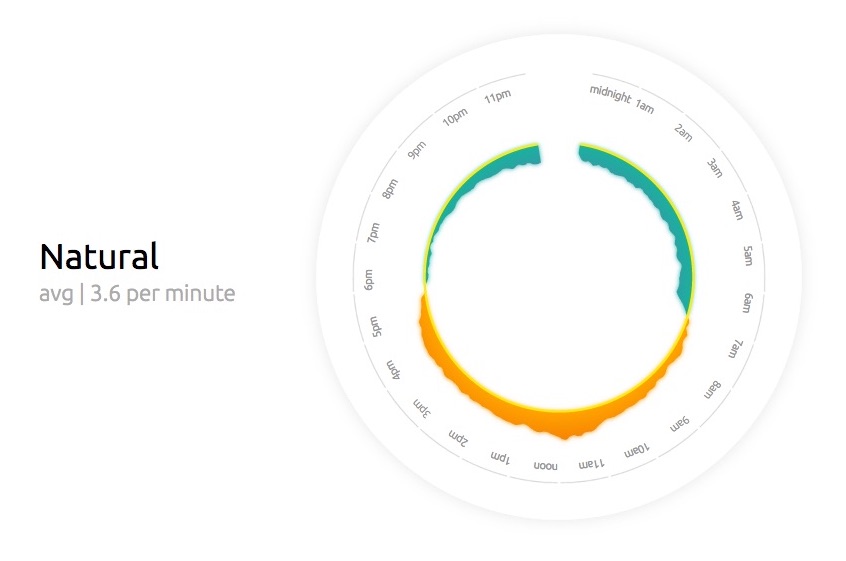
Perhaps you might’ve noticed that the mini chart above contains the gradients and not the concentric circles. This shift from the three main charts was made after we asked several people for feedback. The concentric circles seemed to make it easier to compare different areas within the same chart. Which was our main goal for the bigger time-focused visuals. The gradients, on the other hand, seemed to help when you wanted to compare across charts. And that was something Zan and I wanted to highlight in these delivery type charts. The three smaller charts are also the only ones where the yellow line representing the average isn’t fixed at the same radius (more on that in the section below). Instead, a specific value of babies born per minute is set, and the average line scales with that. Apart from the gradient fill, this is the second change from the bigger time-focused charts to make a comparison across these smaller charts easier.
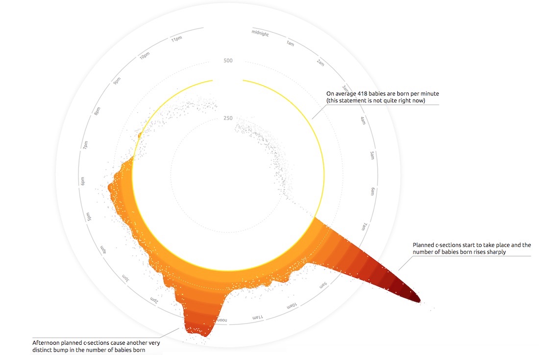
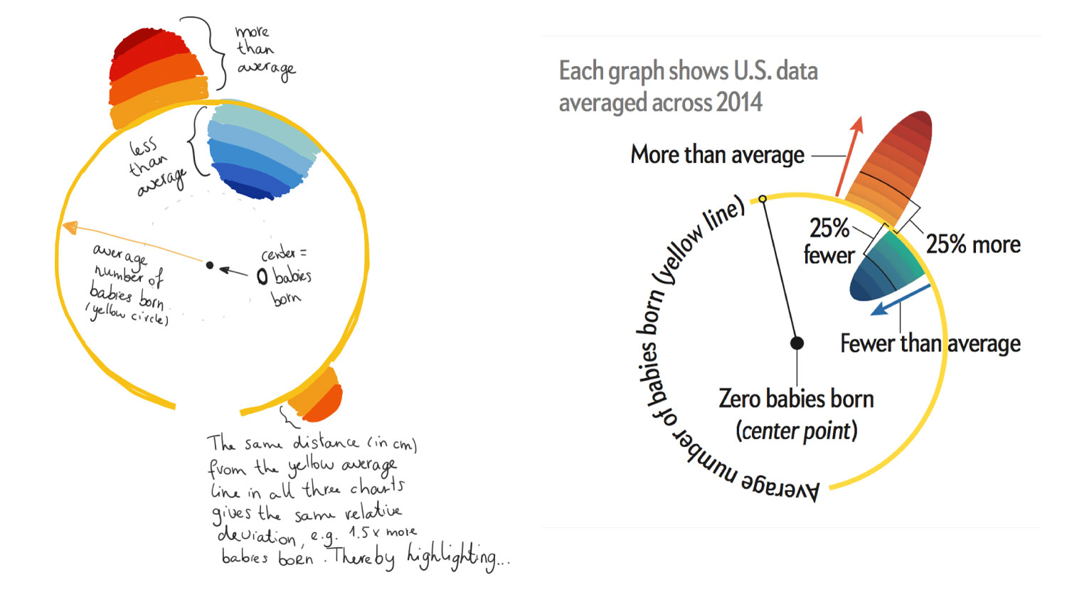
The average line
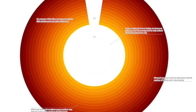
The baby chart designs were going back and forth between me, Zan and the Scientific American. At some point Zan and I got the question if we could adjust the scales of the weeks-per-year chart so the bumps and dips would become more pronounced. However, this was a result of the deliberate choice Zan and I made. The radius of the circle that represents the average is the same in all 3 visuals. In that manner, the “extent” of the deviations from this average could be compared across the charts. That the bumps in the weekly chart are so shallow is a result of the fact that most weeks are pretty typical. Whereas if we look at the minute chart, there are some clear (“breaking out of the graph”) peaks going on. Practically twice the average number of babies are born per minute around 8am!
Thankfully, Zan was very successful in making our point to SciAm. They only asked if we could come up with a better legend that would explain the nuance of these average lines better. At that point I was in Berlin, getting ready to talk at CSSConf. I was a little low on available time, but made a quick sketch of what I had in mind for the legend (image below left) and send it to Zan and Jen. Jen continued with the idea of my sketch and created an actual, better and improved, version in Illustrator (image below right). It’s one of my favorite legends ever!
The Graphic Science page
About 2 months later, Zan and I could finally see how the Graphic Science page looked in its printed version when the July issue came out. For me, but also for Zan I think, it was such a weird but great feeling to have made something that was now in a (highly esteemed) magazine that people could just buy in a bookstore!
For those interested, I clocked 25 hours on my involvement in this project.
And besides that, it was a great experience working together with Zan and Jen :) I quite enjoyed our lengthy emails explaining exactly what our thought process was behind some choices of data, visuals, wording. I hope all of our effort shines through in the end result!

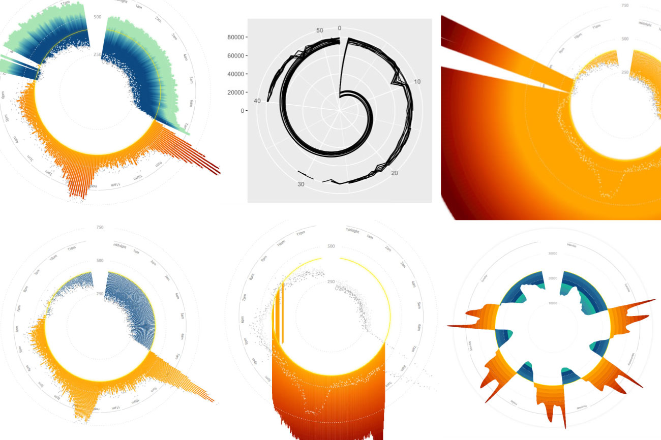
Bloopers
As usual, you think you’ve written the code to do something in a certain way, but after you run it/refresh the page, it shows you something quite different. And I do love making screenshots of those moments. So here are a few of my favorite bloopers.
I hope you enjoyed reading about the process that went into creating the Baby Spike visualization! And don’t forget to check out Zan’s companion blog post!