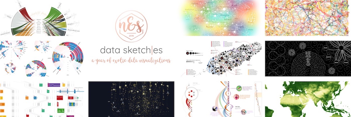
A blog about the new solo talk I’ve created recently that revolves all around Data Sketches, the dataviz collaboration I’m (still) doing together with Shirley Wu. In this talk I (but also we) discuss the lessons that we’ve already learned from doing 10 months of creating an elaborate data visualization a month.
Highlighting favorite months of data, sketches & code: what made them our favorites, the mistakes made along the way, and how we overcame them. Especially highlighting that many of our data visualizations had humble, ugly duckling beginnings, but that through many (embarrassing) iterations, we were able to produce unique and compelling results.
It might take ±10 seconds to show up because everything is loaded at the start.
You can find the slides to my 40-minute solo the talk here. Please look at these slides in Chrome, preferably at a resolution of 1920×1080 (at very different resolutions the text sometimes seems to “twitch” when you go to a different animation within a slide).
The video of our duo talk
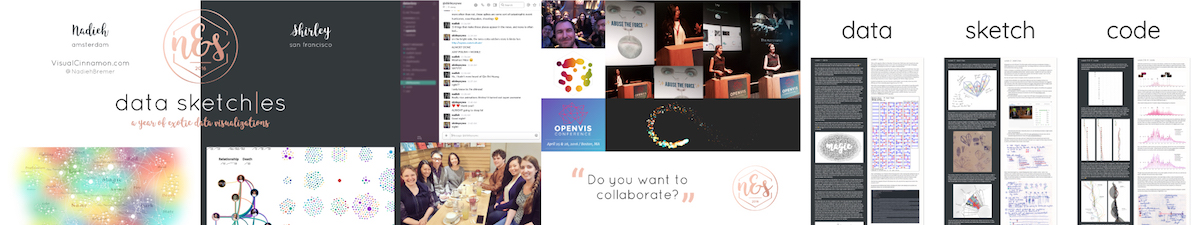
Shirley and me thought it would be amazing to present our lessons learned in a talk at OpenVisConf, since that’s where the first seeds were sown for data sketches just a year before. So we applied to the call-for-speakers, and luckily had the honor to be chosen for the 2017 conference! We slowly started brainstorming about the lessons that we’d learned and wanted to share with our audience. But also, who would lead each lesson, because we could often both share a different story on how we’d separately learned the lessons.
We were in New York the week before OpenVis, where our agendas finally had enough overlapping periods to work together.
Thankfully, I was in the US for 3 weeks prior to OpenVis because I was also speaking at SmashingConf SF at the start of April. However, it wasn’t until the final week that we really worked on the speaking together part. Locking ourselves up in my New York hotel room for 1,5 days and getting our act together and practicing speaking a lot (to see if we weren’t going way over the allotted 30 minutes, which at the start we definitely were).
Just like last year, OpenVisConf was an amazing experience. We loved speaking about data sketches amongst so many fellow dataviz lovers! And it’s always a great time to hang out with friends that I otherwise only speak to online.
The video of my solo talk
But after about a year of “going around the conference circuit” with my Hacking the Visual Norm talk, it was time I created a new talk with lessons learned from the past year. And since practically all my free time had gone into data sketches, it only made sense that I’d extend our duo talk into a 40-minute solo talk. I had enough extra lessons and material to share.
I don’t even want to remember how long it took me to create this talk… But it was at least 1 month of evening hours (including weekends).
I first did my solo talk during the Frontend Conference in Zürich on August 31st, 2017. The first time I do a talk I’m always even more crazy nervous than normal. And funnily enough, I was convinced that I was supposed to speak on the 2nd day of the conference. So I stayed late for the speaker dinner and enjoyed myself. After finally getting to my hotel room and checking out the program folder I almost had a heart attack when I was I was speaking the next day. Or at that moment in time, in about 8-9 hours!! And I really had calculated on having that extra day to practice some more. So that was a night in which I slept exceptionally poor, due to my nerves being flared up even higher. Thankfully, on stage I managed to give the story that I intended, without forgetting any major parts (๑•̀ㅂ•́)ง✧
Lessons learned during data sketches
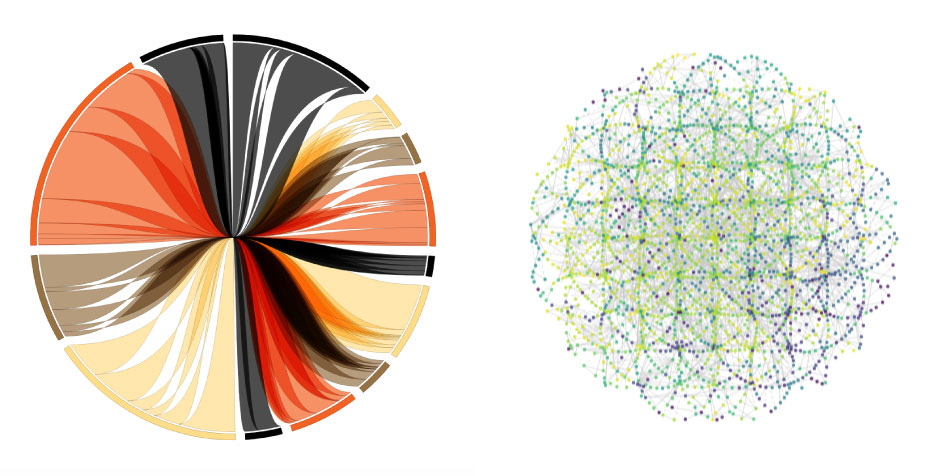
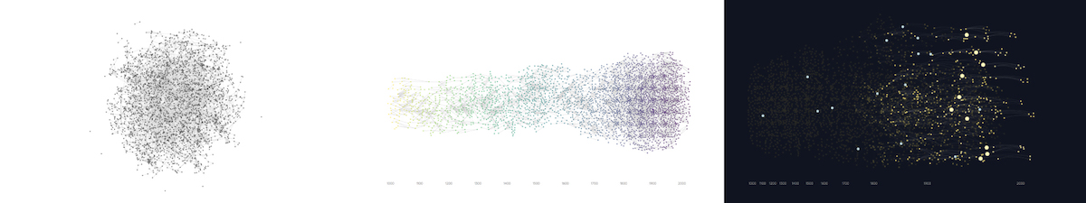
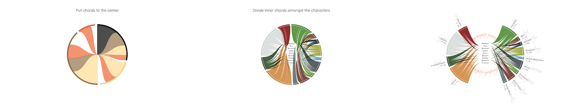
As said before, this presentation revolves around the lessons learned from doing an elaborate data visualization each month. Each of them is based around one of the three pillars that we use in the write-up of each month: the first 3 lessons are about data, the second 3 about sketching and the last 4 are about coding. During the talk I explain each lesson with one or more (with possible dataviz-eye-candy-like interactive) examples from the different months
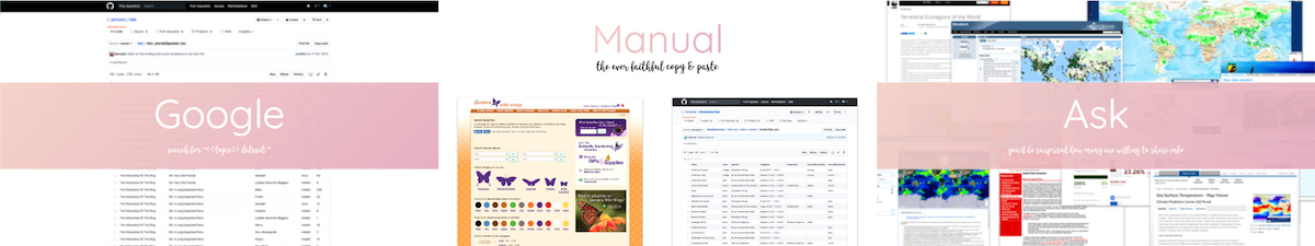
Data can be found in a myriad of places & ways
and it will practically always require manual adjustments
Get a feeling of accuracy & completeness of your data
take sums, counts, etc. and compare this to common sense or a different data source
It's OK to precalculate (fixed) visual variables
not everything needs to be done in the browser / on the fly
Design with code
the actual data has such a great impact on what looks and works best
Sketch the rough visual shape to catch thinking errors
don't just go straight from idea to computer
Try to add extra layers of detail to the design
to give your data & story more depth and context
Remix what's out there already
no need to always start from scratch, even when creating something “new”
Embrace your tool's advanced functionality
for truly unique results (& ❤ SVG paths)
Learn to ❤ math
and especially geometry (yes, not kidding)
The other stuff matters too
to increase delight & engagement
And for the final ±10 minutes I dive into the benefits of doing a project together with someone else and show my favorite months from Shirley’s work. Finally the last slides that quickly goes through several of my “blooper” screenshots (*^▽^*)ゞ
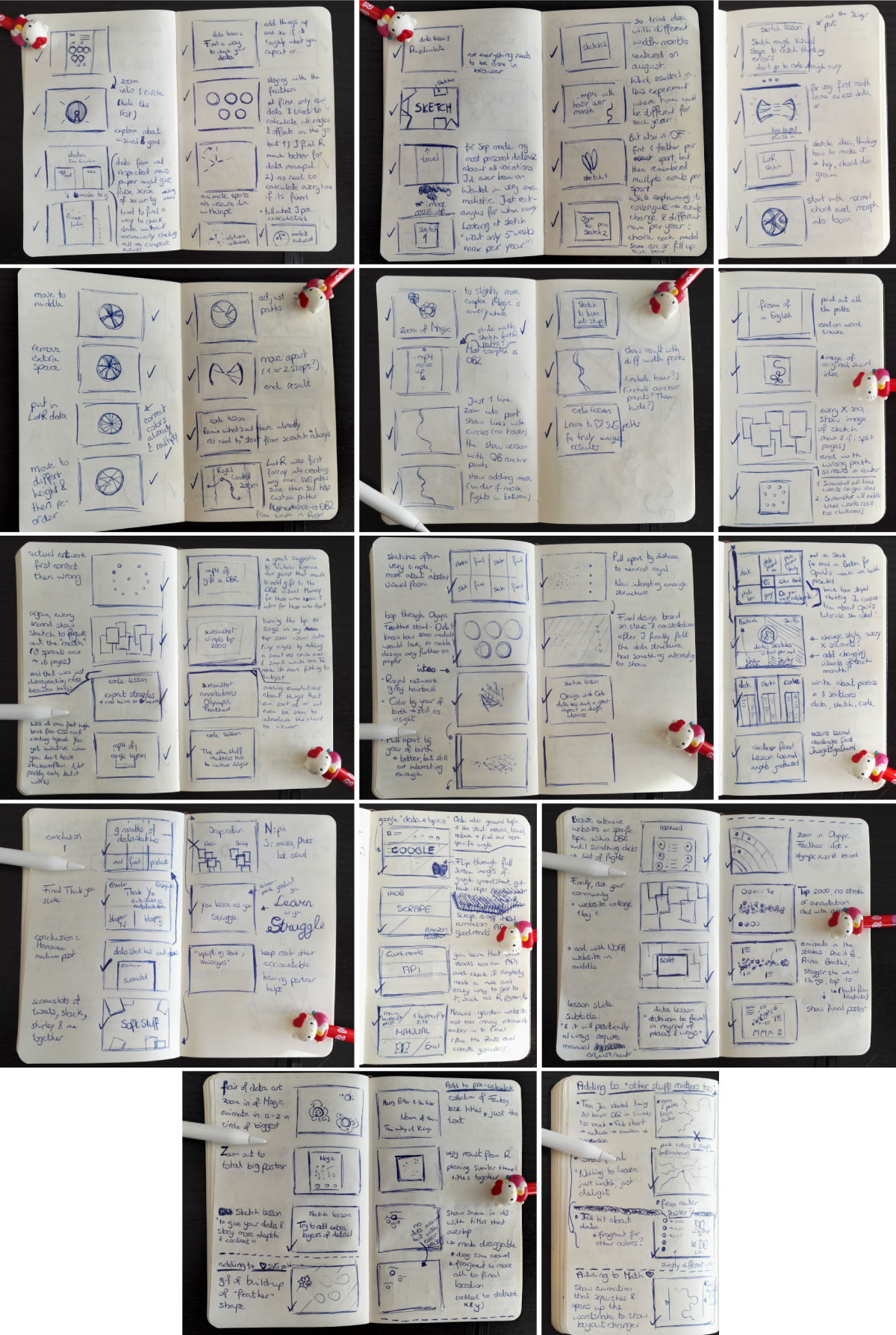
Sketching out the slides
As usual, I like to create mini sketches of my slides before I actually start to build them. And that’s mainly because I build my slides in RevealJS and many of my slides involve some kind of animation sequence / interactive visualization. Therefore, I really want to figure out beforehand what I’m going to do in each slide, e.g. which animation steps there will be, before I spend hours and hours on building it. With RevealJS each slide can sort-of be seen as its own webpage. I’ve written about my reasons for using it (and tips) in a previous post.
Bloopers
Because the solo version of this talk was created across a time period of almost 6 months, I can’t quite remember the details. However, it appears that I don’t have that many bloopers to share of visualization gone wrong during the slide creation phase. It could be due to the fact that this time all the visuals in the presentation already existed in their final forms on data sketches. Therefore, I only had to slightly “reverse engineer” them for some of my slides. I’ll try and make more screenshots next time!