On April 11th 2019, the US National Pet day I released a dataviz driven exploration in collaboration with Google Trends. It went into the questions that people ask on Google to understand their cats and dogs better. In this blog I’ll be taking you through the long and windy design and creation process of the months before the release.
This project took in the excess of 250 hours, so this blog is long and not for the faint of heart. But for those truly wanting to learn more about the process of data visualization, I hope it will be helpful. Alternatively, you can scroll down and only look at the images to get a good sense of the design steps.
The idea
I think it was October 2018 when Alberto Cairo reached out to me. If I was interested in doing another collaboration with Google News Lab (or Google Trends, I’m still not sure (*^▽^*)ゞ ). In 2017 I had created Beautiful in English with them as part of Data Sketches, which was exactly the kind of project I love to create; a fixed dataset (that wasn’t freely available on the web), a creative license to make visually appealing graphs, and combine it all into a story. So I was very much looking forward to doing another project with them!
I proposed several topics we could dive into; from color to museums, candy, pets, and more. It became clear early on though that Alberto and me both just really loved the idea of investigating our pets. Specifically, how people use Google Search to understand their pets better.
While on vacation in New Zealand during Nov & Dec 2018 I started thinking about the the actual angle that I wanted to take, what story to tell and what visuals would hopefully fit that story. I felt that asking for the question popularity of anything relating to cats and dogs would be too broad. However, constraining the questions to include only those that would start with “Why does/are/is my/a cat/dog …” seemed like it would provide a dataset to dig into. To show the reader what questions are most popular; “Why does a cat purr?” or “Why do dogs lick?” maybe? But to also reveal the more specific questions; “Why does a cat purr when I pet her?” for example. To show the nuances, but also to see if some general odd behavior is asked by many people, and thus appears to be “normal” behavior for cats or dogs.
The design
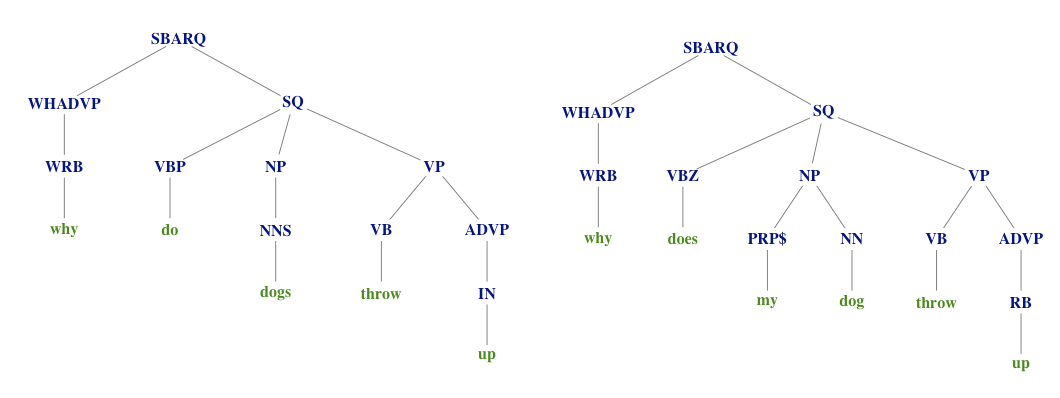
The idea quickly led me to think about a tree structure for the question sentences. Where a sentence tree combines sentences that start with the same word(s) and creates new branches whenever the next word in the sentence has multiple options. Almost like a “flow-chart” in a way; the farther you follow a line away from the center, the more specific and long the question gets.
I drew the very rough designs on my iPad to capture that idea; first starting from a mess of circles, where each circle would represent 1 question (image below, bottom right), and then transforming that to a structured “sentence tree” (image below, top-left), which would reveal the most commonly asked topics.
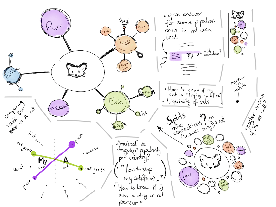
And although that would be the big visual of the story, I was also curious to investigate the most asked questions from two different angles; what is most popular when only looking at general “why” questions (e.g. Why does a cat / Why do cats / etc), and how does that relate to questions that include the word “my” (e.g. Why does my cat / Why is my cat / etc). My design for it was a pretty straightforward visual (image above, bottom-left).
There were some other smaller ideas. Such as to compare general popularity of cats and dogs per country, to maybe even make a poster, to add some blocks in between the general text that would answer some of the most asked questions. And, to add animations of cute cats and dogs!
I cleaned up my design, put it into a Google Doc to describe the flow of the page, send it to Alberto and Simon, and thankfully got the approval to continue.
The data
Next, I needed to get my hands on the data. I was connected to Becky Pinnington from Simon’s team at Google to help me get those “why” questions. Long story short, it wasn’t as trivial as expected to get a proper list of the most popular questions that start with a specific sentence, but we (Becky doing basically all the work here ᕦ(ò_óˇ)ᕤ) got there eventually over the course of 3 weeks of going back and forth and figuring out if the data seemed “complete”.
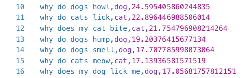
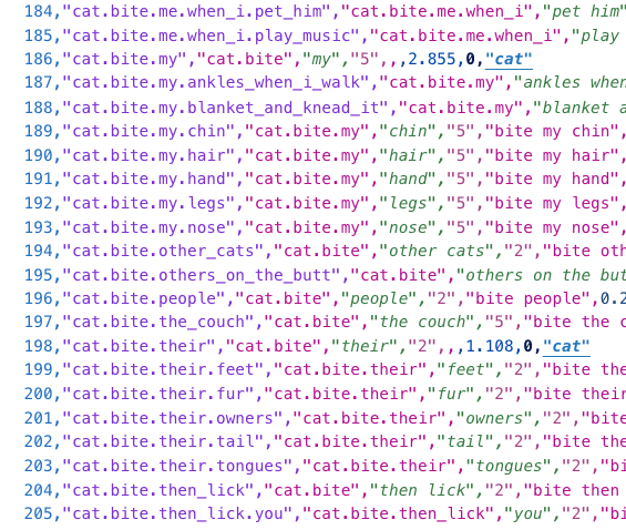
The raw data consisted of ±4400 sentences (an almost 50/50 split between cats and dogs), with the sentence, the animal that it was about and a scaled & normalized value that was the proxy for the search popularity over the past ±5 years.
See the Maxent_Chunk_Annotator from the openNLP package and custom visual function from this stackOverflow question.
Initially I wanted to use Natural Language Processing to chunk each sentence into its logical parts. Where “my” and “dog” would be recognized as belonging to the same chunk. Not surprisingly there are some fascinating packages in R that can assign “part-of-speech” tags and even split sentences apart in “phrasal structures”.
The “not being able to automate it perfectly” was also a reasons I didn’t do stemming, although more went into my decision to stay with the raw sentences.
But after more careful inspection of the resulting “chunks” I found that, although it worked quite decently, it wasn’t perfect by far. Which would mean that I would have to manually move words between the chunks afterwards. And with 4400 questions and the idea that the resulting data would be so heavily influenced by my “opinion” of how chunks should be, I stopped investigating further.
I only removed a few sentences to make the whole dataset kid-friendly, but these sentences weren’t popular anyway.
This initial investigation did show me that I basically wanted to create a sentence tree that was as objective as possible; no intervention on my side. Thus, I would split the sentences at those points where they go on differently (e.g. “Why does my cat lick herself so often?” & “Why does my cat lick herself after I pet her?” will split after “herself”). Straightforward in idea, true to the data, but not so easy to create…
I knew that there was a wonderful function d3 called d3.stratify that could take a list where each row has an id and a parentId, and turn that into a nested hierarchical json-like structure. Although that already made my life a lot easier, making the “sentence tree split” function still ended up being the most complex function I’ve ever created to handle all of the nuances.
I don’t want to bore you with the details, but to give you an idea; it involved several recursive functions, creating extra rows of data for “parent” sentences (e.g. for “bite my hair” and “bite my chin”, a parent needs to created for “bite my”, even though that sentence in itself isn’t in the data. However sometimes the parent is in the data too, such as with “eat grass” also being a parent of “eat grass so often”). To take into account that some words are always asked together (e.g. the words “afraid” is always followed by “of” in this data, so they should be seen as one “word”), and making sure to add up the search popularity values so the parents higher up the tree would represent the combined popularity of all the questions that were a part of it. And if all of this made absolutely no sense to you, don’t worry, my wording above is much too short to explain it properly.
Eventually I ended up with two datasets; one for cats and one for dogs. But I had no idea if my hierarchy was correct. Sure, my function in R hadn’t thrown any more errors at me after 10 hours of work, but I wasn’t sure that the huge structure was logically working. Well, trying to make a hierarchical data visualization out of that seemed like the perfect test!
Initial explorations
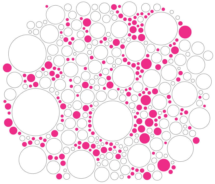
Thankfully, d3 has several “standard” visual layouts that are based on visualizing hierarchical, tree-like data. Such as circle packing. Applying the d3.stratify function already showed me that, yes, I did still have some errors in my data. But after solving those I basically just plotted the most default circle pack available.
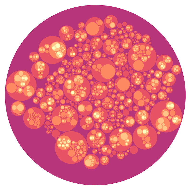
In the circle pack image the size of any “parent” circle is determined by the smallest circle that can enclose all of its children. This means that no parent is sized correctly to account for its own search popularity value.
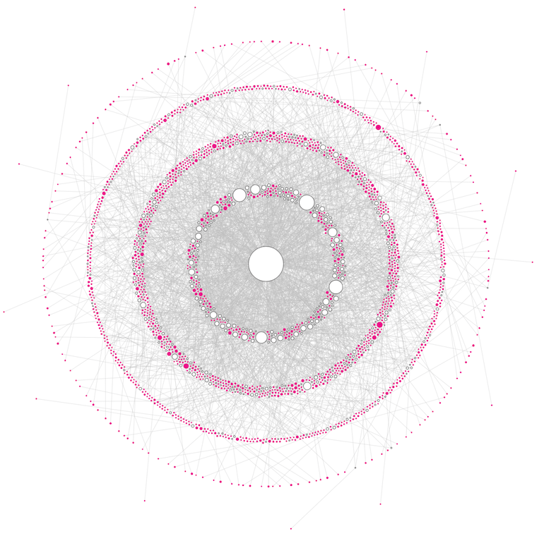
Well, that did have some nice visual aesthetic, and it did give my some idea of the most popular asked question. But it wasn’t portraying the data in the way I wanted. As a second quick test I plotted the data in a radial tree. Where each level deeper into the hierarchy is plotted at a larger radius. With basically 2200 points to plot I knew that it would probably look like a mess of lines, but it did give me a general feeling for the division of datapoints between the hierarchy levels.
The sentence tree avenue of despair
I believe there’s no option to set actual sizes, or even different sizes per circle that the radial tree layout algorithm takes into account to place the circles.
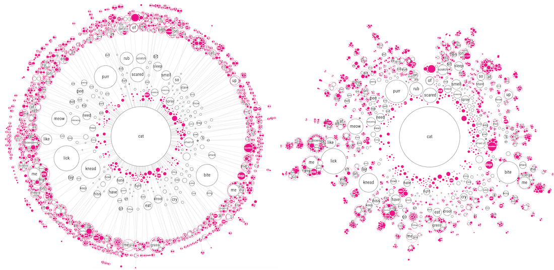
Alright, I was ready to program my “sentence tree” visual from the design with the actual data! Because I wanted to be able to make the circles much bigger, I knew that the radial tree layout wasn’t going to work. I therefore went to a network / force visual as the base, which is more than capable of displaying tree structures.
Although I had no idea about the details of the design yet, such as colors, I decided to make all the “leaves” of the hierarchy (those without any children) pink and the others that do still have children white with a black outline. Below you can see some of the earliest iterations in which I modestly played around with either a radial force to make sure that each level of the hierarchy would be approximately at the same radius, like in the radial-tree before, or where there was a general charge pushing everything outward (the bottom-right image).
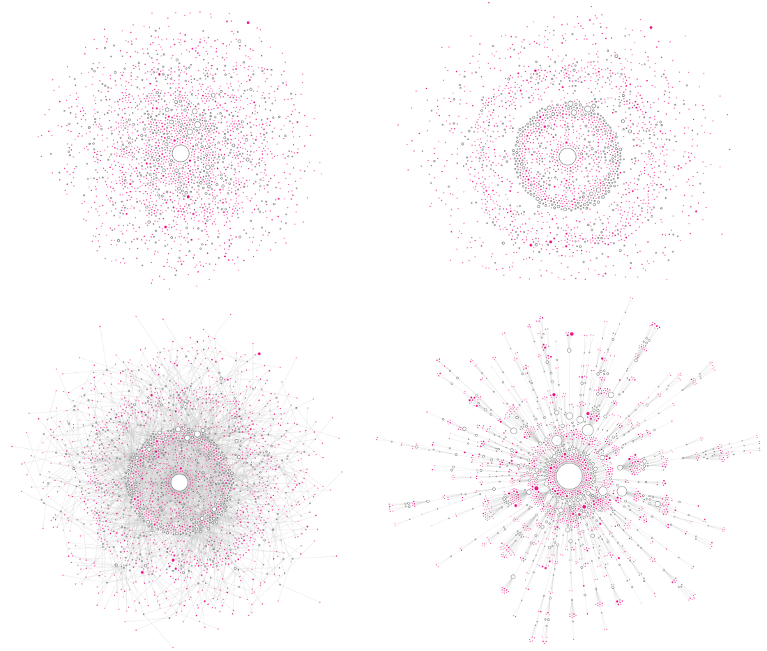
I was quite surprised that the “cluster force” approach that existed in d3 v3 hadn’t been ported over to v4! So I tried to make a version myself. After tweeting about it, more versions thankfully appeared.
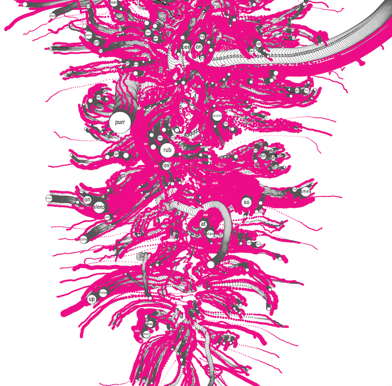
Those circles, although already scaled in size according to the search popularity value, weren’t nearly big enough, because I wanted to place the text that each circle represented inside. I knew that wasn’t going to work for most, but I at least wanted the biggest circles (and thus most popular questions) to have text in them. So I drastically increased the circle sizes and went back to the approach where each level deeper into the sentence tree would be at a larger radius (left image below). However, it was truly impossible to tell which lines from a smaller level/radius connected to circles at a larger radius… So I added an extra collision detection to group all children that came from the same parent (right image below). But that didn’t actually make it much clearer who that parent might be ಥ_ಥ
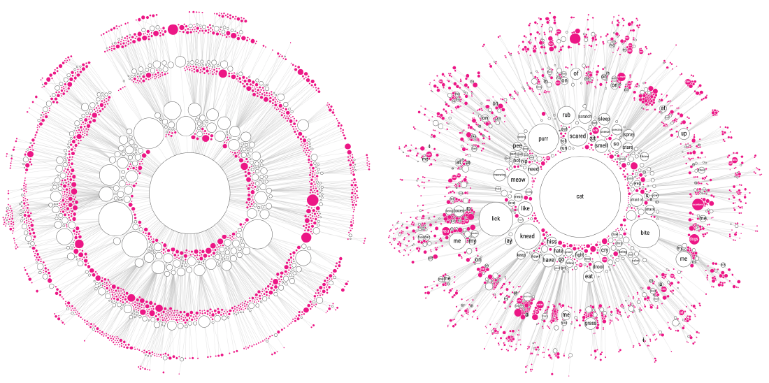
At least the increase of the circle size did make most words fit inside the biggest circles. And from a purely visual aesthetic I do like the image blow. But it was quite too daunting to show readers. Besides it being impossible to follow one “branch” from the center outwards.
You can read more about the options of the ‘circle pack’ layout on the d3 wiki page about hierarchies.
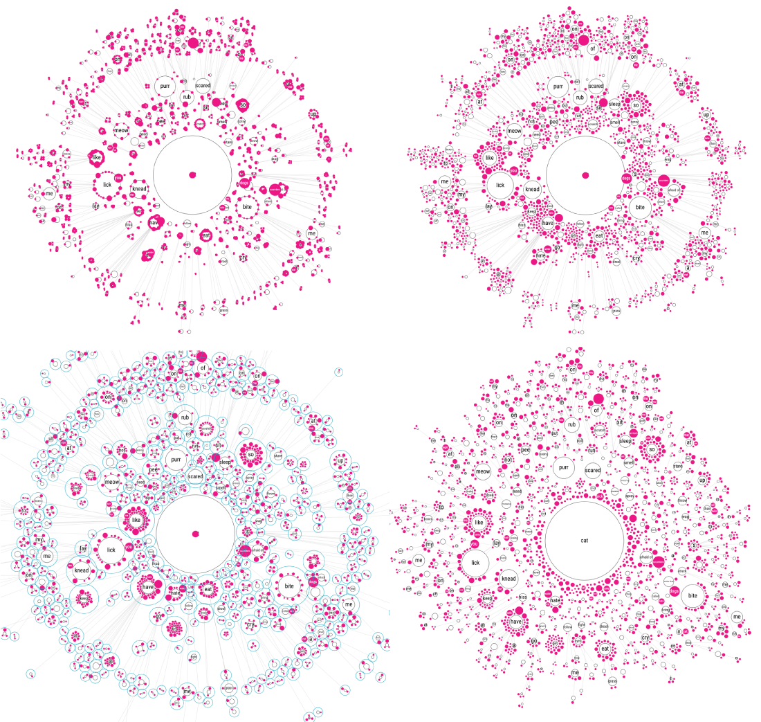
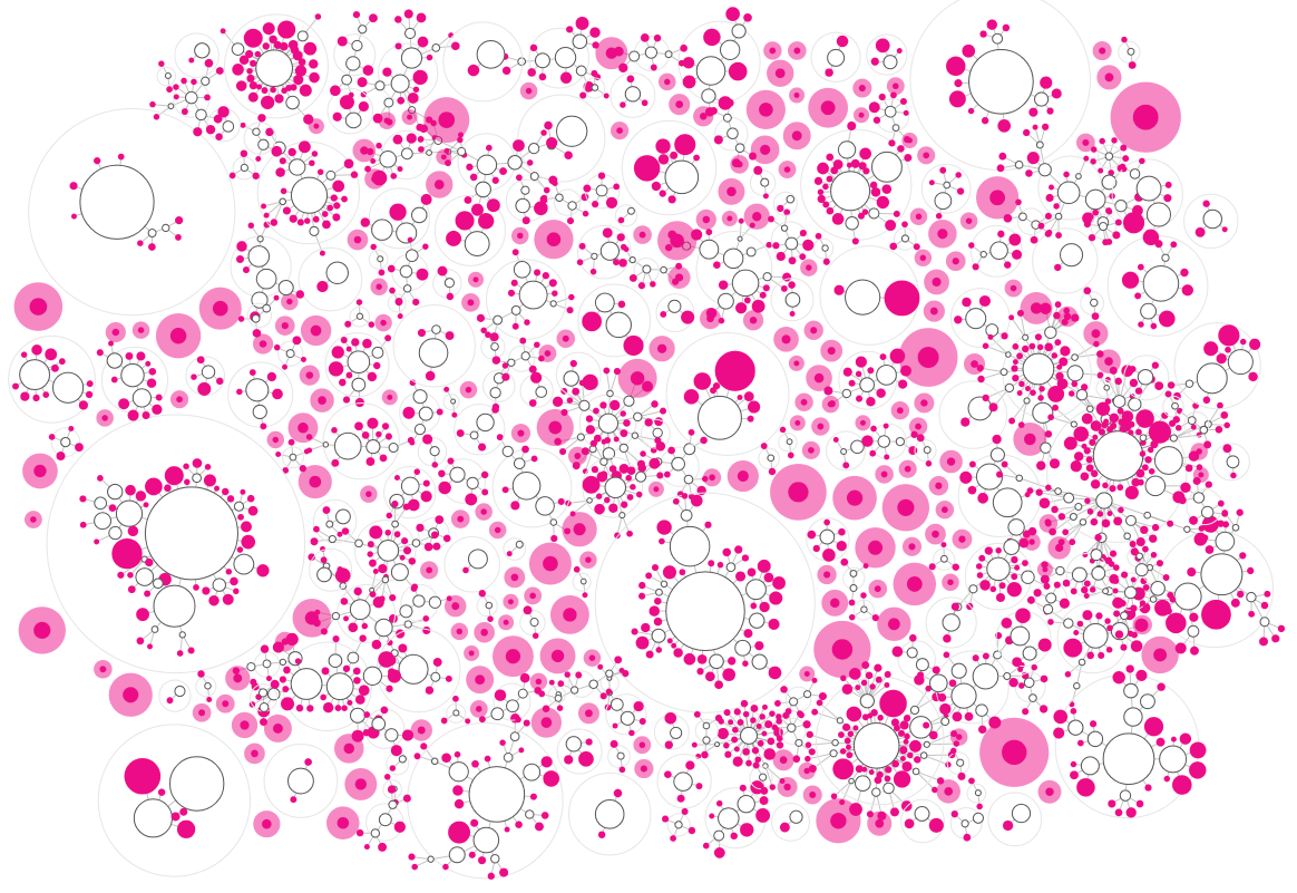
Ok, what to do….. Well, it’s been two months since I was in the middle of this process and it seems that I forgot how I thought of it, but I decided to try something that I had never seen before; combine circle packing and the force layout. To place all the children of a branch into a larger circle, and then use these larger “child-enclosing” circles in the force layout instead. This would make sure that all the children of a branch would always be together. I first drew out my idea in my notebook to make sure that I hadn’t made any obvious thinking errors in this set-up.
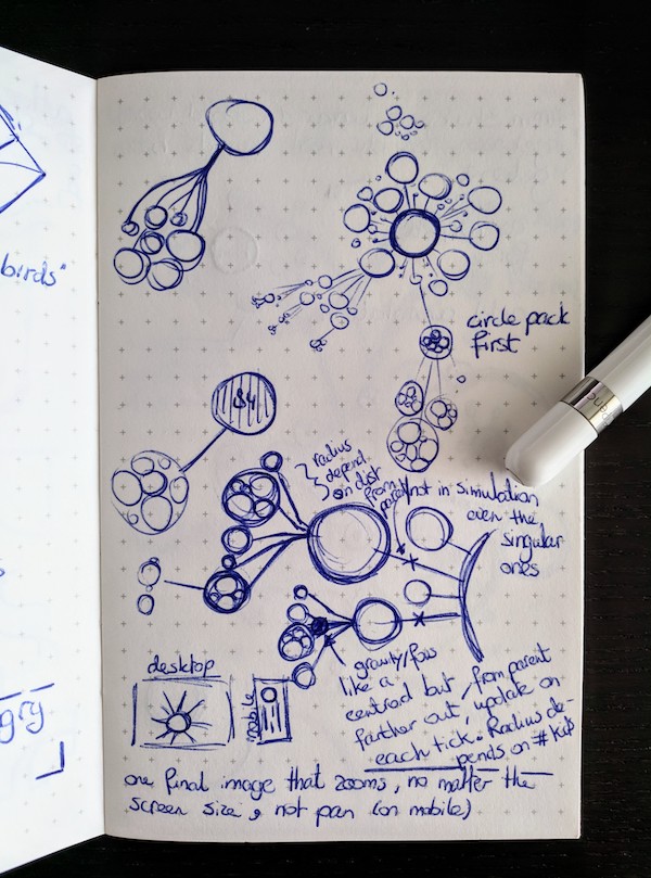
This new approach did require quite the change in my code! Having to replace the circles that were originally in my force function with the “child-enclosing” ones, and afterwards doing the circle pack. But after slow but steady progress, I got there!
However, now you could no longer see from which child inside the larger enclosing circle the line/connection flowed to deeper levels. For example, look at the have circle in the image below at about 7 o’clock around the circle. It is connected to one pretty big enclosing circle with lots of smaller circles inside. This bigger enclosing circles has several connections even farther outward, but it’s not clear from which of the smaller circles these start. (I hope that made some sense…). Showing the actual connections between the original circles, and not the enclosing circles, only created one big mess again sadly enough (╥_╥)
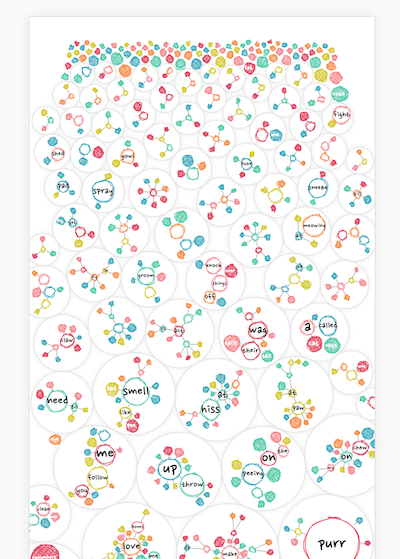
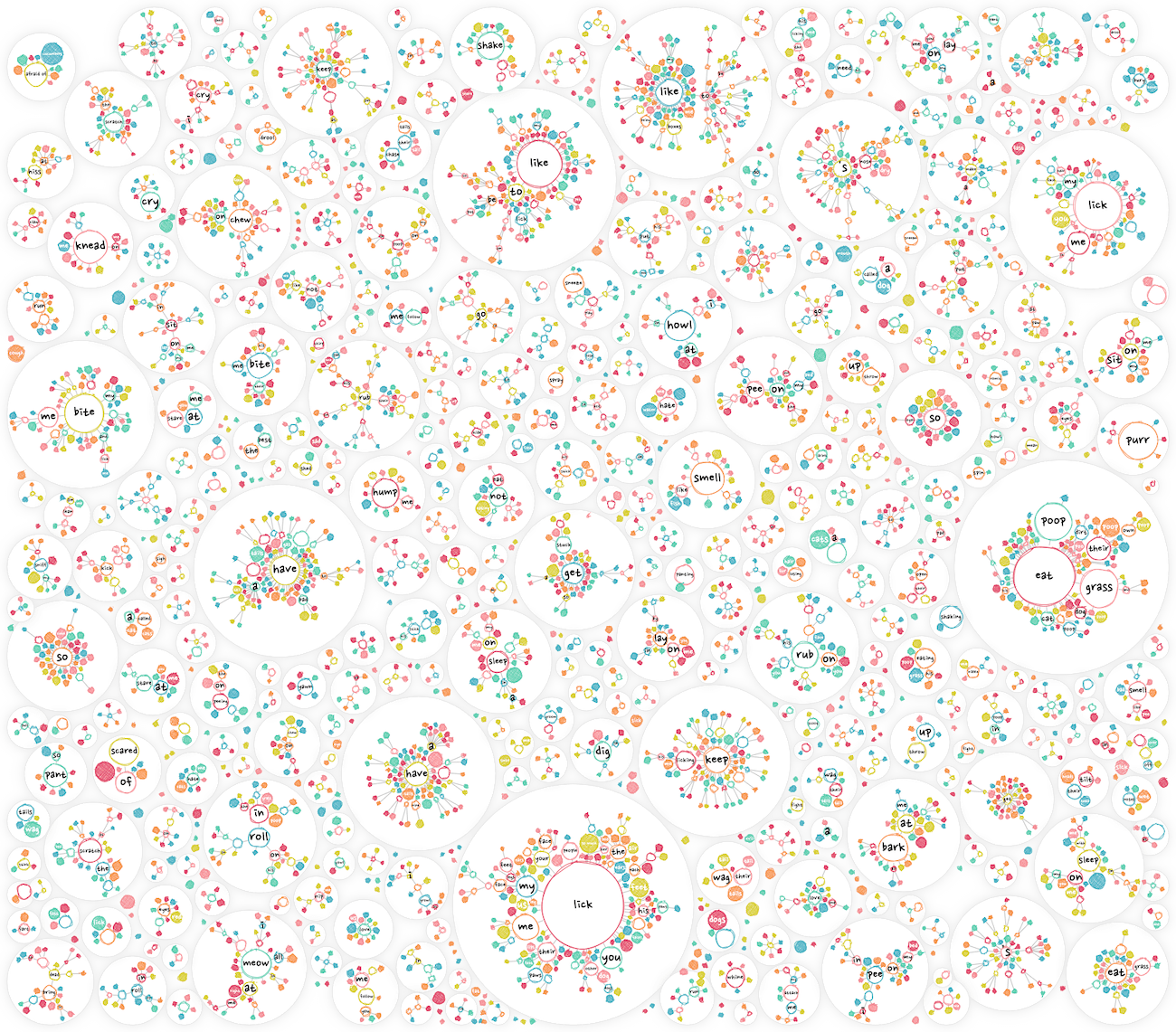
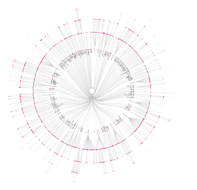
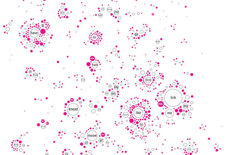
Feeling that the circle packing approach wasn’t improving readability, I went for yet another approach. Instead of everything being connected to the central “cat” circle, I removed these links and let each branch flow on its own. This created many small mini networks, but they looked a lot more insightful than all I’d tried before.
In hindsight, I really should’ve given up ages ago…
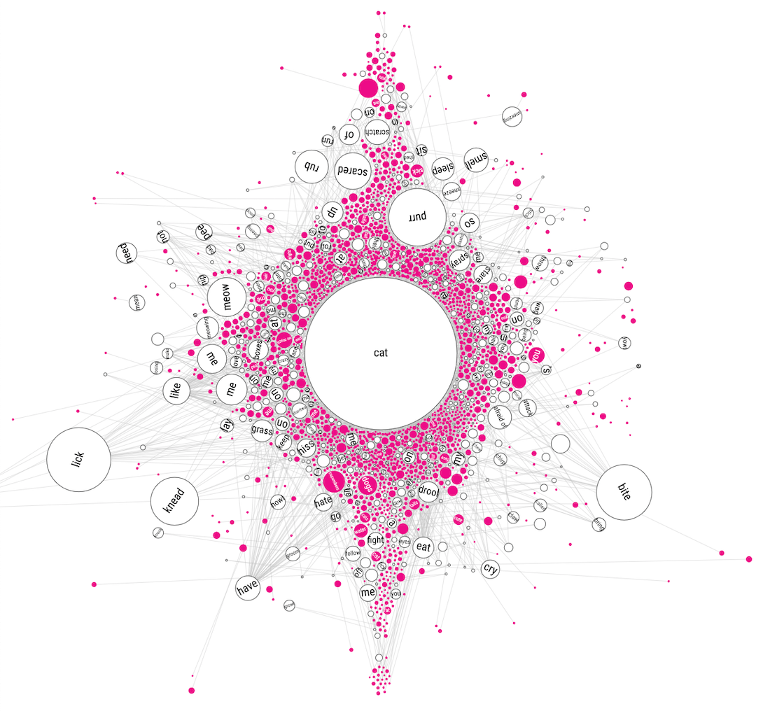
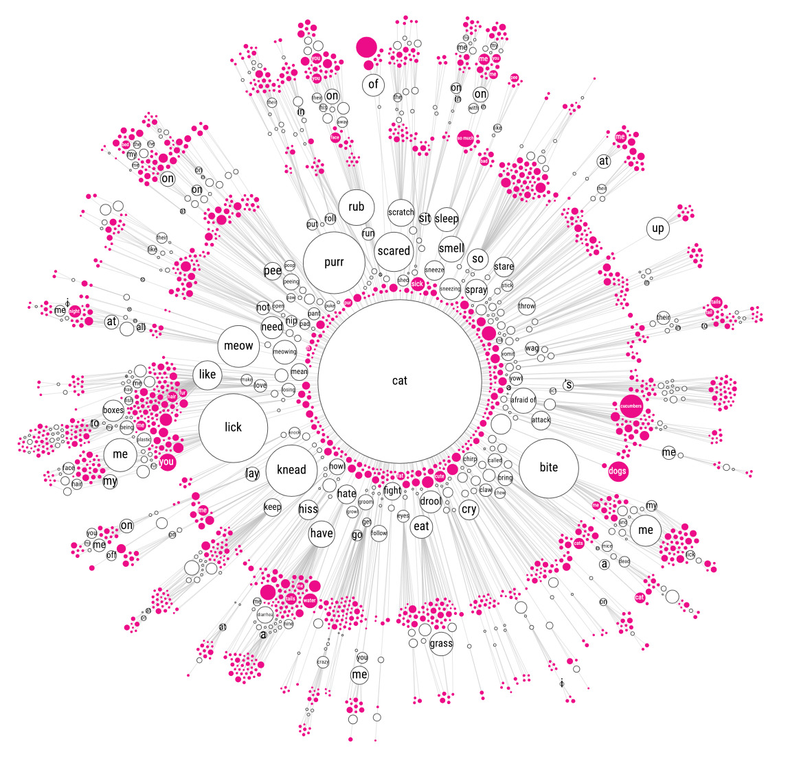
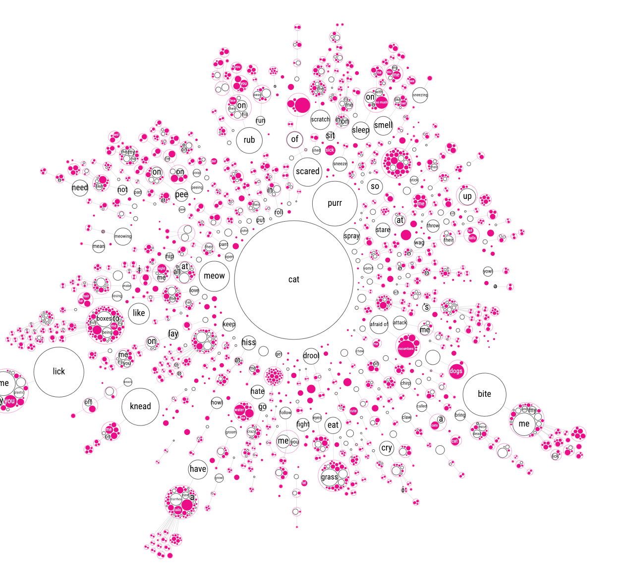
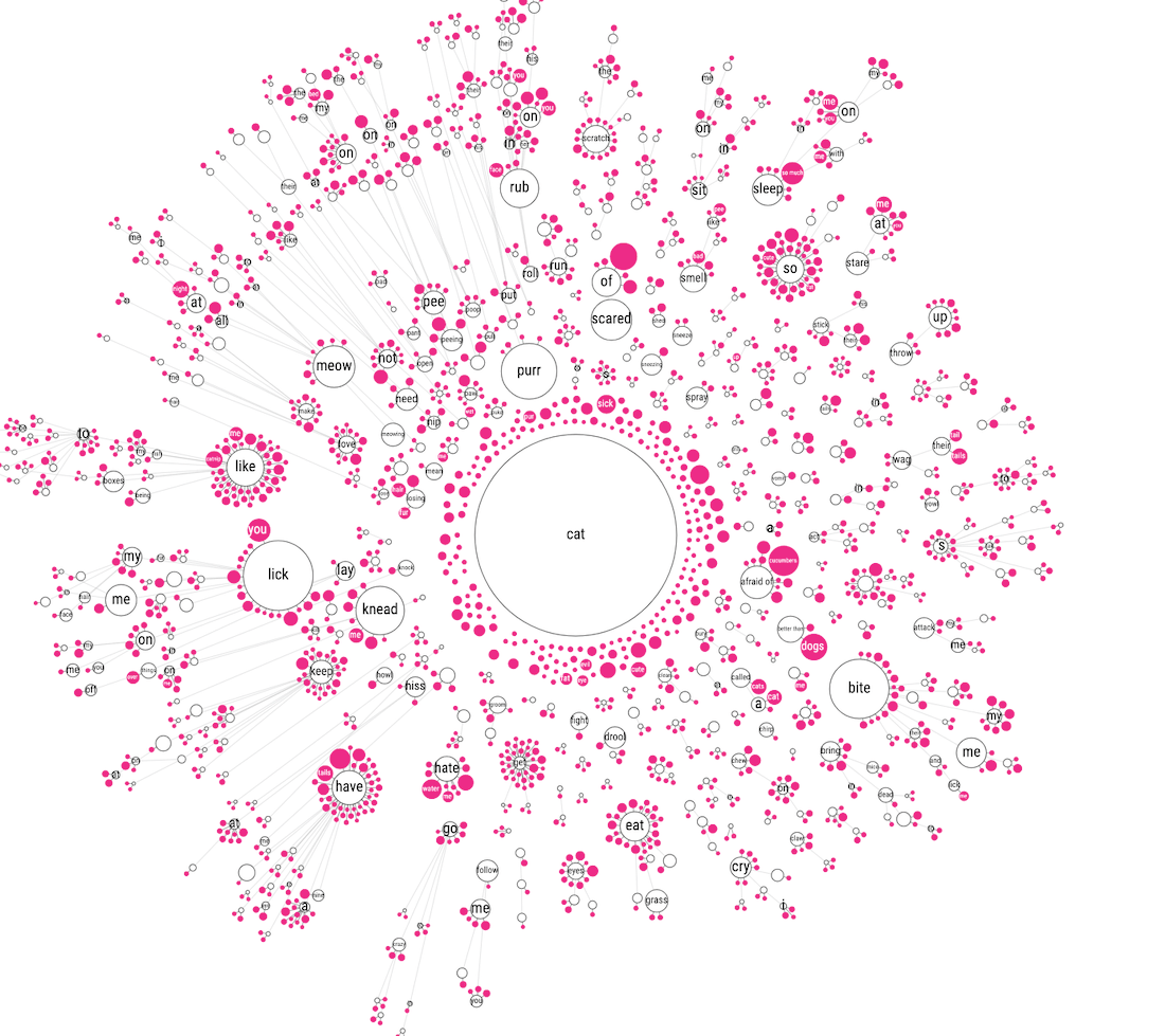
But I (still) wasn’t ready to give up my original idea of one sentence tree starting from a common root. I had yet another idea! What if you kept the circles without children of their own (the pink ones) close to their direct parent. But place the circles who had children of their own farther outward and then repeat the process. As with the previous approaches it’s probably best to look at the iterations below to get the gist of it (I hope).
That did create the most insightful image I had seen so far, although I mean that relative here. The previous tests were dreadfully useless, and this was only marginally better than that. It just wasn’t quite right I thought. Perhaps if I started from that final state, but then manually dragged each branch to a position where it wouldn’t overlap any other and be pointed outward?
Thankfully I had done this manual dragging approach before in my Magic is Everywhere project, so I could, relatively easily, copy the code to make it possible. But the dragging wasn’t nearly as easy as I’d hoped. Making small changes in the inner section meant that I had to then update everything surrounding it, which in turn meant that I had to update all that surrounded that, etc.
This approach totally ignored the (probably) possibility that small data changes or size changes could occur, thus making it necessary to redo the entire process…
After 2 hours(!) of dragging I had finished the right side of the cat tree (image below). I was not looking forward to the next 2 hours. Luckily, I felt that having done half was enough to be able to assess if this final result was truly working. And yes, it was the best thing I’d managed to create in terms of understanding the data, but still… was it really something people would dive into? Was it useful? Was it inviting exploration? HOW was this going to work on mobile anyway?!
Having explored the “sentence tree” avenue for almost 40 hours (across multiple days of course) I woke up and did the smart thing; I gave up.
Finally… o(╥﹏╥)o
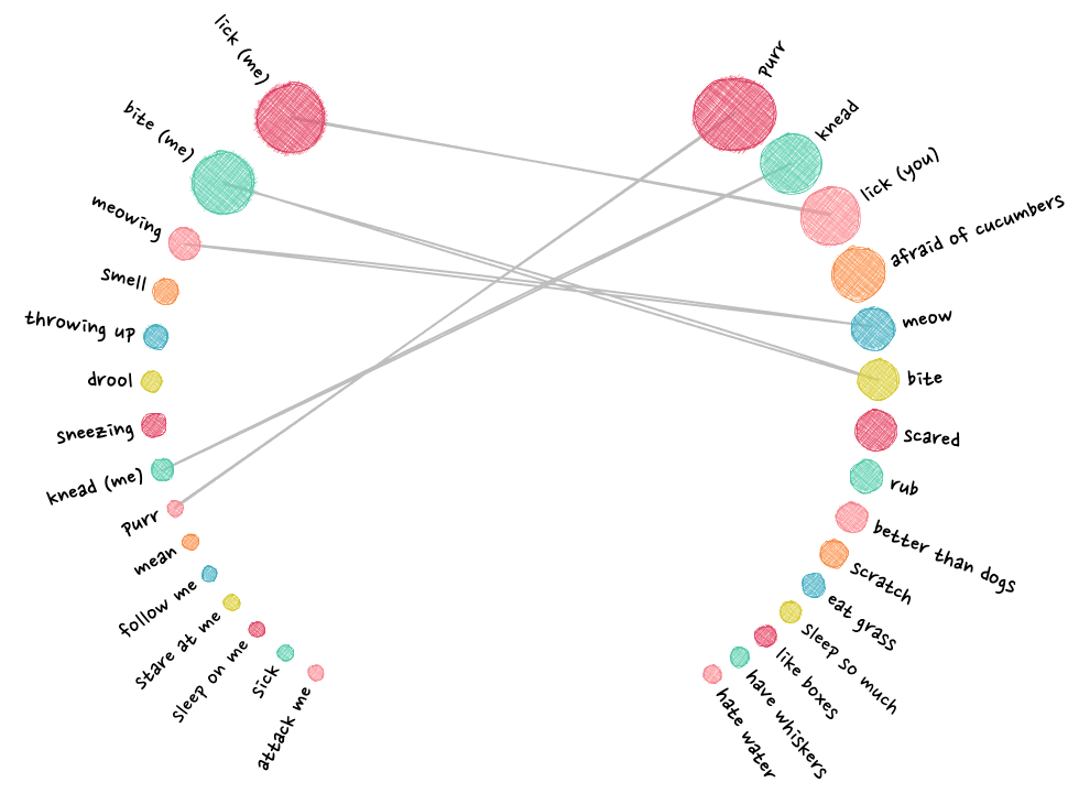
Nested mini networks
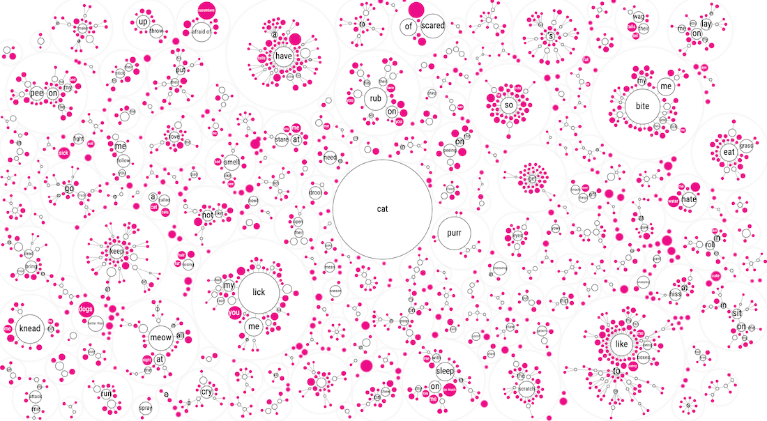
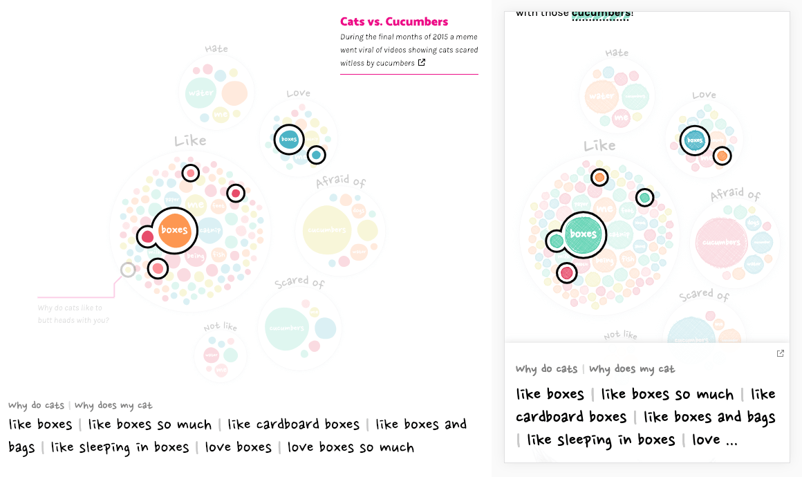
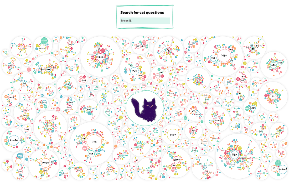
Ok, I couldn’t totally give up, I still needed to create a visualization of the data. But I wasn’t doing it from the approach of a “central cat/dog circle” anymore. And that’s when I looked at the screenshots of the separate mini networks again. Where the connection to the central “cat” circle had been removed. Perhaps I could somehow pack each of these mini-networks inside larger circles, thereby clearly sectioning each branch/mini-network from the rest.
I started out guessing the radius that would be needed to fit the mini networks from summing the area of each circle that would be placed inside.
First, I had to pack the circles representing each of the ±370 separate branches that are directly connected to the cat “root” into a rectangle. The pink circles now still represent leaves, which means that these sentences are totally unique from the very first word after “Why does/are/is my/a cat(s)”, such as “Why does my cat avoid eye contact”. No other sentence begins with avoid it seems. The white circles are those branches that have children, such as lick, have, bite, and many more.
With the circle packing code that I’d written during my doomed sentence tree explorations I could at least quite easily create the initial packing of the “enclosing circles”.
Later I also added a circular “bounding box” to make sure no small circle could move outside of its “enclosing circle” during the force simulation.
Next, I basically did a separate network calculation for each of the white circles. I made sure that each mini network would be centered on [0,0] and then just added the central location of the enclosing circle after the force simulation was done. Luckily my initial approach to guess the required radius for each enclosing circle wasn’t half bad, and it was quite easy to update to make most networks fit. All these extra network simulations did take a lot of time though…
I wanted to make the outer enclosing circles fill the entire width of the viewer’s screen, with the height updating to become smaller on wider screens. This meant that the initial force simulation that places all the enclosing circles in a rectangular shape had to be done on the fly; separately for every user.
I’ve used this approach of saving final locations of a network simulation in lots of projects, such as Royal Constellations and my work for UNESCO.
However, the exact placement of the inner networks would always stay the same, no matter the screen size, even for mobile. I could therefore save the final locations of all the inner circles and use this data to immediately place all the inner circles on their final location for the readers. That took off quite some page load time.
Nevertheless, the initial simulation of the enclosing circles was still taking too long. And since most of that time is spent in doing calculations I could actually use Web Workers to speed things up substantially! Web workers make scripts run in background threads, without freezing up the browser (and therefore finishes much faster). For data viz people, it sadly can’t draw to the screen directly, such as a canvas. But if you’re running a code to calculate variables/arrays/etc. that take a long time, web workers are amazing!
Moving the simulation to web workers, combined with the inner network positions coming from a file, the entire visual of ±2200 circles was calculated and visualized in less than a second, woohoo!
In terms of this “mini network packing” visual, I was happy enough with how it visualized this large amount of data in a way that didn’t seem to overwhelm (too much) but did reveal insights. It needed a lot more love to truly become useful, such as a hover and search functionality, but it was on the right track. However, I did now realize that this visual couldn’t be the only and main one. It was more the “here is all the data, have fun exploring” kind of visual that comes after you’ve taken the reader through more focused insights/visuals.
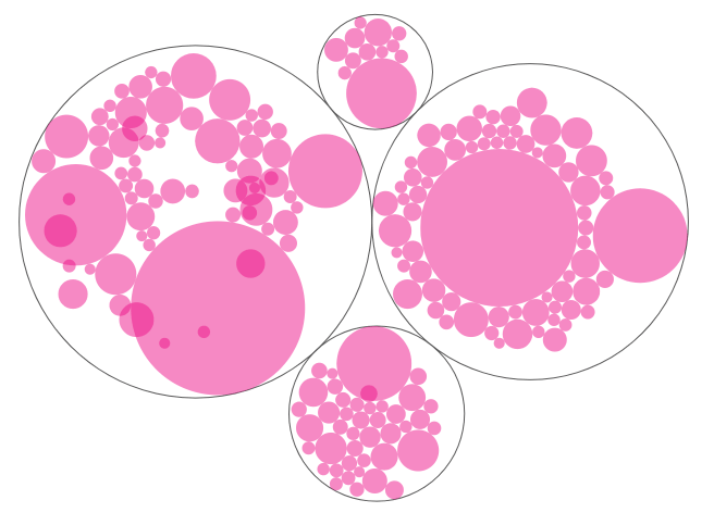
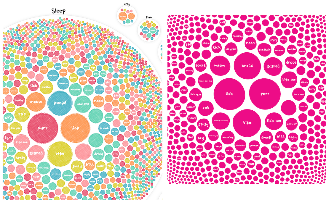
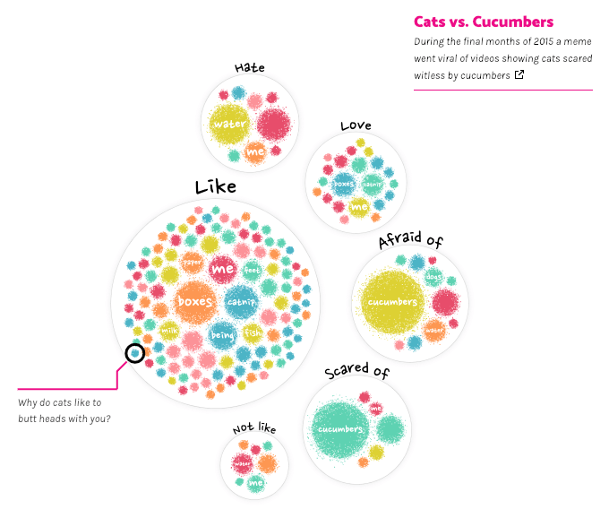
Circle packing groups
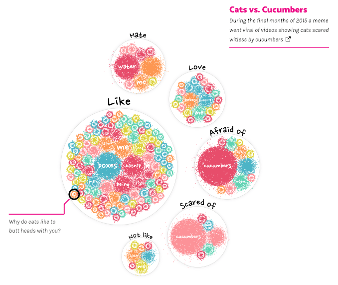
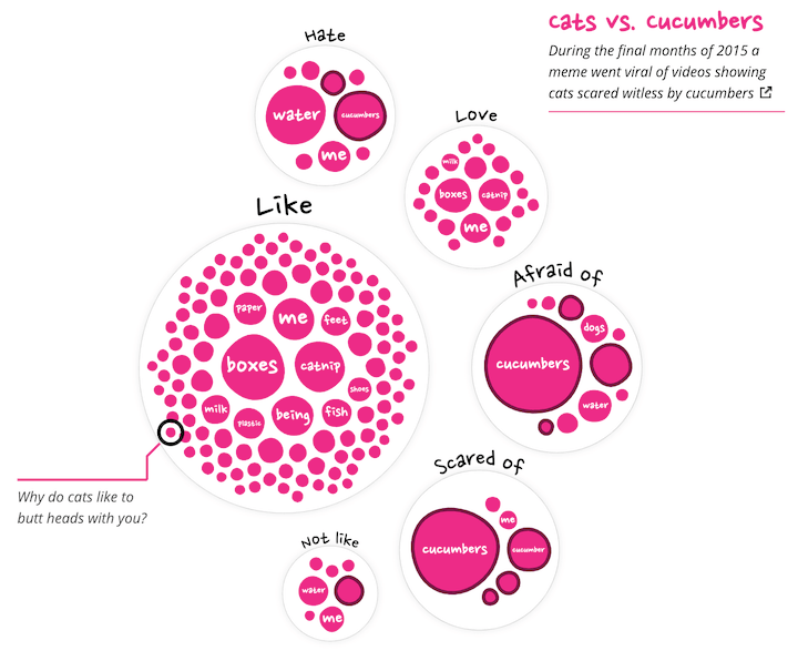
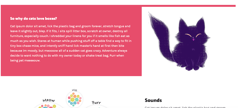
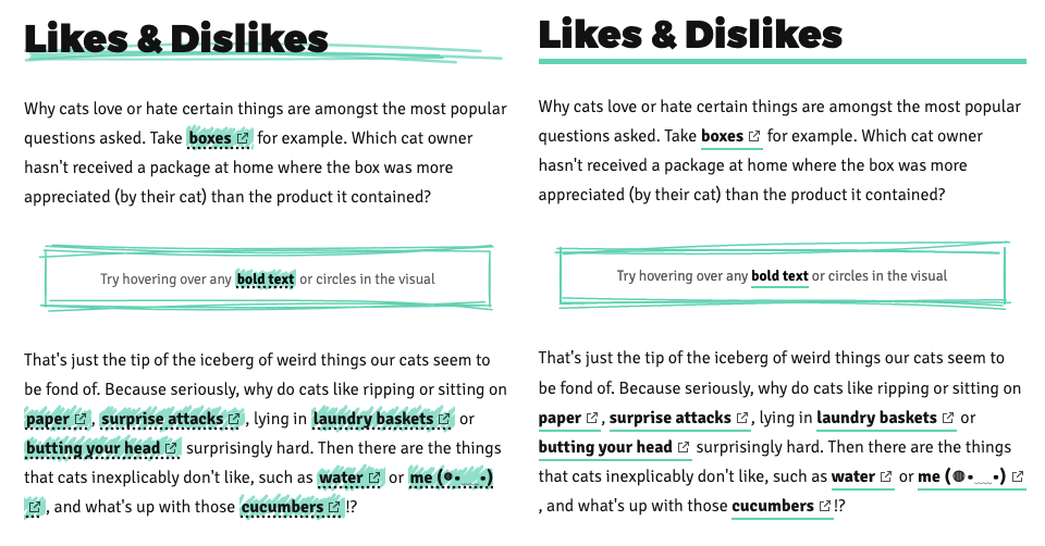
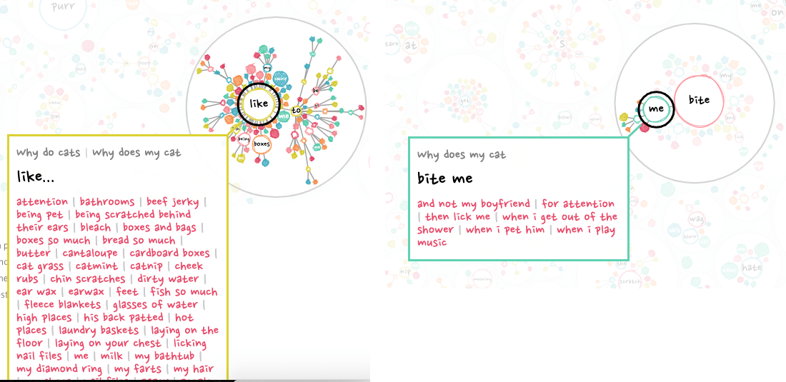
Dang, that meant I had to create those “initial” visuals. Which weren’t in my original design… Before thinking about new designs though I first took a step back to consider what insights I wanted to highlight before the viewer would get to the visual revealing all the questions. So I went back to the data, and while browsing through it, doing some analyses and such, I noticed that many questions could be grouped into a broader categories. For example, everything cats do with their mouth, such as liking and biting.
Using regex I could make sure to only include those sentences where the chosen word was used in the right way. For example, I could make sure that “like” always meant “prefer” and not also include a sentences such as “… behave like a monkey?” or “…not like to…”.
That led me to the idea of ditching the “sentence tree” for a bit. Instead grouping all the sentences that contained a specific word (such as bite or like). I could then show a collection of these word-groups that all belonged to a higher category, such as mouth, likes & dislikes or sounds. I guess that circle packing was still in my head from the earlier explorations, and so I’m not surprised that the design that quickly came to mind was a circle pack.
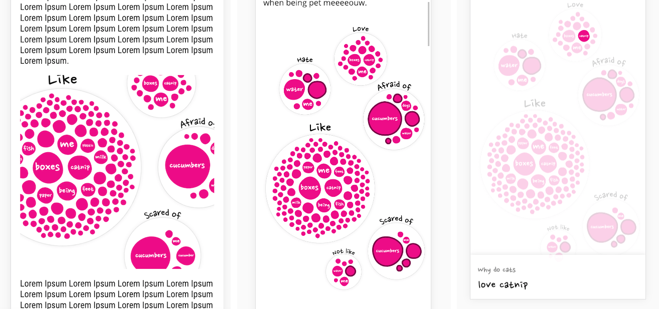
I still had some circle packing code “lying around” which made it straightforward to get something decent going. But I just wasn’t liking the perfect circles of SVGs anymore (image below left). It was too clinical, too straightforward. The topic of this project was more whimsical than that. I thus wanted to distort the circle, to make it imperfect.
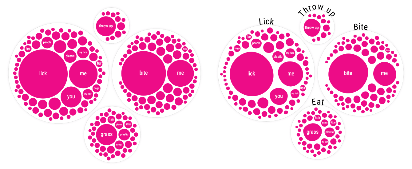
Creating an imperfect circle is actually quite easy with d3’s (radial) line curve interpolation. For each circle, I would calculate 10 points on the edge of the circle’s radius, spread out evenly. I would then slightly move each of these points inward or outward. And finally, I draw a line through the jiggled points with d3.curveBasisClosed and fill it pink.
About 20 different fonts and some smaller adjustments later…
Naturally though, the circle packing would be too wide for mobile screens. I didn’t want to scale all the circles down, because that would mean that even less of the circles would be big enough to place (readable) text inside. Instead, I start out with the circle pack. And if the width this requires is wider than the screen, I do a force simulation with a “bounding box” to jiggle the circles up and down to make sure it does all fit.
This project is build on Matt’s wonderful budo library. And when this project grew beyond budo’s initial set-up, Matt has been so very kind to look into it and provide me with adjustments that would make it work!
While working on this I went to the FITC conference in Amsterdam where I hung out with the amazing Matt DesLauriers who spoke there. I discussed my set-up, but also that I was trying to create a more whimsical, less perfect, style. He then reminded me of the sketchy style. I had totally forgotten that! I still remember being blown away by Elijah Meeks’ wonderful experiments over the years to make sketchy graphs. A quick Google showed me that this technique had been placed into a JavaScript library called rough.js. And lucky for me, it worked on both SVG and canvas (ノ◕ヮ◕)ノ*:・゚✧
A few code changes later and I was very much liking where this was going!
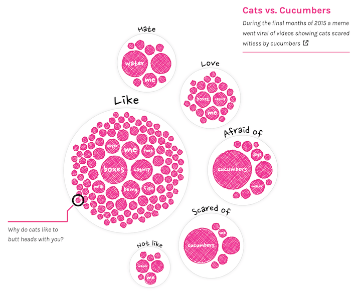
But there was still one final idea I wanted to try; to make the edges of the circle more grainy, as if they’d been drawn with a crayon. Perhaps that would fit the style of the animator better (we’ll get to the amazing animations later ^.~). Some time before, I had come across a tweet of Manoloide which gave me enough of a place to start.
Some tweaks and lots of small iterations later I figured I had created the best I was able to. And it wasn’t bad, but I liked the sketchy style a little more. Plus, this was yet again quite expensive to draw, ugh…
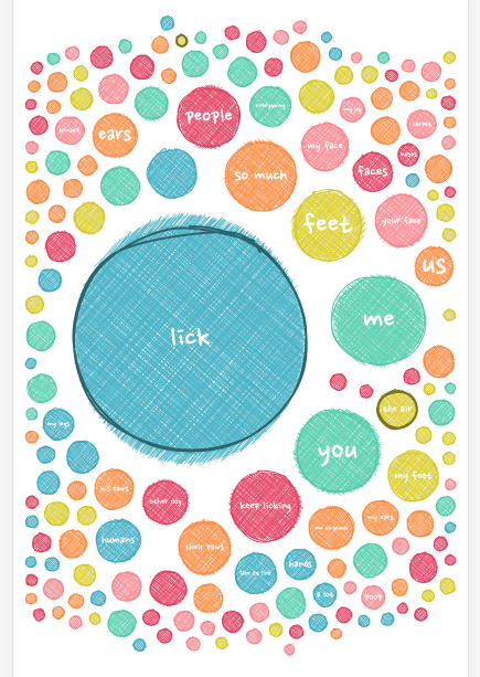
A while later, when I was setting up similar groups for the dog data, I noticed that people really want to know why dogs lick. The enclosing circle was so big that it wouldn’t fit even a decently sized mobile screen. Still not wanting to scale the circles down, I therefore wrote an exception in the code for this particular group; after the circle pack, each circle itself becomes part of the simulation that tries to fit it all in the screen (instead of only the enclosing circles). Resulting in the image below.
Colors
It was high time to focus on colors! I kind of knew that I wouldn’t be using colors for any continuous variable. I had only one of those, the search popularity, and I was already using size for that. I also didn’t really have a good categorical variable to apply color too. Maybe I could do something with the words, such as coloring by the type of word (e.g. adjective, noun, …), but I had learned from my Beautiful in English project that assigning those types would mean lots of wrong automated types and thus a lot of manual corrections from my side. This didn’t seem worth the effort in coloring words by type. It didn’t really add to any increased insight.
So I played around with two other options; coloring the circles completely randomly, why not, or giving the same (but still random) color to all the circles within a group. There was one major benefit from this. Both options meant that the colors wouldn’t have to be easily distinguishable! Giving me lots more freedom in trying to create a visually pleasing palette.
Weirdly enough I only use Sketch when I’m color picking. It’s the main thing I think sucks in Illustrator.
I browsed the web and looked through my Pinterest boards to find inspiration for colors. Slowly building up a few palettes in Sketch to try out on the data.
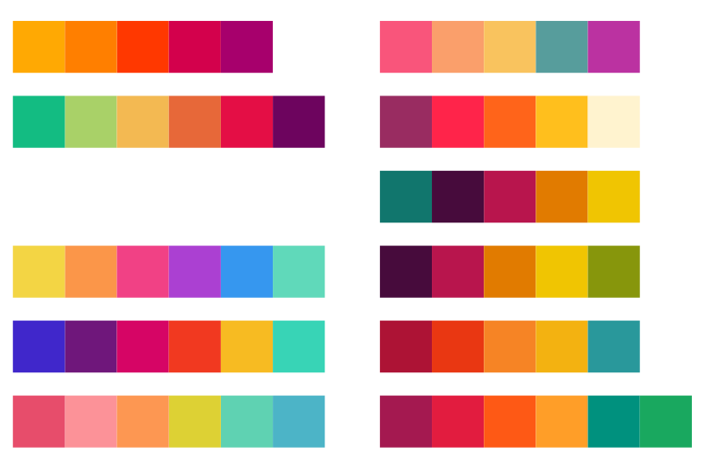
Below you can see some of the color iterations that I deemed worthy enough to screenshot at the time. Funnily enough the last one in the lower right corner, the one I choose, was basically a small iteration on the very first one in the top left ┐( ̄ヮ ̄)┌. But hey, at least after 20+ more iterations I was now pretty sure I was happy with my final palette.
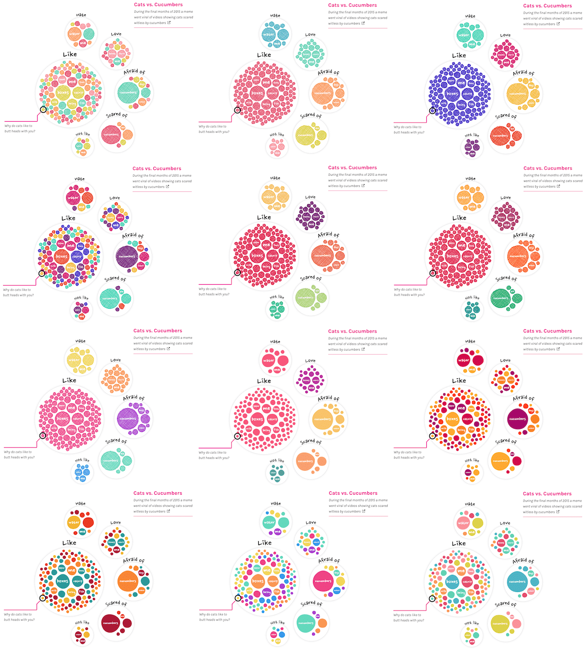
On and off in between the color picking, I’d been fiddling with the interactions as well. There were going to be links in the text that, when hovered/clicked, would highlight a selection of the circles. For example, all the sentences that are about boxes. However, just dimming all the other circles wasn’t making it obvious enough. So I added a white (with black stroked) circle in the background to make the highlighted circles stand out even more. And kind of by accident, this created a really lovely “circle merge” effect if two circles were close together. One of those things you didn’t expect, but once you see it, you know it’s there to stay (•‿•)
Sketchy style all the way
With these circle pack visuals getting more and more refined, colors being there, interactions working on both desktop and mobile, I went on to the hard part; text & layout (◍•﹏•) Saying that I feel like I’m just floundering around when I need to either write about the visual, or have to design the layout of the overall page, is an understatement.
After fiddling for a bit, especially with how I would make the “explanation sub sections” stand out, I came to the conclusion that this wasn’t looking pretty at all…
I wished that I could somehow pull the random, sketchy style of the visuals into the layout as well. While googling for “sketchy css”, or something along those lines, I came across an amazing blog by Una Kravets about the CSS Paint API, also known as Houdini. It’s quite amazing in opening up the possibilities of what you can create in terms of visual layout styles!
If that sentence didn’t make total sense to you, like it was for me, it’s probably best to check out some Houdini examples and be amazed (•‿•) As a bonus for many dataviz people, it’s based on doing things in canvas. Thus for those familiar with canvas it’s really easy to pick up and learn from the existing examples.
In my good fortune, the example that Una explains in her blog creates sketchy underlines, a really good place to start for what I was after. After wrapping my head around the general set-up of Houdini and getting Una’s example working I started to experiment with different styles, eventually settling on one that looks as if someone had scratched/highlighted the bold words with a colored marker.
And even better, there’s a specific rough boxes example out there as well that I could build on. Using exactly the same style as the sketchy circles in the visual made the text unreadable, so I settled on a solid colored background.
Playing with these options and making my own sketchy styles was a lot of fun to do! I ended up making four different layout options. Two of which you can see in the image below. A rough box that can be placed around a text, like in the pink box. And the sketchy background of the bold text. Later I also added a sketchy underline for the titles of each section, and a different kind of sketchy background for the page titles all the way at the top.
One of the wonderful things about Houdini is that it updates to whatever size the divs, h1, span, whatever-you-apply-it-to, are. So you basically don’t have to do anything different on mobile to make it work.
But of course Safari, Firefox and Edge haven’t joined the Houdini bandwagon yet. Gosh, the time browser-specific-adjustments take on a typically project just makes me want to cry. And this became one of the worst.
I have to admit that I was very happy to realize that there was a css-paint-polyfill available. However I guess this one hasn’t been used very widely, because I came across some obvious bugs take took a long time to fix/work around. It also required some non-optimal div-nesting to make the sketchy styles in the *stupid* browsers look at least somewhat similar to Chrome, and lots of barely understandable CSS settings. Still, I dont want to complain, because I’m super happy that it exists in the first place, even if it took some workarounds.
To top it all off, while the page was growing and more and more places were using the sketchy style, and thus using the polyfill in the *aggravating* browsers, it made those browsers sloooooow. In the end I therefore had to remove some of the sketchy styles from the *boring* browsers and only keep the few that made the biggest visual impact. Still sucks that you will only see the page in its original intent on Chrome and Android ಥ_ಥ
Having taken my “layout-design-skills” to the max of what I had in me, I just had to face the facts and realize that I couldn’t design/create anything that would even come close to what you might see in the Awwwards Site of the Day or its likes. So I moved on.
The most asked questions
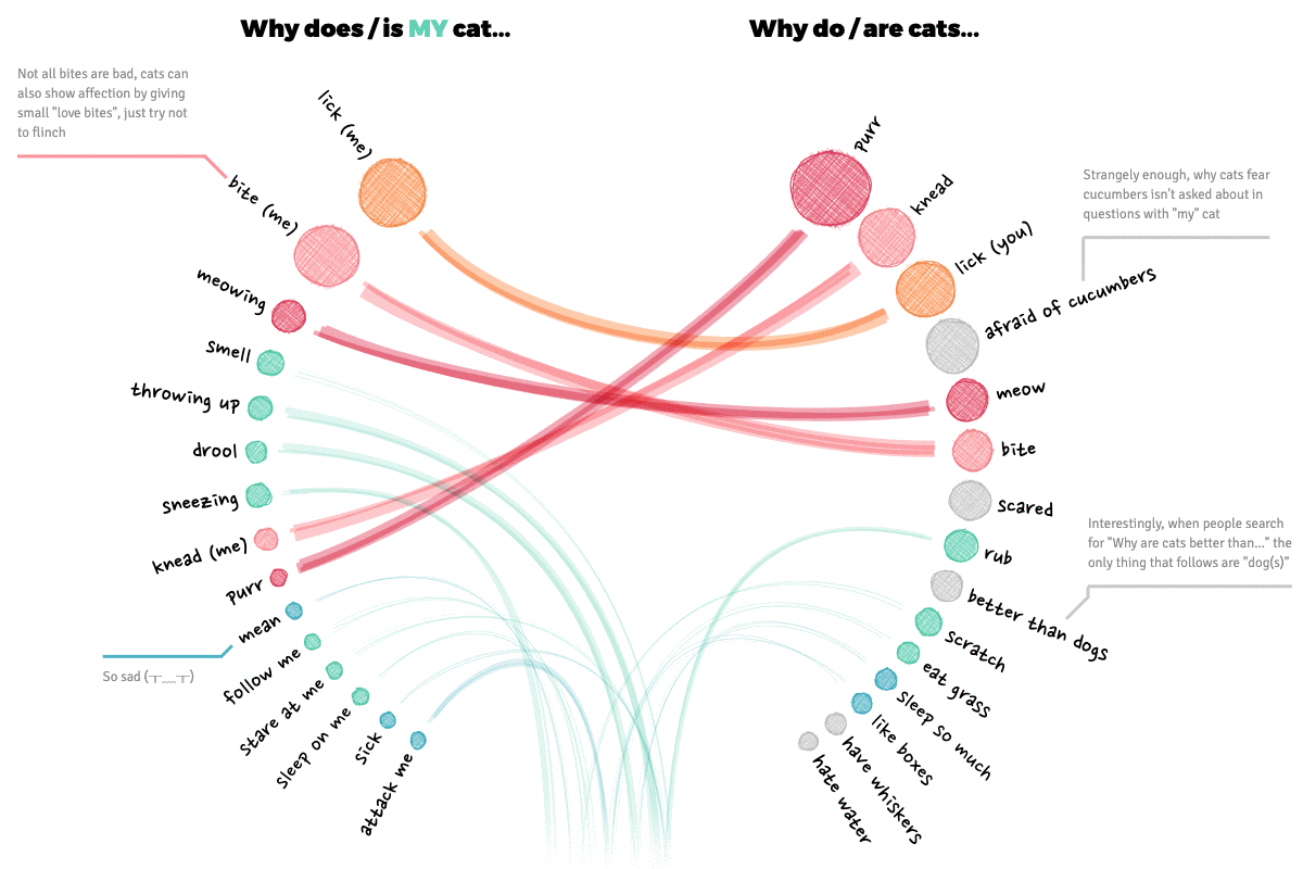
With the circle packing visuals serving as an introduction, and the mini-network visual of all the data roughly ready, I started with another visual that was part of the design; comparing the general and my most asked questions.
My initial design put the top X of the general and my questions across from each other in two semi-circles, connecting those that were the same on both sides. Why semi-circles and not straight lines down? Well, I prefer the look of the semi-circle and it lets you show more data within a specific height than a straight layout. And finally, the circular style fills up more width of the screen, which looks better on a larger screen I find.
Nevertheless, on mobile the circular layout wasn’t going to fit. Therefore, I did place the circles in a straight layout for small screens. By placing the longer text across two lines still left enough space in the middle to draw some curvy lines.
I experimented a little with what type of line to draw. Eventually settling on the idea to make a line thicker if the combined rank of the questions (on both the general and my ranking) is higher. I used the sketchy line option of the rough library, drawing several on top of each other, to create the “sketchy line” I was looking for.
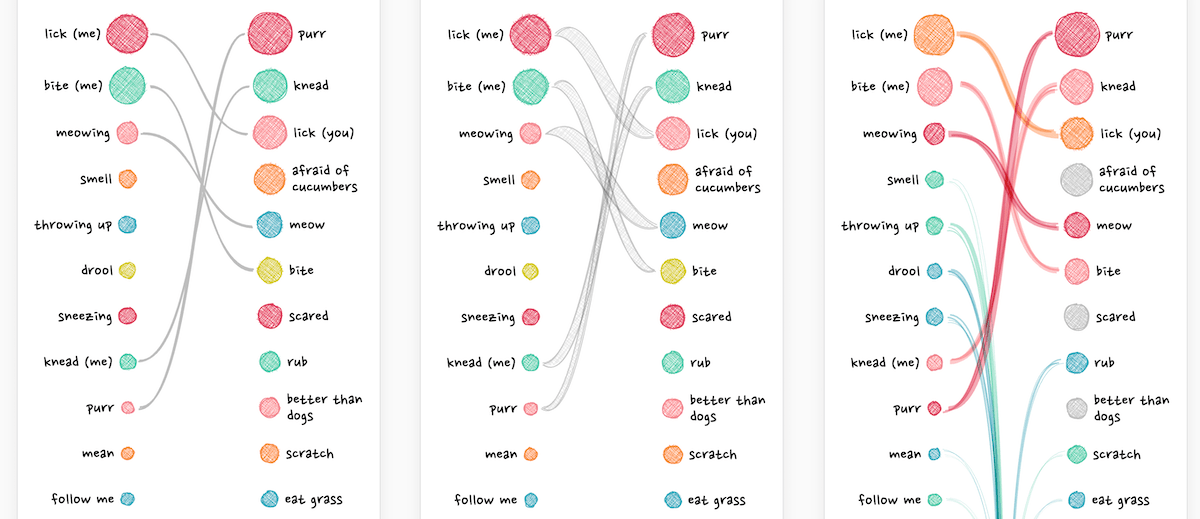
Going back to the desktop version, I had to alter the calculations of how to draw the lines between the circles. And have the lines “go off into the distance” if the corresponding question on the other side was below the top 15 (the blue-green lines).
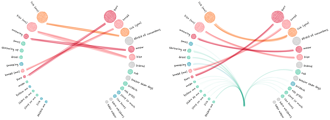
The annotations were created with the d3-annotation library by Susie Lu.
Finally I added some annotations, which become hover annotations for smaller screens, and clickable on mobile screens.
Going back to the mini networks
Now that I had a better grasp on the subtleties of the visual design; the sketchy-ness and colors, I went back to the original mini network visual showing all of the data. Not only to update the style, but to make it more user friendly by adding interaction and a search functionality.
Here is a good and short example of using the voronoi technique with a canvas.
Since I was using a canvas for the visual, I couldn’t use any circle.on("mouseover", () => {...}) kind of code to figure out where the mouse was hovering. But thank d3 again, because this is were the d3.voronoi function is wonderful! I won’t explain it here, I have a whole blog post on the technique, but it creates a (hidden) grid that figures out to which circle the mouse is closest.
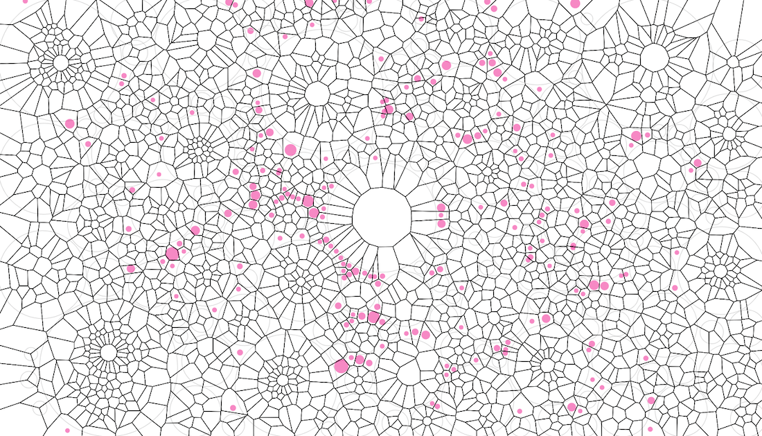
Applying the sketchy style and color palette already made a world of difference in how this visual looked. It just made me happy to look at! Especially with the addition of the cute test image I had gotten from the animator in the center.
For the search box I wanted something that would type ahead / autocomplete; showing you all the possible options that include the letters you’ve typed so far. This quickly brought me to the Awesomeplete library by Lea Verou, which was just a breeze to implement and style.
Running a function on each change in the search box, so even before a user has selected something, I could update the visual on the fly and show all the circles that were still part of the possible options. This way you could, for example, see where all of the questions are scattered that include the word lick (well, on larger screens).
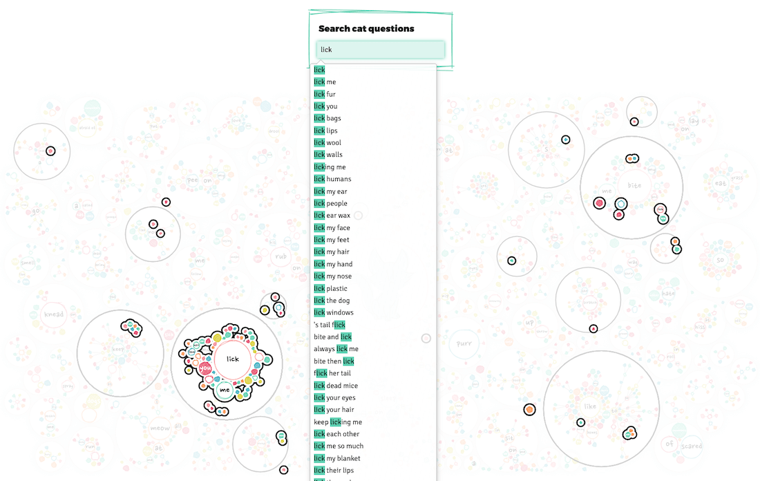
Finally, adding a tooltip that shows what you’re actually hovering. Purposely running below the screen when you’re hovering a rather large branch (instead of trying to make the hovering rectangle wider).
Splitting the page
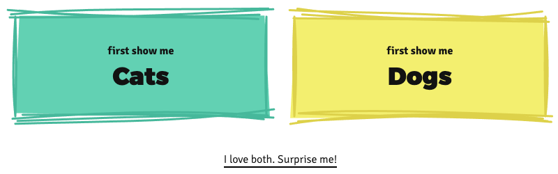
Gosh, awesome to see that you’re still reading! Well, perhaps by now you’ve also gotten the realization that this page was getting rather long. Not this blog post, the original project; with 4 of the circle pack visuals, the full width mini-network visual and the my-vs-general top 15 visual (plus title, intro, other text and the explanation boxes in between). And that was just for cats?! I still had to add the same for dogs o_O
I also asked a few friends for their opinion on whether or not to split. I think they all agreed that it had to be split.
No, that wasn’t going to work all on one page anymore. I just had to split this up into separate dog and cat pages and make a general introduction page that would make people choose which one to see. I did hesitate for a while because I knew I would loose readers since they’d have to click once more before getting to “the good stuff” -_-
Therefore I tried to keep the intro page really short. Explain just enough to make people (hopefully) interested to know more, and then have the cat and dog button be as big and bright as possible.
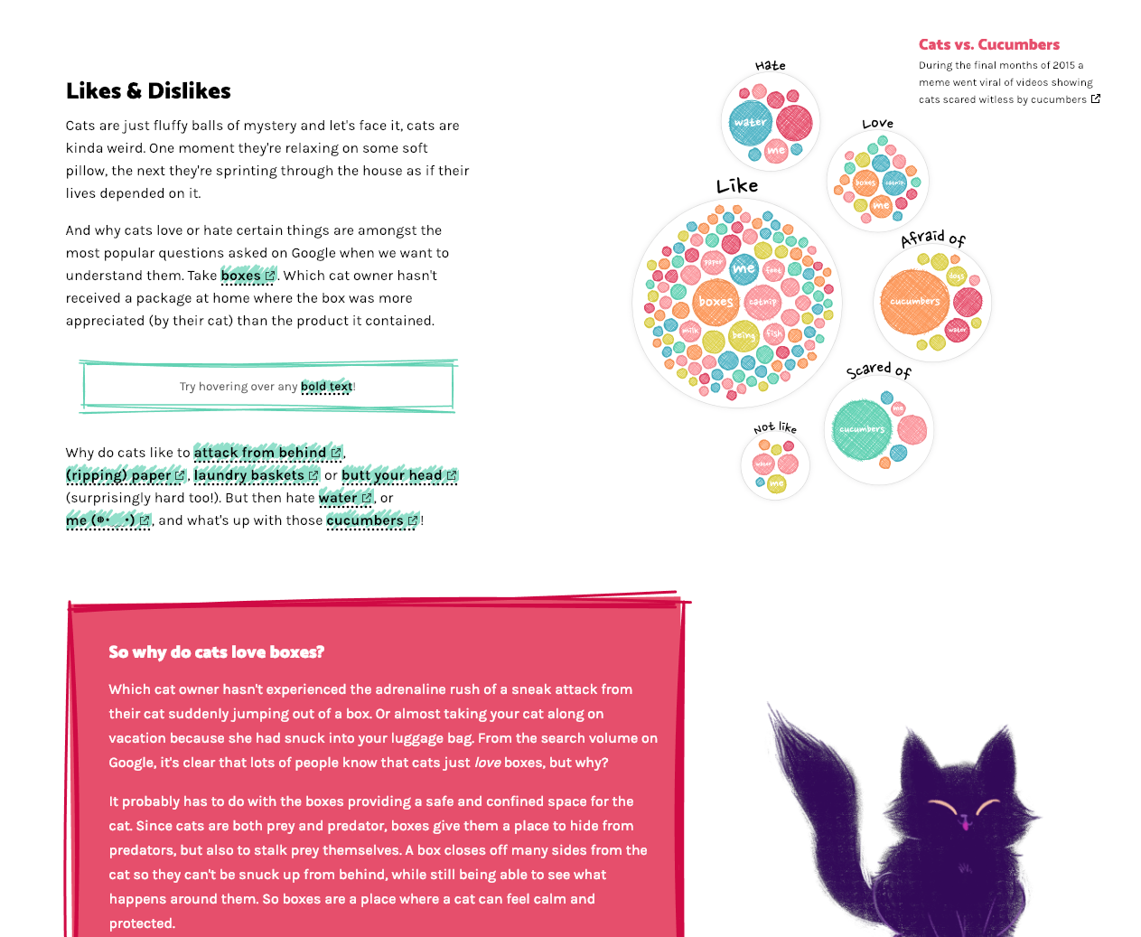
Cat versus dog popularity
Yes, search popularity isn’t nearly a perfect way to say which countries veer more towards cats or dogs, but it’s a start.
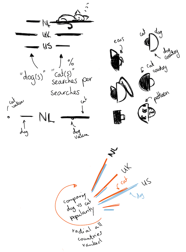
Almost done with the visuals, just one more to go. This was still a remnant of the original design, where I wanted to end the page with a quick look at the overall search popularity of cats and dogs, split per country. To sneakily be able to say something about which countries were cat countries or dog countries. However, with the pages now being split, it functioned more as a way to tie in to the other animal and show the “go to other animal” button right after.
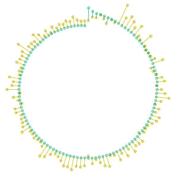
I made this one while on (yes, another) vacation, this time to South Africa during March 2019. Comparing cats and dogs made me think of visuals along the lines of dumbbell plots and slope charts. The upside of the dumbbell plot was that I could show all of the ±115 countries for which I had received data. However, with 115 countries that would become a very high chart, not ideal…
Well, I could cut that height in 3-ish by mapping the dumbbells along a circle instead. Yes, that would make it more difficult to compare across countries. However, I felt that being able to see all countries on the screen, sorting the countries to help with comparison, this chart in general not being that important, plus people generally like the visual appeal of circles more, outweighed the downside of it not being easy to compare across the circle and having to tilt you head to read country labels (plus, I didn’t want a very long but narrow plot either).
So I set about plotting some dumbbells along a circle.
Slowly adding in the background, axes, country labels and such. And as I also did for the Baby Spike visual, I added a background circle with a soft outer glow to give at least some “enclosure” to the chart.
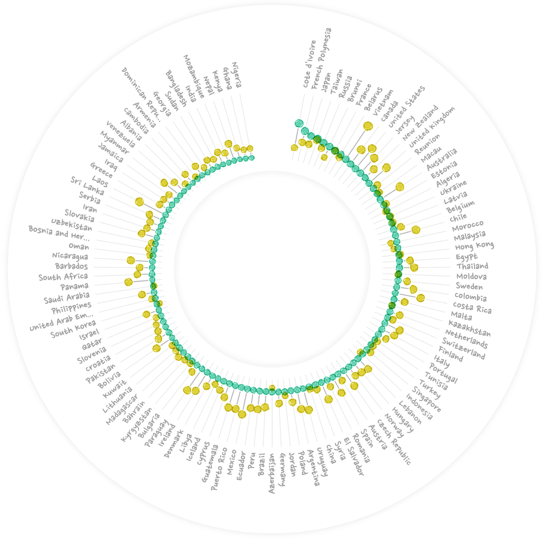
Adding a title. Having darker bands to act as gridlines, and moving the country labels outside of the “outer-glow” circle to make the visual a little more compact.
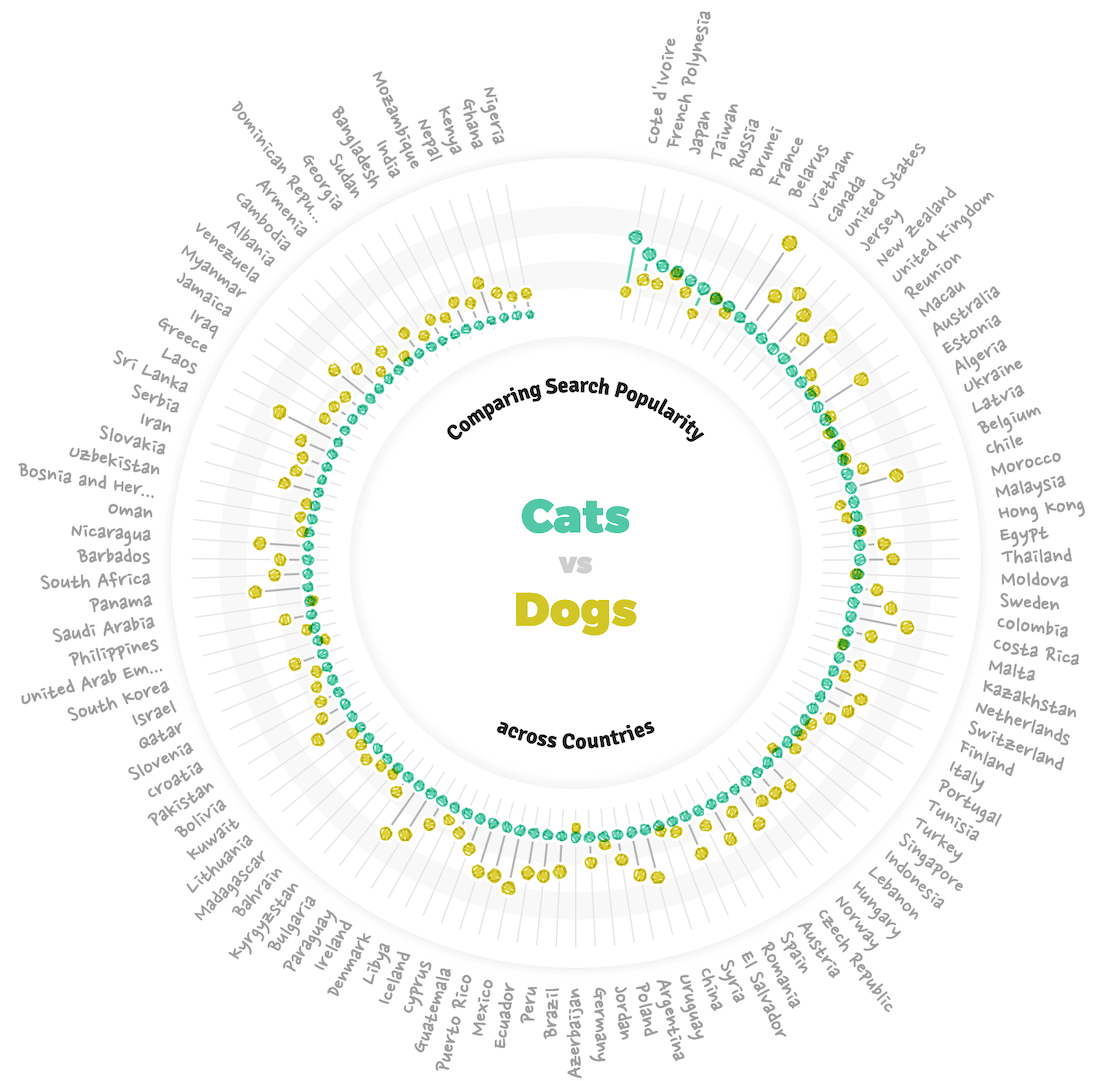
“Interesting” being defined by whether you’re looking at the visual from the cat or dog page.
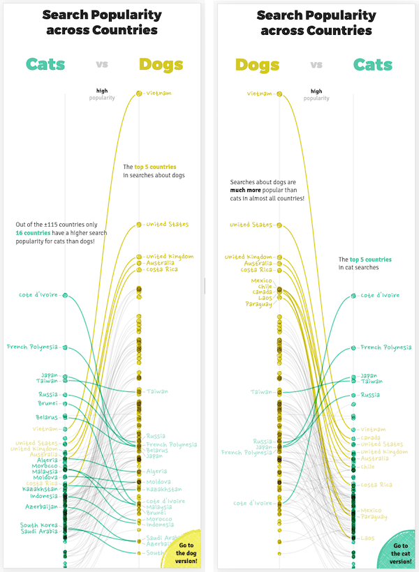
Of course, as usual, this layout wasn’t going to work for mobile screens. I still didn’t want to make a straight dumbbell, due to the height it would require. So instead I went for a slope chart approach. I knew that would mean many overlapping lines and point though. But after considering I decided to only highlight several “interesting” countries and have the rest function as “context” for that.
I did need to figure out a non-label-overlapping function for the country names. Which (unexpectedly) created a bug on the smallest of screens when that function was stuck in an infinite loop because there was no non-overlapping solution -_- Easy-but-not-perfect-fix: make the chart at least X pixels high.
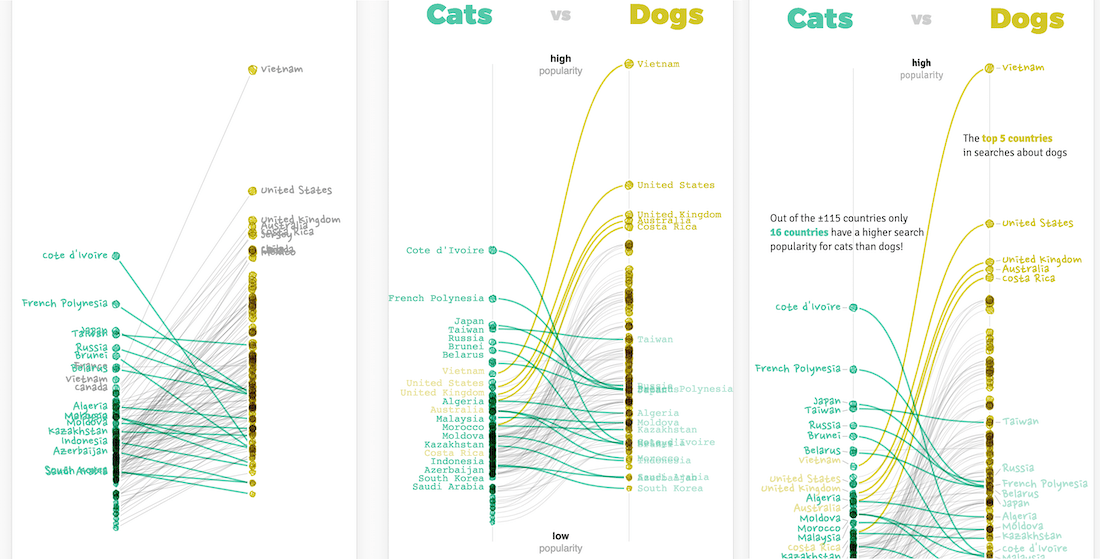
Some more detailed changes (e.g. create an actual gap in the top to place the axis labels) in the desktop version, and this visual was done! (Well, apart from implementing hover interactivity, adding click areas to be taken to the corresponding Google trend page, etc etc…)
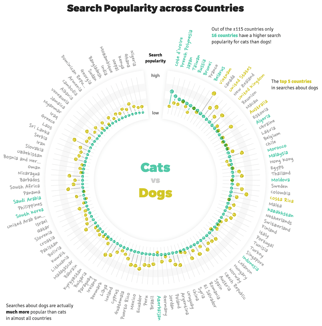
Perhaps you’ve noticed how the visual is (slightly) different depending on the page. Apart from swapping the side of the animals, it looks at the data from the cat perspective on the cat page and dog perspective on the dog page (•‿•)
The stuff you don’t see
And we’ve finally reached the end! But even though I’ve taken you through the design process of the visual stuff, in between many many hours were spend on things that you don’t necessarily see or notice. All those different fonts I tried for the chart, body and title text. The time that all those hidden annotations took to assess, prepare and place. The complexity of getting the different interactions working together correctly; with different scenarios on mobile versus desktop. Having to check so many different screen sizes and devices and making adjustments when something didn’t fit on the smallest of screens (over and over). Bugs, bugs and more (browser) bugs. Improving performance to make the page load faster, this list can go on for a while…
I guess I just want to say that even in a data visualization project on the web, which is quite visual, so much more (boring, aggravating, time-consuming) stuff goes on that you never truly notice from just the final result, and that I don’t want to bore you with in this (already excessively long) blog post 。^‿^。
Amazing animations
About those adorable animation. In the same conversation between me and Alberto that we decided on the topic of pets, all the way at the start of the project, we agreed that we wanted to add cute images or animations of the pets. So once my design had been approved a few weeks later I send out a tweet asking people for references on who to hire.
And the response was overwhelming! So many lovely people were being recommended or reached out themselves. I was drowning in talent that I could hire. In the end it was so difficult to decide who to pick! I slowly made the list of people smaller who’s style I liked the most and fitted what I had in mind for this project.
Juliana Chen jumped out for me because she combined this cute, sketchy style with adorable animations! I mean, just look at the Magic Cat Academy animations and I don’t think it’s possible not to cry when watching Stay. She was one of the people that had reached out to me herself, so it was easy to keep the conversation going and soon we were working together on the pets project (ノ◕ヮ◕)ノ*:・゚✧

And I am SO in love with the final animations that she created!! They really add a lot of warmth and smiles to the page and I’m sure lots of people are only scrolling through the page to see the animations ♥‿♥

I only told her how many animations I wanted, the aspect ratio of them, and in terms of style that I was looking for something quite sketchy and using the same six colors as the palette of the visuals. We brainstormed roughly about what each animation would show (she then refined the idea into something adorable), which ones would fit the data. And then she just took that and flew with it!

Yes, I’m very happy that Juliana reached out to the tweet! ^_^
Final thoughts
And of course there were stressful moments too, there always are.
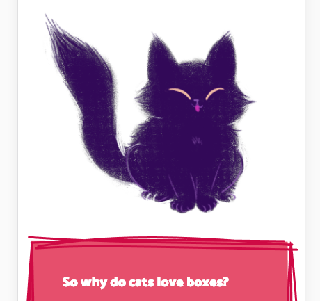
I truly love cats and dogs, although I’m a little more of a cat person seeing as how I own an adorable black kitty with white sock ฅ^•ﻌ•^ฅ So it’s been an utmost joy to work on this project! Yes, it’s taken about 100% more hours than I initially expected, but the data was just so much fun to investigate and I couldn’t help myself from visualizing lots of different aspects.
People will probably say that the page is too long (like this post). But if you’ve seen some of my previous projects, you might know that I love creating visuals specifically for the “fans”. Whether they are LotR, Dragonball Z, or crazy about cats and/or dogs in this case. I love giving the people that are truly interested the means to have fun exploring different facets of the data, to discover multiple stories and weird exceptions. I hope this project as succeeded in providing that platform for them.
And I hope this blog has been an interesting read for you! To see how the final piece came together from many tangents doomed to fail, but where some parts of it were useful later on. That there are more than enough parts where I’m never truly happy with the final result, but that there are also lots of things that I’m proud of (so if you feel the same way about your projects often, you’re not alone ^_^).
Bloopers
Can’t end without some “after credits” stuff these days right? So enjoy the bloopers! (I have to admit, they’re not as good as I hoped in hindsight ಠ_ರೃ)
This first video though… I still don’t know what was going on there… ¯\(°_o)/¯