For me making a data visualization look good and be effective on both mobile and desktop is one of the most difficult aspects of my work (next to browser bugs, implementing interactivity and optimizing performance). Although there is no “one-size-fits-all” solution I have found several different options across past projects that work for me.
From doing nothing all the way to creating a different chart for mobile and desktop. I’ll share and explain these and many more examples in this blog. Hopefully they can act as an inspiration for how you might tackle your own dataset and visual.
Bar charts and the other “more straightforward” charts are amazing! It’s just that it’s not what I enjoy making myself.
I think that a big reason why the mobile-desktop dataviz is quite difficult for me is that I just really like creating BIG and intricate visuals. Using lots of data and giving people the possibility to see the main story from different angles. In short, I like a big canvas, and my clients don’t hire me to create a bar chart.
The examples are more from a “big to small” screen direction, which stems from my preferred way of designing, but I believe the abstract lessons work for a “mobile first” approach too.
I’ll start from what I think is the the easiest option and go into more and more complex approaches. Some of the first ones aren’t necessarily good, but in some cases they might just be enough of a fix.
tl;dr or you can just jump down straight to the summary of all the techniques.
Note you can use the devTools (I’d suggest Chrome) to quickly switch between a desktop sized screen and a mobile one. Not all of the examples below have a good resize function (they assume that people don’t resize that excessively) so you might have to reload the page after switching between sizes if things don’t seem correct.
Do nothing
Like I warned you, this first option is not even a solution. However, there are times when taking mobile into account isn’t needed. I’ve done several projects where the final visual was going to be seen on my client’s internal environment. And those are usually not visited on a mobile phone. Another example was a website with several visuals in scrollytelling style that my client would use in face-to-face presentations. Again, this was never going to be seen on a small screen, thus I didn’t take that (and even resizing) into account.
Therefore check with your boss / client / yourself if a mobile “version” is truly needed. And be sure to make them aware of the complexity, time (and extra money) this will take.
Vice versa, maybe you don’t need a separate desktop version! ಠ_ರೃ
From a personal perspective, I just don’t like taking mobile screens into account. So most of my personal projects follow the “do nothing” approach (*^▽^*)ゞ Such as many of my data sketches projects, like Figures in the Sky, Royal Constellations, Olympic Feathers and My Life in Vacations. The main reason being that I made them for the sheer fun of things, and therefore didn’t want to feel constrained by having to think about mobile screens (or spend any time on it).
Thankfully, even though the page loads on mobile with the text looking teeny-tiny, it is still possible to zoom in to read some text.
A way to achieve this “scaling down” of the website until it fits in width is actually done with changing / adding one line of code in the head of your index.html and then fixing the width of your charts (e.g. say that the chart is 1200px wide, always).
<!-- Below is the more commonly used "viewport setting -->
<!-- <meta name="viewport" content="width=device-width, initial-scale=1"> -->

<!-- Instead, make the page scale to fit --->
<meta name="viewport" content="user-scalable=yes">
I have to admit, I’m not totally sure if this is the correct way of doing it, but it usually works for me. I believe it might also be enough to set no viewport at all and just fix the sizes of your chart…. I think….
Image on mobile
This is very similar to the one above. However, when the screen gets too small, you don’t even bother running your visual function to create the chart, you show them an image of the chart instead. This can save a lot of browser calculations, making the page much faster to load.
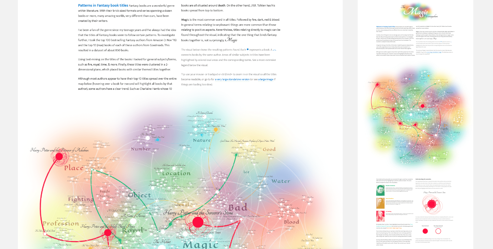
I’ve used this once for a client who didn’t have the budget to invest in a mobile version and for whom it was much more important to have a good and impressive desktop visual of their data to use at a press release and subsequent in-person presentations (the visual was also placed on their website, where I added the “image on mobile” approach).
“Magic is Everywhere” was heavy due to the many objects to draw (the circles, tiny dots, connecting lines and swooping arcs), plus the large use of the SVG blur filter on the background colors.
When the visual never changes ratio or shape, such as in Magic is Everywhere, which was also a heavy visual to draw in the first place, showing on image on mobile made most sense to me. Having the interactive options to hover the lines and books wasn’t an added value on a small screen. With the image there the viewers could still get a sense of the total visual and zoom in (by pinching) to see the smaller details.
A simple way to show a place-holder image on small screens only is to use a CSS media query, and giving the image a class that is hidden on larger screens.
@media screen and (min-width: 400px) {
   /* hide it on screens larger than 400px wide */
   .hide-on-desktop { display: none; }
}
Be sure to also check the screen’s width with Javascript to determine whether or not you should run the chart function. Something like the code below (although there are many ways to go about this, for example, there are many widths available).
let small_screen = document.documentElement.clientWidth < 400 ? true : false
if(!small_screen) {
    //run visual function
}
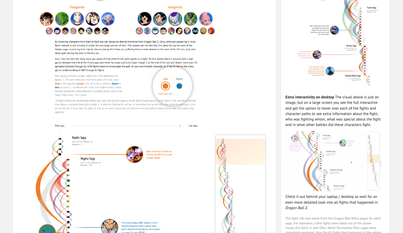
As yet another data sketches example, for the All Fights in Dragon Ball Z visual I tried enticing people to the desktop version by also showing a small video of the interactivity available on larger screens. I totally don’t know if this convinced anybody though (ー_ー﹡; )
Position is arbitrary
It does help if the largest “object” to pack is smaller than the smallest screen you’re taking into account.
We’re finally getting to a true solution, although this one really depends on the visual itself. There are cases when the exact location of the data on the screen is arbitrary. For example, with the more force (clustering) visuals. You can therefore use the available width of the screen or chart container and use as much height as you need to pack in all of the visual “objects” (such as circles).
For example, I’m packing about 300 circles in tightly in this Mini Network Packing visual, always using the entire available width. This results in a small required height on desktop and larger height on mobile.
This example that clusters exoplanets by Mike Bostock could also follow the same approach to make all the exoplanets fit on a mobile screen without having to scale down the circles. And networks in general can be constrained by a “bounding box” to make them fit inside whatever width and/or height you determine.
Typically, in these cases, the approximate area of the visual stays the same. Once you’ve determined a width x height that works well, you can use these base numbers to calculate an initial height “guess” for any other screen size.
//Earlier tests showed that the visual fits nicely with these dimensions
const base_width = 1600
const base_height = 900

let width = document.getElementById("chart").clientWidth
//Using the base dimensions & known width, make a guess for the required height
//assuming that the area remains the same:
//width * height = base_width * base_height
let height = base_width*base_height / width
The nice thing about the examples above is that you basically don’t have to do anything “special” for mobile. Once it works for a specific width it should work for any width.
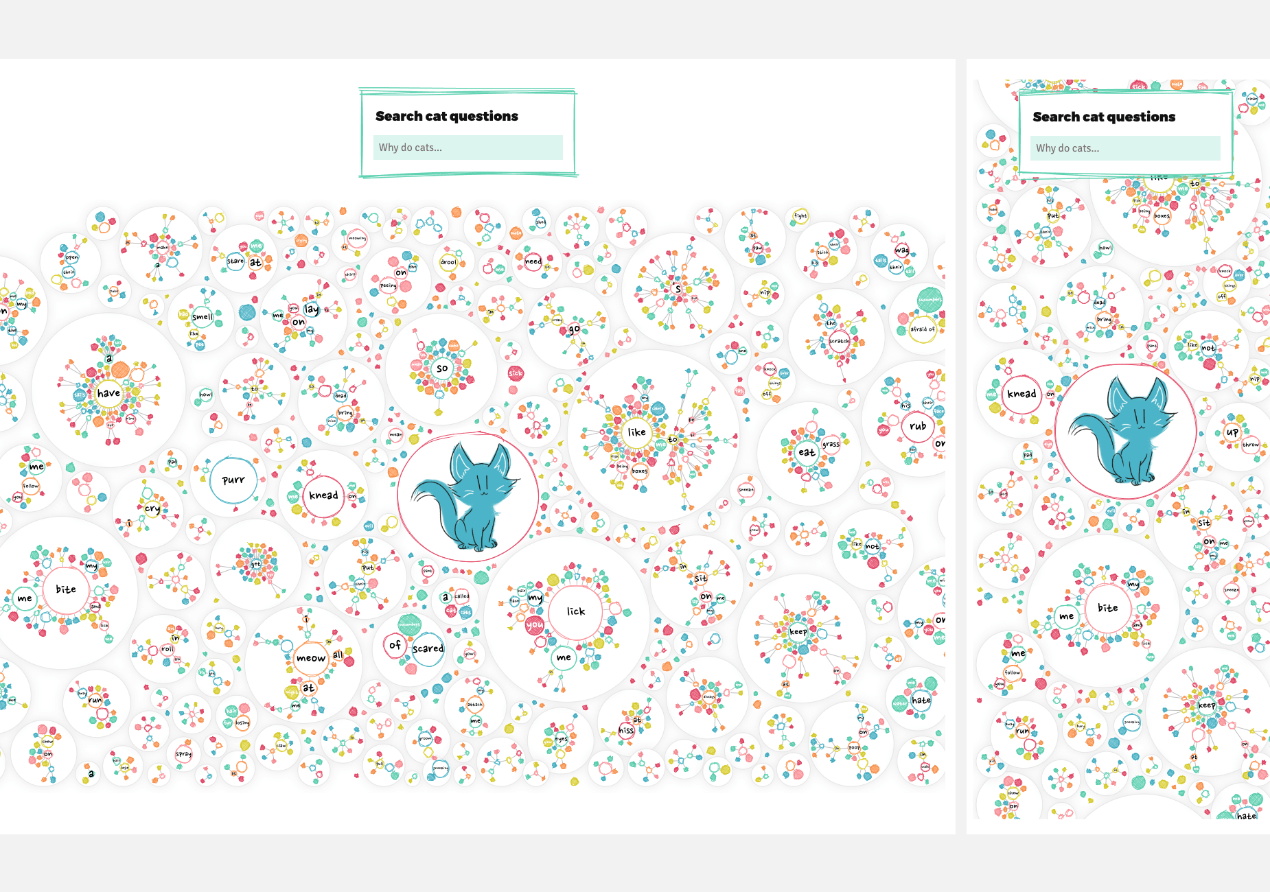
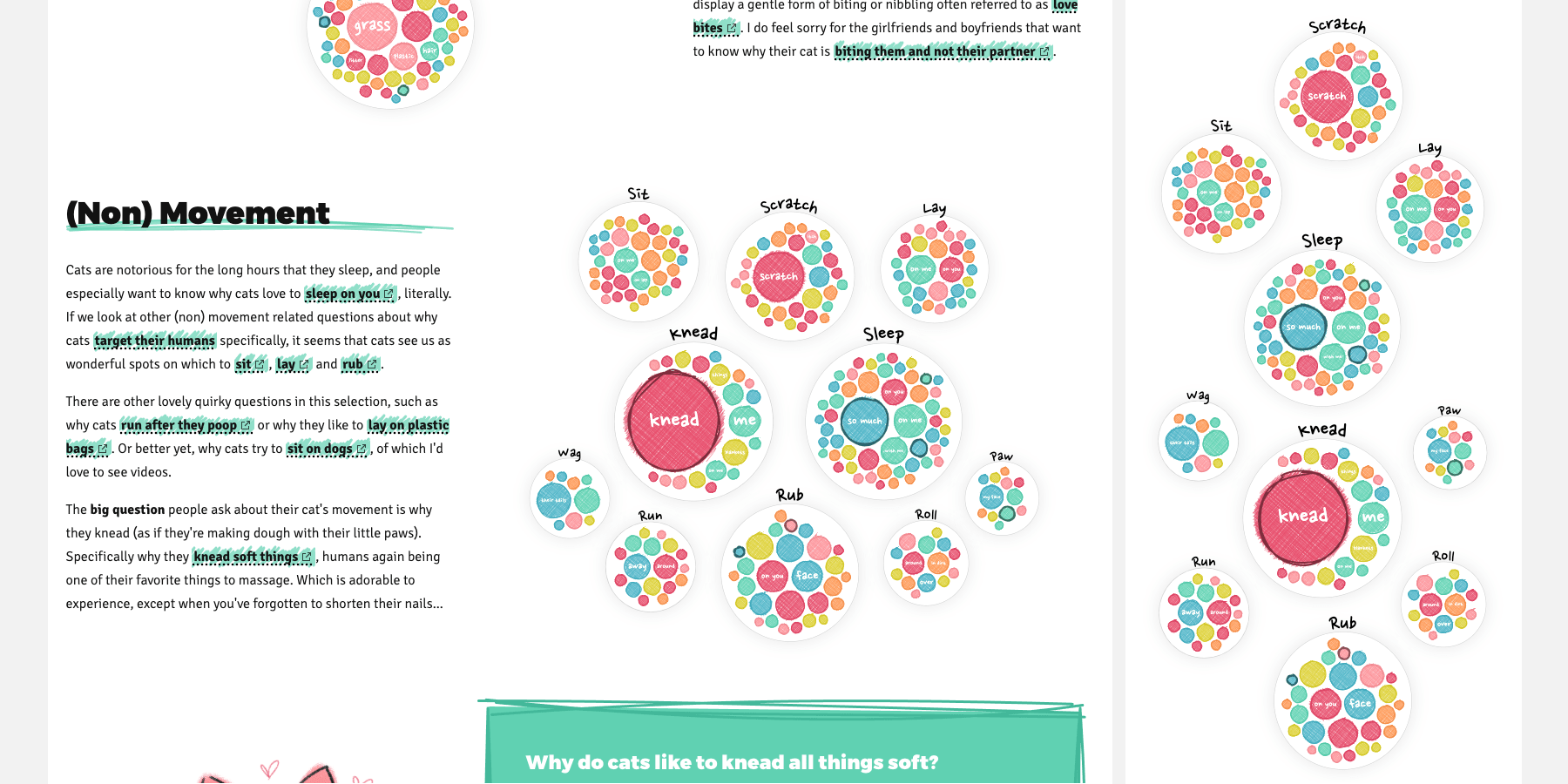
As another example (from the same project as the mini networks) are the very first visuals on that page. These show larger circles with small circles inside them that all have the same word in common (e.g. all questions contain the word sleep). The exact placement of the larger circles (or even the smaller circles inside each enclosing circle) are arbitrary. However, I applied a circle packing approach to have a visually pleasing grouping, from largest to smallest, in a circular pattern.
When the screen gets too small, I apply a force simulation with a “bounding box” to jiggle the circles up and down from their original “circle pack” location to one that makes them fit the available width.
The exact code to do this really depends on your situation.
Afterwards you can refine your SVG or canvas height (after having run your code for determining the (updated) x and y locations) by calculating the object that is placed highest and the one that is placed lowest, and adjusting the chart’s height now that you know the actual required height.
//Find the minimum and maximum height after you've placed the data
let height_min = d3.min(data, d => d.y - d.r)
let height_max = d3.max(data, d => d.y + d.r)

//Next update the chart's height, reposition your data up and down
//if needed an/or run a resize function internally
height = /*etc*/
Size is arbitrary
Sometimes merely using the available width (and / or height) is enough, because the visual works on any screen size, such as with my Marble Butterflies project. Although I guess this particular case is more “data art” than dataviz, so I’m not sure this is ever the case for a chart that tries to teach people something ಠ_ರೃ
Scale down
Just scaling the whole chart down to make it fit can be a simple strategy, but it really only works for charts that were pretty narrow to begin with. However, for the right charts, this can be an easy and really good solution.
Some things don’t need to be scaled linearly, such as line thickness or font size.
Apart from scaling down the entire SVG or canvas, you can also use something like a scale_factor variable that you set at the start and all positions and dimensions are multiplied by it. The latter gives you more refined control on exactly what you want to scale and by how much, but you might end up applying the scale_factor variable to many places in your code. It works, but it ain’t pretty code.
const base_width = 1600
let width = document.getElementById("chart").clientWidth

//The scale factor determines how much smaller the visual needs to become
//In this case I also never want it to become bigger than the base
let scale_factor = Math.min(1, width / base_width)

//Now apply the scale factor to all things that have to do with
//sizes, dimensions and locations, e.g.
data.forEach(d => {
    d.r = d.r_base * scale_factor
})
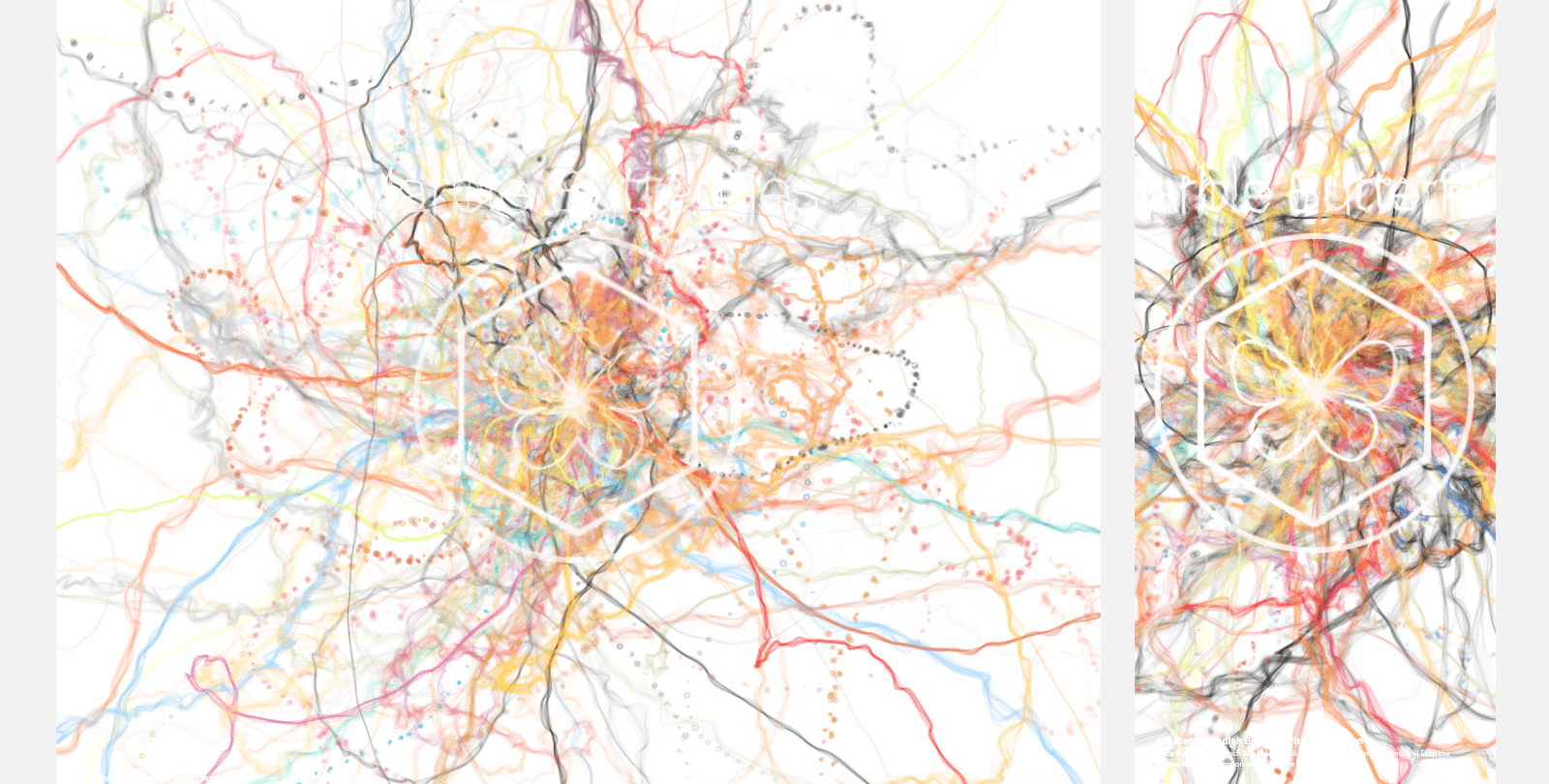
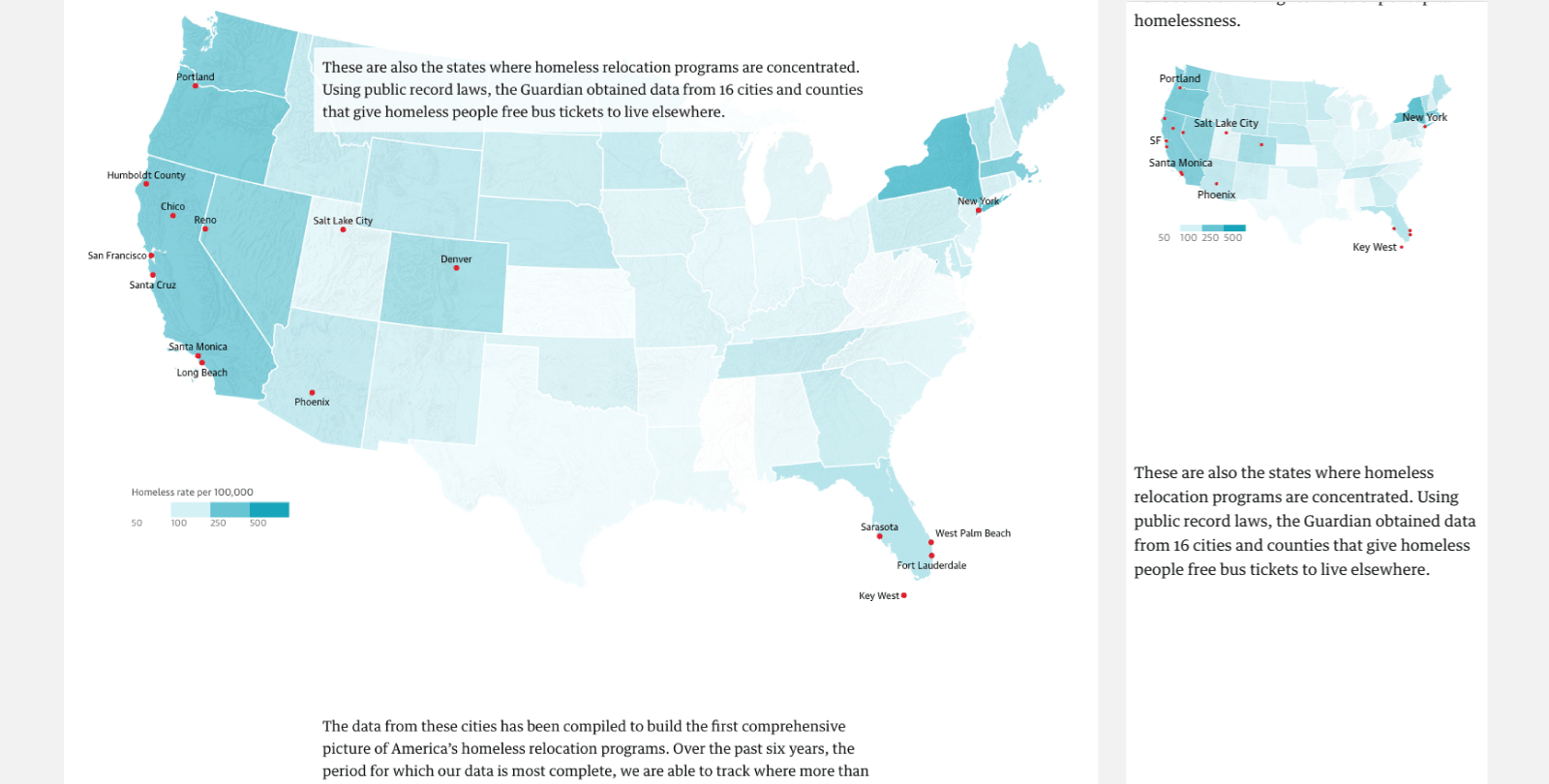
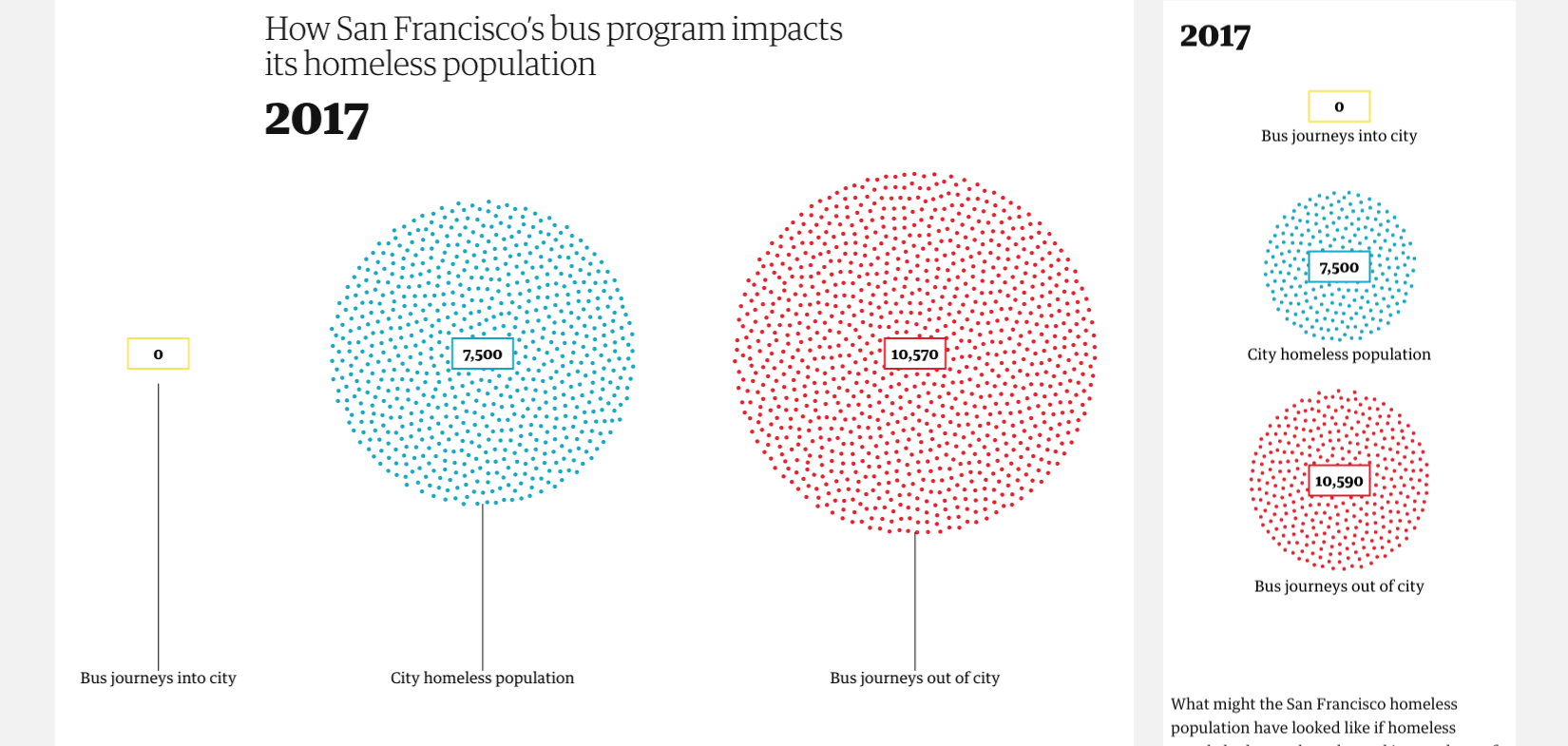
I’ve used this down scaling approach in all three visuals that I created for the Bussed Out article from the Guardian, about how homeless people are being bussed around the US.
All three of the ‘Bussed Out’ visuals also use a non-linear down scaling for the font-size to make sure that it doesn’t get too small or too big. In those instances, I often end up using a font_size_scale linear scale variable with d3:
//Let the font-size depend on the width (here between 320 and 800px)
//Clamping it to min 10px and max 20px in font-size
const font_size_scale = d3.scaleLinear()
    .domain([320, 800]) //based on width
    .range([10, 20])
    .clamp(true)
Instead of completely hiding annotations, you can also turn them into small “badges” that reveal the text on a hover or click. See this example by Susie Lu.
While scaling down, you can also hide parts of the visual when the screen gets too small for them to have any use. Such as shortening or even completely hiding textual annotations. In the example below of the map from the ‘Bussed Out’ article only a few of the city names are still shown on small screens (San Francisco having been shortened to SF). Furthermore, the title of the legend is also no longer shown because the surrounding article text also explained this. Besides hiding or adjusting text you could also think of hiding other non-critical extra elements, such as images, icons of gifs that surround a chart.
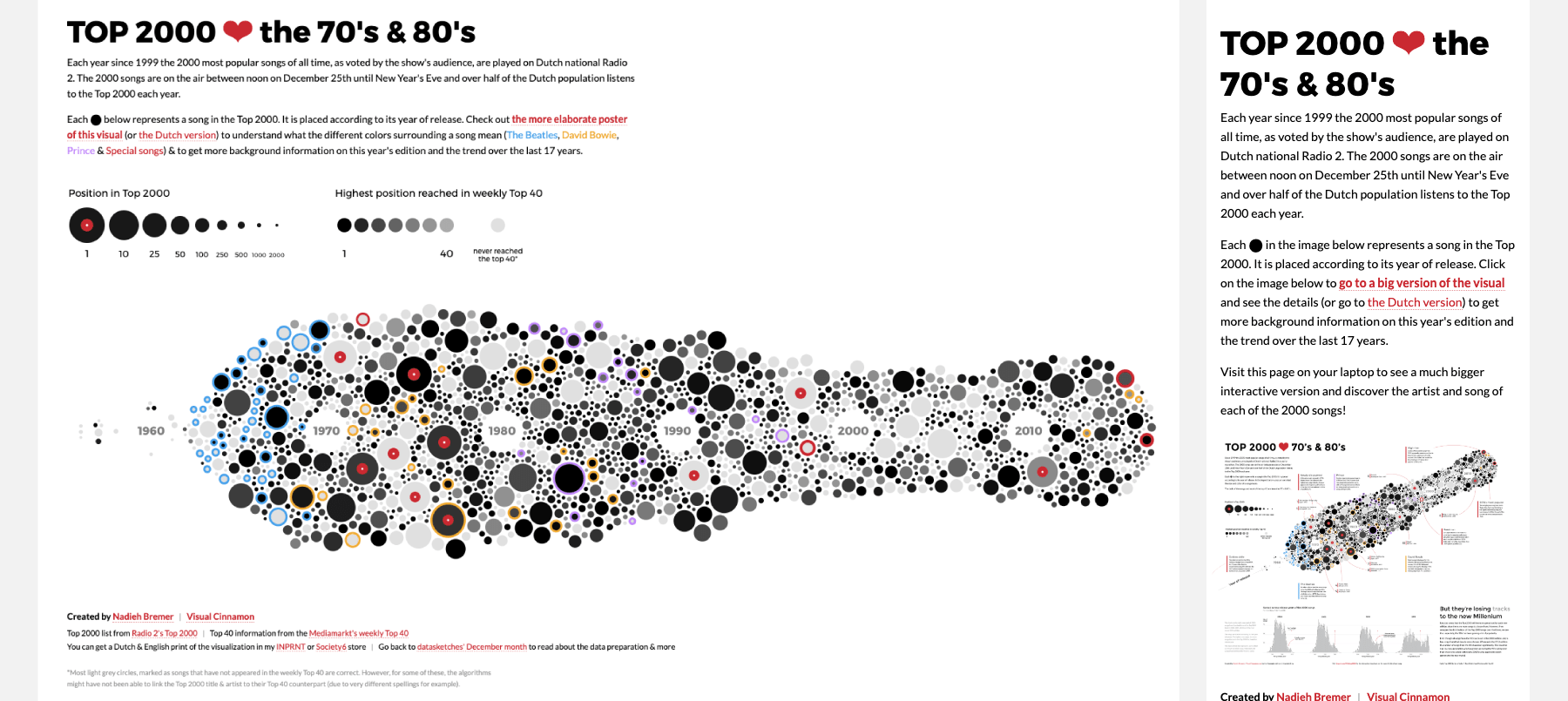
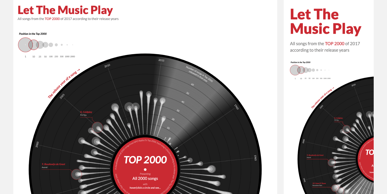
Finally, you can scale down until a minimum predefined width, but no farther (because that might render the chart completely useless). This effectively looks like the “Do Nothing” approach on mobile, but at least it does take most desktop resolutions into account. I’ve applied this minimum width technique to my Top 10 Baby Names and Let the Music Play projects.
Fit to the available width
This is very similar to scaling down, except that you really only scale down the width and horizontal aspects, but keep the height and vertical parts the same as on desktop. I see this approach very often while looking at works done by other people, but I was surprised to find that I’ve hardly used it myself.
I had to go back a few years to a project that I did while still working as a consultant at Deloitte. The visuals are about the housing market in the Netherlands. I’m afraid the text is in Dutch, but you don’t need to be able to read it to see what happens between desktop and mobile sizes thankfully.
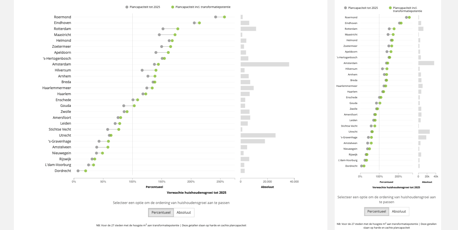
The project shows three charts, each using slightly different approaches to go between mobile and desktop. The map of the Netherlands scales down (both width and height) to fit into the available width. The treemap and dumbbell plots use the available width, without (really) updating the height, to fit themselves on the screen. However, there is of course also a maximum width after which they don’t become any wider.
Stack vertically
Another technique that I see quite often online, especially from newsrooms, but I apparently don’t use often myself. This approach uses some form of a horizontally oriented grid on desktop, but stacks things (more) vertically on small screens. It shares DNA with the “Position is arbitrary approach” except that now the data/clusters are positioned very specifically according to a grid. Order can still matter, as is the case in the example below from the ‘Bussed Out’ article (created by my amazing partner on that project Shirley Wu)
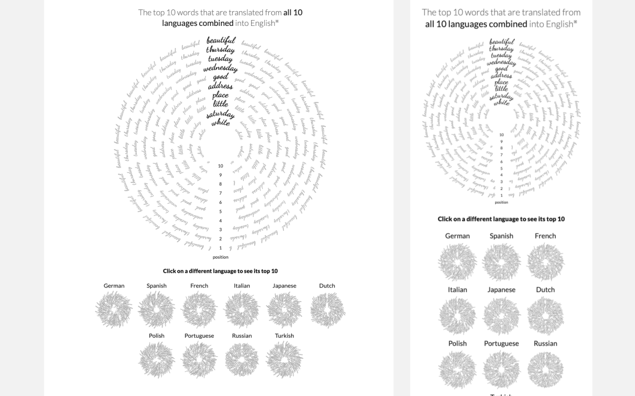
The small circles in the ‘Top 10’ tree-ring like chart from my Beautiful in English project don’t get smaller on a mobile screen, but instead stack themselves into more vertical grid. Although you can use JavaScript to calculate how wide of a grid might fit on the available screen, using CSS with flexbox or CSS grid can work miracles too. The CSS approach will mean that you have to create a separate SVG for each of the mini charts that you want to place in the grid. Not necessarily bad, but something to keep in mind.
Zoomable visuals & starting zooms
If your visual is using a zoom interaction then you might be in luck. Perhaps the only real change you need to do is make the initial zoom scale smaller on mobile so the visual approximately, nicely, fills the screen. To make it more general, you’d need a function to figure out what initial zoom scale would create a nice fit no matter the screen size.
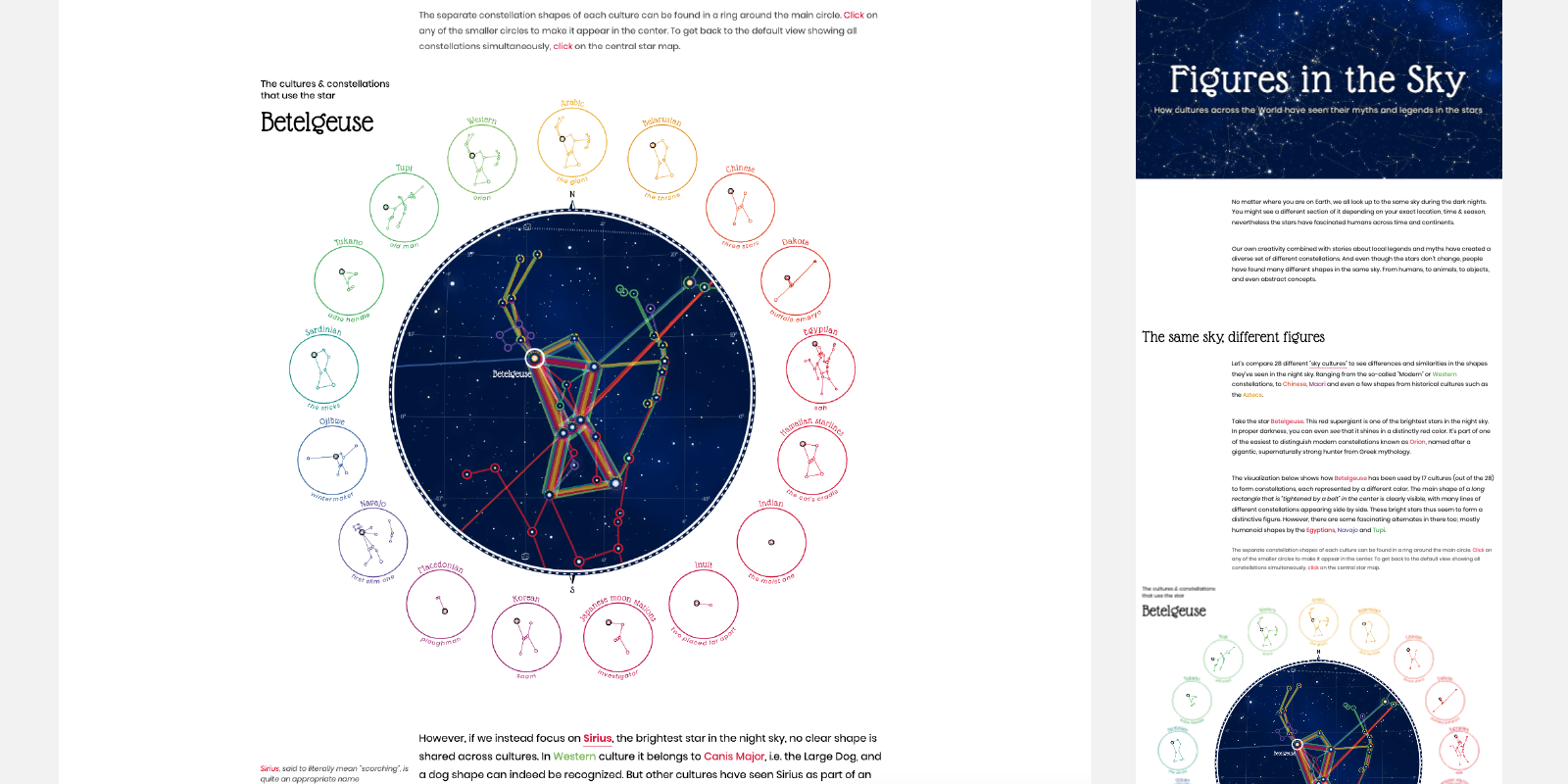
I used this approach for the main “Constellation” visual about our Intangible Cultural Heritage made for UNESCO. This visual would be heavily reliant on being able to zoom and pan because there were so many connections and datapoints to plot. The visual would have to show the main overview, but give people the opportunity to zoom in and inspect the smaller details.
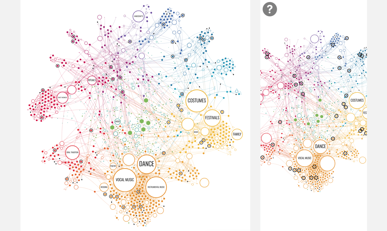
Well…. it appears that what the image above shows isn’t what happens when you actually go to the link on mobile (ー_ー﹡; ) After looking into my code it seems that figuring out the optimum start_zoom level is something that was taken out of the visual function and had to be set from the outside (similar as if you’d set the height or width in advance). I’m guessing that my client hasn’t implemented a function to calculate the start_zoom when they added the visual to their own environment in the busy time we had before the launch of this project, meaning that it falls back to a default value. It was more meant for exploration on desktops. Anyway, the image above shows the idea as I had intended.
Reposition the data
This seems to be one of my preferred approaches. It comes down to placing your data in different (but very case-specific) locations for larger and smaller screens. In essence changing the layout while being able to reuse many aspects of the underlying code.
Actually, having been able to mathematically determine the position of the circles for one of the three options (2,3 or 4 circles wide) was already 80% of the effort to then being able to figure out the remaining two options.
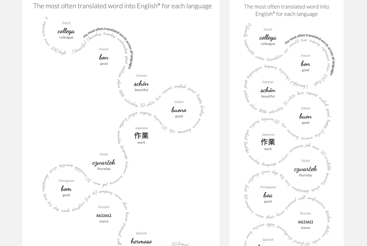
As a bit of an unique, but very appropriate, example; for the Beautiful in English project I strung together the most translated word for the 10 chosen languages with a string representing the 100 most translated words overall. The layout was based on the “language circles” being placed along a line that would zig-zag down. However, this layout can have an arbitrary number of “circles” being placed along the zig-zag before it would change direction. I could therefore use the available width to calculate how many of the circles would fit, and use that info to make the zig-zag either 2, 3 or 4 circles wide.
Mathematically, figuring out what the logic was that would determine the new center positions of the circles, and especially changing the “word string” between those 3 options was a fun challenge, but that was truly the only thing needed to make this visual fit all screen sizes.
People just like circles ^.~
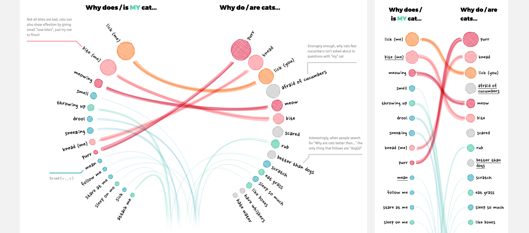
For my recent project Why do cats and dogs …? I wanted to compare two different “top-15” lists, to see the overlap and differences. On desktop I could use the width to make the layout into two semi-circles. That meant it needed less height, and thus fit more easily on any desktop resolution. Plus, I also liked the visual appeal that it gave. On smaller screens I changed the position of the 30 circles into a more standard straight layout.
Besides the circle positions I had to write two different functions for the line calculation. The start and end position were connected to the circles, so those were already taken care of by the circle position calculation. So thankfully I only had to use a few different SVG anchor points in between to bend the lines differently (technical SVG path talk here, sorry!). But again, that was basically all that needed changing (disregarding the annotation placement).
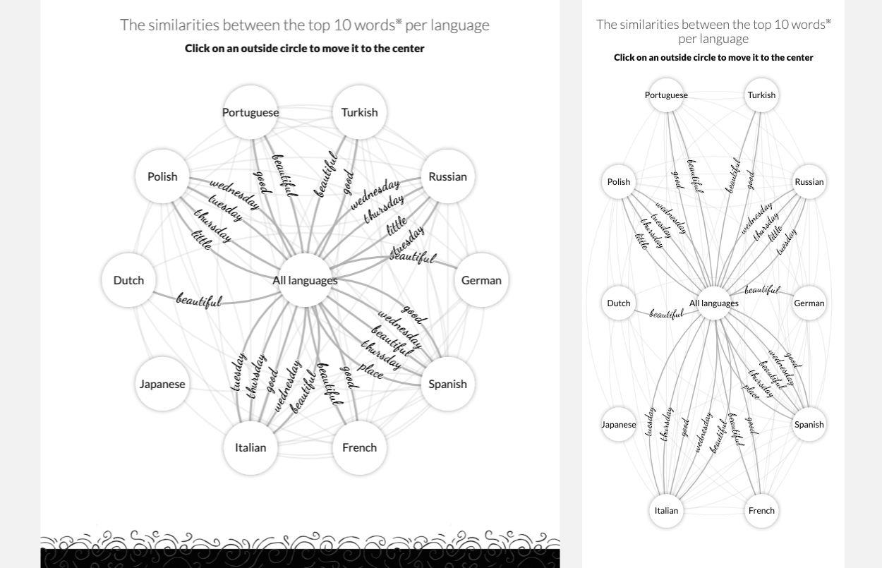
A final example, also from the ‘Beautiful in English’ project, is the final visual that compares the similarities between the languages. On large screens I could use the space and show a full circle, a visually appealing shape. For small screens I didn’t want to scale down the entire circle until it fit. That would mean scaling down the circles and text quite a lot. Instead, I positioned the outer circles along a rectangle that fitted the screen, using the available space in height to offset the loss in width. This way I didn’t have to scale down the circles and text as much. It came down to repositioning the data/circles, but not much else to have something work on both mobile and desktop.
Use different charts
And here we’ve come the final option in this list, the one that will probably require the most code adjustments, the largest separation between code used for desktop and mobile; creating two different charts.
Using a circular layout made it possible to keep this visual compact and not too high. Plus, circles were the design approach for all the other visuals on desktop in that project.
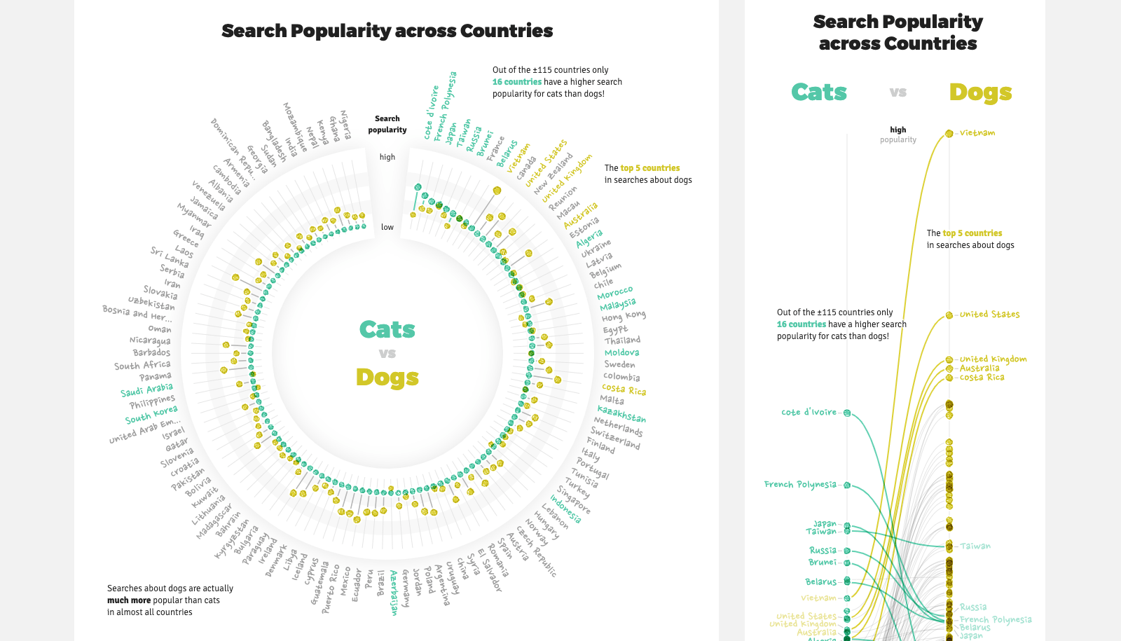
In the final visual in the Why do cats & dogs …? project the search popularity of cats and dogs is compared for ±115 countries. On desktop I wanted to use the space available to show all of these countries separately in a circular dumbbell style visual.
On mobile the circular layout wasn’t going to fit, scaling down wouldn’t create anything useful. I didn’t want to just reposition the data and go for a rectangular dumbbell either. With 115 countries that would take up an excessive amount of height, particularly for this final (and more of an “add-on”) chart. Instead, I decided that on mobile only the ±20 countries that had something “interesting” about them would be highlighted in a slope chart, with the other countries serving as background context.
Still, there are often quite a few places where some overlap between the two charts occur. Try to section these out into their own functions that you can use for both cases. For example, the same function is called to draw the circles in the case above. It’s just that a different function has previously calculated the positions of those circles. The same click function is used, although I had to place the hidden “shapes” that listen for the click differently.
Damn, programming complex interactivity is such a time sink! Setting up the “base” chart instead is often quite fast (with only 1 type of interactivity, e.g. a hover).
Having two different “base” charts, each made to use the strengths of their intended devices can actually be faster (and better) to create than trying to stick to the same chart but use some complex changes in interactivity instead (literally speaking from experience here!).
Recap
In short, these are the different techniques that I discussed:
- Do nothing Having a visual that looks effective on mobile screens isn’t always needed. By having no
viewportmeta setting in the header, the page will scale down to fit into a small screen automatically - Image on mobile Similar to “do nothing” except that you even replace the visual in small screens with an image to improve load times
- Position is arbitrary More of a special case where the positions of your datapoints are so arbitrary that you can just fit them within the available width and use as much height as is needed to show all the data
- Scale down Scale down the entire chart. Although you will probably need to watch your font sizes and scale these differently to keep them readable
- Fit to the available width Keep the height the same, but scale down the width of everything to make it fit even the smallest screens
- Stack vertically Spread your data (or clusters of data) horizontally on large screens, but vertically on small screens
- Zoomable visuals & starting zooms Another special case when you have a zoomable visual. In this case use a function to calculate an initial zoom scale that makes the visual fit any screen. The user can zoom in afterwards if they want to
- Reposition data Place your data in different locations, depending on the width available. For example, going from a more circular setup on large screens to a narrow straight placement on mobile
- Different charts The biggest change is to have two different charts. Use the space available on desktop to reveal more context about the data, but focus on the critical insights that you might reveal differently on a small screen
And I’m sure that there are many more that I haven’t come across or used. But I hope to have at least been able to show you from this list of options, there is not one set way of going about the “mobile vs desktop” dataviz debacle. I flit around from technique to technique, where I make it depend on the design I have in mind to show the data in the most effective way, regardless of screen size. Once I have a grip on my preferred set-up I can think of how that would truly look on big and small screens and what approach / adjustments either would need.
Hopefully this list will give you inspiration on what technique to use for your next web-based data visualization. Good luck!