In celebration of the Hubble Space Telescope’s 30-year anniversary in April 2020 I created an extensive visualization, more of fully-fledged poster really, for Physics Today. Let me show you how the static visuals that I made still became one of the biggest projects I’ve ever worked on in terms of hours invested. I could’ve called this blog post “the impact of small design choices” because the main issue wasn’t necessarily what type of chart form to use. It was really how to display the datapoints (Hubble’s observations) in the chosen chart form (a map of the sky) to reveal both details and the bigger picture.
Andrew had expected that the topic would interest me. Glad that I’ve started to convey to clients that I love visualizing science data!
At the end of August 2019 I was contacted by Andrew Grant from Physics Today, a monthly membership magazine of the American Institute of Physics in the US. If I was perhaps interested in creating visualizations to commemorate the 30th anniversary of the Hubble Space Telescope (HST). The amazing images of the HST are one of the main reasons that I fell in love with astronomy as a kid, and went on to study the subject at University. So I was really excited by the prospect! (ノ◕ヮ◕)ノ*:・゚✧
Over 500,000 observations of more than 30,000 targets are available for retrieval from MAST.
They had a dataset about all the science observations that the HST had done that could be downloaded from the Mikulski Archive for Space Telescopes (MAST). However, it wasn’t yet clear exactly what to visualize, where the interesting stories could be found in those hundreds of thousands of observations. I therefore proposed that I’d first dive into the data to try and find interesting angles. With this particular topic I didn’t have to think hard on what different aspects I wanted to investigate. A sky map that plotted all of those observations was a no-brainer. But I was sure there were a lot more interesting angles to investigate. What would a frequency table on the target classifications reveal? Or a timeline of observations per instrument, what about wavelength ranges, or observation times?
Data Cleaning, Analysis & Research
Fast forward to the end of November 2019. I had a call with Greg Stasiewicz, web producer at Physics Today. He had already written a script that downloaded all of Hubble’s science tagged observations using the astroquery.mast package from Python. His initial research into the topic really helped me get a running start. However, I’m a R person, so after I had Greg’s Python code working and had downloaded my own copy of all the observations, I loaded it into my R session to start on the data cleaning and analysis (*^▽^*)ゞ
E.g. there were a few rows with starting observation times that were later in time than their end times.
For me data analysis and cleaning go hand-in-hand. While investigating the data I will come across data errors. Figuring out if something might be wrong will in turn teach me about the data. For example, to see if the observational wavelength ranges were correct I had to first research the wavelength ranges that each of Hubble’s instruments could actually observe.
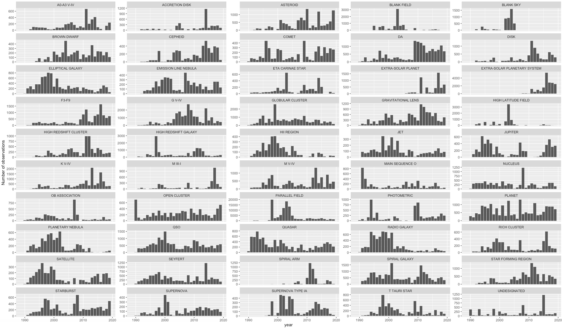
I generally start by creating simple plots for each available variable in the dataset; histograms for numerical values and bar charts for categorical ones.
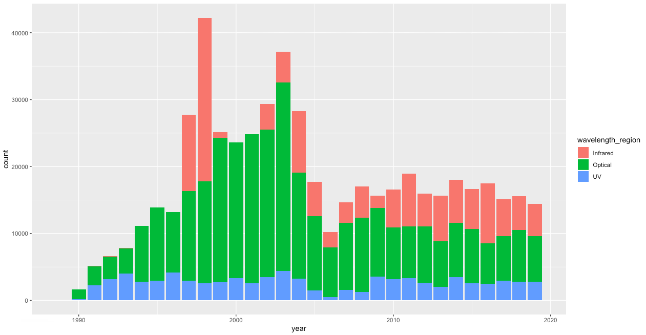
Afterwards I might start combining a few variables to look for correlations and trends (such as scatterplots and box plots). Below is one of the earliest plots I made, it shows the number of observations by year and splits each year by the wavelength region. The general shape is already interesting, with observations increasing until ~2004 after which it steadies off at a much lower number of observations per year. But the color split immediately shows several other intriguing things. Such as infrared starting with a spike in 1997 and 1998 and then suddenly disappearing again for a bit in 1999.
I know that R Markdown could also be an option, but I find using comments to be faster and easier when I’m the only person who will see the script.
Small side note, I use comments a lot. Besides explaining what almost every line of code does, I also use them to jot down thoughts and findings in R. I think some of my R scripts have more comment lines than code lines. I also feverishly add comments about functionality in my JavaScript code. However, my R scripts have a lot more because I’m trying to understand the insights of the data. Not only now, but also weeks/months later when I need to check something. Whereas in JavaScript the code’s function is only to make my visual work on a webpage.
WFPC: Wide Field and Planetary Camera | ACS: Advanced Camera for Surveys
Looking closer at the instruments, I created a similar chart as above, but now as a small multiple by instrument. Using online sources I double checked which were still functional and set this as the color. Seeing the resulting chart also helped me to understand which instrument had taken over for which. For example, the interplay with the WFPC being replaced by the WFPC2, and then by ACS, which in turn broke down for a little while in 2007 so the WFPC2 picked back up again. But then the mighty WFC3 was installed in 2009 taking over most optical observations.
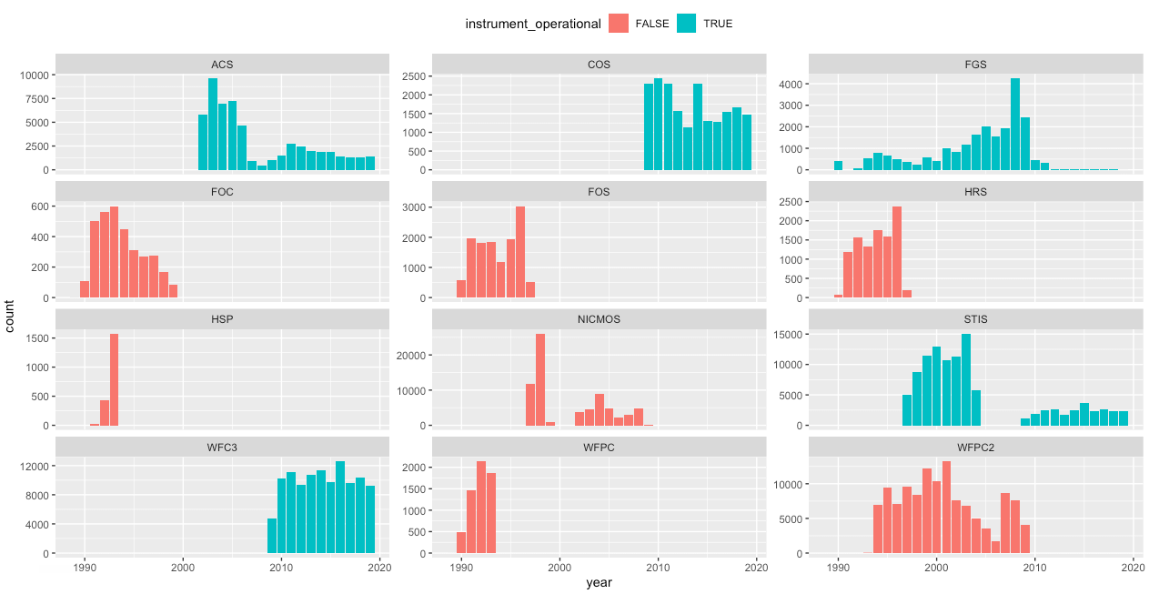
Wikipedia has very detailed histories on the workings of each instrument
I searched online to try and find explanations for some of the peaks and dips in usage of the instruments, in part to make sure that they weren’t some weird data error (or coding error from me). I found several interesting facts about failures or servicing missions from astronauts to the HST to repair or replace instruments (I’d almost forgotten that, but really cool, astronauts going up to Hubble!).
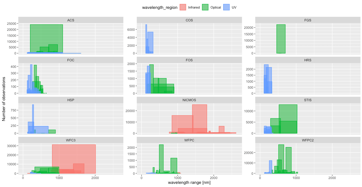
I also wanted to investigate if there was anything interesting going on in the wavelength ranges being observed. After some dataviz trial and error I came up with the plot below. The height of each box is the number of observations, and the width is the actual wavelength range observed (e.g. the big red box running from 810 to 2010 nanometers in the bottom-left WFC3 chart). These are often very instrument specific, hence the small multiple charts by instrument again. However, being a theoretical/cosmology astronomer by trade I didn’t know/remember enough about wavelengths ranges and what interesting things might be seen in very narrow (or broad) ranges. I therefore couldn’t actually say if there was something interesting going on, haha (*^▽^*)ゞ
I say “officially” because of course somehow there were still more than enough classifications used that weren’t in the list
But actually, the thing that I thought would be most fascinating to a general audience were the target classifications. Each observation is given a classification, to signify the type of object being observed. Thankfully, this was mostly streamlined and “officially” had to come from a predetermined list. There are 11 main classifications, such as star or galaxy. And each has a specific subset of secondary classifications, such as supernova or interacting galaxy. To make things a little more complicated, each observation could have more than one main target, and it could have zero to many (I think the largest was 9) secondary classifications.
Sadly, all the target classification info was contained within one string variable. So I had to write some extensive code to properly clean everything that was not following the predetermined list. For example, most used a semicolon to separate between tags, and two semicolons to separate between two main targets, but others used a comma. Most only had targets from the predetermined list, but some had come up with their own classifications (some even with whole sentences, even with commas in them ಥ_ಥ ).
And of course, the spelling errors. Ah, the joy that finding and fixing spelling errors have brought me over the past few year (╥﹏╥) Many hours, probably some headaches, some online research, lists to compare against and checks later, I had reconstructed the target classifications into something proper. Splitting apart main and secondary classifications into separate columns, and making sure that each target name came from a list of ±275 options.
Exoplanets are planets outside our Solar System, they move around stars other than the Sun
With the cleaning of the targets done, I could create plots to look for possible stories to reveal. But there wasn’t enough going on in terms of trends across time that I could see. Most seemed instrument-error related. The appearance of exoplanets as a target classification around 2008 was really the only time related aspect that was truly interesting. More generally the most fascinating aspect was simply how often each classification was used compared to the rest.
Researchers send in detailed proposals to apply for time on the HST to perform specific observations.
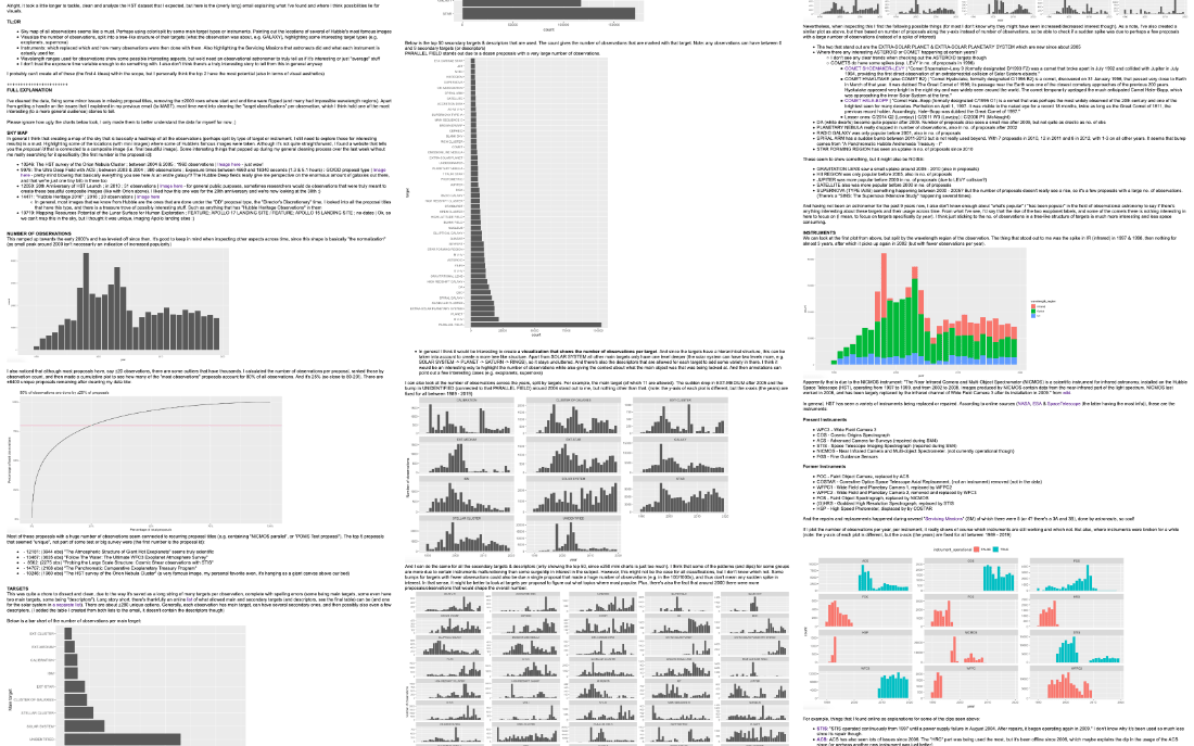
I also looked into very specific proposals to find some that could be highlighted in the visual. Such as those that resulted in stunning photos of our universe. I did several checks with an online counterpart that has information about the observations made, but only per proposal. Thankfully, at some point I did feel that I had investigated enough angles of the dataset to have a good enough grasp.
There is so much more that I dove into, but that I don’t want to bore you with, I only picked some of the most interesting parts for this blog
So about 40 hours of data gathering, cleaning, analyzing and online research later I send an endlessly long email to Physics Today to convey my findings and what I felt were some options to visualize for one or more articles. Of the four ideas presented (sky map, instruments, target classifications, wavelength ranges), we picked the two that seemed most interesting: a sky map with all of the observations, and a visual to show how often each target classification was used.
Creating the Sky Map
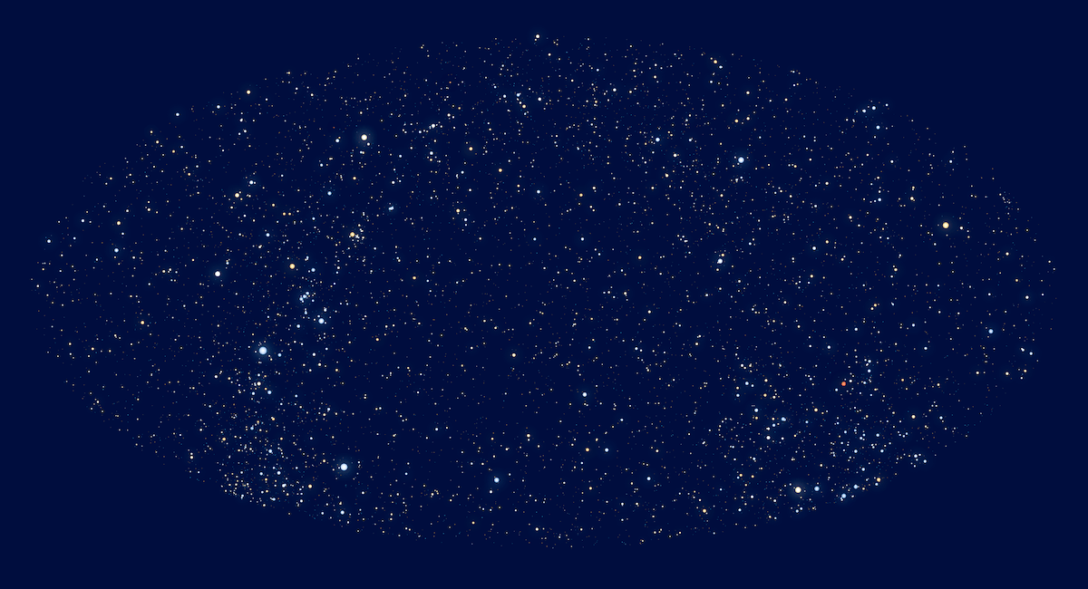
The sky map was the most important of the two visuals, so I started there. I set-up a simple development folder and used canvas-sketch to make the creation process easier (such as having hot reloading). Thankfully, I didn’t have to start from scratch. I had created a star map before for the Figures in the Sky project, made in 2018 as my final project of Data Sketches.
It still took some time to tease out the relevant code that I needed for this new project and make it work. Using the d3.geoAitoff() projection, which I had found is quite typical for visualizing the whole night sky, and I had a first working sky map.
The MAST website shares an image of how it should look
I plotted the 550,000+ HST observations on the map and immediately saw that I had done something completely wrong! I was using the exact same code to place the Hubble observations as the stars, so what could be the issue?
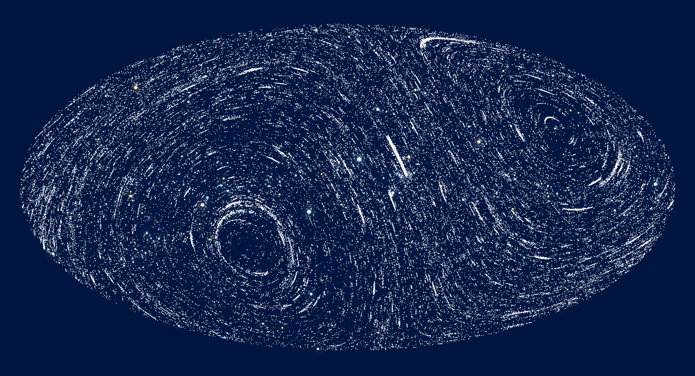
I looked up examples made with d3.js that visualized the night sky and came across an interesting one that even plotted the Milky Way in contours, made by Philippe Rivière, who has the most amazing knowledge of cartography. I loved the addition of the Milky Way, so I added it to my visual, and strangely that did work, so where was my error for plotting the observations? I found a fascinating interactive sky map version that talked about equatorial, galactic, and other coordinates.
Philippe even wrote an extensive new Observable notebook that goes into the rotation matrices between the different coordinate systems
Somehow I was now convinced that I needed to transform my Hubble observations to galactic coordinates first O.O I reached out to Philippe to ask for help and he was amazingly kind to dive into the subject. Even reading papers about coordinate systems, and expanding on his Milky Way example. I searched online for more info on galactic coordinates, dove into the source code of the other interactive example, and kept on tinkering with my code.
Right ascension and declination are used to plot coordinates on the celestial sphere, the latitude and longitude of the sky in a way.
And then…. Then it appeared that I was using two different numerical transformations for the right ascension o(╥﹏╥)o One was calculated in (24) hours and the other in (360) degrees. Such a silly mistake! I was blushing as I wrote the email to Philippe and explain my error (•ω•) . Thankfully, my new plot was looking like I expected it to; such as a clear band going across the middle that are the Solar System targets (basically all objects in our Solar System rotate around the Sun in the same plane).
Note: the Milky Way was still flipped (vertically) the wrong way in the previous plot
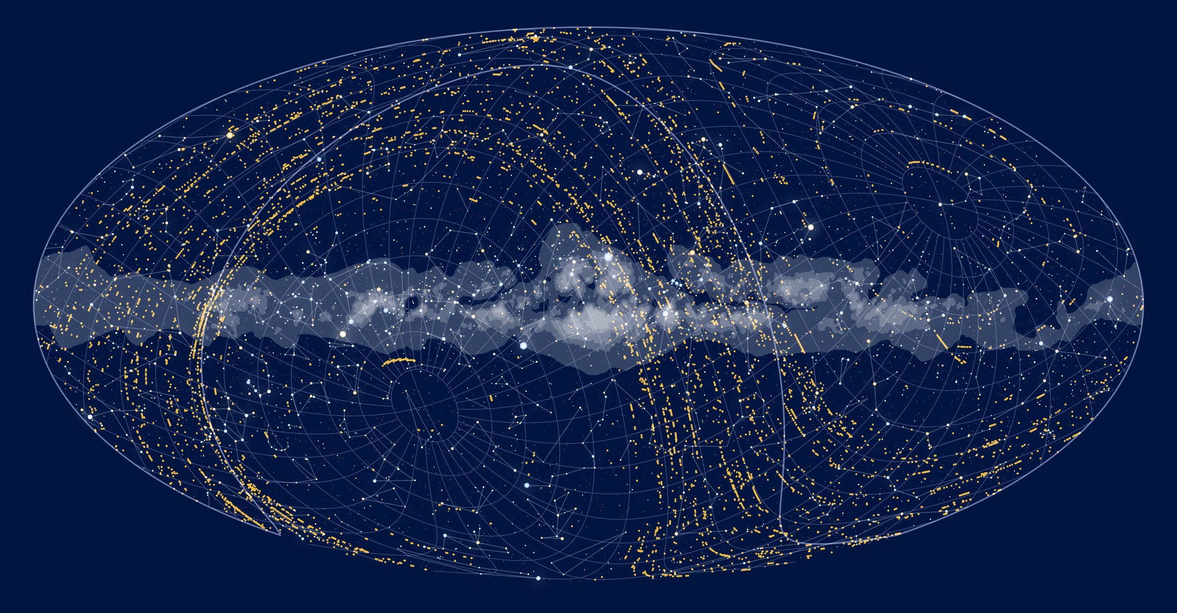
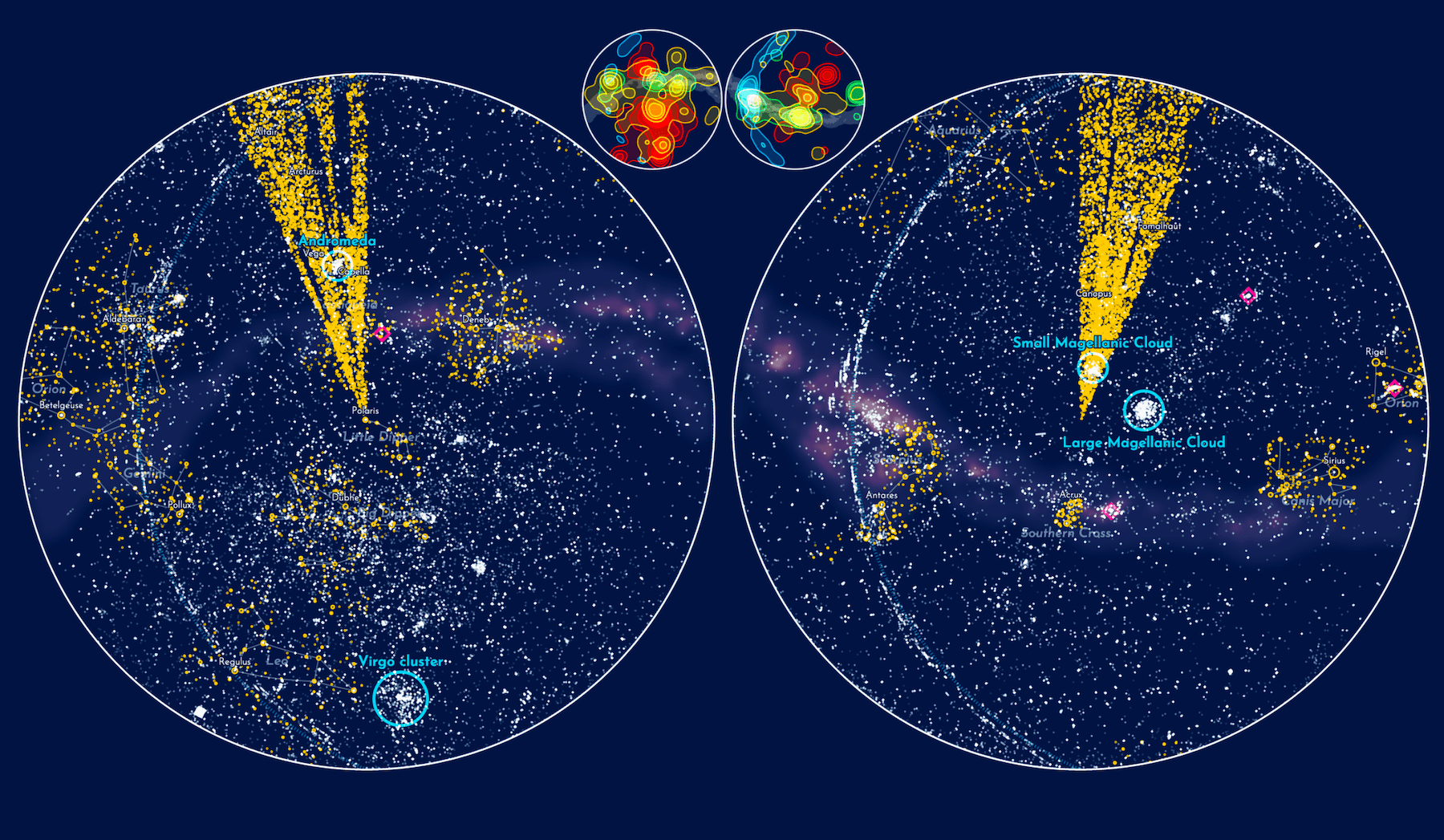
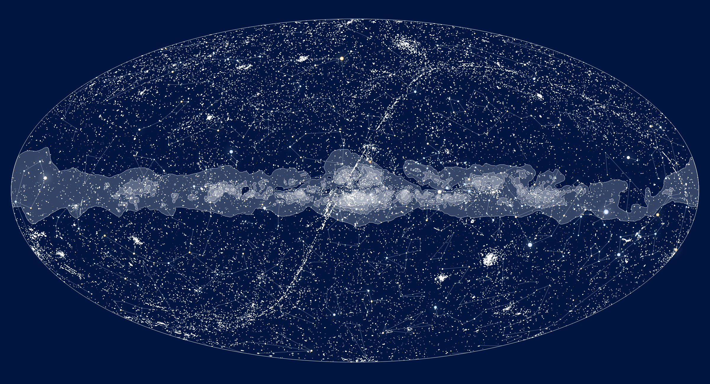
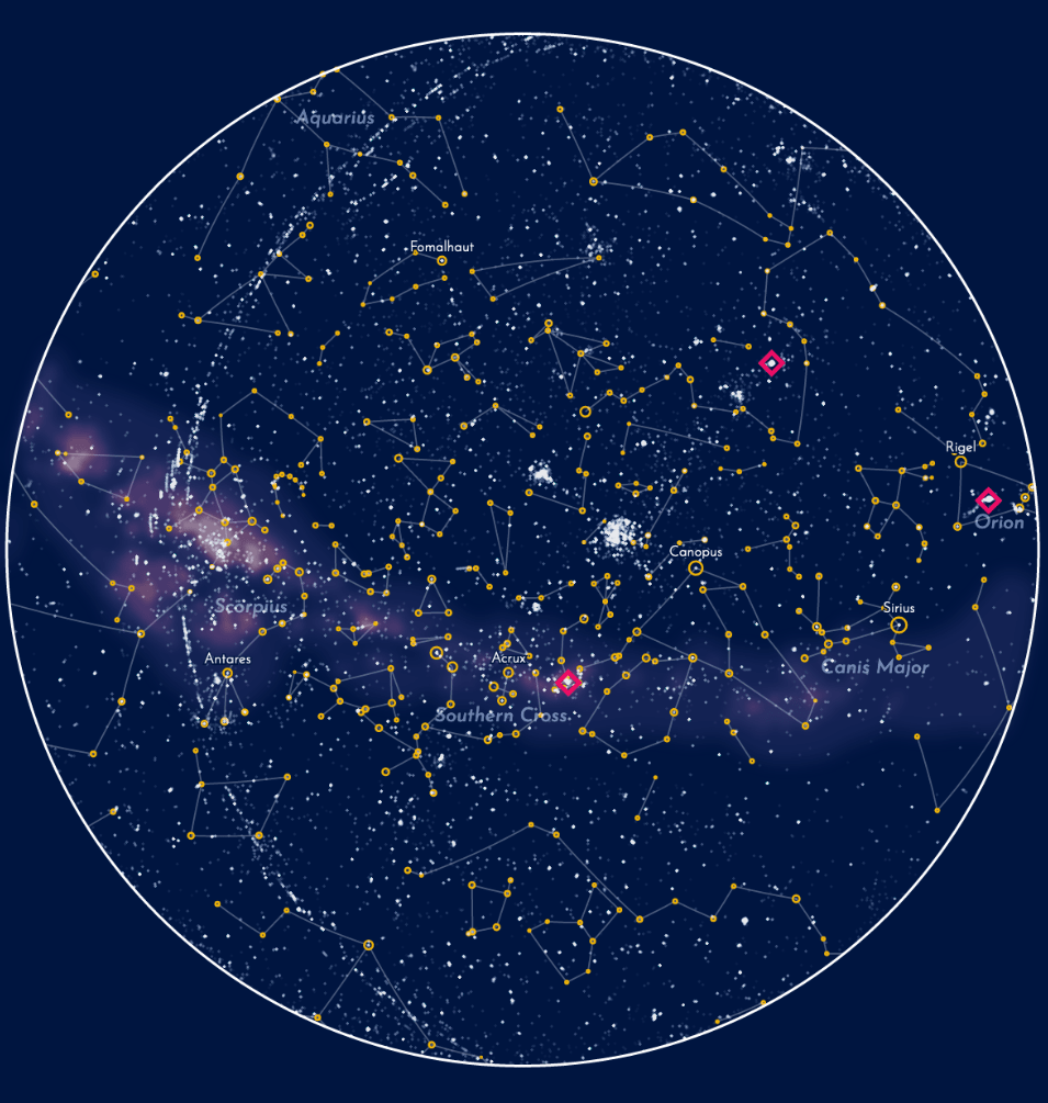
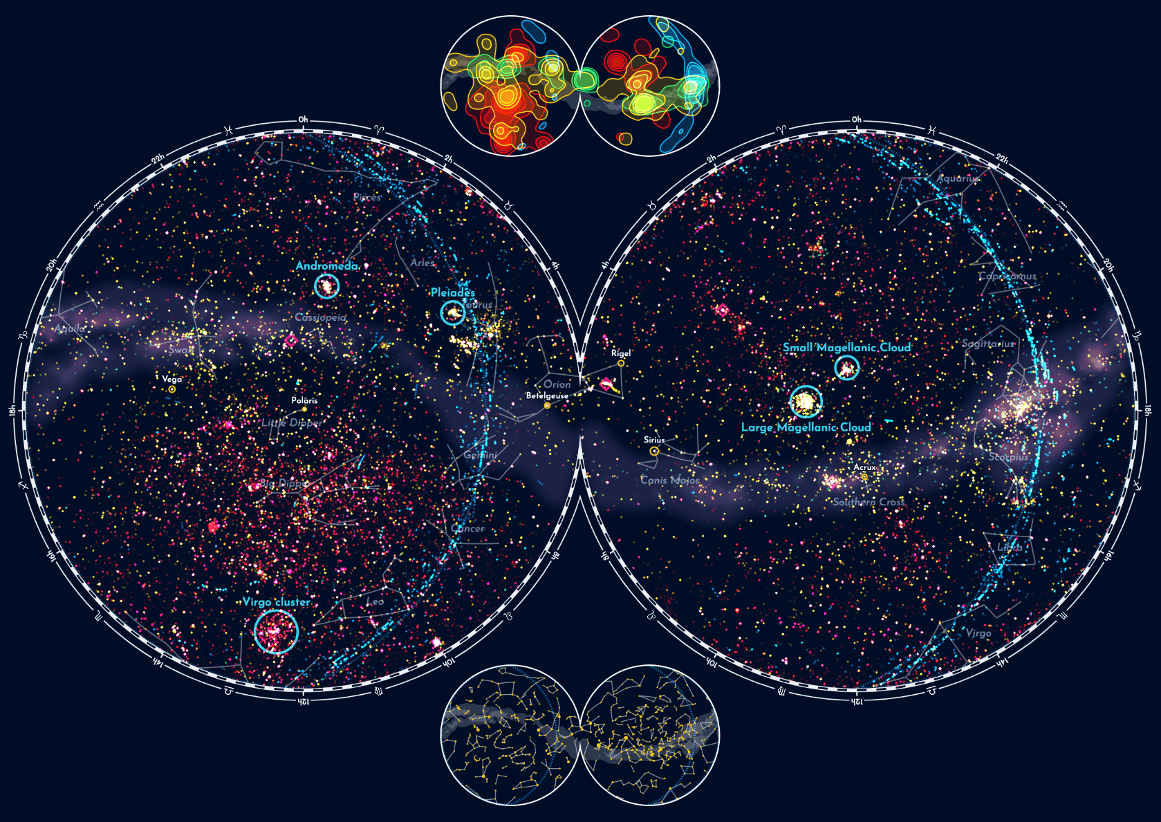
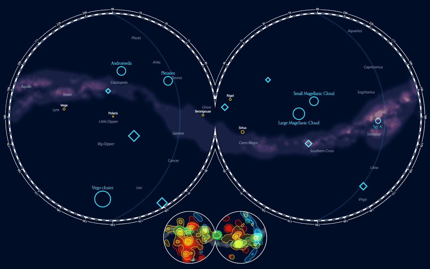
Although I liked the schematic nature of the Milky Way in the background, it was too attention grabbing. I wanted it to be more muted and blurry in the background. I looked up images of the Milky Way to color pick and try and recreate something that would mimic the way most of us see images of the Milky Way in photos. Below you can see the updated Milky Way (with only the HST observations of solar system targets in yellow and naming some of the brightest stars, such as Sirius and Polaris).
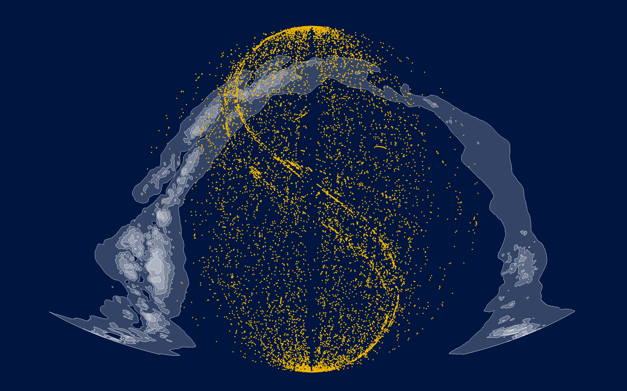
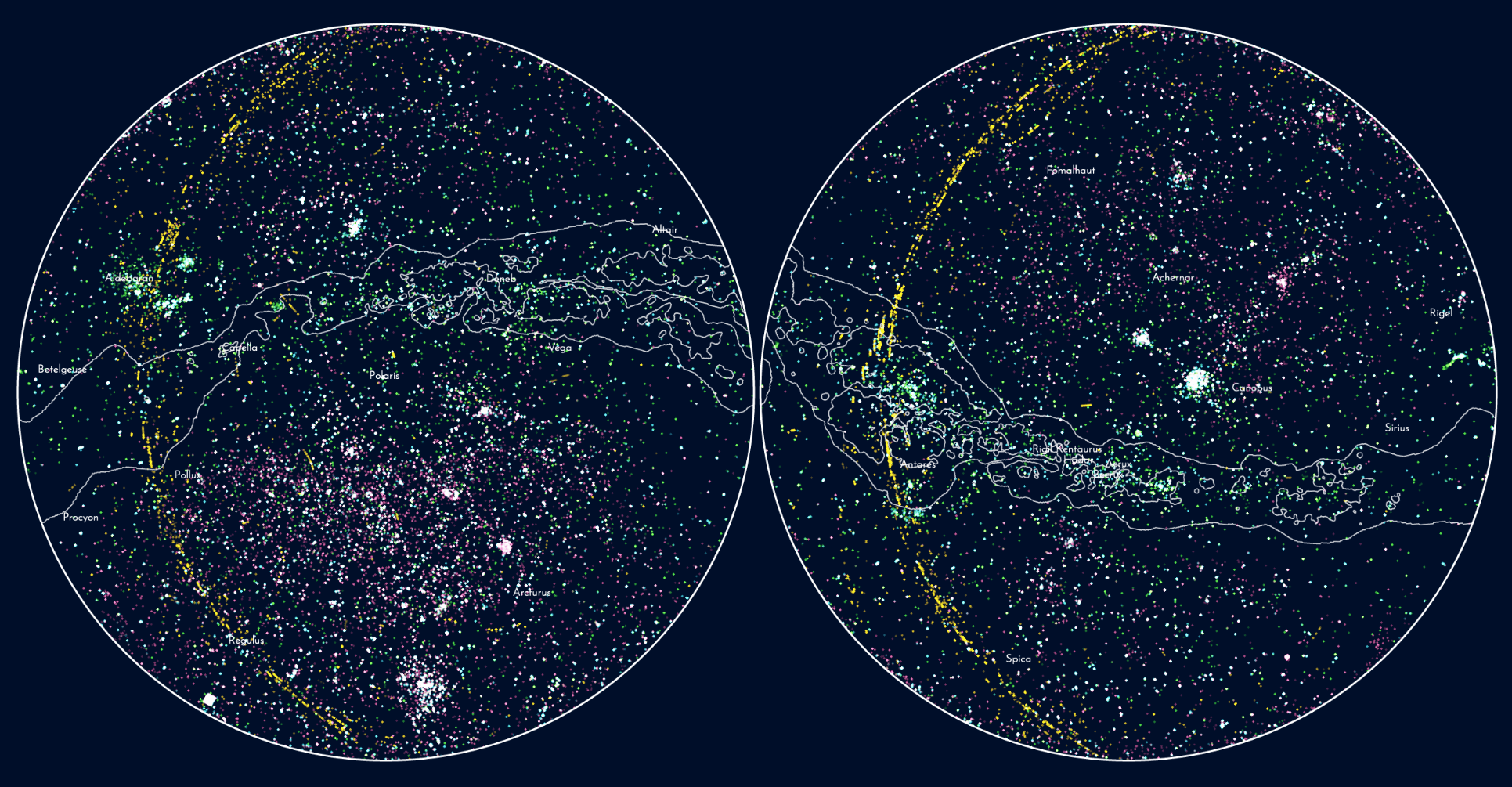
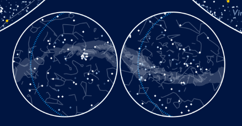
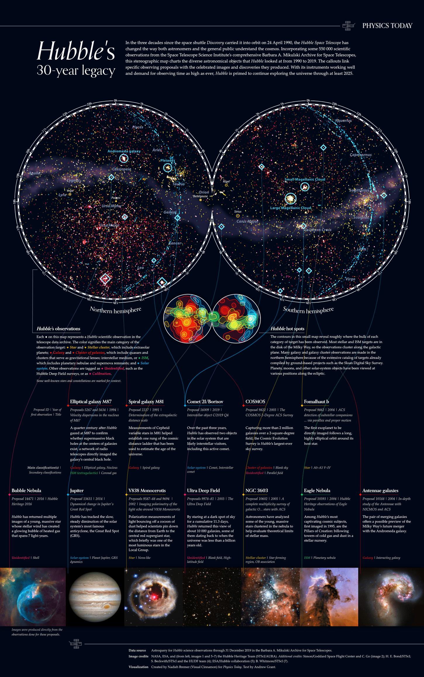
Ok, now that I had (sort of) recreated the image of Hubble’s observations that I had also seen on the MAST website, I wasn’t sure if it was the best way to go. Sure, this could give an overview of the full sky in one map, but it was a very warped view. With the Polaris (the North Pole star) and the Ursa Minor constellation somewhere along the top-left, for example. Perhaps it would be better if the visual looked more like the way we humans see the night sky? I therefore created a second version of the sky map that used the d3.geoStereographic() projection. It has two halves. The left circle below shows the Northern hemisphere, what someone would see at night if they stood at the North Pole. The right circle is the night sky from the Southern Hemisphere, as seen from the South Pole. That did make the Milky Way into a swirl, so I wasn’t 100% convinced that stereographic was the way to go.
Less is More
To add more dimension to Hubble’s observations it made sense to use color to reveal something about their context. Such as coloring the observations by their main target. Even though there are 11 main targets, a few of them could easily be combined. Such as stars and external-stars, where the latter are stars from galaxies outside of our Milky Way. This left five groups of main targets that I wanted to highlight with different colors. But damn, finding a color palette that worked well was really hard! There were so many, very small dots, many overlapping each other. Plus, there were many colorful stars in the background. Below you can see a few of my attempts where I not only changed colors, but also the color blending, such as using “screen”, which made the most dense places appear completely white (bottom two images below).
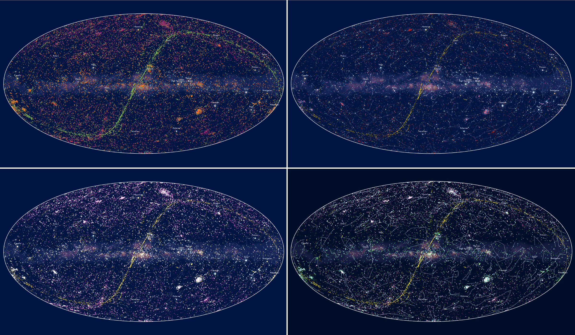
But no matter the color palette that I tried, it was never clear which small dots were Hubble observations and which were stars. I tried a version without any stars and constellations, which you can see below. Also turning the Milky Way back into schematic lines, so any color or dot that was in the visual was a Hubble observation.
However, without any stars or constellations I couldn’t quite relate these observations to my own view of the night sky. I realized that the stars and constellations acted as way points: “Ah, that awesome image of Galaxy XX was taken right next to the Big Bear”. They grounded the observations, at least to me.
And thus the stars, constellations (and blurry Milky Way) came back. But to be able to distinguish between stars and Hubble observations I only used two colors; yellow for stars and white for observations.
That made the distinction a lot clearer indeed. But the focus seemed to lay on the stars, they grabbed my eyes more. I therefore removed all the stars that weren’t part of any constellation. This severely reduced the tiniest of yellow dots, but kept the stars that acted as the true way points. I also turned the stars into stroked circles so Hubble observations that were done on stars wouldn’t overlap the yellow the stars (such as Sirius or Canopus below in the middle-right).
But it was still rather busy… It was hard to make out the constellations. In my next iteration I added subtle names of some famous constellations in the background. The pink diamond markers were a first test to highlight special observations that had led to either famous images or major breakthroughs in science.
Mini Maps and More Colors
I wasn’t totally satisfied, but I didn’t know what else to try. I therefore turned my mind to something else. My “all HST observations are white” choice had created a problem; it was completely unclear how the various main target categories were spread out. And there definitely were some interesting patterns to reveal.
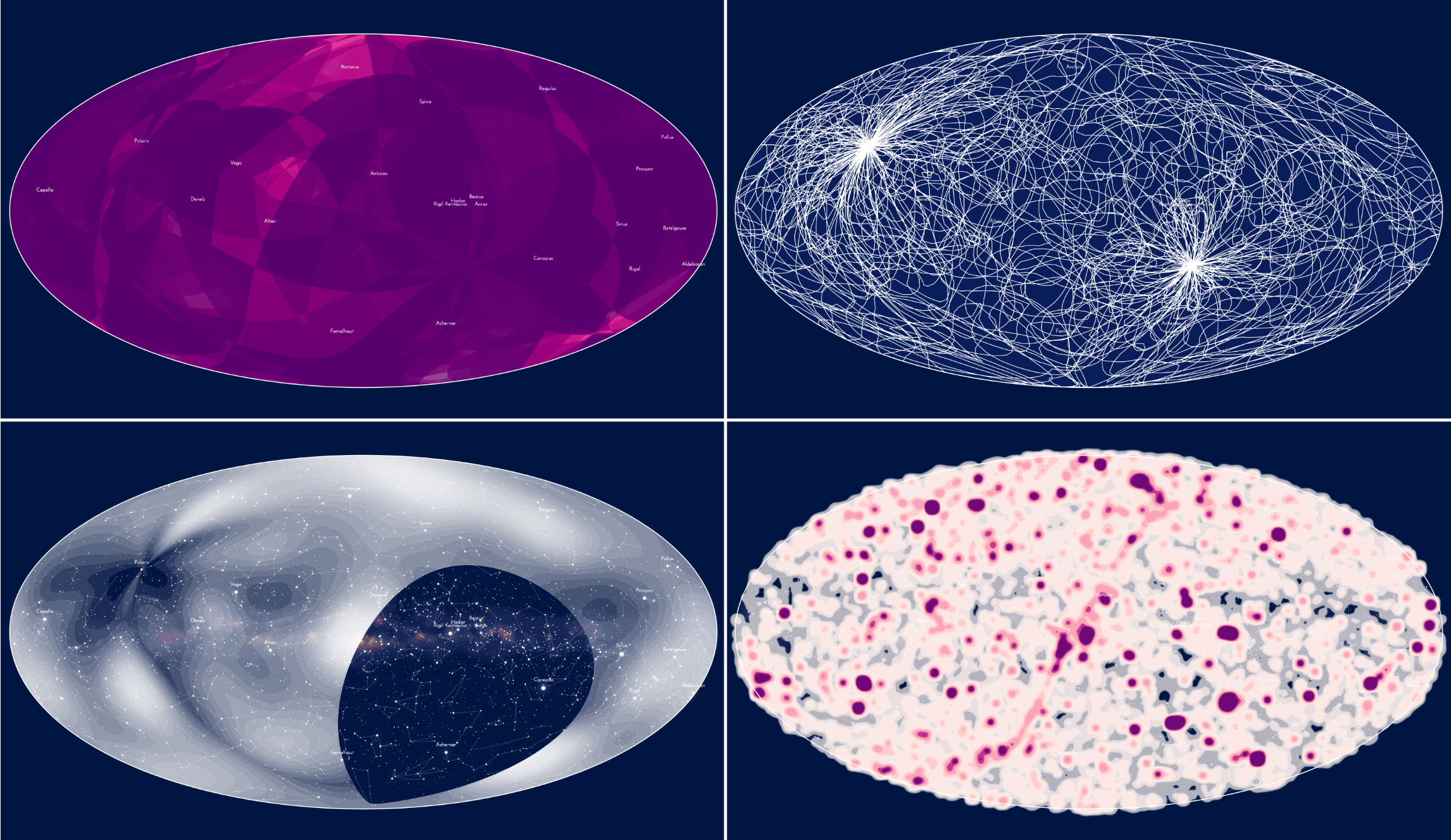
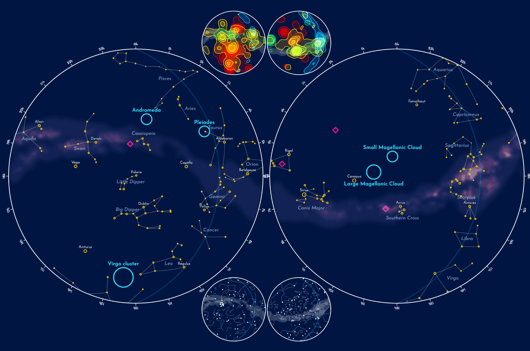
With so many observations it was hard to assess regions where a lot of overplotting occurred. I therefore used d3.contours() to map a contour plot on top of the base sky map. I created a contour map for each group of the main targets to look for general patterns. Observations done one stars (top-left of the image below) could be found almost everywhere, but especially around the band of the Milky Way. Galaxy observations (top-right) where the exact opposite, these are found mainly away from the Milky Way band, which obstructs the universe beyond. Interstellar matter (ISM, in the bottom-left) were rare, and were also found primarily around the Milky Way band, with a clear hotspot around the Orion nebula (far middle-right of ISM image). Because I didn’t quite know what to do with unidentified and calibration I put these together in a final group, seen in the bottom-right below (the last group, which isn’t shown below, are the solar system targets).
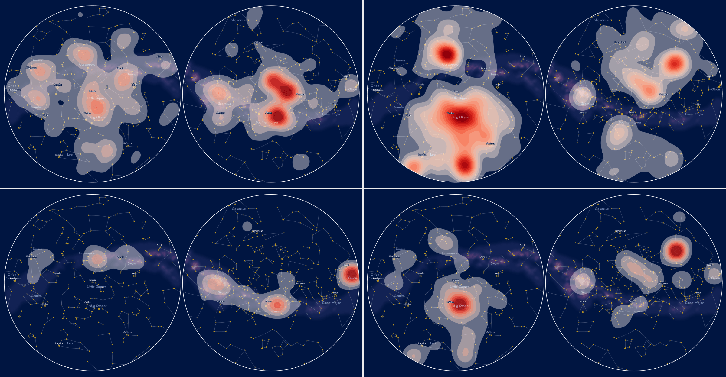
As context to the main sky map, I wanted to create a smaller version of the sky map that showed a combined version of all those contours. So the viewer could see where certain main target categories were highly present. But the contours of each group weren’t perfectly separated, for example stars and ISM had quite a lot of overlap. I therefore tinkered for a while to figure out the right balance between giving the contour maps the right amount of detail so the most important areas were present for each target category, while making it somewhat possible to distinguish each category.
I guess it wouldn’t fit my style if I didn’t throw in at least some vibrant colors ^.~
I left out the unidentified and calibration category, because I felt that it was more important to highlight the remaining four: solar system, stars, ISM and galaxies. I also gave a renewed effort to find a color palette for the target categories and finally settled on one that used four very distinct colors; blue, green, yellow and red. All picked to be very vibrant and almost glowing (without being too neon). Below you can see a few steps in my process of settling on the final contour map.
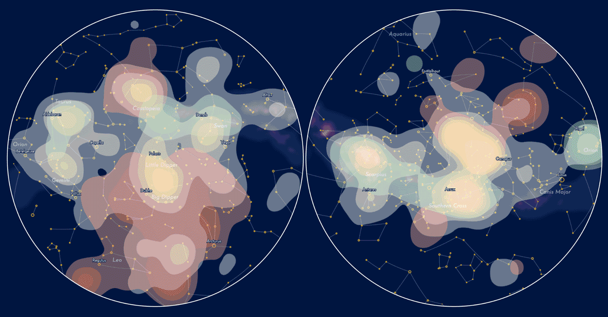
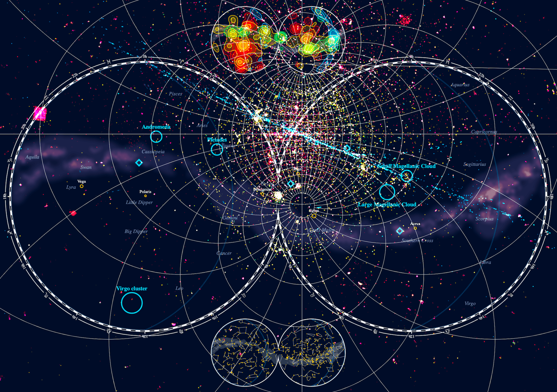
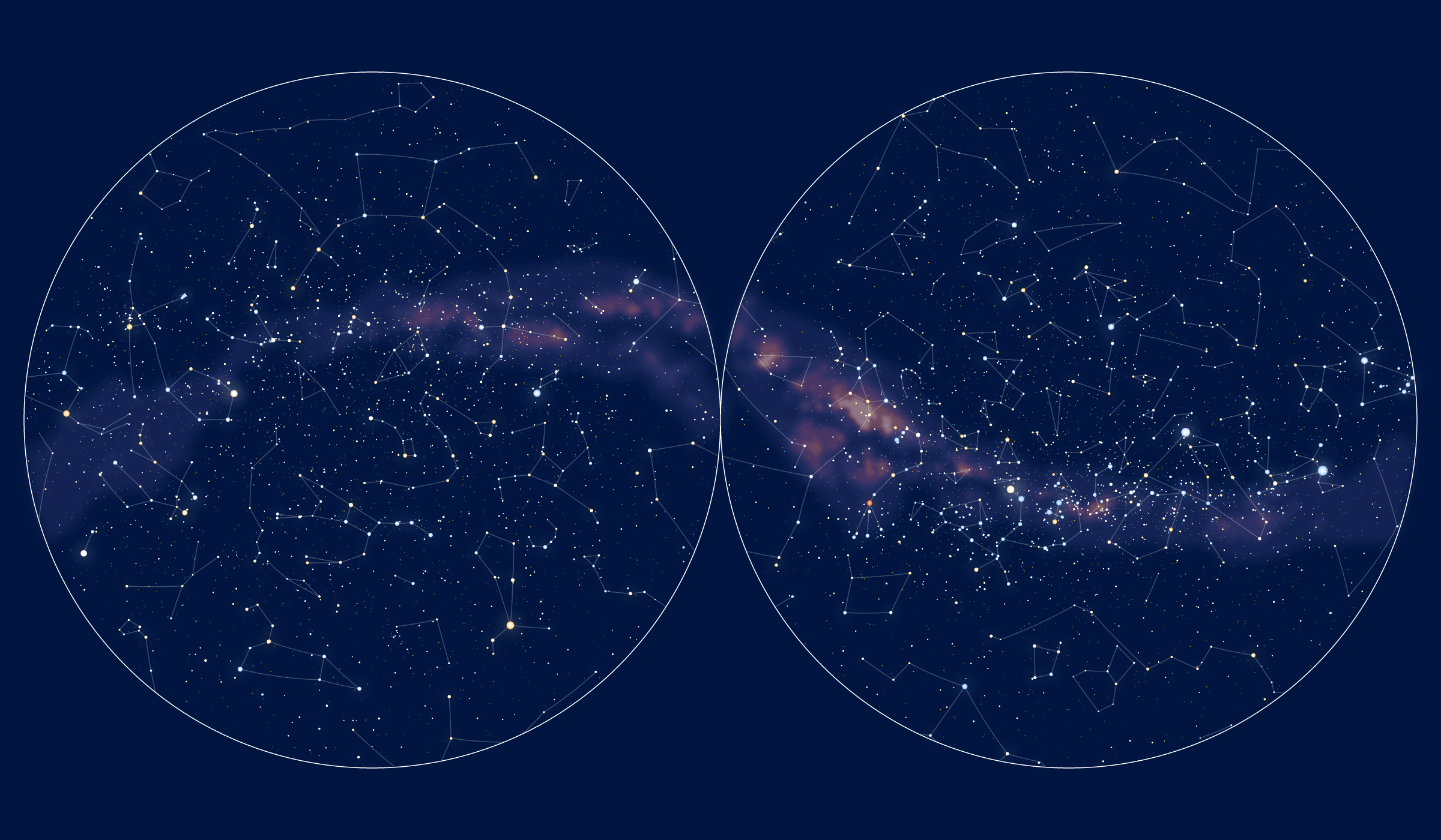
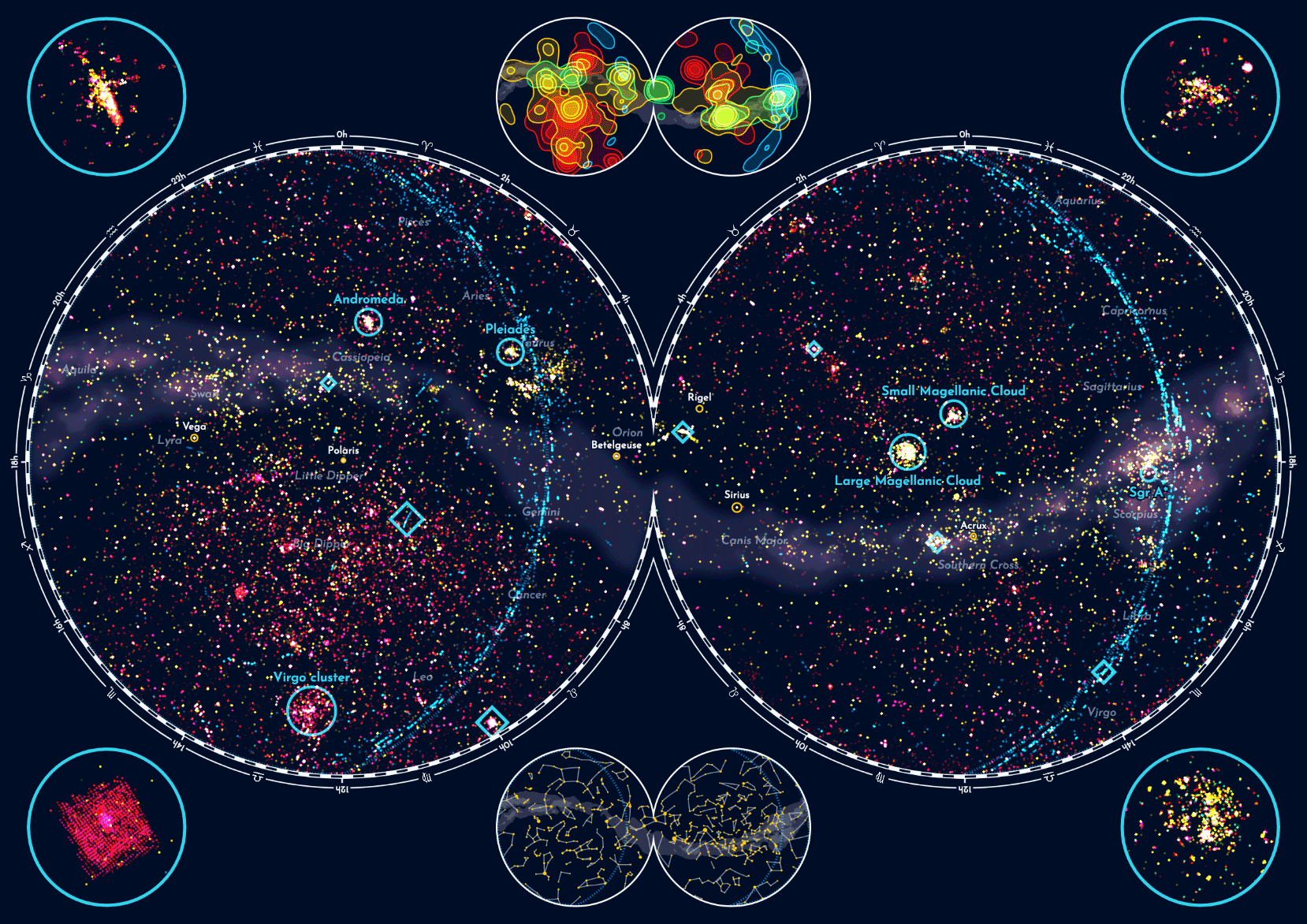
By now I was 100% convinced that the stereographic projection, using the two circles, was the better way to go, no matter that the Hubble websites used the elliptical version. Using the version that most resembles a typical star map, and the constellations looking most like their actual counterparts in the sky, was more important. As an added bonus, this layout had some empty space in the middle, above and below where the two main circles almost touch, to place a mini map. I added the contour map in the top, and due to symmetry I figured I might as well place something else in the bottom.
During the whole contour-mapping process I had removed even more from the main sky map. It was still too darn busy! I only kept a few of the (88) constellations, only those whose names might be known, such as the zodiac signs (e.g. Aquarius), and several other famous ones. Really trying to whittle down what was the minimal part of the night sky that I needed to still ground the observations in that what viewers might know. For the mini map in the bottom I therefore added a version that did contain all 88 constellations (and its stars), a miniscule sky map.
However, it somewhat bothered me that the constellation mini map didn’t have anything to do with the Hubble data. What aspect of the data could I show instead in such a small part of the full visual? Some important group of observations perhaps?
The blue dotted line arcing along the left of the two circles is the ecliptic line.
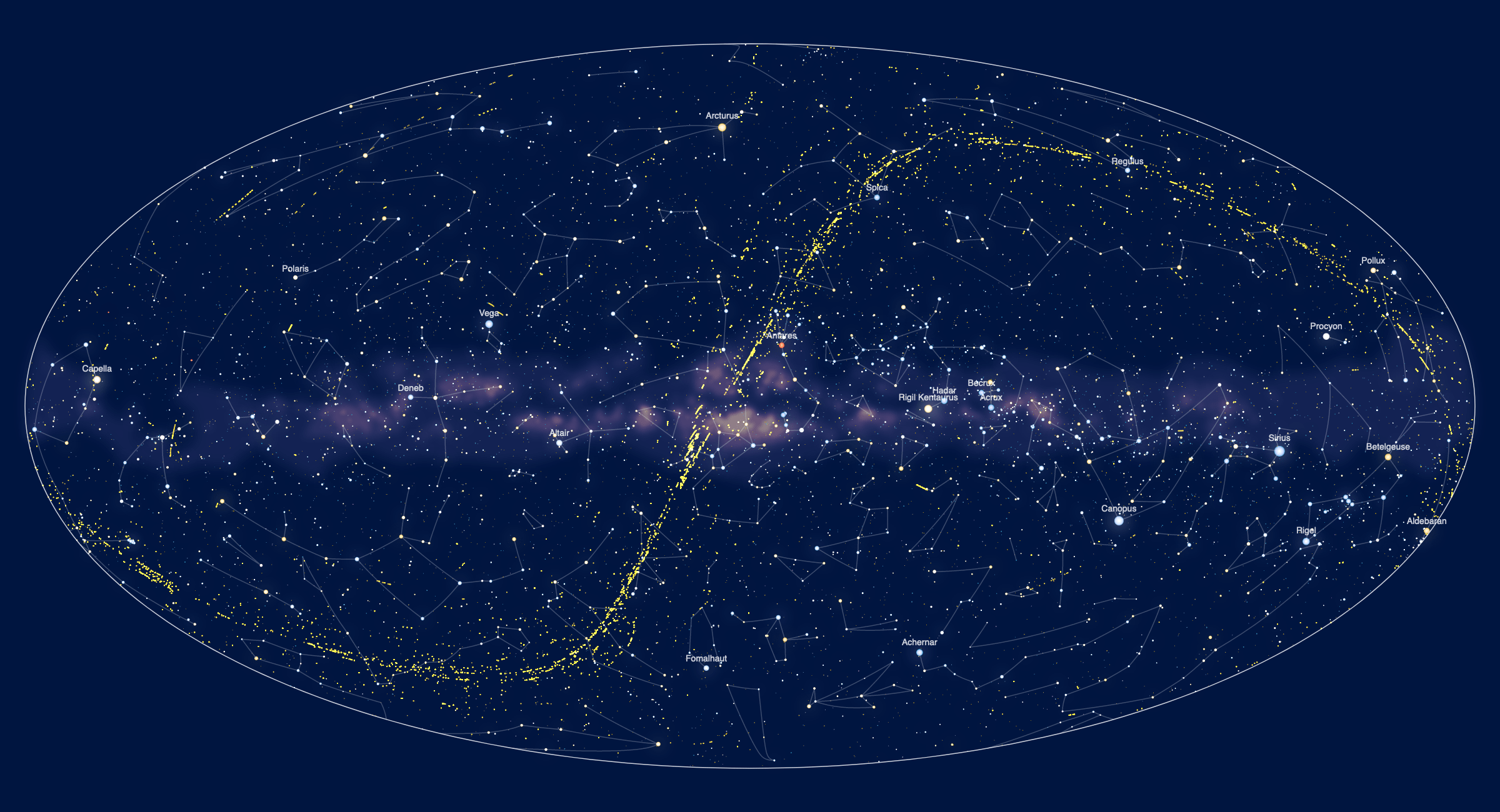
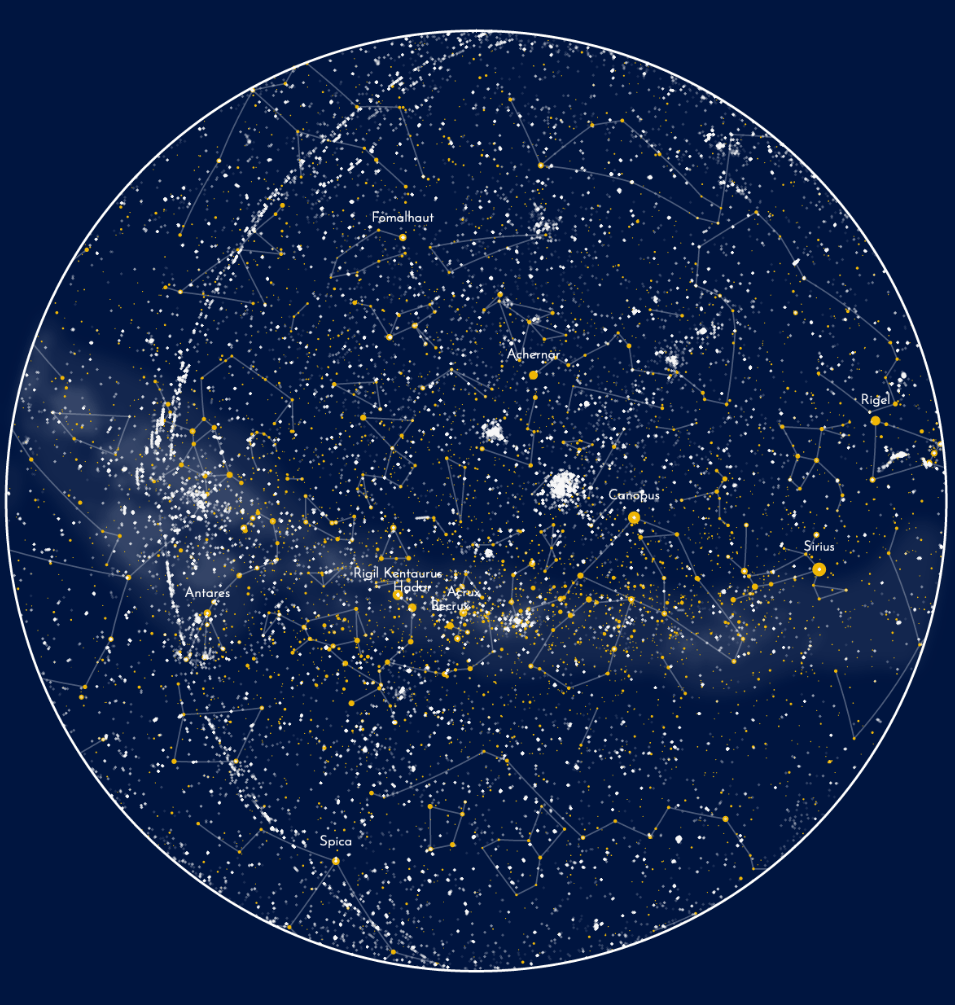
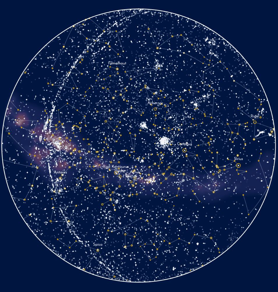
To me, the detection of exoplanets has been one of the most fascinating discoveries in astronomy in the past 30 years. I therefore took out all of the stars from the mini map, but kept the constellation lines for reference. Instead I added all of Hubble’s observations that had Extra-solar Planet or Extra-solar Planetary System as a secondary target class and plotted those in white.
Embellishing the Main Map
I don’t believe in astrology but I like the signs themselves. I see them as reflections of their constellations only
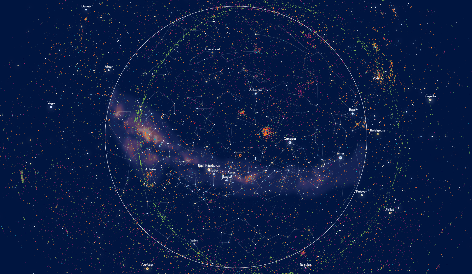
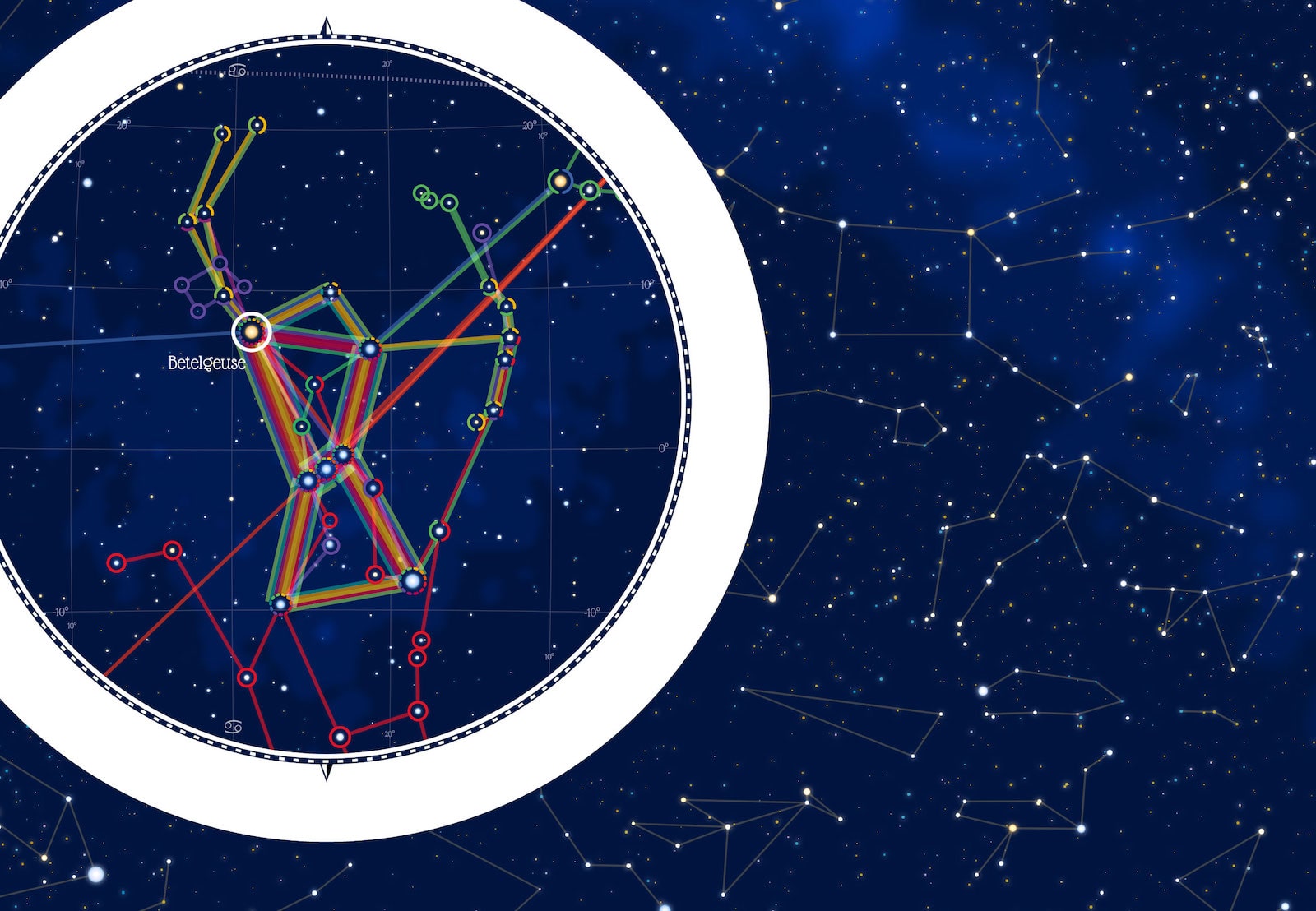
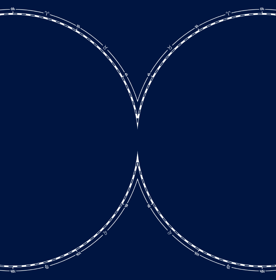
Slowly the full map was coming into shape. But it was missing some flourish. Sky maps have been made for hundreds of years and if you image search for “historic sky map” you can see the artistry that was put into some of these maps. I especially like a “Celestial Plate” made by Alexander Jamieson in 1822. With markings around the outside of the circle, the addition of the zodiac signs to divide the sky into 12 parts, the ecliptic line inside the map to mark the path of the Sun.
And while I was investigating more sky maps I noticed that most of them had the orientations flipped from what I had. My ecliptic line was arching along the left-hand side of each circle, but the other sky maps had that line arching along the right. Both are correct, it’s only a matter of rotation. But what really made me switch to the more common rotation was the fact that Orion, my favorite constellation, would be “brought together” in the middle of the new orientation ฅ^•ﻌ•^ฅ (see the image below along the place where the circles almost touch).
Figuring out the right steps (and in what order) to create the overlap effect was an interesting little puzzle
I started to embellish the outer ring of the main map. Adding the hour markers for the right ascension, then replacing every other hour marker with the zodiac sign that belongs to that area in the sky. The dashed line is so standard in old sky maps that I couldn’t resist adding it as well. And finally, I moved both circles a little closer together. To signify that these two half are connected somehow. Plus, it just looked fancy!
And with that I had finally gotten to a point where I felt good enough about the result to share it with Physics Today. Typically I send clients a first work-in-progress way way earlier than I did here. However, in this case the whole look and feel of the visual was so highly dependent on the tiniest of design decisions. Sending something that I didn’t support enough myself just didn’t convey the final direction I had in mind.
Bringing Back the Color
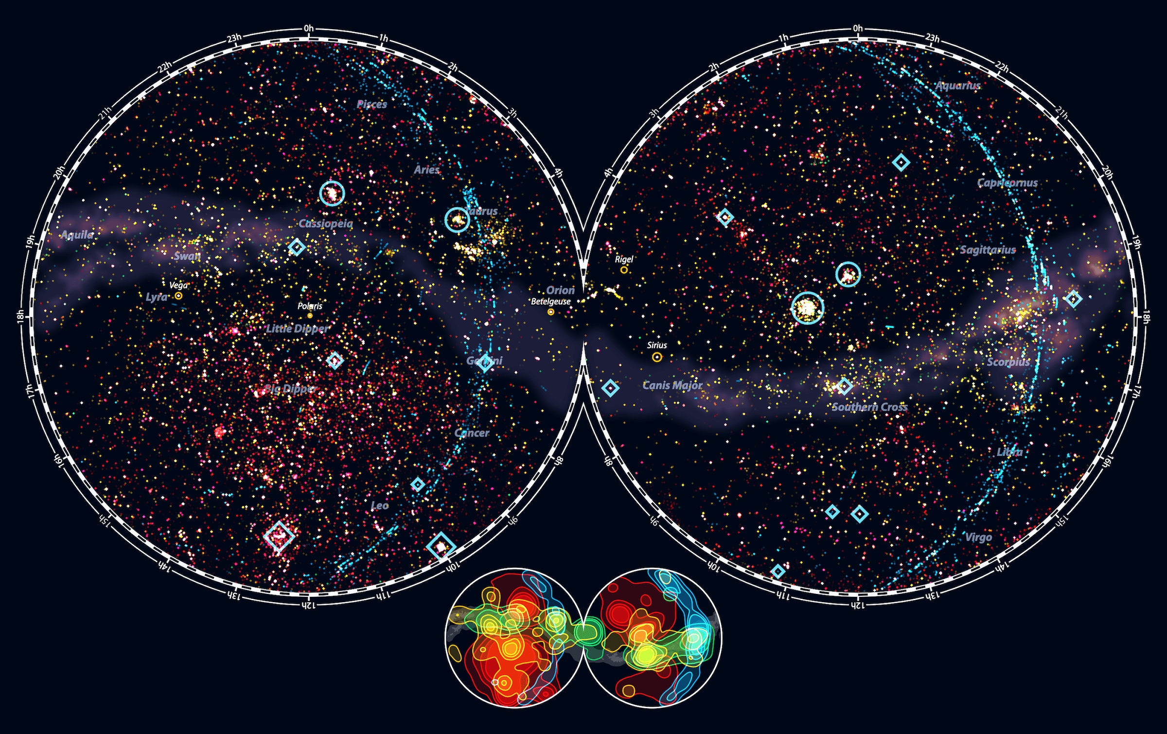
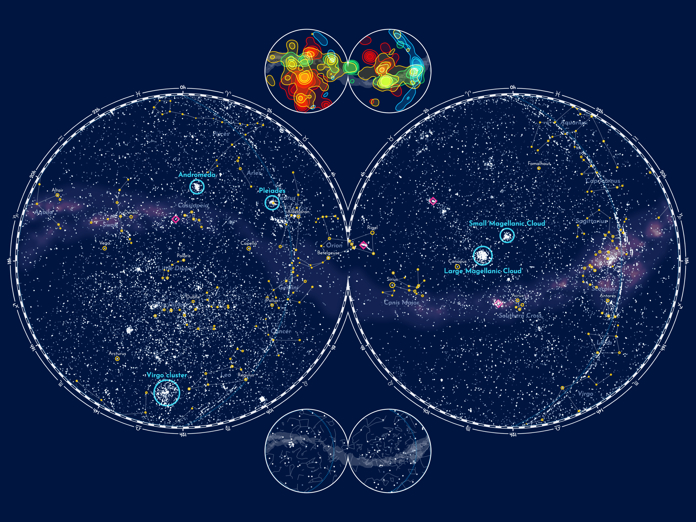
The next day I woke up with an itch. Keeping all of Hubble’s observations white in the main sky map really wasn’t making sense anymore! I had taken out most stars and constellations anyway. It would be such a shame to not utilize color in the main visual to signify an important aspect of what made this data interesting. So even before I’d gotten a reply on my email to Physics Today. Even before knowing if they liked the design direction of the sky map, did I dive back in to make changes (I typically wait for a reply from my client before continuing).
And it wasn’t difficult, I’d already created a color palette when I worked on the mini contour map. Somehow I hadn’t thought of that when I returned to work on the main map. I did iterate and try dozens of colors for the only category that wasn’t in the contour map, the unidentified & calibration and settled on vibrant pink. Yes, this looked a lot like the deep red of galaxies, but there wasn’t a perfect solution anymore I found.
Interesting to realize that a design decision (make all HST observations white) made a while ago was rendered obsolete due to many tiny other changes to my visual since then, but that I didn’t notice this until I took a step away from working on it.
Since I removed almost all of the stars I felt that probably the constellation + star mini map was needed more instead of the exoplanet one
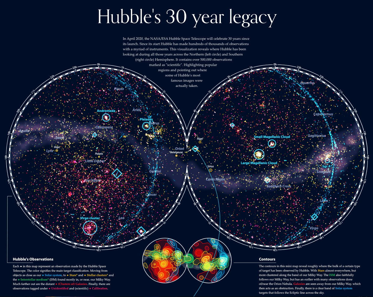
I made the background even darker to really make the colors pop. In my almost final attempt to minimize what was needed of the background stars and constellations I removed all the stars, except a handful of the most famous ones, and kept only the chosen constellation lines (and names). This was also because many of Hubble’s observations had become yellow, which created confusion again with the stars.
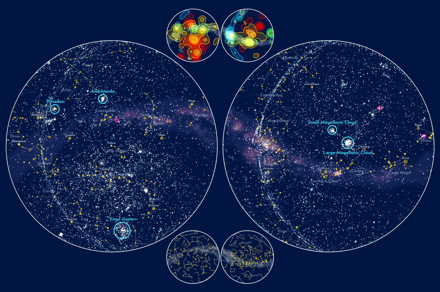
I was so much happier with having brought back the colors! Full of energy from that small change I apparently couldn’t stop myself. There were four more corners in the map where I could put even more context!! (๑•̀ㅂ•́)ง✧
The Magellanic Clouds are two irregular dwarf galaxies that are orbiting the Milky Way
The corners were too small for more mini maps of the full sky, so I chose to make zoomed in snapshots of different areas in the main sky map. The Large and Small Magellanic Clouds for example had so many observations that I thought it would be interesting to show a close-up of those areas.
And in my final step to simplify the stars and constellations, I took out all the constellation lines and only kept the names faintly visible in the background. Together with the names and stroked circles of five famous stars; Polaris, Vega, Betelgeuse, Rigel and Sirius.
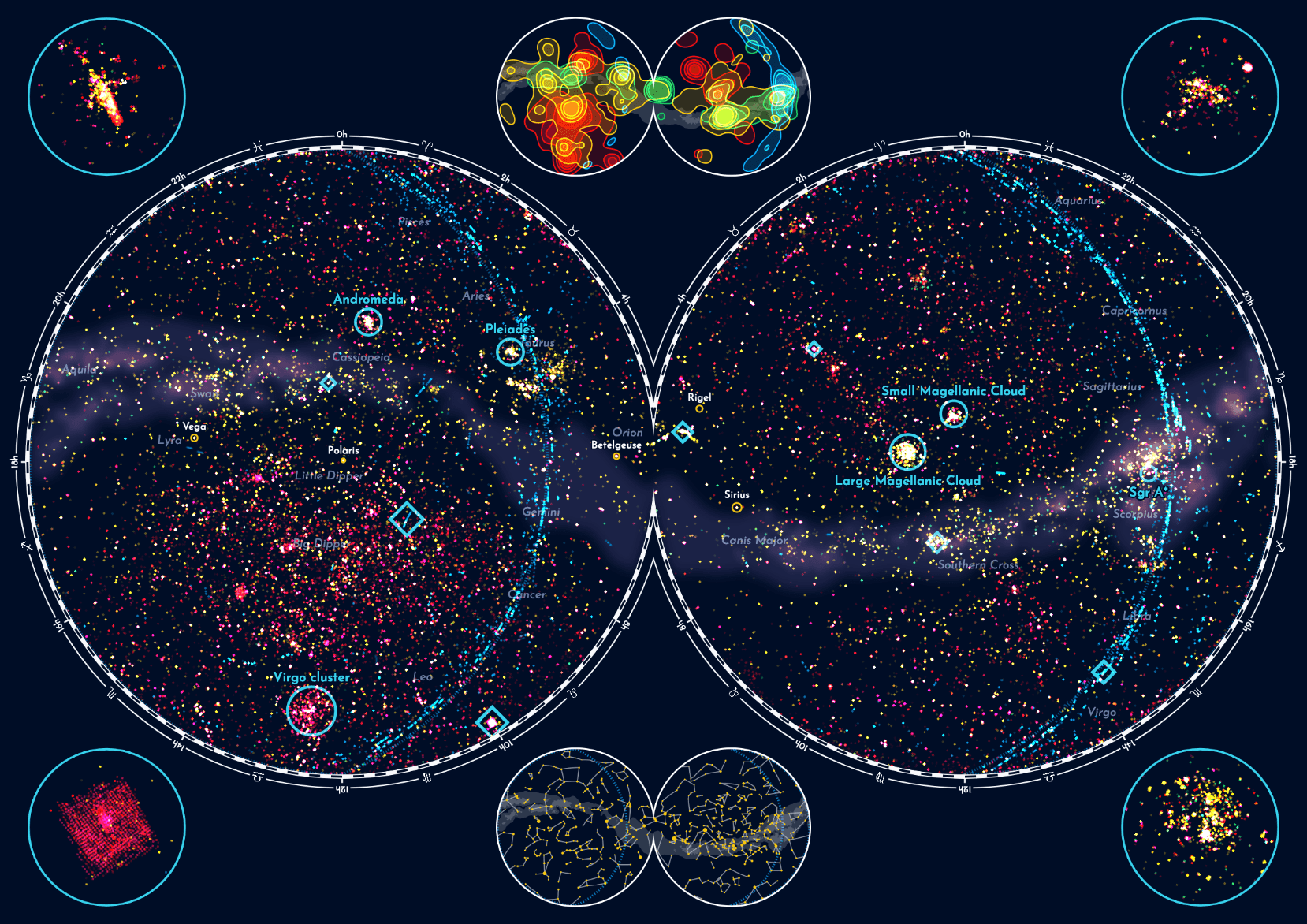
Although I did like the zoomed in versions, I didn’t quite like how they looked together with the full map. Perhaps I was making things too busy again. Nevertheless, I did send this version to Physics Today as a follow up to my email from the day before. That way they could see all the options, and we could decide what needed to be taken out.
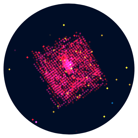
I eventually adjusted my code to be able to output a zoomed in circle only instead of the full map. This could then be used in the Physics Today article that was going to show the full sky map at the top. Below you can see a zoom on the observations done for COSMOS which shows a fascinating grid structure. In the main sky map from above you can see this inside the big blue diamond in the lower-right of the left circle.
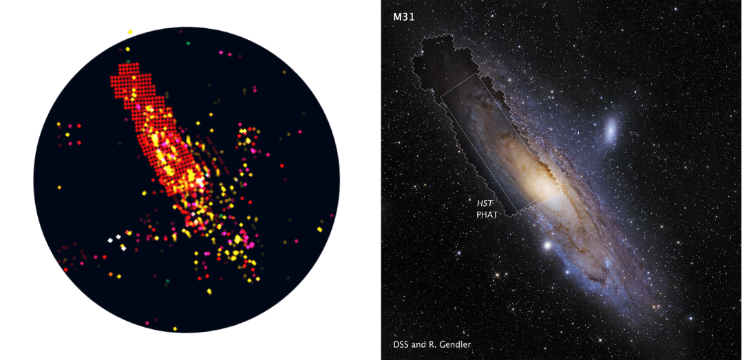
The zoom map that was eventually used in the Physics Today article shows the fascinating grid structure that made up the PHAT mosaic, which was part of the largest HST image ever assembled. Below I’ve put the zoom map next to an image of Andromeda showing the exact same outline of the grid structure, so cool haha (⌐■_■)
Yes, I’m one of those people that thrives on positive reactions, which makes me work even harder
Thankfully, the feedback from Physics Today was amazing! There were some things they wanted changed of course (they felt all the mini maps indeed made it too busy), but generally they told me that they loved the design and look. Andrew even said that the print department was interested in featuring it in the April edition. Woohoo! I was on cloud nine ᕕ( ᐛ )ᕗ
Creating the Poster
I hadn’t asked for a style guide from Physics Today at the start of the project. Mostly because I had expected that the sky map itself would feature (almost) no words, and the legend and intro would come much later in the process. But with every new minimalization step, I somehow took out circles and lines (stars and constellations) and put words back in. So I needed a temporary font. After trying a dozen different fonts I’d settled on using Josefin Sans from Google.
Although Physics Today has some fancy fonts it was only the simpler sans serif fonts that looked good within that busy sky map
But I’d finally asked and received the PT fonts and style guide. However, after so many hours of looking at Josefin Sans it was a little hard to find a combination of PT fonts that I was equally happy with, haha. I tried many different combinations, whittling down the ones I was least happy with to finally have one that I was pleased with.
I programmed the visual with HTML5 canvas, meaning that the sky map in my web browser was already a png
The sky map didn’t yet have any kind of introduction or explanation, and since this was going to be a static image, I saved the map (as a png) and opened it up in Affinity Designer to add the final textual elements. I find that doing basically anything text, overall layout, or legend related is so much easier, and eons faster, to do in a vector program than through code.
Instead of a normal “bullet-point” style legend to explain what the different colors meant, I wrote a small paragraph explaining the different color categories while coloring the relevant target category words (see bottom-left in the image below).
It’s at times like these that I wish that I’d had a graphic design education (as well). I don’t have the same “range” of ideas to try for layouts than the ideas that I might have for a typical data visualization. But I try. Perhaps I could use some text wrapping to contour the intro in between the shape of the map?
But I also really wanted to show several of the special and gorgeous images that Hubble has made over the past 30 years. This was already the plan from the first vague thoughts that I send Andrew many months ago, to also include a few actual images. In terms of layout, I didn’t want to make the visual any wider, since it was already wide enough for your average computer screen. Thus, I figured that the only place to put them was below the main map.
See for example how proposal id 10241 is mentioned (and linked) in the Carina Nebula image of the HubbleSite link
I feel like I browsed through almost all images on HubbleSite, which had one amazingly useful feature; they added the proposal id to most of the data descriptions! This meant that I could precisely link an image to a proposal id in my data and thus to observation locations in the sky map. I saved the images and links of the most amazing photos. Keeping those where the final image was only made with the HST (and image processing of course), and not with additions from other telescopes. I looked up the proposals with my R script to retrieve the metadata. I then added this info together with the Hubble image to the full visual. I tried to get images from a variety of different targets; a galaxy, something with stars, a nebula, etc.
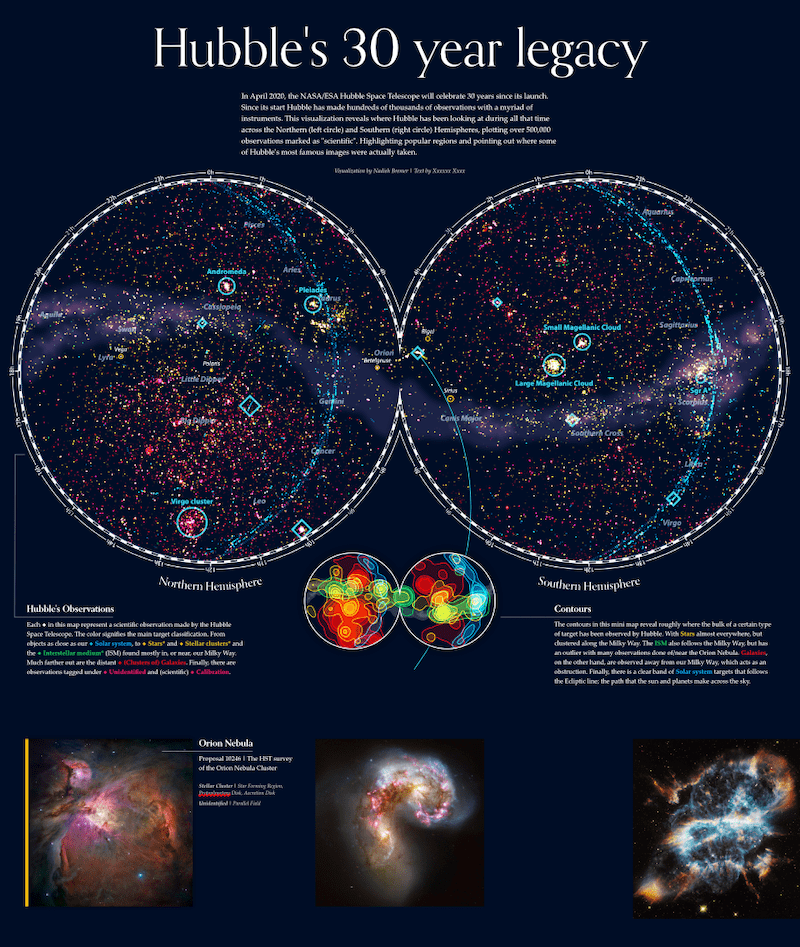
The original images have quite different proportions. I wasn’t really sure how to combine these. Some sort of masonry style grouping wasn’t fitting the geometric symmetry of the sky map though…
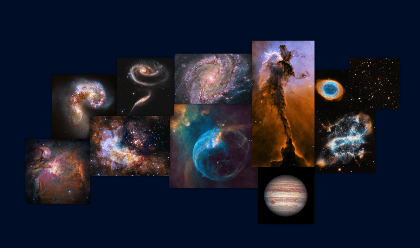
Placing them in a row, all cropped to the same square shape was feeling a lot better. I almost wanted to go with two lines of images, it was so hard to choose! However, I felt that would make the visual too long.
This timeline of major breakthroughs in Hubble’s life, with links back to HubbleSite and thus proposal id’s was an invaluable resource
Eventually though a second row did appear when I figured that it would also be interesting to highlight certain observations that were fascinating, but for which no “beautiful” image was relevant. Greg (from PT) researched and selected some of the most interesting, having resulted in major scientific breakthroughs, proposals to add. I dove into his list to figure out which would make most sense to add to the visual. Below you can see a few steps in the way I evolved the visual and how it started to look more and more like a full blown poster instead of “just” the sky map (*^▽^*)ゞ
The Final Online & Printed Visual
Physics Today made a few changes to the highlighted proposals in the poster after they’d had the chance to properly dive into the subject as well and had written the accompanying article. Andrew supplied me with the changes and final text, an expert and a proof-reader went over it, I made some more tiny changes, and voilà, the Hubble sky map poster was done!
On April 1st the article that Andrew wrote, which included this poster, went live! Together with the article that Greg wrote containing the second visualization I made about the target classifications. Yes, I’ve been totally ignoring that second visual in this blog, but that’s because I’ve written an entire separate blog about its creation!
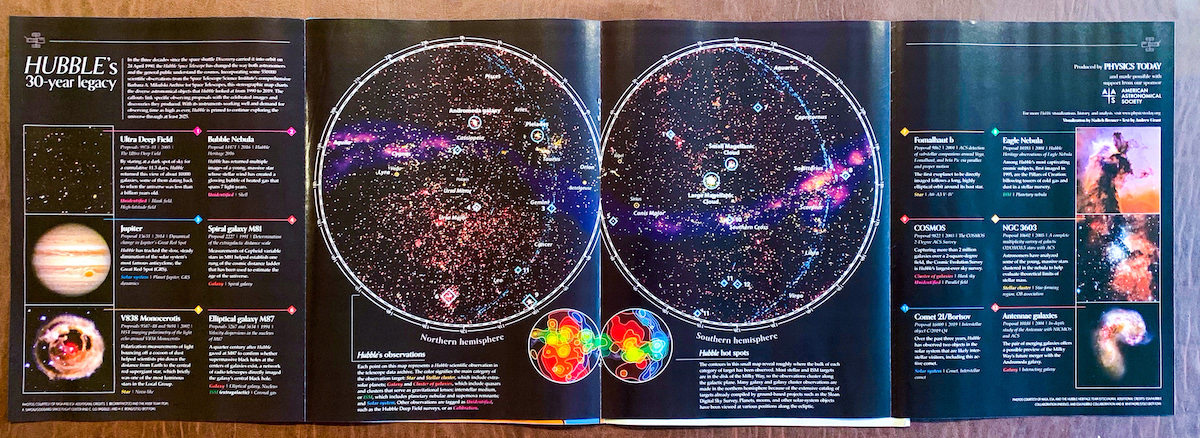
I had send my design for the poster, plus an image of the sky map without any text, to Physics Today so the print department could create a version for the magazine. With all of the details going on in the main map, it needed the full height of a page and thus they couldn’t use the same portrait style layout, instead transforming it to a landscape version. And if it wasn’t already cool enough that the visual would be printed in the magazine, they made it into a bloody gate-fold! ୧☉□☉୨ Below is a photo taken by Hannah Pell, which she shared on Twitter (I can’t wait to get my own hands on an edition!)
Gosh, I’ve really poured my ❤ into this visualization. It was so much fun to work on, and to learn more and more about the history of Hubble and the diversity of observations made. I just couldn’t stop myself, and ended up spending an insane amount of work on it (especially considering that this is a static end result). But it’s become one of the visuals that I’m most proud of ^_^ I hope you’ll enjoy exploring it too!
High Quality Printed Posters
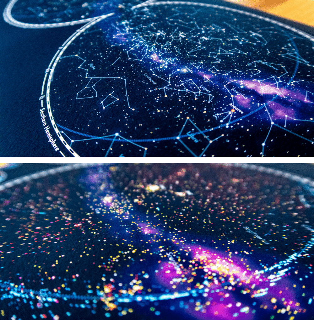
Even though I work almost exclusively in the digital realm, I’m very interested in taking some of my dataviz into the physical realm as well. This seemed like a visual that had enough diversity going on to look well on a large print. Therefore, I turned the sky map into actual posters. Four different versions, using the two different geographic projections that I started this whole project with, and with either the stars & constellations, or the Hubble observations.
A3 is 297x420mm or 11.69x16.53 inches
Bloopers
Not a blooper, but something I came across while looking through the 250+ screenshots that I’d made across the weeks. Several snapshots of the sky map version with all the bells and whistles where each was showing only observations that come from one color. I didn’t have the space (or interactive options) to show this in the main visual on the Physics Today website, but at least in this blog I can show you a simple animated gif of these subsets.
Ok, here are the actual bloopers, enjoy!