Besides a visualization that plotted Hubble’s observation on a map in the sky, I created another dataviz for Physics Today to celebrate the Hubble Space Telescope’s 30 year anniversary in April 2020. Revealing the types of astronomy targets that Hubble has been looking at. In this design blog I’ll take you through the design process that led to the final visual.
You can read all about the steps that led up to my collaboration with Physics Today, the data consisting of all of Hubble’s the science tagged observations from the Mikulski Archive for Space Telescopes (MAST), and the very long data cleaning & analysis phase in my other blog, which is about the creation of the “flagship” visualization of the two; the sky map. This blog continues as a second branch at the end of the Data Cleaning, Analysis & Research section from the sky map blog.
The website of the predetermined list doesn’t work in every browser it seems…
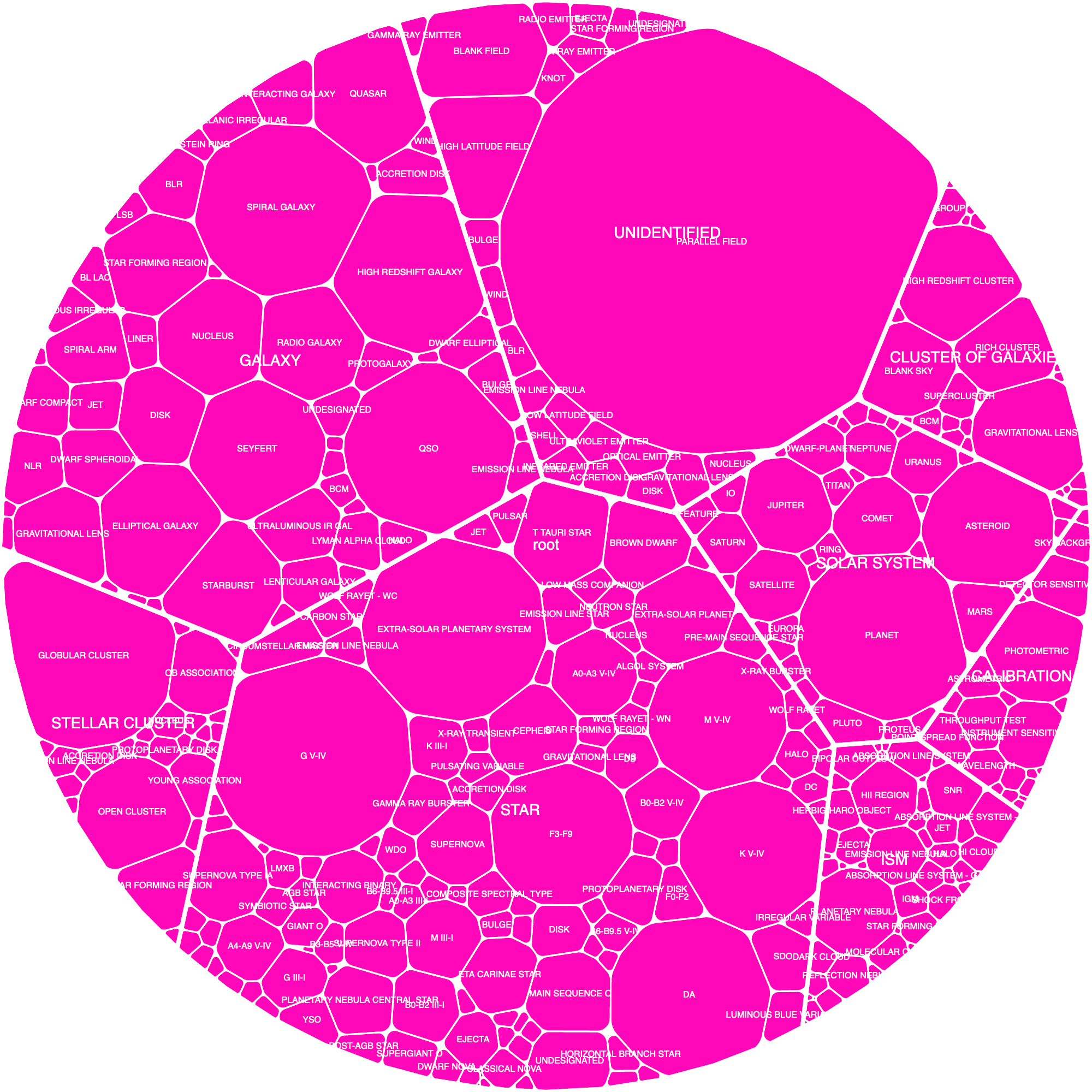
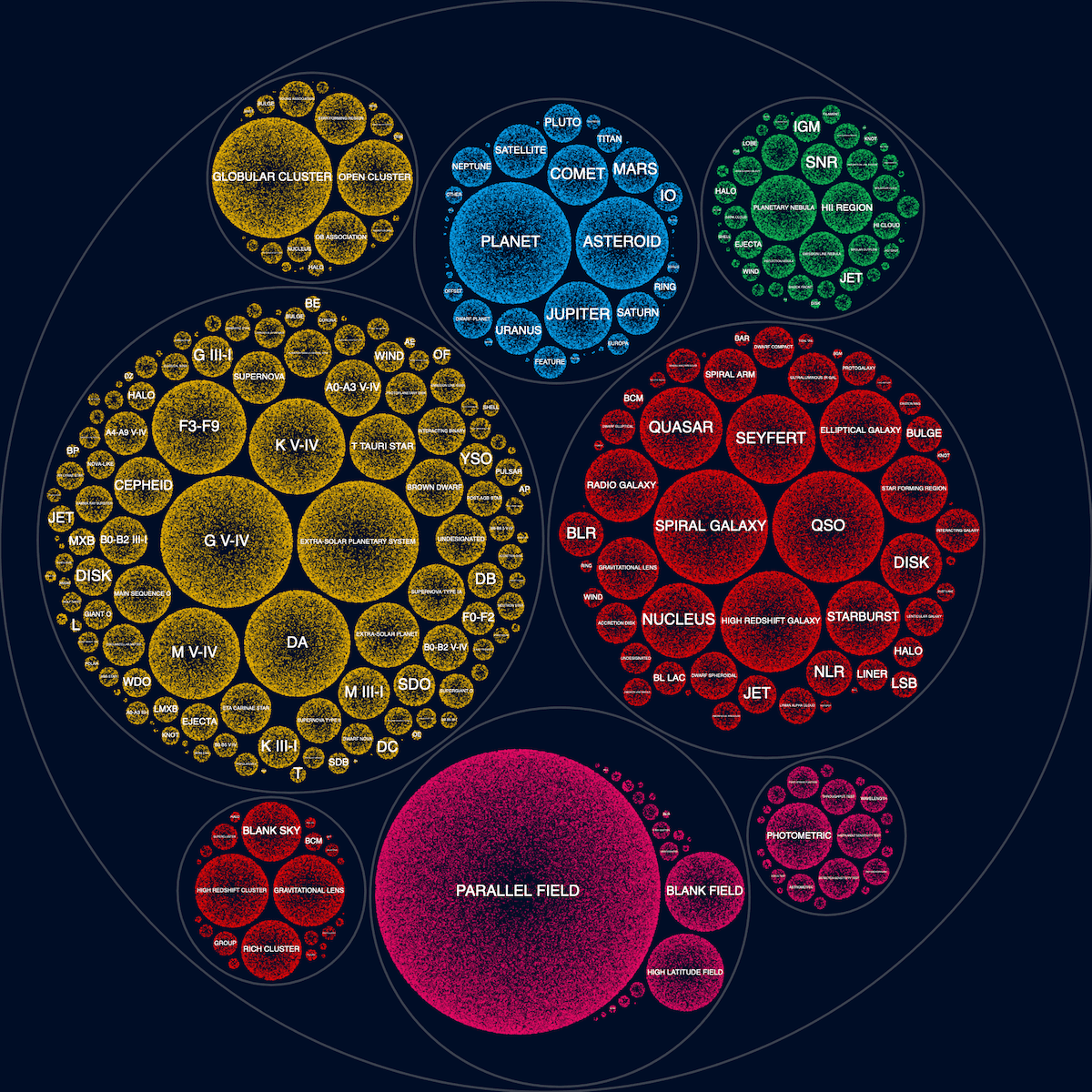
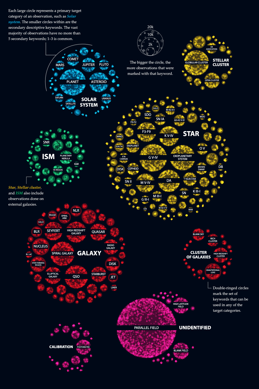
So! Continuing from the point where the data was cleaned, analyzed, and visualization ideas figured out: Each datapoint, an observation that Hubble has made, has a main target that could come from 11 main classifications, such as star, or galaxy, and it could have between 0 - ±9 secondary classifications, which come from a predetermined list, such as supernova or interacting galaxy.
I wanted to visualize how often certain classifications has been used, while simultaneously teaching the audience about some astronomy terms and what they relate to. For example seeing that supernova belongs to the main class of star. Or that a planetary nebula is part of the main class of interstellar matter (ISM).
Figuring Out the Chart Form
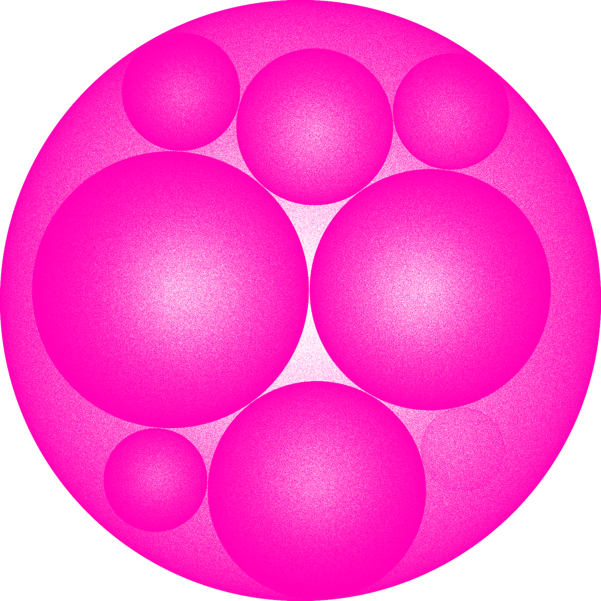
Seeing that this data was hierarchical in nature, I defaulted to my preferred hierarchical chart form; Circle Packing (especially when you want to use size to scale each subgroup). I’ve made it often enough by now that I can quickly find some code from previous projects to start with and plug in the new data.
Using the handy measureText function that is part of HTML5 canvas I could figure out a font size that would make the full target classification label fit inside. If the font size becomes too small, I don’t draw a label.
When I had that working I could finally see how these different secondary classifications were scaled to each other and how that affected the size of the 11 different main targets.
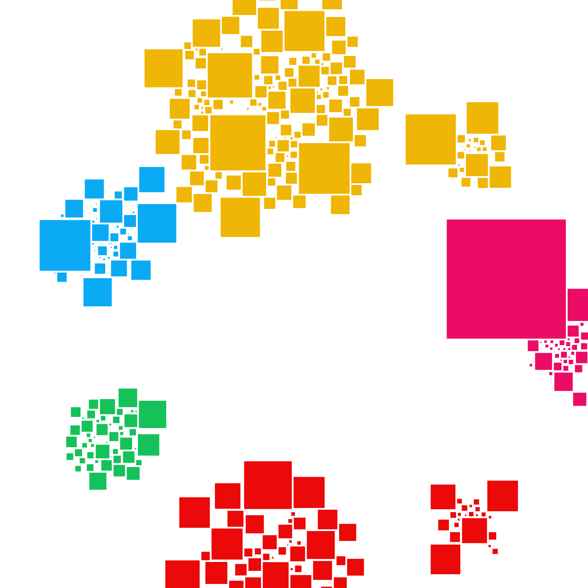
I had recently worked with a voronoi-treemap, for a project I did for Greenpeace Unearthed & Public Eye, where the size of each cell is scaled to each other. It’s basically a treemap, but with more natural and interesting shapes I find. As a benefit over circle packing, the size of each level of the hierarchy scales correctly; the cells of all the classifications that belong to star make up the “bigger” cell of star exactly, there’s no whitespace such as with circle packing that artificially adds volume.
With the code for a voronoi-treemap still fresh in my mind I created a version based on the Hubble data. It looked interesting, but it wasn’t quite the design that I wanted to go for with this Hubble data.
I also tried to use d3’s force algorithm where each secondary classification became a rectangle, which all wanted to cluster with other secondary classifications of the same main target. However, I couldn’t manage to make the rectangles fit together nicely though. There were always large gaps and white spaces in between them.
Most search results led to the algorithms to pack rectangles into a predefined larger rectangle (e.g. packages into a delivery van)
And thus I started looking for some form of square packing. Basically the same idea as circle packing but with squares. But it seems this is a much harder algorithm to solve, because I couldn’t find a fool proof solution. In fact, I only found one result that even remotely tried to make a square packing algorithm in this blog by Interactive Things. It seems to work for a handful of squares, but I expected it to fail for my case. Nevertheless, I installed the simple-square-packing module that the writer had created. It was easy to start using, so I just wanted to see if this was potentially going somewhere at all.
I would still be really happy if someone does ever create a fully working square packing algorithm!
Nope it wasn’t… And I’d already spend so much time on the data cleaning, analysis, and the sky map that I just didn’t have the time to try and figure out this algorithm in a thin hope that maybe I could make it work for more rectangles.
After these different tests I felt that the initial circle packing visual looked the best for this dataset; using circles to represent objects in the sky, and how the main sky map was also in the shape of (two) circles. I “only” had to figure out the design of those circles now.
Sketching ideas
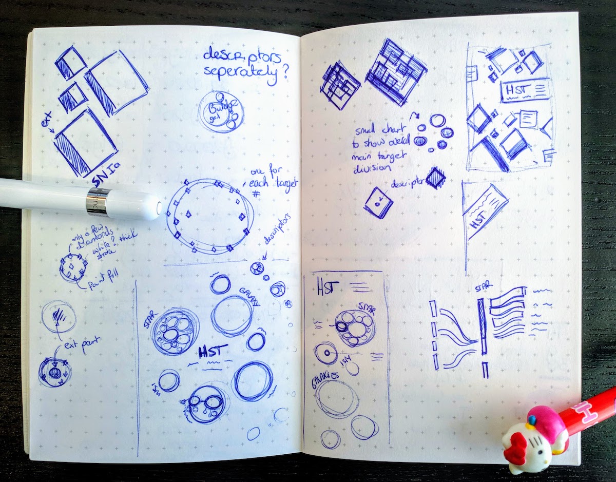
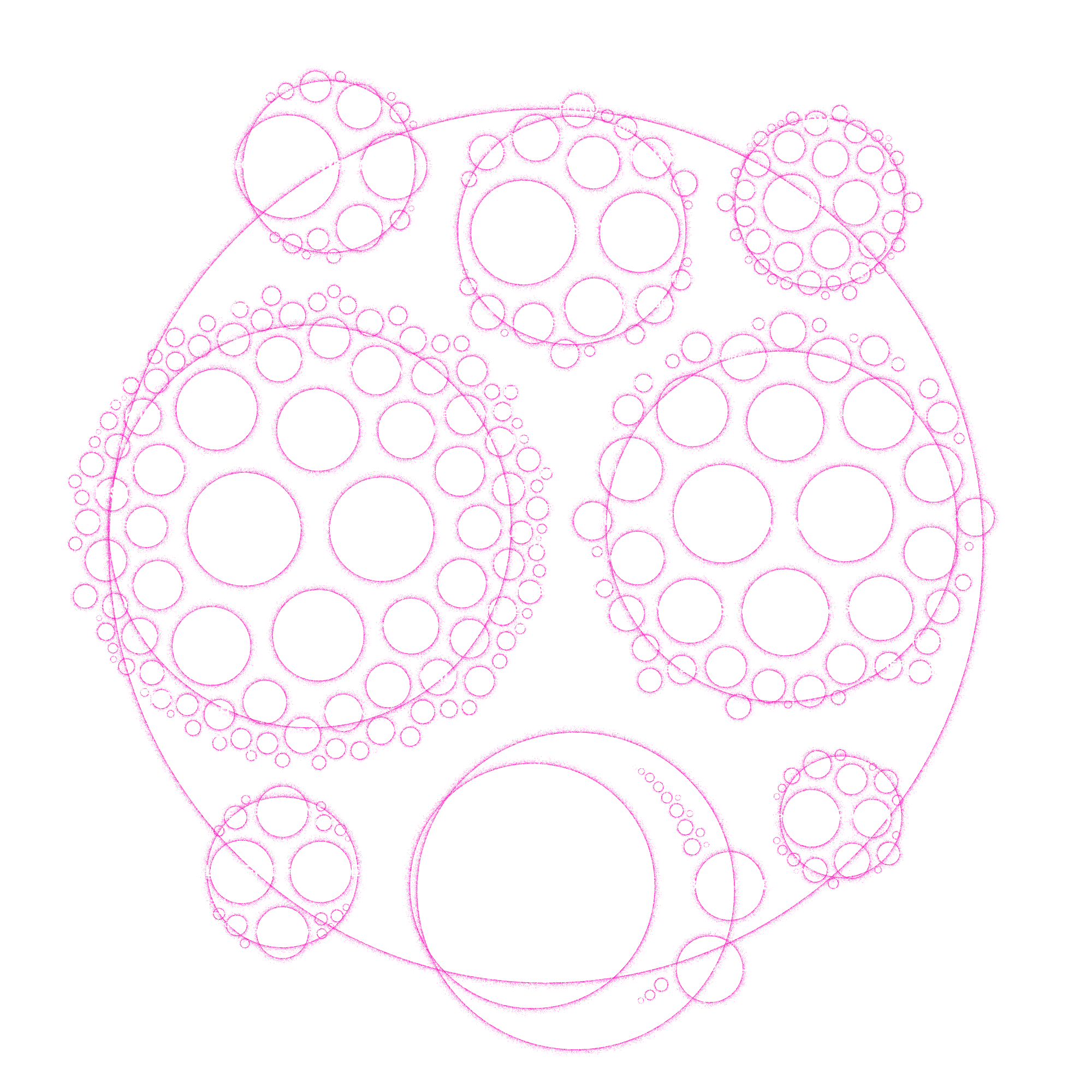
As always, I also sketched out some ideas, but throughout the design phase, I kept on adding small ideas and notes within the available white space. What you see below is a chaos that came together across a week’s time and goes from the start (which chart form) to the finished design (how to layout the final idea). I didn’t really know where to place this image in the blog, so I just put it halfway ┐( ̄ヮ ̄)┌
The Many Ways of Placing Dots
If I find some code online which becomes the basis of something in my own code, I always add the original URL where I found it in a comment
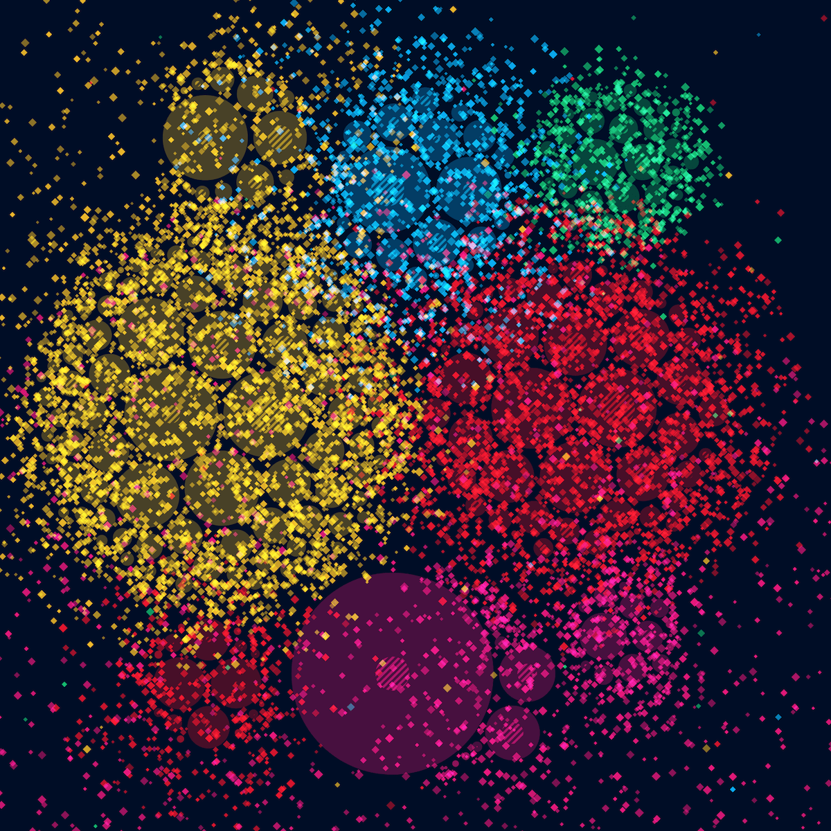
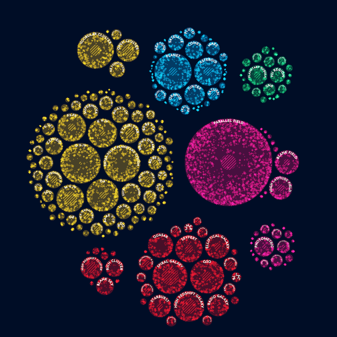
With more than half a million observations to work with, I thought it would be interesting to try and use one dot for each observation which together created the appearance of each circle. Using dots to create a circle reminded me of something that I’d experimented with a year before while working on my “Why do cats and dogs…?” project. Digging a little into my (code) comments of that project I found the tweet with the “dotting effect” that I was looking for, by Manoloide
And thus I went into a stretch of playing with the formulas to create the circles with tiny dots. In my first attempt of making the “dotting” formula work I somehow created a dotted drop shadow effect instead (*^▽^*)ゞ Which actually looked quite visually pleasing I found.
Then it became a matter of tweaking the formulas, the number of dots to draw, the colors, the padding, etc. to try and figure out which result I was most happy with and what would actually work for a data visualization. It took a while before my browser was done with drawing all those dots for each new try, but thankfully the final visual was going to be static, so it didn’t matter that the code wasn’t fast.
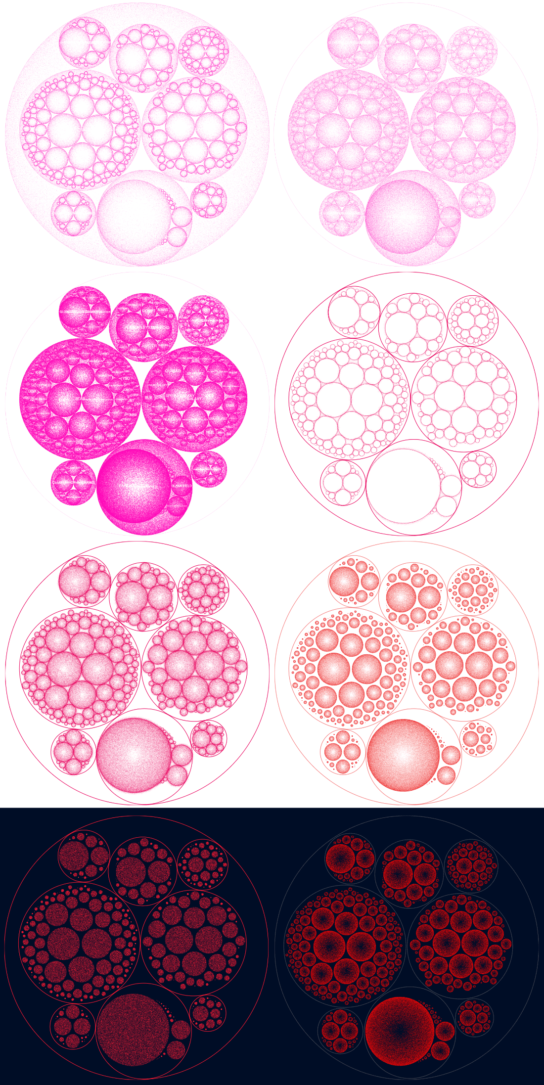
Eventually I settled on using a dark background (the same color as the sky map), and applying the same colors to each main target group as the sky map as well to signify that the two visualization were connected. The “dotting” was more dense around the outside of each circle, but with a relatively slow fall-off towards the middle.
Introducing the Diamonds
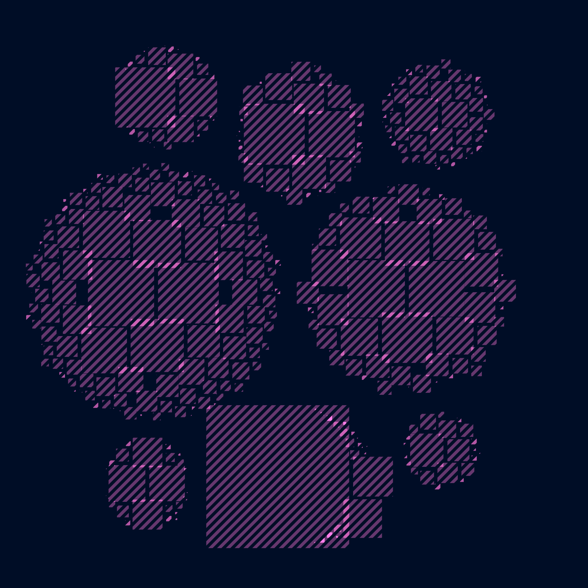
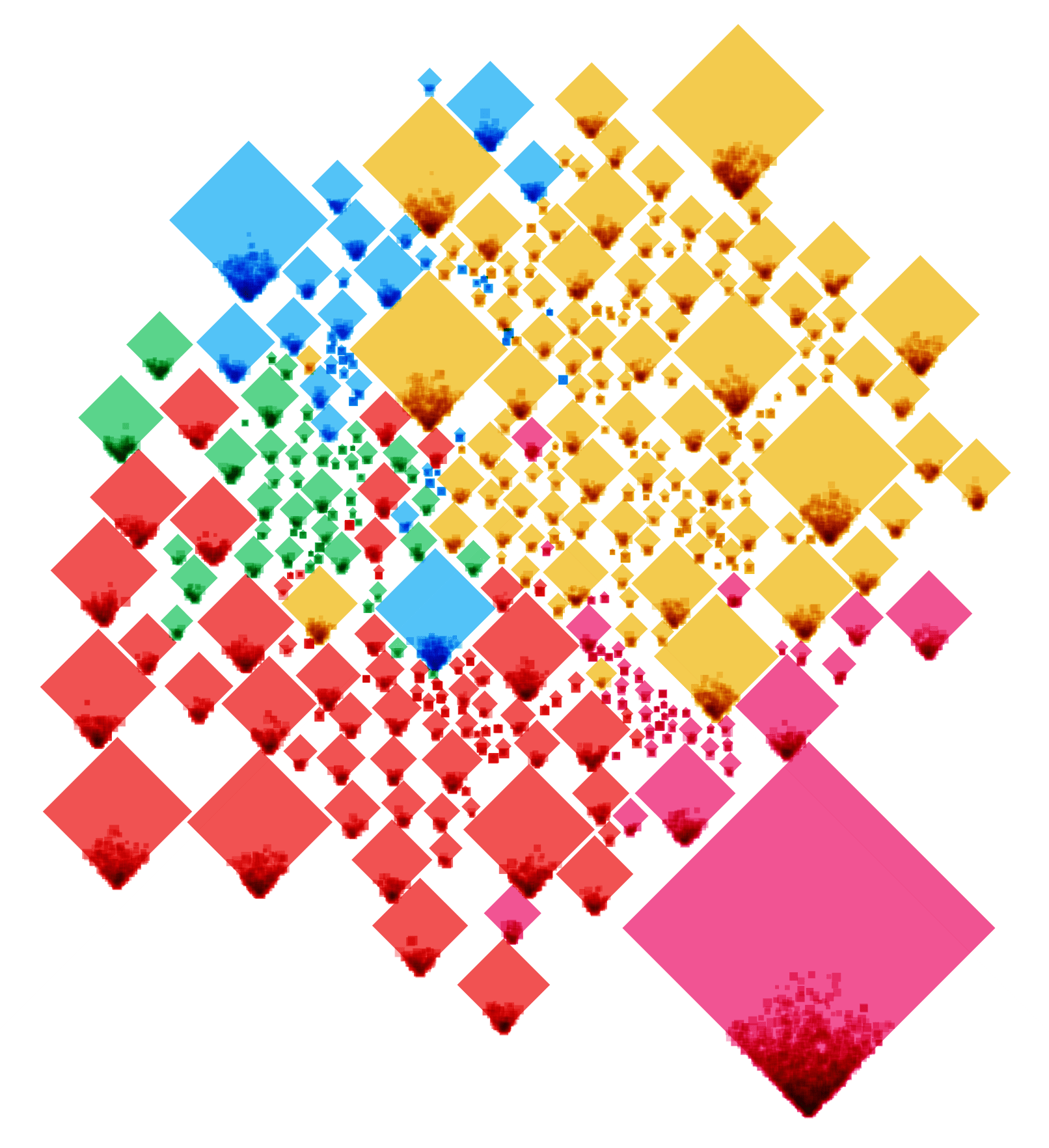
I don’t quite remember how the next change came about, but probably because I was thinking of how I could make this visual closer in design to the main sky map. In that sky map I use a tiny diamond shape to plot each of the 550,000+ observations. And so I tried to draw diamonds in this visual as well instead of tiny dots. I did have to make the diamonds a lot bigger to make the shape apparent. But I was unexpectedly happy with the result (ノ◕ヮ◕)ノ*:・゚✧ It kind of made me think of the multitude of twinkling stars that you can see on a truly dark night.
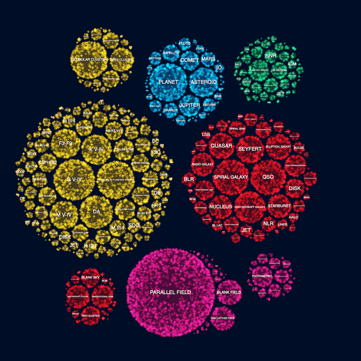
Actually, the number of diamonds drawn is max(3, num_observations/60)
I played a little with using slightly different sizes and opacities for each diamond, chosen at random, to create a more visually interesting and diverse result. Because the diamonds were a lot bigger I couldn’t draw one diamond per actual observation, but instead divide that number by 60. The true number of diamonds drawn really wasn’t important to this visual, but part of me liked that the final number of diamonds still had a little to do with the actual data.
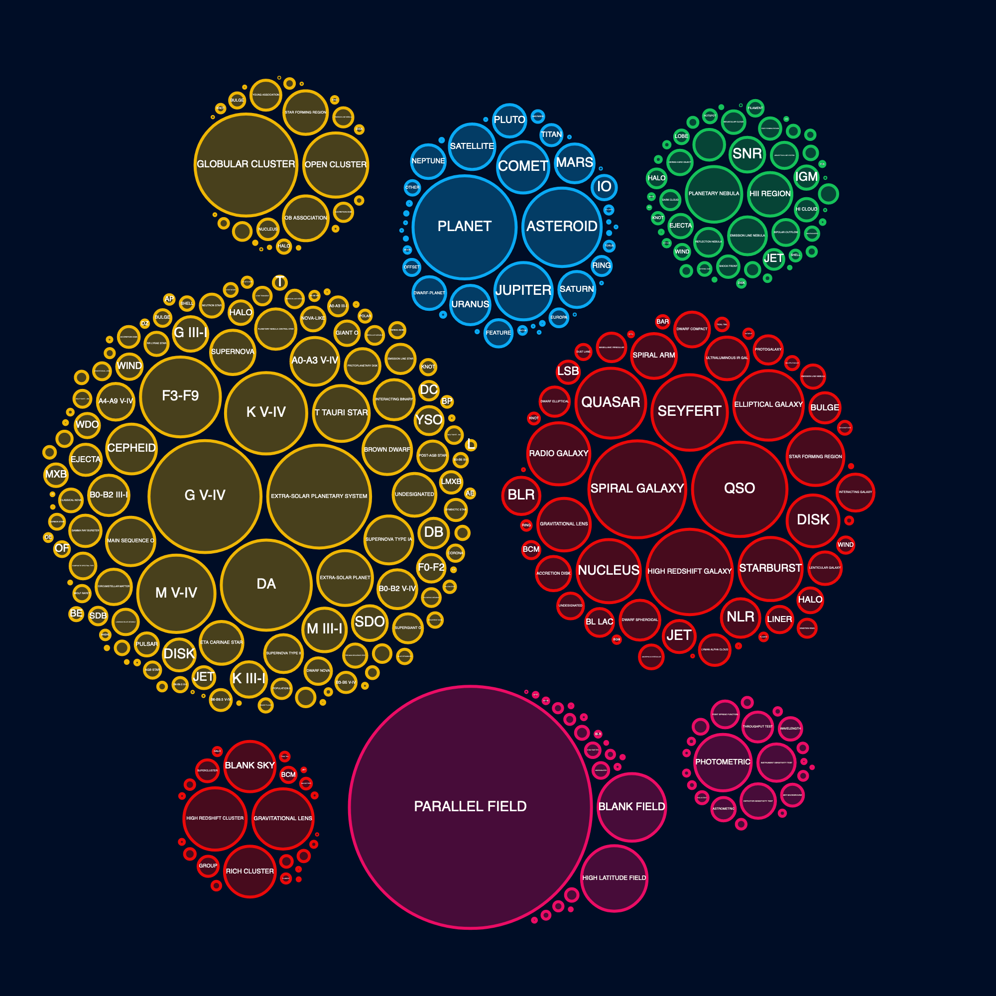
To make sure that my design tweaks hadn’t let me astray too far from a straightforward “perfect circle” approach, I quickly created the most basic version. Yeah, I liked the diamond version a lot more and it was still conveying the same information. Perhaps the tiniest of tiny circles weren’t as easily visible, but that wasn’t where the interesting insights were anyway.
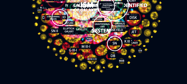
Placing the Labels
I knew that it wasn’t possible to place a label inside each circle. However, I felt that the focus had to be on the biggest circles anyway. The smaller circles (targets that are used a lot less) were more meant as context. In trying to get more labels visible, I created a version where they were placed along a curved line.
One look at the result showed me that it wasn’t a good solution. Many circles were already so small that any text inside was curved too much. Keeping the labels straight was much better even if less circles would be able to show labels.
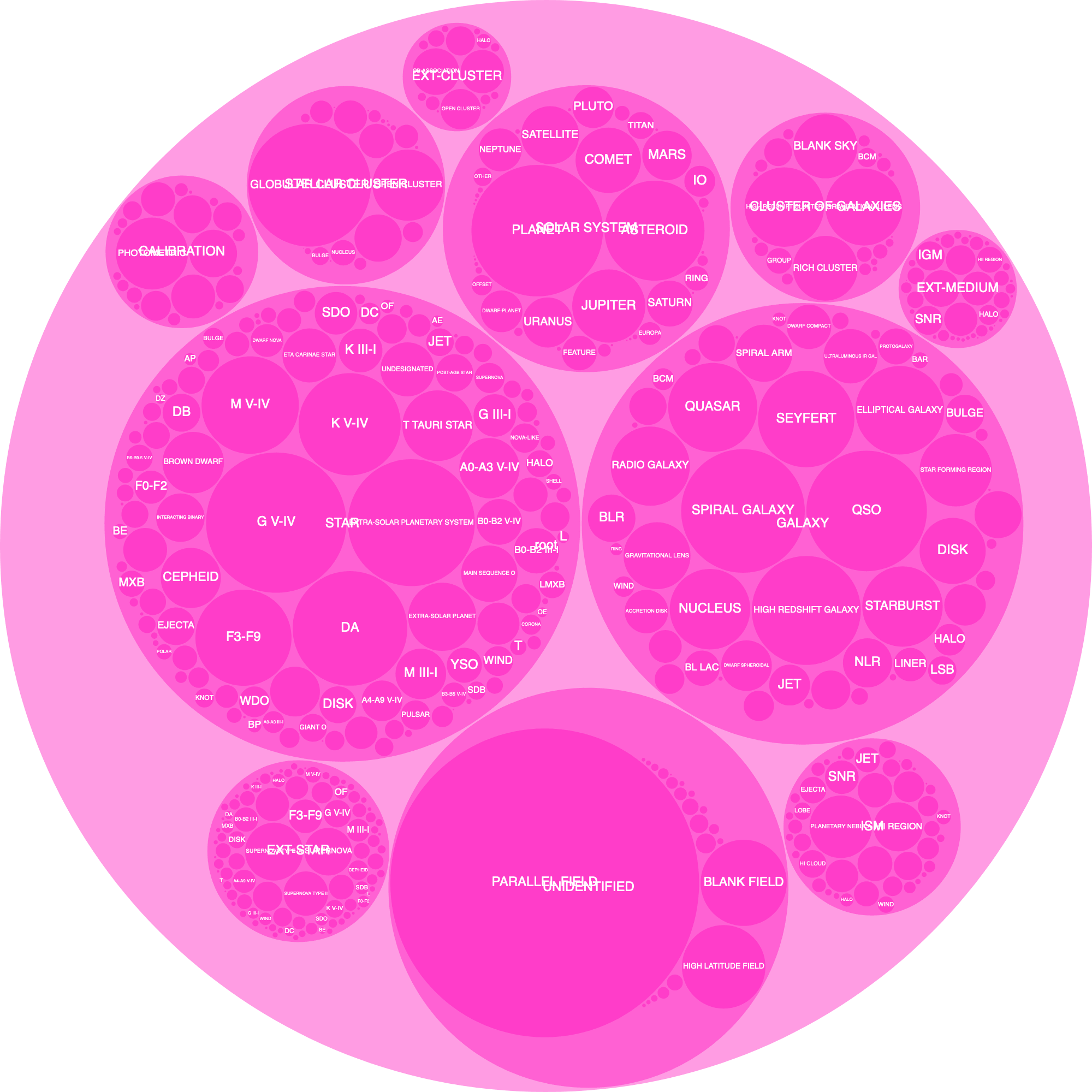
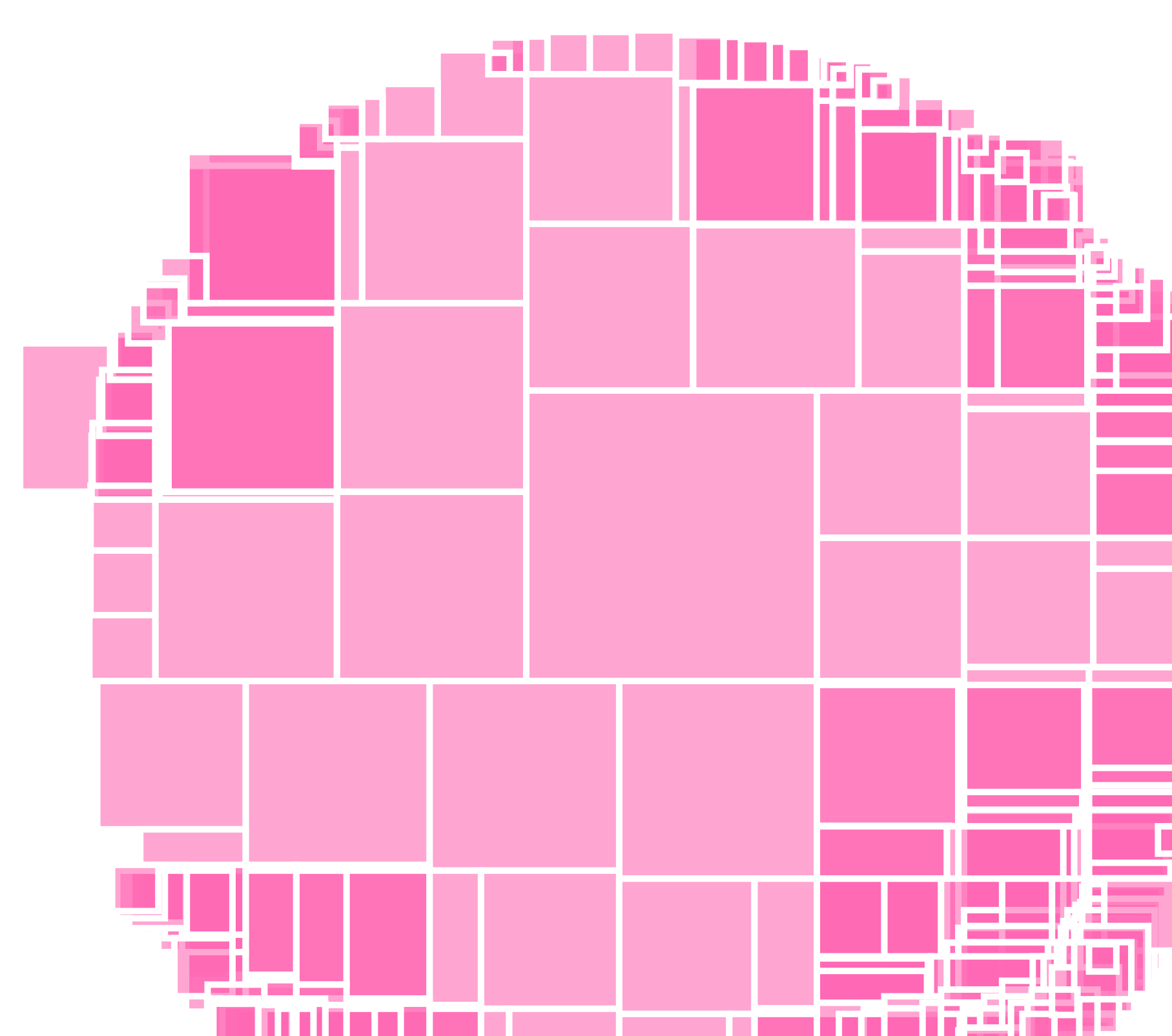
Galaxies are external by definition
In the meantime I’d also created hatched circles inside each target circle to give an idea of what part of a certain target came from observations done in external galaxies, such as cepheid observed within our Milky Way versus in another galaxy. The image above shows random numbers that I’d put in for each circle (even though some categories don’t have an “external counterpart,” such as galaxies) because I hadn’t yet calculated the actual percentage with the raw data in R. Eventually I removed the hatched circles after feedback from Physics Today that said it was too much. I do often have a tendency to want to put in as many contextual elements and information to a visual, haha.
Going back to the straight labels. However, they were a little hard to read on top of those circles filled with diamonds. On a whim I thought to place a dark rectangle on top of the circle first in the same color as the dark background and I quite liked the result. White text on top of an almost black background was as readable as I was going to get it.
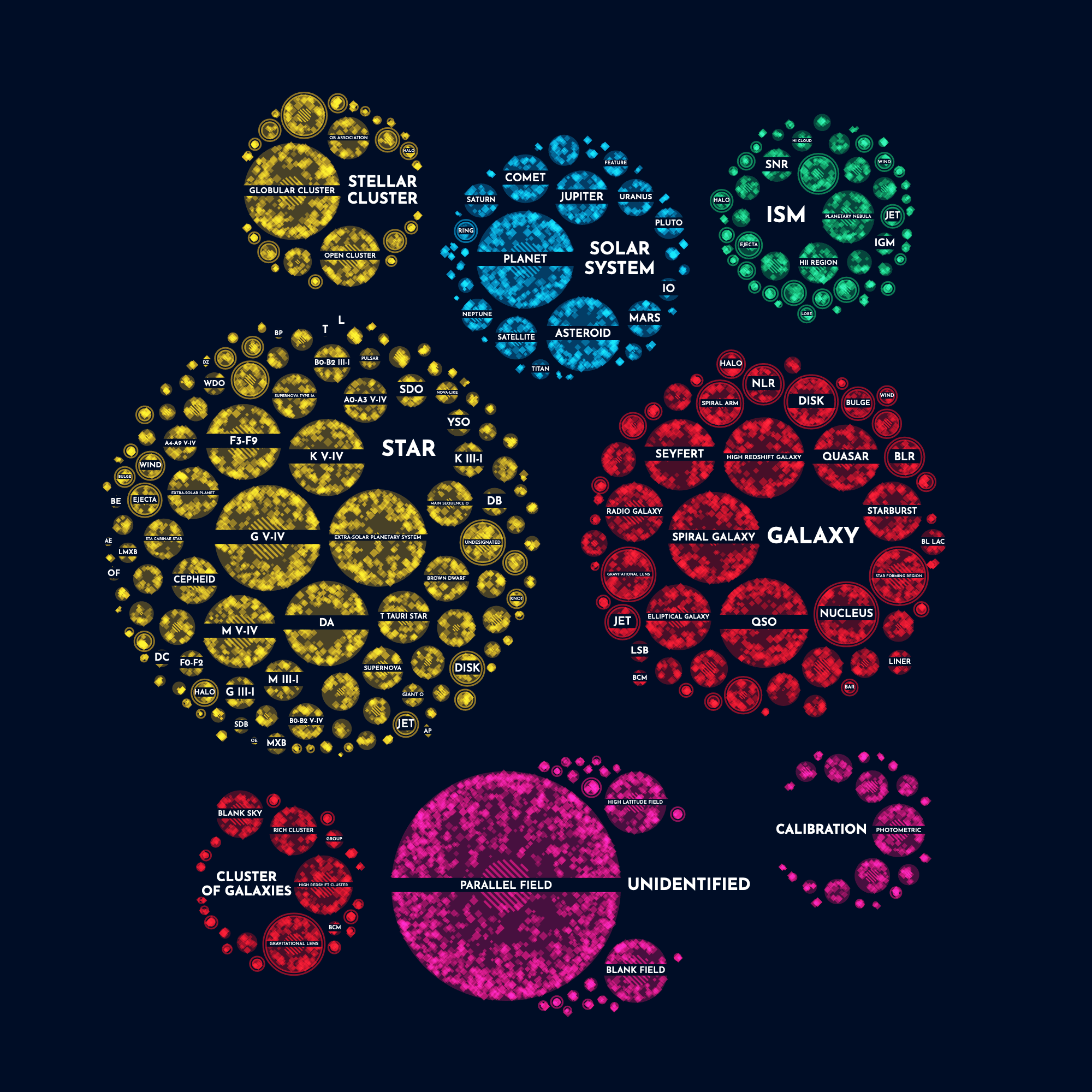
I also had to add the labels of the main categories themselves, the star, solar system and others. This time I wanted to try something different from adding it to the top or side of the circle, or curving it along the outside radius. Instead I added a dummy circle to the data which the circle packing algorithm would incorporate. I made sure that these dummy circles were marked as “dummy” in the data so I could visualize them differently (i.e. not draw anything except a label).
Some fine-tuning was needed to figure out how large each dummy circle needed to be to properly show the full label. A few labels were so long that I created (very manual) code to create two lines of text if needed, such as Cluster of galaxies.
Creating the Final Visual
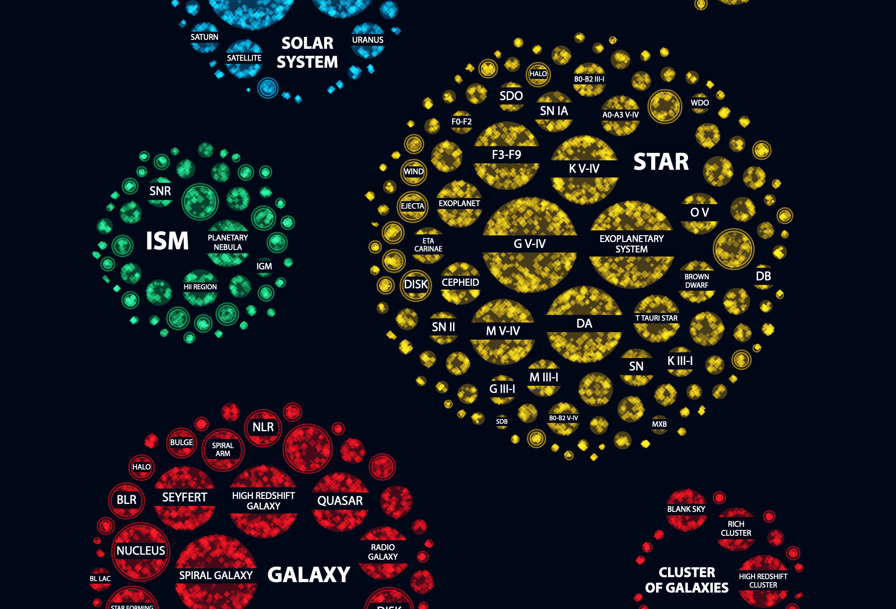
For the final layout I jiggled the circles into a more rectangular layout. To be able to make as many labels readable in a visual of 900 pixels wide, it was better to go with a more elongated grouping. That way I could make the circles themselves just a little bigger (than in the circular layout).
I switched to the Physics Today fonts and also used the double-line code, that I’d written for the labels of the main targets, to also split a few secondary target labels on two lines.
I programmed the visual with HTML5 canvas, meaning that the visual in my web browser was already a png
After that was done I took the resulting image from my browser (as a png) into Affinity Designer to add some textual elements, such as the legend for the size, and a few more explanations on how to read the visual.
Andrew provided some small changes to the text on the visual, and Greg Stasiewicz wrote the entire article, and that’s how this second visual was finished not much later than the main sky map!
Bloopers
To end with some blooper shots for your enjoyment. This first one below was in interesting one where I was drawing 10, maybe even 100, times more dots than I wanted. The browser just kept on churning and churning without showing anything. After a minute or so I figured that I’d done something wrong in my code and broke off the process. Surprisingly my browser then showed the image of how far it had gotten, which was looked intense in an interesting way (^∇^)