In April, Sony Music Entertainment reached out to me with a really interesting project idea. When a single or album sells more than a certain amount of units they become a gold or platinum record. The artist generally receives a framed vinyl or CD. But in these days of data being tracked everywhere and listening to music online, could I develop a more data art inspired version of a gold record using data from the actual streams, charts and the song itself. Well, that sounded like an amazingly fun project to sink my teeth into so I enthusiastically agreed!
BTW, streams are also counted towards a gold record, with 1,500 audio or video streams counting as 10 track sales or one album sale.
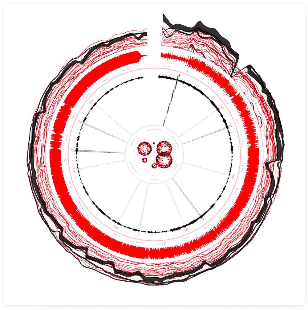
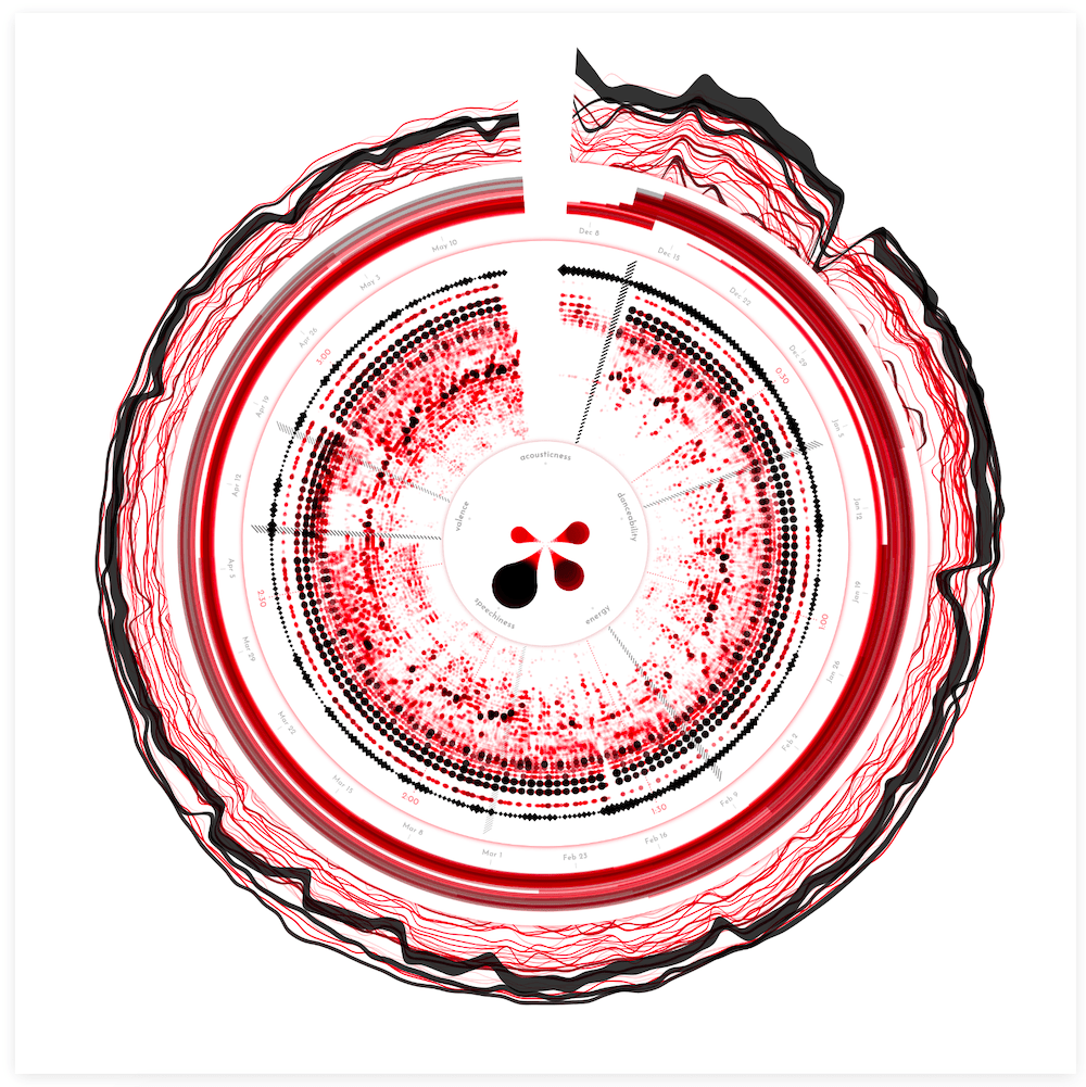
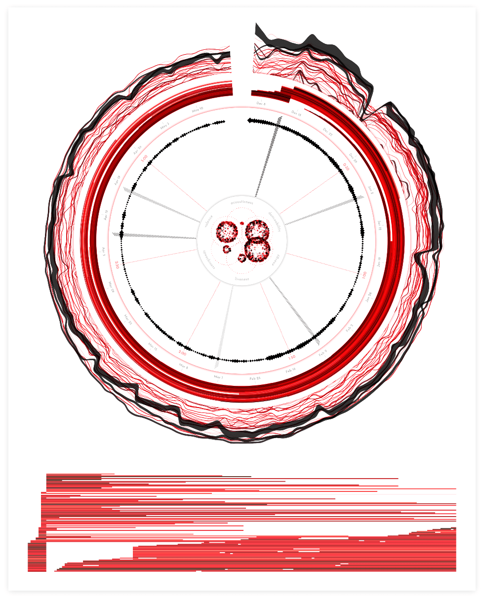
Below you can see the final result based on the song “Adore You” by Harry Styles, the base song that I used for most of the development. I’m very happy that I truly like this song, because I’m not sure if many others have heard this song more often than me by the time I finished (*^▽^*)ゞ
Sony Music has already released six high quality posters that you can download for free (and have printed for example) in this blog! And they’re going to be sharing many more in the future ^_^
Let me show you how I ended up here.
Visualizing Music
I’ve never visualized music before. I’ve visualized data about music, but never data that was directly based on the music itself. For this project I knew from the start that I wanted to use the characteristics of song itself, alongside the data about its streams and chart entries. To create a data-based “fingerprint” for the song. Since I was so new to the topic, I posted a question to Twitter about what data I could even possibly get about music.
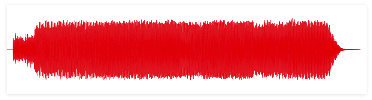
While I was waiting for replies to come in (and respond to) I looked into the Web Audio API. The MDN docs were a great place to start, and they even have a page on making visualizations with the Web Audio API. I searched for as many examples that created visuals with the Web Audio API as I could find. A bar chart of the music’s frequency spectrum was by far the most common visual I saw and thus felt like a good place to start. A few hours of fiddling, locating a very old mp3 (on my laptop) of one of my favorite feel-good songs, “Dancing in the Moonlight” by Toploader, some d3.js programming later, and I had a dancing bar chart! (I apologize for the crappy audio quality of all the clips in this blog!)
Lower frequencies are on the left of the bar chart going towards higher frequencies on the right.
The Pudding has written a very useful Let’s Learn about Waveforms explorable.
Besides the frequency data, the Web Audio API also makes it easy to get the waveform of the song. Turning the bar chart into a line chart, using the waveform data, and voila!
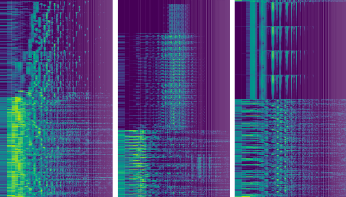
However, both of these visualize the music as it’s playing whereas I wanted a static visual about the song as a whole. The “problem” though is that there’s just a ton of data residing within the full song, both the waveform and frequencies. For example, a typical song is playing at 44,100Hz; that’s how many “datapoints”, in essence, it plays per second! The song “Adore You” is 3:27 long, or 207 seconds, so that totals to a dataset with ±9.1 million entries. Well, good luck making each datapoint clearly visible on a screen… ಥ﹏ಥ Showing the entire waveform of the song basically results in a squished, jaggedy line that only really shows the beat, since these have the highest amplitude.
Due to the way Fourier Transforms work you need the bins to be a power of 2, and I generally found that either 512, 1024 or 2048 datapoints are used per bin.
To get the frequency spectrum data along the full song, on the other hand, you need to chunk the full dataset into bins. Each bin is then used in a Fast Fourier Transform to get back the different frequencies detected within that snippet of song. The more datapoints in the bin, the better the resolution of the resulting frequencies, but the less bins you can make from the full song (it’s a bit more nuanced than that, but this captures the essence). With a bin size of 2048, I would still have ±4,400 frequency spectra to visualize (or one for each 0.05 seconds of the song, where each resulting frequency spectrum contains 1024 datapoints). Still a lot, but somewhat more manageable than 9.1 million. In short, I was going to focus on the frequencies.
Logarithmic Scales
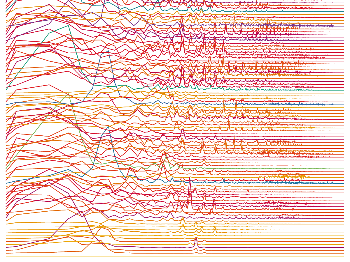
Looking more into frequencies I learned that humans don’t perceive sound/notes/frequencies in a linear fashion. Instead our ears respond logarithmically to both the volume and frequency. I therefore switched from showing the range between ±20 Hz to 20,000 Hz in a linear fashion (the first video below), to a logarithmic scale (the second video below).
The logarithmic version spreads the actual notes that you hear across almost all the width, whereas in the linear version barely anything is happening in the right half. You can see the difference even better when I recreate these animations for a short snippet that sounds as if it’s increasing linearly in pitch (is that the right word?). The linear scale basically stays along the left for most of what you hear, whereas the logarithmic scale moves along steadily with the perceived sound.
Amplitude Spectrum
Eventually I asked the Meyda contributors on GitHub what the difference was between the frequency and amplitude spectrum.
The second big change came when I started to investigate all the resources that people had send me in response to my initial tweet. Especially Meyda seemed able to get some really interesting insights from the music itself. The software can extract a multitude of audio features from a song, but what stood out to me was the Amplitude Spectrum. According to the docs this is “the distribution of frequencies in the signal along with their corresponding strength”. I didn’t know how this related to the frequency spectrum specifically, but I wanted to try it out.
When I saw the results, I felt that it was better at revealing the specific “notes” of the song than what I’d seen before from the frequency spectrum animations. The latter seemed a lot more noisy with tiny spikes on top of tiny spikes (see the second video in the section above for example). With Meyda’s amplitude spectrum my dancing line charts now looked more …. clear?
Since I wanted something that would visually best represent what I was hearing, I decided to continue using the amplitude spectrum.
Another important reason to use Meyda over the Web Audio API was because I could analyze the full song’s frequency spectrum without having to play it in real-time.
As it turns out, the amplitude spectrum is basically the frequency spectrum that I was using from the Web Audio API. The frequency spectrum is the amplitude spectrum converted to decibels (and the Web Audio API’s getByteFrequencyData() function is furthermore clamped to lie within 0 - 255). And decibels are a rather tricky scale to work with.
Spectrograms
These two sources explain spectrograms much better.
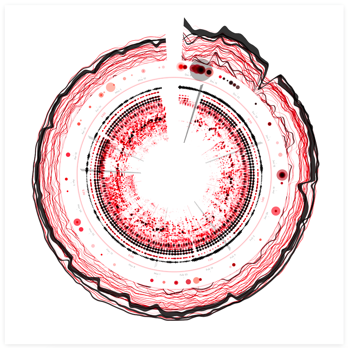
From the moment I saw my first wiggly frequency spectrum line dance on the screen, I already had something vague in mind on what to do for the full song. Later, while searching the web more generally for frequency/amplitude spectra I saw that my idea already existed. They’re called spectrograms. In essence, a heatmap with frequency bins along one axis, time along the other axis, and color to represent the value (or amplitude) of each frequency at each point in time.
By far the best interactive implementation that I found was the Spectrogram from Chrome Experiments. I could even use the “Dancing in the Moonlight” mp3 file.
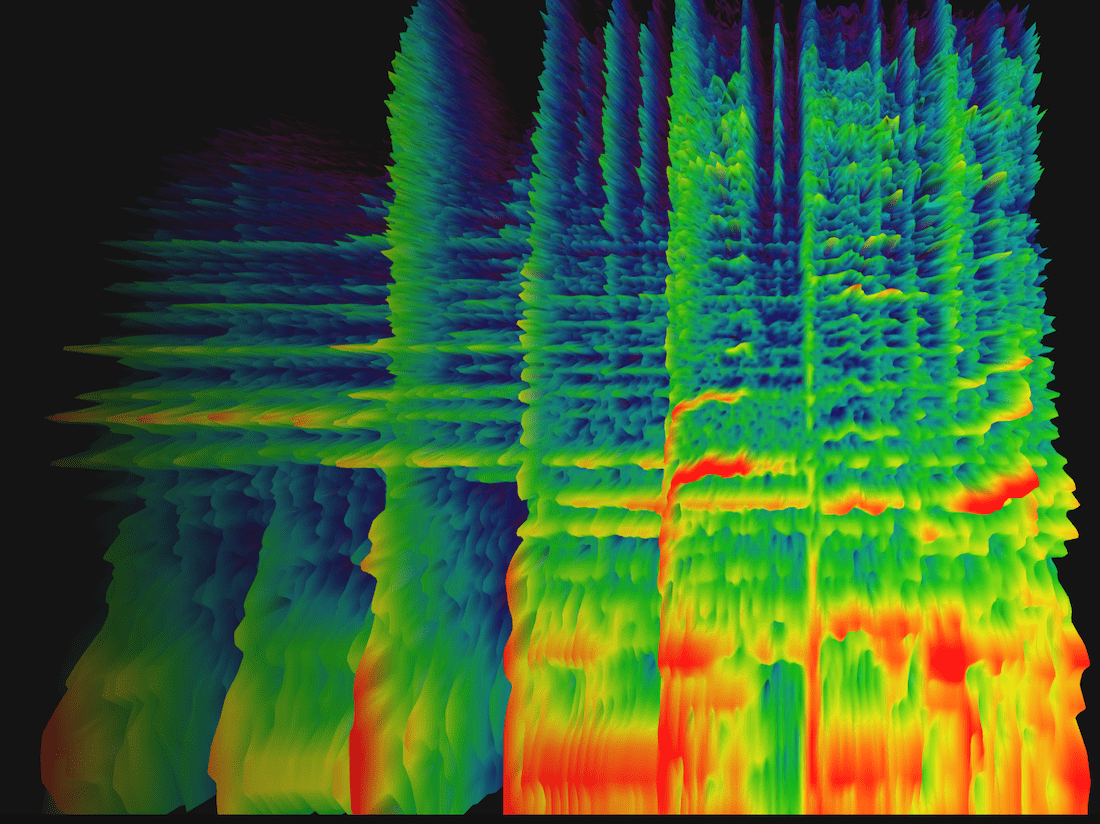
In my first step towards a heatmap, I plotted a selection of the amplitude spectra above one another, moving up a little with each new line. And thus I had suddenly created my own version of a famous visual made by astronomer Harold Craft in his thesis on the first pulsar ᕕ( ᐛ )ᕗ
Next, I converted it all to a heatmap where each rectangle represents a small range of frequencies, switched to a viridis color scale and pressed play:
The low/bass is in the left third of the visual and the voices appear toward the right of the middle. I thought it was so cool to start seeing a “fingerprint” and what had actually happened in the song. The yellow rectangles along the left to signify the steady beat, the yellow squiggles along the middle revealing how a voice rises and falls with a melody. I immediately searched for some other mp3’s and applied the same code. The results were all unique and clearly revealing some very inherent structure of each song.
And it was only at this point that I felt like I was on the right track in my “quest” to visualize the data of the music itself (๑•̀ㅂ•́)ง✧
Circles
In rectangular form the heatmap was taking up a ton of space. The versions above are only the first ±30 seconds of a song. So, I wrapped it into a circle! It gives you about 3x more space in the same amount of height and I like the visual look of circles. But here there were two other important reasons (besides the extra space it gives) to go for a circular form.
The first is that this is inspired by the gold record which typically features a large circular vinyl record, and thus I wanted the base of this visualization to be circular as well, as if to mimic that original layout. The second reason was that most of the amplitude spectrum “action” is happening in the lower frequencies. By wrapping it into a circle the lower frequencies would get more space along the outside, whereas the rarely used high frequencies take up much less space in the center.
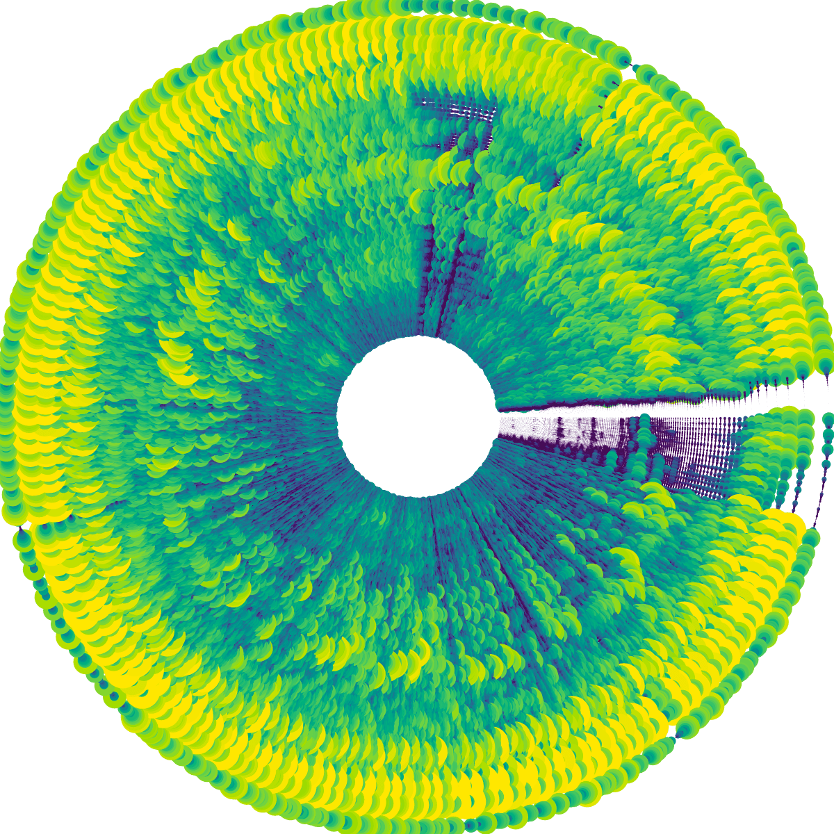
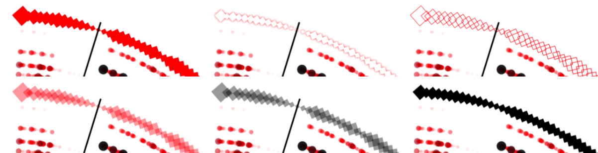
I turned each rectangle into a circle and scaled the size with the amplitude as well (besides the color), and I immediately liked the look of it a lot more than the rectangular heatmap! In animated form it was also more fun to watch than the rectangular one, and a lot easier to follow with your eyes.
Nevertheless, there was definitely some work to do to make this look visually more effective and on brand. Right now the circles were too large and overlapping which meant that you couldn’t really see the more subtle effects that were going on (such as the voice going up or down).
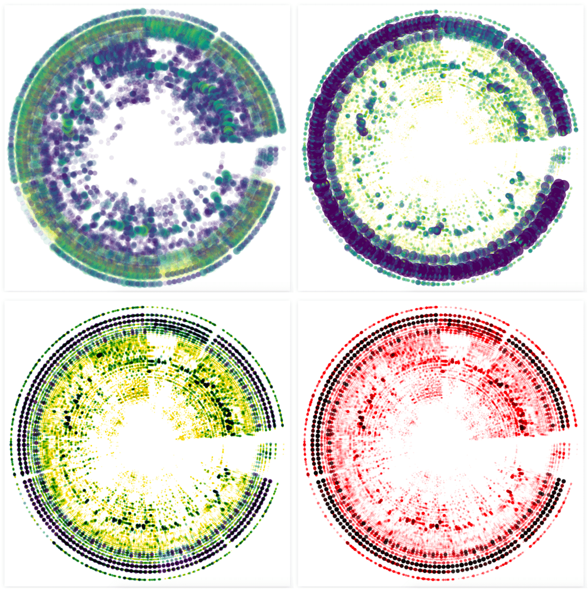
Through an iterative process I eventually ended up with much smaller circles, so the different aspects of the song weren’t overlapping each other anymore (such as the beat in the outside section), and eventually moved to a palette inspired by the red color of the Sony Music logo.
I thought about adding new colors to the palette, maybe red for the base frequencies and other colors for the midrange for example. However, this visual would potentially/hopefully be created for many different artists, each which their own style and vibe. I therefore wanted the palette to remain rather abstract/minimal. And using the color red, from the company itself, made it more objective and it would also reinforce the design of the eventual poster, even if the visualization itself might look widely different from song to song.
Below you can see some results when I applied the latest design to different songs, with “Aerodynamic” in the top-left, and a song by Elvis in the middle-left. The bottom two images show the result of two short sound snippets. With the bottom-left one being that frequency sweep that I’ve used in the “Logarithmic Scales” section above.
Spotify Audio Analysis
I also had access to second dataset about the music itself, the Spotify Audio Analysis. If you have a Spotify id of the track you can easily download the data from this website. I looked into what each of the variables held in terms of information and felt that the beats and sections seemed like a good choice to add onto my circular spectrogram. I had tried to do something with real-time beat detection earlier on, which hadn’t worked well enough, and the Spotify beats seemed to find the right BPM of songs in general.
I don’t quite understand the logic behind the beat confidence though; it doesn’t seem correlated with the presence of an actual bass/beat sound.
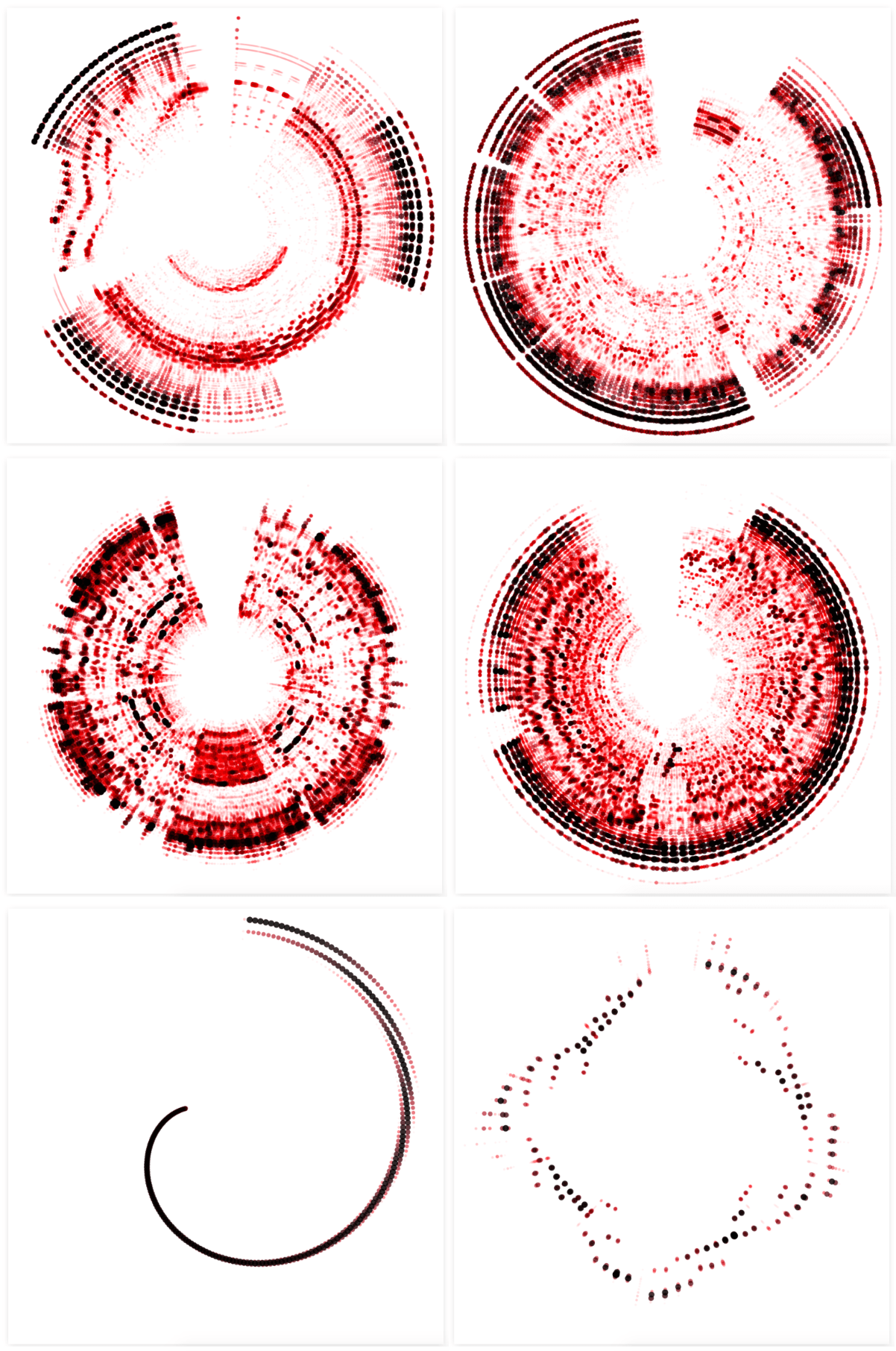
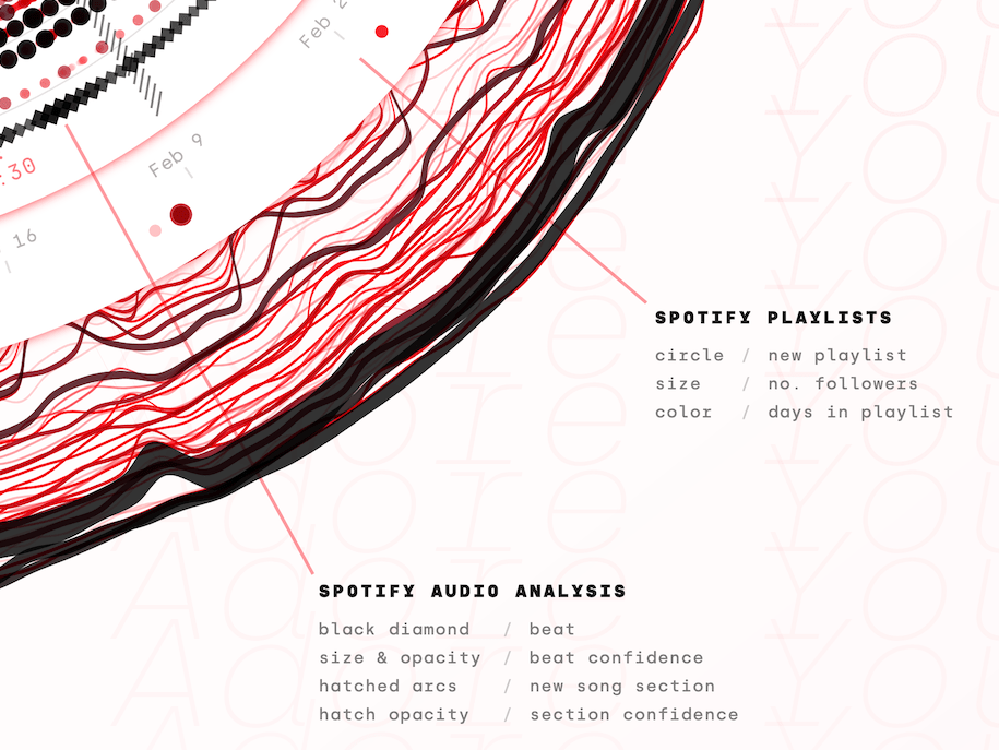
I added the Spotify beats as an outer ring of diamonds, to make them different from the amplitude spectrum circles. I knew that I wanted to base the size of the diamonds on the beat confidence, a variable in the dataset, but I tinkered a lot with the appearance; red or black, stroked or filled, glow or not. In the end I preferred the look of a straightforward black fill (much later I used the beat confidence for the diamond opacity as well).
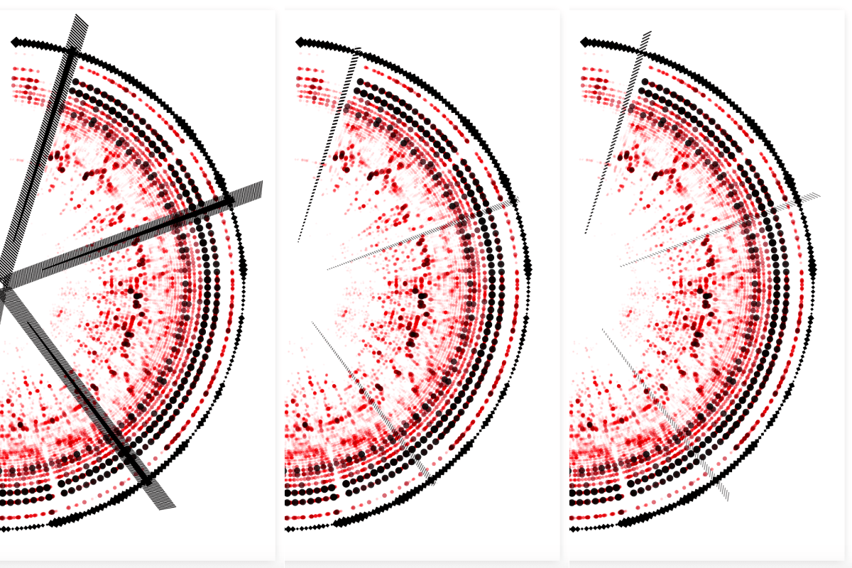
The sections are defined by “large variations in rhythm or timbre, e.g. chorus, verse, bridge, guitar solo, etc”. I wanted to create small arcs at the start of each section, filling each arc with a hatched pattern. At first, I used the technique of clipping: drawing a bunch of diagonal lines and then clipping that to an arc shape. However, I didn’t like the finesse of that look, especially at the top where you might occasionally still see a snippet of the last clipped line (middle image below). Instead, I wanted something a little rougher. Not clipping the lines, but drawing full lines in a diagonal manner that would increase in size according to an arc shape (right image below).
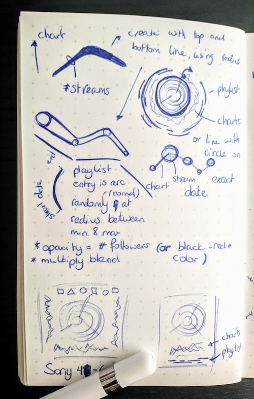
I drew out the sine rule in the bottom-right of my page.
However! Getting to that point was definitely a tricky math puzzle that took me some time to solve. Drawing it out in my little notebook and seeing how to calculate the exact start and end point of each line (at different distances from the center of the circle). I really thought that I wasn’t able to come up with a solution until I remembered to google to sine rule, which finally gave me the missing ingredient to solve for everything!
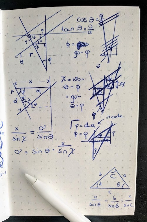
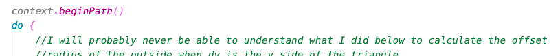
I did add the note below to my script. I already know that (even with excessive comments) I won’t be able to understand the logic behind the end formulas in a few weeks time (¬_¬)
I looked into other possible “music data” aspects, such as loudness or the chords used throughout, but I either didn’t like the result enough, or felt that was adding in too much extra info (such as with the chords). However, having finished the visualization about the actual music didn’t mean I was done. There were a bunch of other fascinating datasets to add.
Spotify Charts and Streaming
Since this data art project would mimic/was inspired by the gold record, but in a digital form, it made sense to add information on how the track had streamed and was viewed online. My contact at Sony Music looked into the data that was available around this topic and came back with three very interesting datasets.
I don’t know from what point in time the number of followers of the playlist is taken. Perhaps the day on which the data is requested?
- The Spotify charting of a track. Containing the number of streams and chart position per day of all the countries where the track had reached position 200 or higher.
- The Youtube streams of the music video per day.
- The Spotify playlists that the track was added to. Together with the possible date that the track had been removed from the playlist and the number of followers.
Sony Music has something in place to easily get these numbers from their system, but all of the data was specifically chosen to also be found publicly through other means, such as Spotify Charts.
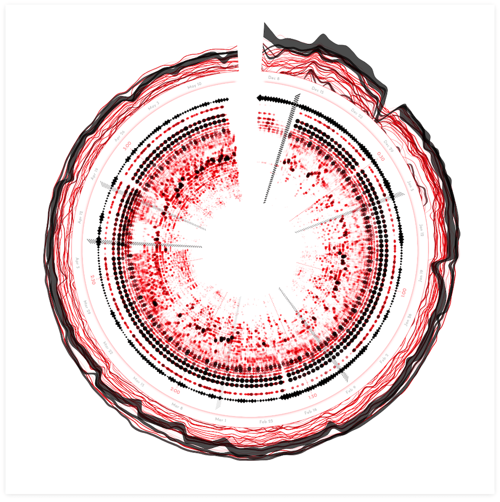
I started drawing some simple sketches to help me think on how to incorporate these datasets. All three new datasets had a similar component in that they were all chronological, having a date. Since the inner circle had time running around the angle (being song duration), I wanted to wrap the other datasets around the circle as well, even though they would have a different scale of time (weeks, instead of seconds).
I did some initial exploration of the data in R to get a sense for it. I immediately noticed that the charting data was very chaotic, but I liked that! It would create some nice visual diversity that would be beneficial for a data art project.
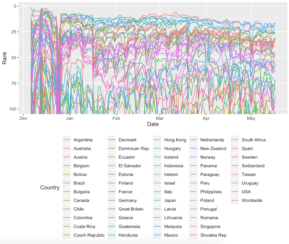
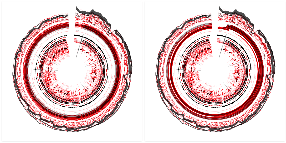
I took the data into my JavaScript code and wrapped it around the circle (really, really easy to do with d3.lineRadial() btw). This particular dataset shows a really interesting data-blip in the top-right, where all the chart rankings suddenly dip drastically for 1 or 2 days. The dates of the dip? December 25 & 26 ʕ•ᴥ•ʔ
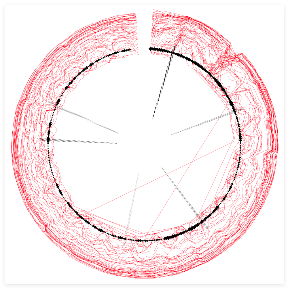
For each of these lines the number of streams per date was also available. I therefore switched from d3.lineRadial() to d3.areaRadial() to use the number of streams as the thickness of the line. Finally, I used the same color palette as the central circle (and principle of higher value = more black) to color each line by the average number of streams.
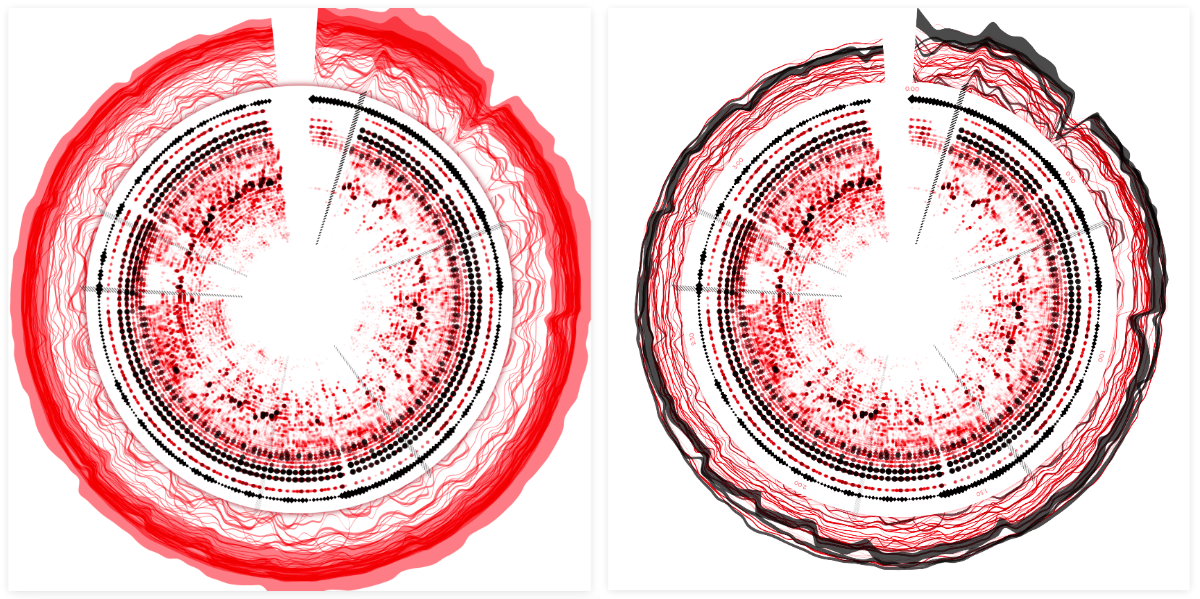
To more clearly separate the central spectrogram part from the outer chart lines I added a circle with a red drop shadow in between the two sections, making it look as if the inner circle was lying on top of the underlying lines. Finally, I added two time axes; one in 30 second intervals for the inner circle, and the second showing the dates for the outer lines. Hopefully that helped to make it more clear that these two parts of the visual didn’t follow the same time scale.
Spotify Playlists | Part I
That went pretty smooth! On to the Spotify playlist data! The most obvious way to visualize this (to me) was to create an arc per playlist, from start to end date. I started out simple by stacking the playlists by start date around the outside of the visual.
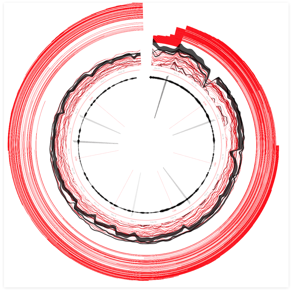
Well, that did reveal some insights about data, with many playlist additions at the release date and then being removed again after exactly 1 week, but it took up a ton of space. It didn’t look very pretty either. I somehow also needed to create a system that would work no matter how few or how many playlist might be in the dataset, thus stacking them wasn’t a good option.
I thought I had some good ideas to try and visualize this differently. For example, by counting the number of playlists that the track is included in, per date, instead of visualizing each playlist separately. However, that looked dreadfully boring! There wasn’t much change happening. Furthermore, it didn’t fit in with the complexity and diversity of the Spotify charting lines and inner amplitude spectrum.
I went back to visualizing each playlist separately, to at least have some visual diversity to play with. What about positioning each playlist randomly around a certain central radius? (left image below) No, no, that was visually too dominant. Gosh, I tried and tweaked so many things, even getting to the point where I thought that converting the straight arcs into squiggly sine lines was a viable idea. Seriously?! What was I thinking?
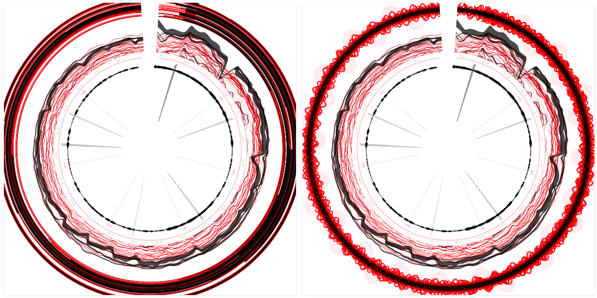
Having the playlists around the outside of the charting lines also created some weird action with the white spacing being trapped in between the outer two sections.
I took the playlist section into the circle. It made more sense to have these straight circular arcs next to the outline of the inner circle. That felt like an improvement at least. However, I still didn’t like the way the playlist arcs looked. They were still quite visually dominant, but in a boring way. The “problem” being that this dataset was just vastly less diverse than the other two already visualized. I therefore couldn’t create the same visual complexity, only single-thickness lines. And it just didn’t mesh with the rest of the visual.
This tactic of letting go for a bit to return to it later has helped me tremendously on many projects.
Because I was out of ideas after a day of trying whatever weird idea that came to mind, I just gave up for now and moved on. Perhaps once more of the visual fell into place, I would get some new inspiration [¬º-°]¬
Spotify Audio Features | Part I
You can get a json file with the information in the same way as the audio analysis data, using the Spotify id on this website.
The last Spotify related dataset that I had were the Spotify Audio Features, not to be confused with the Spotify Audio Analysis dataset that I’ve talked about before. That dataset contained data about the music during the song, such as the beats. The Spotify Audio Features on the other hand is a small dataset that contains some interesting values about the song as a whole. These are a single numbers for things such as danceability, energy, accousticness, and more.
I knew that adding these handful of single values to the visual could be tricky to balance with the diversity of the rest. But I was convinced that placing them in the middle, in some glyph like form inspired by Dear Data/Accurat-style, would work out. And so I started my second doomed quest.
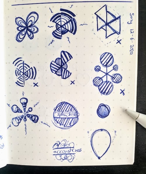
I sat down and sketched out a bunch of ideas on ways to visualize the audio features. All of the Spotify Audio Feature values were abstractly the same; a number between 0 and 1. And thus I should treat each of these values the same way, visually, I felt.
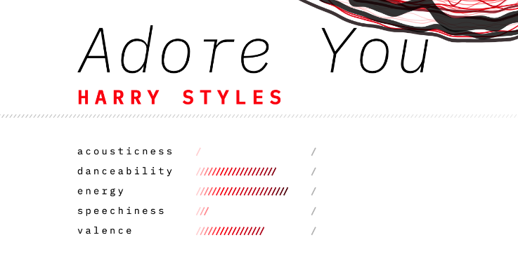
Valence describes the musical positiveness conveyed by a track, from sad (0) to happy (1).
After inspecting the available variables, I chose 5 to visualize: accousticness, danceability, energy, speechiness, and valence, and started on the simplest design; a column of circles, increasing in size, to signify the value.
I added this new section in another “drop shadow circle” in the center to signify that it was different from the amplitude spectrum visual around it. But…. I again didn’t like it. It was a similar feeling as with the playlists, the visual section in the center just didn’t mesh with the diversity of the amplitude spectrum around it. I tried making the glyps more complex themselves, to see if that would fix anything.
I tried more petal-like shapes (image below top-left), which in isolation I quite liked as an abstract representation, but it didn’t fit with the design. My mind went a little crazy again at the point where I decided to spend time and try spiral shapes… ┐( ̄ヮ ̄)┌
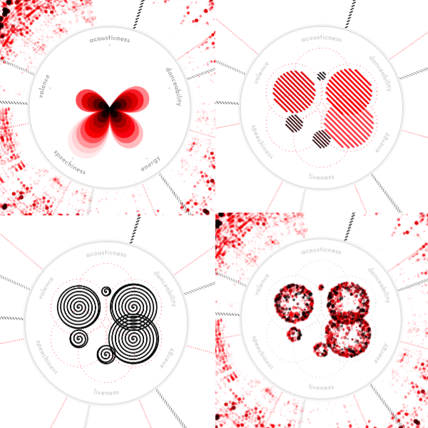
At the end of a day full of iterations, I ended up with the sort of “fireworks” circles from the image above bottom-right. It was at least a mark that had some complexity in it, and felt like the best fit with the overall design. I still wasn’t happy with it though.
That evening I had a call with a dataviz friend, and in the remaining minute I quickly shared my screen to get her thoughts on the current state of the visual. And the first point of feedback she had was that the ring of the playlists and the inner audio features didn’t match with the rest, as if they were forcibly pushed in. Well, that was exactly as I was feeling too! To me, the visual had only gotten worse from the moment that I’d finished the Spotify chart lines around the outside (╥﹏╥)
I really needed to try and let go of my initial goal of wrapping everything in a circle, and try to either totally redo these two sections, or pull them out of the circle.
Spotify Playlists | Part II
Having tried a lot of different things for the circular playlist arrangement before, it was easier to extrapolate that none of those would work in the straight chart either.
Needing some distance from the Spotify Audio Features, I took another look at the Spotify Playlist data. I made a quick test by drawing a version of the visual in a straight chart below the circle. Damn, that looked bad! It looked so bad to me, that I knew I’d probably never get it to a state that I’d be happy with. Furthermore, it made more sense to keep the playlists wrapped around the same axis as the Spotify charts; they’re both based on Spotify data and follow the same date range.
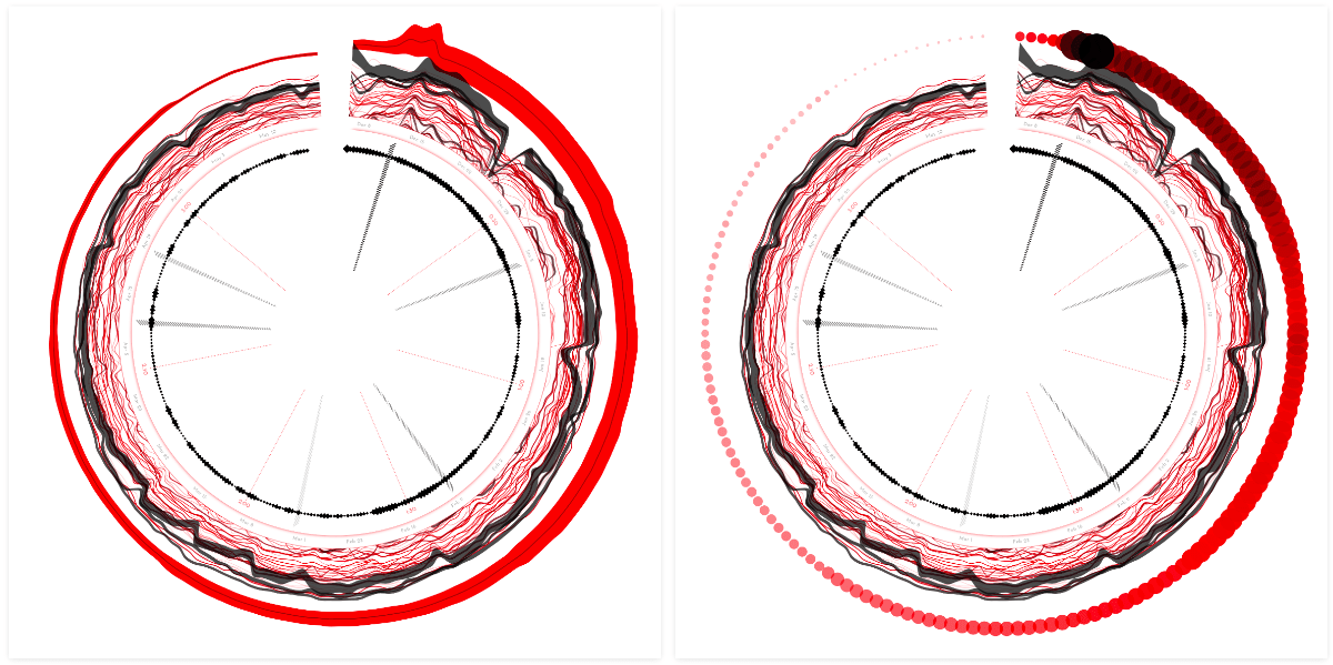
If I wasn’t going to pull out the playlists then I needed to make it visually less dominant and more fitting with the style. I therefore downsized each playlist to a circle on the date that the song was added to the playlist.
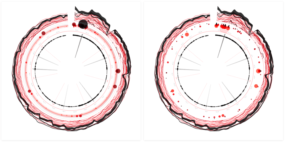
At first I wanted to use a little bit of height differentiation for something such as the number of followers or the number of days in the playlist. However, in the end I kept it more straightforward and placed all the circles at the same radius. Let this playlist section be just a small nod to the dataset.
The circles are scaled according to the number of followers, and colored according to the number of days that the song has been in the playlist. As with the other visual elements, the darker the color, the higher that value.
Finally I was happy. Did it fit with the rest in terms of style? Perhaps not perfectly yet, but it fitted, for me at least, and I liked how it looked now.
Spotify Audio Features | Part II
The Spotify Audio Features were basically 5 numbers having nothing to do with time. Therefore they would actually work much better when taken out of the circle. And somehow, when I had made that decision mentally, the way I did want to visualize those numbers came pretty quickly. I wanted it to look more like a poster where you might have a really big visual taking up most of the space with some smaller charts spread below / around it for extra context.
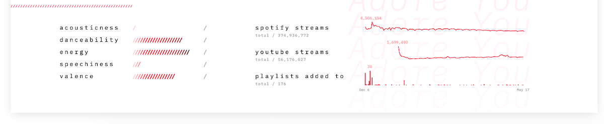
Adding some space below the circle, plus the song title and artist already made it feel more like a true ‘poster’. For ease I first created 5 tiny bar charts for the Spotify Audio Features.
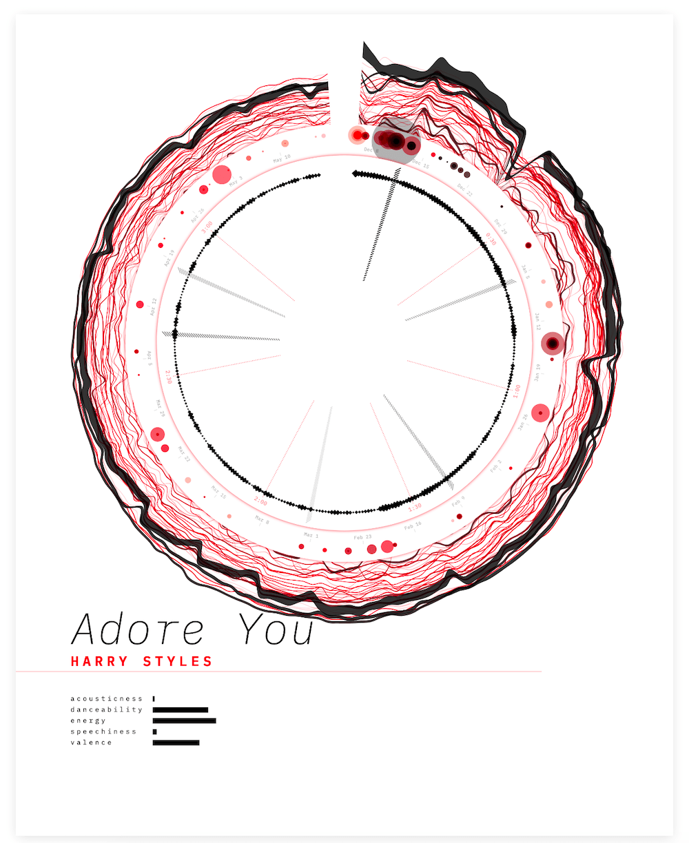
But those bars looked a bit boring. Instead I embraced the “hatched” part of the design and brought it out in more places. Such as converting the bar chart into a set of hatched lines. Much better! (๑•̀ㅂ•́)ง✧
It was technically the simplest iteration of the Spotify Audio Features that I had tried, but it just felt right the moment I had the code working.
Poster Design
Now that I’d made a good start with the poster as a whole, it was time to fill in the other sections of the rectangle. I tried to use the song and artist name to create something more interesting in the background. However, I wasn’t quite liking it just yet.
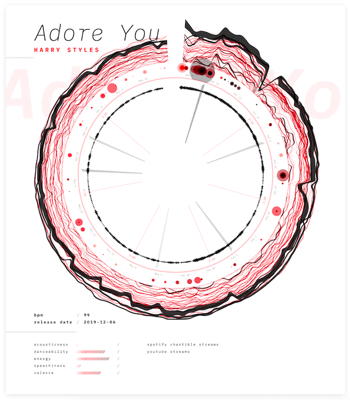
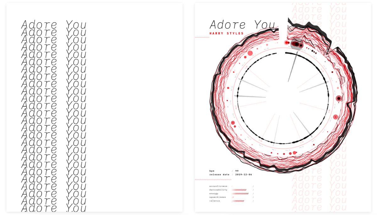
Suddenly, a bug in my code redrew the song title in a column, and I unexpectedly liked that look. I therefore made it intentional and added a subtle grid in the background (⌐■_■)
I wanted to add a few more datapoints in the empty section on the right side of the Spotify Audio Features. The outer ring of the circle focuses on the Spotify charts. The streams per day are wrapped into the line thickness, but it’s very hard to get a good idea of the total number of streams a day. I wanted to visualize the total number of streams more clearly, because my little exploration in R had already shown that there could be some interesting trends, such as a week/weekend dip.
Another reason to leave the Youtube data out of the circle was to only have data in there that comes from Spotify (or the song itself).
I also still had one dataset untapped, the Youtube streams a day. Because this is one number a day, I didn’t want to try and wrap it into the main circle, even though it follows the same timeline as the charts and playlists, it just wasn’t diverse enough. I could visualize the entire dataset equally well with a tiny sparkline.
That did leave space for one more sparkline chart, but I didn’t have any other obvious data aspects to visualize. However, one thing I was sad about with the playlist “ring” in the circle was the fact that it wasn’t easy to see how many playlists the track was added to on busy days. The circles are overlapping too much in those cases. This specifically occurs at the release date of the song. Therefore, I created a tiny bar chart to specifically highlight the number of playlists the track is added to for each date.
These being tiny “sparklines” I didn’t want to convey the exact numbers, but the trend. Nevertheless, I did add a number for the highest value reached, and a tiny grey zero-axis to put the line into context. I mean, we’re often talking about millions of streams a day!
I just want to point out again that this project was started as a data art project. The main goal was never to very clearly visualize the exact numbers, but to create something eye catching, based on the data. Where, if you looked a little longer, you can find some trends, as a bonus. However, during development the poster did swing a little more towards a “data visualization” kind of visual for some parts.
However, the data art mindset was the reason why I kept the legends very minimal. Not adding any explanation felt too cruel for the viewers. I didn’t want to keep people from completely being unable to get a sense of what the data on the poster was about. However, I didn’t want to spend paragraphs to explain clearly what every aspect, thickness, color, shape meant. I therefore tried to to put it into as few words as possible. They might not be 100% clear to everyone, but they act as hints on how to interpret the visuals if you really look at the different elements and try to understand them.
Testing on Other Songs
Quite amazing to see how “Africa” from TOTO (from 1982!) is still making it into the top 200 of several countries and even the worldwide top 200 every now and then!
And then I was send data for three other songs. Trying out the script on these song showed me several tweaks to implement so my code would be able to handle a variety of different cases. For example, one of the songs, “Summer Days”, had been released more than a year ago, while another, “Africa”, was from the previous century. Both of these datasets had way too much data to visualize nicely!
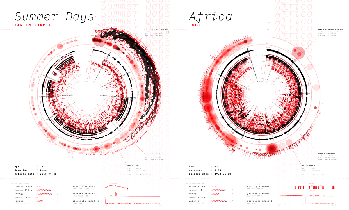
As a fix, the program now takes the earliest date and then cuts it off at a maximum of six months afterwards. This leaves it up to the person creating the future posters to decide what time frame to focus on for songs that have been released for more than six months.
I added a bunch of other updates, improvements, and changes so the script would hopefully be able to handle any kind of song. However, this visualization is made to highlight popular songs and thus it only looks good for songs that have charted in the top 200 (every now and then at least) and have been added to playlists. This data art system isn’t meant for a song such as “Africa”. However, because it’s still so popular today, the resulting visual actually looks interesting. But that’s basically a bonus (∩_∩)
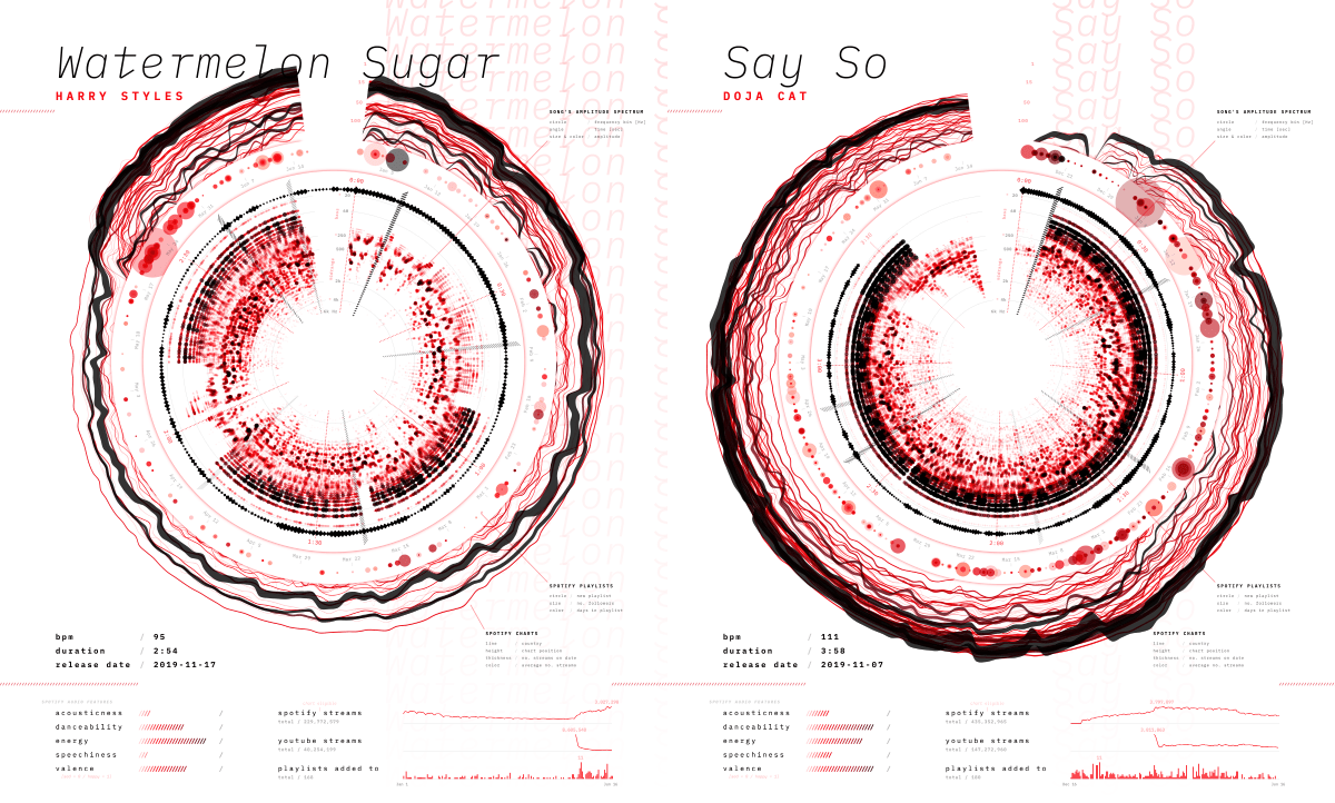
Looking at other recently released and amazingly popular songs revealed how the set-up gave unique results for each and really brought out that fingerprint of each song. Luckily, Sony was also very enthusiastic about the result! *happy dance*
Data Uploading UI
With the poster nearing its completion, I found myself thinking about how Sony Music would be using this system on new datasets. We’d initially agreed that I wouldn’t do any fancy technical implementation. They’d put the new datasets in the data folder of the project’s code. However, that was probably going to hinder its eventual use. For example, it would mean that the users would need to run it through a localhost (to be able to load data).
The JS / front-end that I know is very highly specialized to data visualization.
And therefore I wanted to investigate if I could create a very basic data uploading UI on the same page that creates the poster. A bonus would be for it to also check a few things about the data being uploaded. I’d never done something like this before, and general front-end isn’t where my knowledge is, so it was slow going. Using CSS-flexbox I created a few boxes where you could input a file.
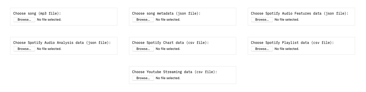
Then I slowly started figuring out; how to first try and load the files from the data folder, and if not found, don’t crash the script, how to add checks to make sure all the required variables are in each file, how to reveal what file was loaded and what might be wrong with it, how to turn the entire box into a drag-and-drop, etc.
I also added a few (data) notes below the uploading section to help the users understand it and explain the handful of other data requirements.
It’s still pretty minimal and definitely not fully dummy-proof. But you can drag-and-drop all the seven files in less than ±20 seconds. And that seemed like it would be enough since this “system” isn’t meant for a general audience, but for data-savvy people within Sony Music.
It always makes me so happy to work with such enthusiastic clients that they check for possible updates themselves ^_^
I pushed these changes to the version Sony had access to, and was fiddling with something else before I wanted to send an email explaining the updates. Funnily, my contact at Sony Music had checked out the new version already and had started to create new posters with other datasets, without me having given any kind of explanation apart from what I’d put on the site itself. So that validated that my simple UI was self-explanatory enough (^ᗨ^)
Final Result & Animated Poster
After some more tweaks, switching to a different font, ordering a test print of the intended 40x50cm size (the size of an actual gold record), making a few more minor changes based on the test poster, and the data art poster system was done! (ノ◕ヮ◕)ノ*:・゚✧

I’m using “Soundflower” on my Mac to capture the computer audio
Something that I haven’t touched upon since the spectrogram section above, but, I never took out the option to animate the poster with the song. I always tried to write any new code in such a way that it would still work when playing the song. No fancy automatic video creation though, just a “play” button below the poster while a user would need to take a screen recording (while also capturing the computer audio), to turn it into a video. I’m not sure if this “animation” option will be used often, but I just found it a lot of fun to watch while developing the project. Plus, it really helps to understand the inner spectrogram section of the poster when you see how it changes with the actual song (the only video here with good audio quality, huzzah!):
And here are the results for the other three songs that I had gotten the data for:
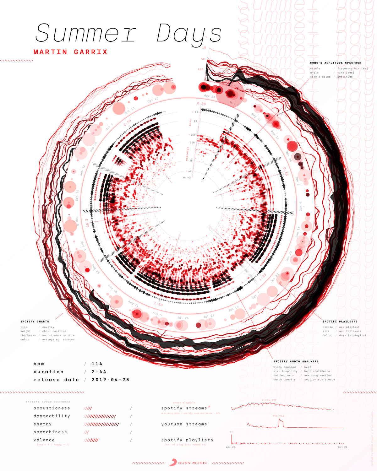
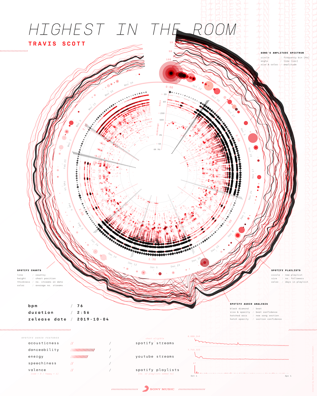
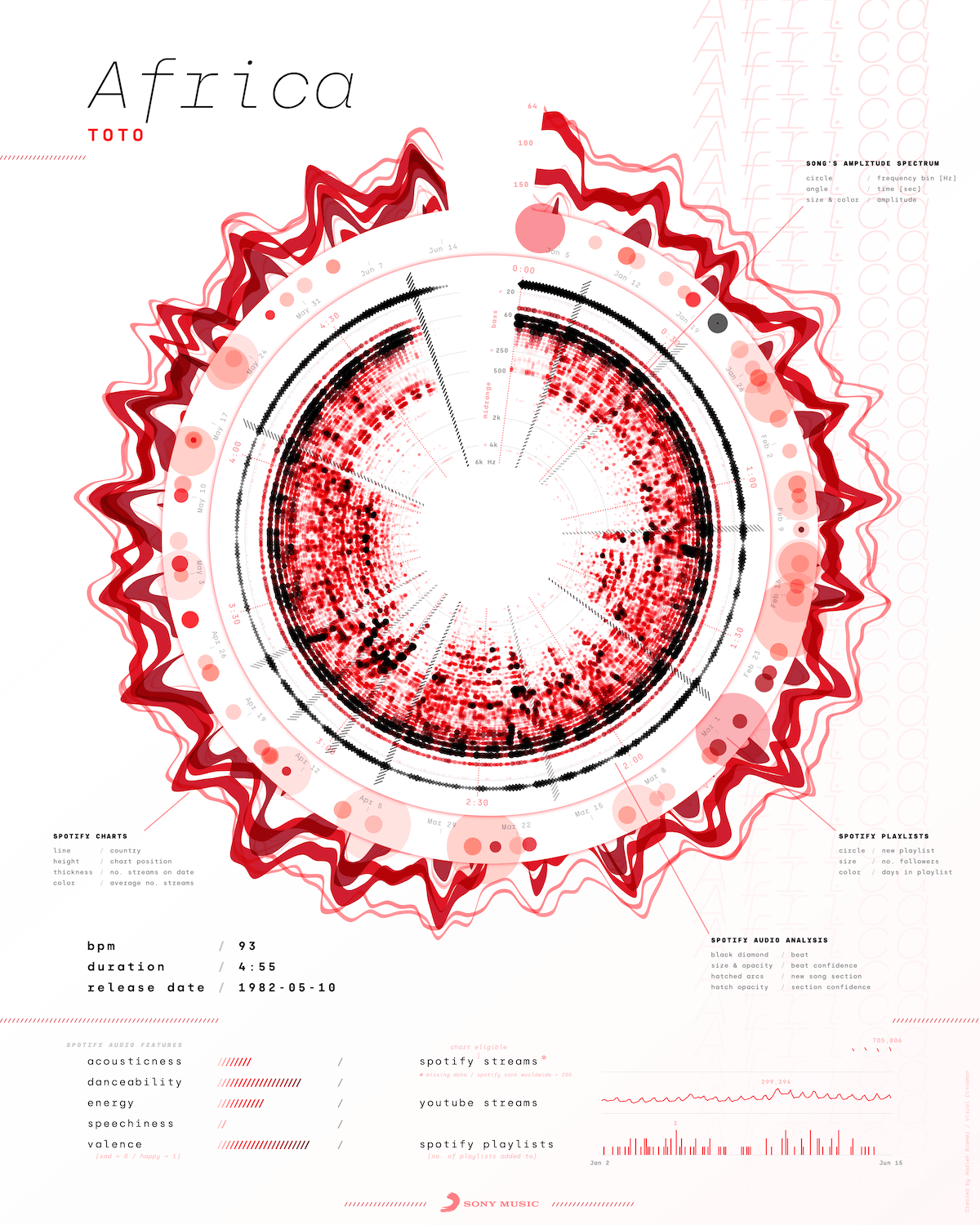
You can find high quality posters of all of these, except Africa, and three other songs at the end of the blog post that Sony Music wrote about the release of this project as well!
Bloopers
I have to admit, my bloopers this time are rather disappointing. Not sure why… (•ω•) But let me at least show you two of the many other things that I’ve tried/iterated on, but didn’t have place for to mention above.
Although I was happy with the red-black color palette, I just wanted to try and see if adding more colors would be better. It could help with making the inner spectrogram and the outer Spotify charts and playlist sections more distinct. However, I just didn’t like it visually, so I reverted back to red, happy to stick with it.
While working on the playlists, I was curious to see how the waveform (that I’d abandoned early in the project) would look in this circular form. Perhaps the extra space would make it expanded enough to reveal something interesting. However, a quick test revealed that it was still much too squished to create a nice looking shape.