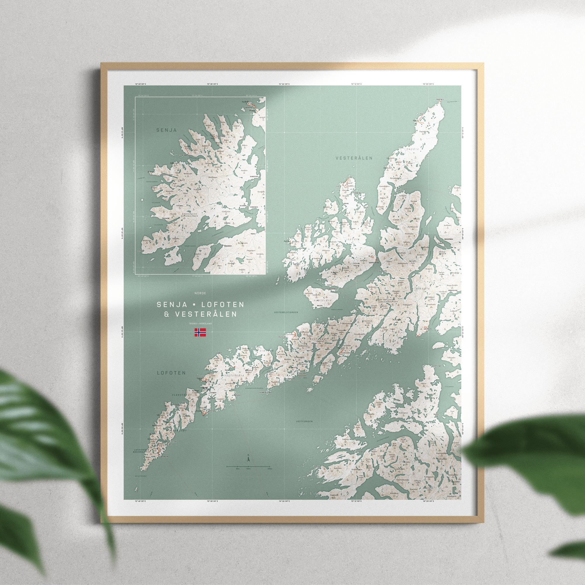
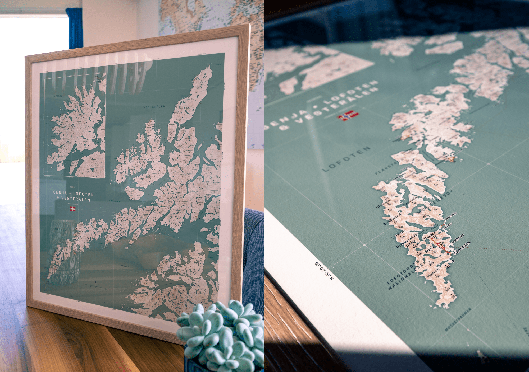
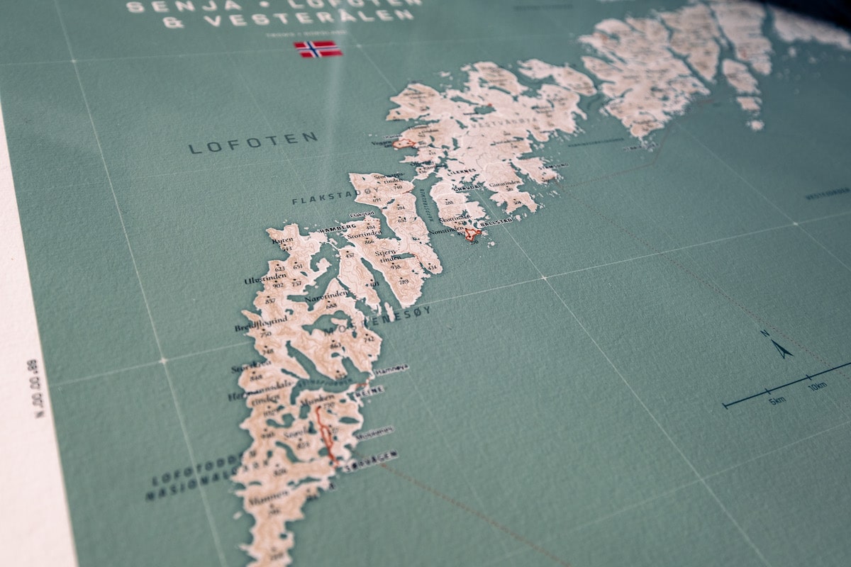
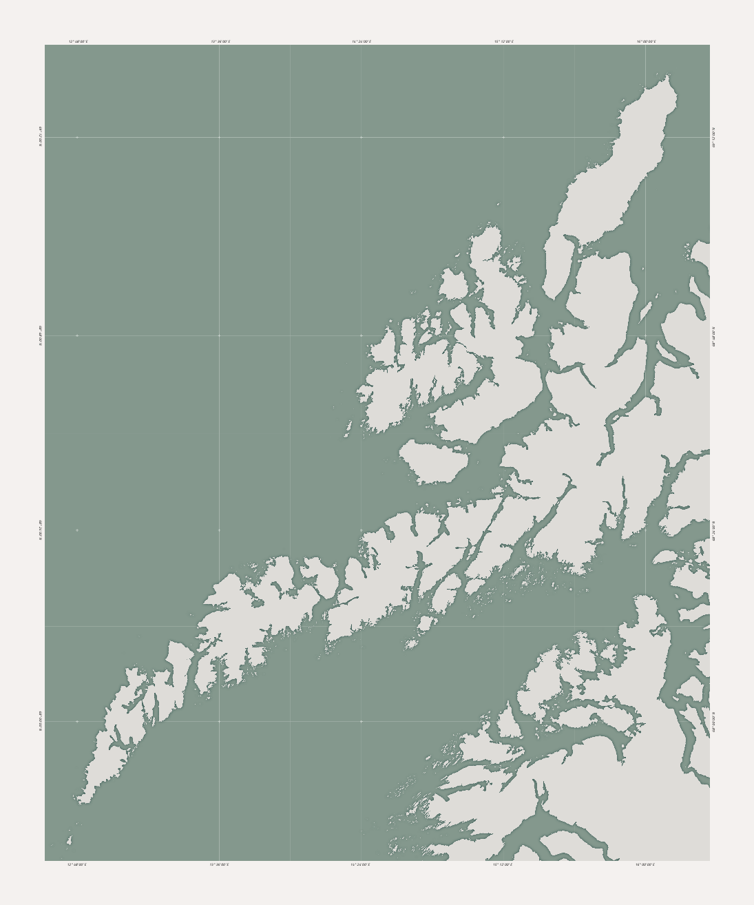
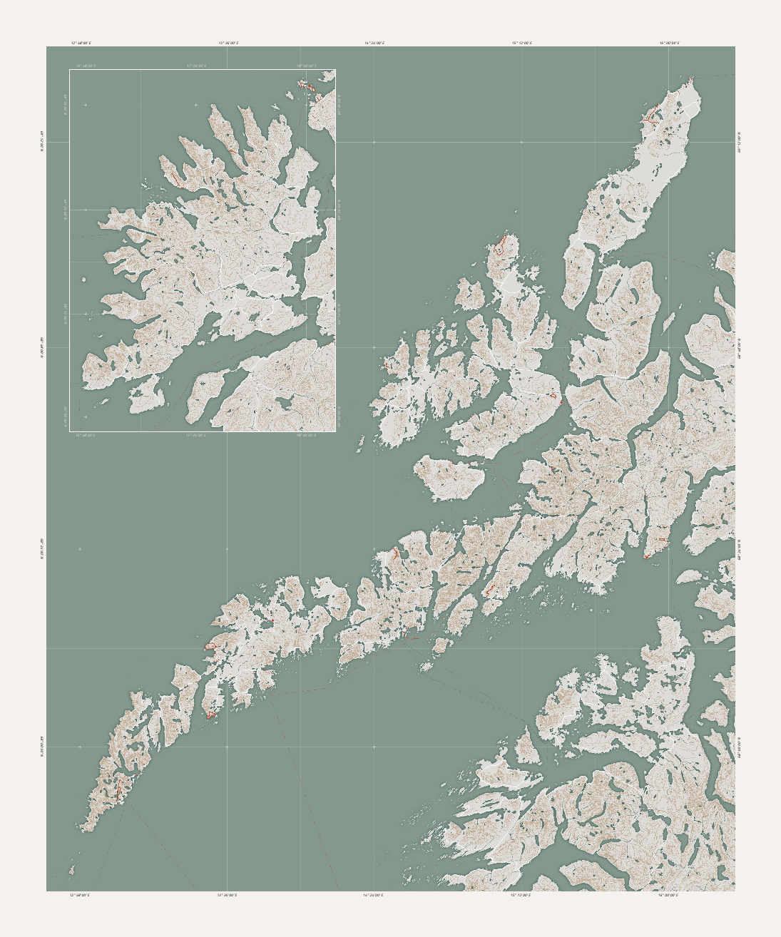
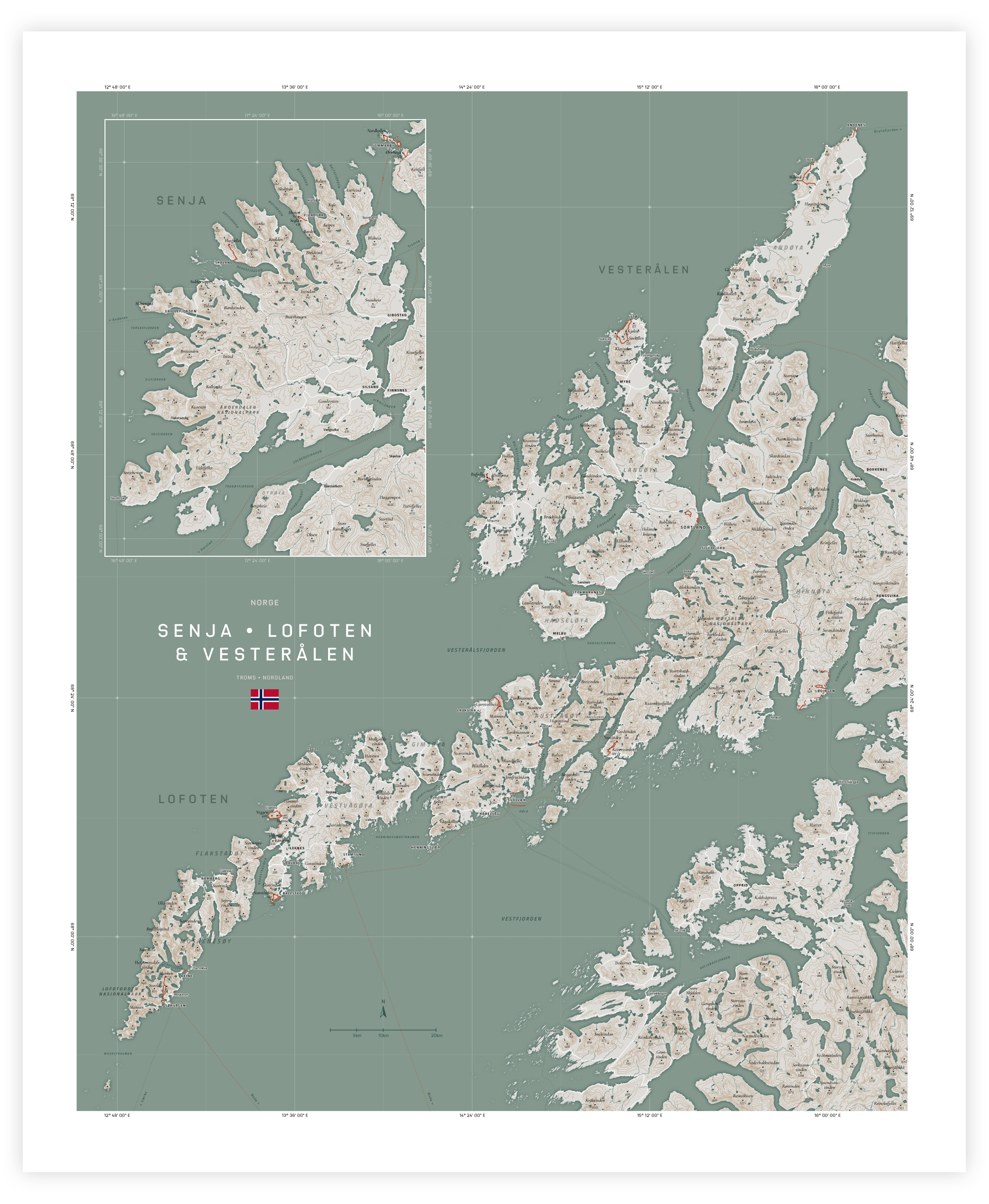
In this blog, I’d like to show you how I created the map below of Senja, Lofoten & Vesterålen in Norway. Using a combination of tools, including the OpenStreetMap API, Amazon Web Services Terrain Tiles, R, d3.js, and JavaScript, I was able to create a unique and personal map that features our hikes, Google location history, and the locations we stayed at during our 5-month trip through Norway in 2022.
As someone new to cartography, I found this project quite challenging, but the result was truly worth the effort for me. Keep reading to find out how I did it!
A Little Background
If you’re not interested in hearing why I created this map, feel free to skip to the next section
Between March and July 2022, I travel+worked my way through Norway together with my partner. We started in the South of Norway (somewhere between Stavanger and Bergen), and every few weeks, we would move farther North to another Airbnb cabin. During the bad days, we would work, and during the good days, we would explore and hike.
Sommarøy is stunning! Tropical-looking beaches with white sand and turquoise water.
Although I utterly loved all of Norway, my heart was stolen by the area of Sommarøy, Senja, the Lofoten, and Vesterålen, way up North. Mountains rising straight from the sea. Amazing white sandy beaches, fantastic clouds and fog, and more mind-blowing hikes than you could ever do.
Back home, I wanted to commemorate these months of travel, and I remembered coming across a beautiful map of Senja by Fjelltop. I almost bought it, but I felt I was missing the Lofoten. A few weeks later, during Christmas time, I decided to see how far I could get in creating a map that would incorporate all my favorite places up North in Norway.
Creating the Map
I’ll spare you all the tangents and dead-ends I went through in making this map and mainly focus on how I did get it to work how I wanted. As I mentioned in the introduction, I’m a mapping newbie. I downloaded QGIS several years ago, opened it, was a bit overwhelmed, and never touched it again. So please see my approach below as a way of doing it, but it’s likely not the most efficient way.
Furthermore, with over 2000 lines of code in my final project, I cannot show or explain all of it. Therefore, I tried to balance explaining my process and sharing the most essential code snippets, but not each and every step and little quirk I came across.
Note | I’ll be assuming some basic R, JavaScript, HTML5 Canvas, and d3.js knowledge.
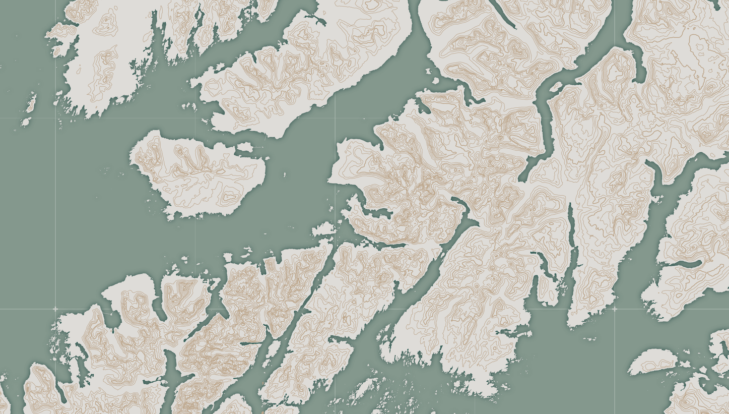
The Coastline
Let’s first get an outline of the Lofoten and Senja on the screen to help with our general orientation. I’ll get back to the OpenStreetMap API in a bit, but I couldn’t use the coastline feature from the OSM API. It wasn’t one connected line, meaning I could only stroke it but not fill it. Trying to solve this gave me a bunch of headaches that I couldn’t fix with my current knowledge.
I used the WGS84 projection with “Large polygons not split” file.
Instead, on this website from OpenStreetMap, you can download a giant shapefile of all the land areas in the world having a connected coastline.
Preparing the Coastline in R
We’ll see the sf package a lot in the remaining preparation steps.
I don’t want to load the entire world while creating the map. I, therefore, want to “cut out” the section around the Lofoten and Senja. I’ll use the sf package in R for this.
library(sf)
librarty(tidyverse)

# Load the big coastline dataset into R
osm_coastline <- read_sf("land-polygons/land_polygons.shp")

# There was something wrong with this shapefile
# I used the following command to fix it
osm_coastline <- st_make_valid(osm_coastline)
I’m going to use just “Lofoten” to mean the region of both the Lofoten and Vesterålen from now on.
I want to create a bounding box around the area of the Lofoten and Vesterålen. To figure out the latitude and longitude coordinates of the corners, I went to Google Maps and clicked on the map roughly in the four corners that I thought would include the map area (it’s ok if it’s quite a bit bigger).
# Rough boundary of Lofoten & Vesterålen, found through Google Maps
lon <- c(12.6, 16.5)
lat <- c(67.6, 69.6)

# Create a bounding box as an sf object
# using the WSG84 projection (which has "EPSG-code" 4326)
bb_rect <- data.frame(lat, lon) %>%
  st_as_sf(coords = c("lon", "lat")) %>%
  st_set_crs(4326) %>%
  st_bbox() %>%
  st_as_sfc()

# Now intersect the full world's coastline with the bounding box
coastline_intersect <- osm_coastline %>% st_crop(bb_rect)
Let’s plot the result to see if it all worked.
# Plot the coastline - Takes a while
ggplot() +
  geom_sf(data = coastline_intersect) +
  xlab("Longitude") + ylab("Latitude") + theme_minimal()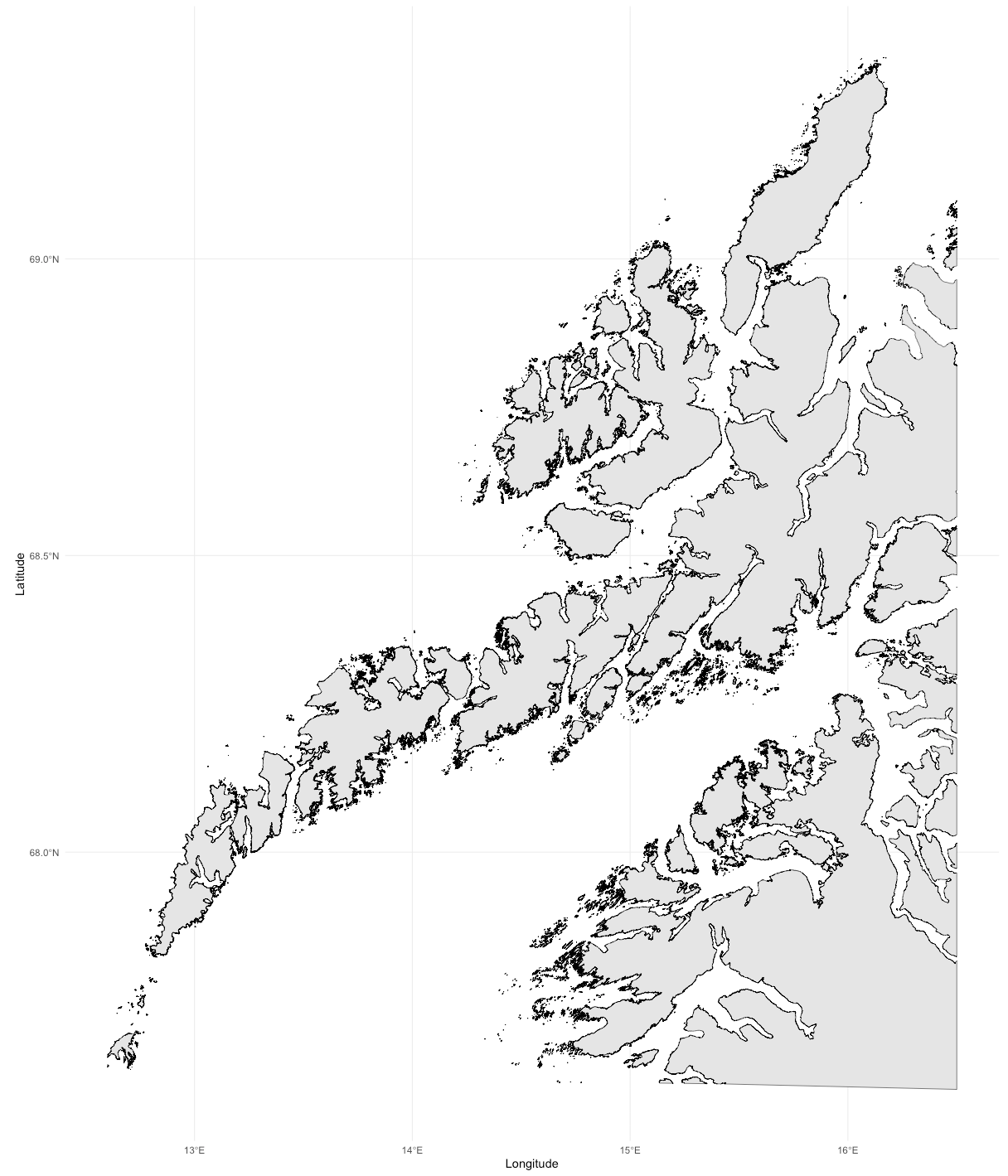
That looks good! It has the entire area of the Lofoten and Vesterålen that I want to have in my final map and some more. Time to save it to a geojson to load into my JavaScript file.
# Save the clipped coastline to a geojson file
st_write(coastline_intersect, "lofoten_coastline.geojson", delete_dsn = T)
I repeated these steps for the area around Senja, which will be placed as a map-in-map in the top left corner of the main Lofoten map.
Preparing the Canvas and Loading the Data
I wanted my map to be roughly 50cm wide when printed. I always use pixelcalculator to quickly figure out how many pixels that would be at 300 dpi. Through some iteration, the print would have to be 60cm high to fit the entire Lofoten area nicely.
//Sizes
const W = 5906 //50cm
const H = 7087 //60cm
const CM = 118 //1 cm in pixels at 300dpi
const MARGIN = 3 * CM
const WIDTH = W - 2 * MARGIN
const HEIGHT = H - 2 * MARGIN

const canvas = document.getElementById("canvas")
const context = canvas.getContext("2d")

// Set the width and height, translate by the margin, etc...
You can load the coastline data using d3.json(). I ran it through mapshaper to simplify the geometry somewhat and create a smaller file. However, this isn’t required.
let coastline_lofoten
await d3.json("lofoten_coastline_simplified.json").then(data => {
    coastline_lofoten = data
})
console.log(coastline_lofoten)
This gives us a FeatureCollection that can be plotted using other functions from d3.js. However, you must first create the projection for d3 to know what to do with that geo data.
// Scale and Center found through trial-and-error
const SCALE = 79500
const CENTER = [14.49,68.56] // [lon,lat]

const projection = d3.geoMercator()
    .scale(SCALE)
    .center(CENTER)
    .translate([WIDTH * 0.5, HEIGHT * 0.5])
    // .clipExtent(CLIP) // You can use this to clip the area,
    // but I'll be doing something else

const geoPath = d3.geoPath()
    .projection(projection)
    .context(context)
Ocean & Graticule Lines
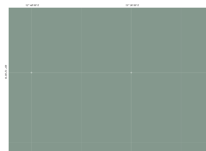
The coastline isn’t truly the first layer. That would be the ocean and the graticule lines with the degree notations around the outside. The ocean is very easy, a simple blue-ish rectangle:
context.fillStyle = COLOR_WATER
context.fillRect(0,0,WIDTH,HEIGHT)
D3 has several handy graticule functions to draw the longitude and latitude lines across the map. Mercator has straight lines, but if you want to play with different projections, these functions will ensure that the graticule lines adapt to the chosen projection.
I created two sets of graticules, thick ones, and thinner ones halfway in between.
const DEGREE_STEP = [0.8,0.4]

// Set up the graticule generators

// Thinner lines at half the DEGREE_STEP intervals
const graticules = d3.geoGraticule()
    .step([DEGREE_STEP[0]/2,DEGREE_STEP[1]/2])
    .precision(0.4)
    ()

// Thicker lines at DEGREE_STEP intervals
const graticulesMajor = d3.geoGraticule()
    .step(DEGREE_STEP)
    .precision(0.4)
    ()
If you draw everything through d3’s projection function, set the .clipExtent.
You want to ensure that whatever you draw stays within the blue rectangle. No matter if I draw it using d3’s projection function or not. I’m therefore using a more general clipping function instead of the build-in .clipExtent option from d3’s projection function:
// Clip to a rectangle
// CLIP contains the `[[top-left], [bottom-right]]` coordinates
function clipToRectangle(context, CLIP) {
    let width = CLIP[1][0]-CLIP[0][0]
    let height = CLIP[1][1]-CLIP[0][1]
    context.save()
    context.beginPath()
    context.rect(...CLIP[0], width, height)
    context.clip()
}// function clipToRectangle

// Remember to call "context.restore()" afterwards
I only need to call this once at the start of drawing the Lofoten map and once at the end. However, to show you an example of how to use it to draw only the graticules:
function drawGraticule() {
    context.strokeStyle = COLOR_GRATICULE

    // Clip the contour lines to a rectangle
    const CLIP = [[0, 0], [WIDTH, HEIGHT]]
    clipToRectangle(context, CLIP)

        // Minor
        context.lineWidth = 1.5
        context.globalAlpha = 0.3
        context.beginPath()
        geoPath(graticules)
        context.stroke()

        // Major
        context.lineWidth = 2.5
        context.globalAlpha = 0.4
        context.beginPath()
        geoPath(graticulesMajor)
        context.stroke()

    // Restore from clipping to the rectangle
    context.restore()
}// function drawGraticule
I also added small thick crosses along the crossing points of the major graticule lines. To roughly explain the process: create a nested loop across a grid, using the DEGREE_STEP (through the projection() function) to set the distance between the grid in the x and y direction and drawing a tiny cross at each location of the grid.
I’m using Izoard for the degree notations.
You can add the degree notations along the outside in a similar manner, knowing the outside boundaries of the map and using the DEGREE_STEP value to place them. If you have less straightforward locations of your graticule intersections, then this post by Saneef Ansari might be just what you need to get those nice labels still.
Plotting the Coastline
With the ocean, graticule lines, and degree notations placed along the outside, the next layer would finally be the coastline.
You can use the following simple code to draw the coastline. And if I want to stroke the coast, this would be fine. However, if I fill it, the entire rectangle becomes filled with the background color. I’m still unsure what the issue was; perhaps having to deal with multipolygon features?
// This DID NOT work for filled shapes
context.beginPath()
coastline.features.forEach(feature => {
     geoPath(feature)
})//forEach

// Stroking is fine
context.stroke()

// But filling...
context.fillStyle = COLOR_BACKGROUND
context.fill()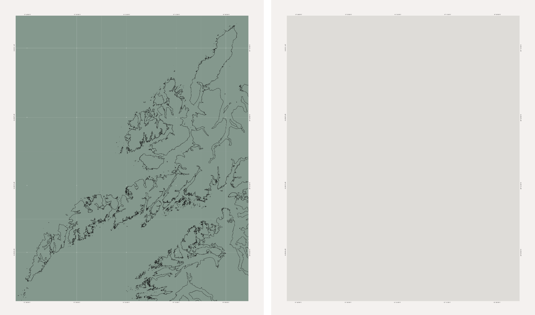
Figuring out how to fix this issue took me quite a while. I eventually had to write a custom function that would loop through all of the coordinates in the geojson and call a specific function (drawOutline) differently depending on the type of feature:
// Call the function
drawCoastline(context, projection, coastline_lofoten)

function drawCoastline(context, projection, coastline) {
    context.fillStyle = COLOR_BACKGROUND
    // Get a bit of shadow around the coastline
    context.shadowBlur = 20
    context.shadowColor = COLOR_WATER_SHADOW

    context.beginPath()
    coastline.features.forEach((feature,i) => {
        if(!feature.geometry) return

        if(feature.geometry.type === "GeometryCollection") {
            feature.geometry.geometries
                .filter(geom => geom.type === "Polygon")
                .forEach(geom => {
                    drawOutline(context, projection, geom.coordinates)
                })//forEach

        } else if(feature.geometry.type === "Polygon") {
            drawOutline(context, projection, feature.geometry.coordinates)

        } else if(feature.geometry.type === "MultiPolygon") {
            feature.geometry.coordinates.forEach(lines => {
                drawOutline(context, projection, lines)
            })//forEach coordinates

        }//else if

    })//forEach features
    context.fill()

    // Reset
    context.shadowBlur = 0
}// function drawCoastline

// Loop over all the coordinates in the feature
function drawOutline(context, projection, coordinates) {
    coordinates.forEach(line => {
        line.forEach((l, i) => {
            let [x, y] = projection(l)
            if (i === 0) context.moveTo(x, y)
            else context.lineTo(x, y)
        })//forEach l
    })//forEach
    context.closePath()
}// function drawOutline
I love how coastlines in maps have a shadow around them along the water. You can easily add this effect using the shadowBlur option before applying the fill.
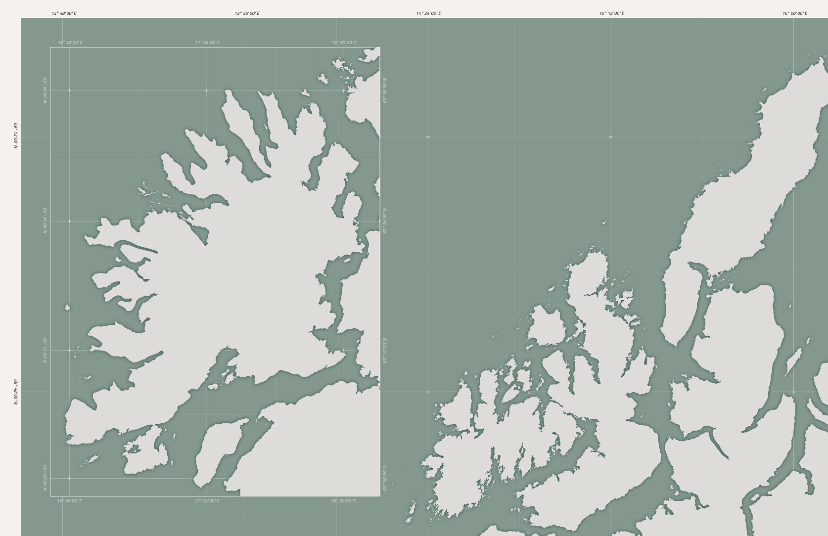
Adding Senja in the Top Left
To quickly address how to add a map-in-map for Senja in the top-left. In short, do everything twice, once for the Lofoten area and once for the Senja area. There is a projection_lofoten variable and a projection_senja version. A coastline_lofoten variable and a coastline_senja. A clipping rectangle for the Lofoten, which is simply the entire area, and another for Senja (CLIP_SENJA), a rectangle in the top left. Call all of the functions twice, once giving it the data and projection of the Lofoten and then again for Senja.
See the variables below that I used for Senja.
Those for the Lofoten were given in an earlier section.
const CENTER_SENJA = [17.41,69.325] // [lon,lat]
const DEGREE_STEP_SENJA = [0.6,0.2] // For the graticule lines
const projection_senja = d3.geoMercator()
    .scale(SCALE) // Using the same scale though!
    .center(CENTER_SENJA)
    .translate([WIDTH * 0.22, HEIGHT * 0.24])

// The area in the top-left for the clipping rectangle
const CLIP_SENJA = [[1.5*CM, 1.5*CM],[18.5*CM, 24.65*CM]]
With some slight color variations of the colors of the degree notations of Senja, I end up with this after calling the drawGraticule() and drawCoastline() functions once for the Lofoten and once for Senja. The clipping rectangles ensure nothing is plotted outside their respective boxes.
I’ll only refer to the Lofoten in the text below, assuming that the same steps are also applied to Senja and its data.
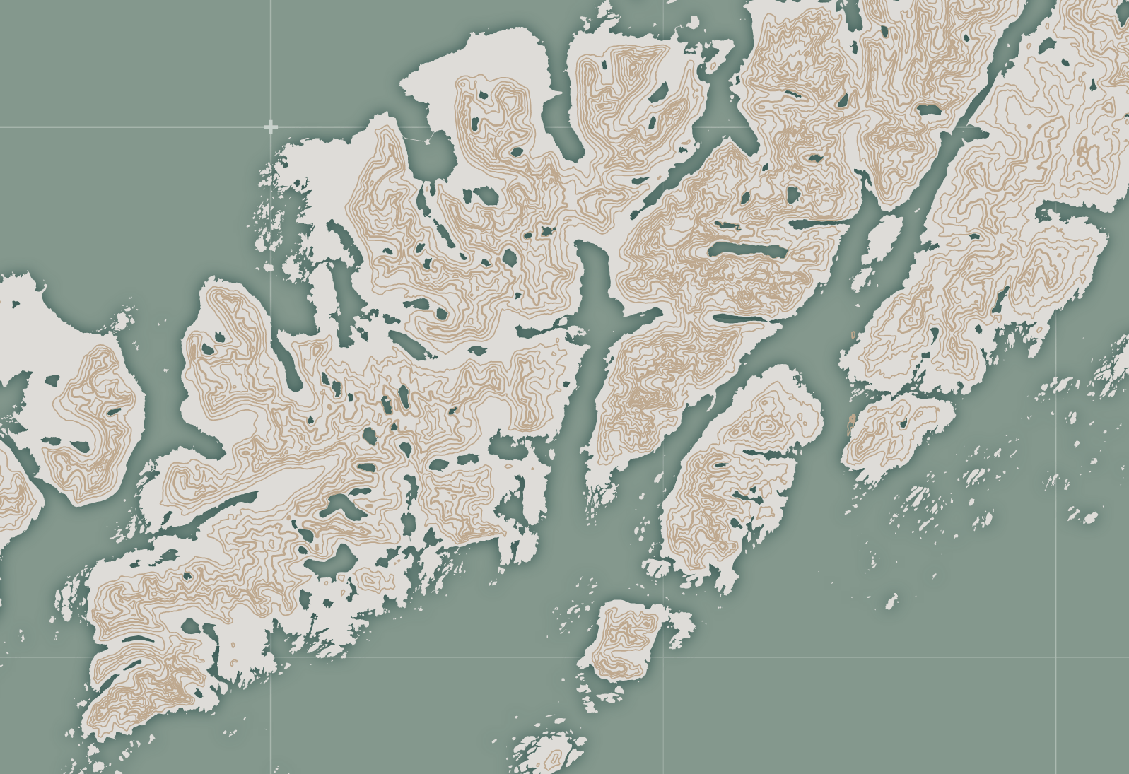
Adding the Height Contour Lines
We must return to R to prepare the data for the height contour lines. One option is to use the Amazon Web Services Terrain Tiles. In R there is the get_elev_raster function from the elevatr package. As with the coastline, you only want to download the data for the area around the Lofoten and Senja. Therefore, let’s first create a bounding box around the Lofoten.
I pieced the following code together from different tutorials around the web that I was sadly not smart enough to save.
library(sf) # General mapping package
library(geodata) # Get GADM data set of Norway/Nordland
library(elevatr) # Get elevation data
library(raster) # Get contour lines from elevation data
options("max.contour.segments"= 300000)

# Rough boundary of Lofoten
lon <- c(12.6, 16.5)
lat <- c(67.6, 69.6)

# Get the outline of Norway and all its cantons
# Level 0 = outline of country / level 1 = cantons
norway_1 <- gadm(country = "Norway", level = 1, path = "MapData")
# plot(norway_1)

# The 10th is Nordland, where the Lofoten is
nordland <- norway_1[10,]
# plot(nordland)

# Bounding box around Lofoten
longitude <- c(lon[1],lon[2],lon[2],lon[1])
latitude <- c(lat[2],lat[2],lat[1],lat[1])
bbox_nordland <- vect(cbind(id=1, part=1, longitude, latitude),
                      type="polygons", crs = "+proj=longlat +datum=WGS84" )

# Intersection of Nordland and the bounding box around the Lofoten
lofoten <- intersect(nordland, bbox_nordland)
plot(lofoten)
You can then use the get_elev_raster function from the elevatr package to download the elevation data for the area within the bounding box.
# Turn into sf
lofoten_sf <- st_as_sf(lofoten)

# Get elevation data - using the "zoom" level of 11
elev_lofoten <- get_elev_raster(lofoten_sf, z = 11, clip = "bbox")
plot(elev_lofoten, col = grey(1:100/100))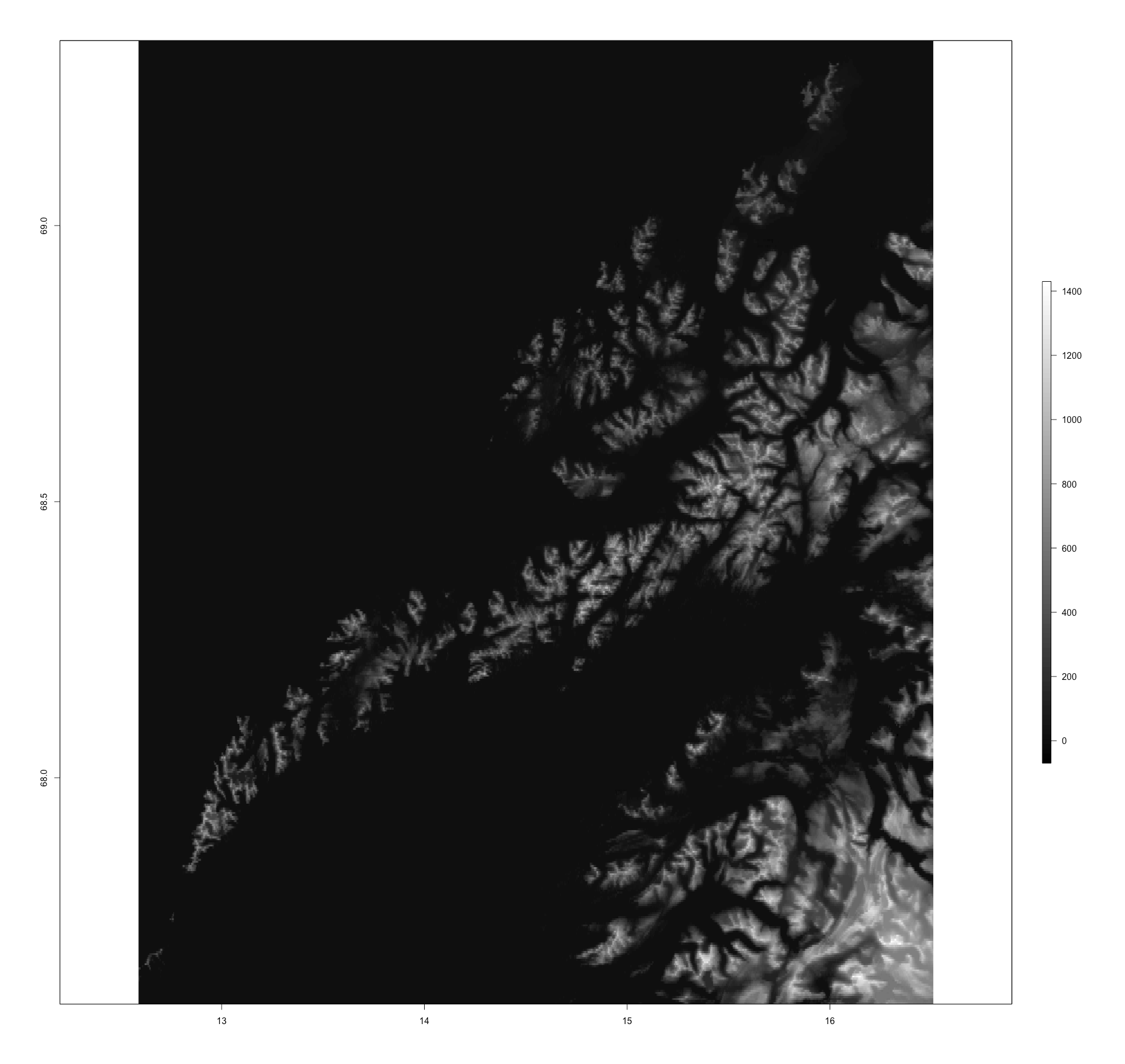
This creates an array of “pixels” where the elevation on that [x,y] point on the Earth is saved as a value. Adjusting the value of z will give you coarser or higher resolutions. This dataset is then used to create contours that follow the same height level using the rasterToContour function.
# Custom contour break levels for every 100m
breaks <- seq(from = 100, to = 1400, by = 100)
contour_lofoten <- rasterToContour(elev_lofoten, maxpixels = 10000000, levels = breaks)
plot(contour_lofoten, lwd = 0.8, col = "#606060")

# Save as GeoJSON
geojson_write(geojson_json(contour_lofoten), file = "lofoten_contours.geojson")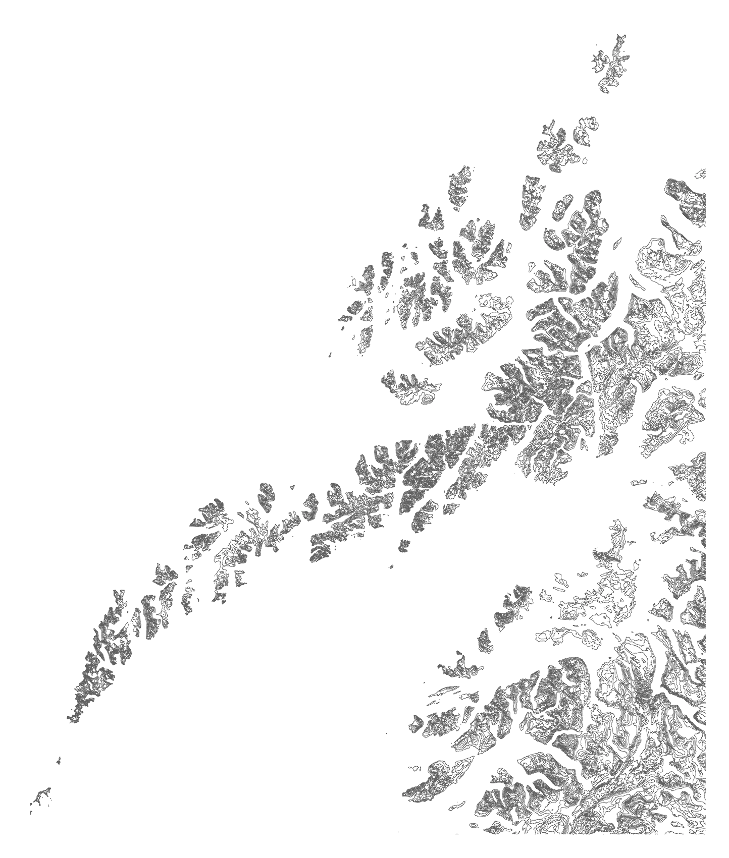
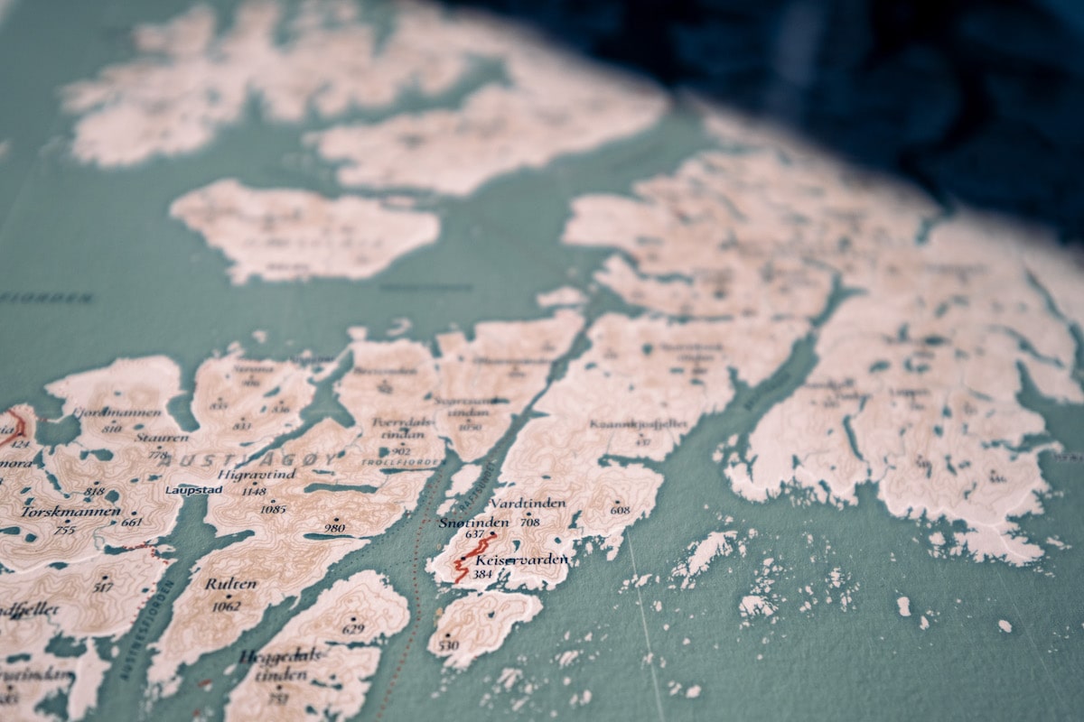
It’s hard to see in an image this small because the mountains in the Lofoten are steep, but along the right, you can see the contour lines more separated.
Having written this data into a geojson file, we can go back into JavaScript and plot the contours in the map.
Drawing the Contours in the Map
Load the data into the JavaScript file with a similar command for the coastline file. Because we’ll be drawing the contours as stroked lines, not filled areas, we can use the simple default method through the geoPath function.
function drawContours(context, contours) {
    // Draw a few levels with slightly thicker lines
    const thick_levels = [400,800,1200]
    context.strokeStyle = COLOR_CONTOURS

    // Draw the height lines
    contours.features.forEach(d => {
        let lw = thick_levels.indexOf(+d.properties.level) >= 0 ? 3 : 1.75
        context.beginPath()
        geoPath(d)
        context.lineWidth = lw
        context.stroke()
    })//forEach
}// function drawContours
Adding Lakes
There are many other tools with which you can access the OpenStreetMap API or Terrain Tiles besides R.
Next up are the lakes. This is where we’ll dive into the OpenStreetMap data and its API. I’ll use the osmdata data package in R, a straightforward package to use. You can find a tutorial about it here if you want more explanation about the exact code below.
Using the information about what features can be downloaded from this Wiki page, I set up the following code to download all the natural water bodies.
And here we have the third (somewhat) different way I’ve been making bounding boxes across this one project…
# Rough boundary of Lofoten
lon <- c(12.6, 16.5)
lat <- c(67.6, 69.6)
bbox <- st_bbox(c(xmin = lon[1], xmax= lon[2], ymin = lat[1], ymax=lat[2]))
osm_lakes <-
opq(bbox = bbox) %>%
add_osm_feature(key = "natural", value = "water") %>%
add_osm_feature(key = "water", value = "!river") %>% #Exclude the rivers
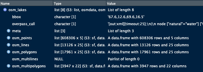
osmdata_sf()This gives me a variable osm_lakes, a list containing all the “water” geometries. But these can be points, lines, polygons, multilines, and multipolygons. You can inspect this variable in RStudio to see which contain valuable data.
Some can be empty lists (such as the osm_multilines above). Others don’t contain information once you inspect what’s inside (such as the osm_points). You can guess which of these will be useful or not depending on the type of feature that you’ve downloaded. For example, points don’t make sense for lakes, while polygons don’t make sense for roads.
I recommend always plotting the results of every feature set you download through the OSM API to see what’s inside and if you need to do some cleaning or filtering.
I followed the solution here to filter out any islands within lakes. Mostly to save me some headaches in plotting them later.
lakes <- osm_lakes$osm_polygons
lakes_multi <- osm_lakes$osm_multipolygons

# Only keep the largest lakes
lakes <- lakes %>%
  mutate(area = st_area(.)) %>%
  filter(as.numeric(area) > 47000)
# And then the same for the lakes_multi

# Filter out islands within lakes - see link in the gutter note

# Plot the results
ggplot() +
  geom_sf(data = coastline, col = "transparent") +
  geom_sf(data = lakes, aes(fill = water), col="transparent") +
  geom_sf(data = lakes_multi, aes(fill = water), col="transparent") +
  coord_sf(xlim = lon, ylim = lat) +
  xlab("Longitude") + ylab("Latitude") + theme_minimal()

# Save each to a geojson file separately
st_write(lakes, "lofoten_lakes_polygons.geojson", delete_dsn = T)
st_write(lakes_multi, "lofoten_lakes_multipolygons.geojson", delete_dsn = T)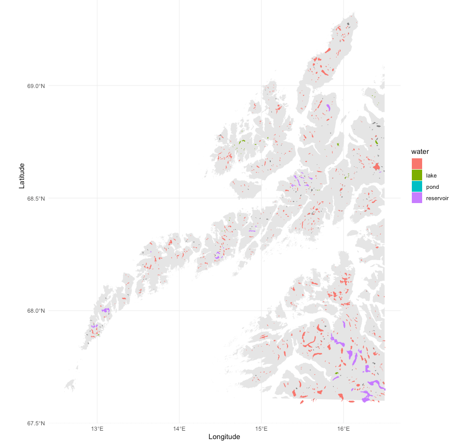
I don’t know if I had to save the polygons and multipolygons in separate files. I don’t think it’s needed? However, I was/am still so new to all this when I started that I had to make things as simple as possible.
Drawing the Lakes in the Map
As before, load the file into JavaScript with the d3.json function. Since we want to fill these areas, I do have to use the custom functionality that I had made for the coastlines, which checks per type of feature and acts accordingly:
function drawLakes(context, lakes, projection) {
    context.fillStyle = COLOR_WATER

    lakes.features.forEach(feature => {
        let type = feature.geometry.type.toLowerCase()

        context.beginPath()
        if(type === "polygon") {
            drawOutline(context, projection, feature.geometry.coordinates)
        } else if(type === "multipolygon") {
            feature.geometry.coordinates.forEach(lines => {
                drawOutline(context, projection, lines)
            })//forEach coordinates
        }//else if
        context.fill()
    })//forEach features
}// function drawLakes
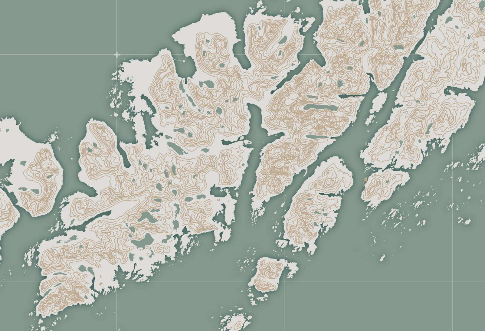
Getting an Inner Shadow
However, as you may notice, the lakes are missing something compared to the coastline: a shadow on the inside of the lake. Sadly, the shadowBlur property always draws a shadow around the outside.
A way to solve this is to use the concept of holes. Draw a big box around each lake, and draw the lake as a hole inside that box while adding a shadowBlur to the whole. Unfortunately, the code I used for this is too long for a blog post. Therefore, I made this simple example in Observable showing the concept.
In short, step 1: Create a clipping area that is the exact shape of the lake. Step 2: Draw a big box around each lake (clockwise), then draw the lake in counterclockwise order (thus becoming a hole) inside the box. Step 3: Fill it while also having set the shadowBlur property.
Below you can see a work-in-progress view. It shows the “boxes” around each lake and the lakes being holes on the inside, with an inner shadow.
The image isn’t fully correct since the box has the lake color and the lake shape is empty.
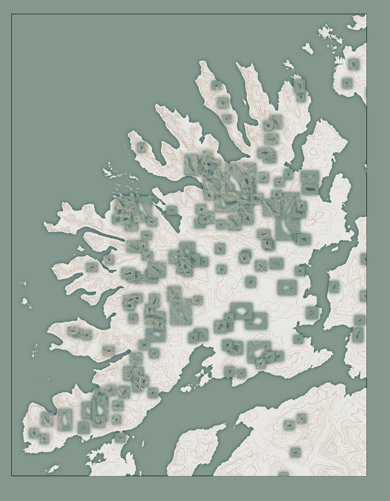
Appropriately applied, each lake now has a nice inner shadow that makes it look in sync with the coastline.
Drawing Other Features
The rest is simply applying the same steps over and over but for different features. To summarize:
The general steps in R:
- Find the feature on the OSM Wiki page that you want to draw
- Use the
add_osm_featurefunction to download those features. Using some trial-and-error to figure out precisely what you need (by inspecting and plotting the results) - Save to a
geojsonfile
# Get the OpenStreetMap info about roads
osm_roads <-
    opq(bbox = bbox) %>%
    add_osm_feature(key = "highway",
                   value = c("motorway", "primary", "secondary",
                             "tertiary", "trunk")) %>%
    osmdata_sf()

# Inspect and plot the results to see what you need
# [...]

# Save to file
st_write(roads, "lofoten_roads.geojson", delete_dsn = T)
The general steps in JavaScript:
- Load the
geojsonfile usingd3.json - Use the “simple” function with
geoPathif you want to stroke the feature (e.g., roads) or the more elaborate function if you want to fill the feature (e.g., lakes) - Each feature gets its stroke/fill colors and other visual settings.
// Draw the roads across the land
function drawRoads(context, roads) {
    context.strokeStyle = COLOR_ROADS
    context.lineWidth = 3.5

    context.beginPath()
    roads.features.forEach(feature => {
        geoPath(feature)
    })//forEach
    context.stroke()
}// function drawRoads
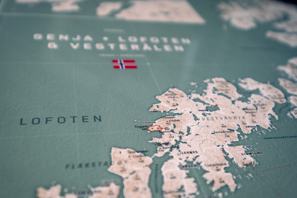
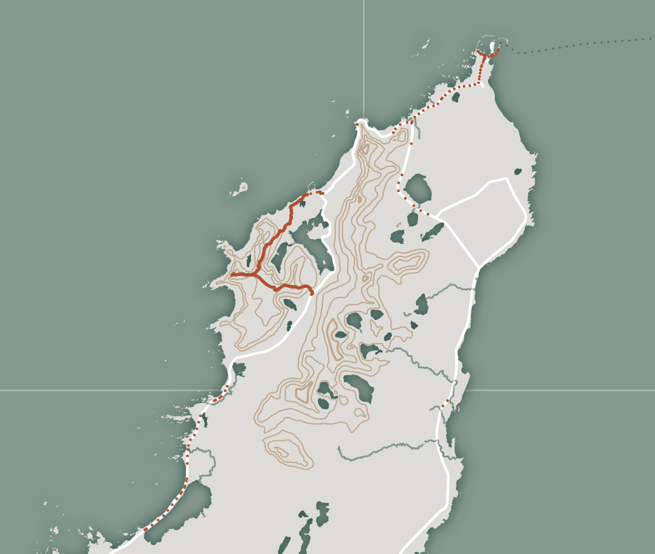
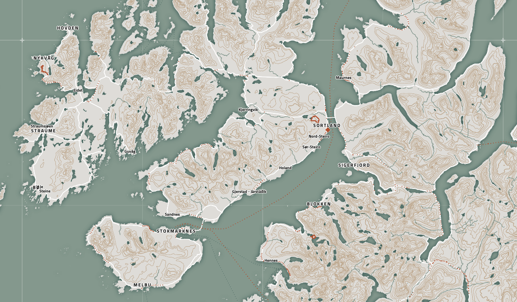
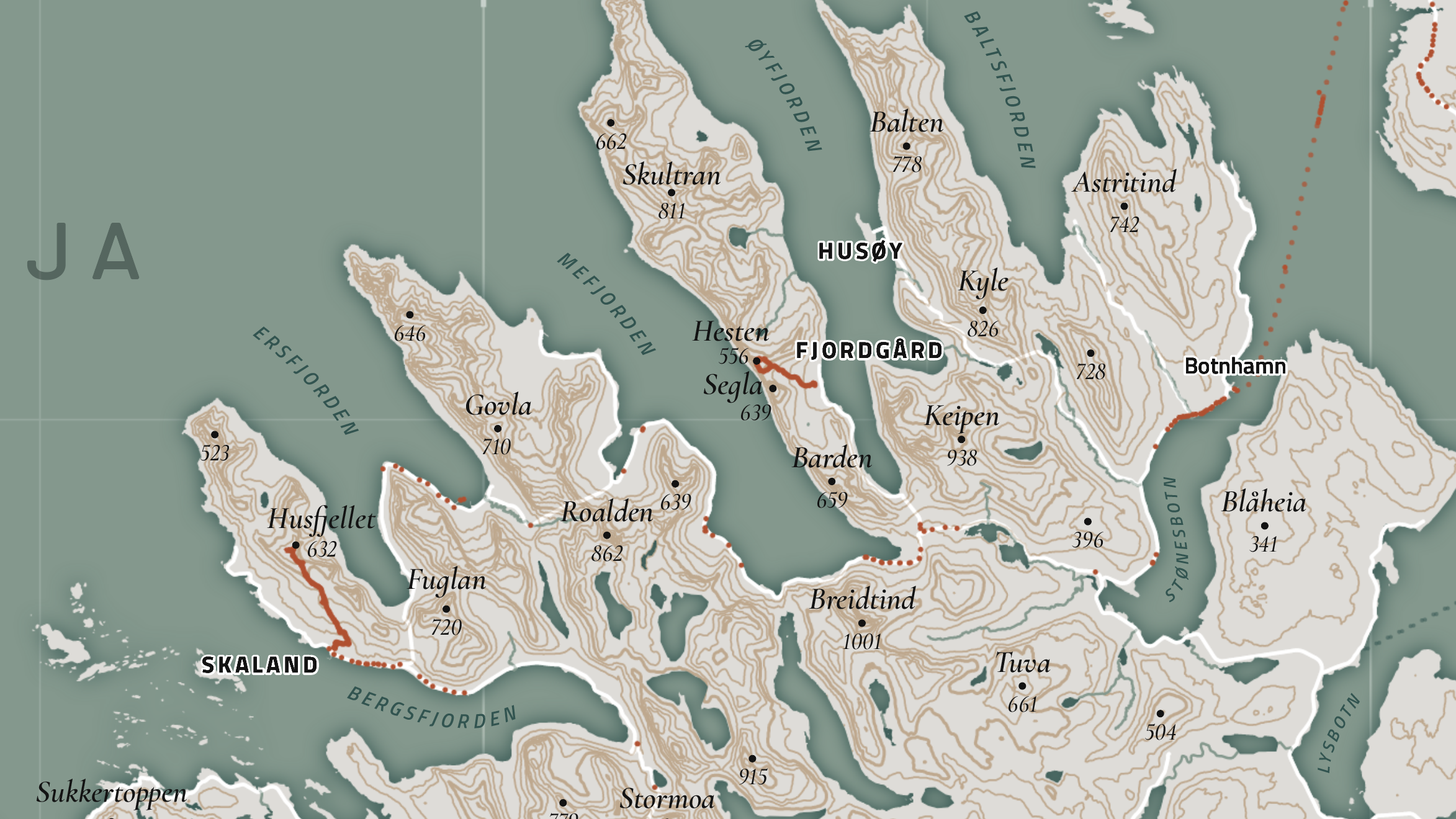
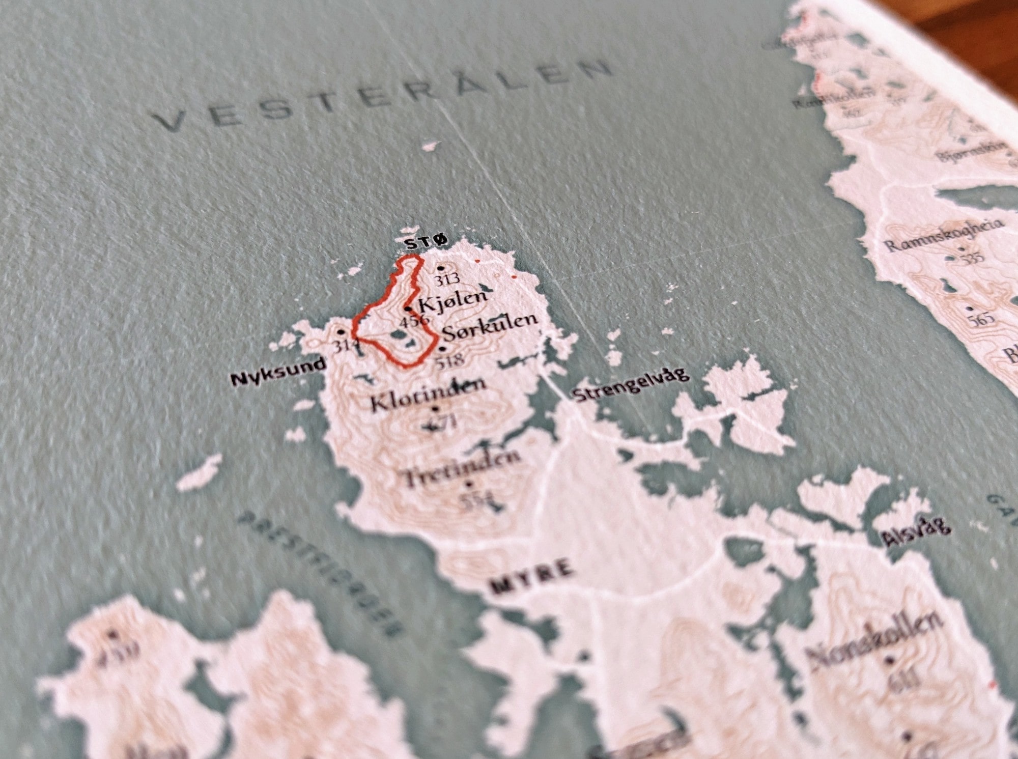
For this specific map, I repeated this for the roads (as seen above), the rivers (add_osm_feature(key = "water", value = "river") + add_osm_feature(key = "waterway", value = "river")), the ferry routes (add_osm_feature(key = "route", value = "ferry")), but also for our hikes, our Google locations, and cabins we stayed at, which I’ll explain more about in the next section.
Adding My Personal Data
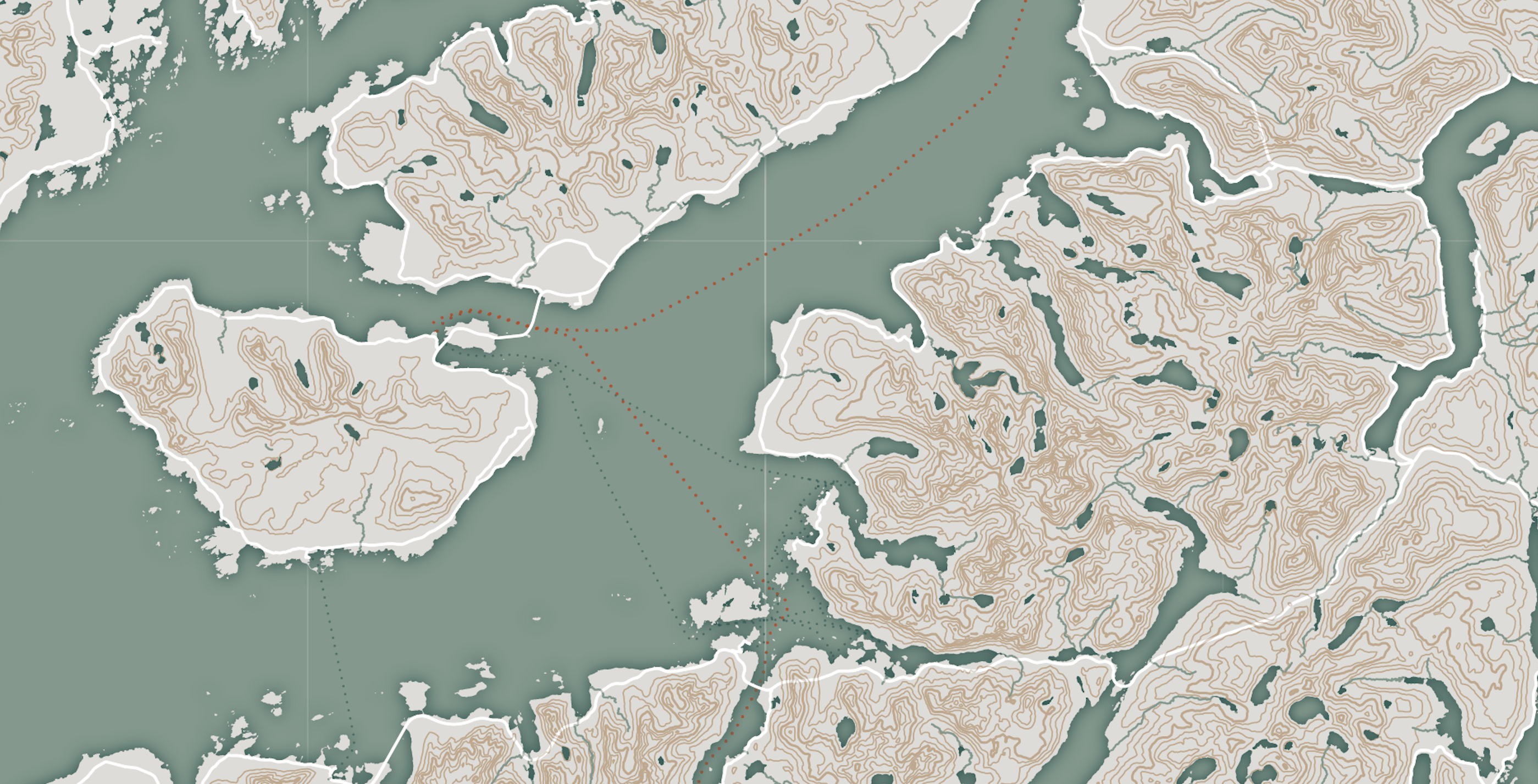
The fun thing about creating such a personal map is that you can make it really personal by adding your data to the map. For example, a simple change was to draw the ferry routes we took in red, instead of the default blue. One of the many metadata variables that come with the ferries’ OSM data is the route’s name. So, I manually looked up the ferry routes we took and put these in an array that the script would search to decide which color to draw the dotted ferry line.
Hiking Activities
We love tracking our data in general. Therefore, we made sure to track all of the hikes we did during our trip. I have a Garmin watch and can log into my Garmin account online to download each hike separately. These are saved as fit files. Using the FITfileR package in R and this tutorial, I loaded all these files into R and turned them into something that would output a single geojson file with each hike as separate line feature (that I then plotted in the same way as shown before, such as the roads, but thicker and in red).
It made such a difference once I saw our hikes appear on the map for the first time. Emotionally, it turned the map from a nice-looking map to a very personal map. Being able to see our exact walking paths drawn on the map, placing them in the context of the whole region and mountains. Each red line reminds me of the hike itself, the things we saw, the effort it took to climb so high, the views! In a way, adding this personal data was the best decision I made during the whole creation.
Google Location History
I used the steps outlined in this blog to download both of our Google Location History datasets. Filtered to only the dates we were in the Lofoten and Senja area. I saved the data as a simple csv file of latitudes and longitudes (and accuracy). Then, in JavaScript, I load the file using the d3.csv function and loop over all the locations using the projection function to place a small red circle at its location.
function drawGoogleLocations(context, projection, google_locations) {
    context.fillStyle = COLOR_RED
    context.beginPath()
    google_locations
        .filter(d => d.accuracy < 30) // Only those with enough accuracy
        .forEach(d => {
            let [x,y] = projection([d.longitude, d.latitude])
            context.moveTo(x+2, y)
            context.arc(x,y,2,0,TAU)
        })//forEach
    context.fill()
}// function drawGoogleLocations
Cabin Locations
There were four different cabins / Airbnbs that we stayed in that are located within the map area. I manually looked up the latitude and longitude of each and plotted these as red diamonds following a similar process as the Google Locations from above.
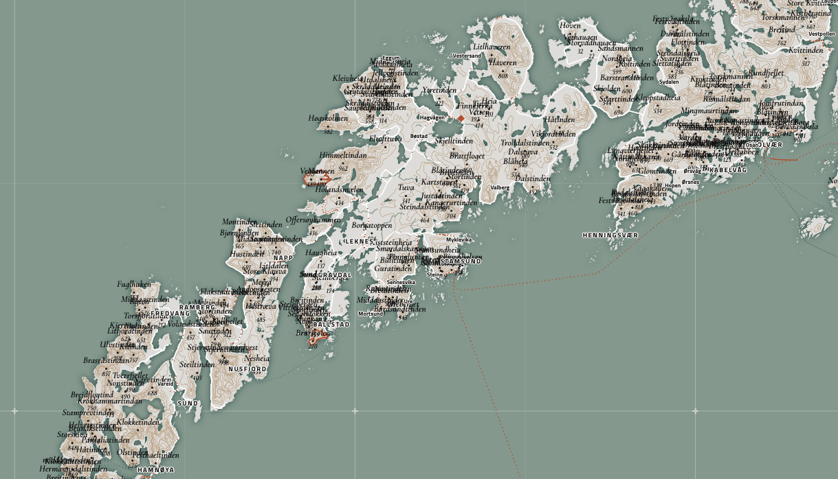
Adding Labels
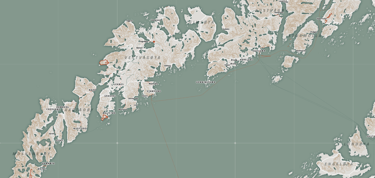
It’s a bit difficult to see, but by now, the map is looking something like this:
What is missing still are the point locations. The locations you want to mark with text. Such as cities and towns, the fjords, the national parks, the island names, the mountain peaks!
Unlike all of the features we’ve been plotting until now, I want to be able to alter these features manually after my script has placed them on the map. Mostly because I think it’s impossible to place labels perfectly purely with programming (especially when there are many).
Adobe Illustrator, Affinity Designer or InkScape for example.
Instead of plotting them onto the HTML5 canvas we’ve been using so far, we’ll use an SVG for all the text. This makes it possible to copy the svg element into your vector editor to change the texts manually.
Cities & Towns
Starting with an easy one, below is some code to get the geo-locations of the cities, towns, and villages into a geojson file.
# Download the towns and villages from OpenStreetMap
osm_cities <-
   opq(bbox = bbox) %>%
   add_osm_feature(key = "place", value = c("city", "town", "village", "quarter")) %>%
   osmdata_sf()

# Only keep the useful variables and the cities with a name
cities <- osm_cities$osm_points[,c("osm_id", "name", "place", "population")] %>%
  filter(!is.na(name))

# Save to file
st_write(cities, "lofoten_cities.geojson", delete_dsn = T)
I could’ve also saved this as a csv file with the latitudes and longitudes since they’re point locations, but I already had the whole st_write set up for the polygon shapes from before, so it was simply easier to continue.
With the data loaded in the JavaScript file, I used the function below (for this and all the other datasets that will get plotted on the svg) to prepare it for easy plotting.
function prepareDataForSVG(data, projection, CLIP) {
    // Precalculate the pixel location of the peaks
    data.features.forEach(feature => {
        let point = feature.geometry.coordinates
        let [x, y] = projection(point)
        feature.x = x
        feature.y = y
    })//forEach

    // Filter out all data outside of the clipping area
    data.features = data.features.filter(feature => {
        let x = feature.x
        let y = feature.y
        return x > CLIP[0][0] && x < CLIP[1][0] && y > CLIP[0][1] && y < CLIP[1][1]
    })//filter
} //function prepareDataForSVG
Assuming you have the typical svg & g variables created through d3.js.
// I already created an SVG element in the html with an id of "svg"
const svg = d3.select("#svg")
const g = svg.append("g").attr("transform", `translate(${MARGIN},${MARGIN})`)
Adding the city data as text to the map is pretty straightforward and done in a typical d3.js style. However, one important thing I’ve noticed is that you can’t use classes to set the styles. Instead, you must set all the typical CSS stylings directly on each element. Otherwise, if you copy the svg into Illustrator, the stylings won’t come over.
function drawCities(cities) {
    // Create a separate group element to place all the city texts into
    const city_group = g.append("g").attr("id","city-group")

    // Draw the name label for the cities
    // Making those places of type "quarter" smaller
    city_group.append("g").attr("id",`cities`)
        .selectAll(".city")
        .data(cities.features)
        .join("text")
        .attr("transform", d => `translate(${d.x},${d.y})`)
        .style("font-family", FONT_FAMILY_CITIES)
        .style("font-weight", 700)
        .style("text-anchor", "middle")
        .style("font-size", d => `${d.properties.place === "quarter" ? 7 : 8}px`)
        .style("letter-spacing", d => `${d.properties.place === "quarter" ? 0 : 0.15}em`)
        .style("fill", COLOR_BLACK)
        .style("text-shadow", "0 1px 0 #fff, 1px 0 0 #fff, -1px 0 0 #fff, 0 -1px 0 #fff")
        .text(d => {
            let t = d.properties.name
            return d.properties.place === "quarter" ? t : t.toUpperCase()
        })
}//function drawCities
I preferred to focus on all the cities at once or all the fjords and could easily hide all the other textual layers in the meantime.
Another tip is to add each “feature set” (e.g., all the cities and all the fjords) into a separate g element. If you paste the svg into Illustrator, this will keep the feature sets grouped into layers, making it much easier to work with the file.
This is all still looking reasonably good. There’s some overlap happening in a few places on the map, but not many.
Mountain peaks
Specifically for the mountain peaks (using add_osm_feature(key = "natural", value = "peak")), it will look nice to add a tiny dot for the peak, have the peak name above it, and the height in meters below it. To make it easier to move these label groups around in Illustrator later, it’s handy to turn each “name-dot-height” element into an SVG group here already.
function drawPeaks(peaks) {
    // Sort from largest to smallest peak
    peaks.features = peaks.features.sort((a,b) =>
        b.properties.ele - a.properties.ele
    )

    // Create a general group for all the peaks
    const peak_group = g.append("g").attr("id","peak-group")

    // Create a group per peak
    const group_per_peak = peak_group.selectAll(`.peaks`)
        .data(peaks.features)
        .join("g")
        .attr("class", `peaks`)

    // Draw the name label for the peaks
    group_per_peak
        .append("text")
        .attr("class","peak-label")
        .attr("transform", d => `translate(${d.x},${d.y - 7})`)
        .style("font-family", FONT_FAMILY_PEAKS)
        .style("font-size", `${11}px`)
        .style("font-weight", 600)
        .style("font-style", "italic")
        .style("text-anchor", "middle")
        .style("fill", COLOR_BLACK)
        .text(d => d.properties.name)

    // Draw the small dots for the peaks
    group_per_peak
        .append("circle")
        .attr("class","peak")
        .attr("cx", d => d.x)
        .attr("cy", d => d.y)
        .attr("r", 1.25)
        .style("fill", COLOR_BLACK)

    // Draw the height label for the peaks
    group_per_peak
        .append("text")
        .attr("class","peak-height-label")
        .attr("transform", d => `translate(${d.x},${d.y + 9})`)
        .style("font-family", FONT_FAMILY_PEAKS)
        .style("font-size", `${8.5}px`)
        .style("font-weight", 400)
        .style("font-style", "italic")
        .style("text-anchor", "middle")
        .style("fill", COLOR_BLACK)
        .text(d => d.properties.ele)

}//function drawPeaks
Once plotted, it becomes apparent that a lot of manual clean-up is awaiting!
But we’ll get to that later. So, for now, let’s hide the peaks until we’ve added all the other point locations.
Islands
This could’ve probably also been done in JS with the d3.polygonCentroid() function.
One final preparation step is needed in’ R’ for the remaining subjects that need labels, the fjords, islands, and national parks. These types of features aren’t point locations but polygons. However, we only need one point per fjord, one point per island, etc. Therefore, it is handy to replace the whole polygon geometry with its centroid location.
As with everything I’m sharing here about the sf package, I’m sure this could’ve been coded more easily.
getCentroid <- function(data) {
  data$centroid <- st_centroid(st_geometry(data))
  data <- data %>%
    st_drop_geometry() %>%
    rename(geometry = centroid)
  st_geometry(data) <- data$geometry

  return(data)
}#function getCentroid
After downloading the island data through the OSM API, I split them by the type of geometry that holds meaningful data, being polygons and multipolygons here. However, nothing remains on the polygons once filtered for only the largest islands. Therefore, continuing with just the multipolygons, apply the getCentroid to replace the polygon geometry by its central point, keep only the variables that seem interesting to use in the JavaScript file, and save to a geojson.
# Download the islands from OpenStreetMap
osm_islands <-
   opq(bbox = bbox) %>%
   add_osm_feature(key = "place", value = "island") %>%
   osmdata_sf()

# Only take the bigger islands with a name
islands_polygons <- osm_islands$osm_polygons %>%
  filter(!is.na(name)) %>%
  mutate(area = st_area(.)) %>%
  filter(as.numeric(area) > 25e6)
# There are no "polygon" islands left

islands_multi <- osm_islands$osm_multipolygons %>%
  filter(!is.na(name)) %>%
  mutate(area = st_area(.)) %>%
  filter(as.numeric(area) > 25e6)

# Replace the geometry with the centroid
islands_multi <- getCentroid(islands_multi)
# Keep the interesting variables
islands_multi <- islands_multi[,c("osm_id","name","area")]
# Save to file
st_write(islands, "lofoten_islands.geojson", delete_dsn = T)
Once the file is loaded into the JavaScript file, it follows the same process as above for the cities and peaks to place the text labels of the islands.
Fjords & National Parks
Apply the same process for the fjords (add_osm_feature(key = "natural", value = "bay")), and the national parks (add_osm_feature(key = "boundary", value = "national_park")), using the getCentroid function to replace the whole polygon geometry by the central point and then adding the text at those locations on the SVG.
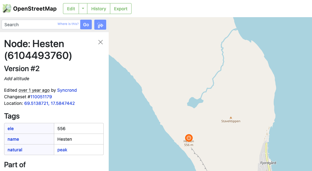
If at any point you don’t know what the name of a feature should be for the OSM API, you can search for an example on the OpenStreetMap site itself. For example, say I didn’t know that mountain peaks were a part of natural -> peak. I would look for a mountain on the OSM website, and once found, the Tags table shows what it belongs to. You can use this information directly or search for it on the OSM Wiki feature page.
Cleaning up the Labels
The map is quite a mess with all the labels (including the mountain peaks again) now plotted on the SVG!
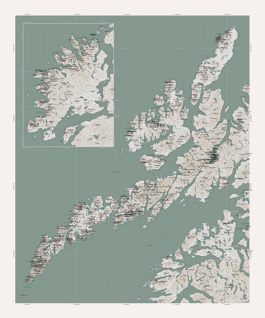
However, everything we could do in JavaScript is now done. All the information is there. The clean-up and fine-tuning will happen within Illustrator. Therefore, copy the SVG (find the svg element in the devTools inspector, right-click, and choose something along the lines of copy -> Outer HTML (it’s called something slightly different per browser, I believe)). Open a new file in Illustrator and paste it. Although it’s been a while since I last tested it, but I’ve found that Adobe Illustrator is the best for “interpreting” a pasted SVG. It will correctly read most of the standard CSS-based features and apply them, except for the text-anchor attribute.
Also, save the background map, the canvas, as a PNG and place this as a layer behind the SVG in Illustrator to help with all the manual editing.
Official Paper Maps to Help
One instrumental piece of information that I couldn’t have done without to decide between “what mountain is the most important in this busy area,” for example, is the Norwegian Kartverket of Historical Maps. It’s a fantastic tool that overlaps older paper maps on a modern zoomable map.
I only wanted relatively recent maps from the 90s and newer.
Press the “Vis Filter” button along the top-right, add a start and end date if you want to be more precise, and press “Search” to get a list all the maps you can overlay that fall into the visible map area.
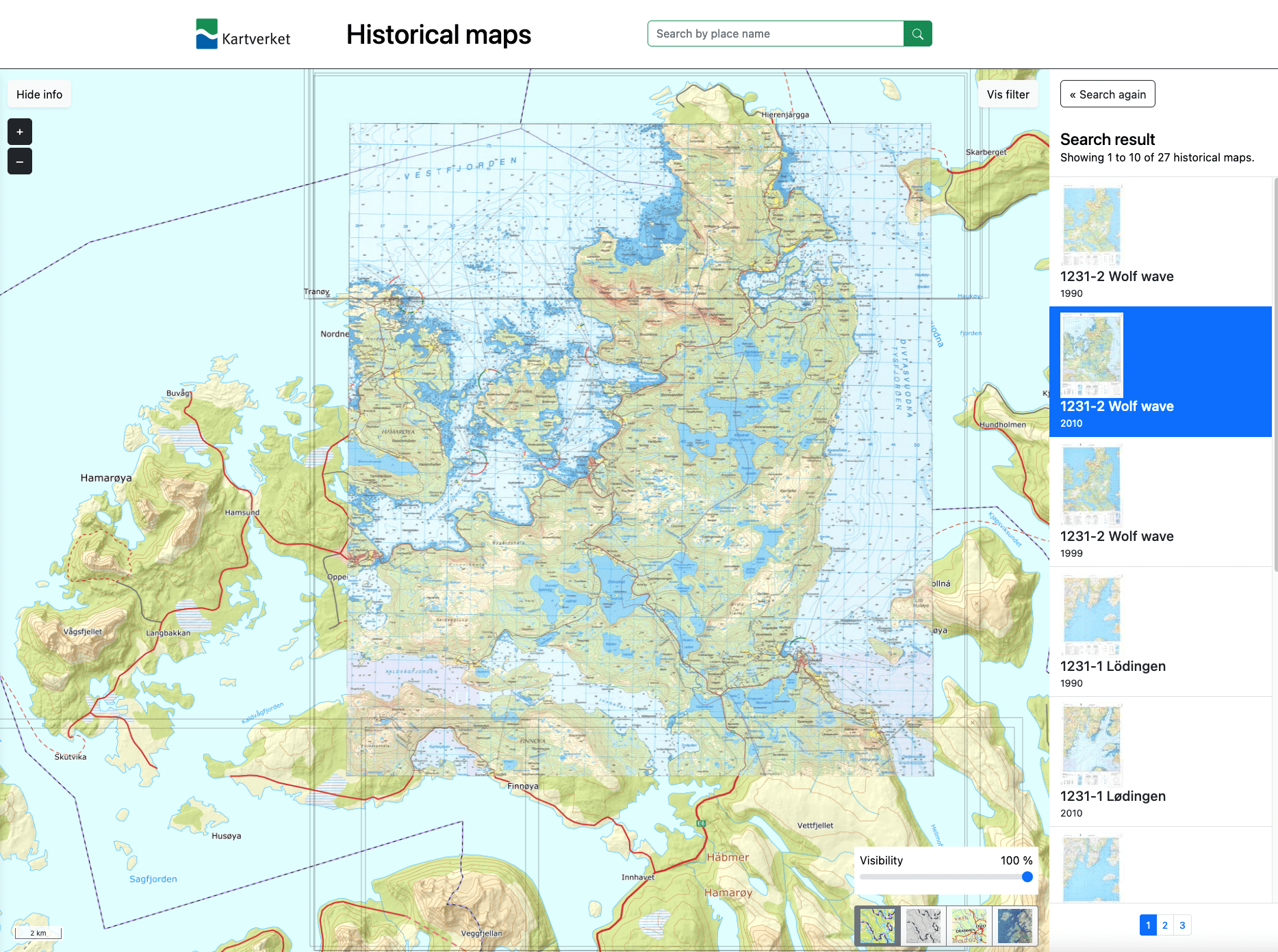
I found that the typical Google Maps and OpenStreetMaps don’t show nearly enough information per zoom level, in a way. They rely more on the idea that you zoom in further if you want more detail. Instead, by looking through the older paper maps on the Kartverket site, I could see how they had decided to deal with areas of many mountain peaks or close-by cities. Or find the names and elevations of mountain peaks that I didn’t have in my map but seemed important in the paper maps.
Remaining Clean-Up
I’m using Izoard, Titillium Web, and Cormorant Infant for my fonts.
I only have a little to talk about the clean-up part in Illustrator. It comes down to finding a way to clean up the labels, especially the overlap, by process of removal or some nudging here and there, and truly deciding how to design the different features’ fonts/colors/styles. Perhaps choose a different font for certain feature groups. Bold fjord names with a lot of kerning, italics for the mountain peaks, white outlines for the city names, etc. I used the map by Fjelltop as a major inspiration for many aspects of my map, which at least made the design process faster.
It’s slow going! It took me about 8 hours(!) to meticulously walk through all of the labels, decide which ones to keep, which ones to remove, which ones to add, and how to move some labels so the island name would still be visible with the cities and peaks on top of it, curving most of the fjord names to follow the fjord shape, and so on.
Finally, adding a title and a little SVG icon of the Norwegian map, and it is done!
Printing
When I need something properly printed, I always use theprintspace. They use giclee printing on rich, textured, archival quality papers that can get outstanding resolutions, vibrancy, and sharpness. I was wondering if the smallest font sizes would be readable. It was hard to decide from looking at my monitor. But from experience, I can usually still read things when printed (with giclee) that are hard to read on my monitor at the same size. I, therefore, first ordered a test strip to be sure.
Thankfully, it looked even better and sharper than I anticipated, so with only some minor tweaks, I ordered the full print at 50x60cm on Hahnemühle German Etching paper.
Wrapping-up
Someday I’ll learn how to write short blog posts…
I know this wasn’t a complete step-by-step explanation of all the code that went into making this map, but it got pretty long even so! However, I hope it was enough to explain the general process of making a nice-looking map using JavaScript (and R to prepare the OSM/contour data) and adding that unique touch by adding personal data. I also hope that the code snippets that I shared might come in handy to save you some time in case you decide to create a JS-based map yourself.