“Anhedra” is a generative art collection that I created for GEN.ART. For this collection I was inspired by the process through which minerals (and rocks) are created, especially when growth occurs in a competitive environment and different minerals collide and form fascinating arrangements together. However, instead of having different atomic elements to grow, Anhedra uses a wide variety of color palettes, and sometimes goes beyond how processes would happen within nature, combining both the digital and organic.
Anhedra was released on GEN.ART on January 26th 2022. There are still mints available for GEN.ART members. If you’d like to become a member, check out the #faq channel on the GEN.ART Discord. You can see the collection in the GEN.ART Gallery and on the secondary market on OpenSea (where you can also get an Anhedra in case you don’t have a GEN.ART membership)
In this post, let me explain more about the idea behind the collection, the inspiration, the visual styles, and more.
Media
If you prefer to get your content through other means than written text, then here are a few other options where I talk about Anhedra. In this ±7min video interview I explain more about the algorithm, the name, and the features (and a smidge of introduction at the start). There’s also this podcast I did with Adam from GEN.ART of ±38mins in which we dive even deeper into Anhedra, my background, my inspiration, work, and more.
Inspiration
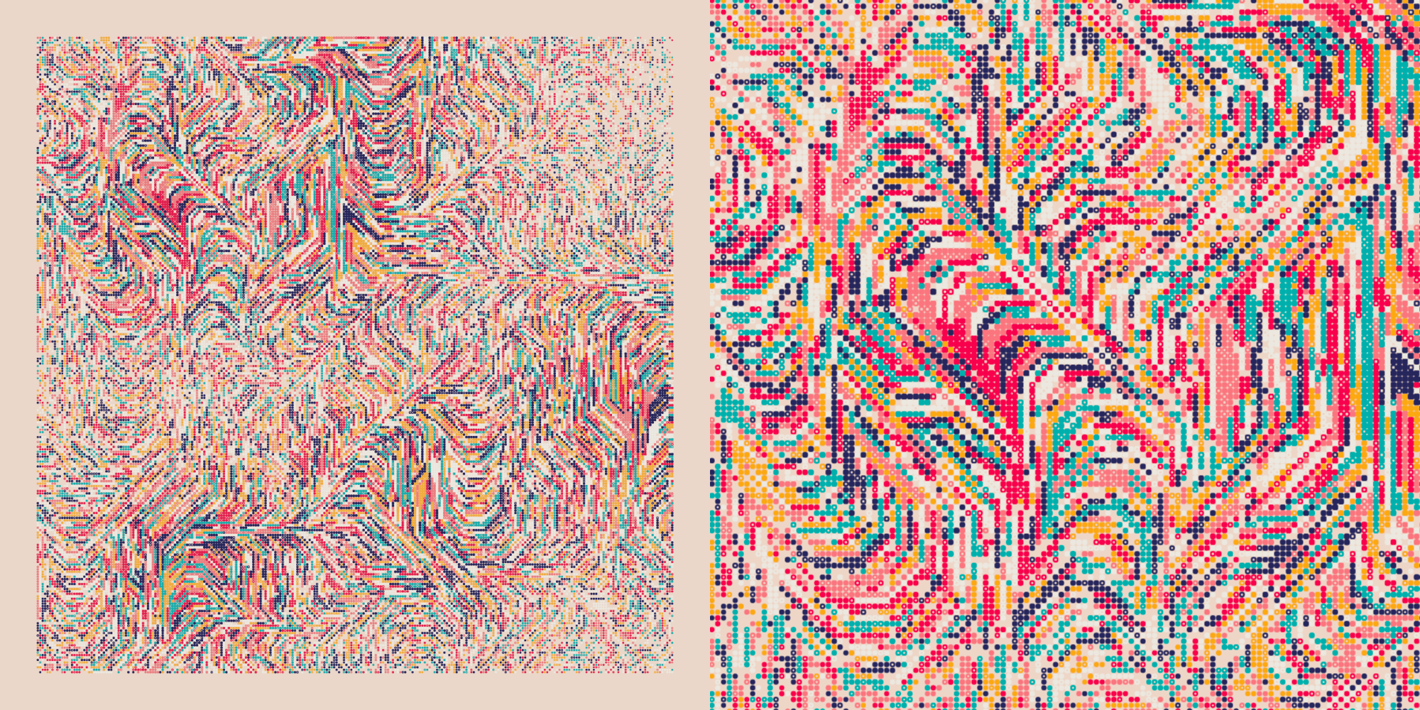
Initially I was playing with rather big grids. I’d seen some wonderful inspiration of grids filled with simple geometric shapes by yazid and wanted to play with this myself.
I thought it would be nice to have some sort of color coordination going on, that shapes next to each other might have an increased chance of being the same color, thereby making the two shapes appear merged. I wrote some really “quick and dirty” code to get an initial feeling for this. But when I looked at the result it wasn’t what I had expected. Instead of some neighboring shapes only sometimes having the same color, entire sections of color had basically “grown” outward and sideways (image below left).
But I liked it!
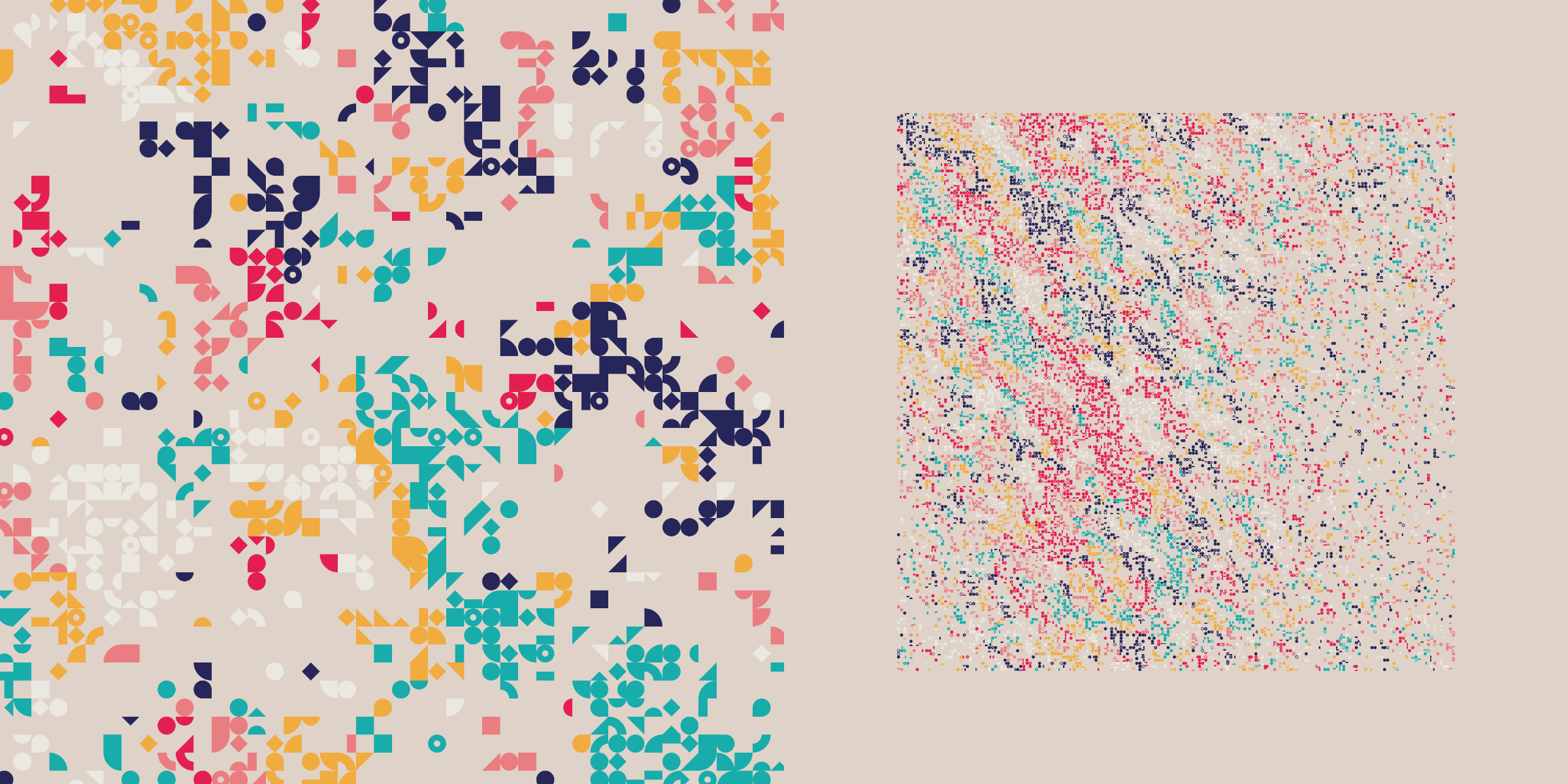
I increased the size of my grid a lot and tried a few more times. I shared an output on social media, and people also seemed drawn to this style.
My partner has a degree in metallurgy and works as a ‘failure analyst’, examining why things have broken at a material level, usually involving metals.
When I showed the result to my partner that evening, he immediately said that it looked very similar to some of the experiments he did in the lab, when examining the micro structures of welds for example. They have machines that examine cross sections of materials (e.g. a pipe) and analyze all of the different materials, and grains, present within, marking each with a bright color.
We searched for some images and videos on “weld solidification”, and they did indeed feel similar to what I was seeing in my images.
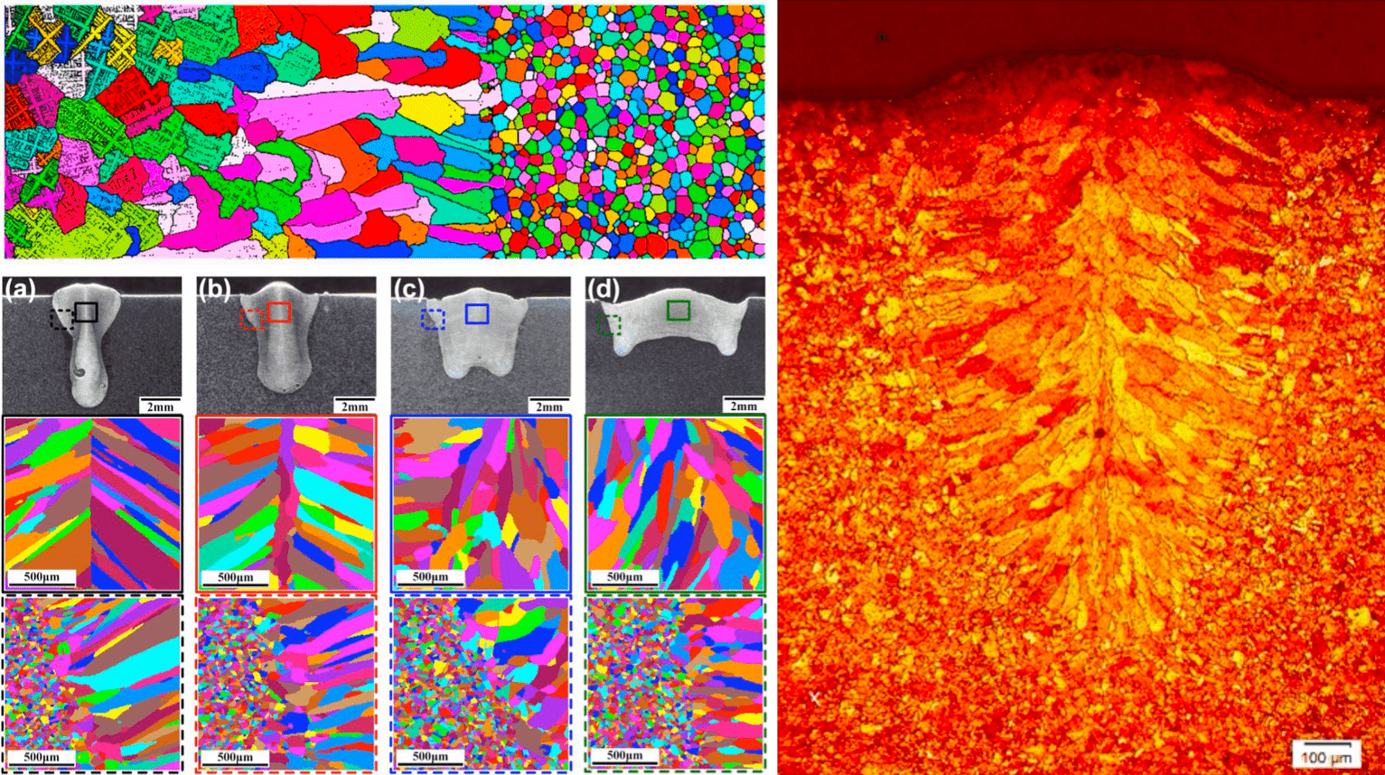
I broadened my search and found that these kinds of patterns were common for minerals in general. Especially when looking at the (image) results of “Optical Mineralogy”. I found this lovely collection of close-up images of rocks and minerals and these slides about Optical Mineralogy.
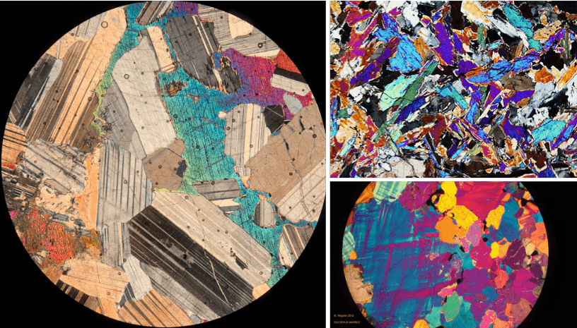
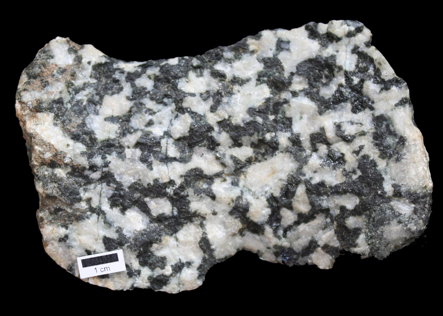
You can also see such patterns in rocks in general with the naked eye, such as the black and white “Diorite”, which is an intrusive igneous rock formed by the slow cooling underground of magma.
A mineral is a solid chemical compound with a fairly well-defined chemical composition and a specific crystal structure that occurs naturally in pure form
My partner explained how this process generally works with the idea of “seeds”. While a material (metals or other elements) is slowly cooling. I’m probably explaining this extremely crudely, and I keep getting minerals and crystals somewhat mixed up, but at some point an atom will sort of “become solid”, become a seed, and other atoms, especially from the same element, can then (more) easily attach themselves to it, slowly creating a mineral.
“Anhedra” comes from anhedral. I preferred the word without the “l” at the end.
If there is space, the mineral can grow into the most fabulous shapes (I can look through shops like this or this for hours), these are known as euhedral. But there is also anhedral (the name!). A rock with an anhedral texture is composed of mineral grains that have no well-formed crystal faces. Anhedral crystal growth occurs in a competitive environment with no free space for the formation of crystal faces.
When I thought about it, the explanation for how an anhedral rock forms was really similar to what I was basically doing with my algorithm. Some cells would become a “color seed” and then the neighbors around it could decide to follow that color, or a color from another neighbor, or even become a new seed itself.
And it is a competitive environment where the color sections will bump into each other and it’s only chance that determines which colors can grow into even larger areas, and which will die out.
As a scientist I still love working with concepts and math based on Nature. I immediately fell in love with this link between the fundaments of my algorithm and mineral growth and therefor decided to explore the ways in which my colors could “grow” and the variety that was possible.
The Algorithm
I won’t go far into any technical details, but let me explain the main aspects behind the algorithm, from a programming perspective.
It starts out with creating a two dimensional grid of “cells” of several hundred rows and columns. If it’s 1000 rows wide and high it would have 1,000 * 1,000 = 1,000,000 cells in it. I want to fill this grid with colored dots.
The main concept consists of two major parts; which cells to drawn dots in, and how to let the colors grow through the dots that have been drawn.
First, the algorithm needs to decide in which cells to draw dots. I don’t want to draw a dot in each cell, that wouldn’t remain interesting for a collection of this size. Instead I want some cells to have dots and others not.
I explain more about what noise fields I use in the Noise section farther below.
Randomly deciding which cells get a dot won’t result in something beautiful. I therefore use different kinds of noise functions to create a two dimensional “probability field”. Each cell gets assigned a value between [0,1] and this represents the odds of a cell actually having a dot drawn. The noise functions make sure that these values change across the 2D field in a visually interesting manner (generally in a smooth way). After a cell is assigned its “probability value”, I convert it into a yes or no; I request a random number and if that value is lower than the probability value, it gets drawn, if it isn’t, the cell remains empty.
After that, the algorithm determines how the colors should grow. Colors grow through the cells by looking at neighbors; a cell checks which of its neighboring cells (that have a dot drawn) already have a color defined, and chooses to follow one from all of its “color-defined” neighbors. It can also have a chance of ignoring its neighbors to become a new “color seed” itself. And finally, if none of its neighbors have a color already assigned (or if it’s not surrounded by any drawn neighbors) it will randomly choose a color from the available color palette.
Determining how I walk through the 2D grid (to define each cell) determines which neighbors of a cell are already defined before reaching that cell. And it’s in changing that walking order that you get all of the different growth patterns that you see in Anhedra (the Color Flows).
There is, of course, a lot more happening around this for the full algorithm, but these two aspects are truly what makes an Anhedra.
Color Flows
As I explained above, the Color Flow, or color growth pattern, is one of the two most fundamental aspect of Anhedra. This is determined by the way I define what the neighbors are of a cell. Or to be more precise, in what order to walk through the entire grid, thereby determining what neighbors potentially have a color already, and which not.
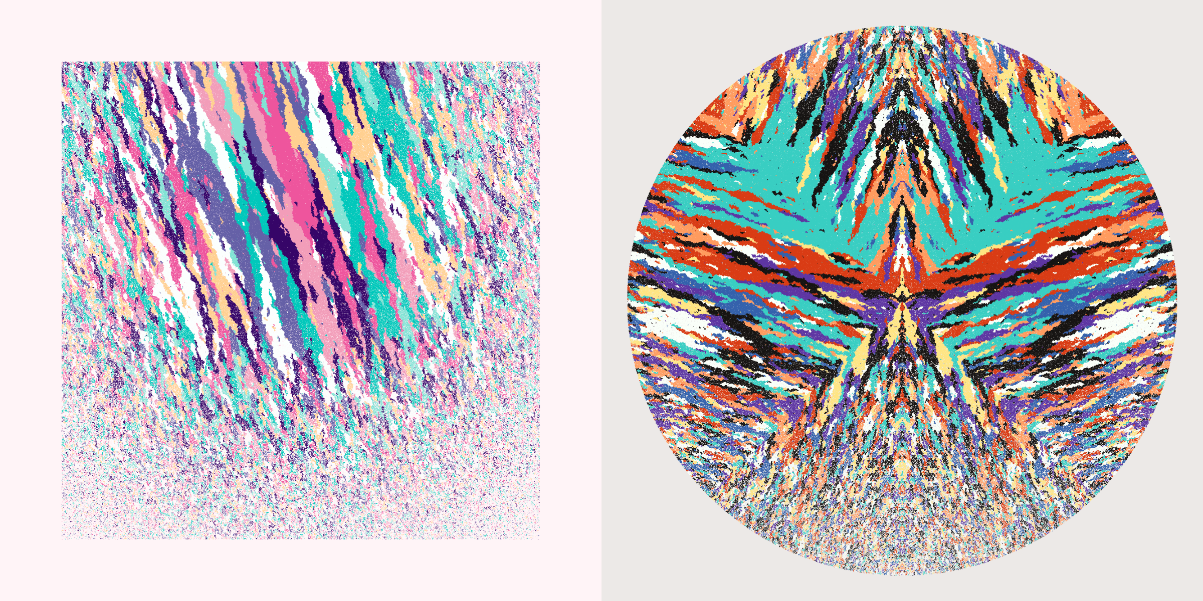
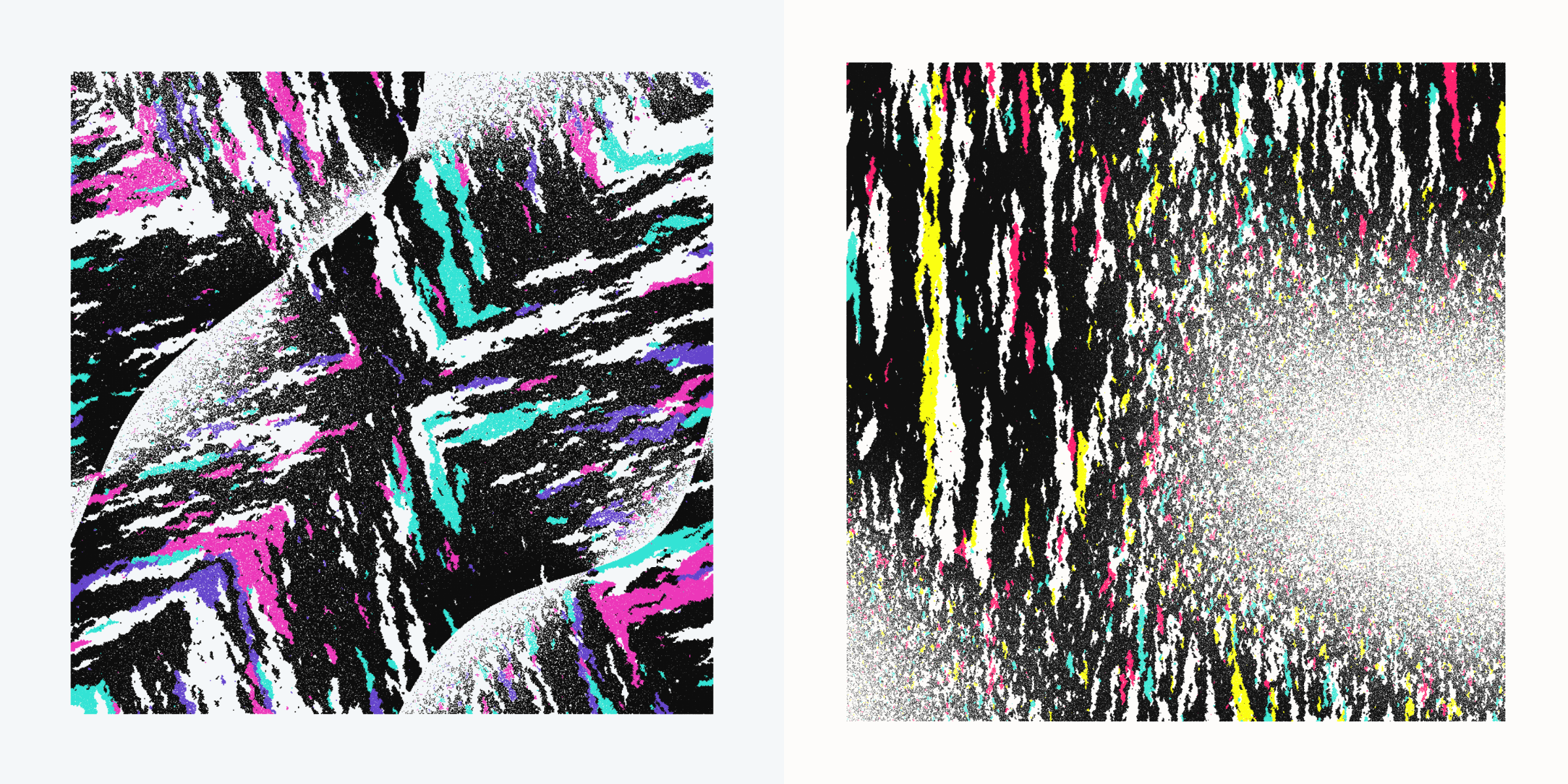
For a cell I can choose to only look at the cell to its left, top, right and bottom. However, I can also look at the four cells in the corners (e.g. top-left). This minor change can create some interesting effects in the patterns of color flow, and you can see what any Anhedra has from the Diagonal Neighbors property.
By playing with the odds of which neighbor a cell can look at, but also with the odds of a cell becoming its own seed you can get outputs with tiny whisps of colors (when cells can easily become a seed themselves) to those with giant areas of the same color (cells can barely become a seed, unless no neighbor has a color).
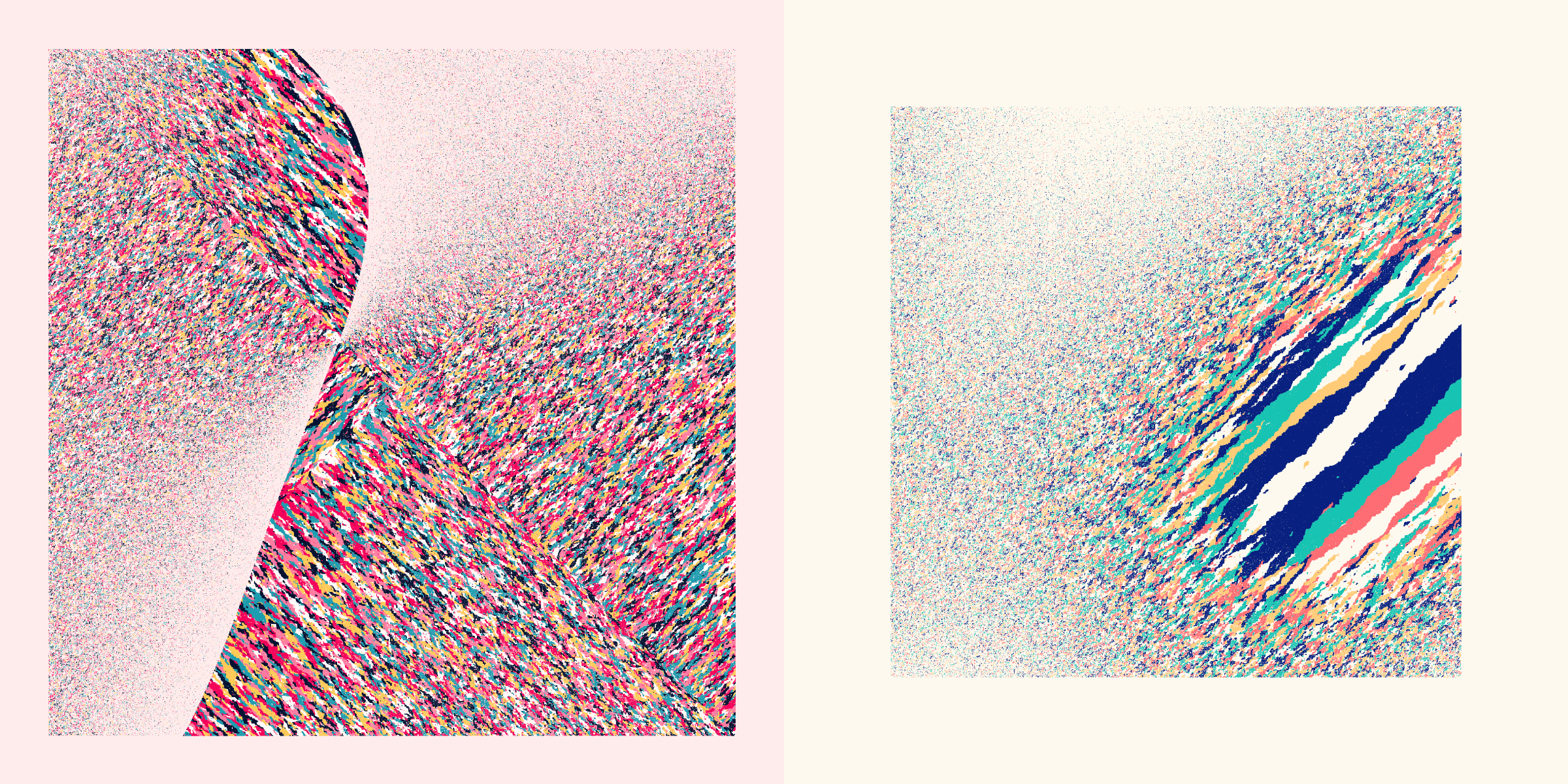
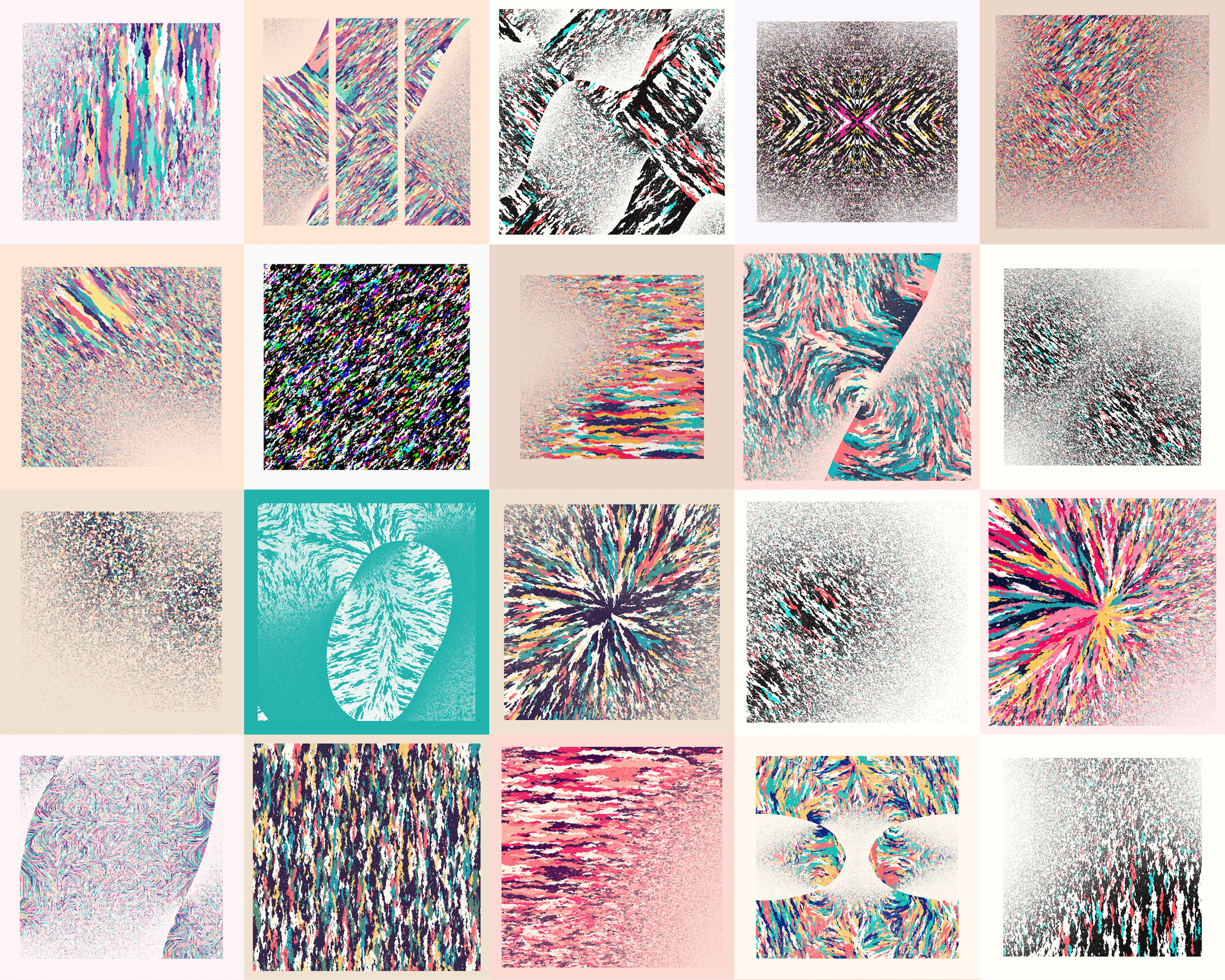
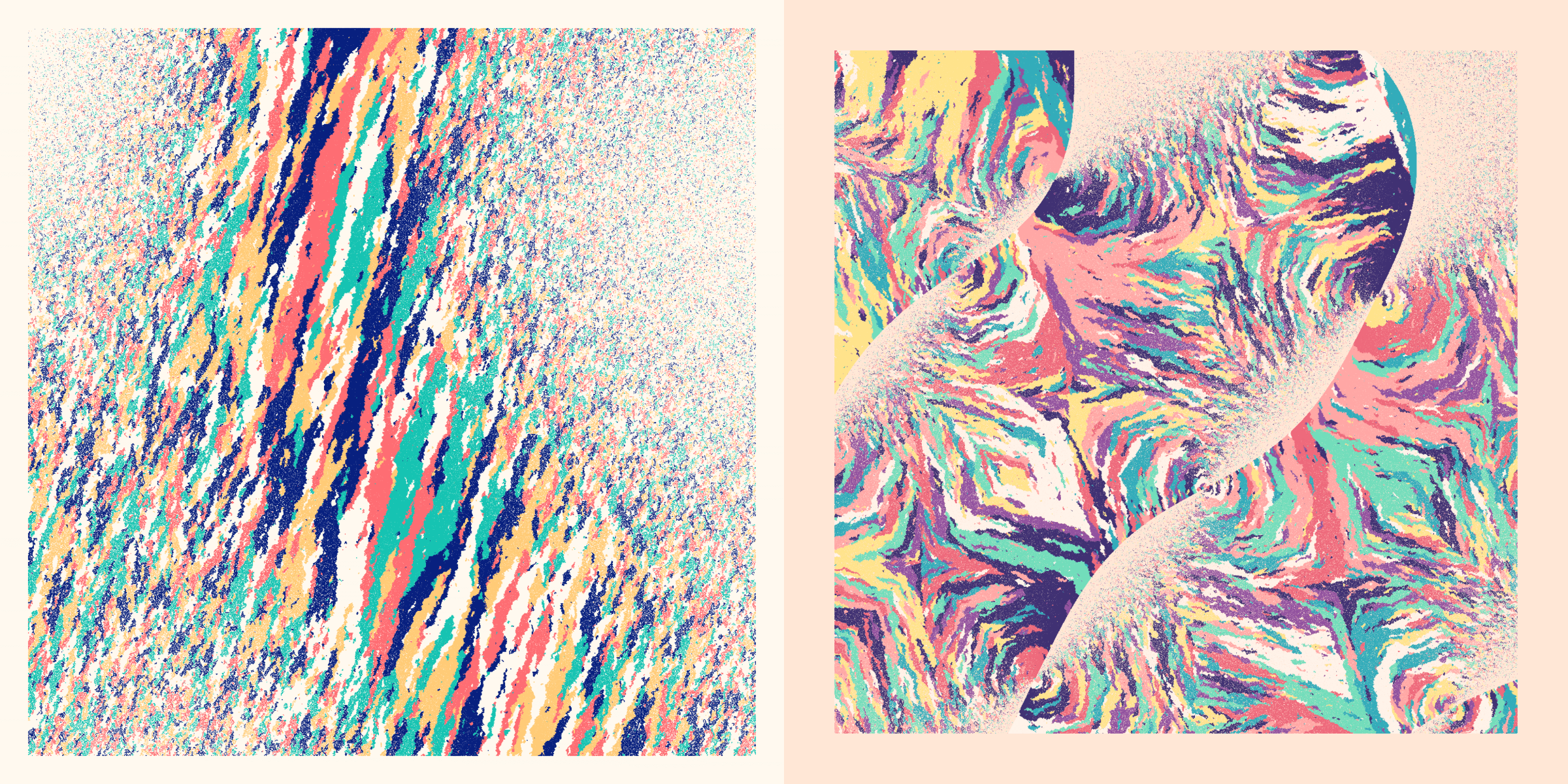
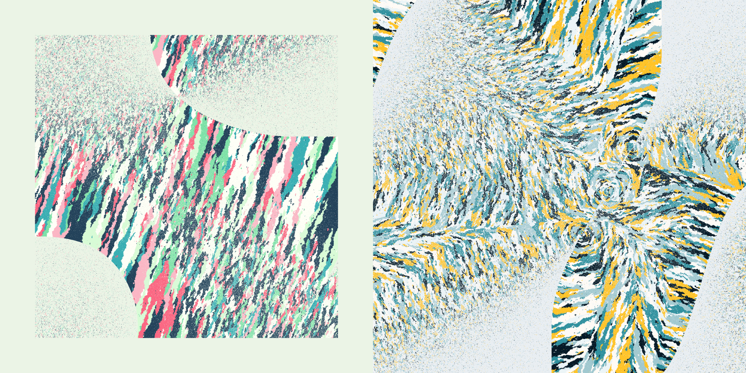
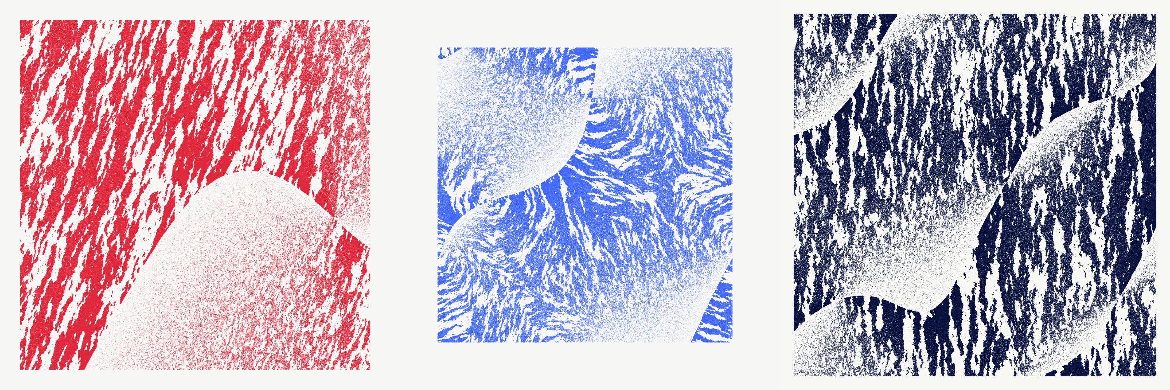
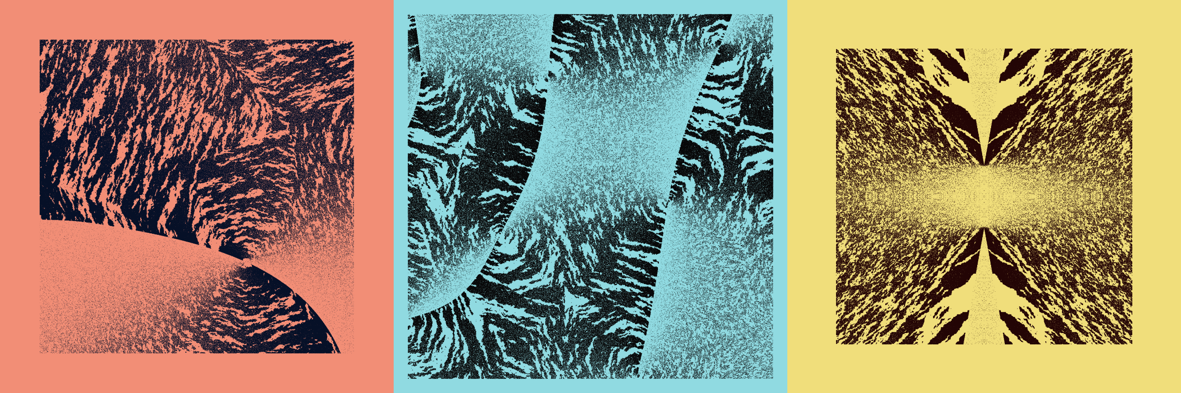
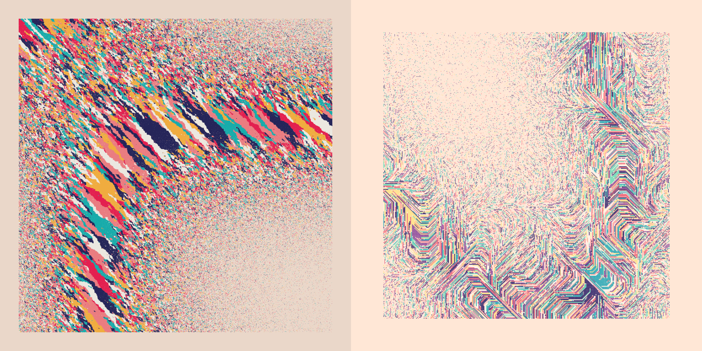
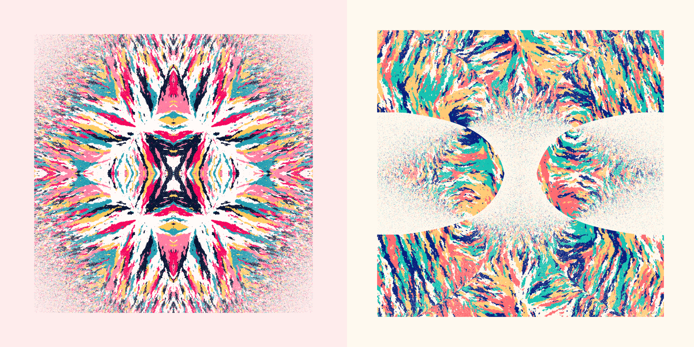
Using different kinds of colors flows and grid sizes I discovered that there are two “subsets” within the collection; the “organic” and the “digital”. There is no clear dividing line between these two, some will fall clearly in either subset, while others have a bit of both. Certain color growth patterns evoke a clear resemblance to nature, with colors generally flowing in short and long straight streaks. The more cells the underlying grid contains, the more fluid the outcome. Whereas certain patterns, and the smaller grids, feel more structured, where colors can only grow in certain directions, giving a feeling of “digital”.
Organic | Angled
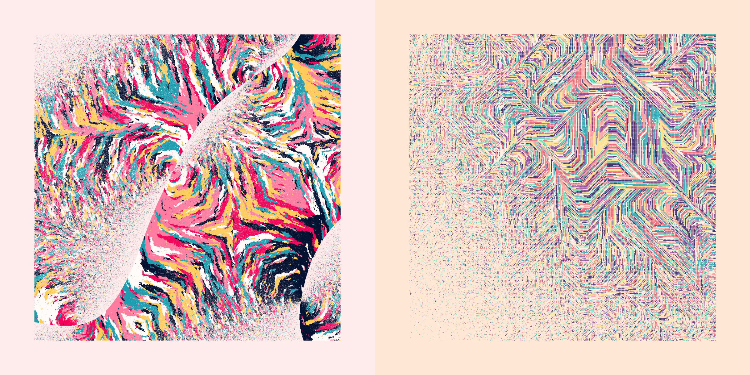
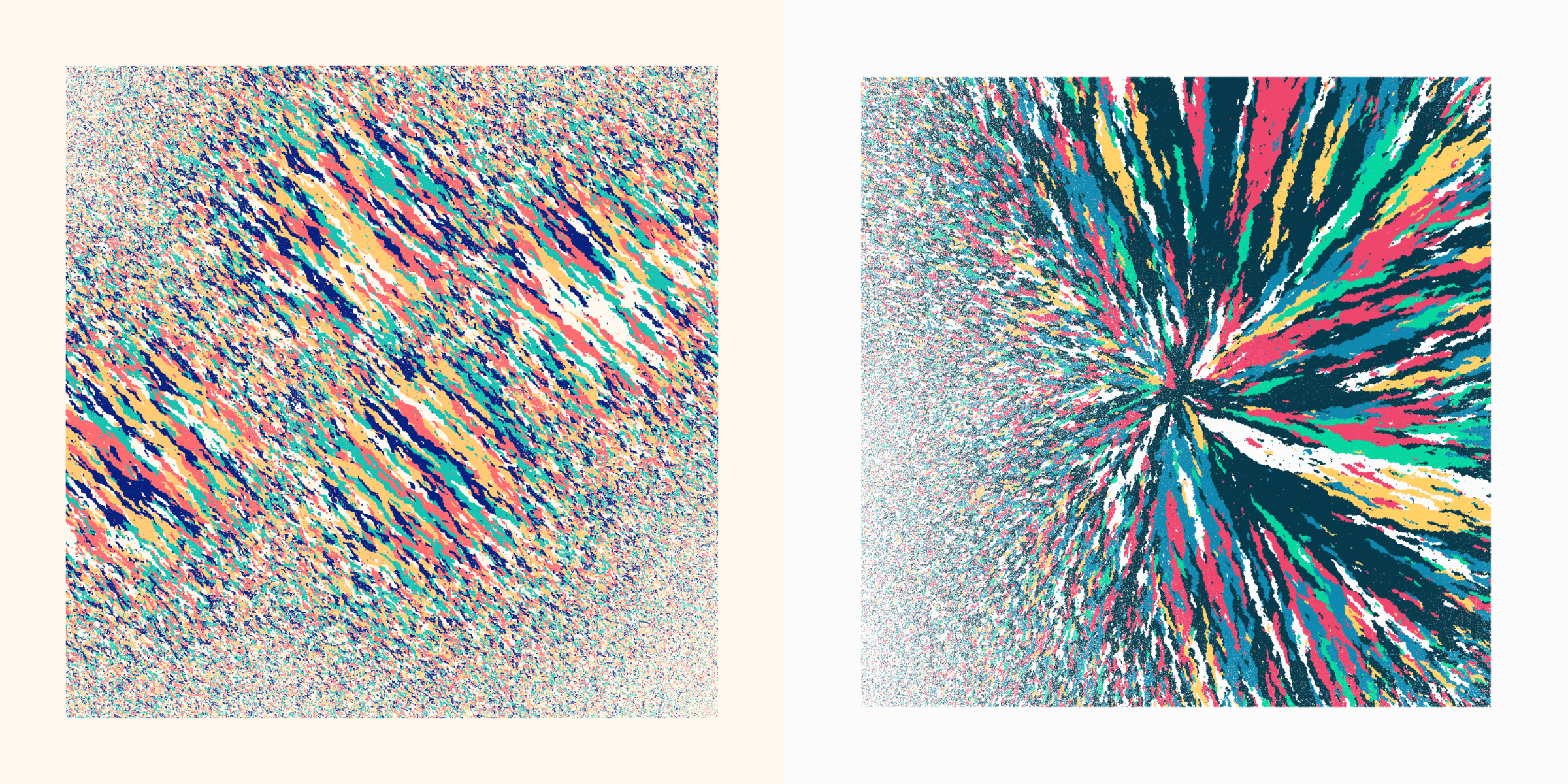
The “angled” flow creates colored streaks moving along an angle, either from the top-left to bottom-right, or top-right to bottom-left. At 45 degree angles when Diagonal Neighbors is false and steeper when it is true.
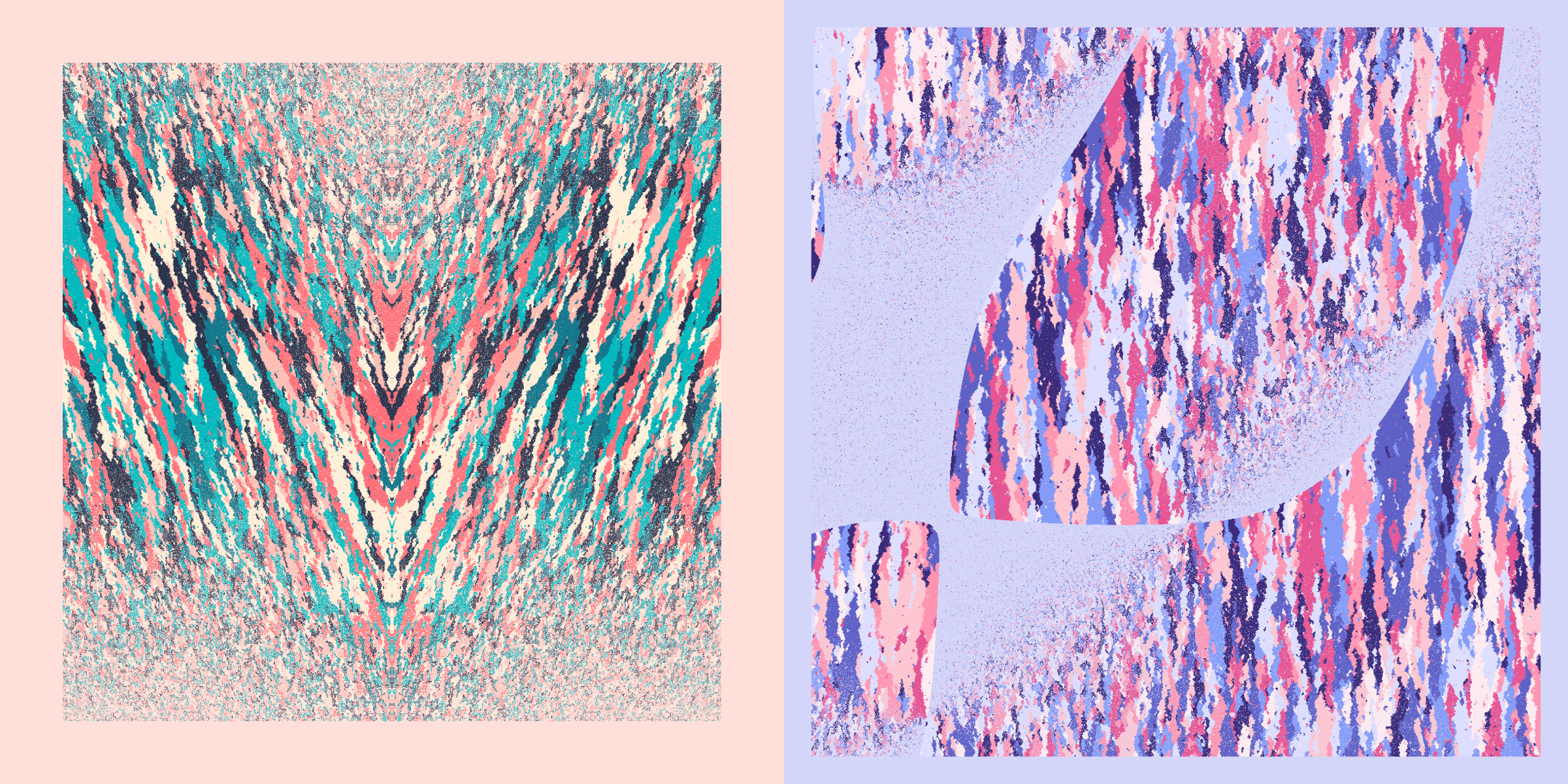
Organic | Straight
The “straight” flow creates colors in straight-ish lines, either horizontally or vertically. These only use Diagonal Neighbors because without it there appeared some odd artifacts around the outsides of the streaks that I didn’t visually like.
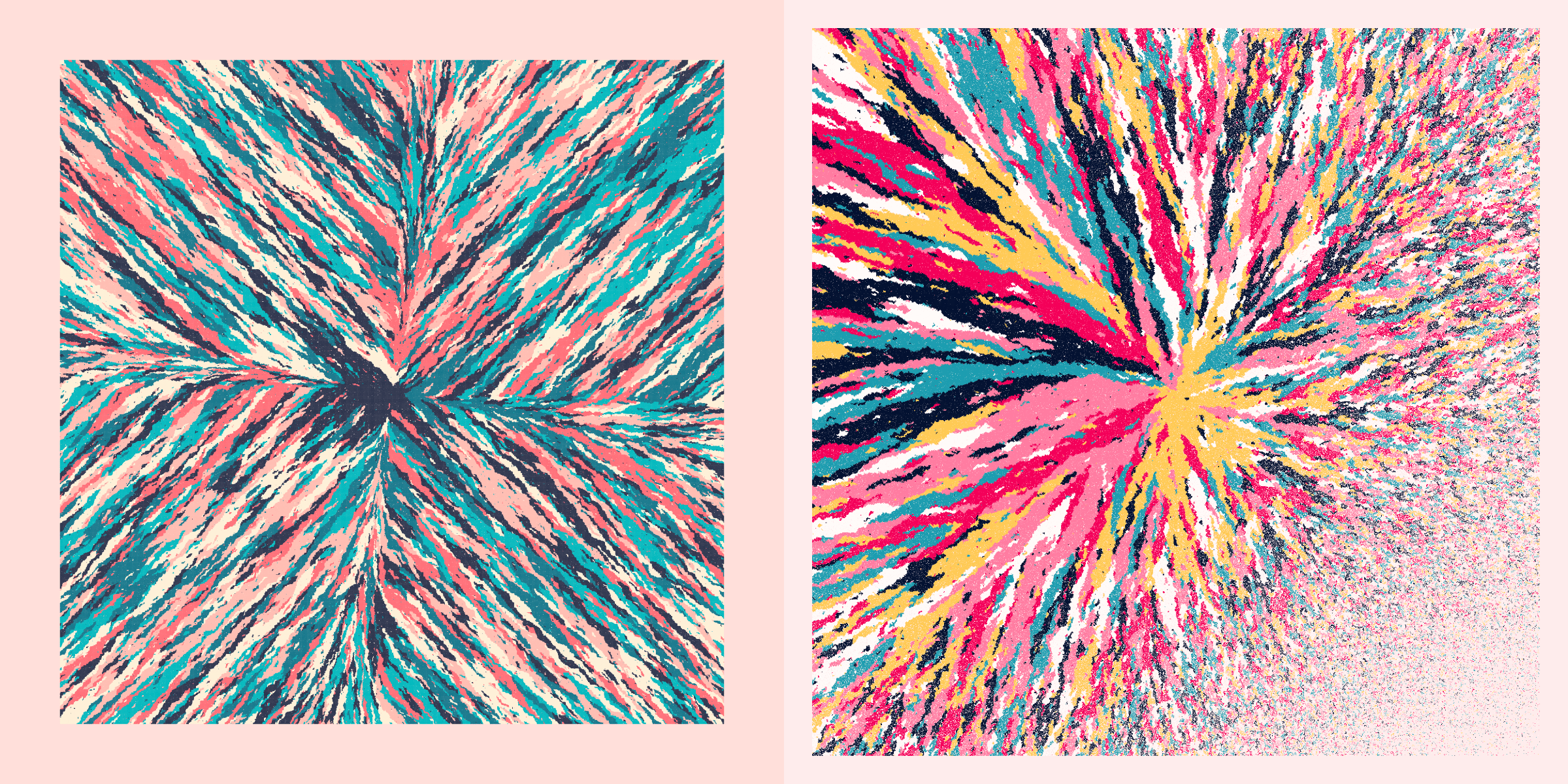
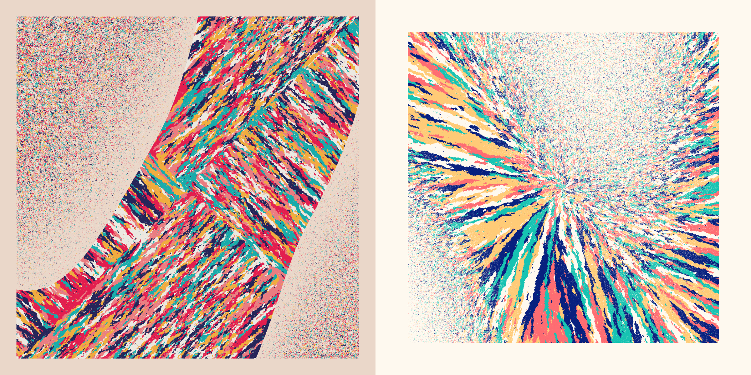
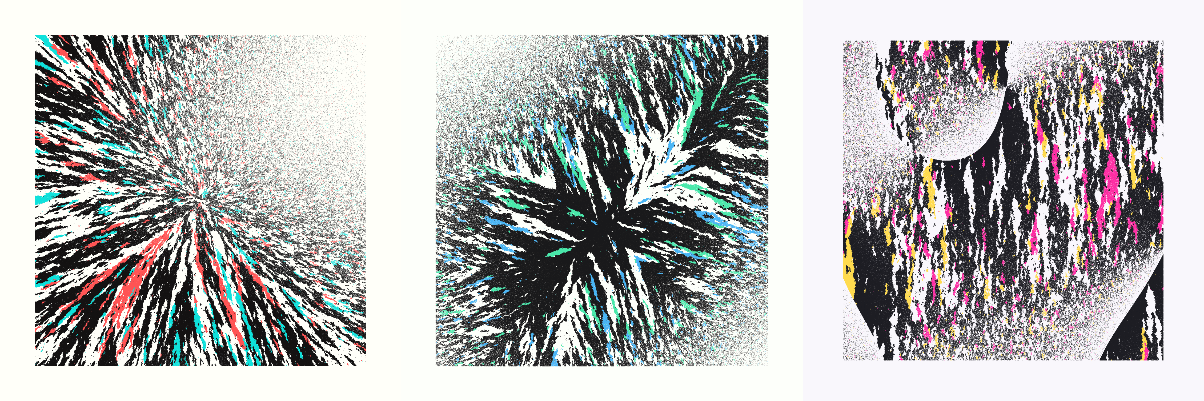
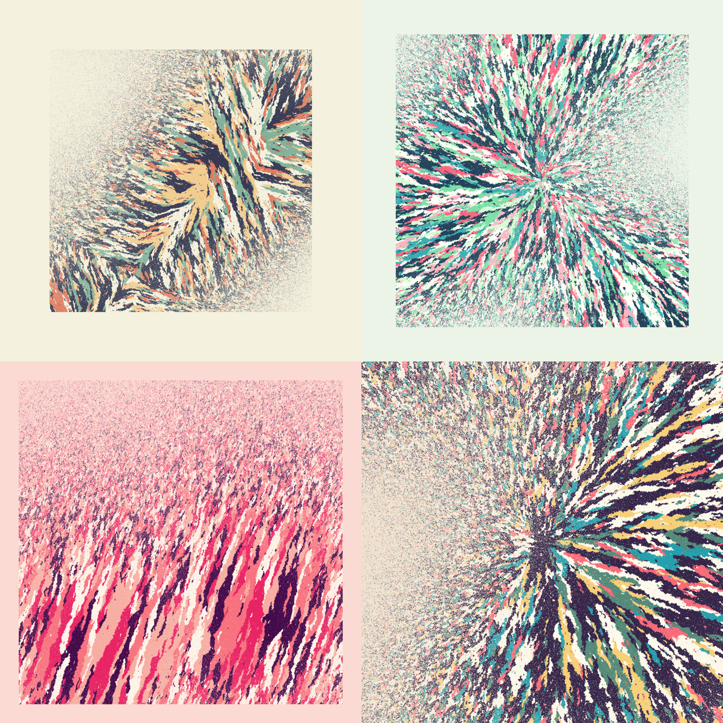
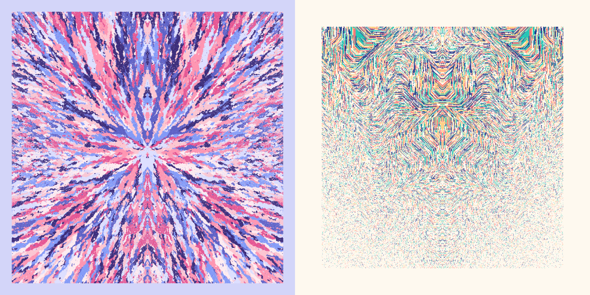
Organic | Radial
The “radial” flow looks like a giant explosion from the center when Diagonal Neighbors is true. Interestingly, when it’s false you get a “+” pattern instead.
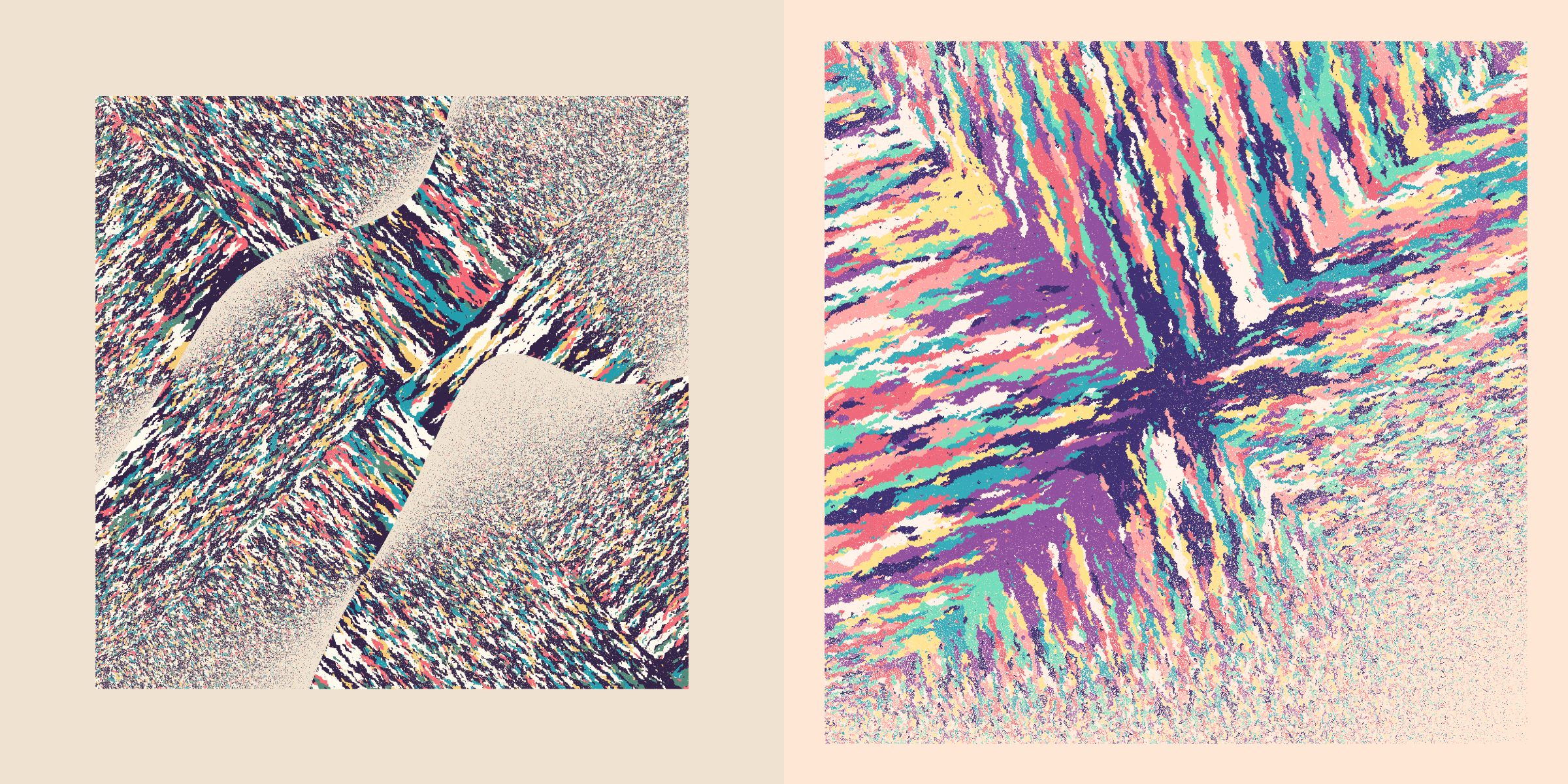
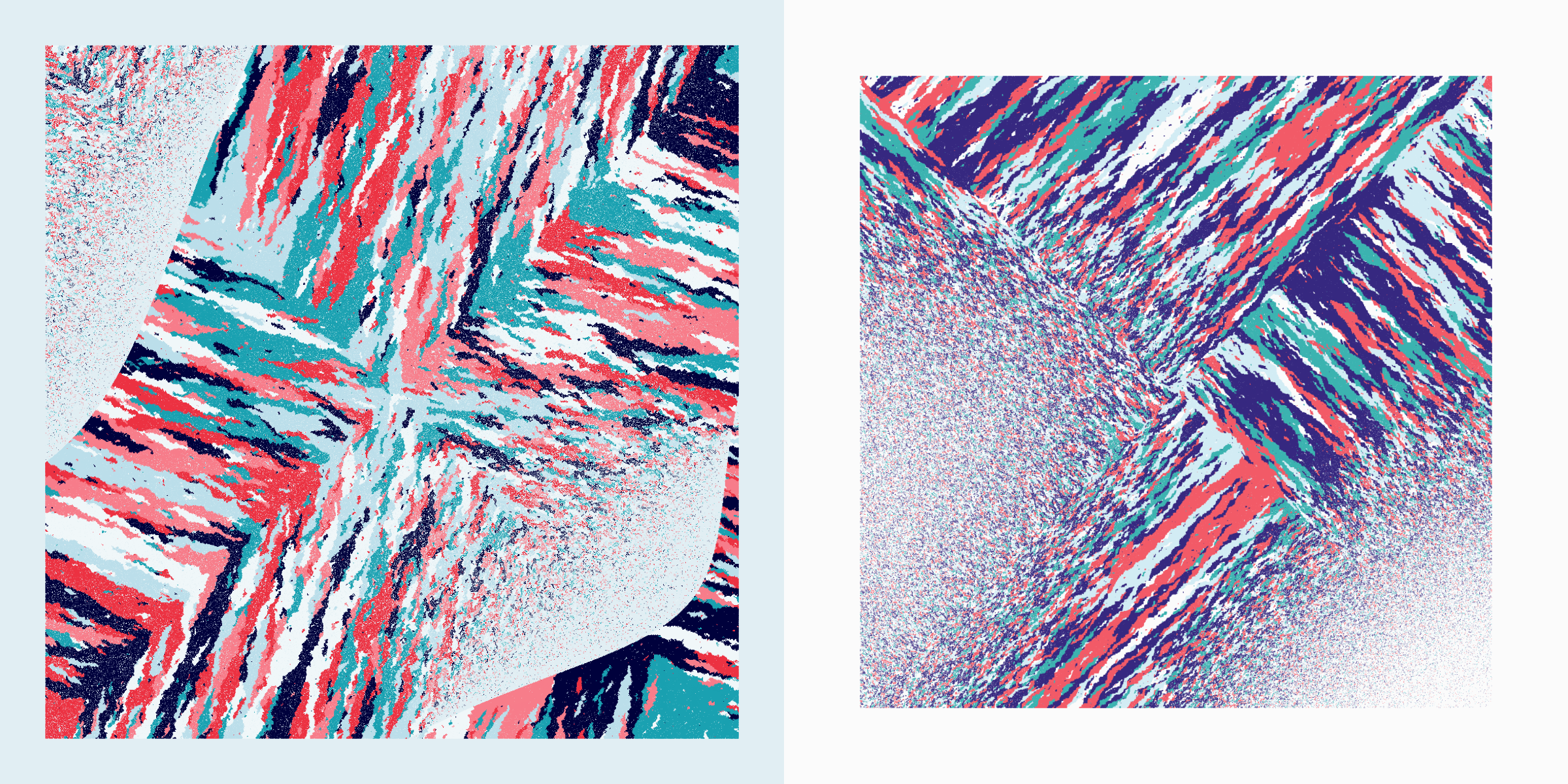
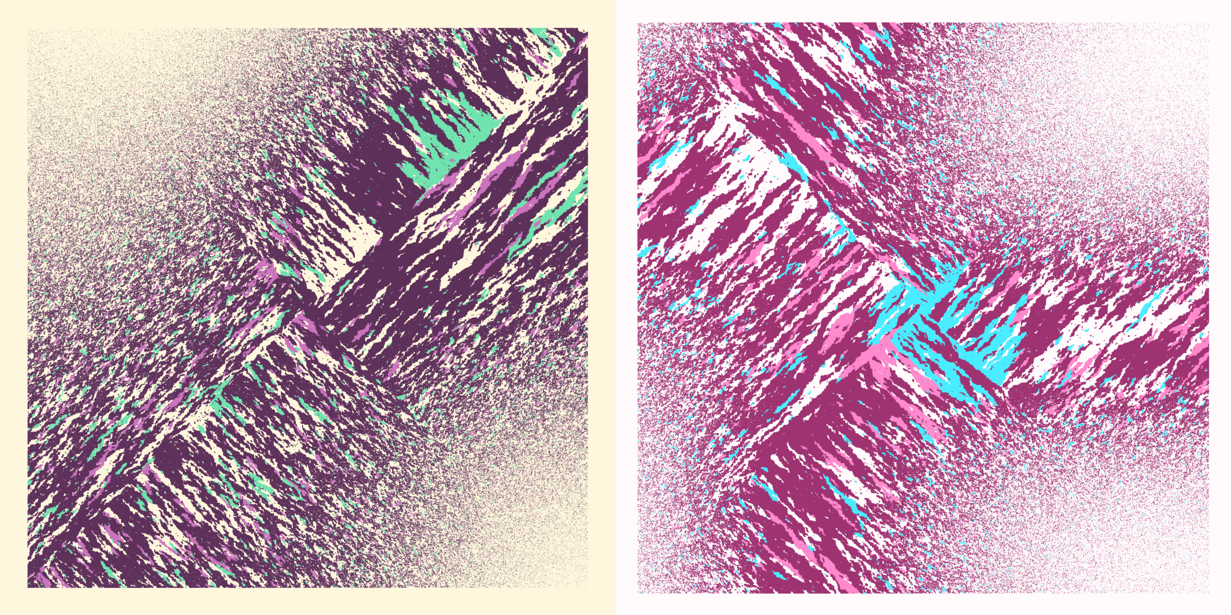
Organic | Cross
The “cross” flow has an “x” pattern, either perfectly along 45 degree angles from top-left to bottom-right and bottom-left to top-right when Diagonal Neighbors is false. This becomes more angled upward, and somewhat more chaotic when Diagonal Neighbors is true.
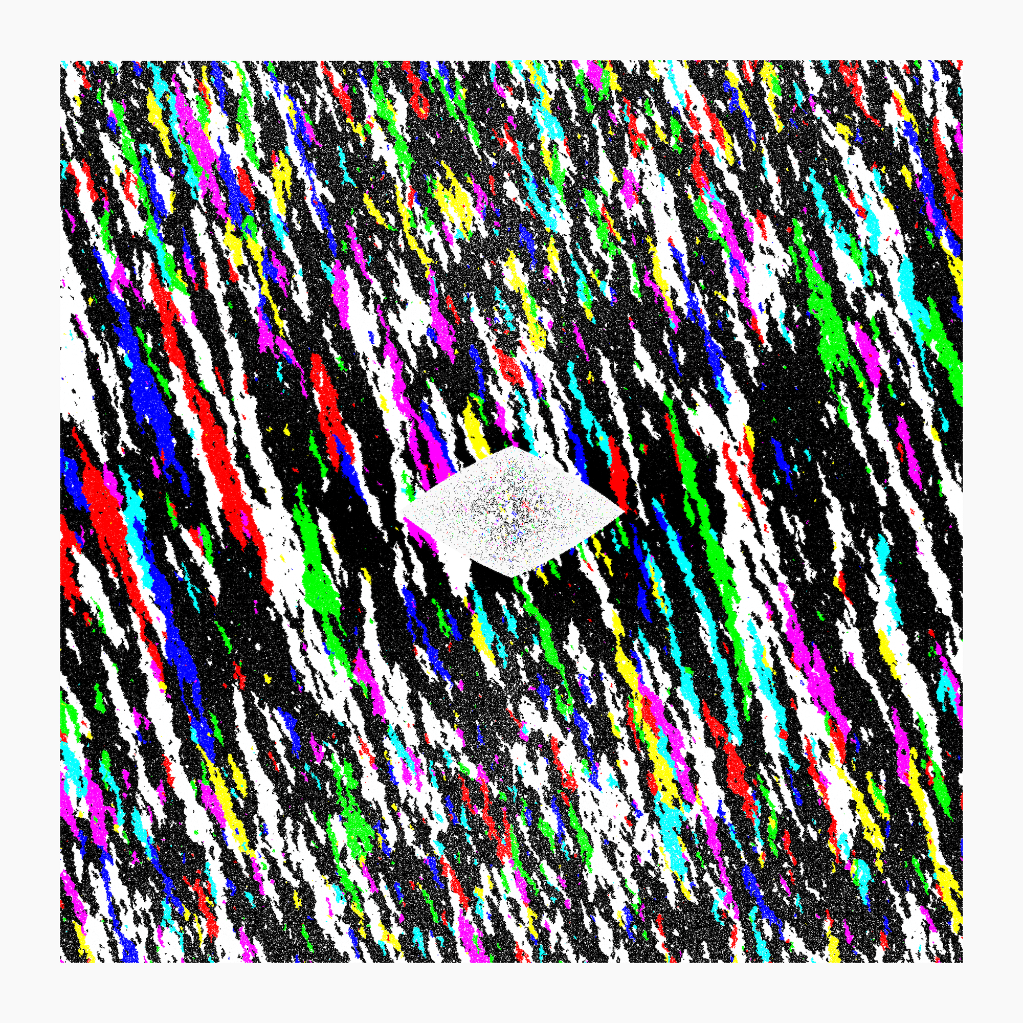
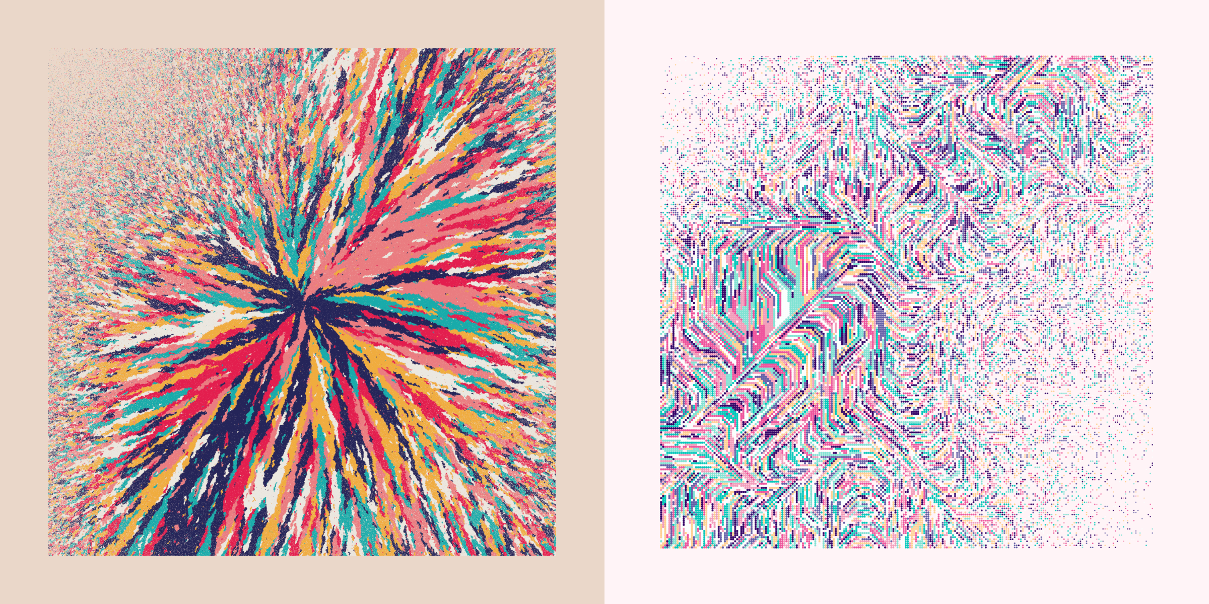
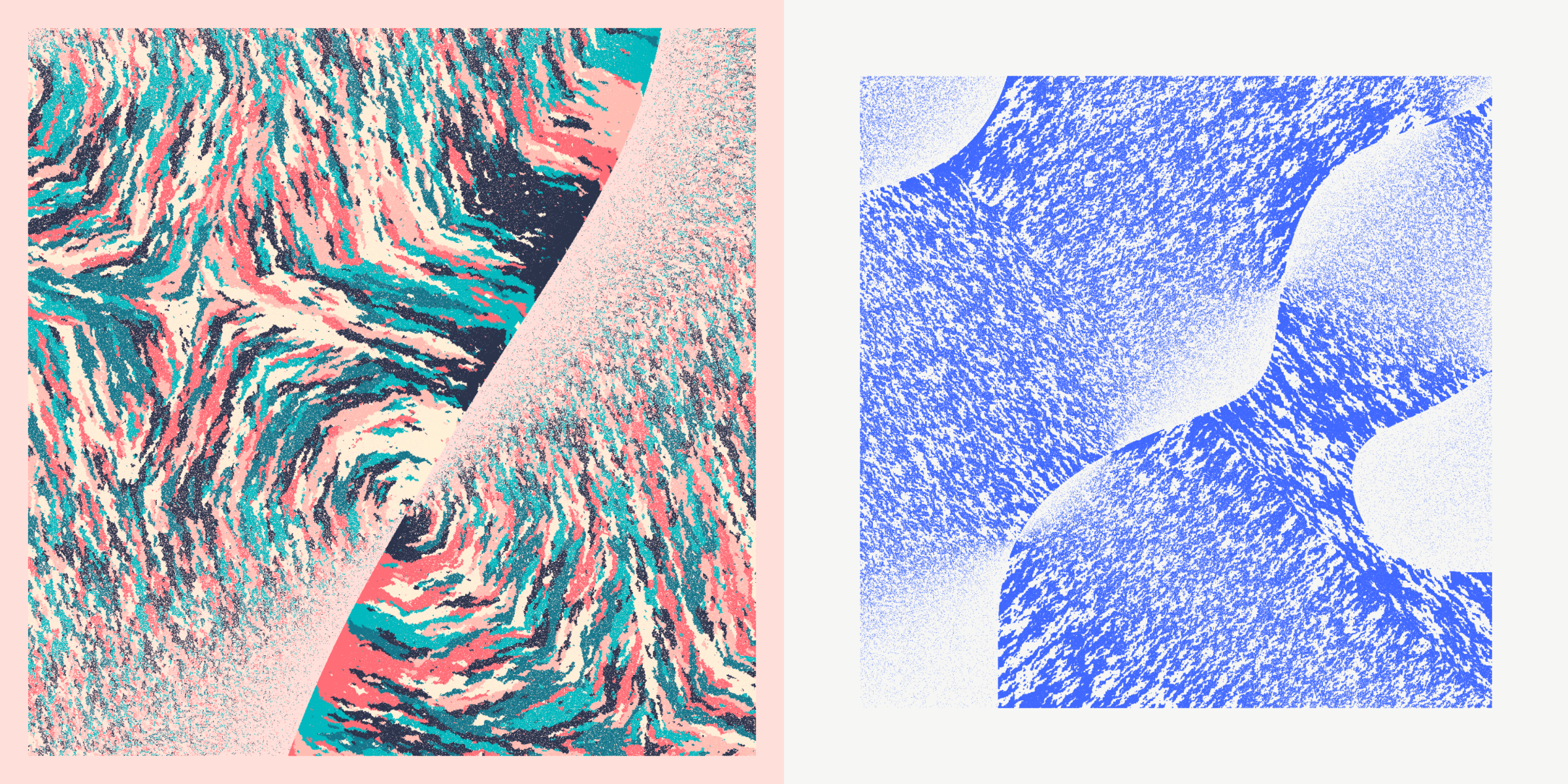
Organic & Digital | Vortex
This flow, to me, represents both the organic and the digital. The flows are very streaked like the other organic ones, but the colors can make drastic changes in directions, like the other digital flows. Many also show very clear (angular) whirlpools in them. This flow always uses Diagonal Neighbors.
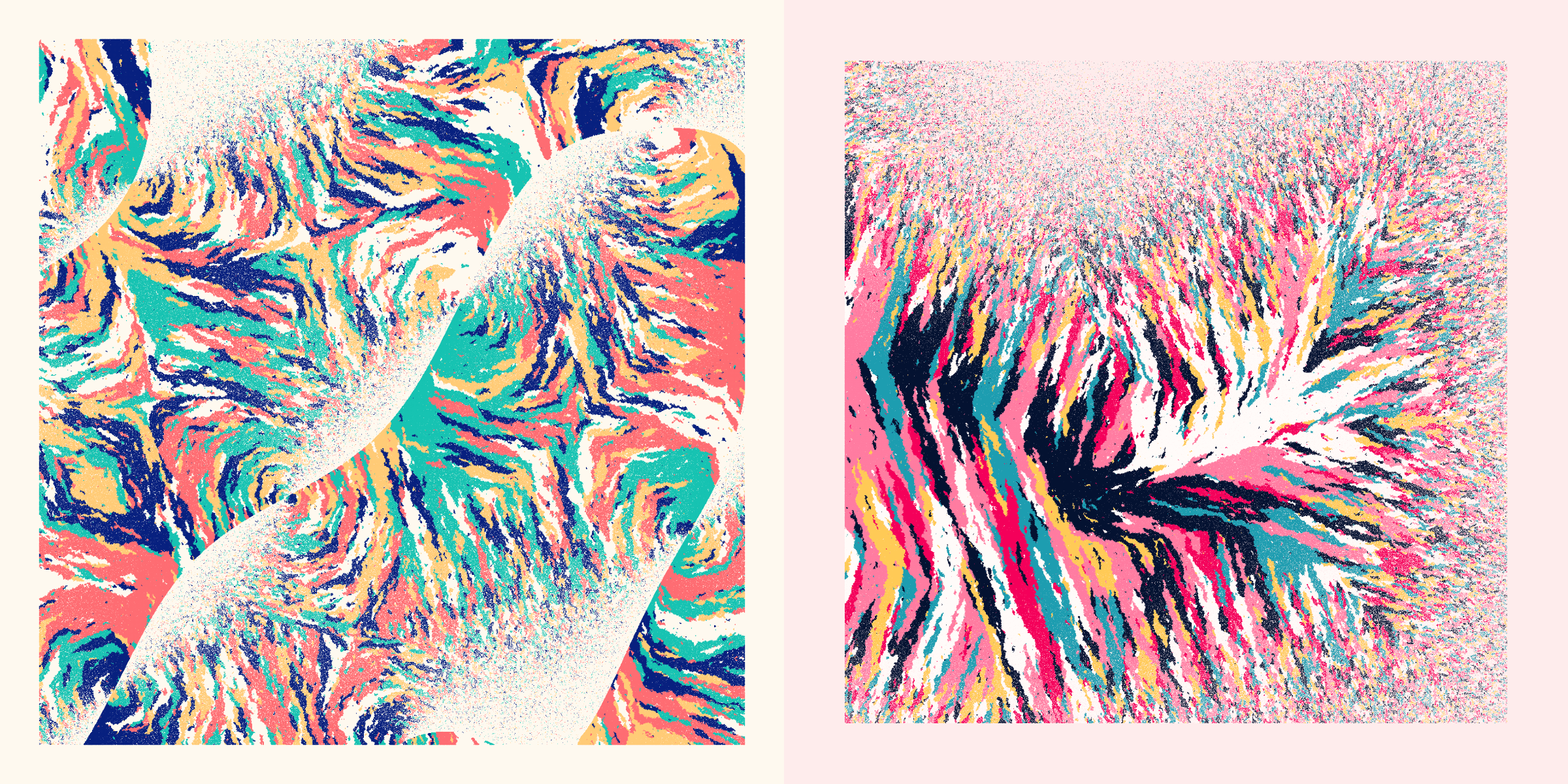
Although it was the last addition to the color flows, it’s become one of my favorites.
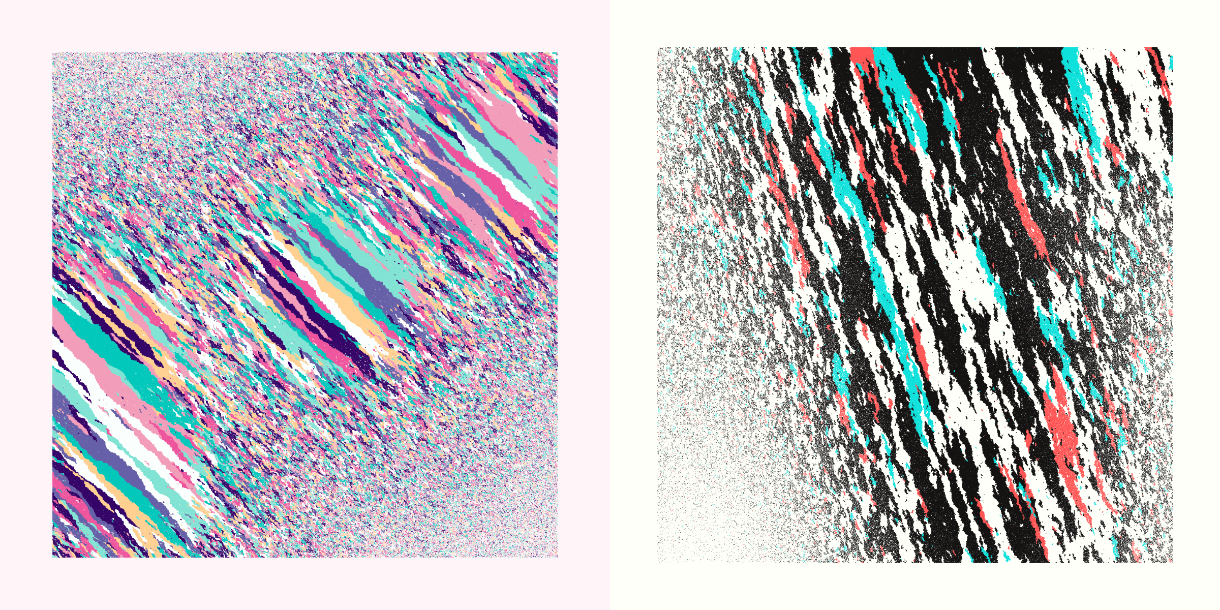
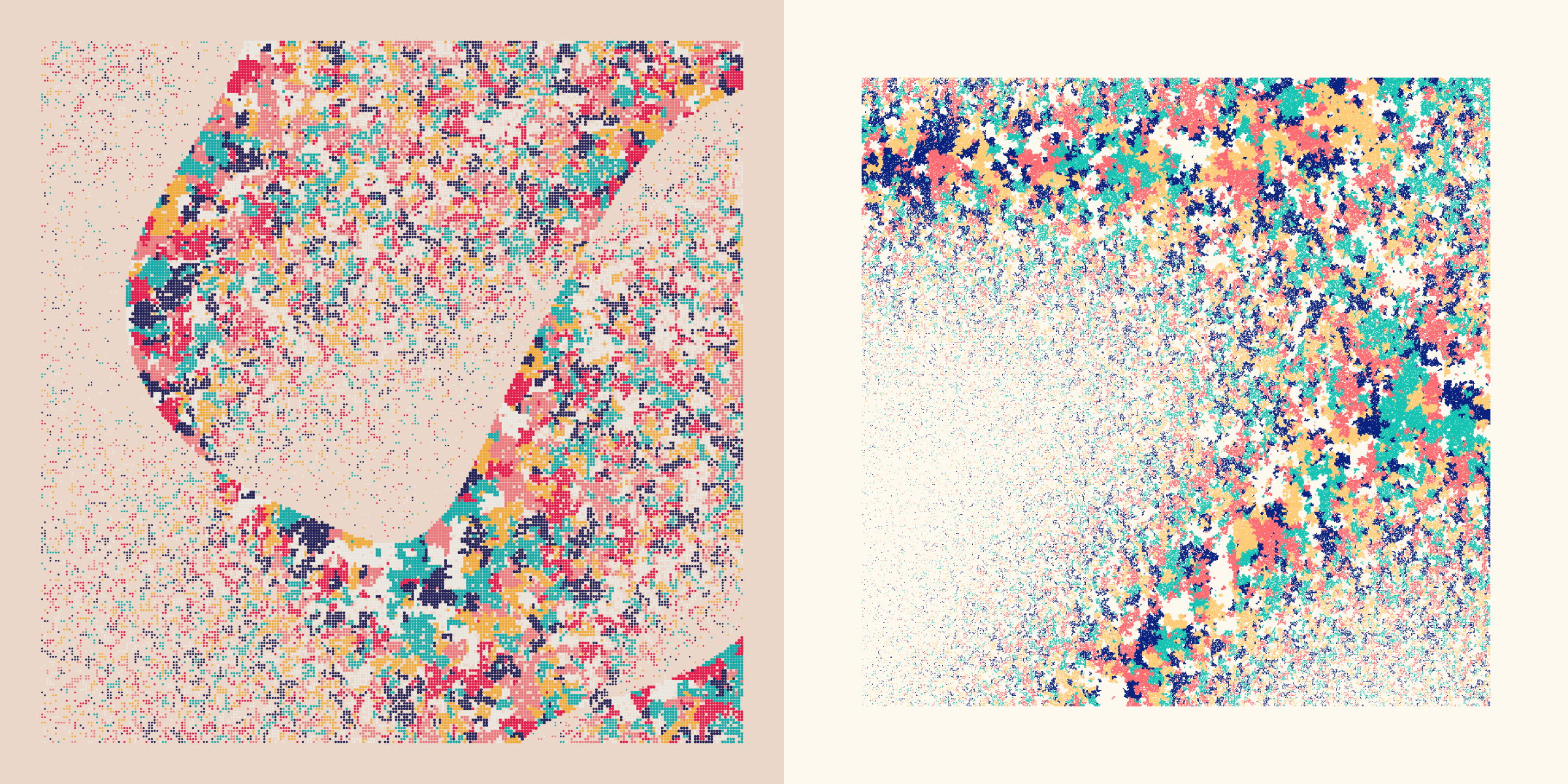
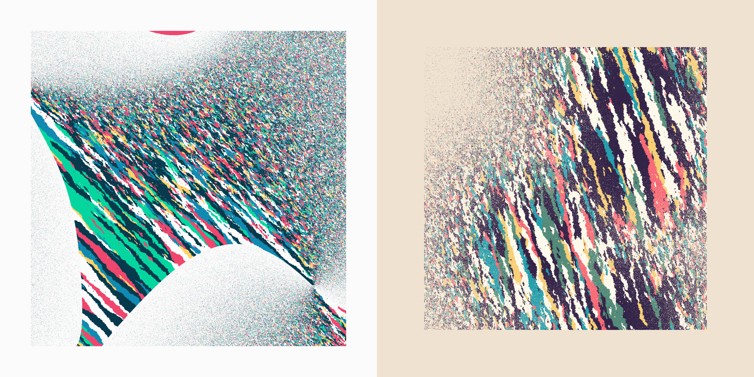
Digital | Speckled
The rarest of the color flows, these flows stay more in small areas without a clear direction (and look similar to the Diorite rock image in the Inspiration section).
You might notice that these only come in 4 grid sizes: 243, 256, 512 and 729. Perhaps some know that 256 and 512 are 2^8 and 2^9. Less well known numbers, 243 and 729 are 3^5 and 3^6. Why these specific numbers? That’s because I’m using two types of space-filling curves (using a line to fill up a 2D plane) to walk through my grid. These generally need a grid of a certain size to fit. The 256 and 512 belong to the Hilbert curve while the 243 and 729 are from the Peano curve.
Visually they look almost the same, but I still used both types of curves (increasing my byte count ╥﹏╥ ) because I preferred to have 4 options for the grid sizes instead of only 2.
The Diagonal Neighbors have no visible effect on this color flow. However, I didn’t want to set it to either always be true or false, so both “Yes” and “No” occur but have basically no meaning here.
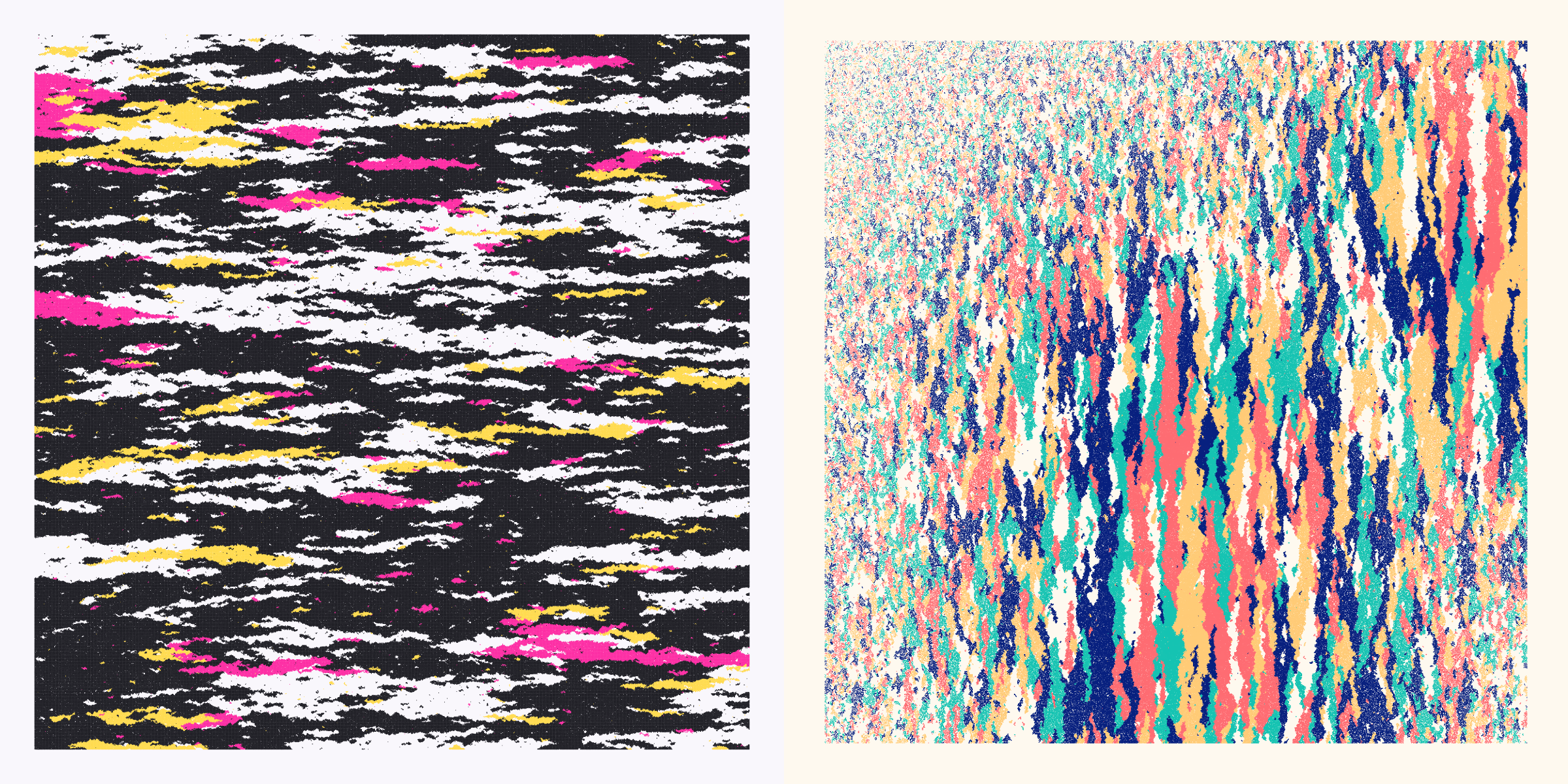
Digital | Drusy
This one looks somewhat like the Speckled color flow, but has even smaller color groups, more like small blobs. Because they stay quite small, this color flow is only allowed for grids up to 550 rows, letting you really see the separate dots. Like with the Speckled flow there is no visible effect from having Diagonal Neighbors being “Yes” or “No”.
For the name of this color flow I took inspiration from minerals. In mineralogy, crystal habit is the characteristic external shape of an individual crystal or crystal group. “Drusy” is one of the possible crystal habits and means a surface that is covered with small crystals. That seemed quite fitting for how these outputs looked.
The “Drusies” look best when viewed on a large screen so you can truly see the separate circles.
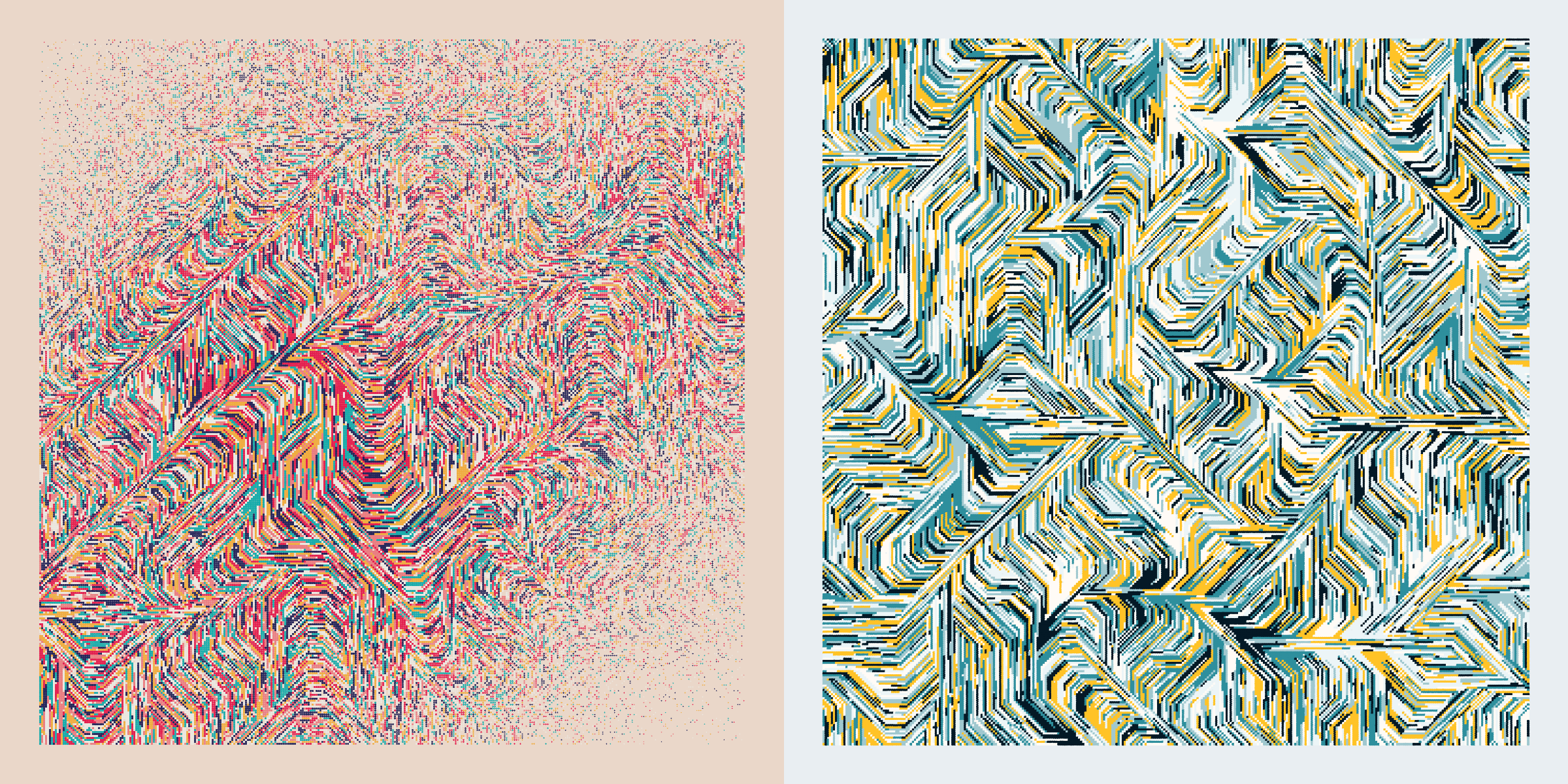
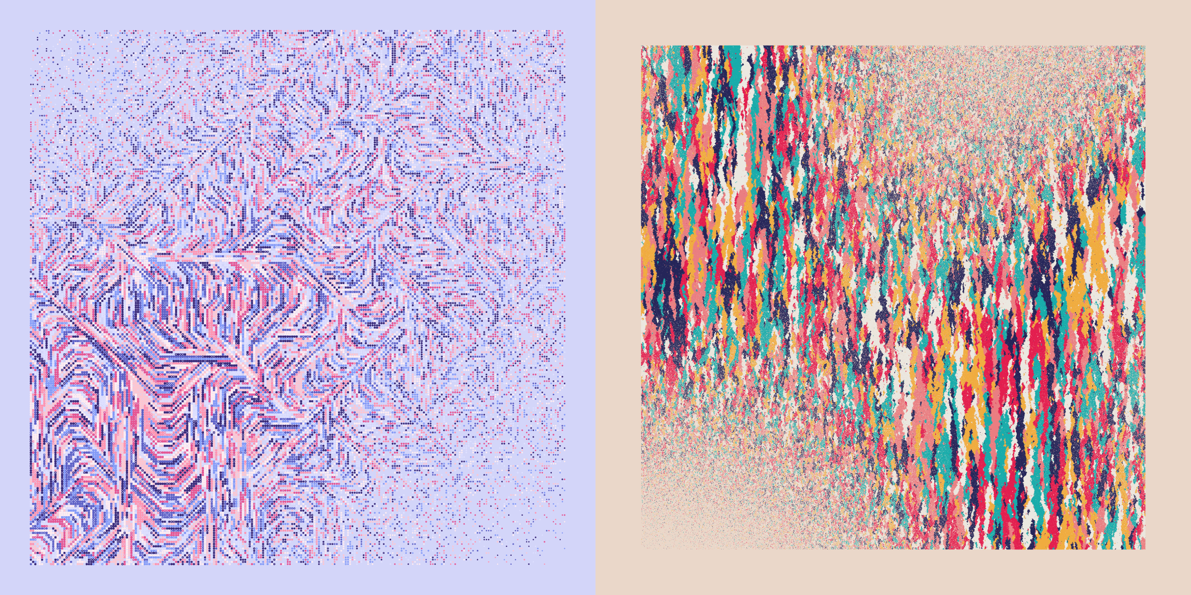
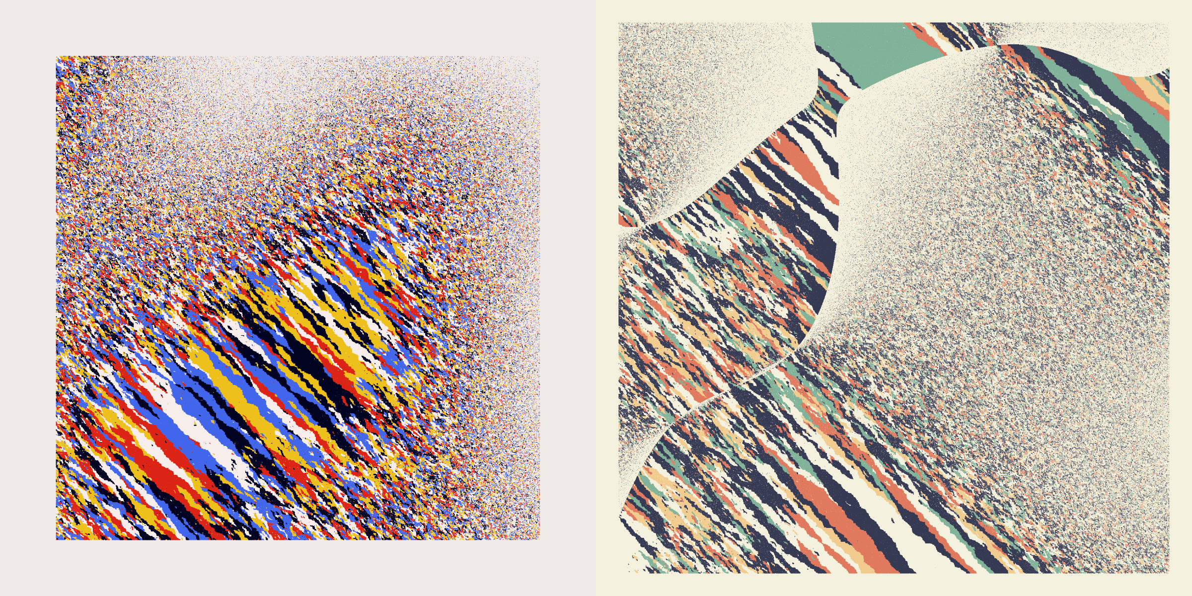
Digital | River
The River flow actually sort of grew out of Genuary day 4 with the prompt “The next next Fidenza” which I took as “anything with flow fields is fine”
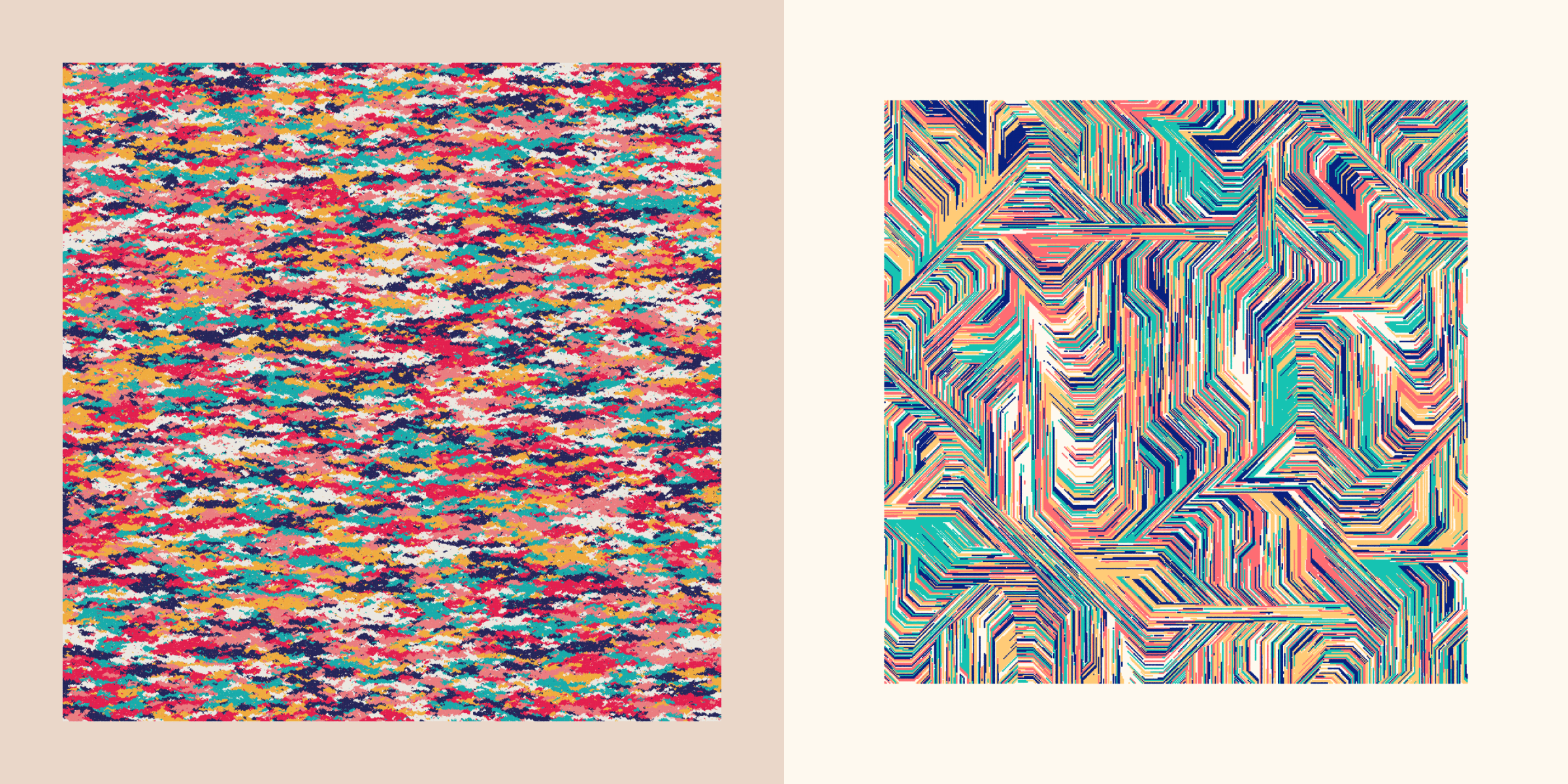
The most digital flow of them all, these remind me of the lines running on PCBs (printed circuit boards). Colors are moving in very narrow lines and only turn in straight or 45 degree angles. Those somewhat familiar with generative art might see the flow fields that form the basis for these color growth patterns.
Because the lines become too thin to appreciate with grids that are too big, this color flow only occurs for grids with a size up to 550 rows. Furthermore, Diagonal Neighbors is always true because otherwise the flows became a bit too… strict with only moving in horizontal and vertical ways.
Those were the eight different color flows present within Anhedra. No doubt that there are still multitudes of other possibilities on how to let colors grow. However, I felt that these patterns, especially those in the organic category felt like a… logical set. Diverse, but not getting too unnatural in a way.
Grid Size
The largest grids definitely need some time to be drawn
The grids within Anhedra can have any size between 240 cells to 1600 cells wide and high. Thereby ranging between 57,600 and 2,560,000 cells in total!
As noted in the previous section, not all color flows occur across the entire range of grid rows. Generally the more “digital” color flows have smaller grid sizes, where you can see the separate dots and where the flows are more angled. The organic flows on the other hand want to stay closer to around ±1100 grid rows, although they’re allowed to go down to 240 (the lower that value the more unlikely it will happen).
Nevertheless, all Anhedra are drawn from dots. Not just circles, not squares, but chunky dots. The more packed the area, the chunkier the dots (getting closer to squares) whereas those within the most empty regions will look like circles. The more densely packed areas will also have some overlap between the dots to really try and fill in the area (and see less from the background).
I personally really love this aspect, having the macroscopic overview where for most Anhedra the separate dots can’t be distinguished and you see the plane of colors. While also being able to see tiny details if you zoom in really far, even sometimes being able to grasp how one particular seed cell started a new color and how it pulled in other cells.
After having some test prints made this also really worked well when taken into real life. Seeing the separate dots when looking up close, while appreciating the overview when at the other side of the room, especially for the very large prints.
I totally hadn’t considered this until someone pointed it out a day before the release, but since I’m working with distinct cells, this is basically pixel art!
Color Palettes
One of those days was actually finding an appropriate name for each palette!
Why do I do this to myself… Anhedra has 39(!) color palettes! ✖‿✖ I timed myself this time. It took me 5 full days between starting on the palettes to finishing.
While the number of color palettes was increasing, I noticed that they could generally be grouped; some had all the colors of the rainbow, to others only having one color. I therefore created five Color Groups. Afterwards these groupings helped to structure my color palette quest considerably. I don’t think any collector would try to get one from each color palette, but perhaps getting one from each Color Group is doable (^ᗨ^)
I didn’t want to use names that felt like combinations of words, such as ‘Fire Opal’. The Lapis Lazuli became the only name with 2 words.
While I was working on a Blue & White color palette I had to think of the Lapis Lazuli, a gorgeous deep blue stone (sometimes with white or grey marbling). I thought it would be a bloody awesome name for a color palette. After that I couldn’t let the idea go, I had to give all the other color palettes names based on rocks, minerals and gemstones as well (I’ll just call them “stones” for ease). Matching the colors of the palette as much to the stones as possible. And thus, during a dreary weekday I looked at hundreds of different types of (amazing) stones [¬º-°]¬ Naturally, many color palettes had colors that don’t naturally co-occur, but I tried my best to find something that felt appropriate.
The Prisms
The color names in this category of eight palettes are based on stones that show a rainbow of different hues, and that is also what defines this color group; these color palettes use colors from all over the rainbow (or generally feel very diverse in their colors).
I take inspiration from other color palettes from past projects as well, so you can find more resemblances to past palettes.
Alright, alright, here I’m saying that I’ve named every color palette after a stone, and the first one I show is not a stone type. Chaos is the only exception. This palette is present in all of my long-form collections (Patchwork Kingdoms, Wanderlust and Rotae), and I’ve decided to try and keep using this one always and have it be named Chaos in each.
Click on any of the stone / palette name links to be taken to a google image search page.
Although Chaos is my favorite palette in general, I personally find Ammolite my favorite palette for Anhedra.
I think the Fluorite palette feels like a really good match for its name, with the mineral often being pink-purple-teal in color.
The Labradorite palette is one of the rarest and also a decent match for the stone with the dark blue and teal-ish undertones.
The Rhodonite palette is named after the pink+black mineral, but with some yellow and blues in there as well.
I knew I had to have an Opal in here as well, which seemed to be a great fit for this palette of pastel colors from all over the rainbow.
I had a hard time finding a name for what became the Chrysocolla palette. I eventually settled on this copper-based mineral because it does have the teal/green-blue-black colors that are found in this palette.
The Bornite palette is another personal favorite for Anhedra, which came as quite a surprise to myself because I’m usually not drawn to more earthy palettes (for me, this is already a “muted” palette).
The Mixed Colors
The Mixed Colors color group of eleven palettes still uses several different colors, but do not quite encompass the full rainbow in terms of hues.
My gosh, I don’t think there exists a mineral with the blue, yellow, and red found in this Bauhaus inspired palette (and a rare one). Instead I settled on Linarite which is intensely blue, but often found in combination with yellow.
The Unakite feels like a pretty good match with the forrest greens and orange reds.
Especially the ‘Watermelon Tourmalines’
With the greens and pink-reds found in this one I knew that Tourmaline was a great match. The Larimar palette on the other hand is more inspired by the blues and gorgeous white lines running through the mineral. Both palettes aren’t very common.
The salmon-orange-teal Serandite is named after a lovely salmon-orange mineral, while the Charoite is a very purple stone with gorgeous white and deep purple marbling.
I don’t think there are any rocks with deep blues and reds only, and thus I choose to focus on a deep red mineral, the Pyroxmangite (one of the rare palettes). The Amazonite has a similar issue, and thus I choose this beautiful mineral that fits the teal and white colors from the palette.
The Zoisite and Kunzite palettes are becoming less “colorful” in terms of the number of unique colors amongst the palettes that still have several colors (without black and white), each having three (and a background color). The Zoisite was another name that felt like a perfect match with the mineral. The Kunzite instead is more based on the soft purples in its mineral. Both are among the rarer palettes.
Finally, there is Thulite having the least number of different colors and staying within a narrow section of hues. It could almost be part of the Monochrome group, but I felt it was more from a salmon-orange to deep purple, instead of “hues of pink”.
Monochrome
Four of the rarest palettes that only use colors from one hue in the spectrum; RGB and Black. The RGB palettes I’ve named after well known gemstones.
The Garnet palette of red hues and Peridot with its greens.
The blue Aquamarine palette looks especially good with the Vortex color flows, giving a feel of a stormy see.
Interestingly, at the time of writing (with about 650 Anhedra minted) not a single Pinolith has been minted (such a fascinating rock, I highly suggest checking the images). Hopefully one will still come out in the remaining mints.

B|W|Colors
Hardystonite is an outlier in terms of being a black stone, but I’ll come back to it.
This group encompasses the seven palettes that focus on black + white while also incorporating between one to eight (very) popping colors. The names for this color group are all based on intensely black minerals, and all end in “ite”.
The Hematite palette has one popping color, but also uses a few shades of grey (also to differentiate it a bit from some of the other palettes in this group). It therefore sits a little in between this color group and the Monochrome.
Because I couldn’t decide on what one color to use for the pop, I selected the three I liked the most and the algorithm will randomly choose; yellow, red, or light blue. It’s a very rare palette, perhaps the rarest. Only one of the reds exists (Anhedra #764)(⊙.⊙)
Next are three palettes that have two vibrant colors to combine with the black and white. The Neptunite palette with a bright orange-red and neon-blue, Magnetite with a bright teal and light navy blue and the Ullmannite with yellow and hot pink. Each has subtly different shades of near black and white.
Then there are two palettes with three popping colors. Shungite with pink, purple and neon blue, and Uraninite with yellow, hotpink and vibrant teal.
Somehow I also think the name ‘Hardystonite’ fits its intense nature.
And finally there is Hardystoneite. This one you really should see the images of. In normal light it’s a pretty ordinary looking stone, but put it under UV light and it’s ready to go crazy at a rave.
This palette uses the (intense) 3-bit RGB colors of ["#000000","#ff0000","#00ff00","#0000ff","#00ffff","#ff00ff","#ffff00","#ffffff"]. The result is quite extreme, but in a good way I found. This is also one of the rarest palettes, but I’m happy that a handful have already shown up, especially this spectacular one:
Singular Color
The last color group has nine palettes that only use one color for their dots (and have a distinct background color). They have three further subdivisions; color on white background, white on a vibrant background, and black on a colored background, each consisting of three palettes. Because these palettes have less going on in terms of colors they only appear when the Curl has been chosen for the Noise type. Furthermore, they’re all on the rare side, some more than others.
The first subgroup of three palettes all have an (almost) white background with one color for the dots. The Cinnabarite palette using a deep red, Lapis Lazuli with a deep royal blue and the Diorite having a deep deep midnight blue, almost black.
The second subgroup uses white dots with a vibrant background color. The Mariposite palette with a teal quite like the mineral (that also has white marbling), Crocoite with a vibrant orange-red (and whose mineral has fabulous shapes and spot-on color), and the Amethyst palette which was one of the most obvious palettes to name.
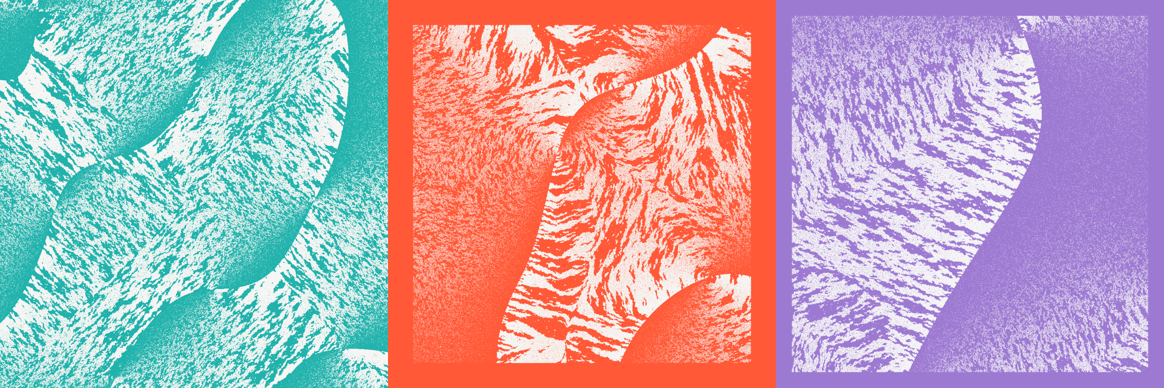
The third subgroup instead uses (near) black dots on vibrant background, but somewhat more muted than the three above. The Granite palette using a rusty orange-red, Turquenite in a light blue (and the mineral having black/brown marbling), and the Legrandite palette with a slightly muted, but still bright yellow.
Noise
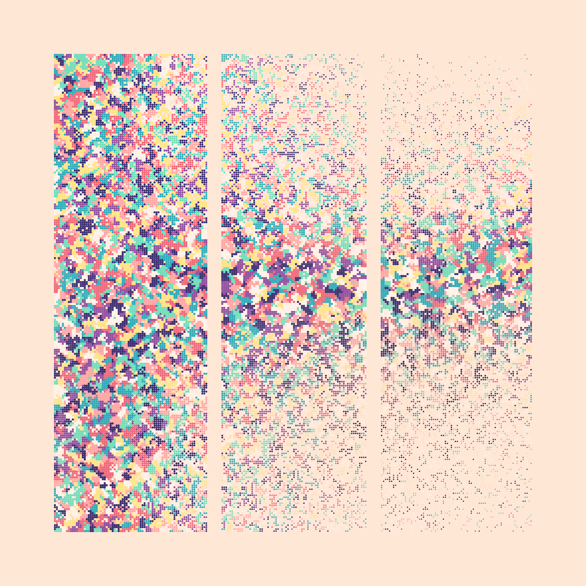
Together with the Color Flow and Color Palette I feel that the Noise setting is one of the three main aspects that determine the visual style of any Anhedra. The Noise variable determines what kind of “probability field” will get applied over the grid. Each cell gets a value between [0,1] and this value represents the odds that a dot will get drawn within the cell. For example, a value of 0.1 for a cell means that there is a 10% chance that a dot is drawn, while a value of 1 basically means that there is a 100% chance that one will be drawn.
I’ve tried several different techniques to create such “probability” fields, and found that the smoothed noise fields that come from Perlin noise (and their like) looked the best to me. Most natural in a way. More experiments with using different kinds of noise fields led me to a final section of four types: Simplex based, Curl-ish, Worley and Ridged noise.
Simplex
A tiny 2D simplex function was kindly supplied to me by Louis-André Labadie, thank you!
An update to Perlin noise, this uses a 2D Simplex noise field and can create very smoothly changing values across a plane, resulting in areas that often remind me of giant (but smooth) sections of coastline seen from high above.
Curl
I’m calling this type Curl for short, which it is, but I’ve also applied a function on top of those values to create sudden breaks, basically jumping from 0 to 1 instantly. This creates the swirling lines seen in these Anhedra. Some can only show a part of a swirl line, while others show many lines flowing about.
Worley
This is based on Worley noise that creates islands of high probability, sometimes lying close enough to merge together into bigger areas (and seeming more like Simplex noise).
Ridged
The final noise type is Ridged noise, which is basically converting the Simplex noise values running from [0,1] into [0,1,0], creating ridges. They remind me of rivers running over the canvas.
Other Design Elements
Even with the main aspects of Color Flow, Color Palette, Grid Size, and Noise covered there are still a whole set of extra variables that have a (big) effect on the look of an Anhedra. Let me show you the options for each of these, usually rarer, properties.
Margin
The Margin determines the amount of empty area between the grid and the edges of the canvas. Going from most to least space there is Big, Medium, Small, and Inverse, with the latter being very uncommon.
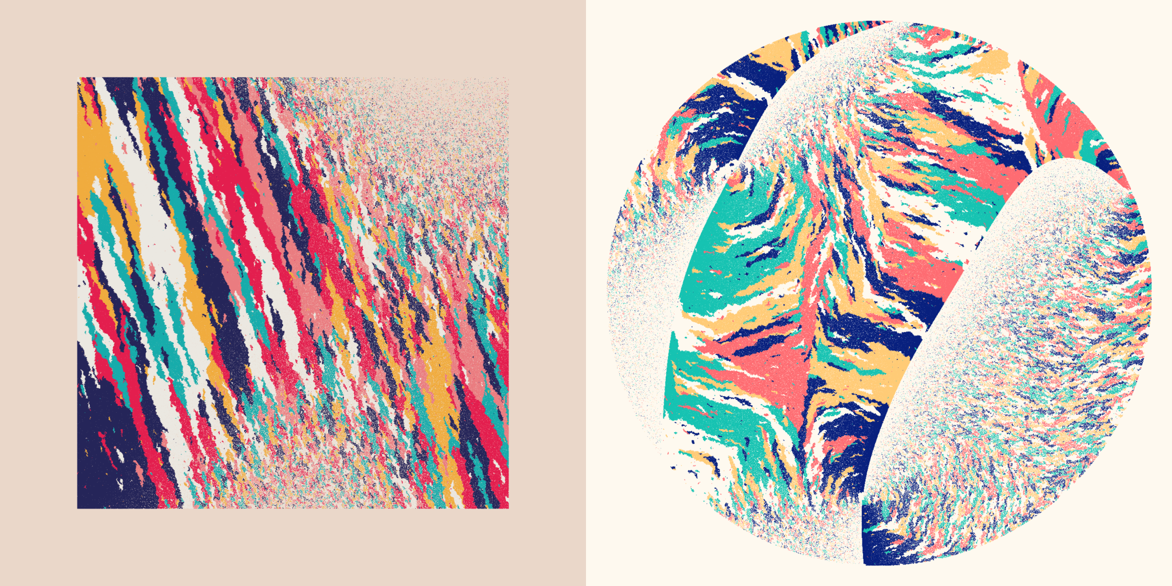
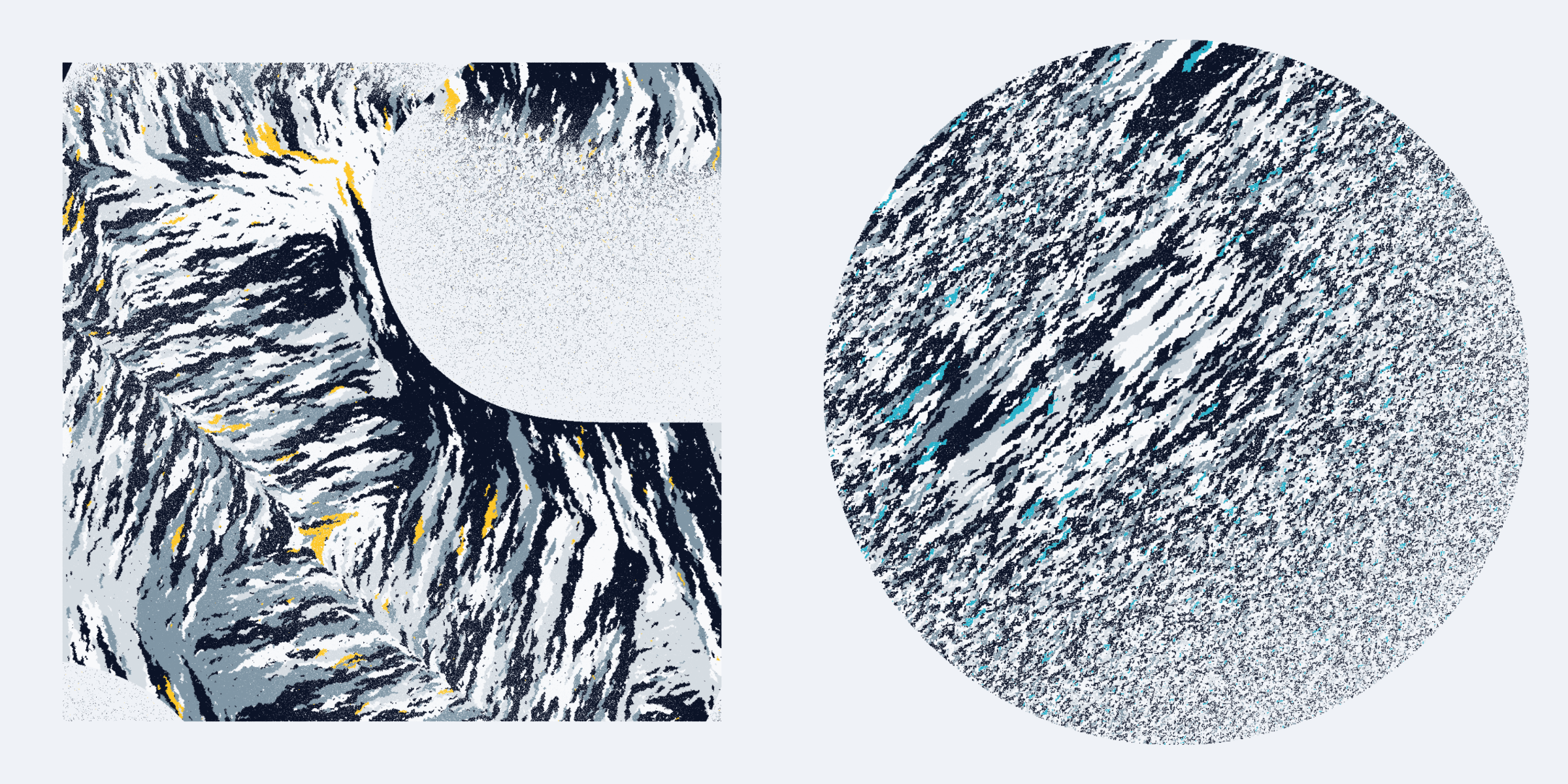
Layout
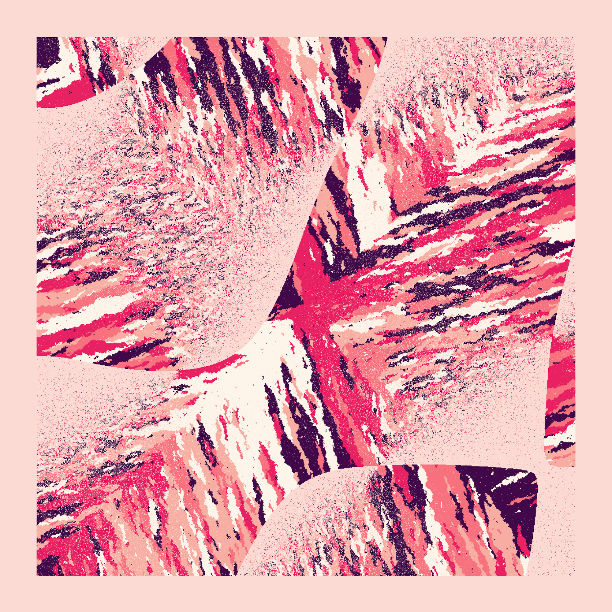
There is a small chance that instead of a Square grid it will become a Circle. When combined with a horizontal Straight color flow you might end up with a planet, such as Anhedra #603.
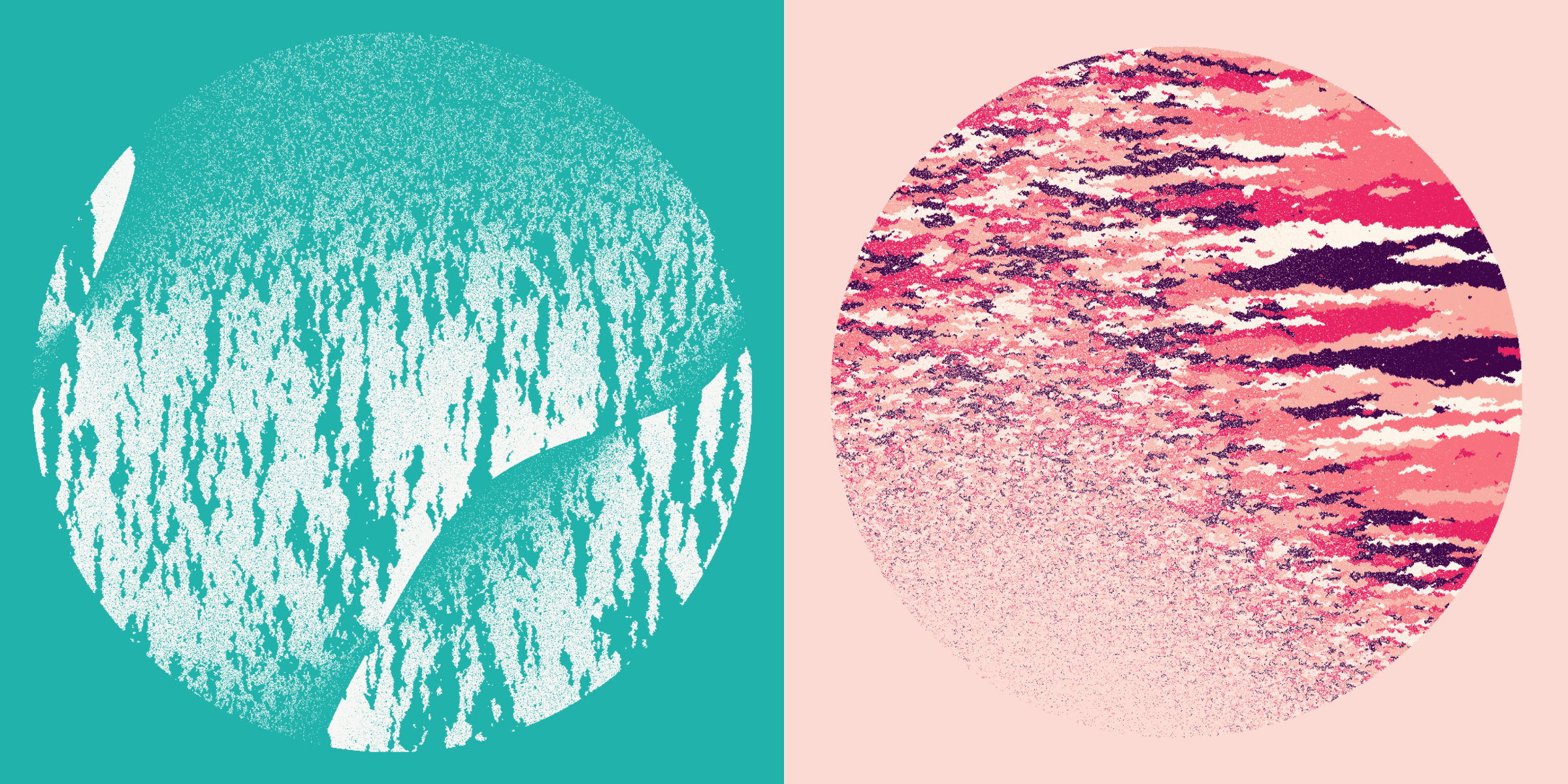
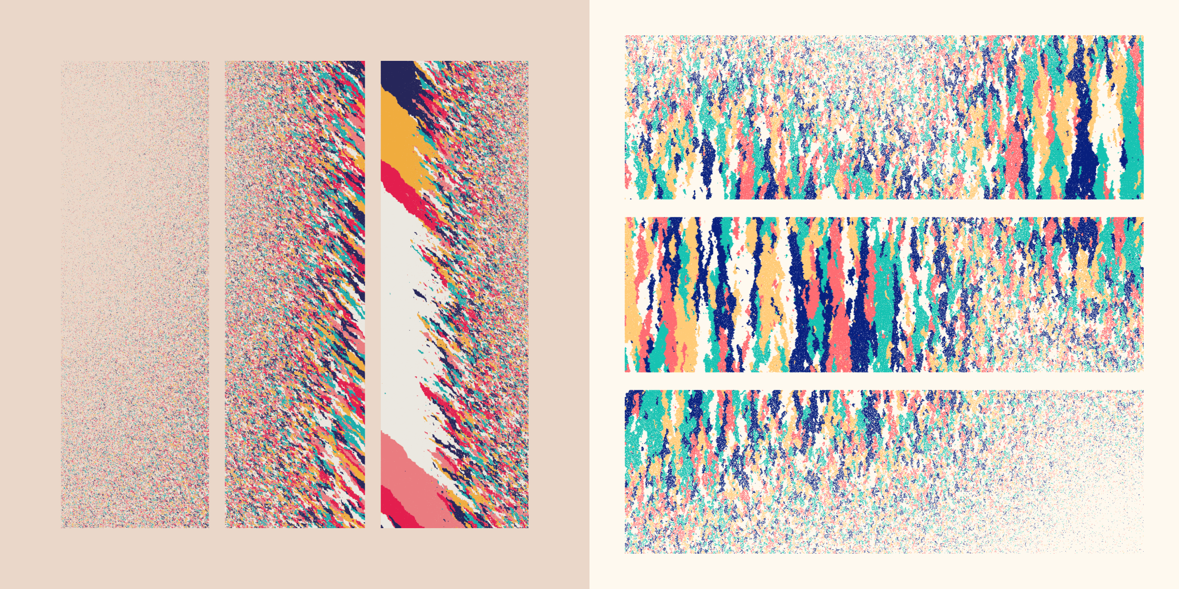
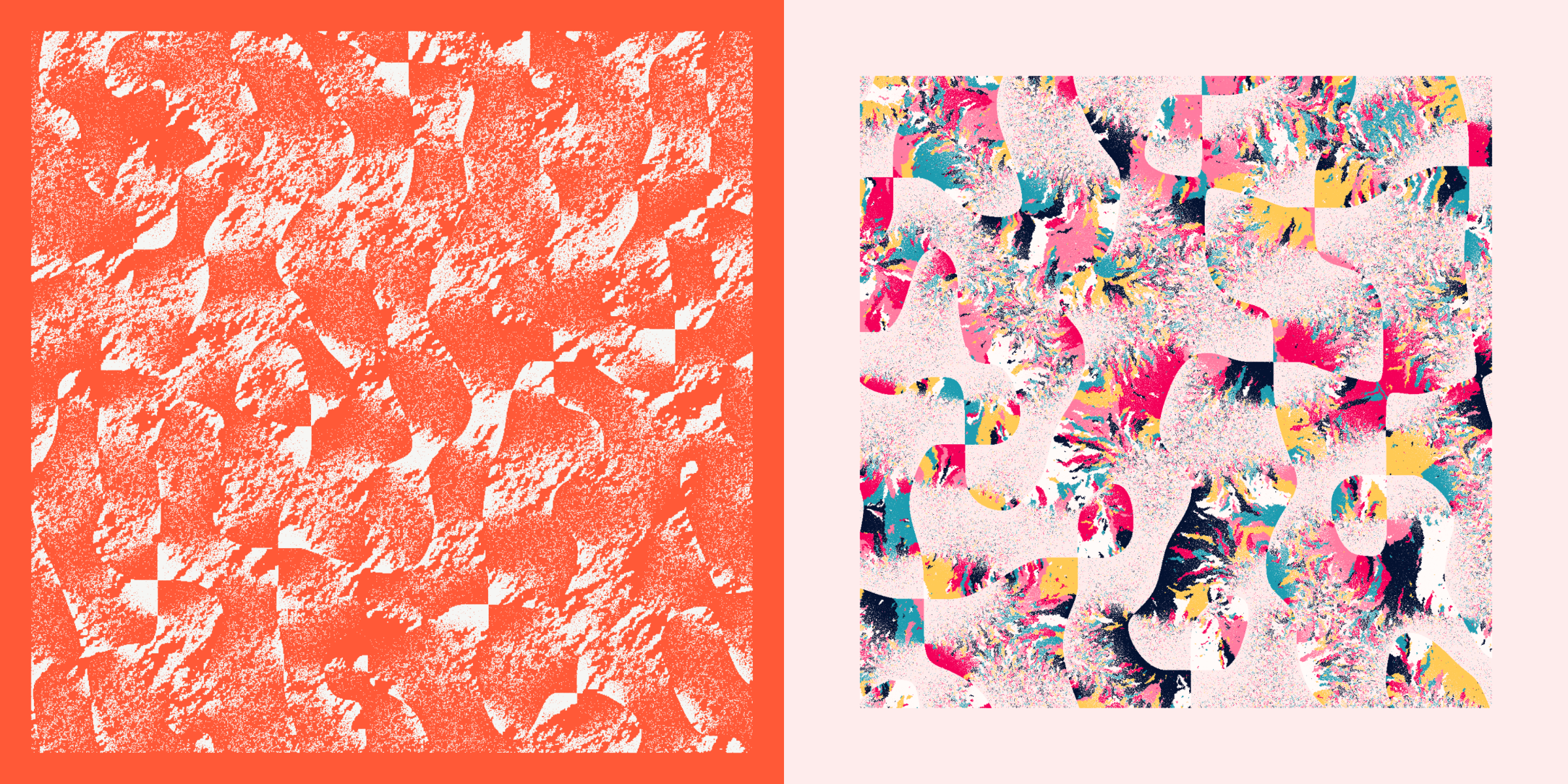
Triptych
Another uncommon occurrence is for the square to be split into a triptych; three panels. Either horizontal or vertical. The colors grow separately in each panel, and this can create fascinating differences between the color patterns per panel, sometimes one panel having extreme areas while the others don’t.
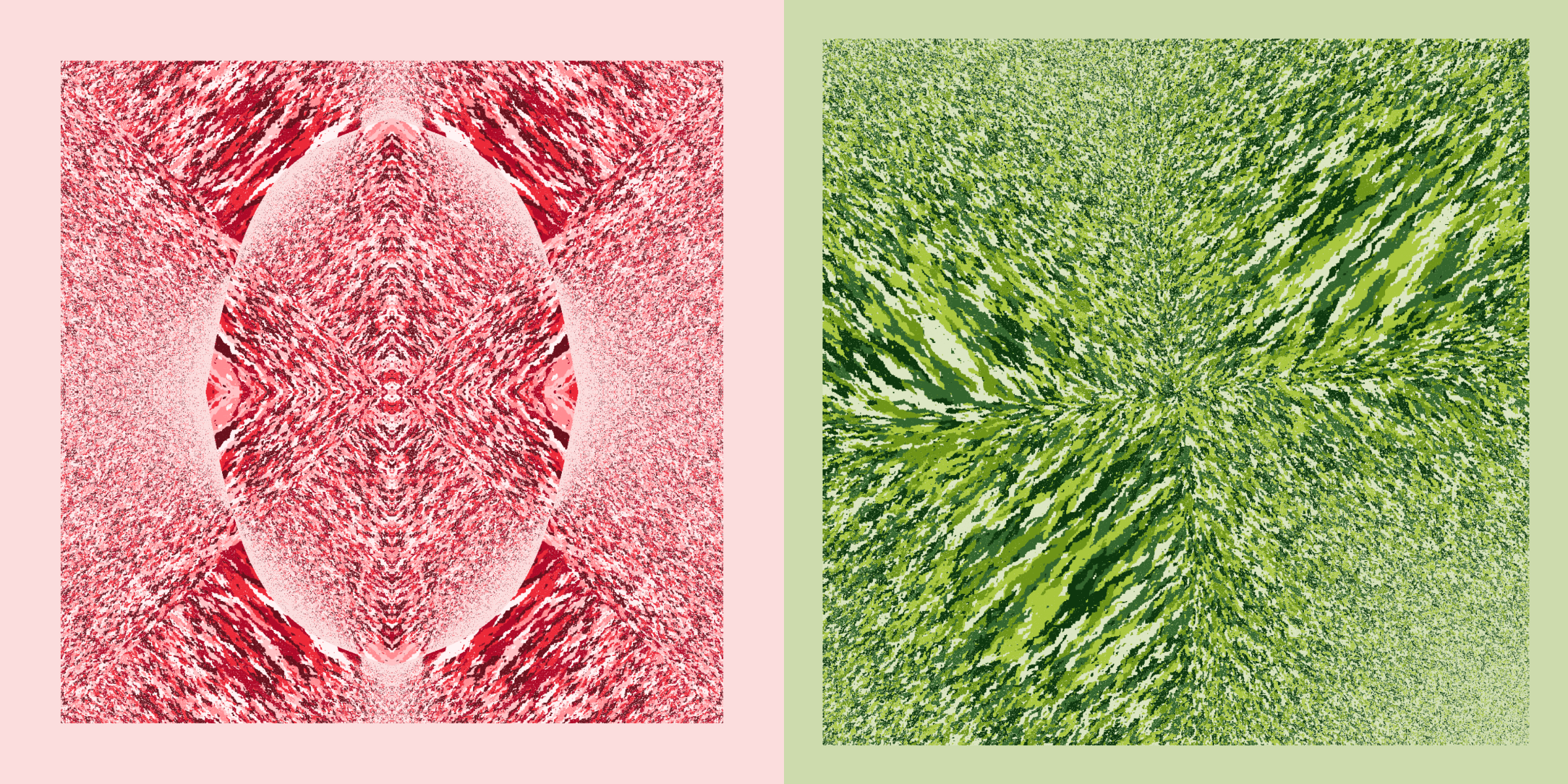
Symmetry
To create a kaleidoscope effect there is a small chance that a Symmetry effect gets applied. This can be either 4-fold where the top-left quadrant gets copied to the others, or a 2-fold symmetry where the left half gets mirrored to the right.
But even more can happen. Although the position of cells is always mirrored when the Symmetry is true, this is not the case for the colors! You can therefore either have a symmetry where both the positions and colors are fully mirrored (such as the left image above), or where only the position is mirrored, but the colors are left to grow how they want (the right image above).
The “position only” symmetry can only happen for 4-fold symmetries, 2-fold symmetries will always have both. The reason is that only doing position, but not color, for the 2-fold was often not clearly visibly “symmetric” anymore.
Along the vertical central “mirror line” in the 2-fold symmetries I often see animals, totems, and for the River colors flows (image above right), aliens (*≧▽≦)
Zoomed Out
Another very rare facet is when the curl noise field used for the probability field is zoomed out quite far, revealing an ocean of swirls. I hope one with the blue and white Lapis Lazuli color palette will appear still, but we’ll have to see…
Full Field
Every cell gets a 98% chance of being drawn
The final metadata / property is the Full Field. When this is set the probability field is let go and almost every cell in the field is drawn, really revealing the Color Flow. If this is set then the Noise type becomes meaningless.
Hidden Feature | Strokes
There is one feature that is “hidden”, as in, it’s not captured by the metadata / properties. Mostly because I found it too subtle to call out in a separate property (there were already enough!). For grids with less than 320 rows there is a (small) chance that some of the dots are drawn with strokes. You really have to get up close to check if this is the case though. This is also the reason why it can only happen for the smallest grids; you can’t tell the difference anymore when the grids get more rows (and the cells become too small).
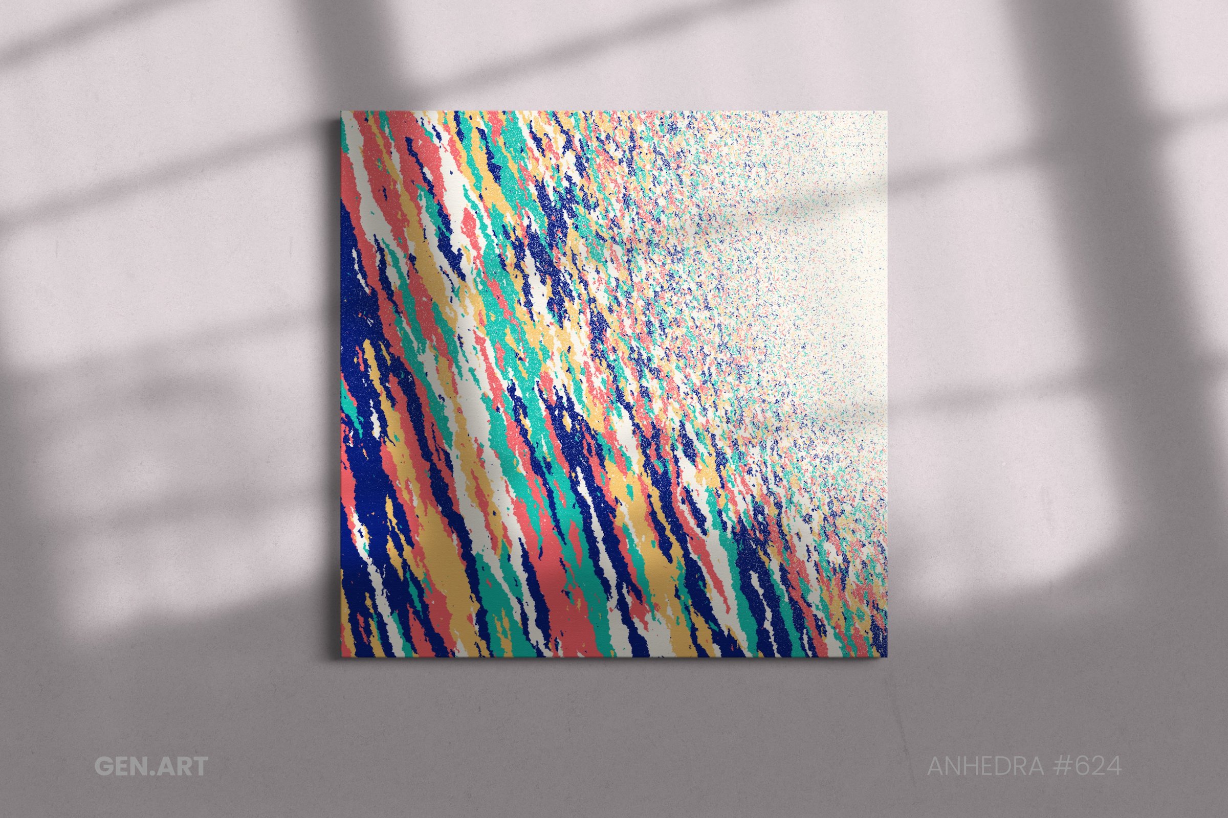
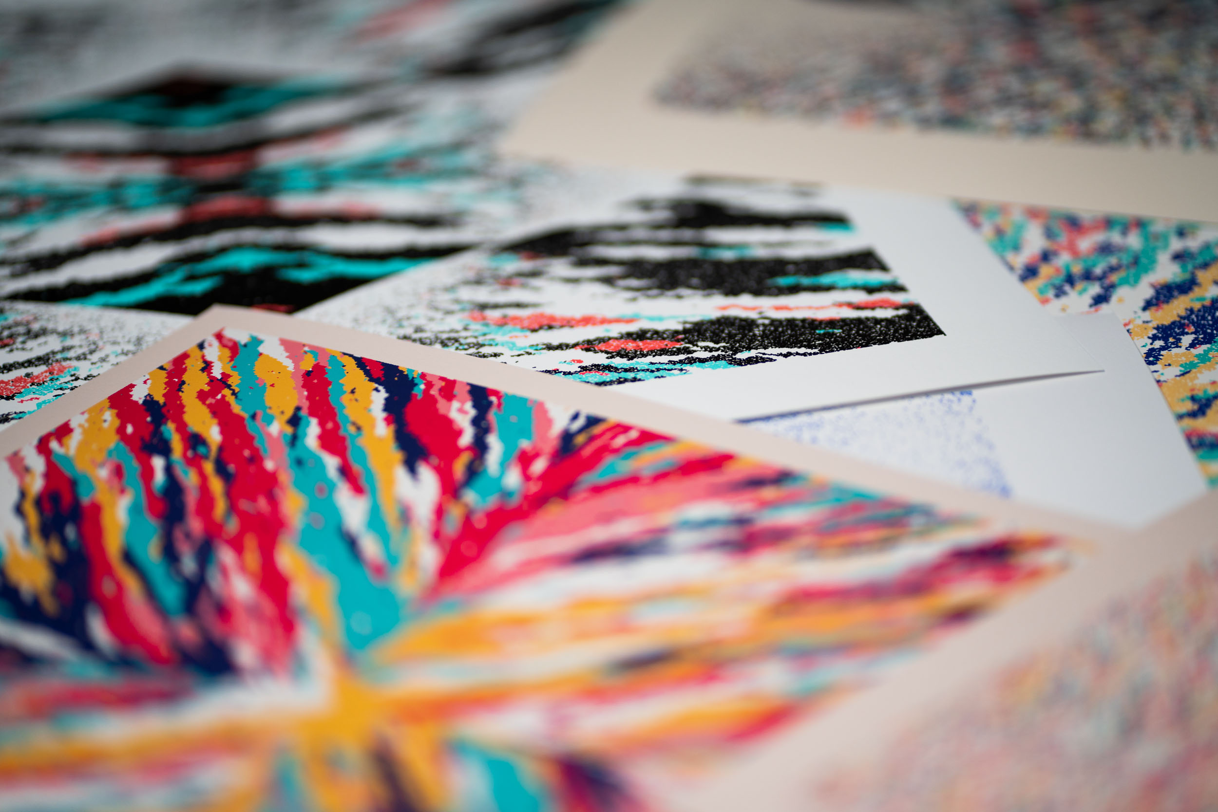
Prints
In preparation for Anhedra’s release I choose seven test outputs and had them printed at different sizes and on two different paper types. From my experience having an online shop where I sell prints of some of my data visualization and data art work, I already knew that I wanted these to be giclee prints, that have amazing sharpness and use archival quality, vibrant inks and rich, textured paper.
These are just my personal thoughts, feel free to choose how you want your Anhedra to look.
I would say that 30x30cm / 12x12" is just a bit too small, but 40x40 / 16x16" is a really good size if you want to stay small-ish still. I had it printed up to 70x70cm / 26x26" which looked quite amazing. Any size in between would also still work in my opinion. I think you could go bigger still if you wanted, I don’t know what the upper size would be. It probably depends on how close you generally are when you’re seeing the artwork. If it’s in a hallway and you can get quite close, perhaps not going much above 60cm would be best, otherwise you can’t quite appreciate the macroscopic view of the whole canvas. However, if it’s hanging somewhere where you’re looking at it from a distance, I think you can go really big.
In terms of paper, I think that Hahnemühle Photorag 308 gsm and Hahnemühle German Etching 310gsm are perfect. Both of these papers are thick, matte, and textured. The German Etching is a bit more textured, the deep dark colors come out a bit better there, and I feel works well with the more earthy color palettes, such as Bornite and Unakite, while the Photorag paper would become my choice for the vibrant palettes. However, I think you can’t go wrong with either paper in the end.
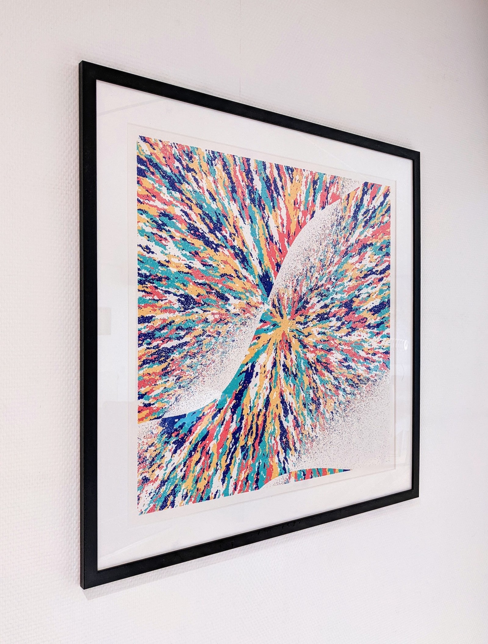
One interesting aspect that I only fully realized after getting the test prints home, is that you can frame it in four different orientations. In my opinion as the artist, I see the way that you view it digitally as just one of the possibilities. Not the only possibility. All four orientations are equally valid and feel free to frame it in whichever way you prefer it.
If you are interested in getting your Anhedra printed, you can download a large 8000+ pixel version by going to the Tools -> My Collection page on the GEN.ART website and download it there (make sure to connect your wallet to be able to see any GEN.ART mints you own). (Or wait until the GEN.ART print shop opens soon!!)
Wrapping Up
Well, that was long enough! I hope you enjoyed learning more about the inspiration of minerals, the algorithm underlying Anhedra, and all the visual styles and options that can occur. If you have any remaining questions, feel free to ask them on Twitter, or in the GEN.ART discord (there’s a #nadieh-bremer channel there).