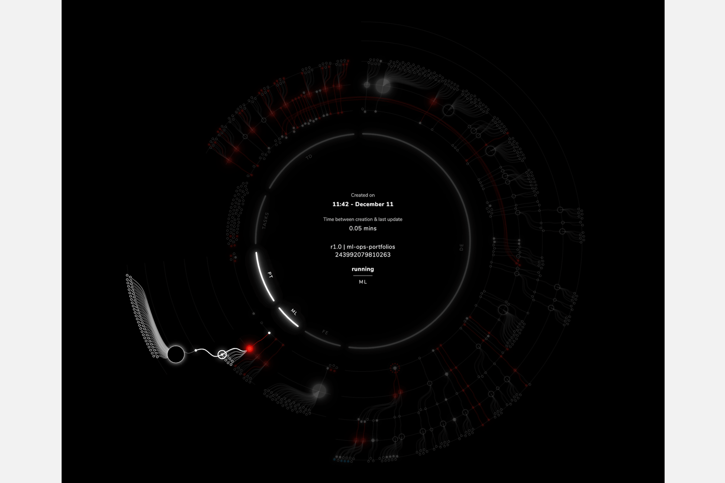
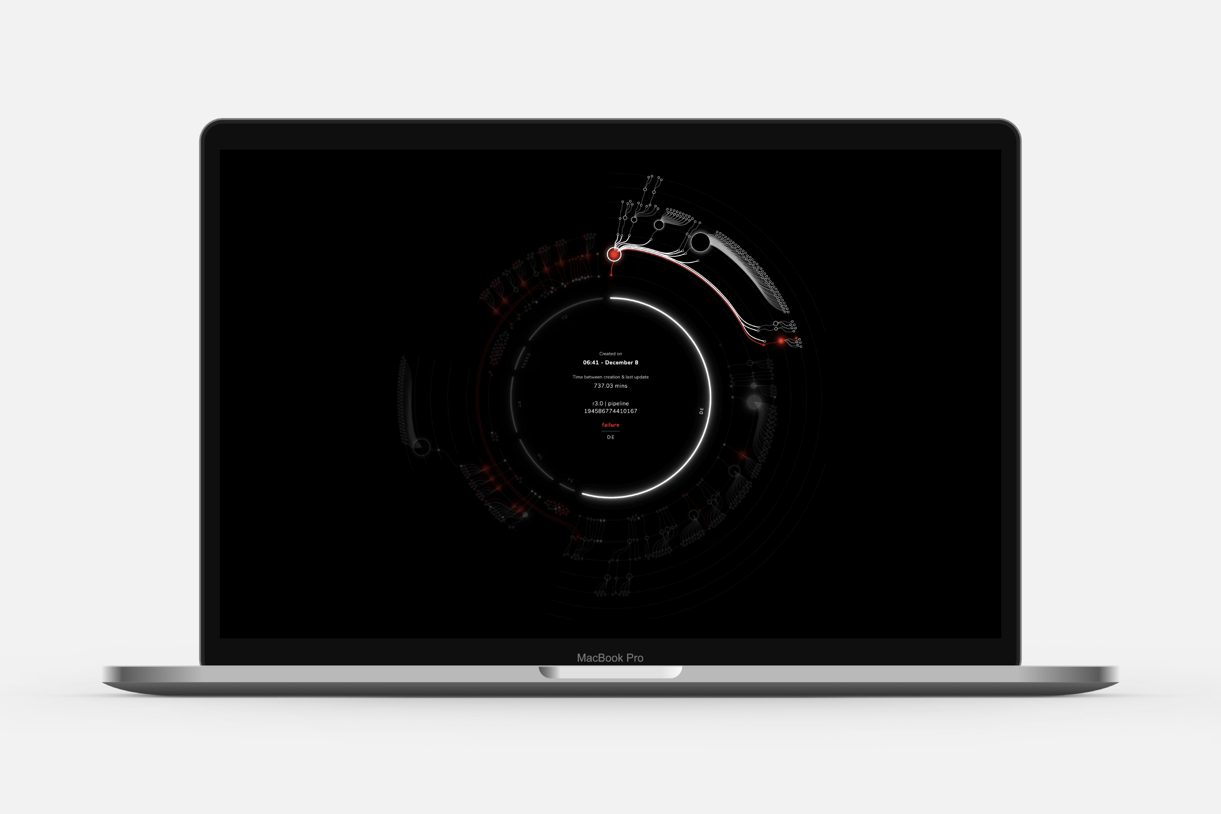
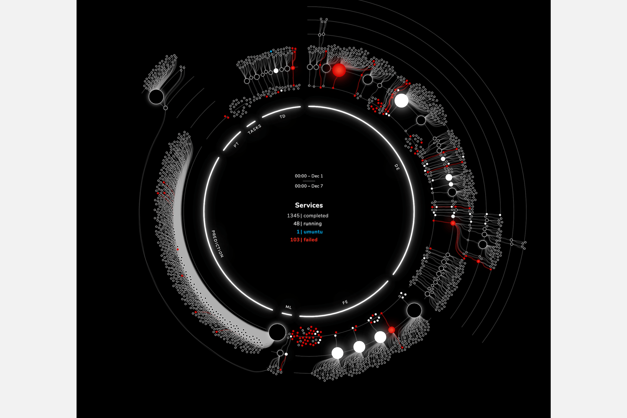
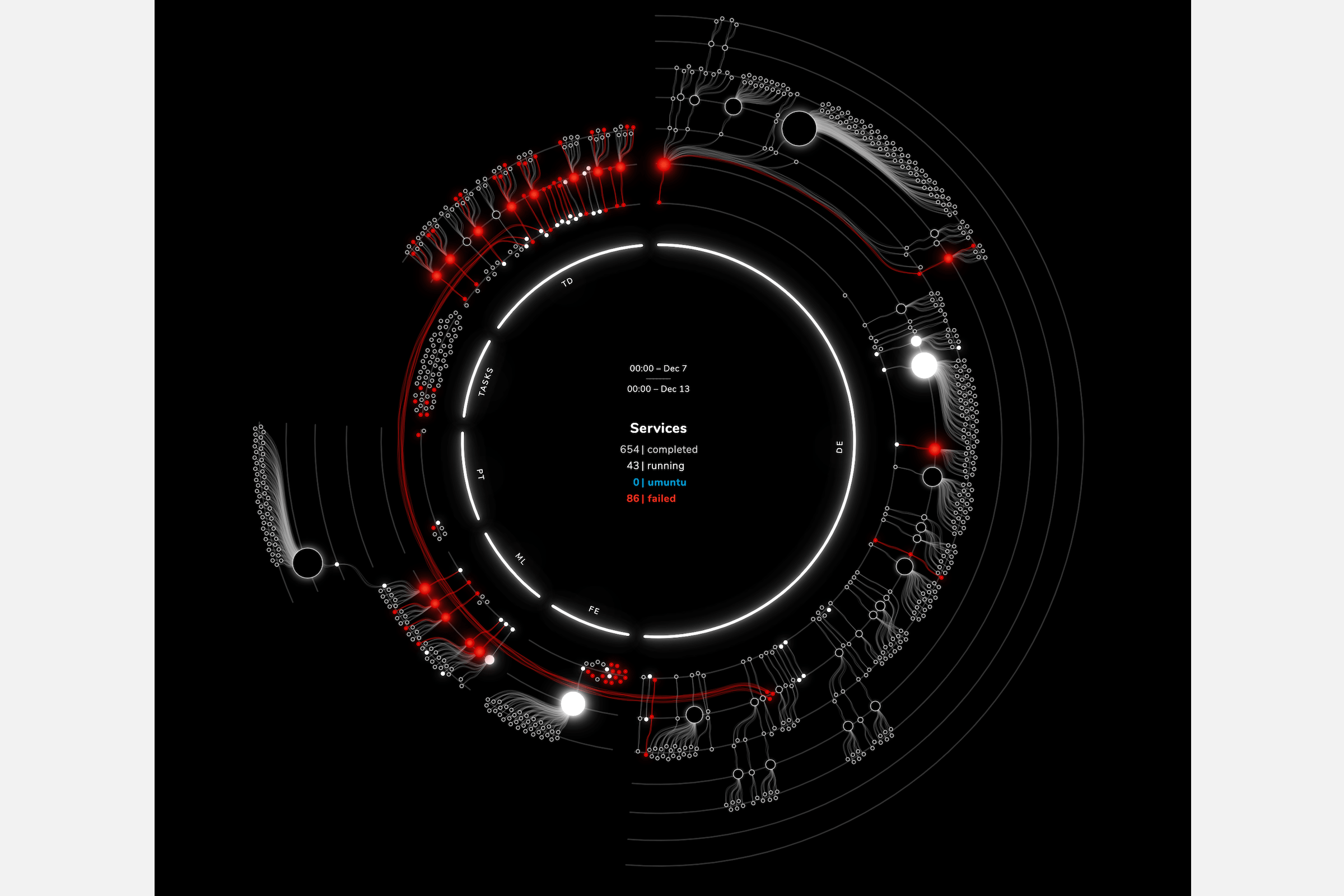
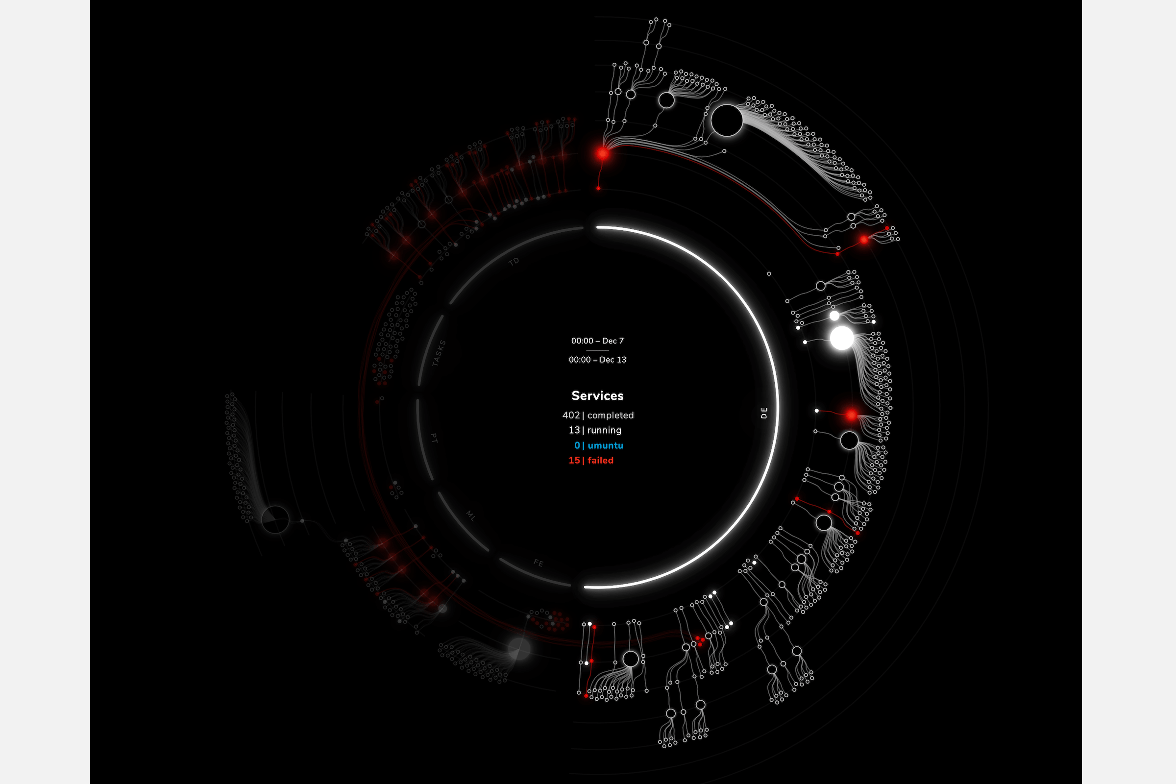
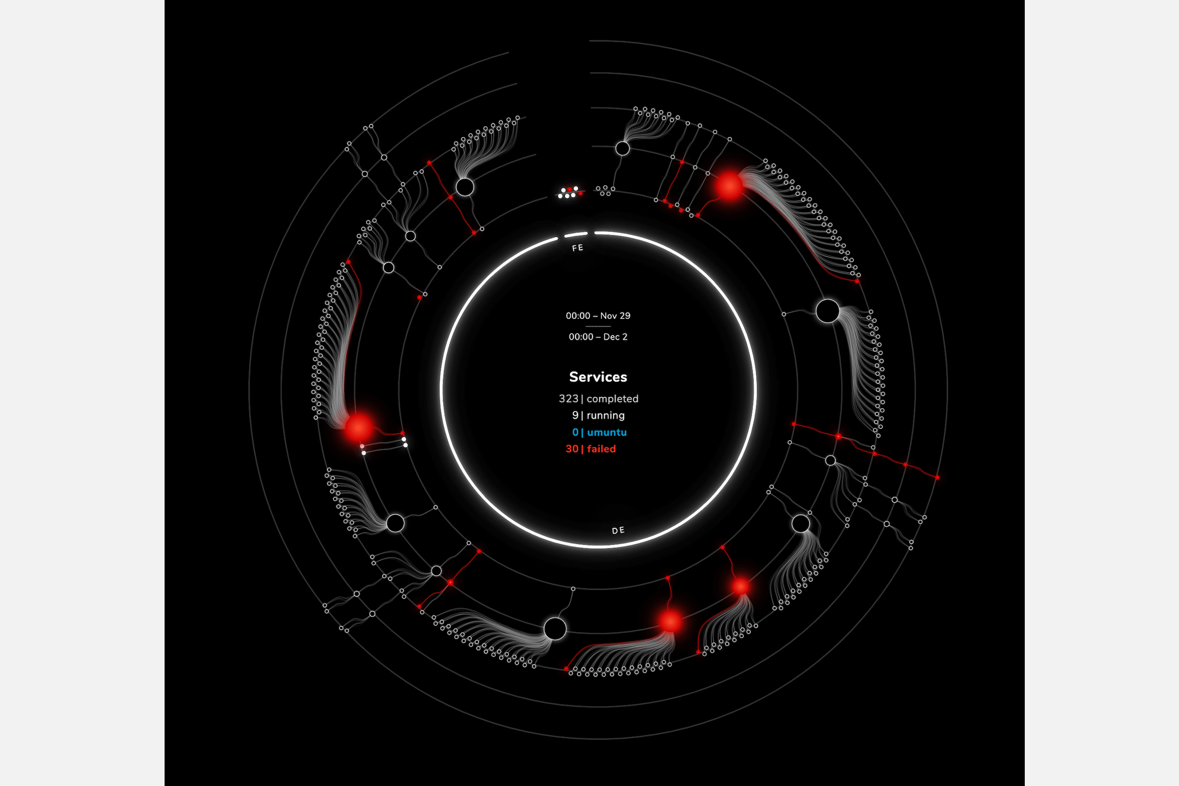
alis_ was looking for a way to visualize the services running on their custom alis_ OS. To reveal if the OS was running well, which tasks were failing. But also to show the dependencies of services having created new services and so on. And to have a clear differentiation between their domains. Finally, the final visual was going to be used both for management and marketing purposes and thus had to be really effective, still look good, and on brand. After a longer design phase to investigate what forms revealed the insights, I developed a custom chart for them to implement as a prototype into their systems.
The client was initially inspired by my Royal Constellations project, and was looking for something similar to that abstract set-up. At the start the data did seem to lend itself to the same approach. However, after I received a dataset to base my prototype on, and made the first rough visual, it was immediately apparent that there were some very important differences in this dataset that made it impossible to use the Royal Constellations approach.
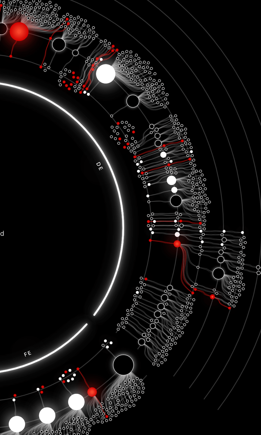
After discussing with the client, we completely readjusted the initial scope to include a exploratory design phase. Based on the actual data, I programmed several different visual forms, from circles to spirals to packing, and eventually came upon the “depth circle” idea. This one shows both the hierarchy of services in their parent-child relationship going outward, with connections being able to cross domain. Plus, within a domain, it would show the order in which the services were created.
The client has shared how pleased they are with the visual: “We have been using your visual for just more than 3 months in production and it has become an absolute integral part of our team. all of my team members have alis_ os open on one of their screens, all the time”