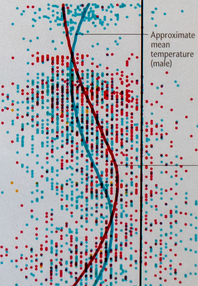
I created the visual on the Graphic Science page of the December issue of the Scientific American. It reveals that what we think of as “normal” body temperature, 98.6° F / 37° C, and fever, is actually quite less. Even more so, it fluctuates throughout the day, is slightly lower for men than women, and even depends on the place the temperature is taken.
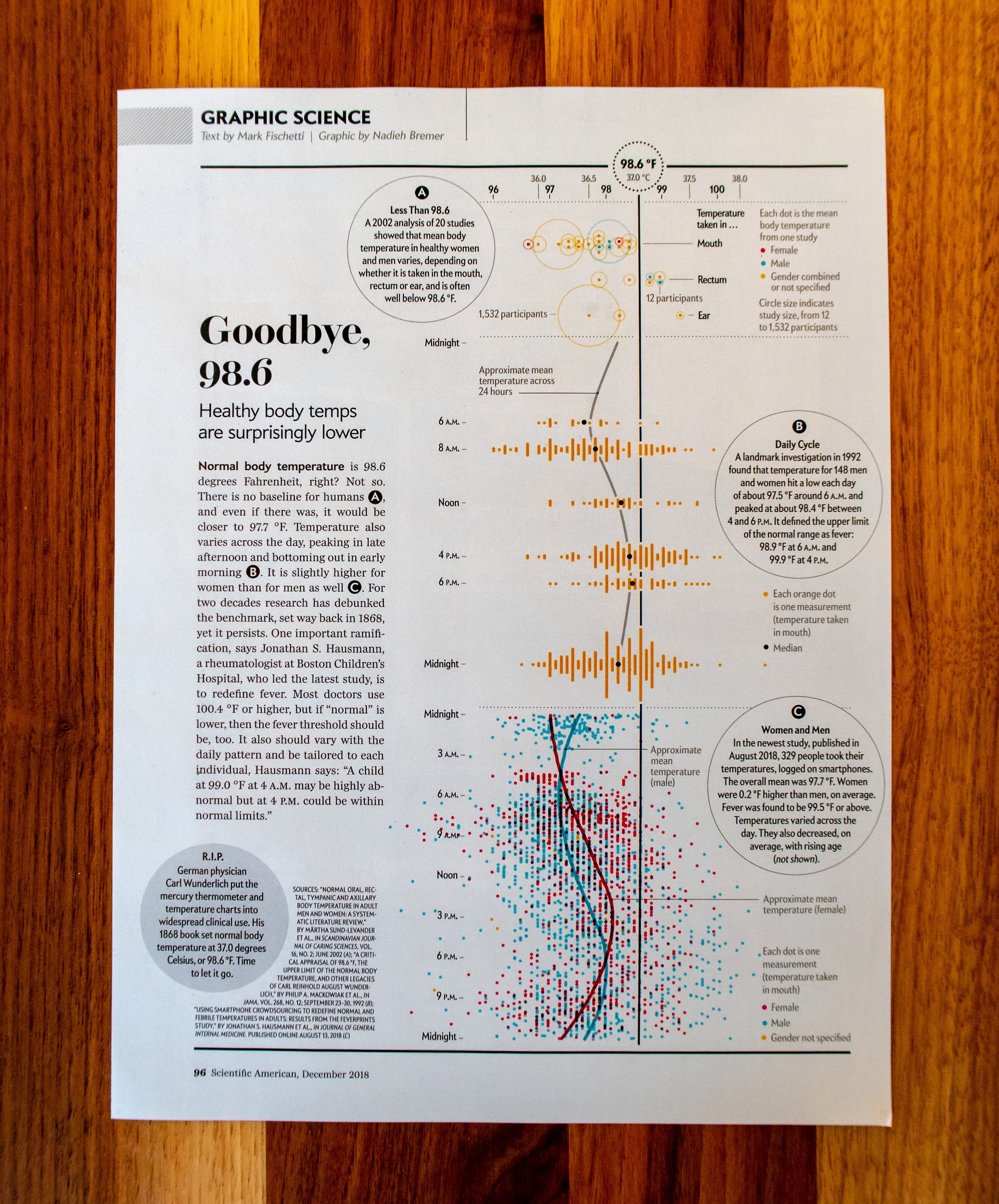
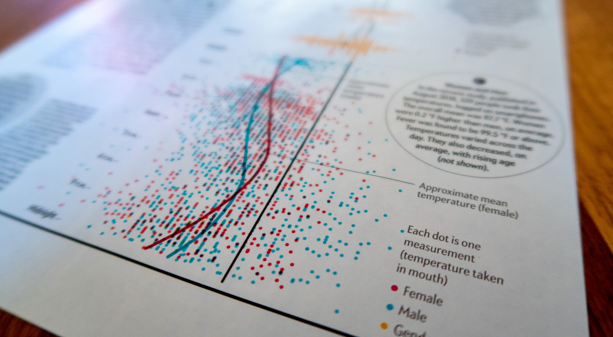
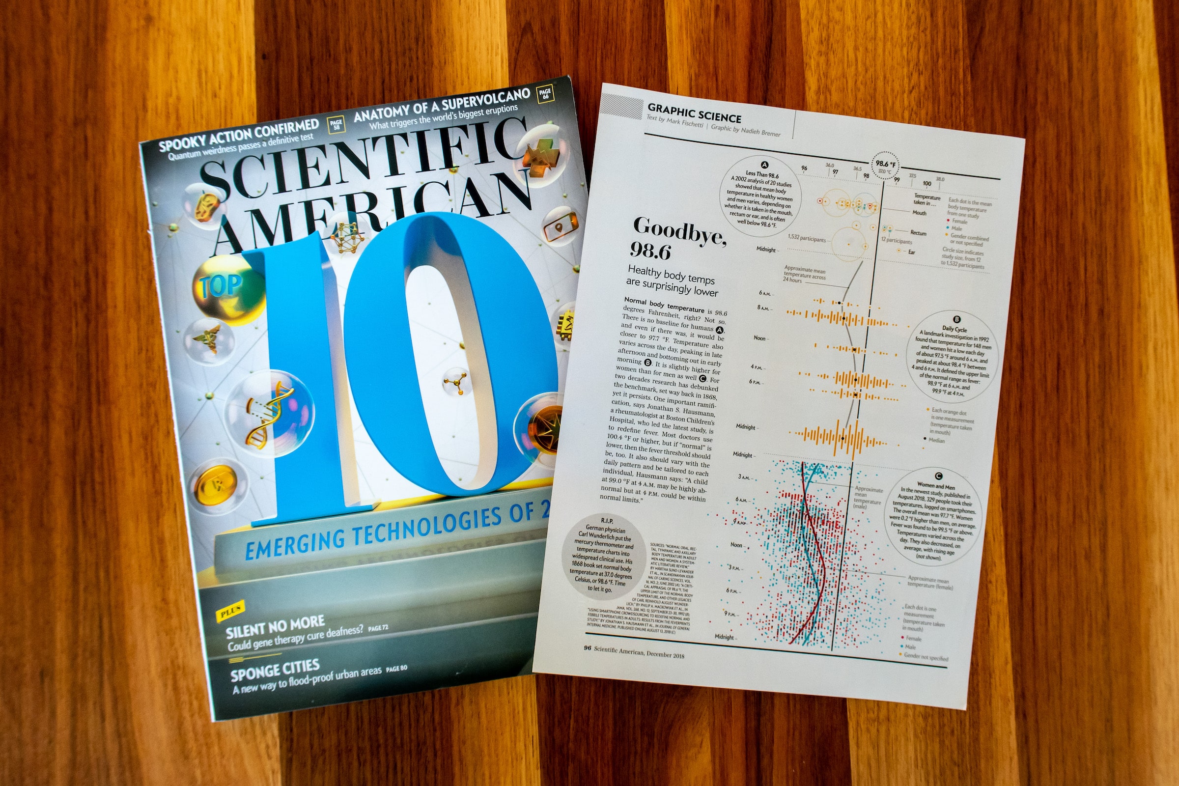
The challenge for this visual was how to combine all the different researches. One was even a literature study of all the “body temperature” research that had been done up until that point, with only a few datapoints. While the latest research had used crowd sourcing and was thus quite data rich.
Using R to understand the details of each dataset, the client and me agreed to focus on the gender and time of day aspects as well, not to average everything to one number. To create consistency in the visual and combine all three studies I used a fixed temperature scale for all three and kept the same style, such as colors and circles throughout.
