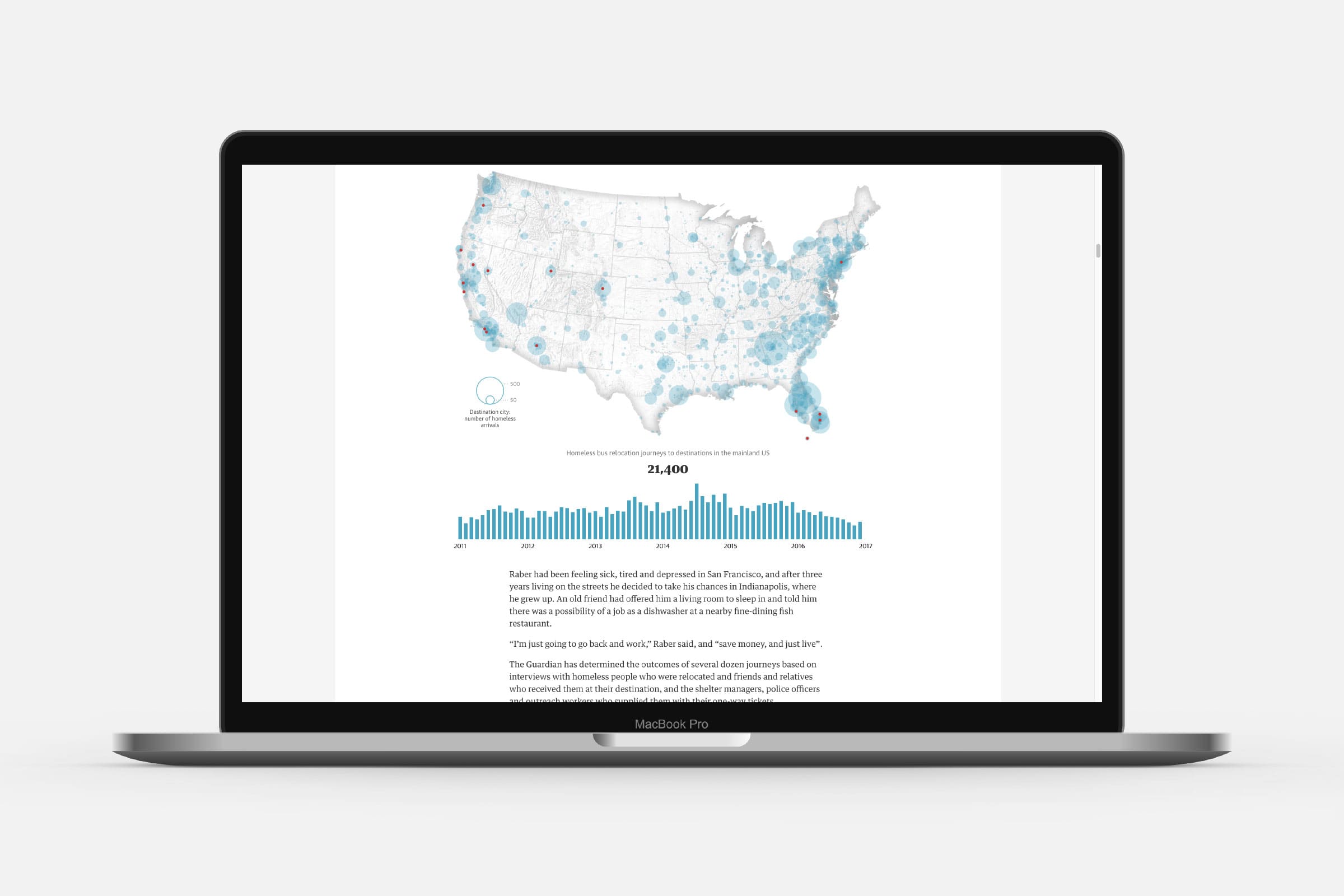
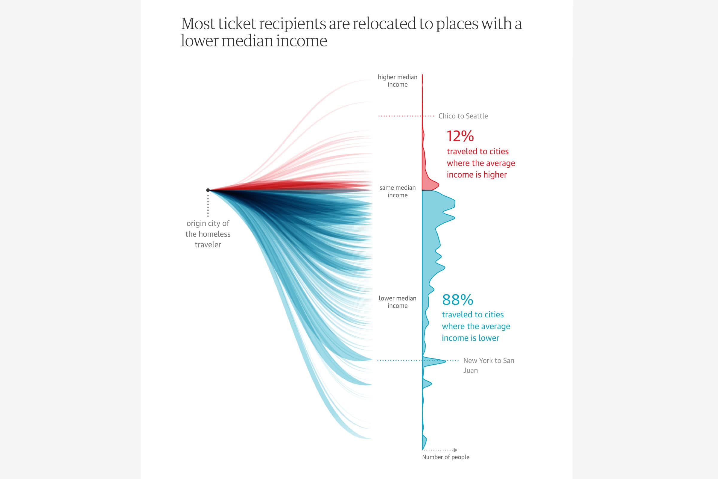
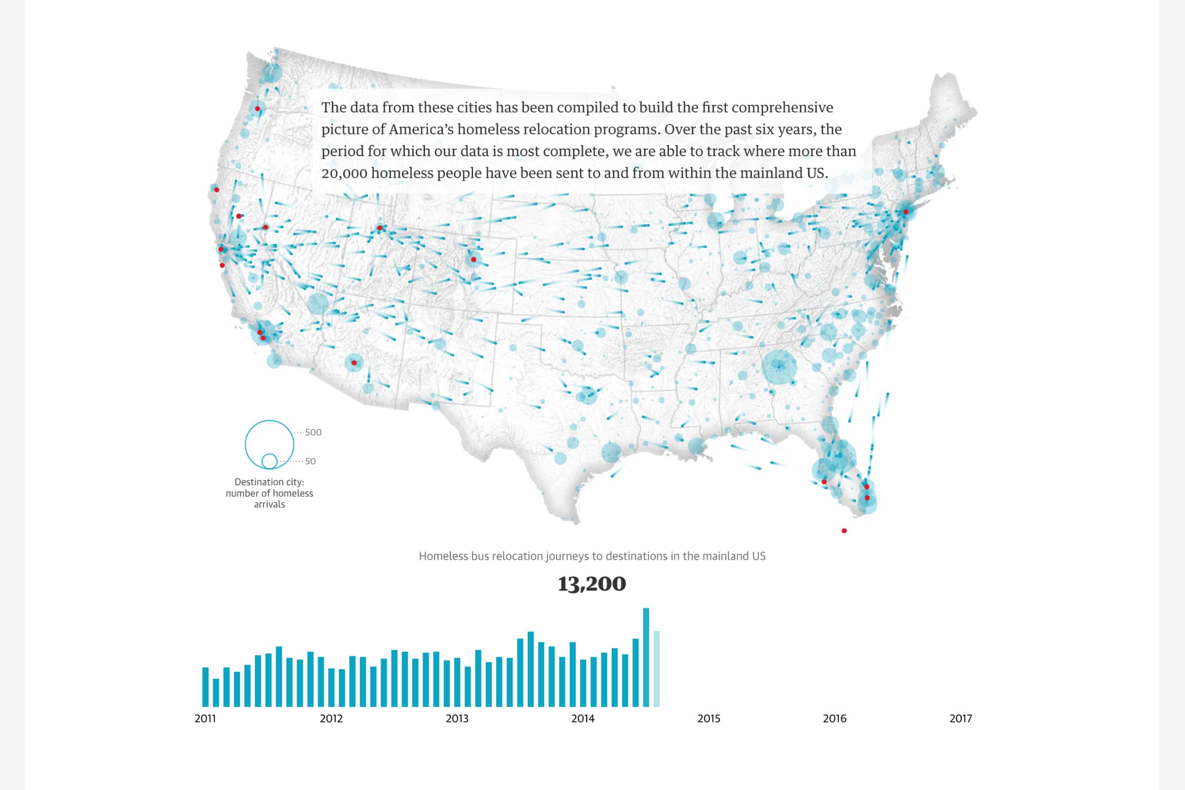
How America moves its homeless | Each year, US cities give thousands of homeless people one-way bus tickets out of town. An 18-month nationwide investigation by the Guardian reveals, for the first time, what really happens at journey’s end. There are several data visualizations in this article. Many of which are created in a Scrollytelling style, where scrolling down the page will trigger animations in the data visualizations. Through these visualizations, video, photography, and of course, text, the article explains the impact of the homeless moving around the US. Both from the perspective of the homeless and the cities that are sending them away.


I was hired by the Guardian US team to help them with their ‘flagship’ article about homelessness. To create something that would combine photo, video, text and custom made visualizations of the data on which the article was based. For the data visualizations and full implementation I worked together with Shirley Wu.
I started by cleaning and analyzing all ±35,000 bus journeys. After which we had a two day brainstorming session with the entire team to define the story that we wanted to tell and which visualizations of the data would bring out the insights. At the end of those two days we had the rough story structure and designs for each of the visualizations.
In the following months me and Shirley created the prototypes of each visualization, making sure they worked on both desktop and mobile sizes. This was eventually brought together into the final page along with the written and multimedia content. Weekly calls with the team at the Guardian kept us all on track and provided moments to discuss the visuals and talk about feedback.
The visualizations that you see on this page are the ones that I constructed. You can read more about the data and creation at the bottom of the article in the Methodology section.