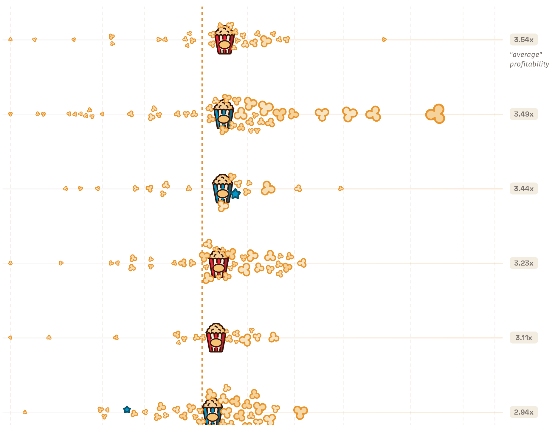
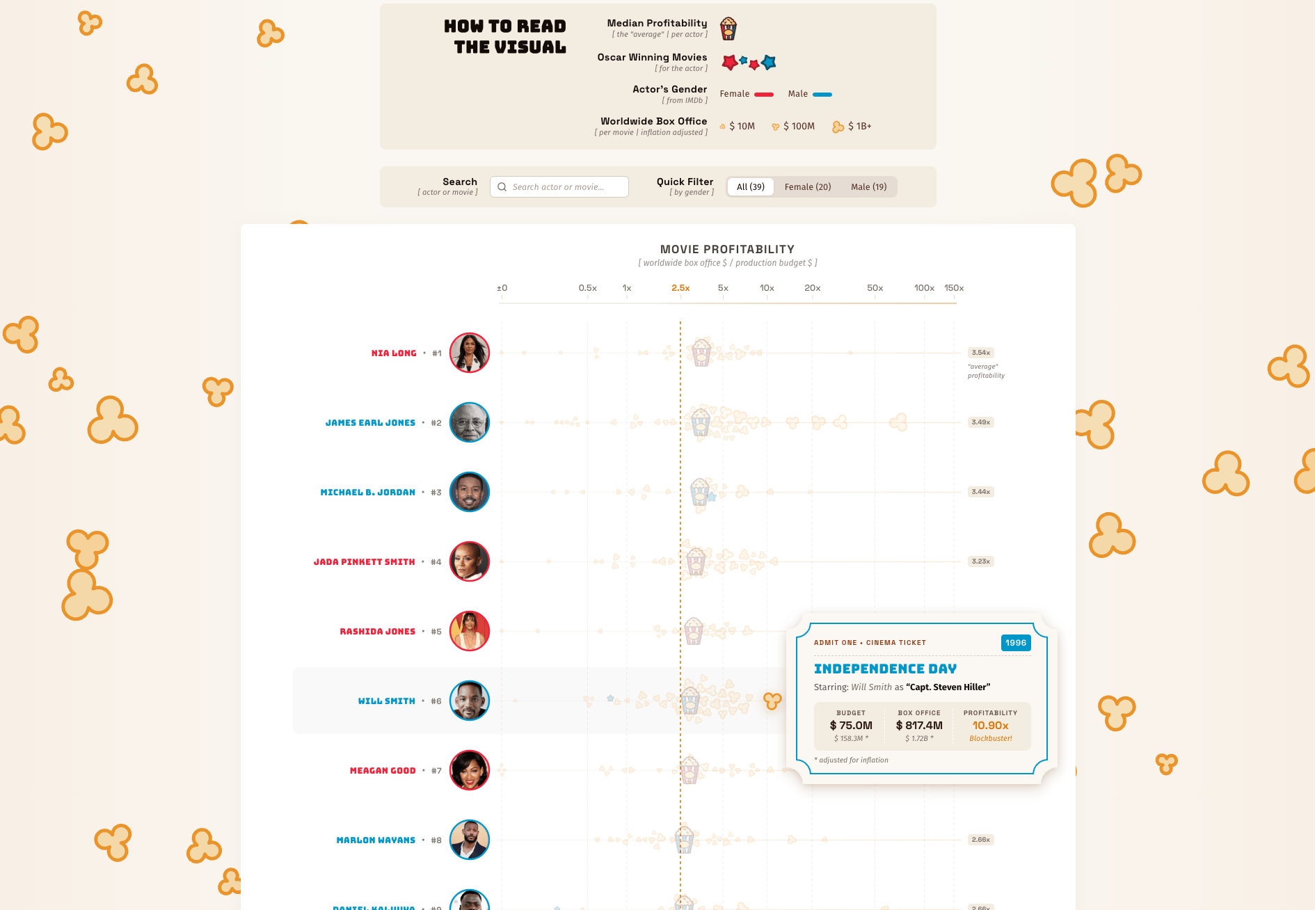
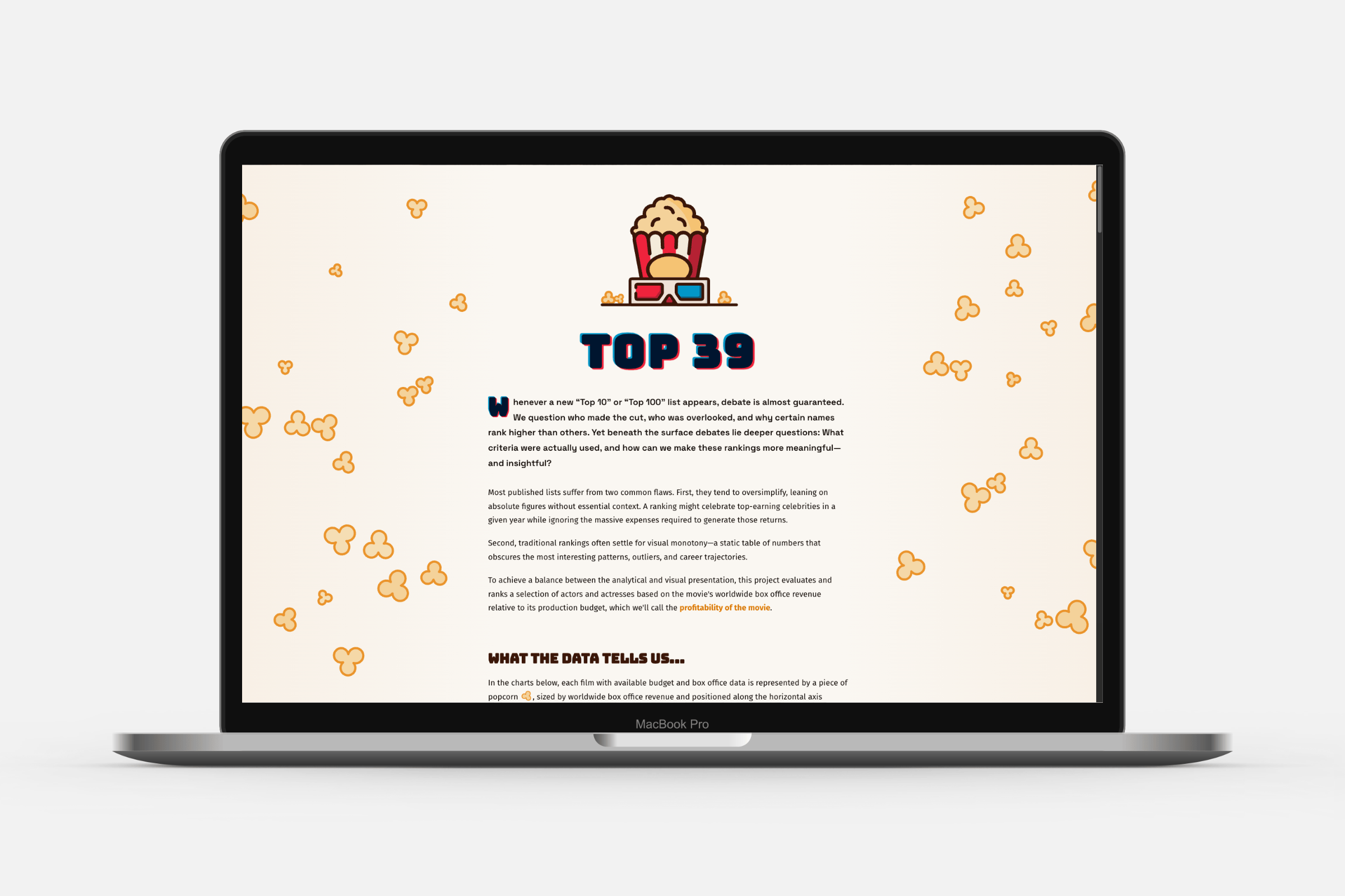
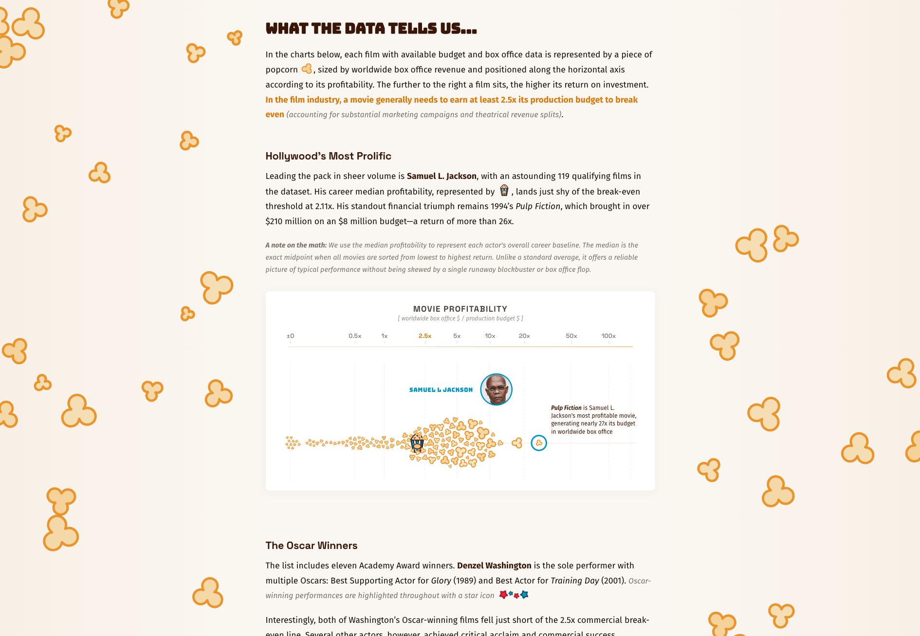
I had the chance to create a fun, whimsical interactive visualization for Graffu, a platform dedicated to sharing stories focused on people of color. The article centers on showing the set of actors the writer was most familiar with, sorted by how profitable the movies they starred in were. I felt the topic was a wonderful fit for a more playful approach, so I leaned into a cinema theme—using pieces of popcorn to visualize each movie, paired with retro 3D glasses (for the color palette as well) and classic popcorn buckets. It turned the final article into an inviting, joyful piece that’s fun to read and explore.
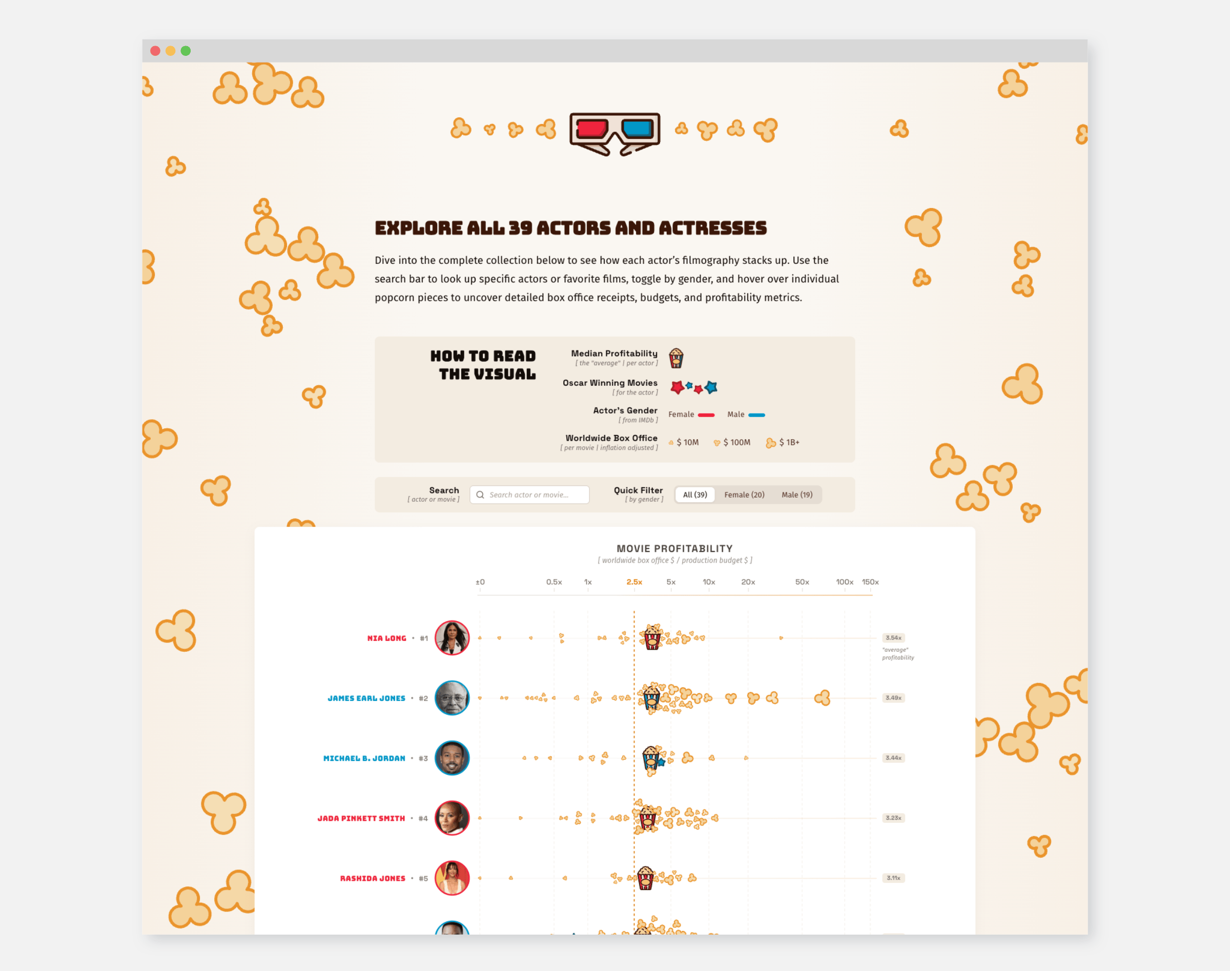
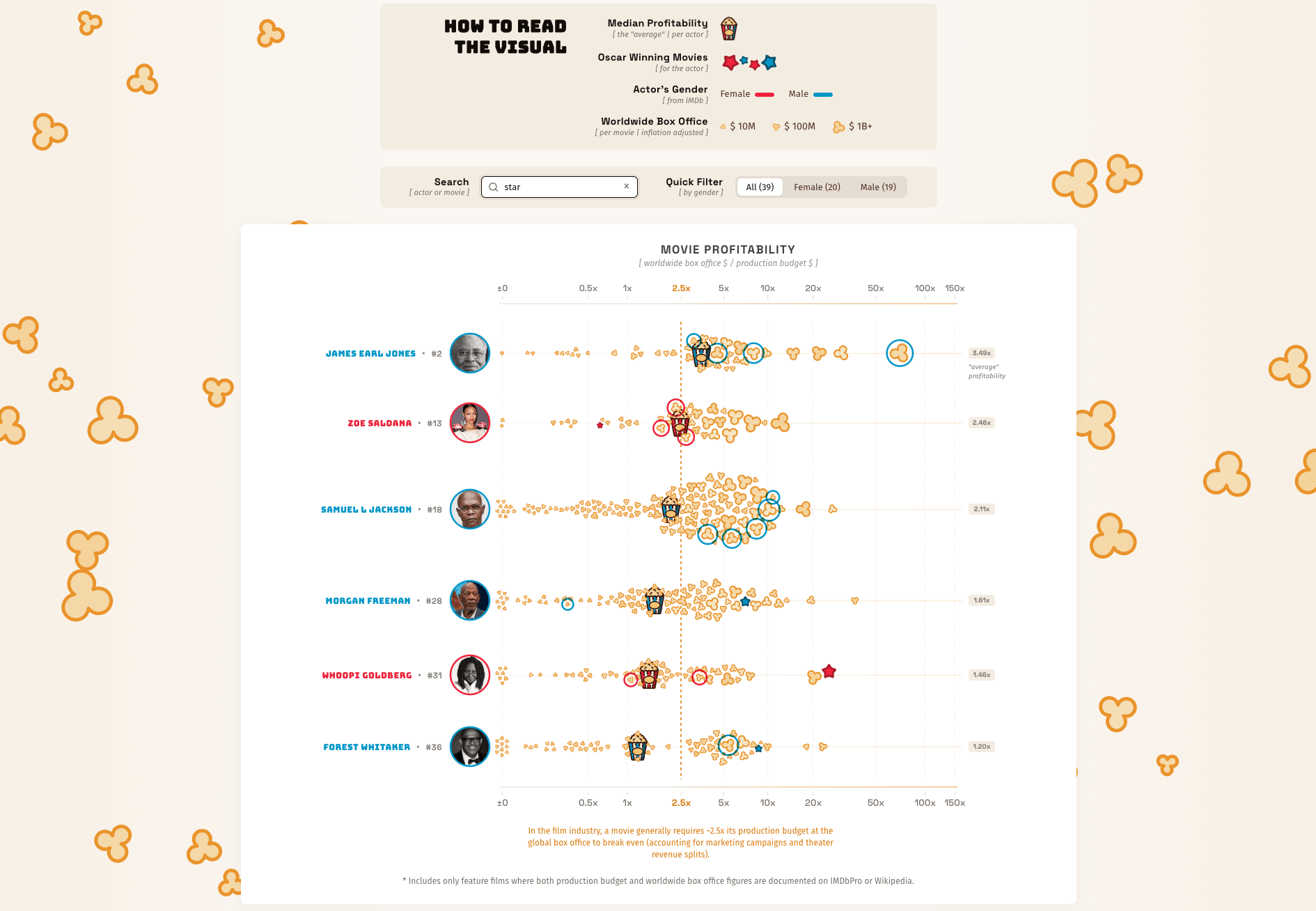
I always love working with pop culture data, so this project was right up my alley. Lighter topics like this naturally lend themselves to going a bit more all-in with metaphors and iconography, so right from the start, I had the idea to use pieces of popcorn instead of plain circles to represent each movie.
To add some extra flair, I found icons of a popcorn bucket, oscar statue and 3D glasses on Flaticon, tweaking their colors and details so they felt right at home in the story.
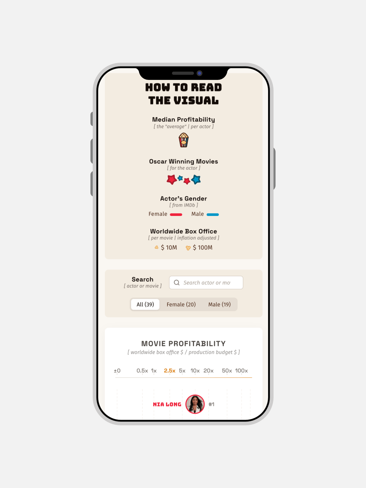
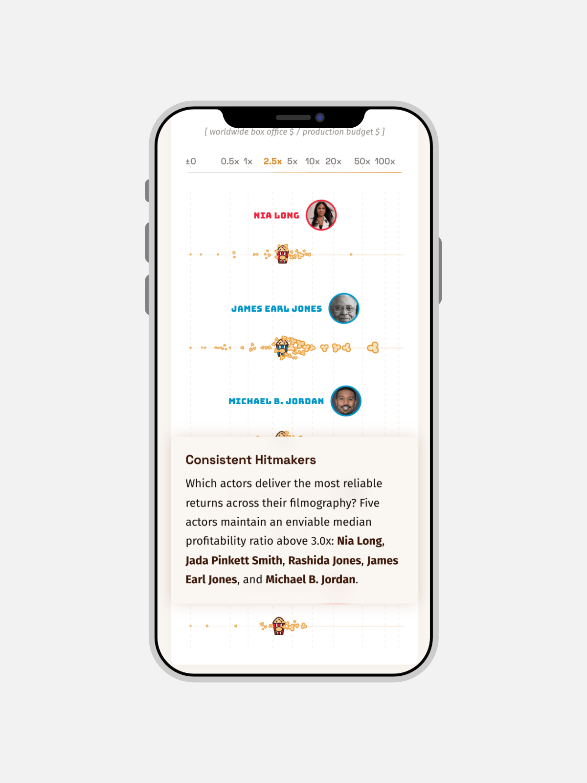
I also wanted to ensure the experience felt great on any device. On mobile, the article transforms into a scrollytelling-style piece, keeping the visualization pinned in place while the text smoothly scrolls over it.
And while I don’t usually get overly excited about tooltips, this was an exception, as I quite enjoyed designing them to capture the nostalgic vibe of an old-school theater ticket.