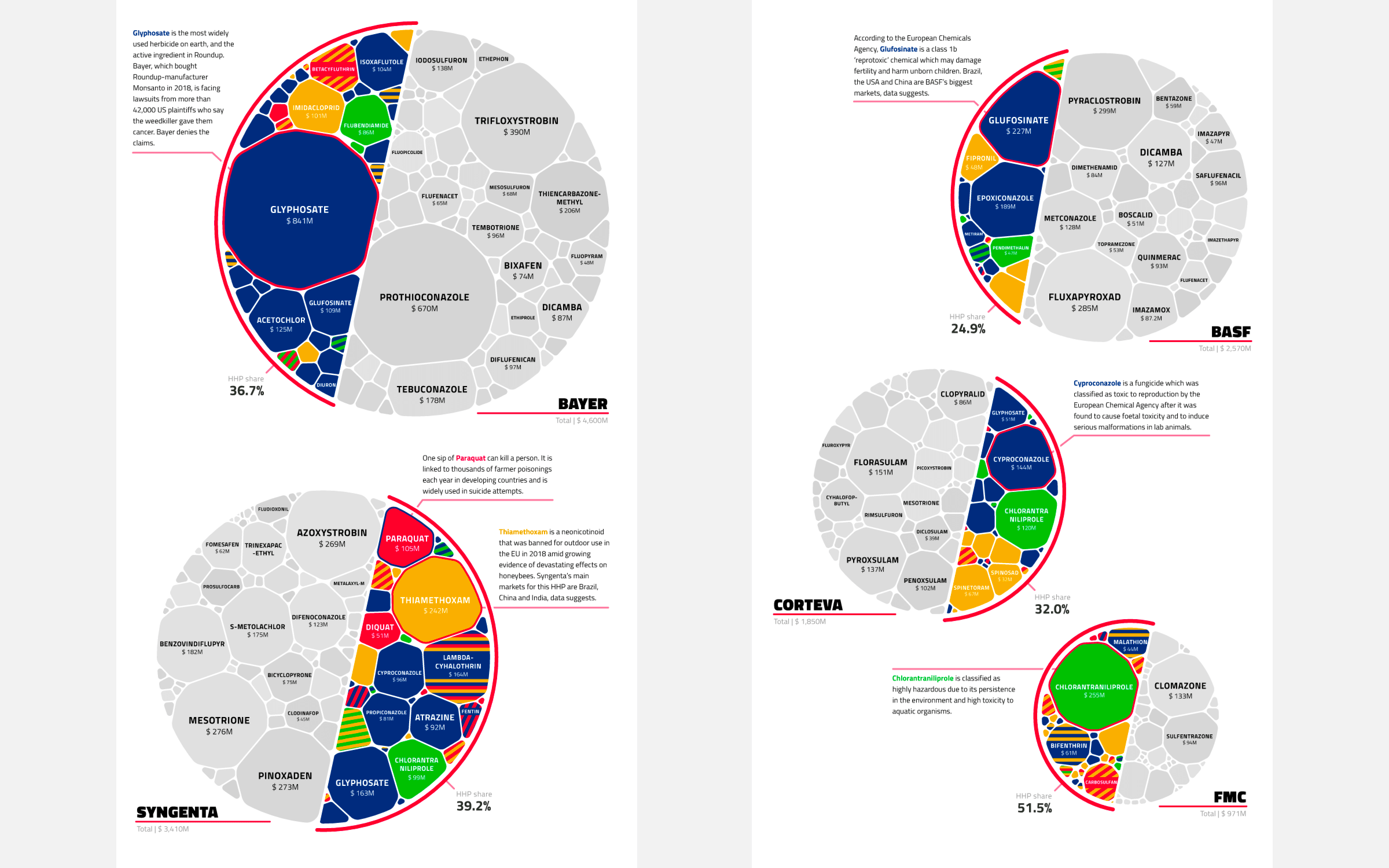
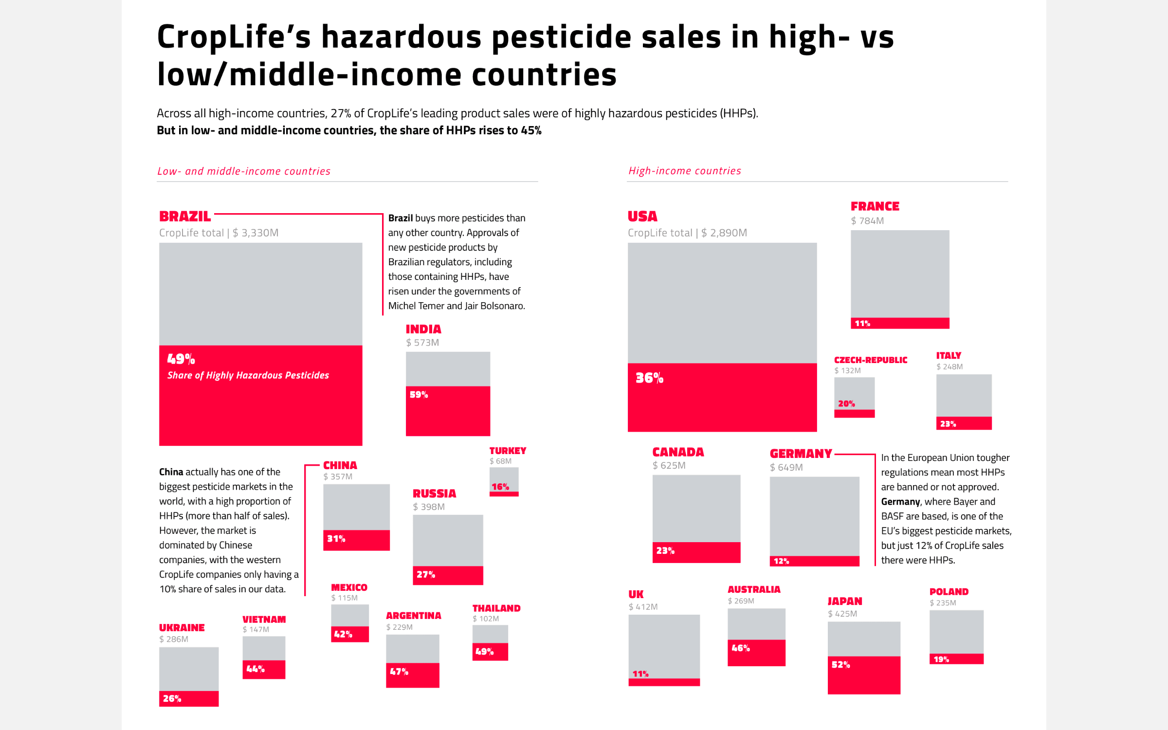
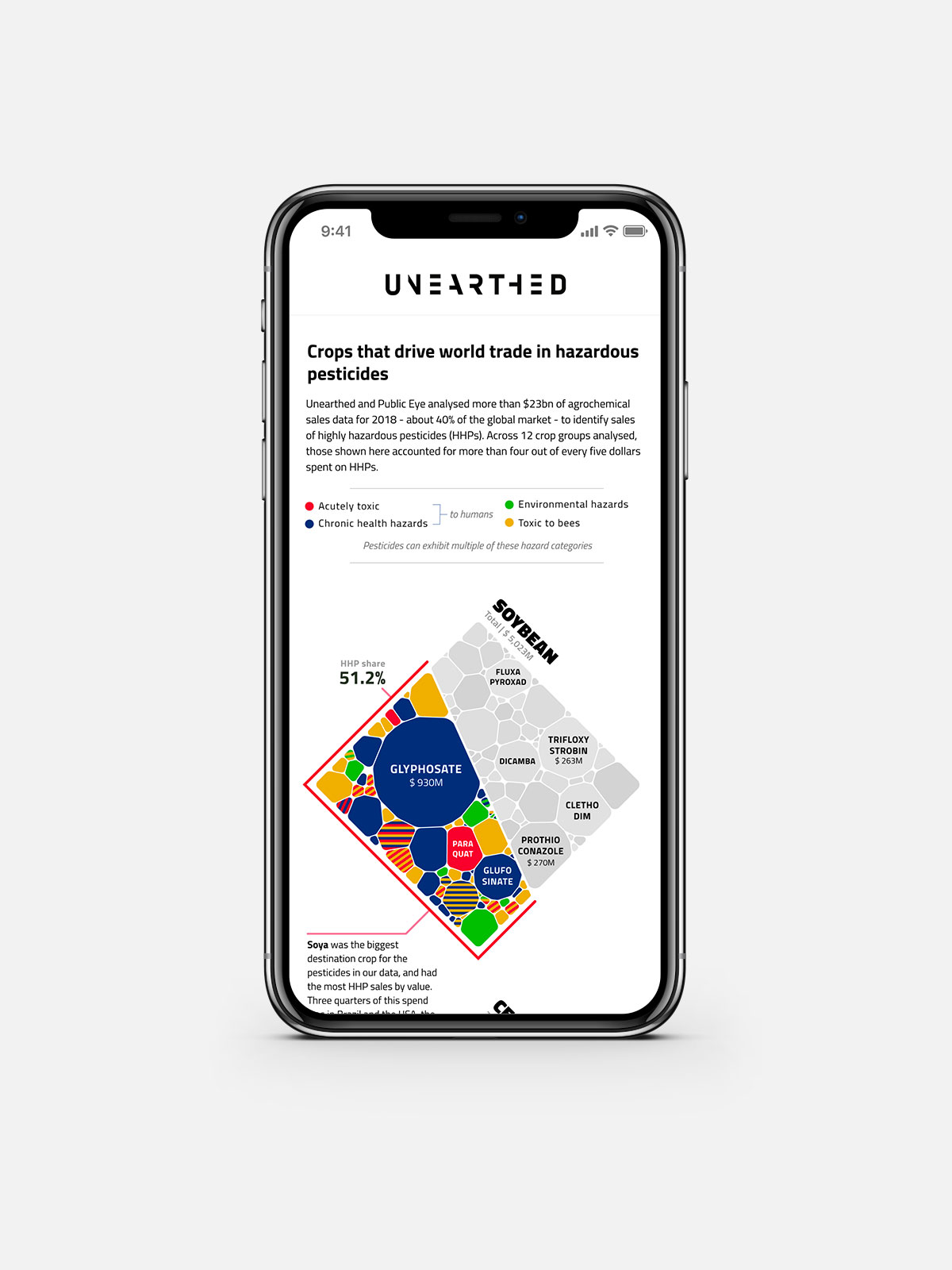
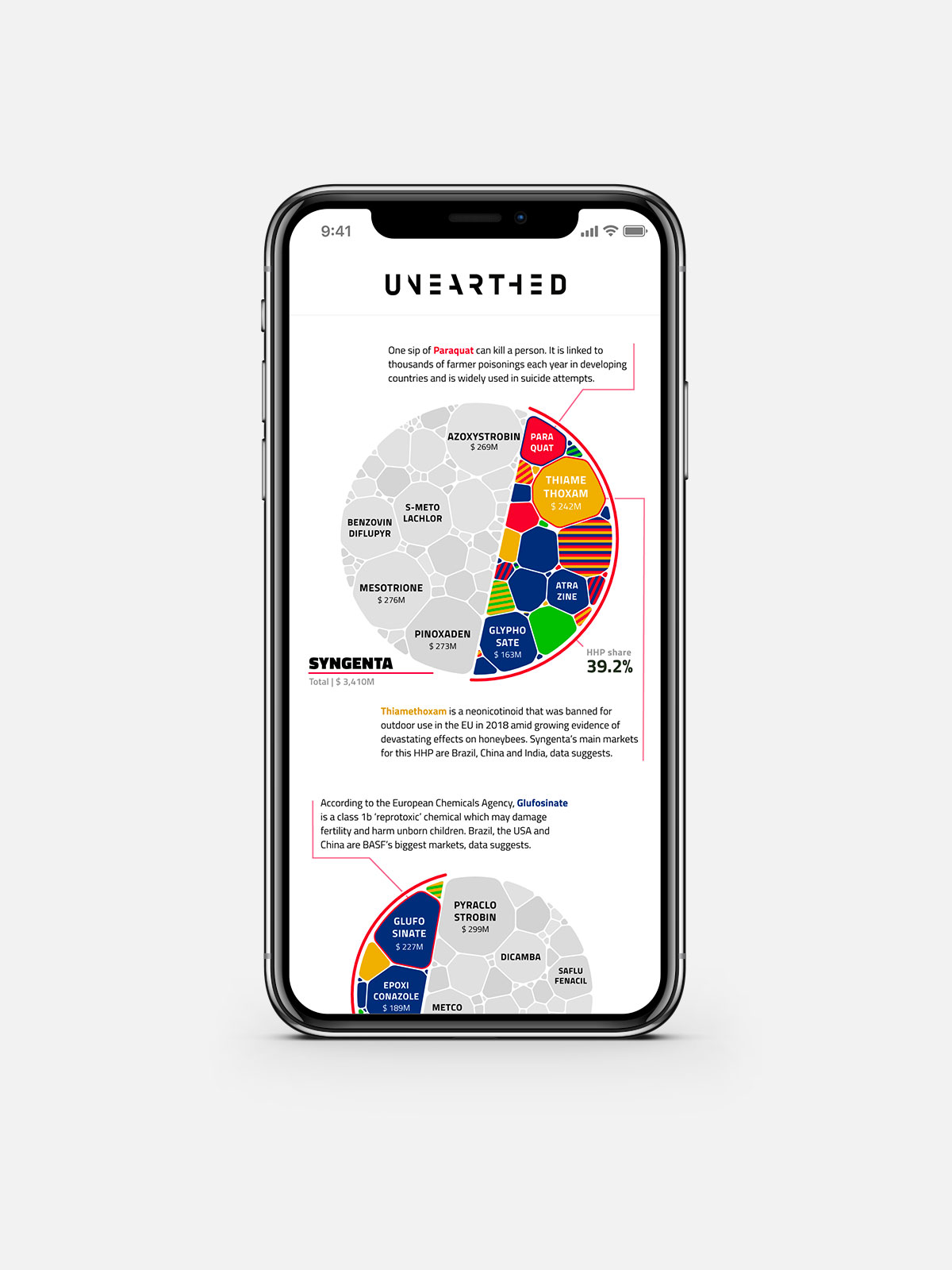
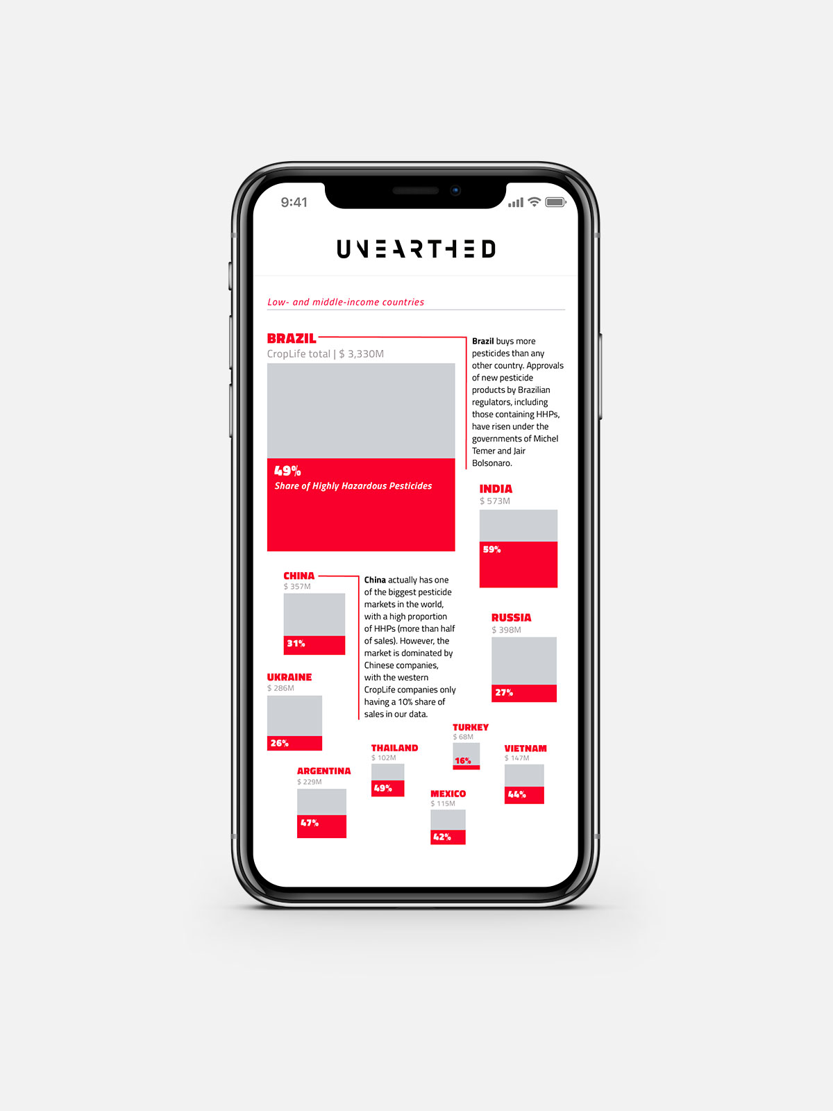
Unearthed, the journalistic arm of Greenpeace, was doing a large scale investigation together with Public Eye, an NGO from Switzerland, on the sales of hazardous pesticides by the CropLife companies. I was approached by Unearthed to help them create eye-catching visuals to accompany the different conclusions that came out of the investigation. These visuals would be used in the articles both parties were writing. Taking into account the broad scope of audiences, from both a general readership to eventual use by experts, I advised to go for a set of static visuals, each with a version for desktop and mobile, which would be visually distinct and still effective in revealing the underlying insights.
Besides having a clear maximum budget the client knew what insight they wanted the visuals to reveal. This helped me to create three different designs that would fit within that budget, ranging from either one simple interactive, to multiple static pieces.
My advice was to go for the latter option due to its technical ease, especially because the final visuals would have to appear on two different websites, each with their own CMS. Furthermore, static images are the fastest to make. I could therefore create a visual for each main conclusion, instead of doing an interactive on only one. Finally, the static images could also be used within any slide decks the client might want to present for experts.
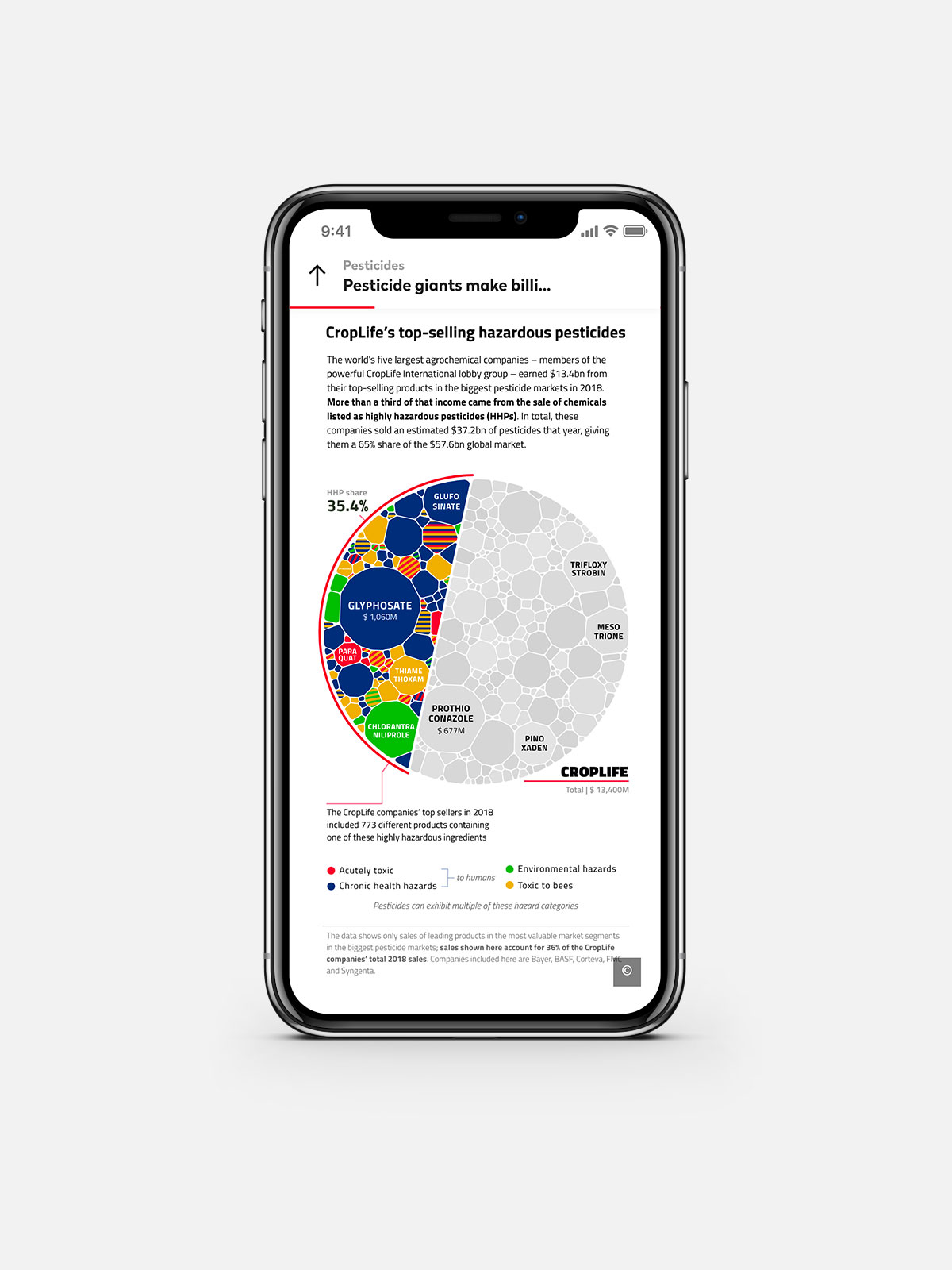
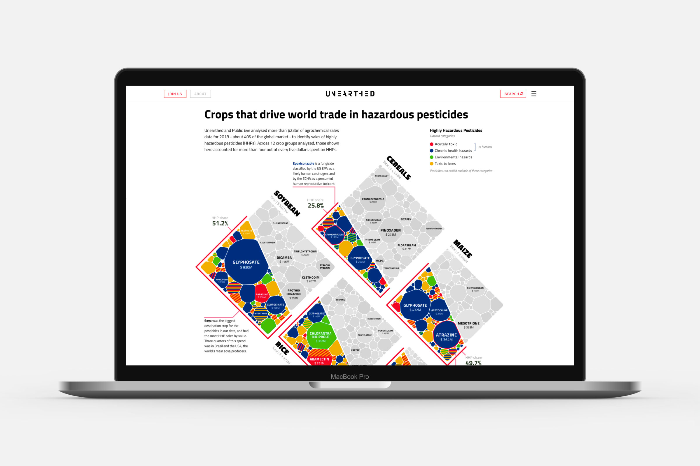
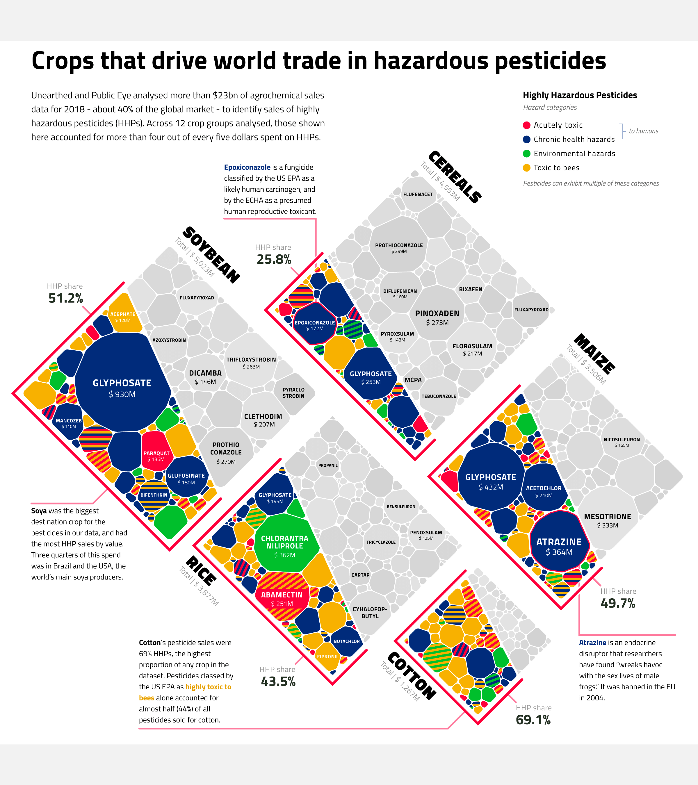
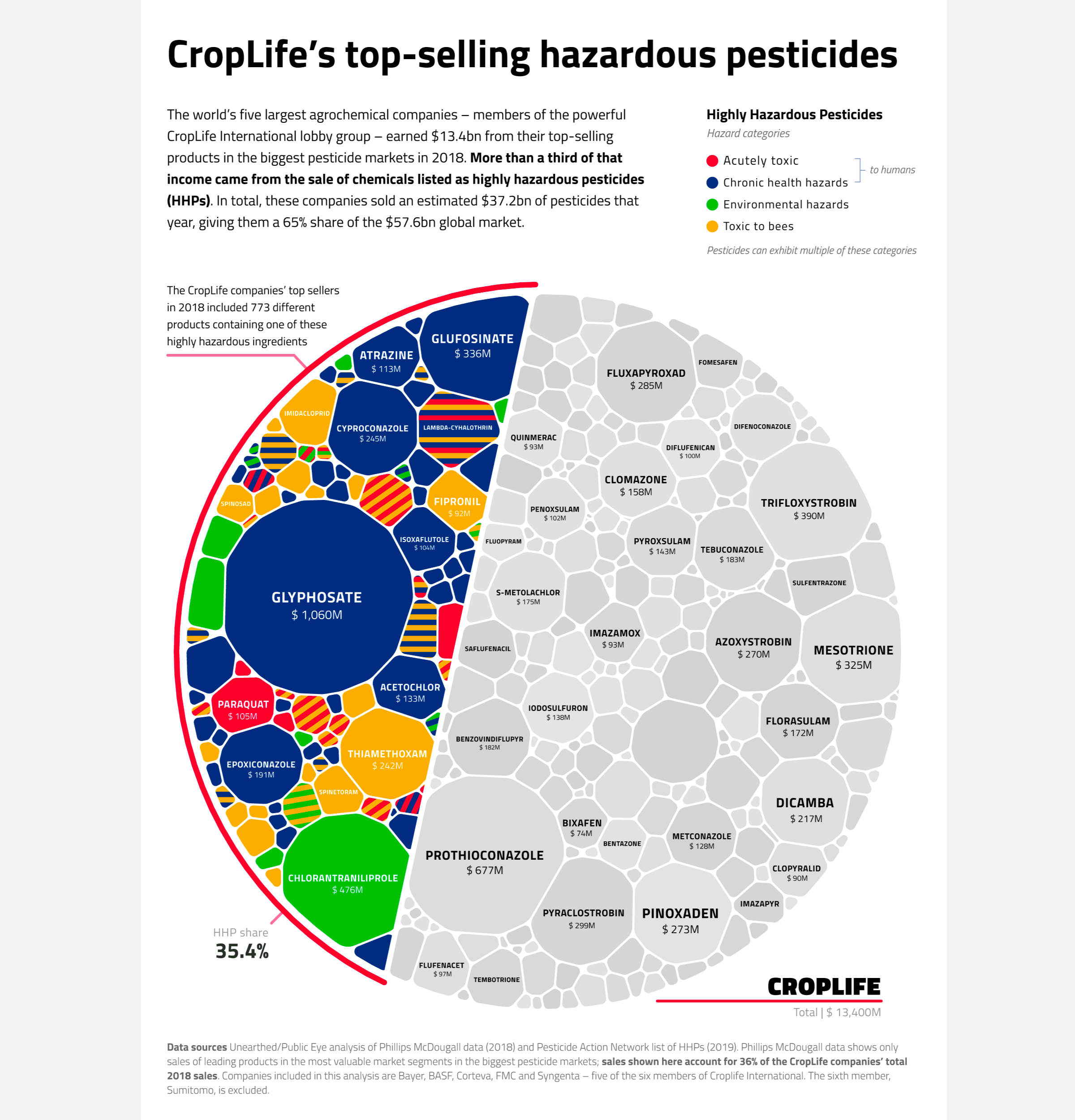
I created four different visualizations, each with a desktop and mobile version. The main Unearthed article shows three of these. There is 2nd article from Unearthed about the crops that drive the world trade in hazardous pesticides. Public Eye posted their own article that went into the different insights found from the analysis, using all the visuals.