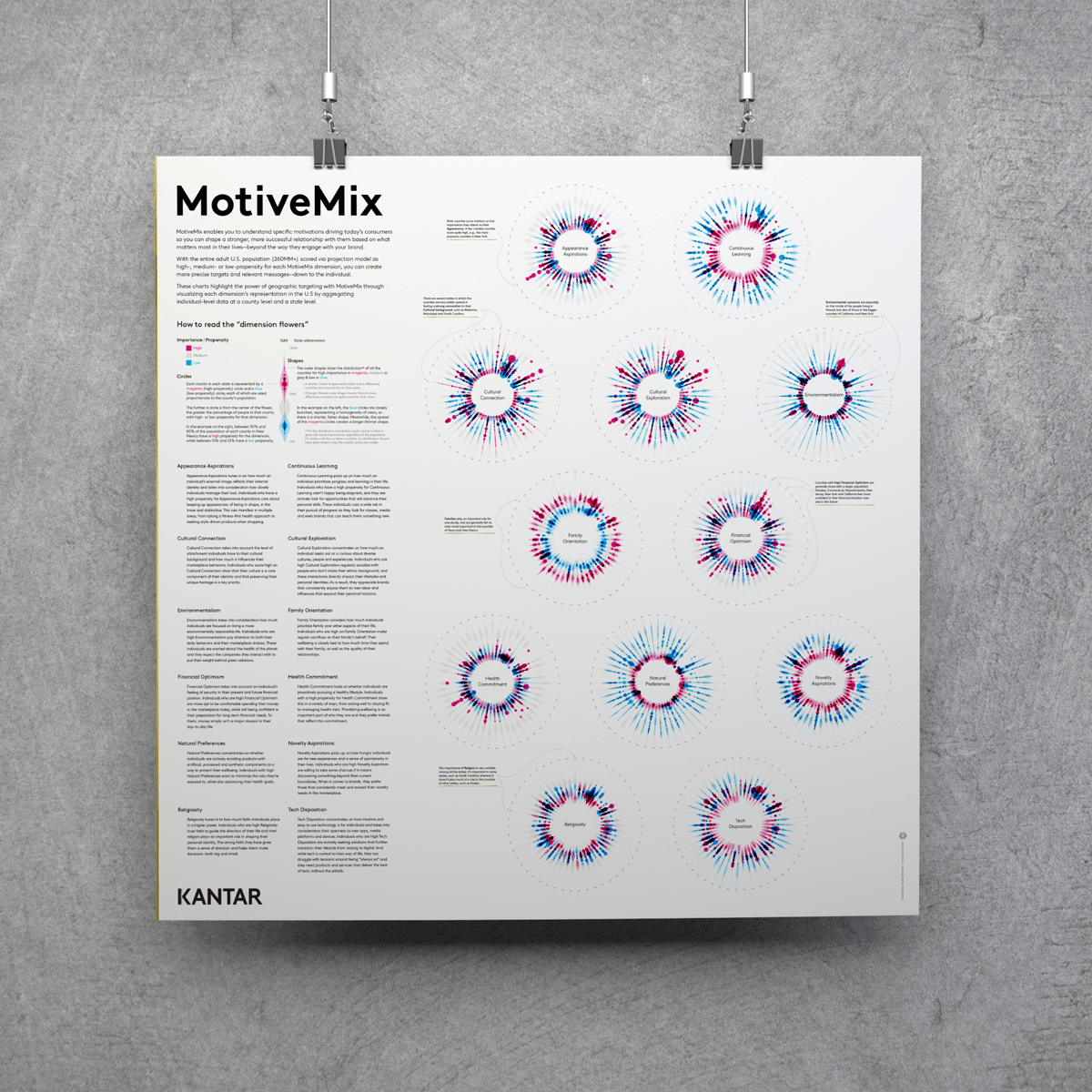
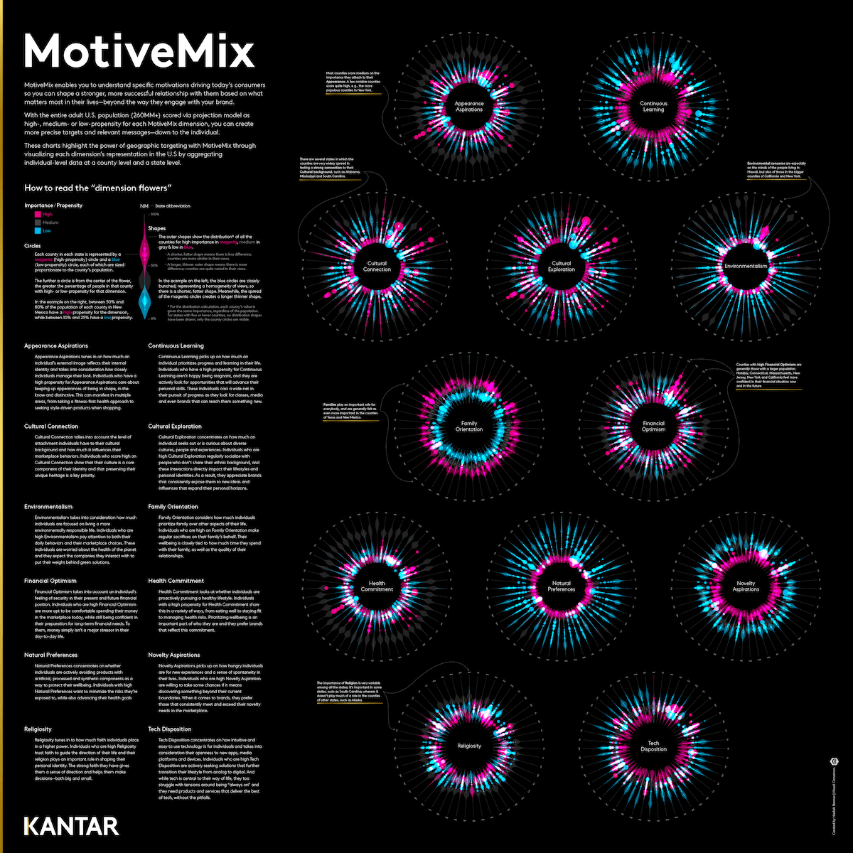
Kantar Consulting reached out to me to help them visualize their MotiveMix dataset. This dataset looks at American consumers along 12 “attitudinal dimensions”, such as Tech Disposition, Environmentalism, Cultural Connection, and more, to better understand what is important to consumers in the counties across the US. I created two very different pieces for this project. One being a large static poster that looks at each dimension per US state to see which states show interesting behaviors (e.g. different from most other states). The other was an animation that reveals how counties could show very similar values for the attitudinal dimensions, even though they are from completely different parts of the US, thereby transcending the typical geographic proximity that more traditional analysis tend to focus on.
At the start of the project I explored several different ideas. Looking at the data from the angle of the dimensions, the states, and at the lowest level, the counties themselves.
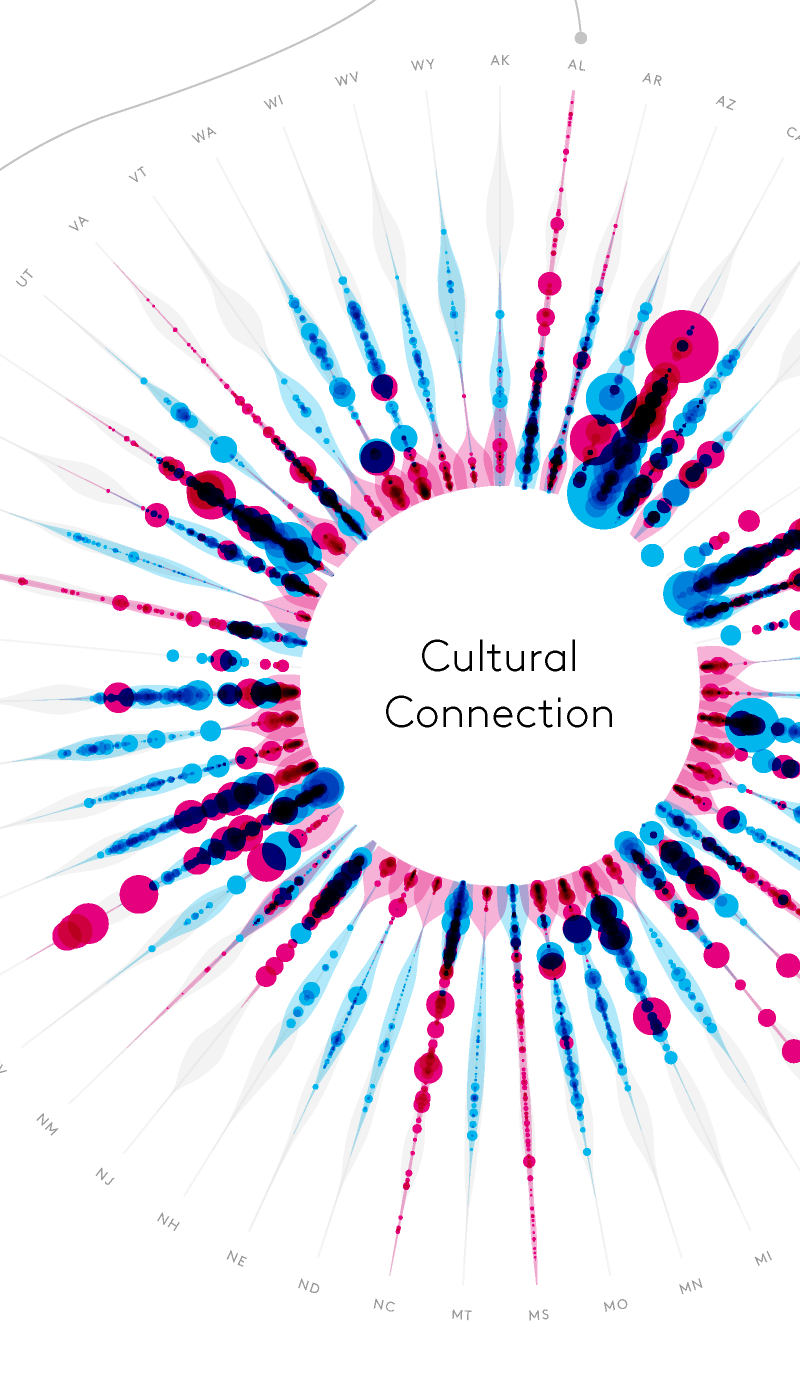
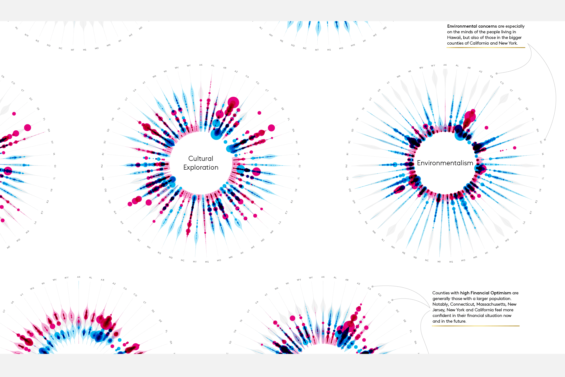
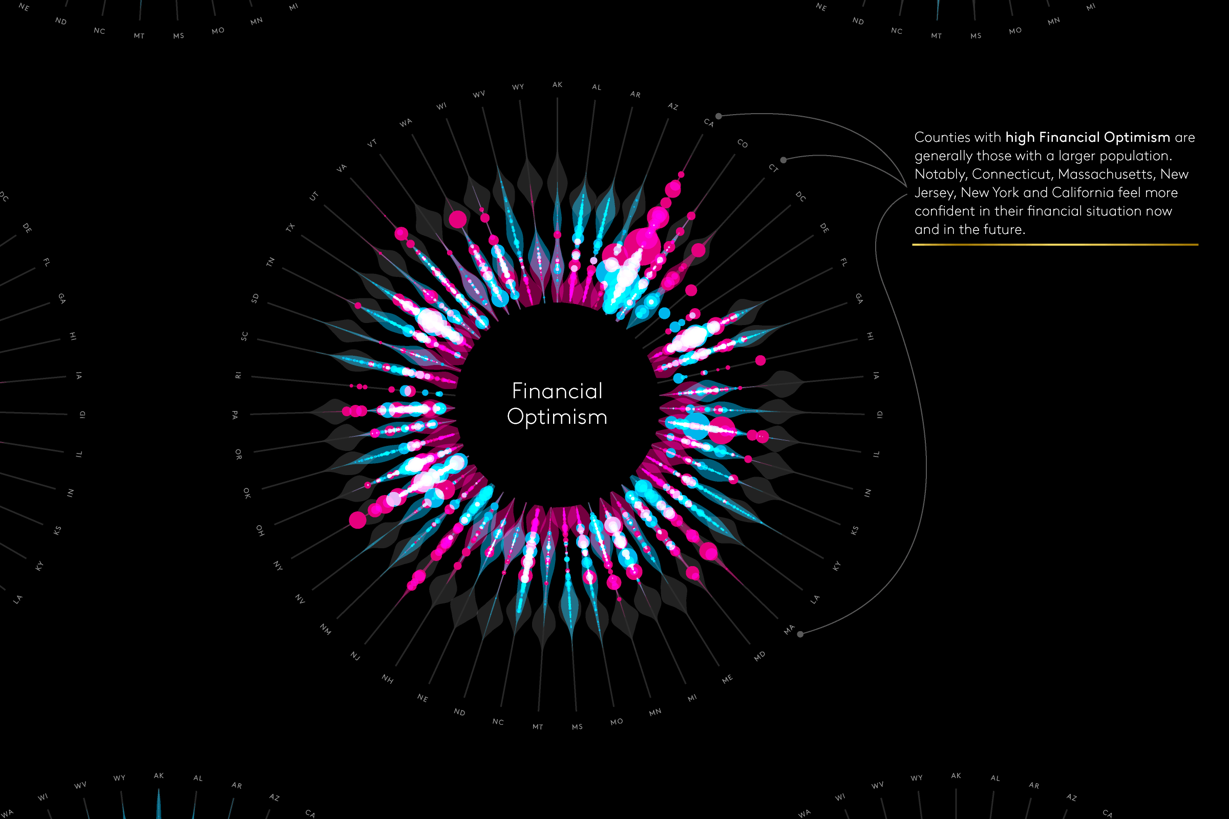
Eventually, the state level idea was turned into a large static poster (which is hanging in Kantar’s office), where the focus was also strongly on making a piece that was visually pleasing. It reveals how, in general, the counties within a state feel about MotiveMix’s 12 “attitudinal dimensions”. Is it important to them, such as Environmentalism in counties across Hawaii and California, or does it not play an important role in their lives.
In the end I couldn’t decide which background I preferred, and thus I ended up making a white and black version of the poster.
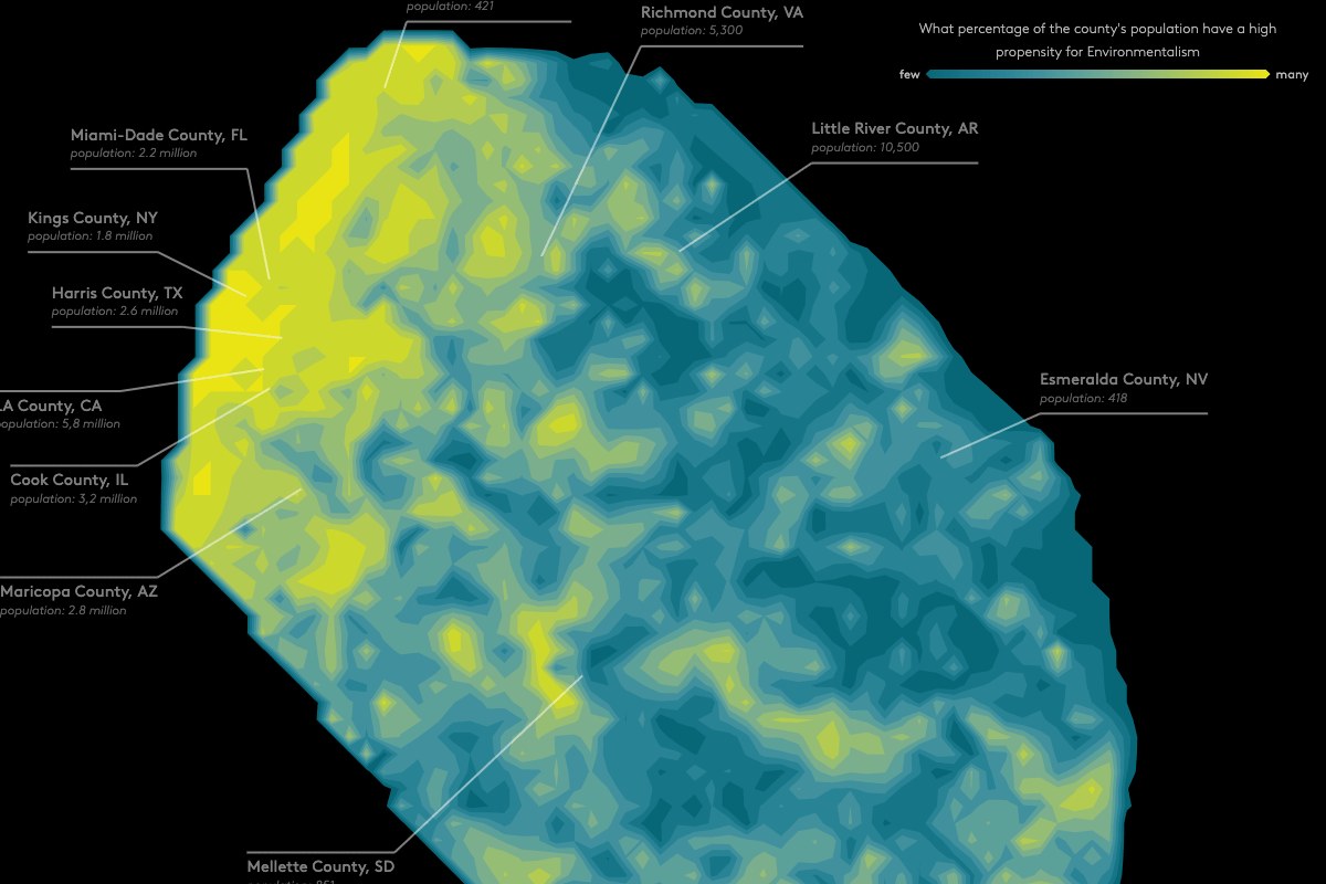
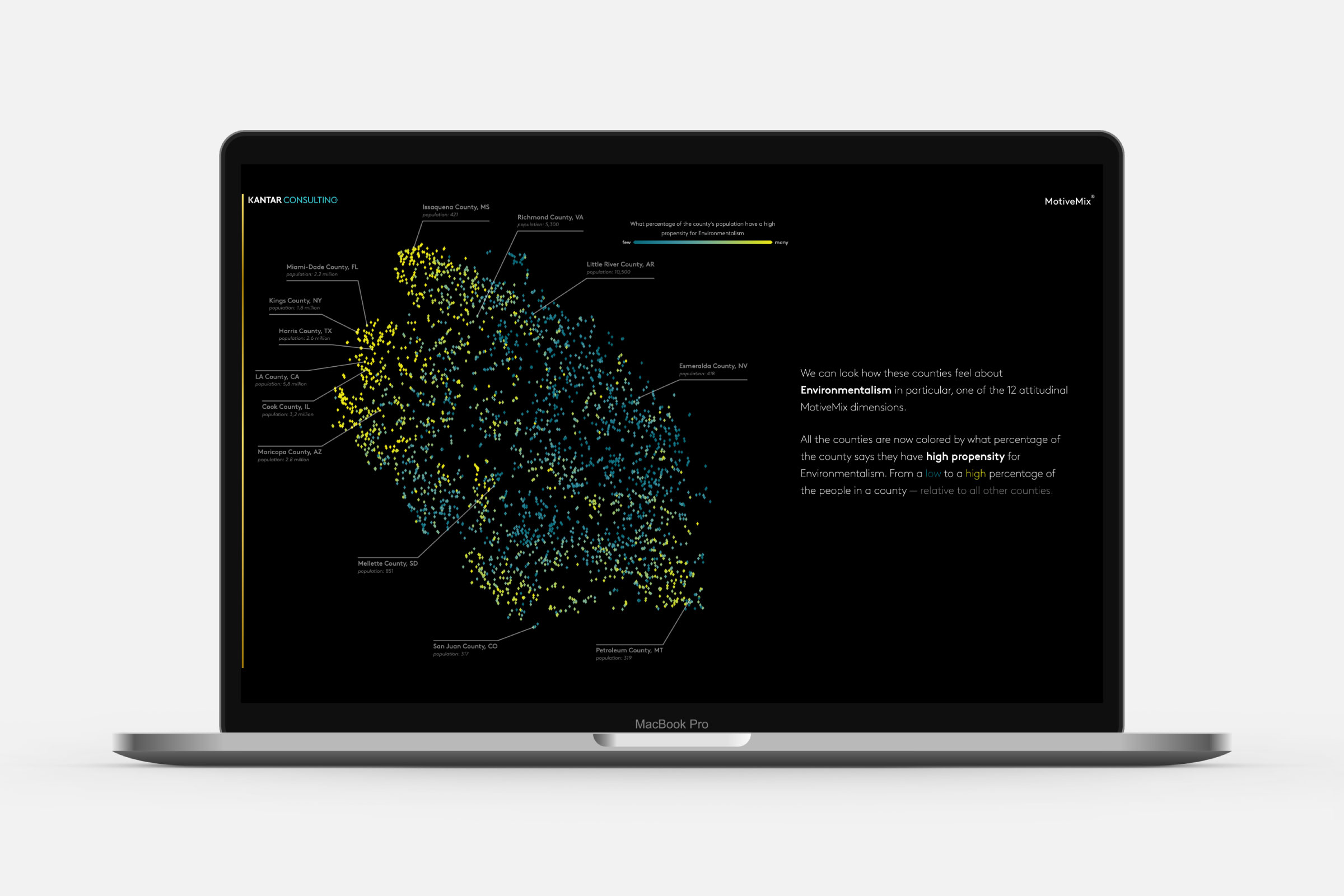
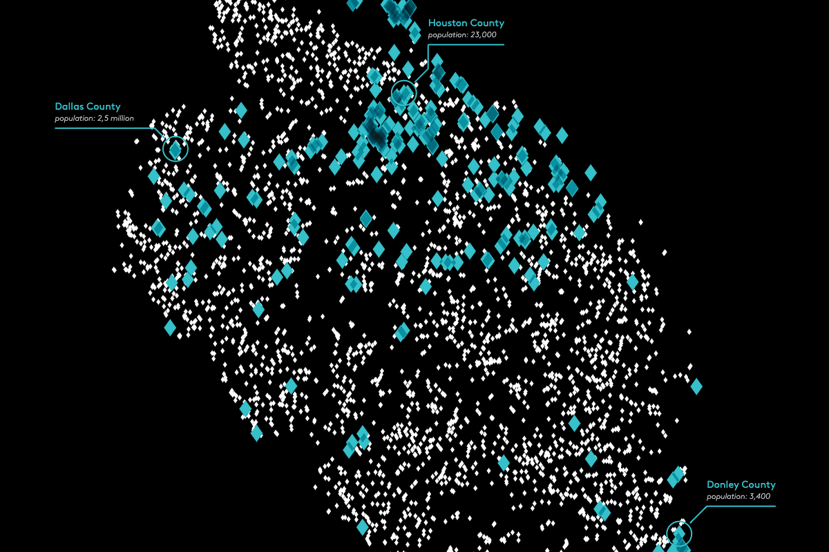
The initial “county level” idea was developed into something completely different, an animation. Instead of the usual geographic way that US counties are visualized, I wanted to create a 2D “map” that would place counties near to each other when they were similar based on their MotiveMix values, their attitudinal dimensions.
I ended up running a t-SNE (machine learning) algorithm that looked only at the attitudinal dimensions of each US county, thus placing “like by like”. The resulting shape became the focal point of the animation and together with the team at Kantar we made a storyboard on what to highlight and what text to show. Using GreenSock, I programmed each “scene” in the animation to which Kantar’s team added the voiceover, to be used as marketing material for MotiveMix.