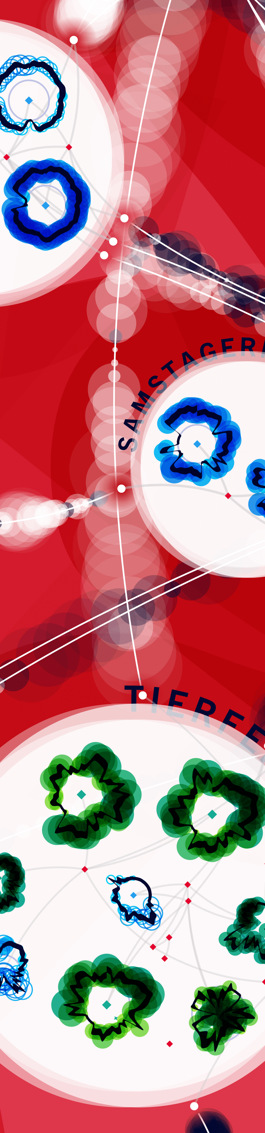
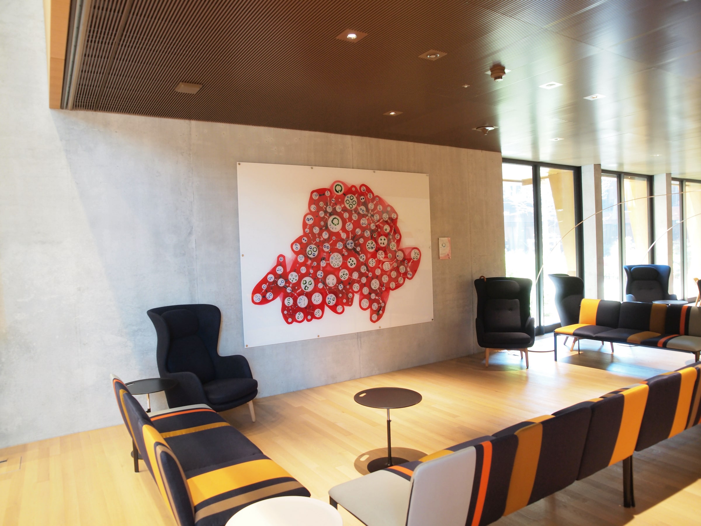
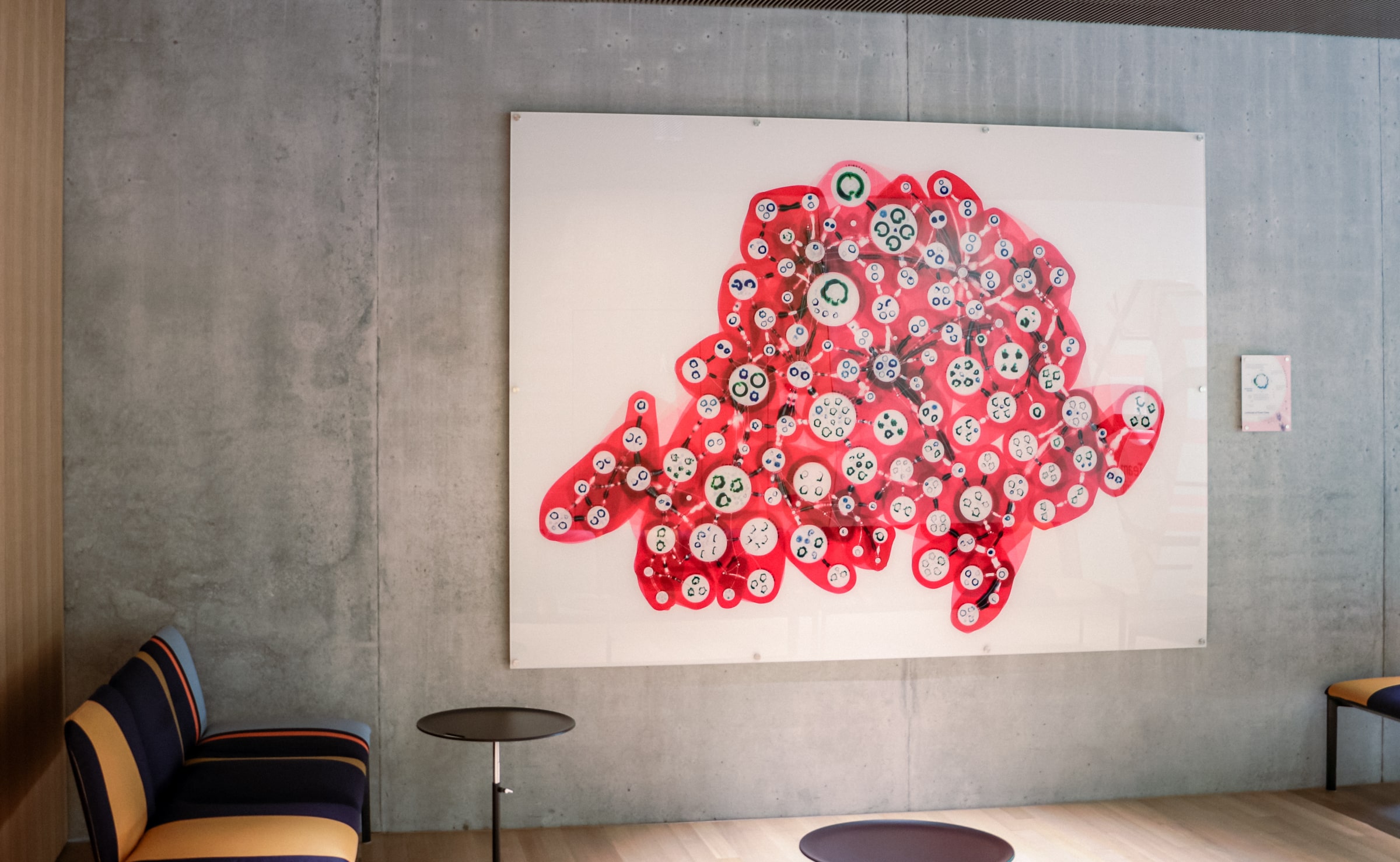
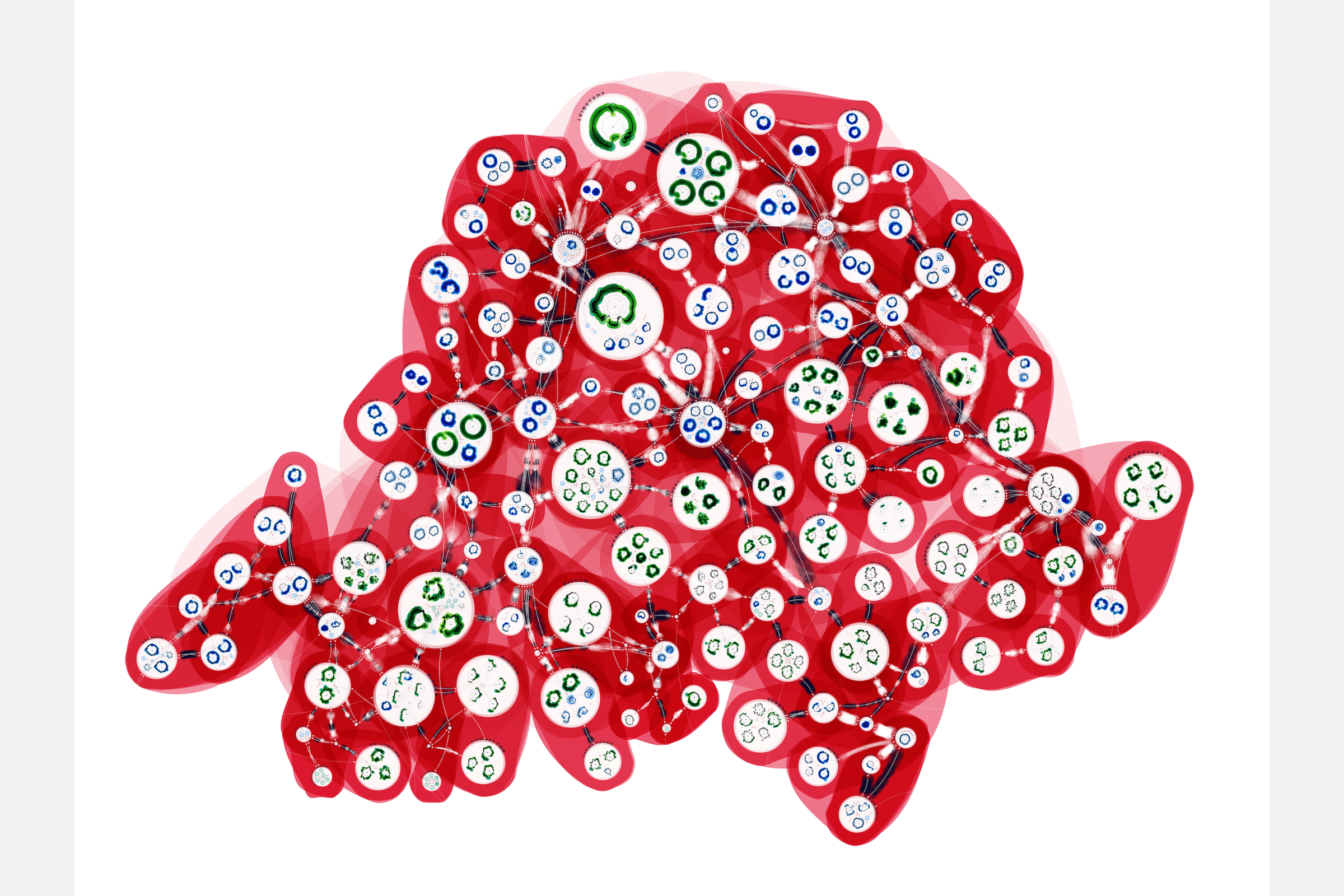
Swissgrid, the national transmission system operator in Switzerland, reached out to me because they wanted to explore an artistic way to visualize the data that is generated in their extra-high-voltage network of electrical grids. With over 60 million datapoints from the year 2019 it was quite a challenge to find the right balance of aggregating values while still showing as much detail as possible. The final result, called “Landscape of Power Flows”, became a giant work of 2m x 2.7m, printed on acrylic glass, and is now hanging in the lobby of Swissgrid’s main office in Aarau, where guests (and employees) can take in the whole visual, but also slowly explore the many details that reveal themselves the closer you get.


The client was looking for a creative way to visualize the huge amounts of data that gets gathered, monitored and acted upon each minute and day along Swissgrid’s high-voltage power lines. They were especially interested for the visual to still convey parts of the (seasonal) changes occurring in the grid, while the end result would become aesthetically beautiful. The priority was always on the data art side, not specifically to convey the data in a quick or easy to read manner.
With many different parts making up a grid, such as generators of power, places where power gets consumed (loads), substations at geographic locations, lines running between these, all of which have their data gathered every 5 minutes, the initial dataset was the biggest I’ve ever worked with; about 60 million rows of data. I started cleaning, combining and investigating parts of the dataset to get a sense of what was typical behavior. I created several different designs to visualize parts of the network, while also seeing what level of aggregation would still convey the changing nature of the grid throughout the year.
Getting the underlying network of how all the (physical) substations are interconnected to look right, and nice, took several iterations, during which I often had contact with my client to make sure we were all aligned on the way the design was progressing.
It was clear early on that this piece would become something quite big, and be printed, not digital. Several test prints were made of the final design, seeing how the details and colors came out on different types of art paper. The client eventually decided to also try acrylic glass, on which the piece could be printed even larger than was possible on the art papers. The tests came out looking crisp, vibrant, and beautiful, and I created the final file to be printed at 2x2.7 meters on glass.
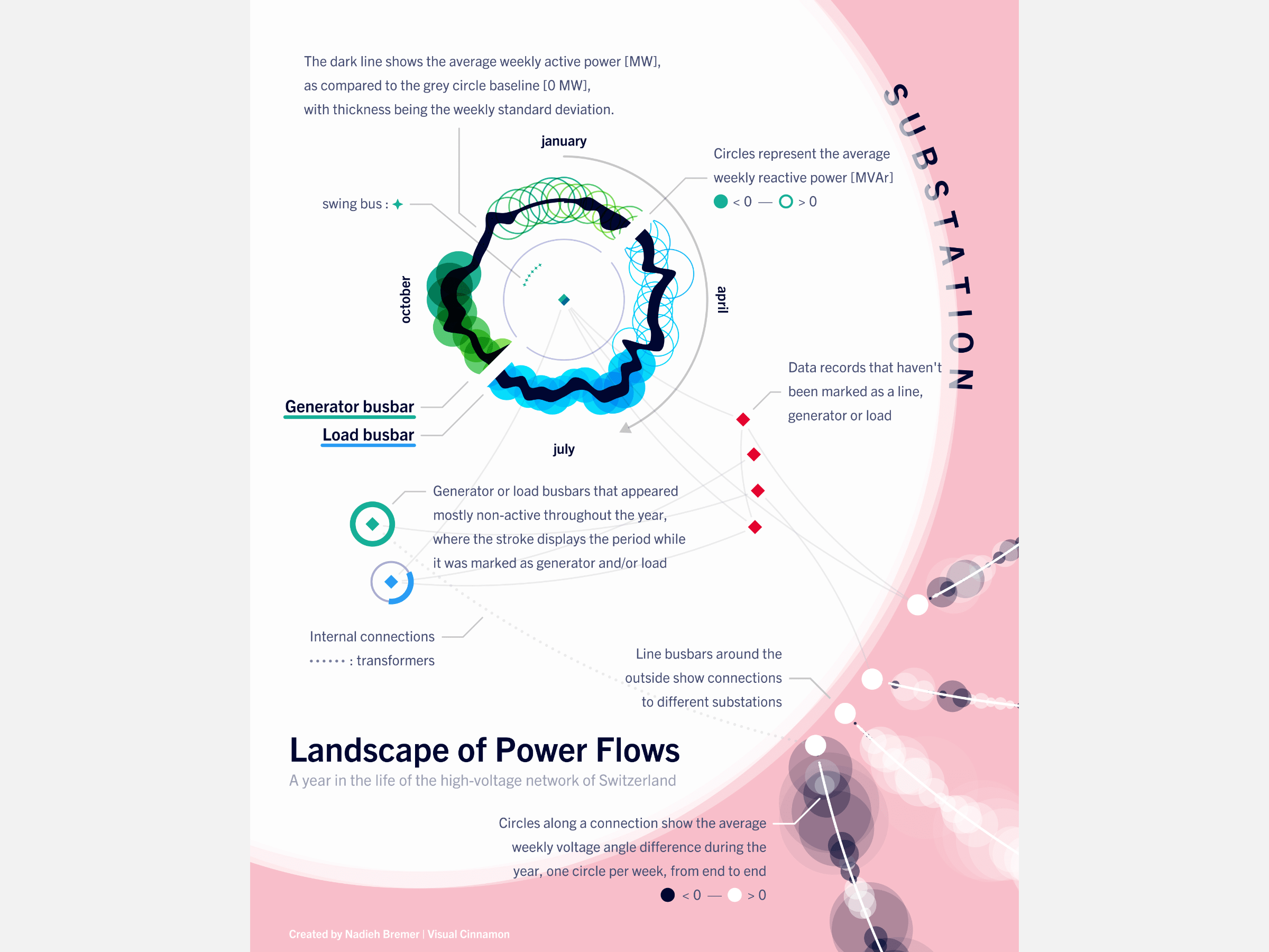
My contact at Swissgrid presented the final piece to the board of Swissgrid who were “truly fascinated and enthusiastic about it”. It has now gotten a prominent location in the lobby of Swissgrid’s office in Aarau (together with a legend next to it that explains how to read the visual, if the viewer would like to understand it - see the image below).