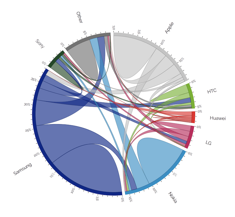
For the Dutch version of the Deloitte Global Mobile Consumer Survey, Deloitte asked 2000 residents of the Netherlands about their mobile phone behavior. The respondents gave information about the brand of their current main phone, and the brand of their previous main phone, and their answers are visualized in this data story.
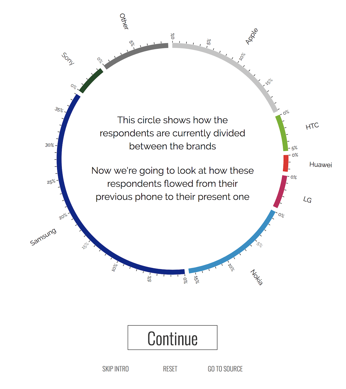
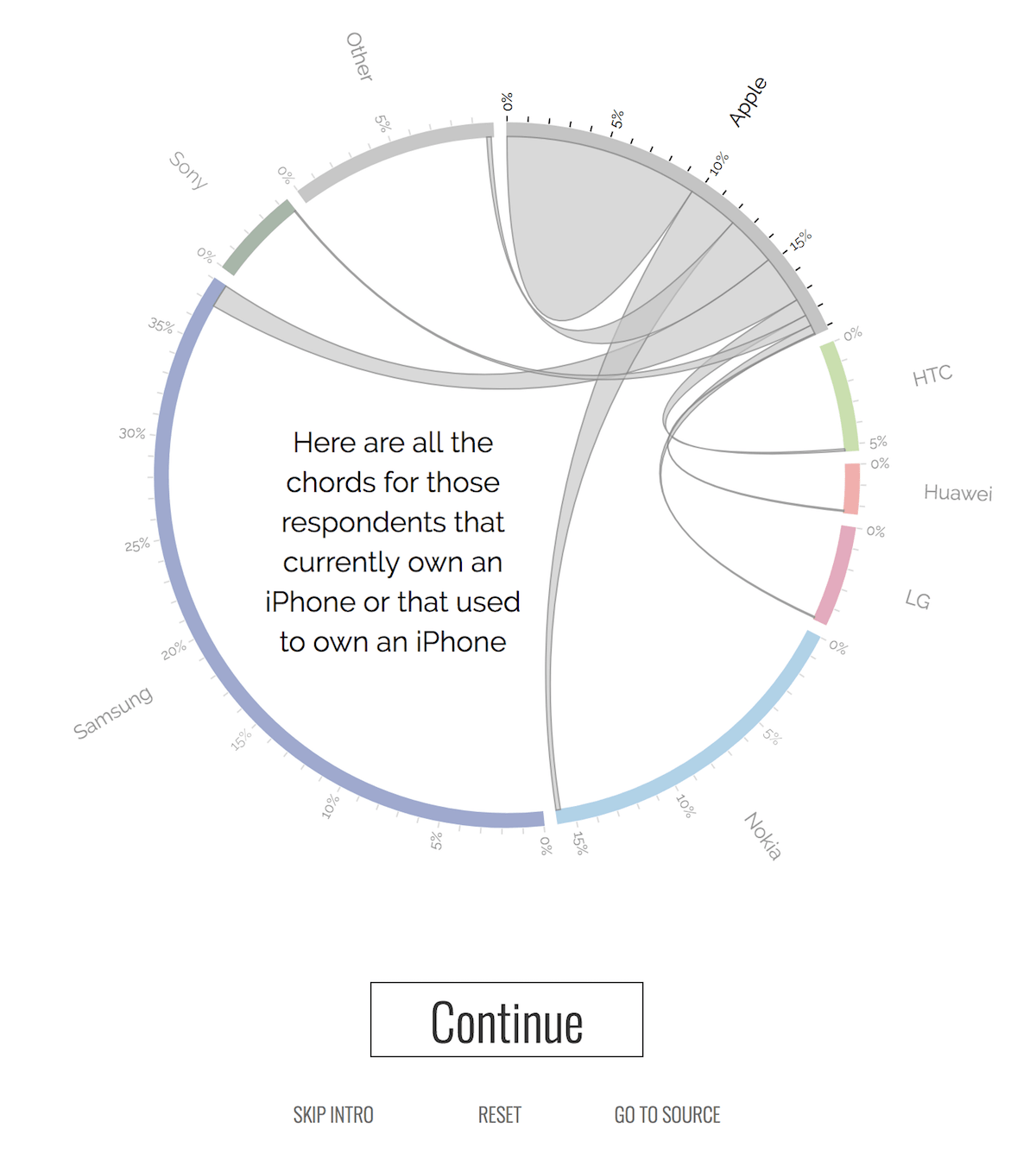
After viewing a talk by Michael Freeman on the Strata conference in Barcelona at the end of November 2014 on Storytelling with data I was inspired to try and tackle one of the visualizations I have most trouble with in terms of explaining to an audience; a chord diagram. I set up the chord diagram piece by piece, explaining what each section means and how it all comes together to tell the story about phone brand switching.
You can read more in my blog about the insights and the approach of Storytelling with data.