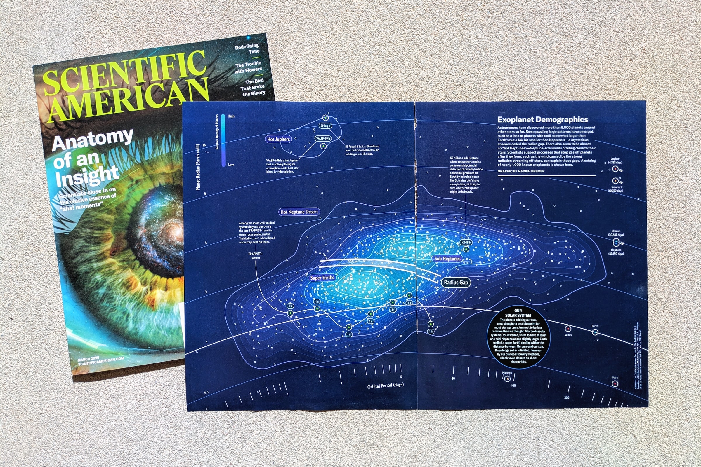
Scientific American commissioned me to create a data visualization for an article exploring the “radius gap.” This is a puzzling absence of exoplanets within a specific size range, larger than Earth but smaller than Neptune. The goal was to illustrate this phenomenon in a way that was both scientifically accurate and visually compelling. Rather than relying on a traditional scatterplot, I aimed to design something more engaging while still making the data accessible to readers. The final visualization, inspired by sci-fi aesthetics, uses a polar plot with density contour lines to highlight the two distinct populations of exoplanets: Super-Earths and Sub-Neptunes. This approach not only made the radius gap apparent but also provided a striking, intuitive way to compare these distant worlds to our own solar system.
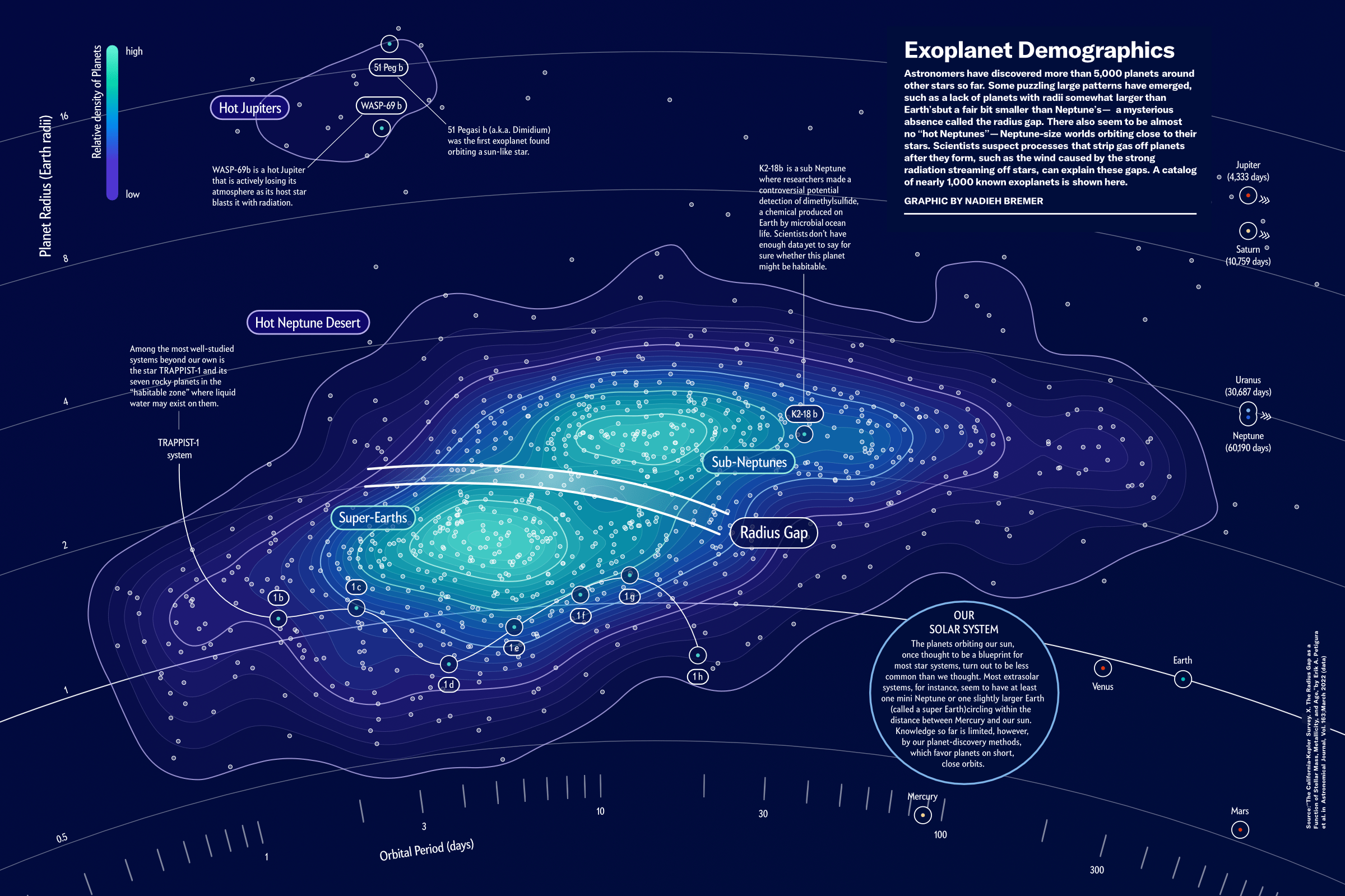
The original text and images provided by the author included a scatterplot illustrating the radius gap using density contour lines. The plot highlighted a band between two clusters where fewer planets existed. While the visualization effectively conveyed the data, a basic scatterplot felt too simplistic to justify a full magazine spread. I wanted to create something more visually engaging.
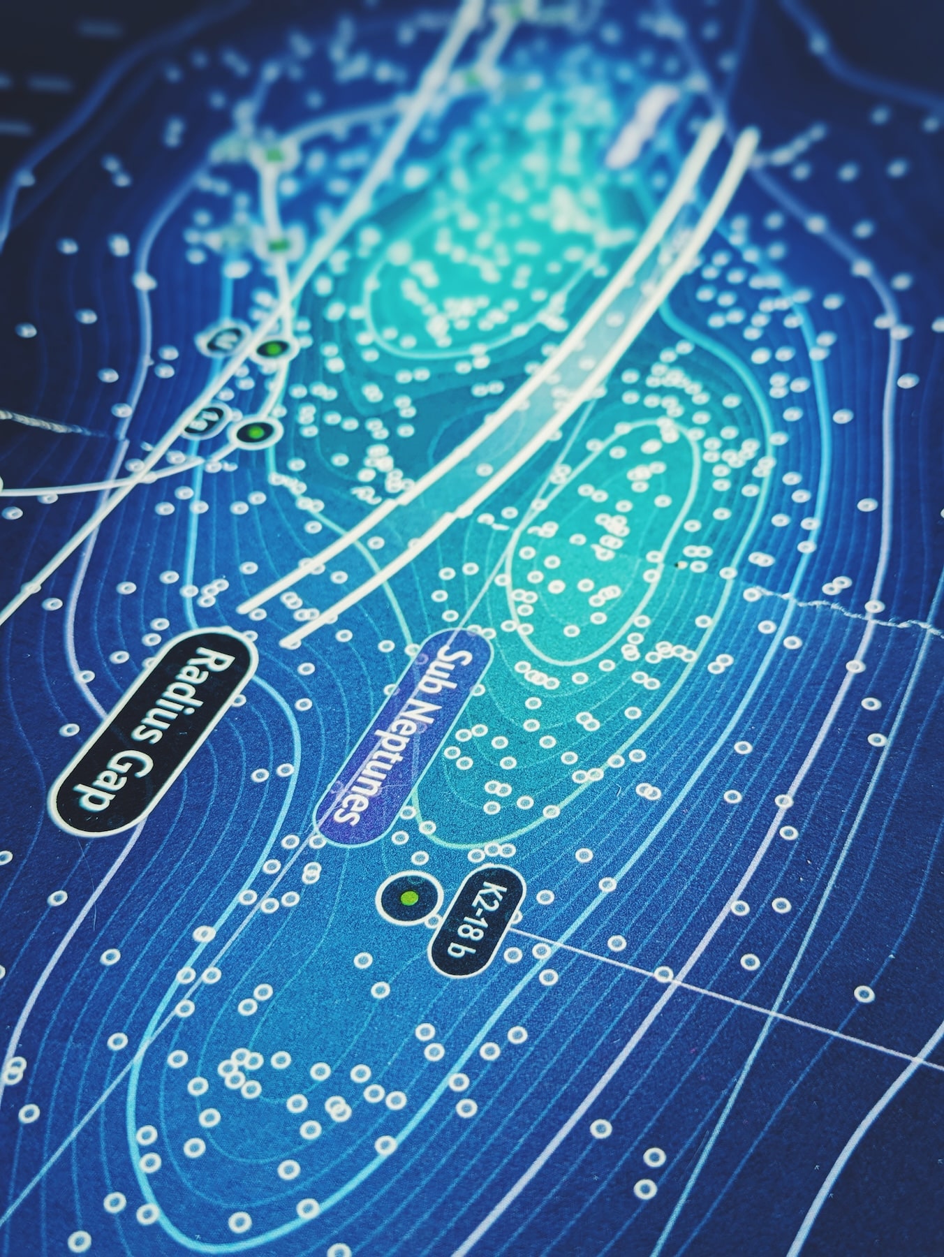
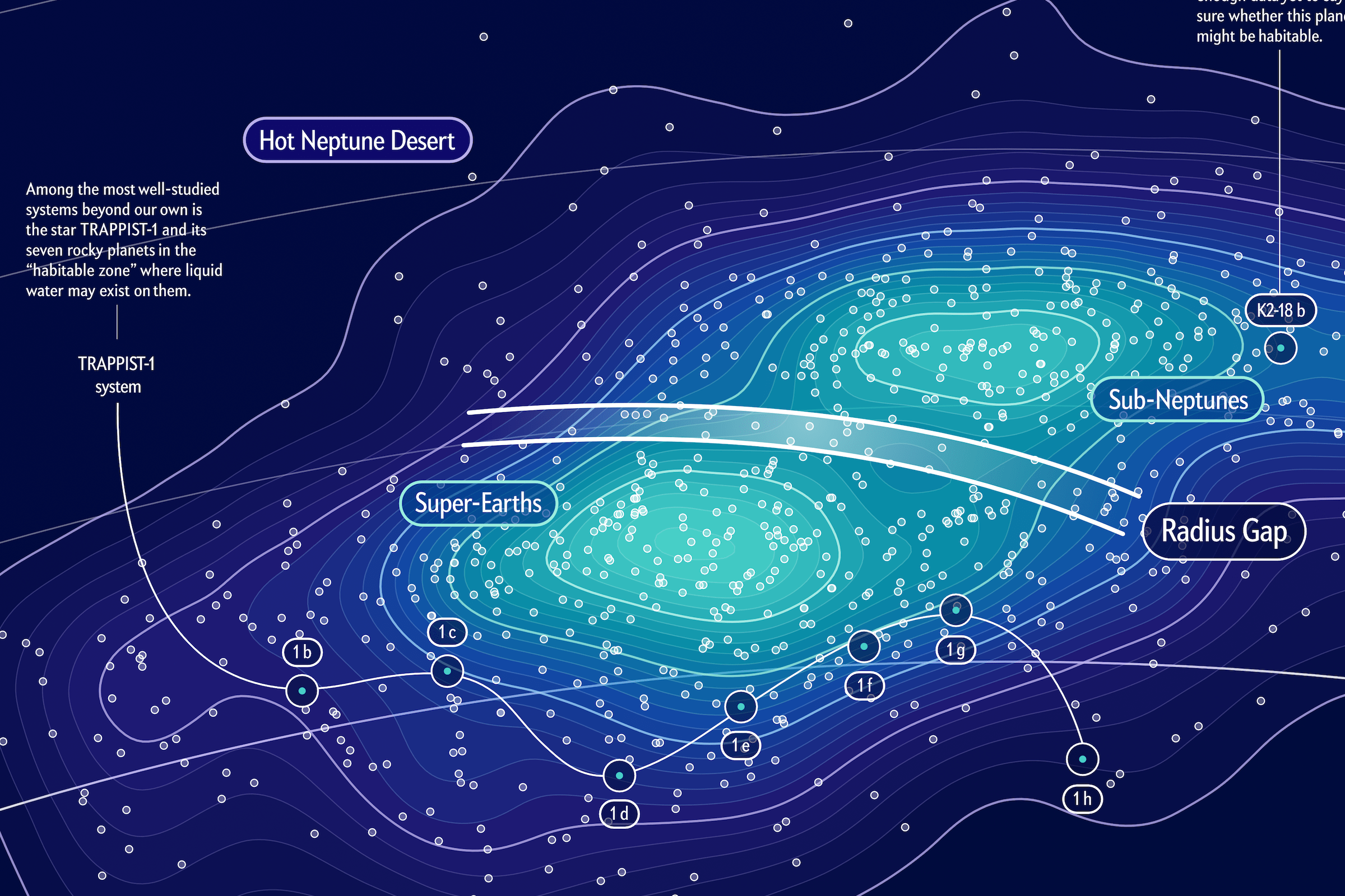
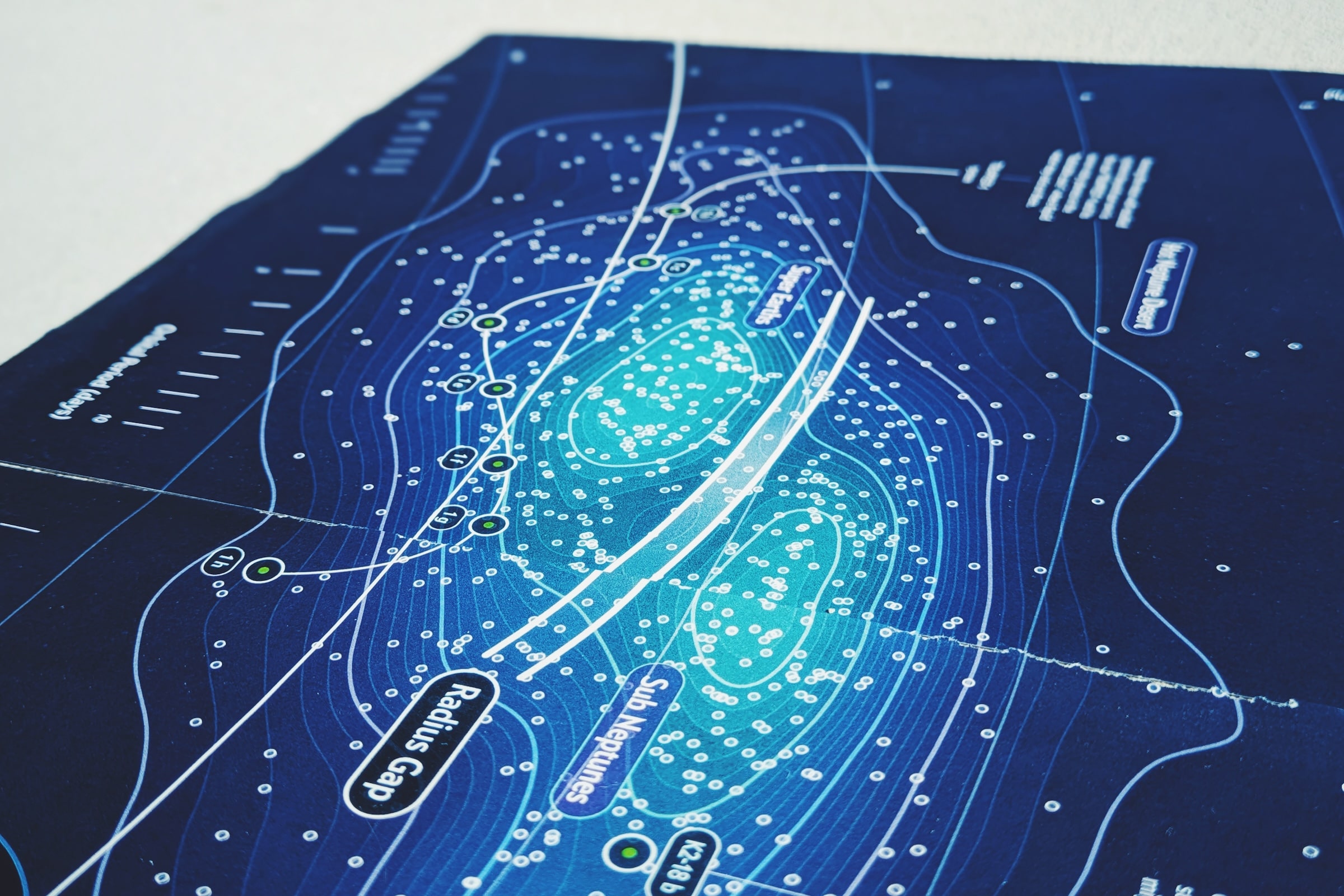
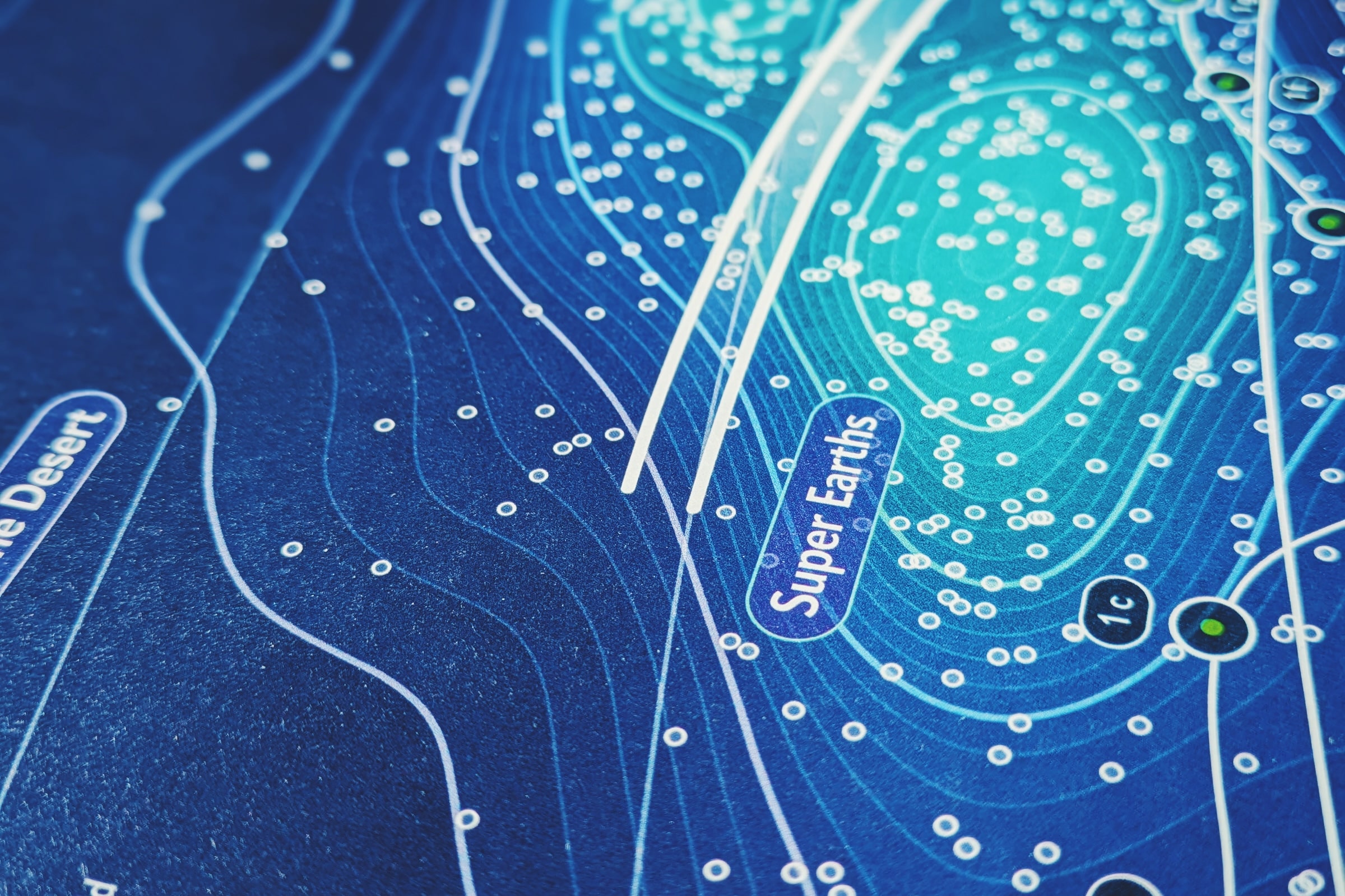
However, after analyzing the data and running tests, I found that the radius gap, while statistically significant, was not as visually pronounced as I had hoped. It was noticeable but not strong enough to support my initial design concepts. I explored alternative approaches but ultimately had to acknowledge that the most effective way to make the pattern visible to the human eye was by retaining the scatterplot format with density contour lines. These contours helped distinguish the two main planet populations: Super-Earths and Sub-Neptunes.
To enhance the visual impact, I transformed the standard x-y scatterplot into a polar plot. Here, planetary radius was mapped along the plot’s radial axis, while the orbital period was represented by the angle. By using an extremely large radius and a narrow angular range, the plot maintained a familiar scatterplot-like appearance but with a slight curvature. This approach also reinforced the link between the plot’s radial scale and the actual sizes of the exoplanets—larger planets appeared at larger radii.
For additional context, I included the planets of our solar system to highlight how these exoplanets compare—raising the question of whether they are unusual or if our own system is the outlier. Inspired by classic sci-fi aesthetics, I used a palette of bright greens, rich purples, and deep blues to transform the scatter-polar plot into an eye-catching, informative visualization.