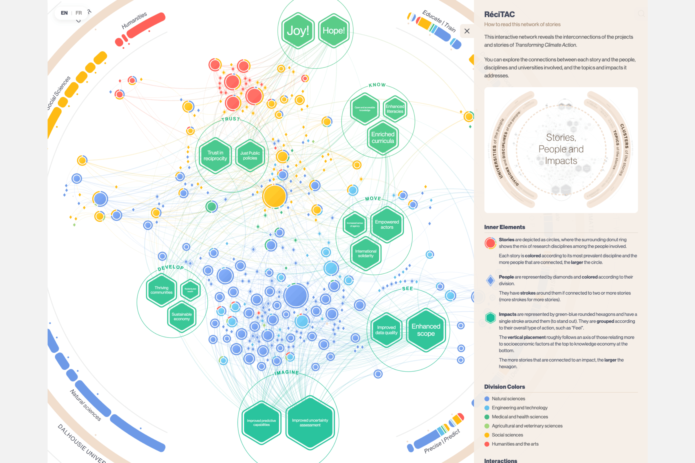
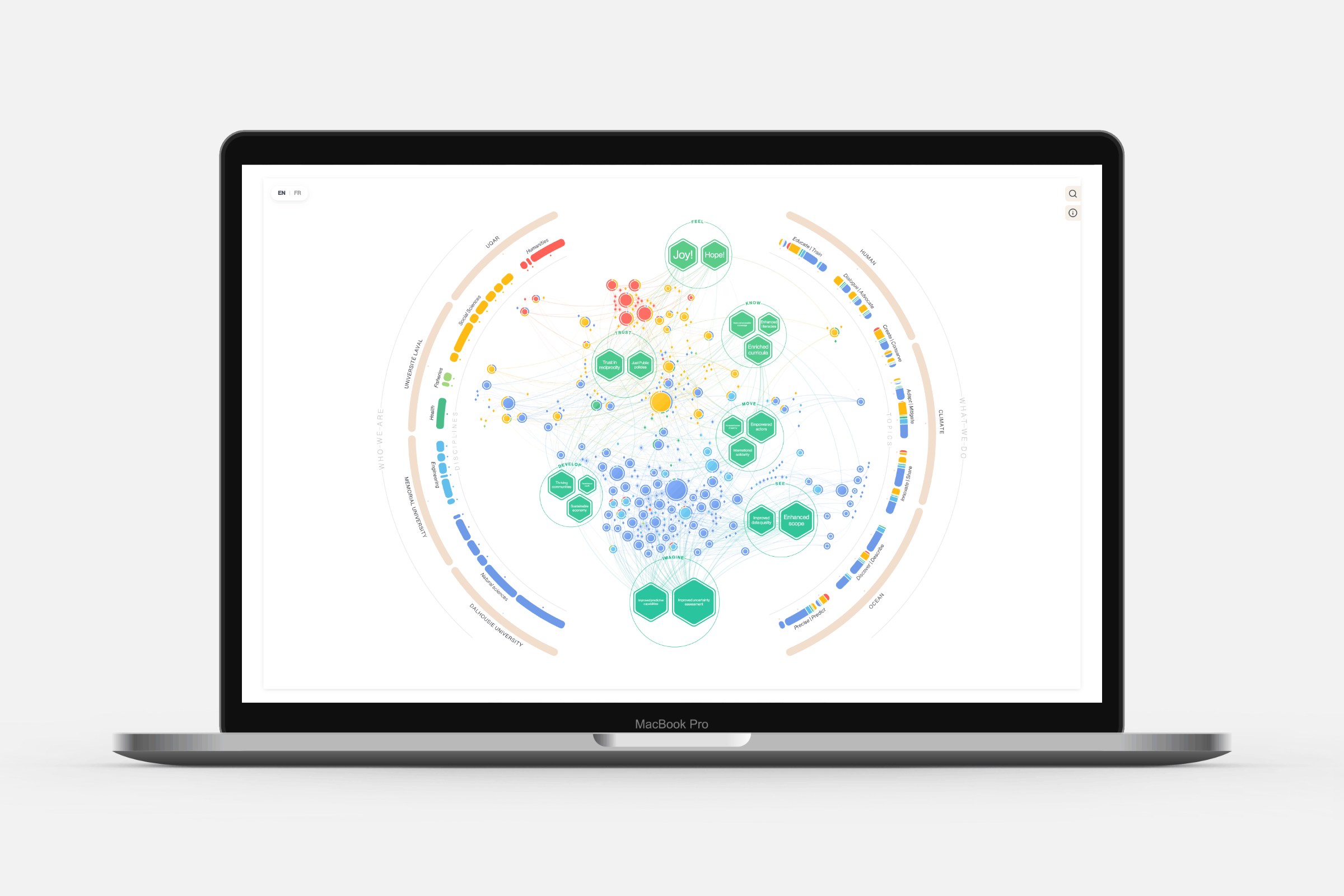
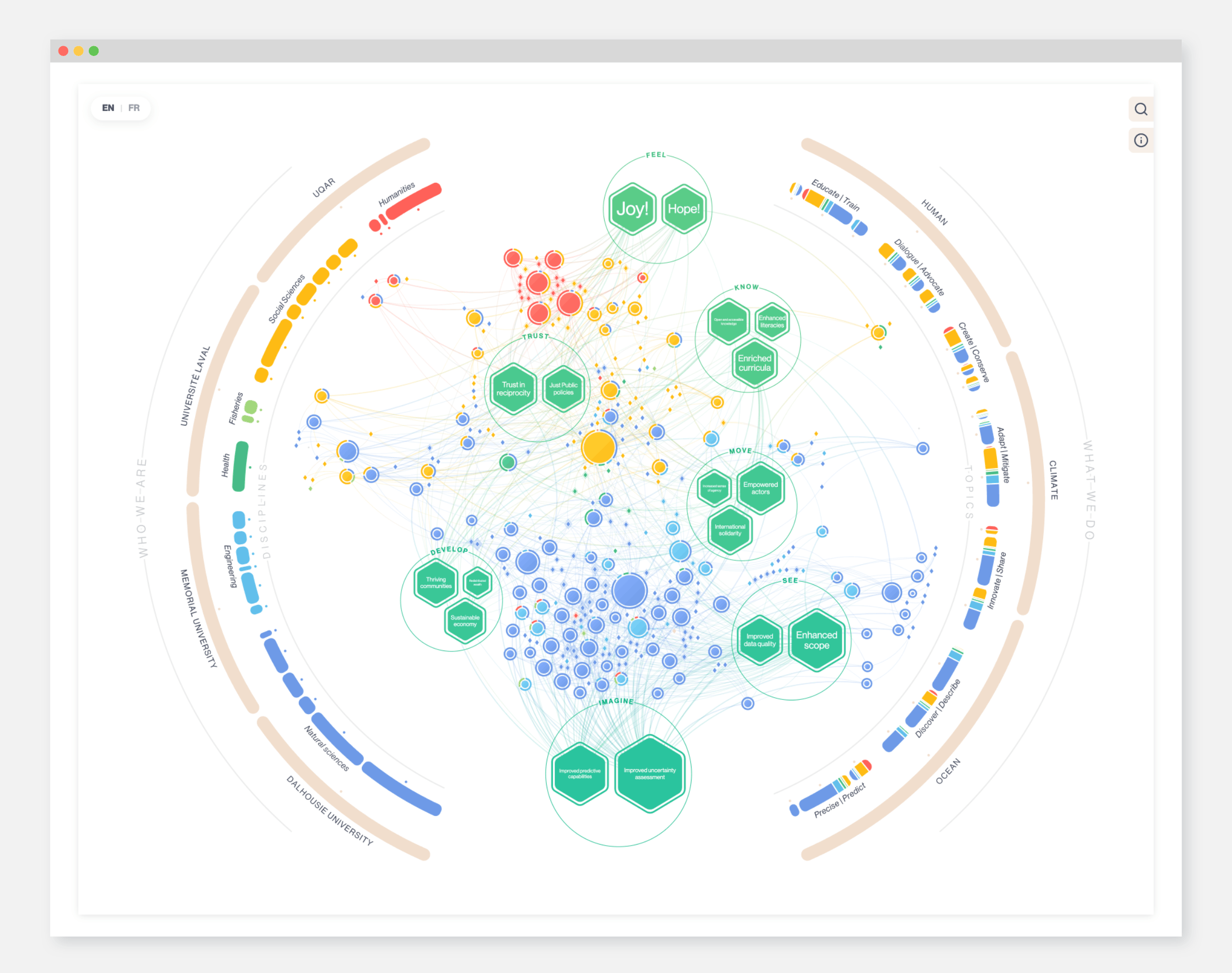
I was approached by the Transforming Climate Action program, a team of researchers from four Canadian universities (Dalhousie University, Université du Québec à Rimouski, Université Laval, and Memorial University) working together to support just and equitable climate adaption, advance responsible marine carbon dioxide removal science and reduce critical uncertainty in the climate system. The team overseeing the massive project was looking for a visual way to show how the researchers were connected through collaborations across various projects. The resulting network is an inviting and playful way to encourage exploration and discovery of the people and projects within the program. Visitors can hover and click on nodes to discover details, filter by discipline or project, and more.
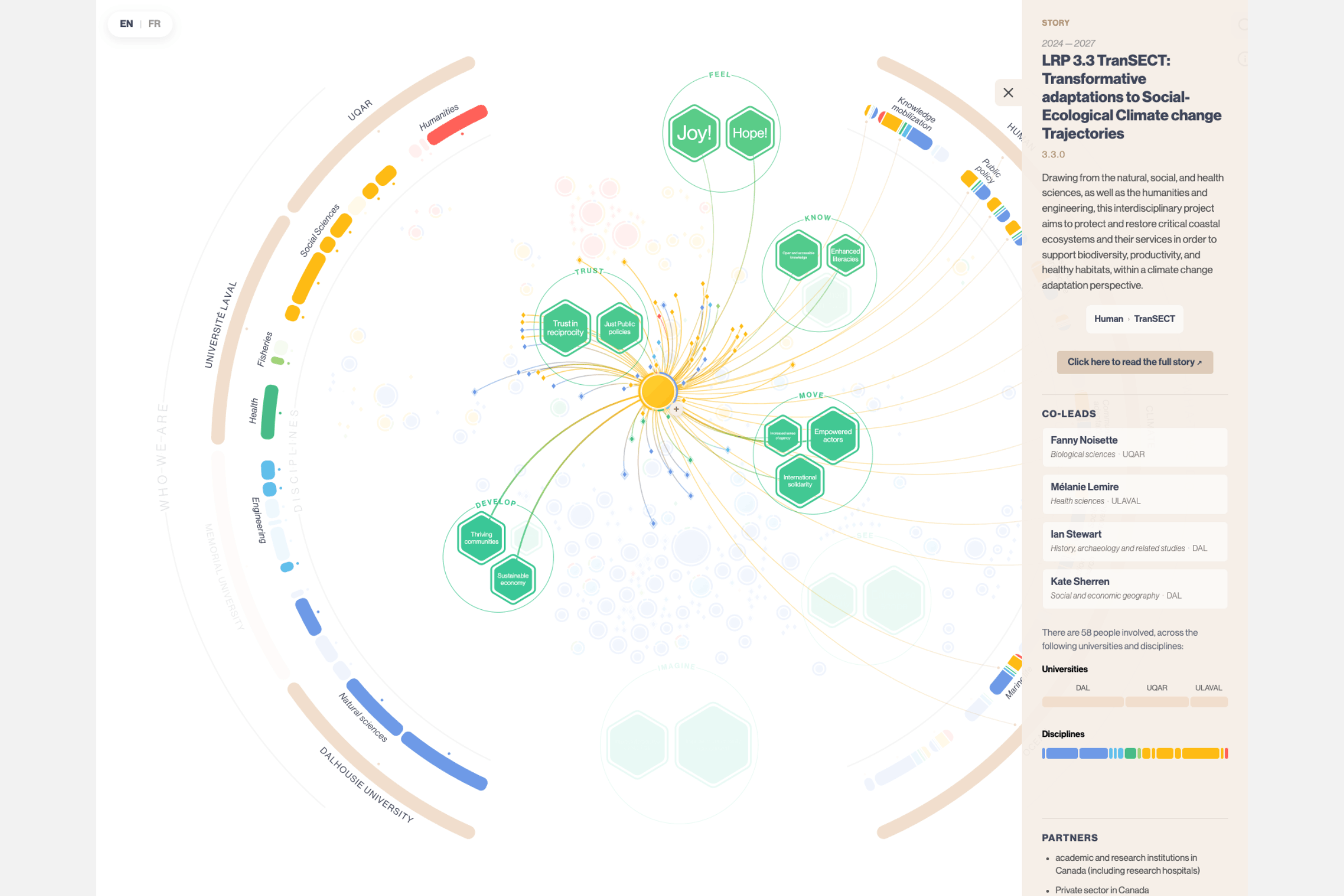
This network posed quite a challenge at the start. There were a lot a different types of “entities” to show in the network, such as projects/stories, people, impacts, disciplines, universities, topics, and overall themes. Simply turning each of these into circles connected with lines would result in a visual clutter of same-ness without focus.
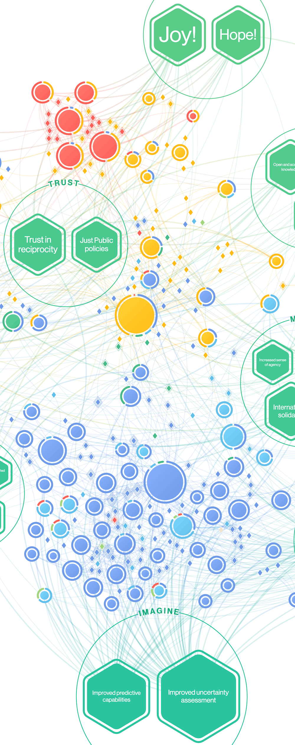
Through conversations with the team I learned that it was the stories, people and impacts that were the most important. I suggested to place those as elements in a central network, while the other entities would be visualized in two semi-circles along the outside (like two hands holding the central portion). Along the left are the parts that relate to the people “who we are”, while the right semi-circle shows “what we do”.
A main point was to show how people with background from different scientific fields (e.g. natural sciences and social sciences) worked together on projects. To highlight this, I added a small donut ring around each project/story that reflected the backgrounds of all connected people (colors represent scientific disciplines).
The final result has many forms of interactivity to give the viewer the option to explore the network. You can hover people and see what other things they are working on. You can click on a large circle and see detailed information and even hover on various parts of the information panel that highlights the relevant parts of the network. You can filter by discipline, team and more. This gives the viewer a playful way to discover connections.
Working with the RéciTAC team, we came up with a “database” within Google sheets where it was easy for the team to keep adding new projects, people, etc. The visual will automatically show these updates, making it able to grow and adapt to the new stories over the next few years.