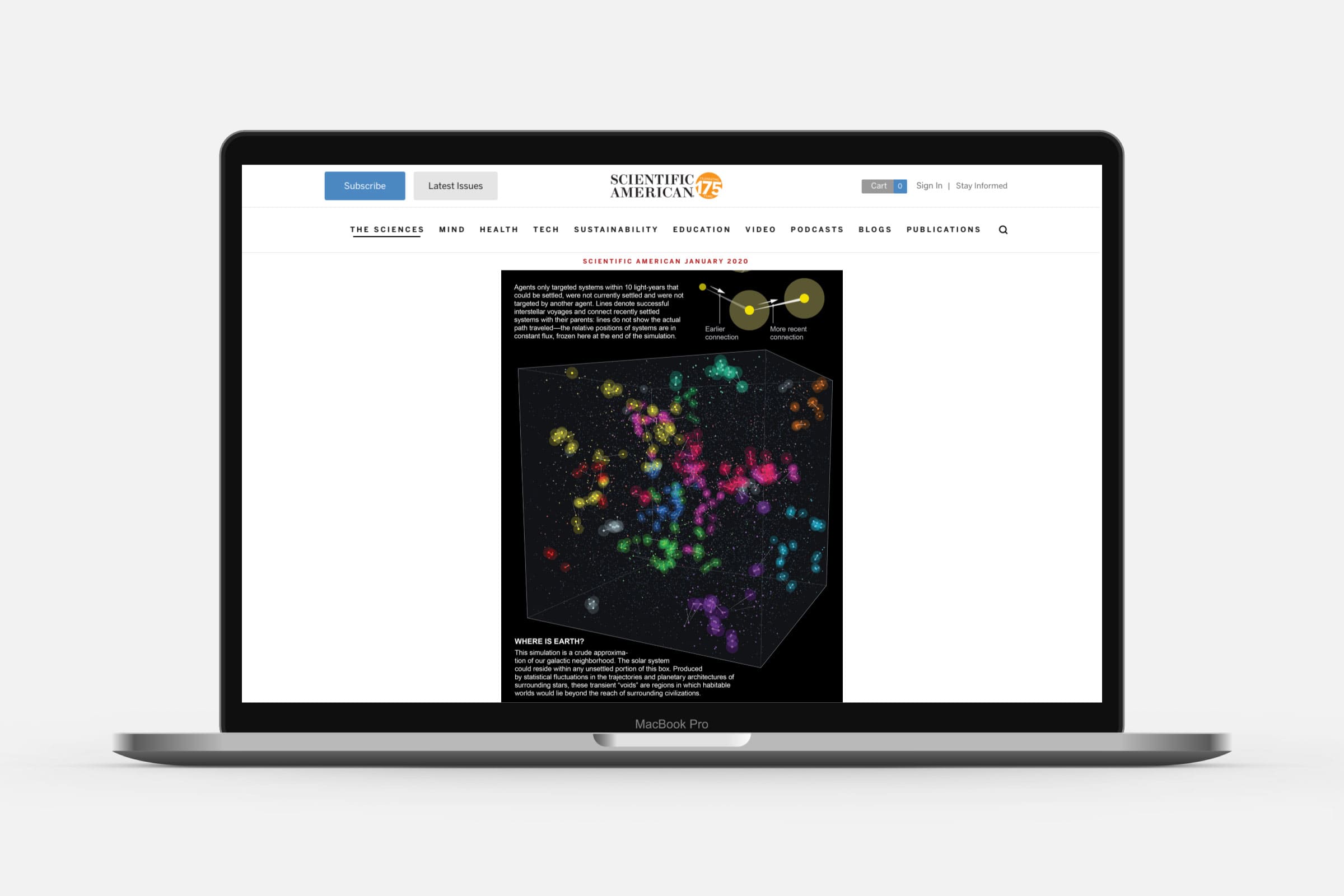
One of the main articles in the January 2020 edition of the Scientific American was about a new simulation that had been performed to address the Fermi Paradox (if there are aliens, why haven’t we met). Scientific American was looking for a full spread visualization to accompany the article. After reading though the scientific paper and draft of the Scientific American article, I proposed to visualize the final state of the simulation, showing a tiny cube of space. I felt this would reveal the main insight best to a more general audience; that it’s perfectly possible for our Milky Way to be settled by alien civilizations, but that our Earth happens to be in a local void, currently unreachable.
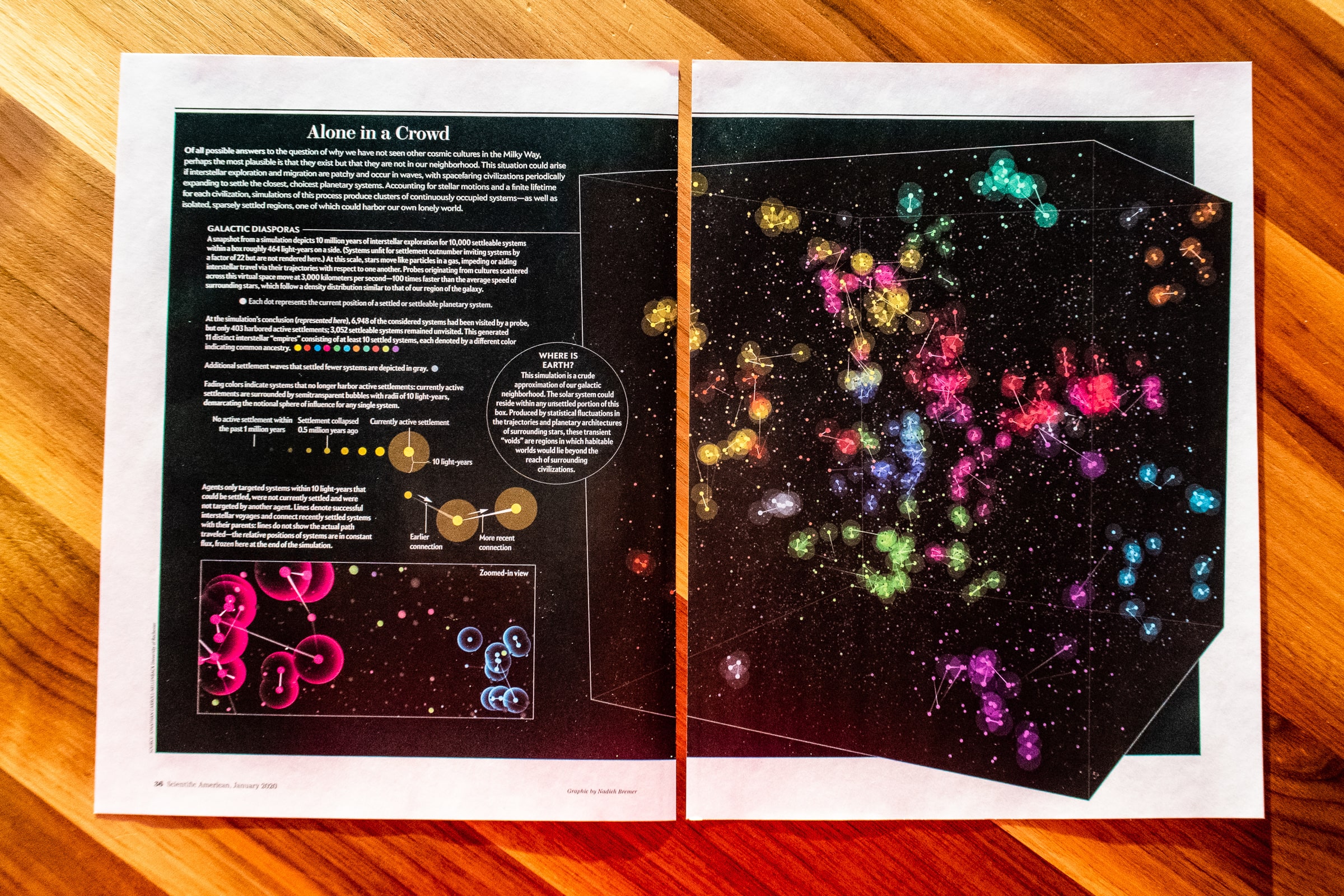
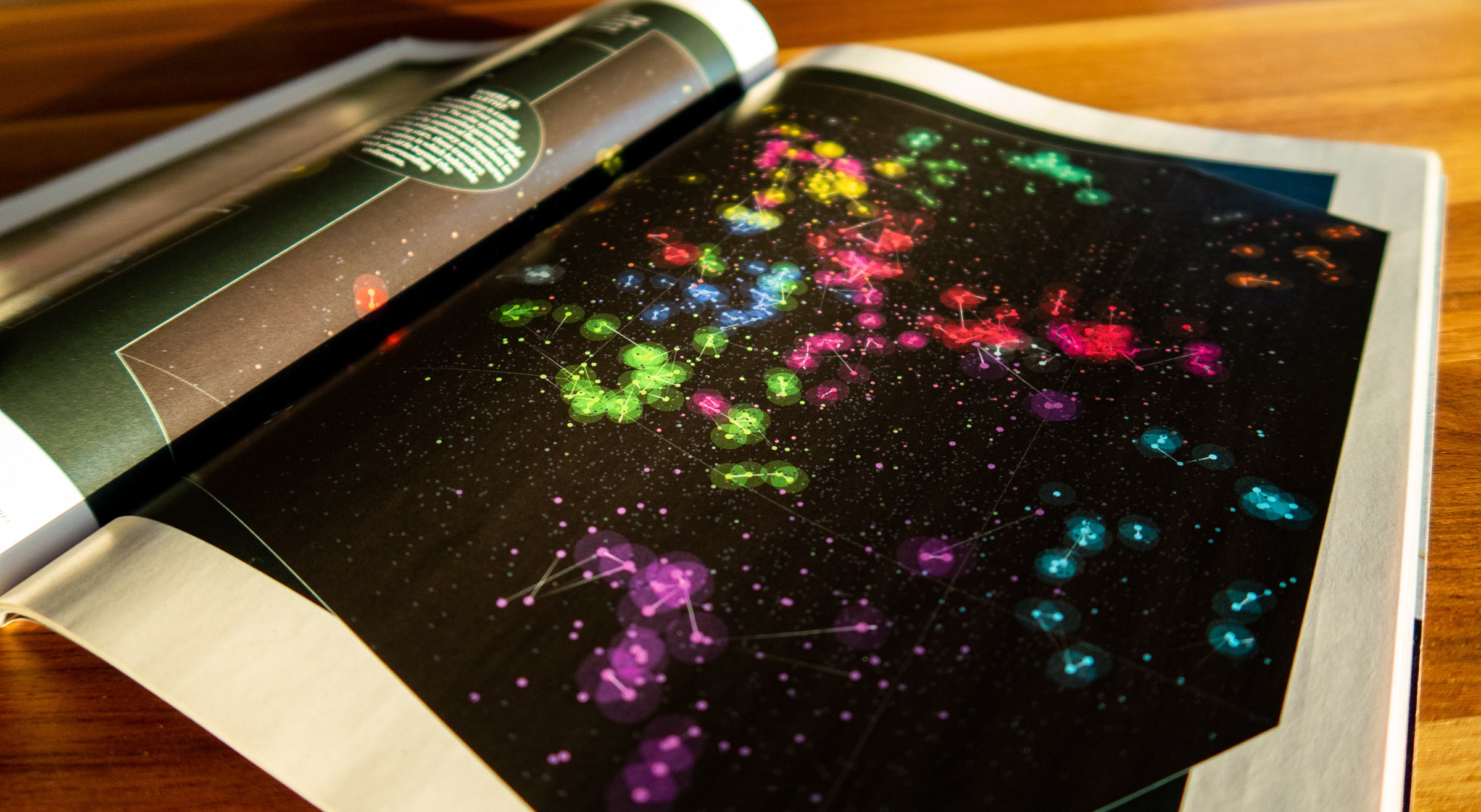
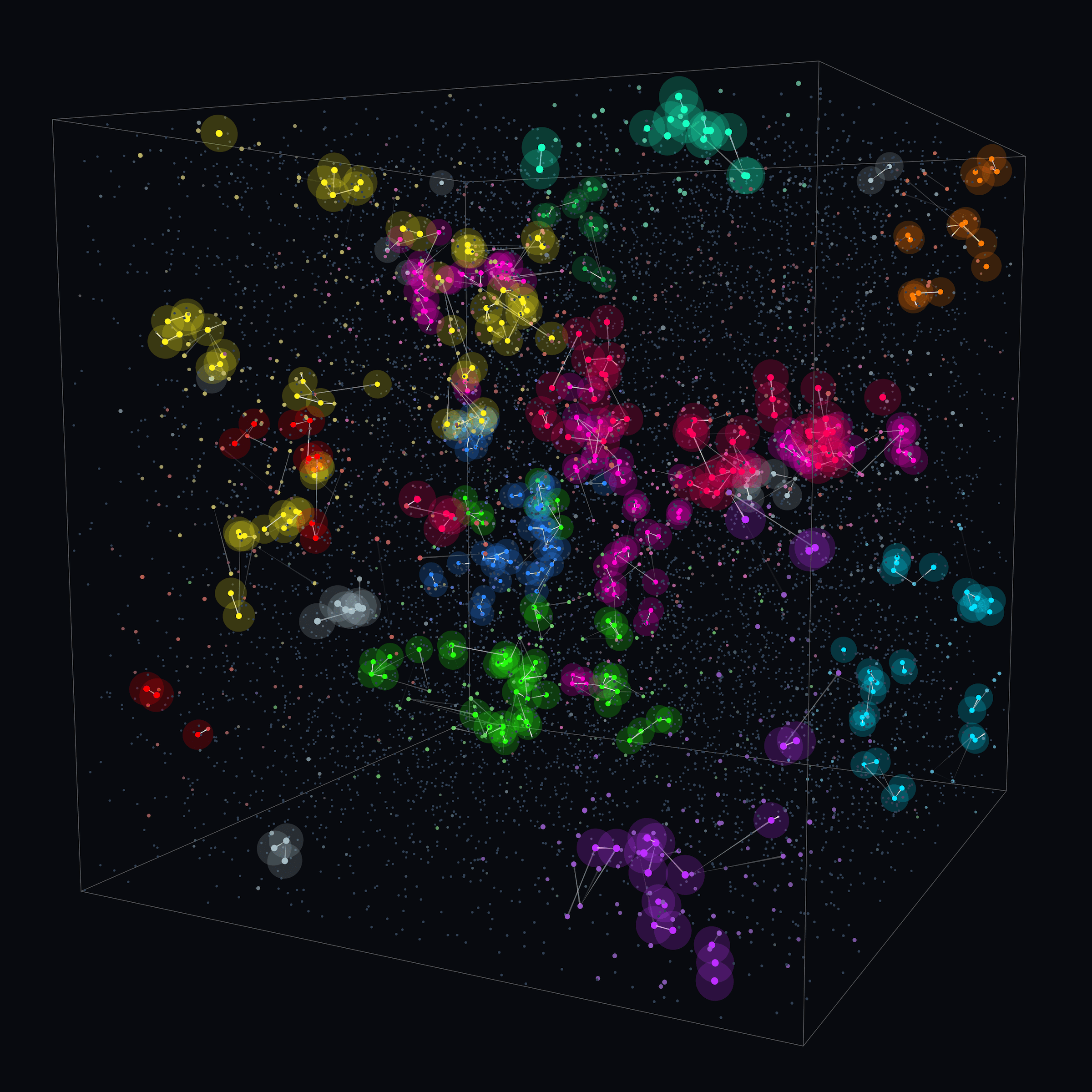
For this project I worked closely together with the author of the article, Caleb Scharf, and especially the first author of the paper, Jonathan Caroll-Nellenback. I explained my idea; to reveal the final state of the visualization and show how the systems had send probes to new systems, how far those probes could even reach, and what systems had recently been settled, but were now dead, thereby also revealing the large voids in between settled regions. Jonathan created the dataset with all the variables that I needed to visualize these different aspects.
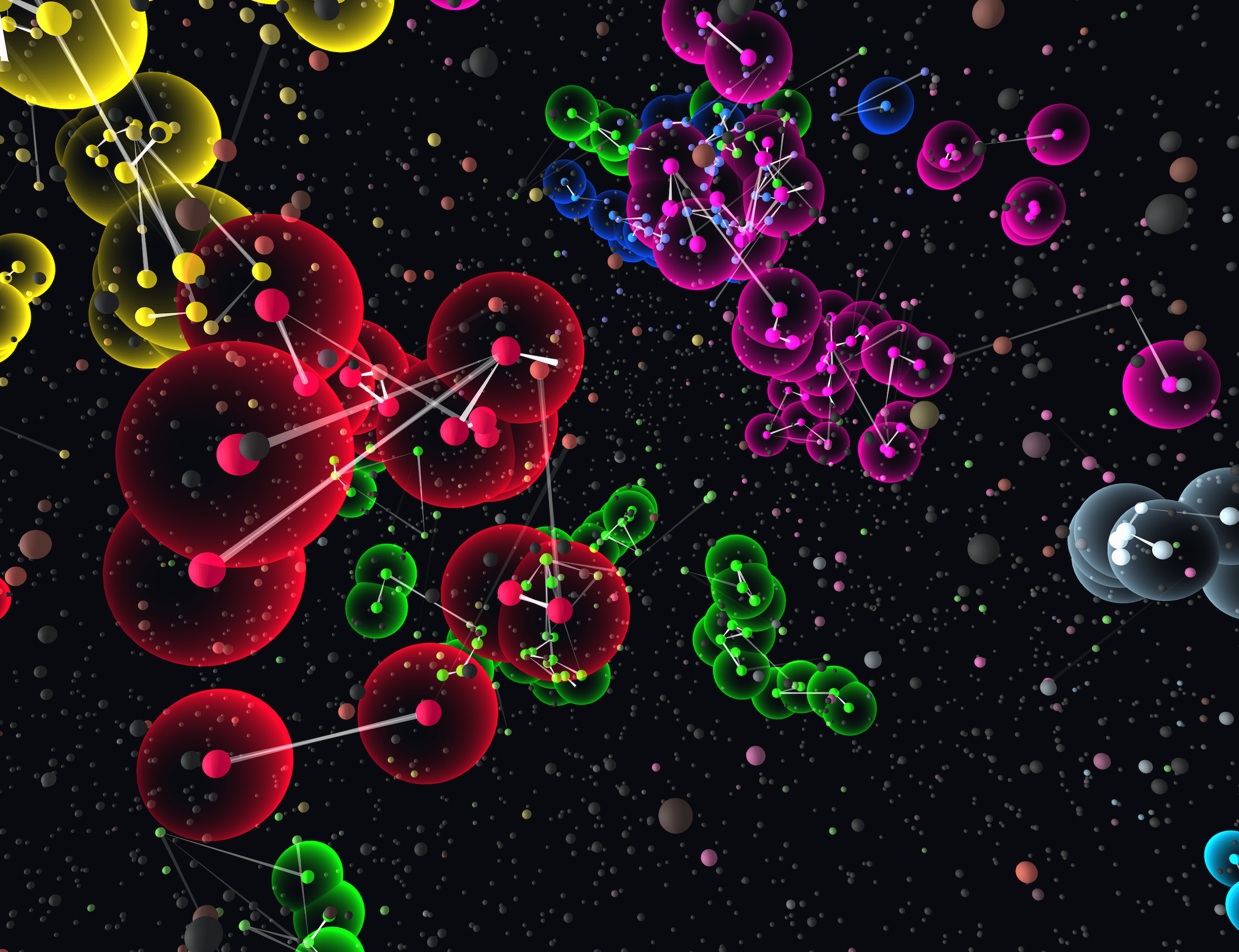
I used Three.js to create the visualization as a 3D rendering of a cube-like area filled with the 10,000 systems. Although I played with many subtle effects, it became apparent early on that the individual systems would be viewed from such a large distance that you couldn’t see much detail. I therefore kept the “overview” version of the main graphic straightforward; although the circles/systems are shown in a 3D space, their appearance is flat, there are no 3D effects. Instead, I’m using transparency and color blending effects for a little extra visual appeal.
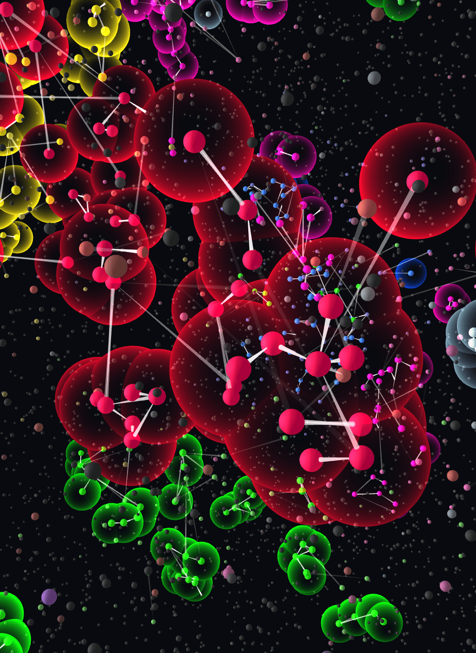
For a smaller visual on the spread that would show a substantially zoomed-in version of the cube, I created a second variation that would indeed use shadow, light and more subtle effects for the circles, the spheres around them and lines connecting the settled systems.
Finally, after the main visuals were done, the client asked if an animation could also be created that would “fly though” the cube (to be used as a banner on the website). Because I had set-up the entire visual using canvas-sketch this was thankfully a relatively easy (unexpected) extra deliverable to create.