I created a visualization showing the rise and recent surge of the number of satellites that orbit Earth for the “Graphic Science” page of the May 2020 issue of the Scientific American. The art director specifically requested a visual that wouldn’t be a more typical “visual that shows the satellites as dots around the Earth” and wanted something more visually bold. I designed a visual that really focuses on showing the numbers and being able to see the sudden rise in the 1-10 kg range for the “Lower” Low Earth orbit in the bottom right.
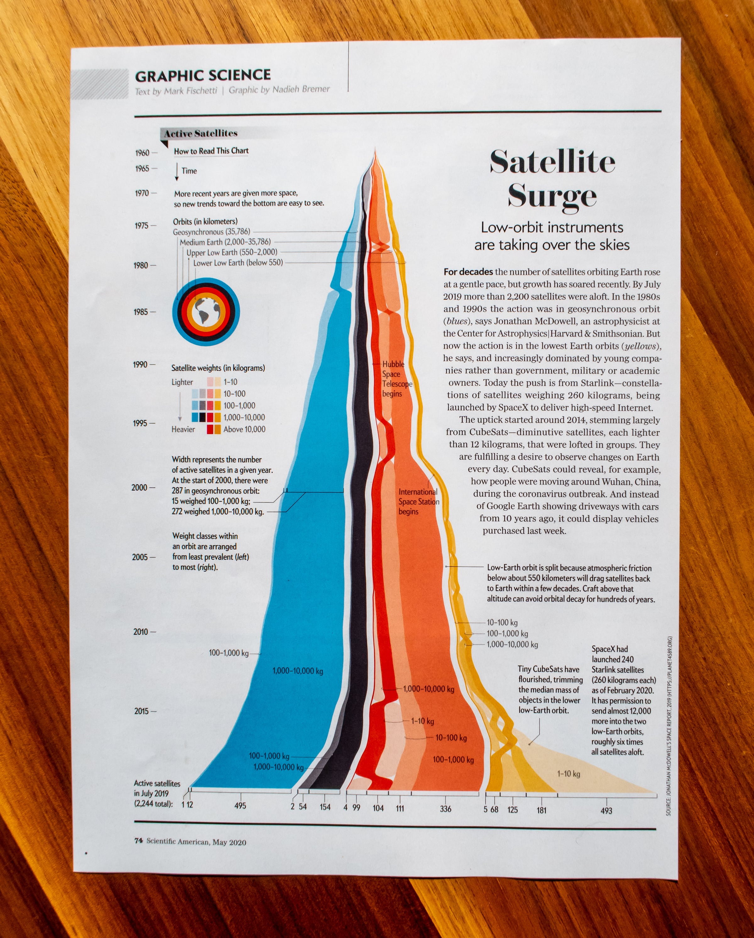


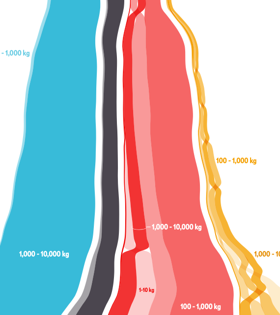
For this visualization I decided to combine the chart types known as a streampgraph with a bumb chart. Each orbit region is a stream that is flowing down in a more natural way according to a streamgraph. Within each of these streams, I’ve divided up the total stream into the weight classes (present within that orbit region), and show these according to a bumb chart, with the inner streams always sorted according to the number of satellites per weight class.