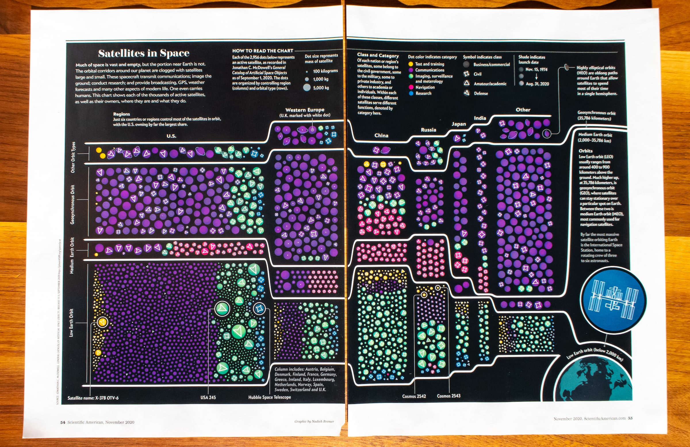
I created a visualization of all the satellites that are still active in space for the “Space Wars” article that was published in the November 2020 edition of Scientific American. By keeping each satellite as a separate circle, but grouping them by the two most important variables, country and orbit, the visualization reveals a very detailed look into the satellites, while not becoming overwhelming to the viewer.
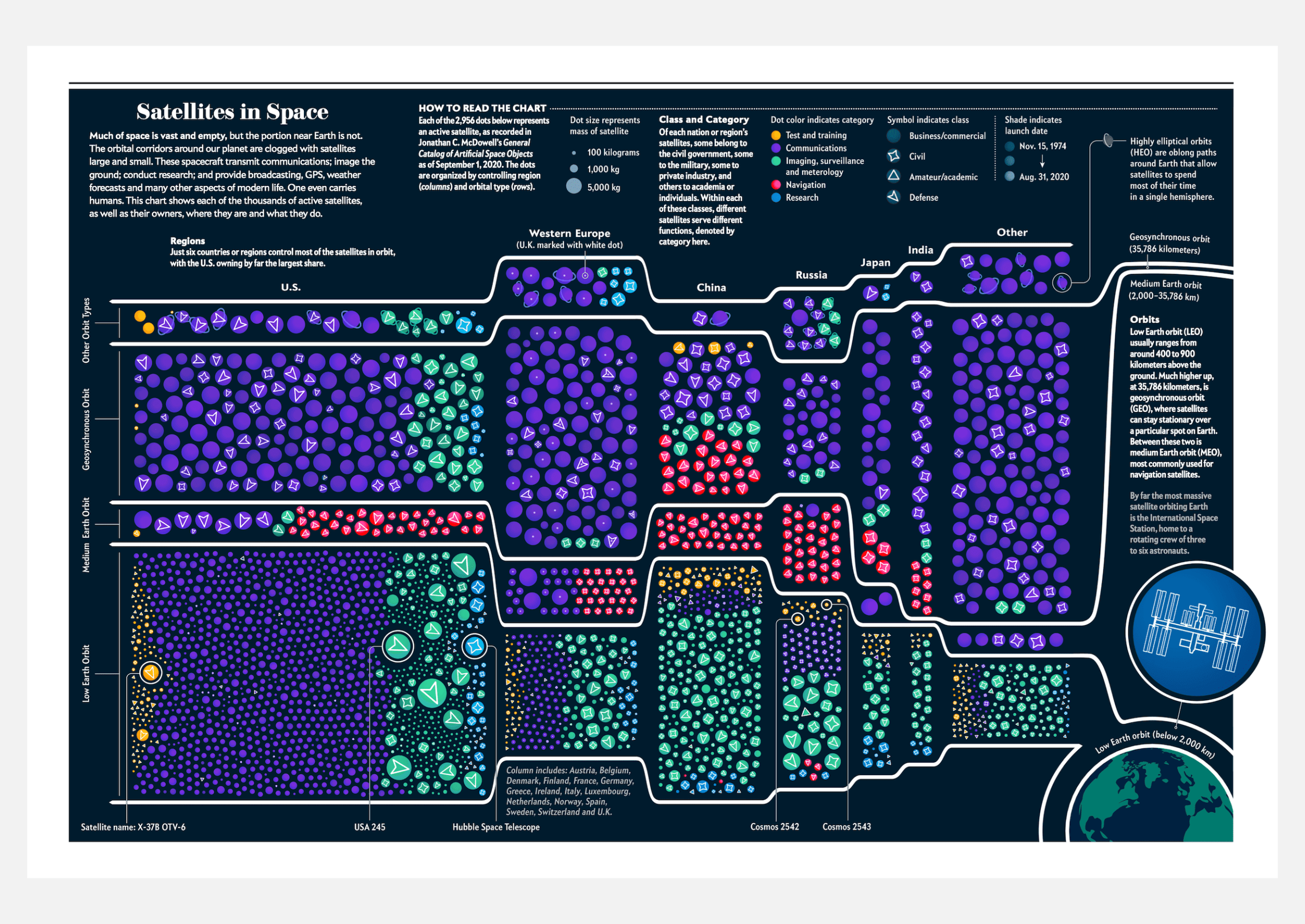

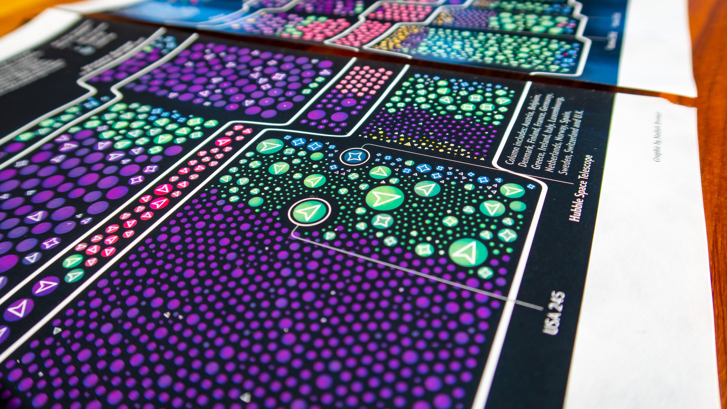

The art director specifically asked to not create a visual with circles around the Earth, but to convey “the state of things”, with a specific focus on the country that owned each satellite, what orbit they occupied, and its class (business, defense, etc). The dataset contained many more interesting variables however, such as launch date, usage category, mass, which I also wanted to convey. I therefore kept each satellite represented as a circle, giving me the opportunity to style each satellite very specifically, such as making it more transparent if it was older and sizing it by its mass. I then created a treemap like clustering of these satellites into a “grid” showing country versus orbit, to highlight those two variables most clearly.