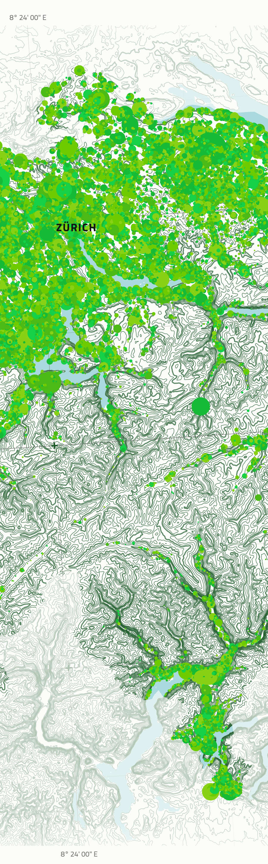
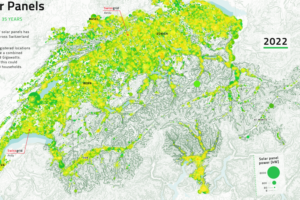
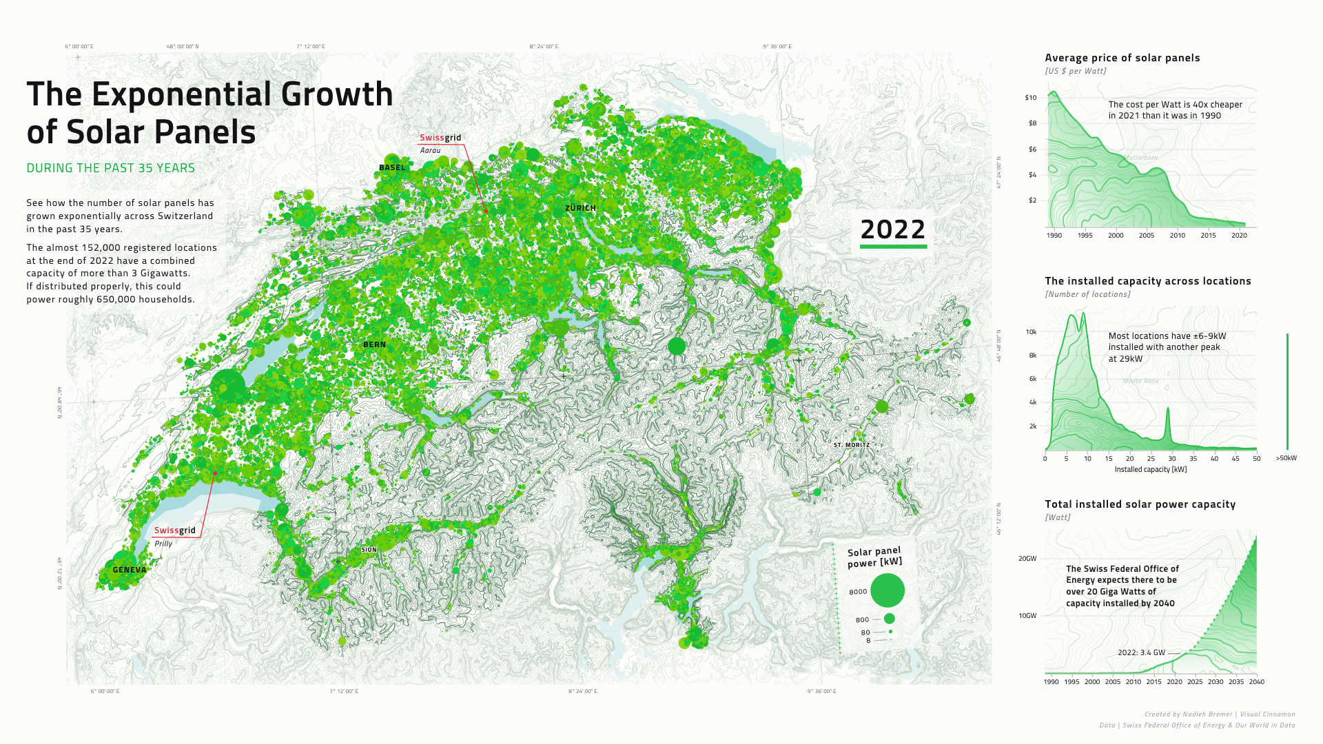
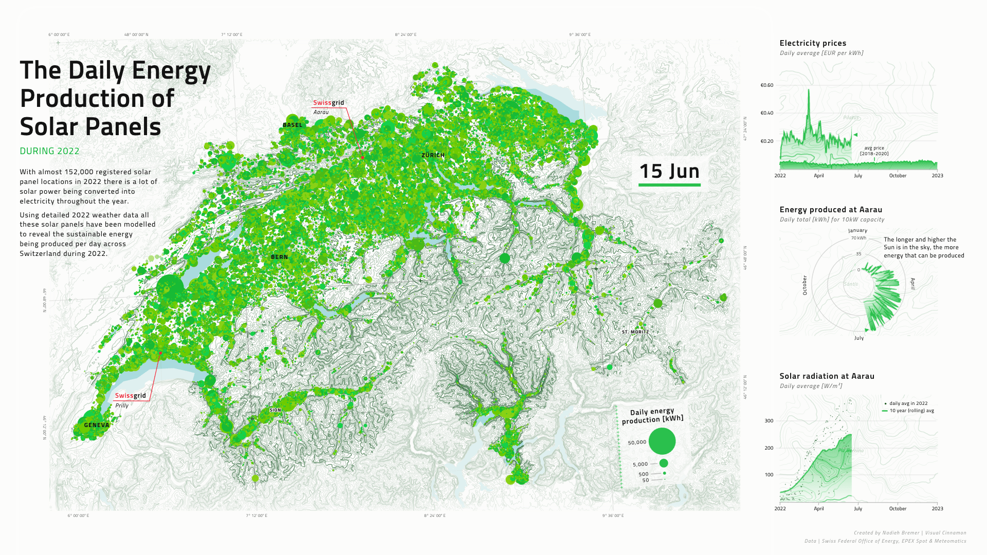
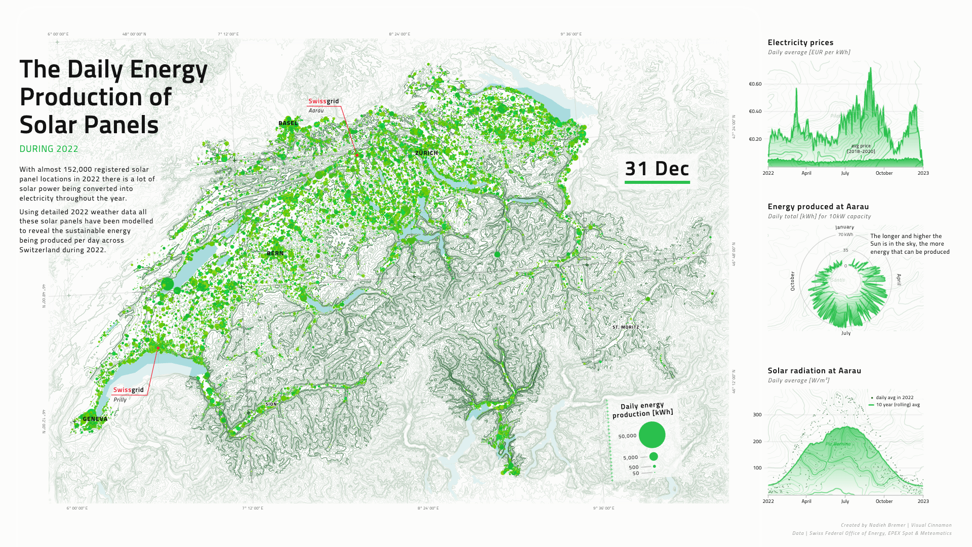
Swissgrid, the national transmission system operator in Switzerland, requested two animation about solar panels that they wanted to use for a specific project. One shows the immense rise of solar panels over the past 35 years since the first was registered in 1988. While the second one reveals a model of the expected daily energy production of each panel across 2022 using weather data. The design of each element of the animation, from the map to the line charts has been a highly custom process to create a unique and visually captivating result.
My goal for the design of these two animations was to create a style for the main map, and from there bleeding into the other parts of the full visual, that was custom. Not your standard “Google Map”, but instead something that you don’t often see and that would capture the audience’s eye.
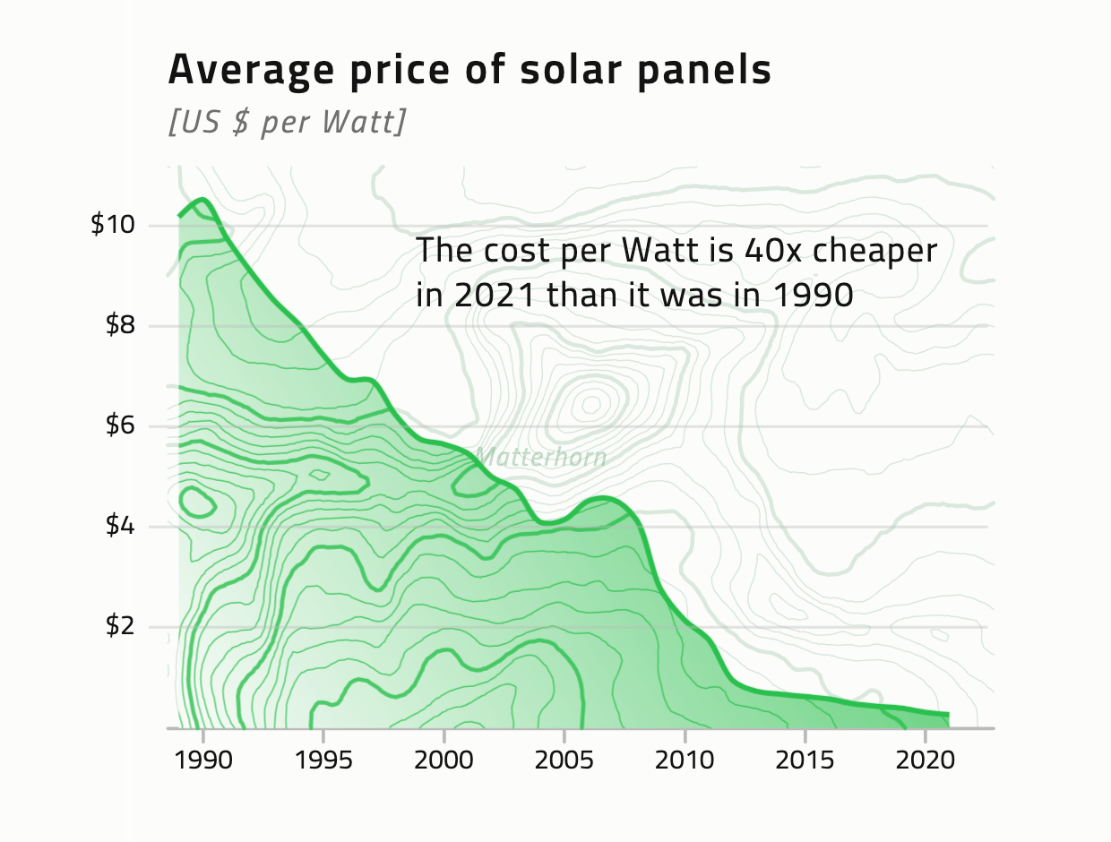
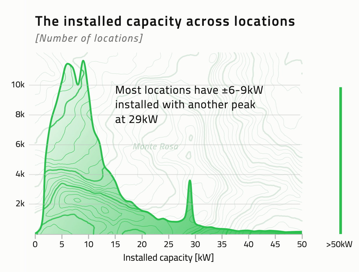
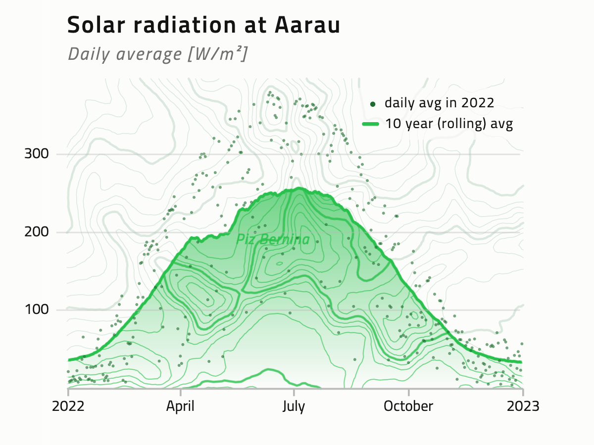
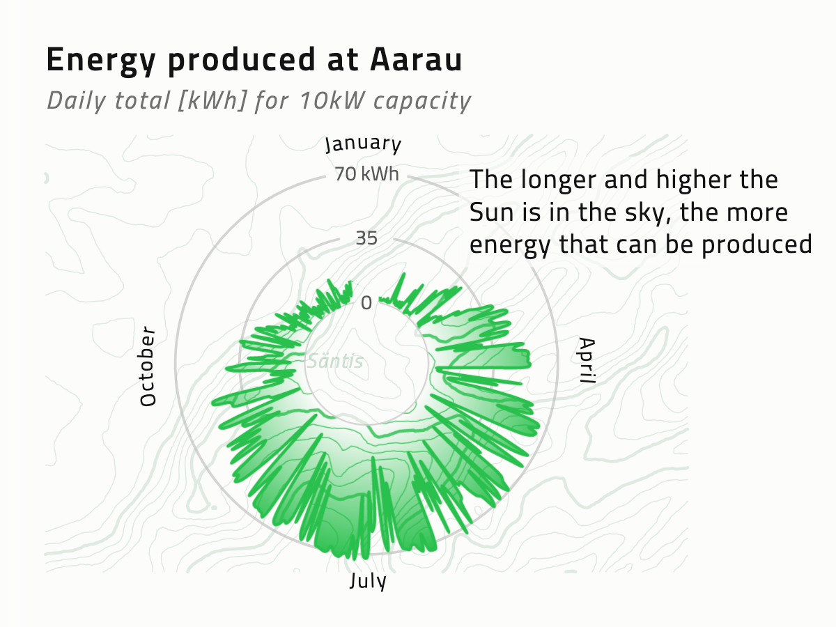
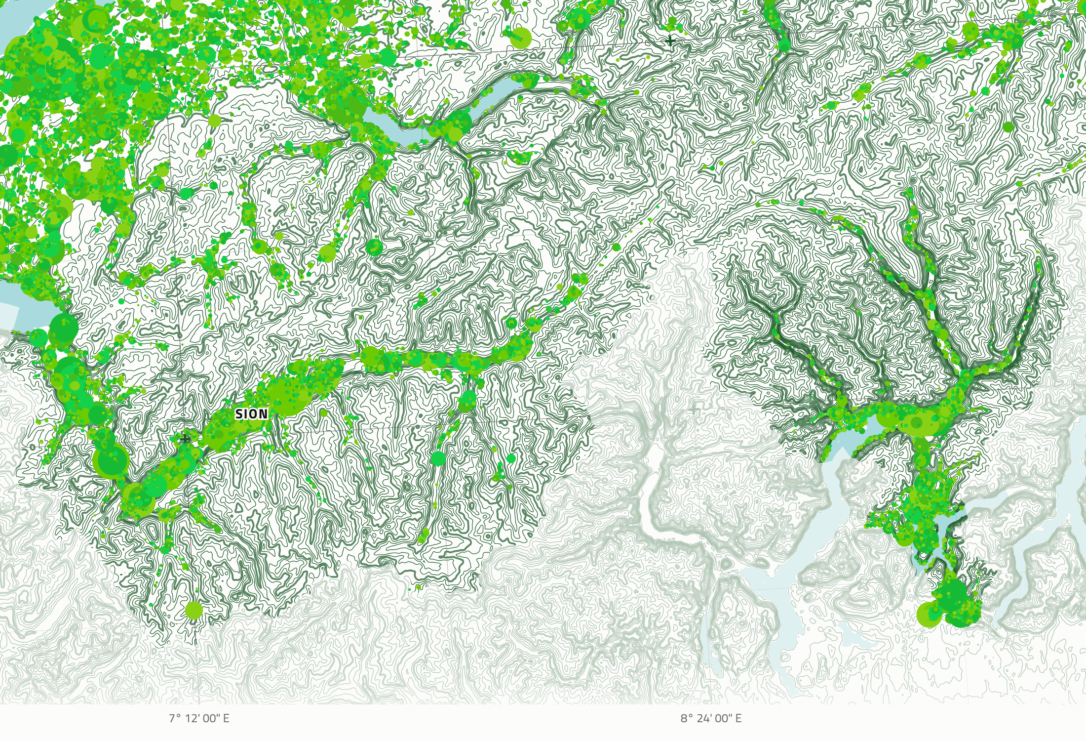
The final style uses a contour-like height relief to show the area of Switzerland. I choose this approach since Switzerland is famous for its beautiful mountains. I could then take the design approach and add subtle contours behind the three line charts along the right of the animation, thereby creating something more visually appealing then simple line charts, while also making them fit with the design of the much more busy main map.
Both animations use open source datasets, ranging from government, weather, mapping and energy data sources. One lasts for 30 seconds as it runs through 35 years of history on the growth of solar panels. The other lasts for 2 minutes. Using detailed 2022 weather data all solar panels have been modelled to reveal the sustainable energy being produced per day across Switzerland during 2022.