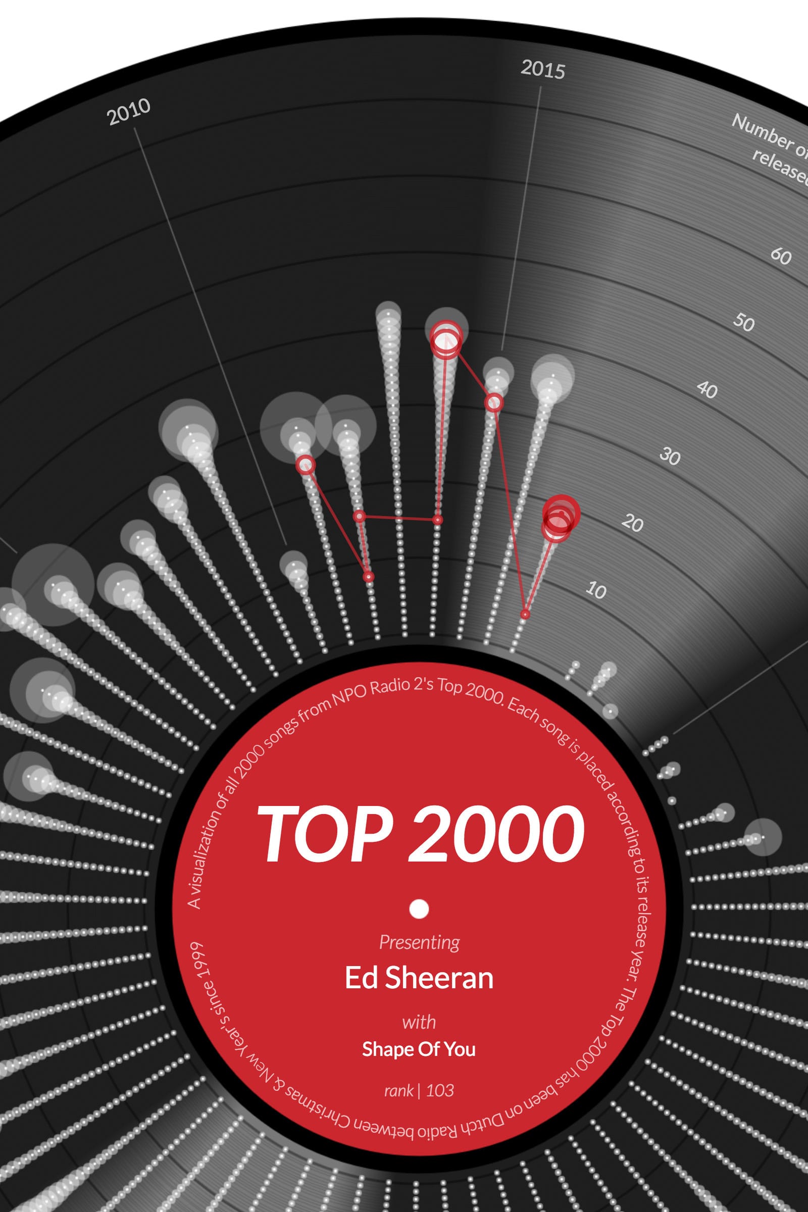
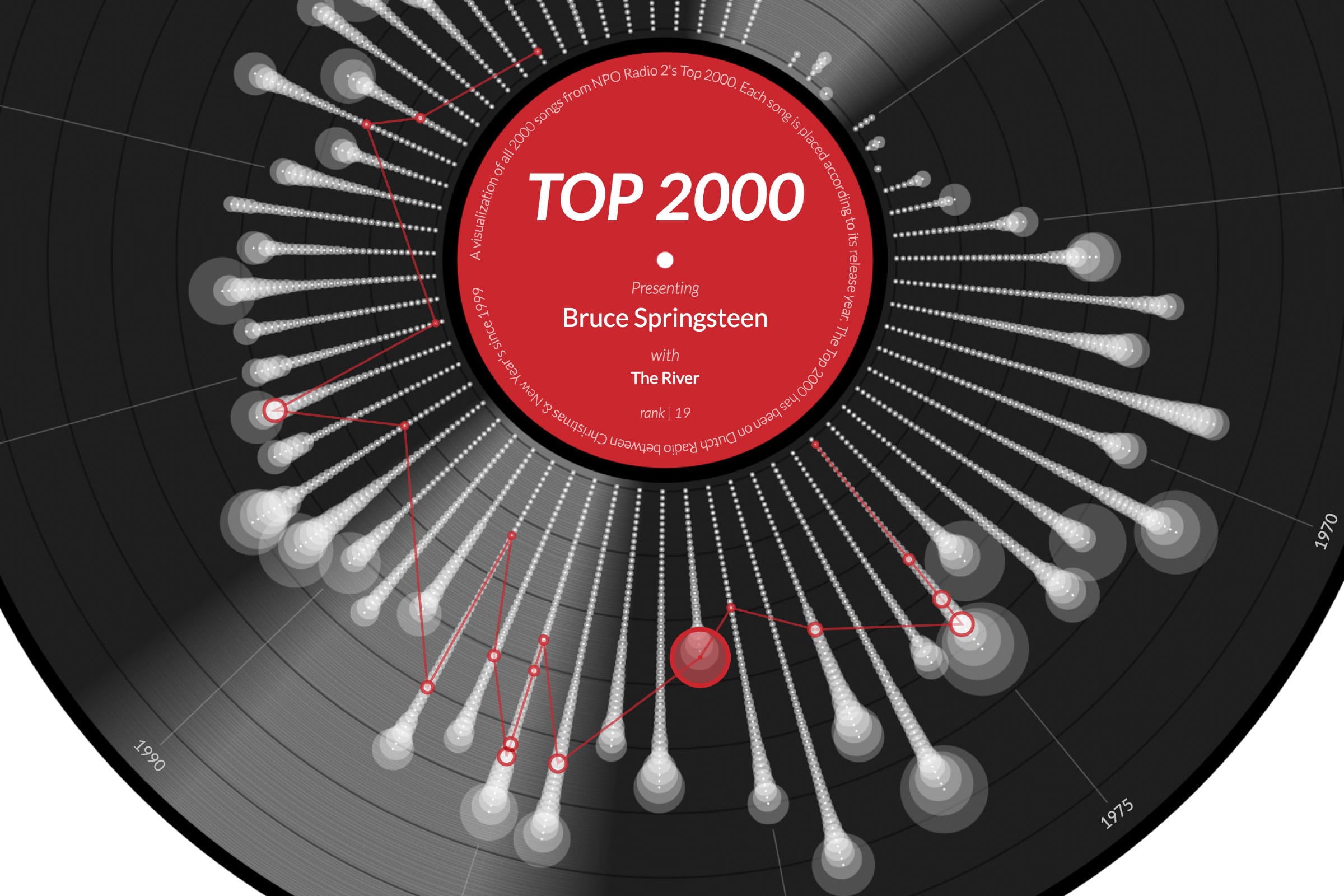
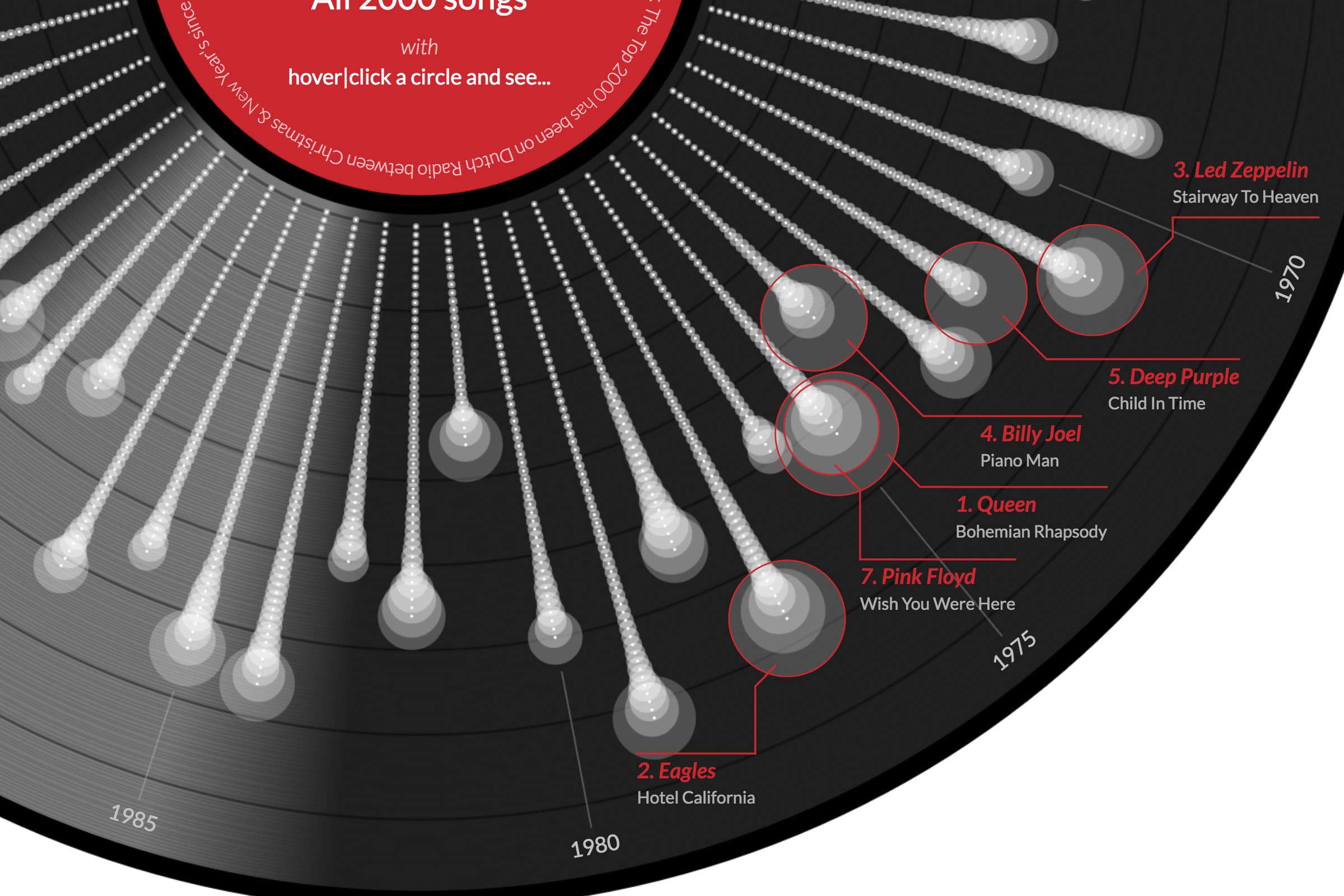
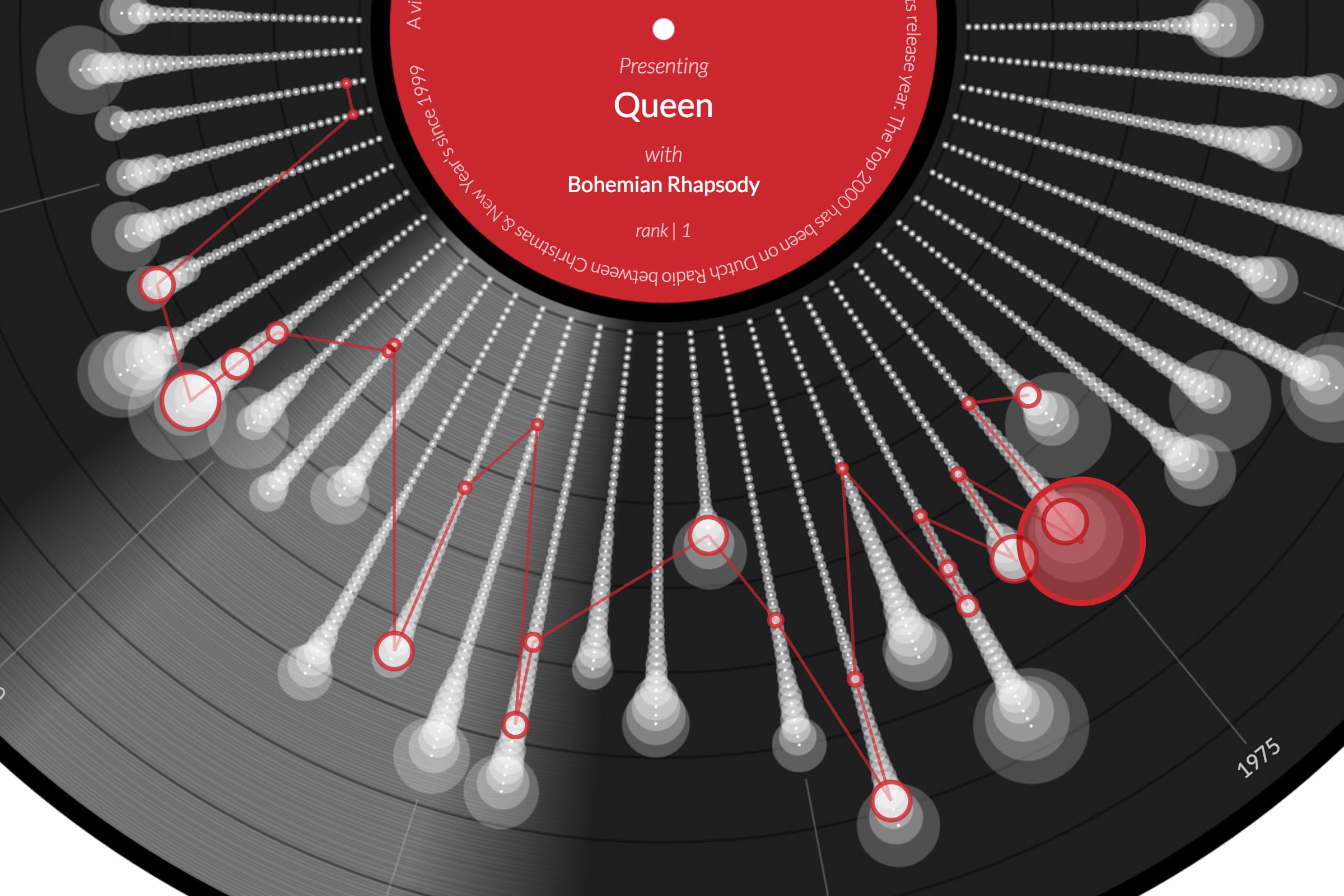
This visualization looks at the Top 2000 best songs ever made and how they are distributed according to their year of release. Starting in the mid-50s going around the vinyl record in a clockwise circle all the way to 2017. Each song is represented by a circle and they are sized according to their position in the Top 2000. The bigger the circle, the higher its rank. Within each release year the songs are stacked from lowest to highest rank at the top, thus the height of each stack of circles shows how many songs from that release year are in the Top 2000. You can hover over each of the songs to see what other songs from the same artist are present in the Top 2000. In general, by far most songs (also from the top 10) come from the 70s.
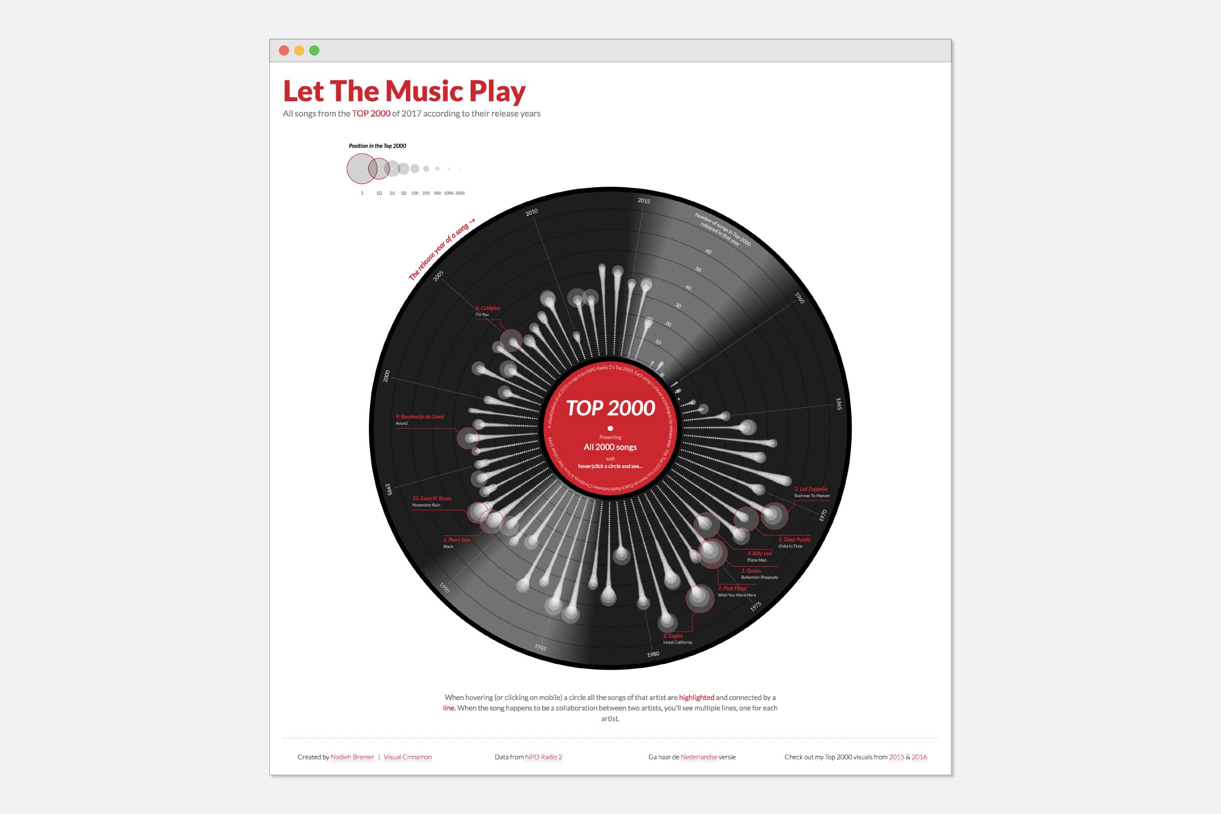
The Top 2000, a yearly chosen list of the best songs, is an extremely popular event happening on Dutch radio between Christmas and New Year’s. This is the 4th year that I’m playing with the same data. It’s almost an exercise to see how I can take the same (but updated) data and the same goal and see how I can visualize it differently.
I had to create a fuzzy matching algorithm in R to find the release years, which were no longer in this year’s dataset. For the main shape of the visual I made a rough design of a vinyl record with all 2000 songs distributed within. After a few experiments it became clear the HTML5 canvas was the easiest way to create my design. And since a canvas now existed, it was just as easy to create the other visual elements using canvas as well (apart from the text and mouse hover interaction, which is still done with SVGs).