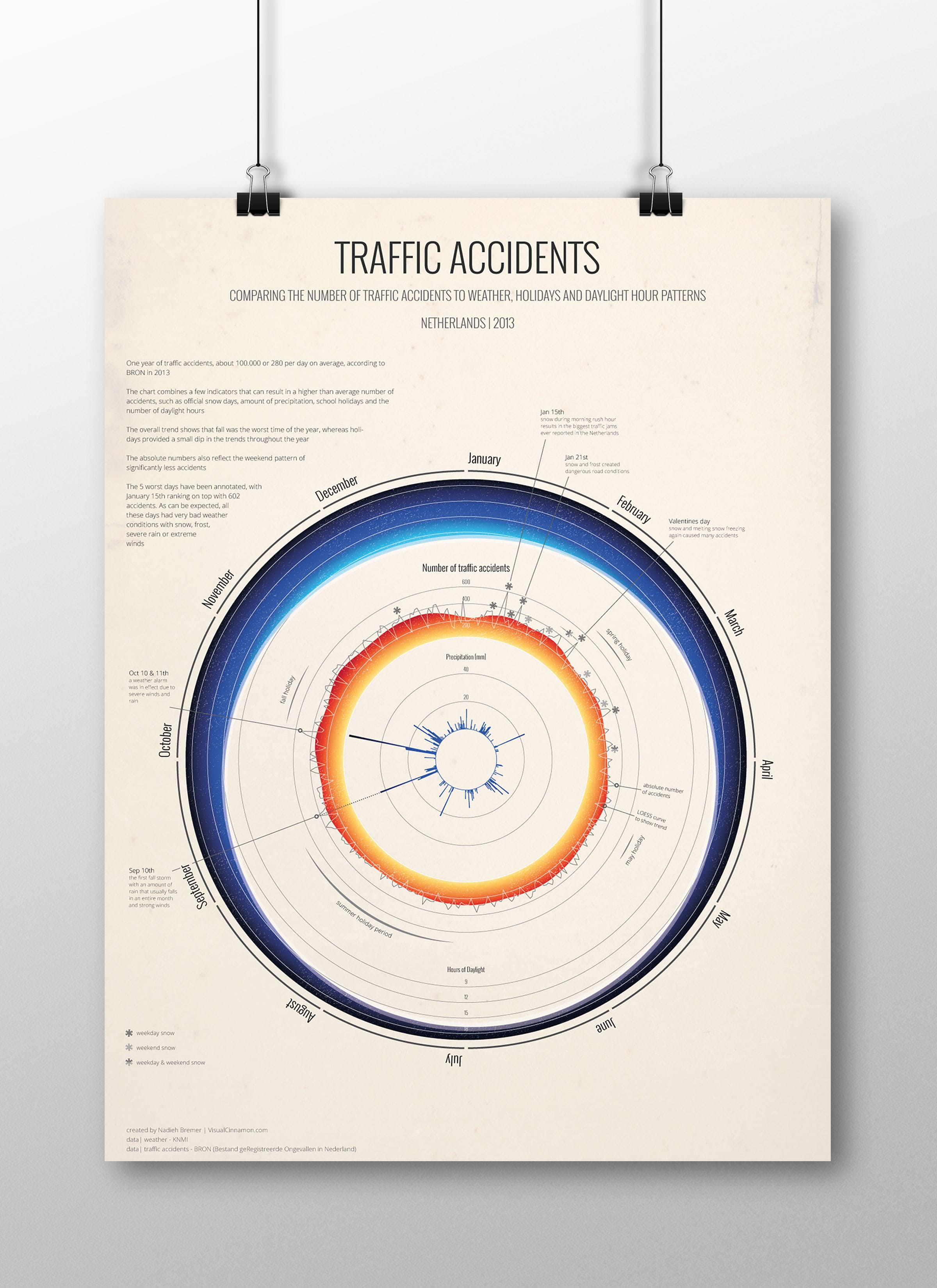
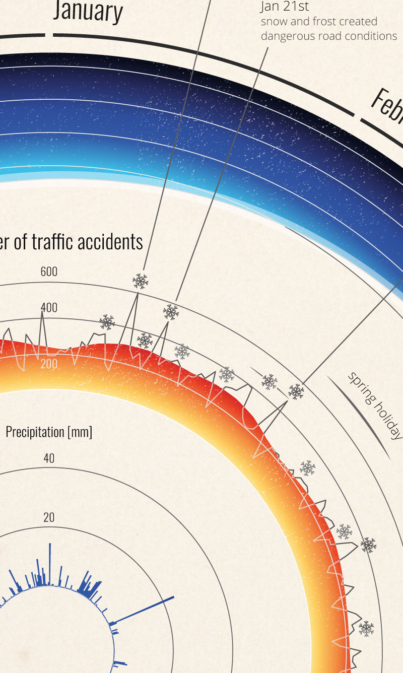
This infographic gives a visual way for the viewer to compare the number of traffic accidents in the Netherlands during 2013 to weather patterns, school holidays and daylight hours.

At work I was discussing with some colleagues what external datasets we could use to create a prediction model of burglaries. And suddenly I thought that perhaps the same datasets could also say something about the number of traffic accidents. I had wanted to make a circular visualization for a while and this seemed like a good opportunity.
I found all datasets I had in mind; the traffic accidents, the amount of rain, the snow days (tucked away in PDF reports), holidays and the number of daylight hours. I created three line charts based on these numbers in R and imported them in Illustrator where I bend them into a circle and added all the colors, icons and annotations. For the latter I searched the news for that particular date to see if anything could be found relating to traffic jams.
