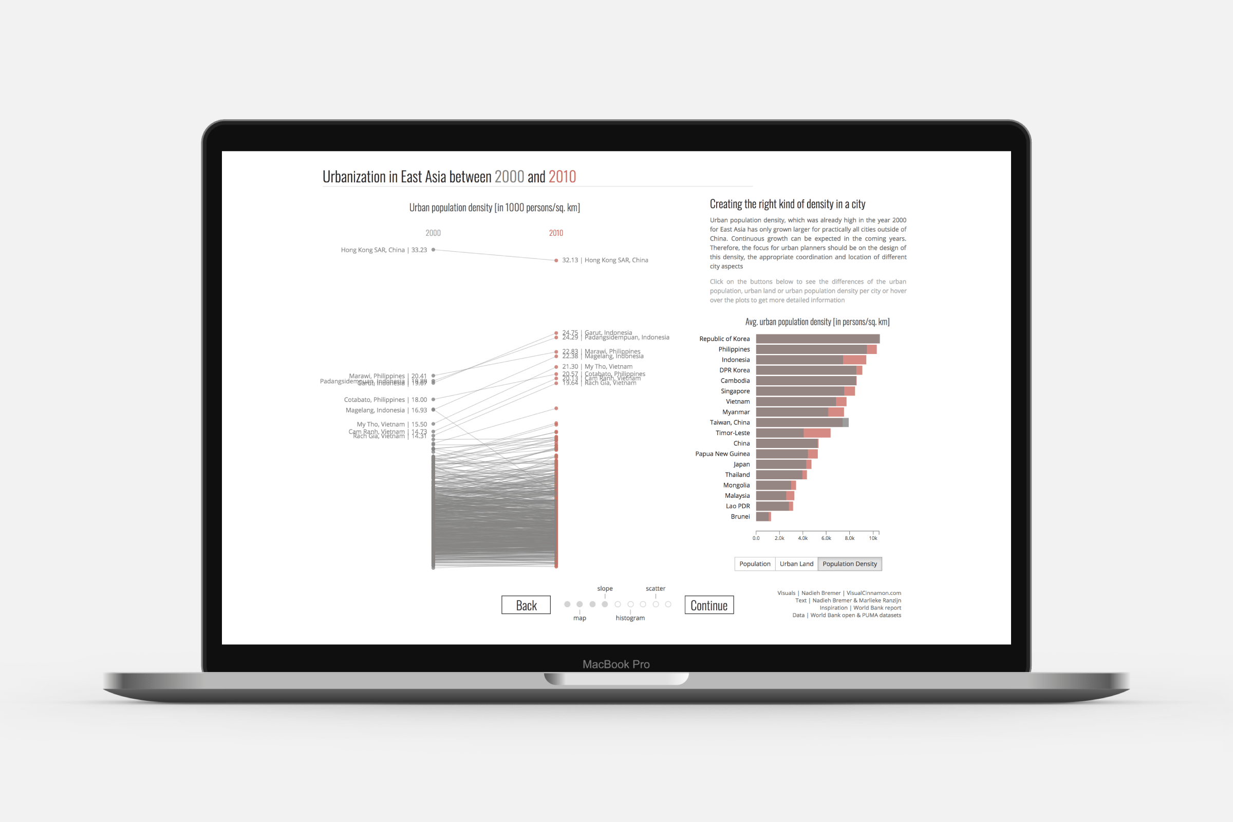
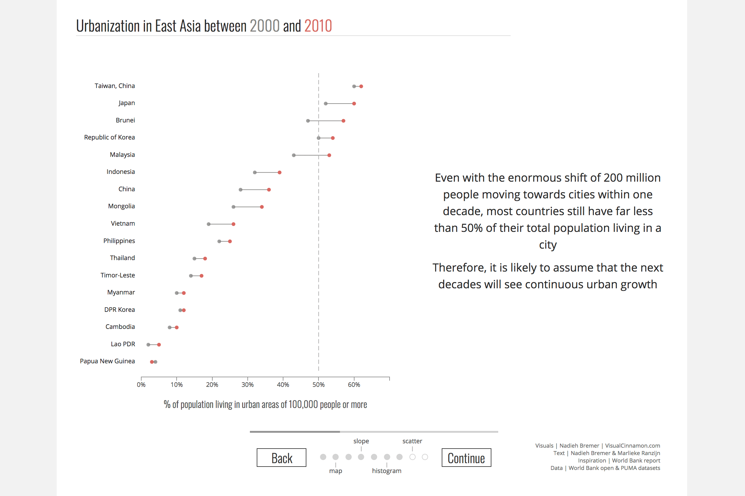
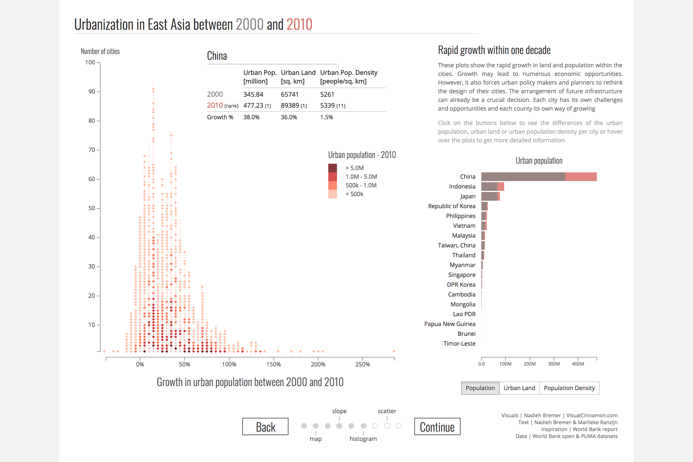
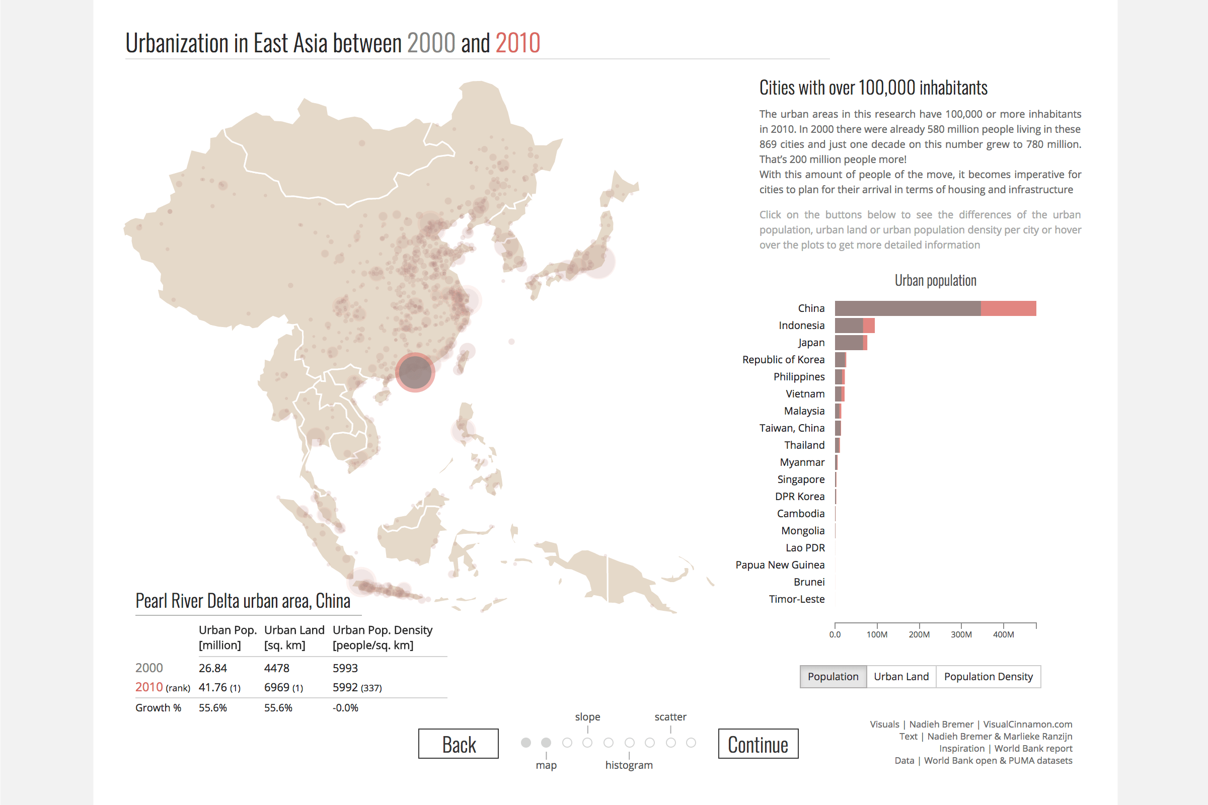
Societies are shifting from having a rural nature to a more and more urban nature. We face the opportunity to set the course of urbanization on a more sustainable and equitable path. This visualization is based on data on urbanization in East Asia between 2000 and 2010 collected by the World Bank using Satellite images and population models. It aims to provide you with a clear view on the magnitude of changes that can happen in only one decade and challenges you to think about the impact on the following years.
I created this for the Visualizing Urban Expansion Challenge organized by the World Bank and Visualizing.org. The goal was to visualize the dataset so policy makers would be motivated to invest more money in research into urbanization.
I had a hard time coming up with an interesting design and brainstormed with colleagues about ideas. In essence the data contained only two types of dimensions; population and urban land. Due to cities being defined differently from the standard, it was not really possible to connect more external data. Thus how do you get your point across that urbanization is something that can make or break your economic growth and general welfare to local policy makers with just numbers on population and urban land?
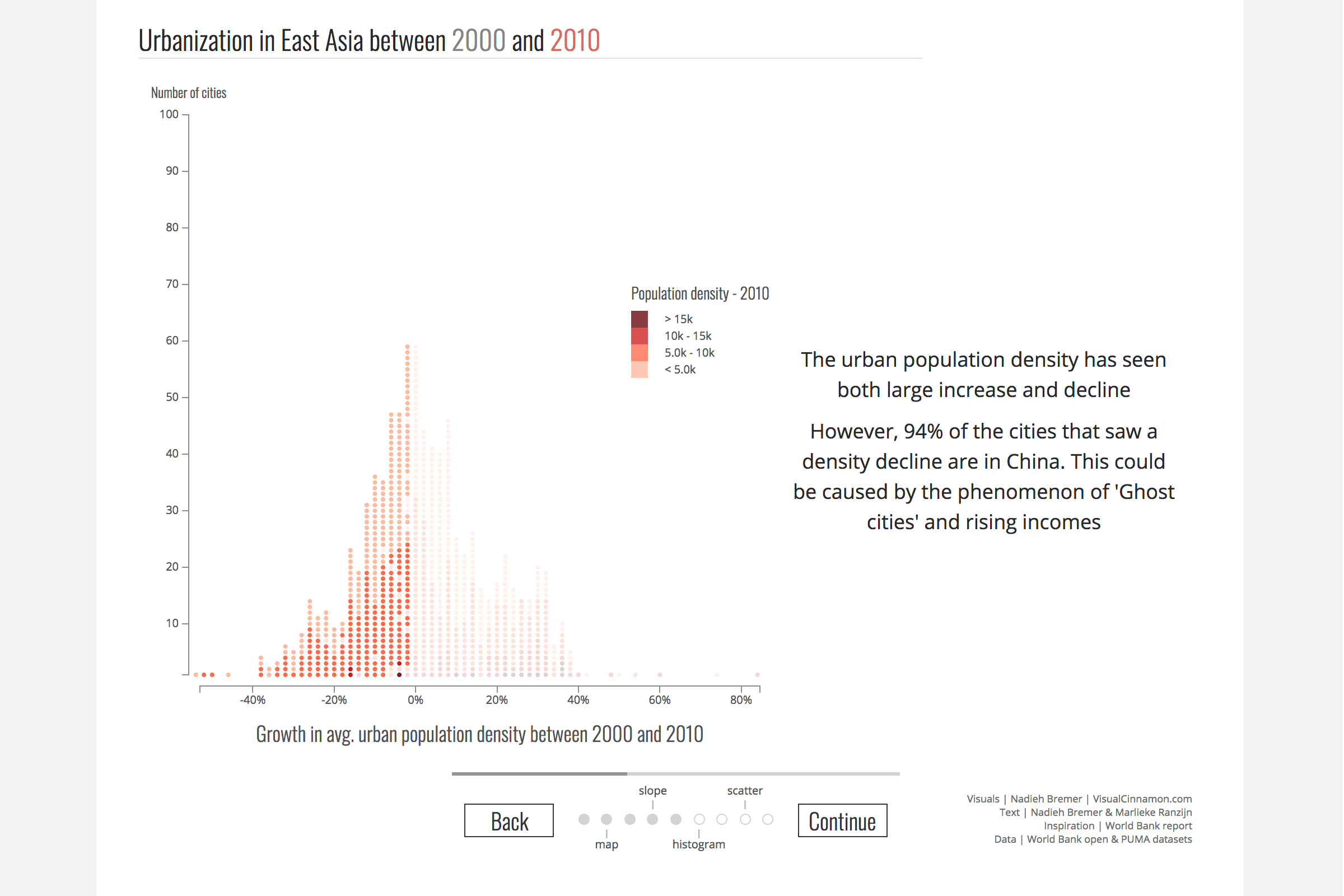
In the end I decided that a more narrative approach, showing one angle of the data, explain the impact and move on to another visualization of the same data which shows something new again, was going to be the main concept. However, I still wanted the viewer to have the freedom to navigate the data, thus I combined the narrative with so-called interactive views. The final visual has 4 of these views, every time highlighting a different insight from the increase in urbanization.