“Visualizing Neglect” is an interactive data-driven article created for the The END Fund, exploring the global burden of neglected tropical diseases (NTDs). These diseases affect around 1.5 billion people worldwide, many of them children, causing lifelong physical, cognitive, and economic harm. Despite their enormous impact, NTDs remain underfunded and underreported—hence the term neglected. The project’s goal was to transform relatively dry public-health data into an experience that makes the scale of the problem, and the progress toward solving it, both understandable and emotionally resonant.
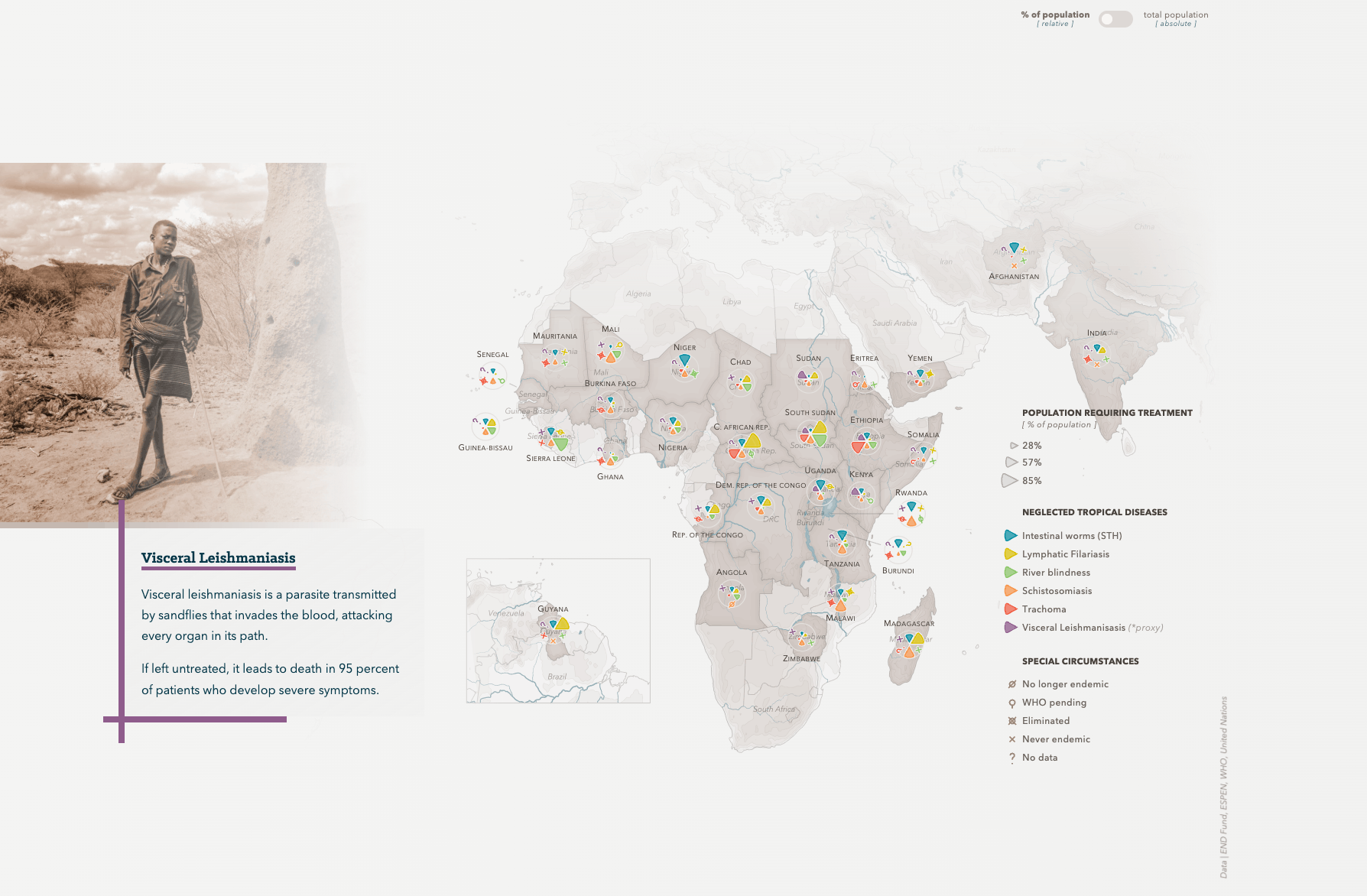
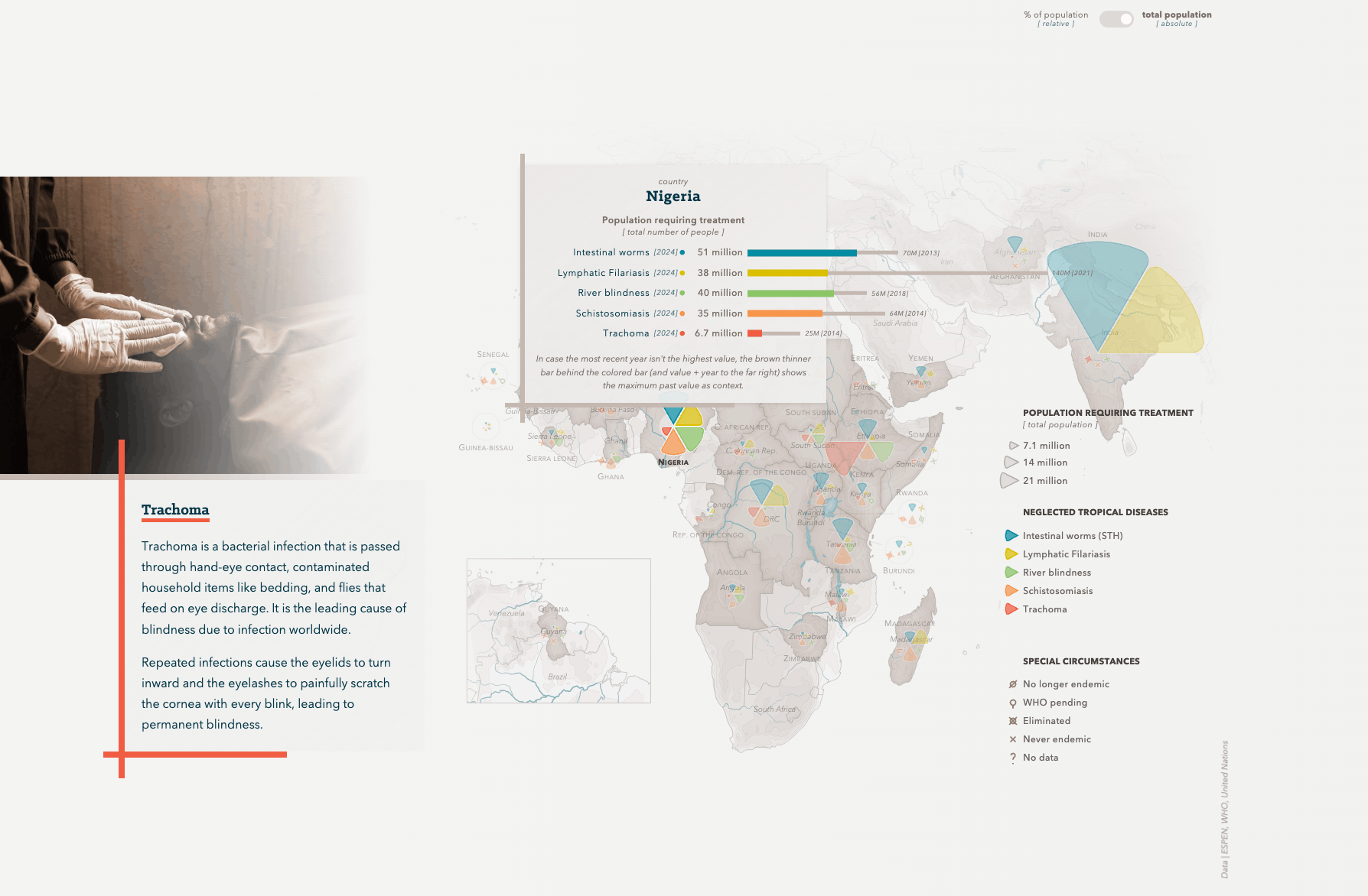
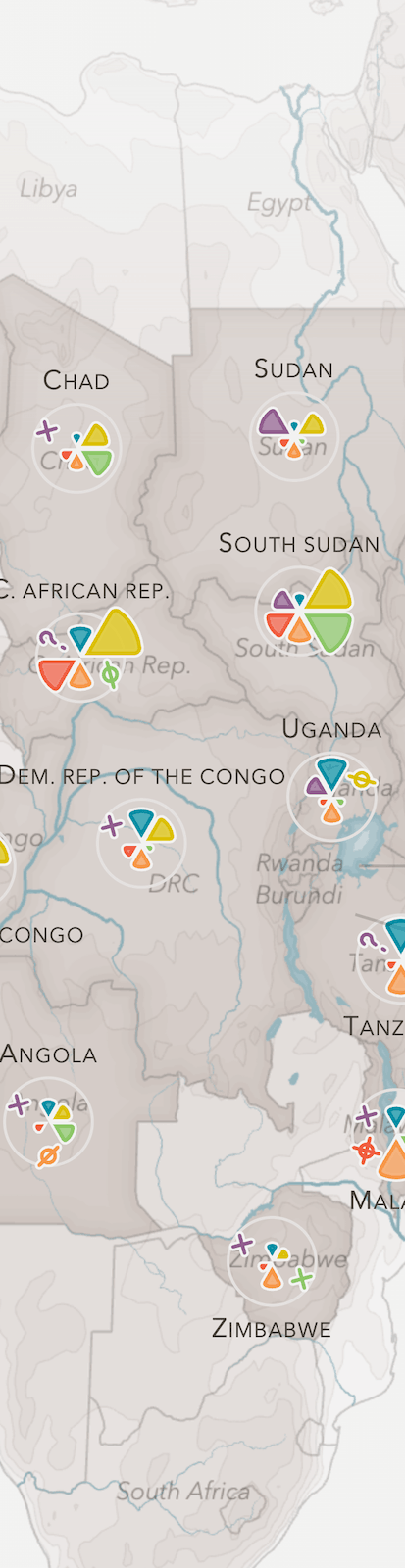
The main challenge of this project was to define the structure of the story. It was clear that the Neglected Tropical Diseases (NTDs) had to be explained first while using a visual form that would capture the reader’s attention. Using a map to show the current state of NTDs in the areas that the END Fund is active was a natural choice as maps are generally aesthetically pleasing when you put in the effort to add details (such as rivers, contour lines, etc.). Furthermore, the scrollytelling technique lends itself really well to slowly explain and introduce the complexity of the NTDs, data and topic.
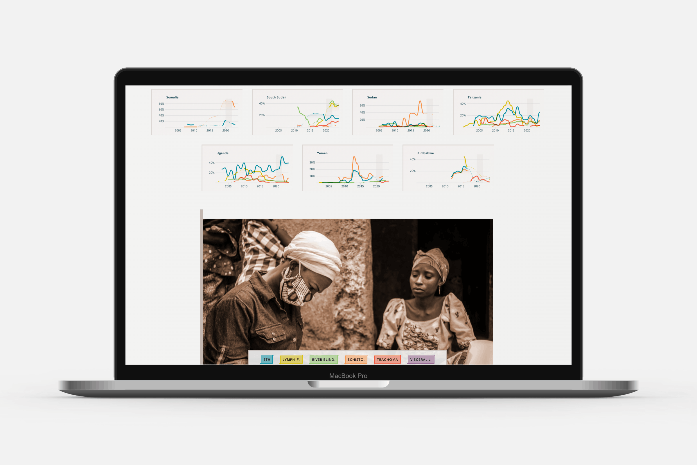
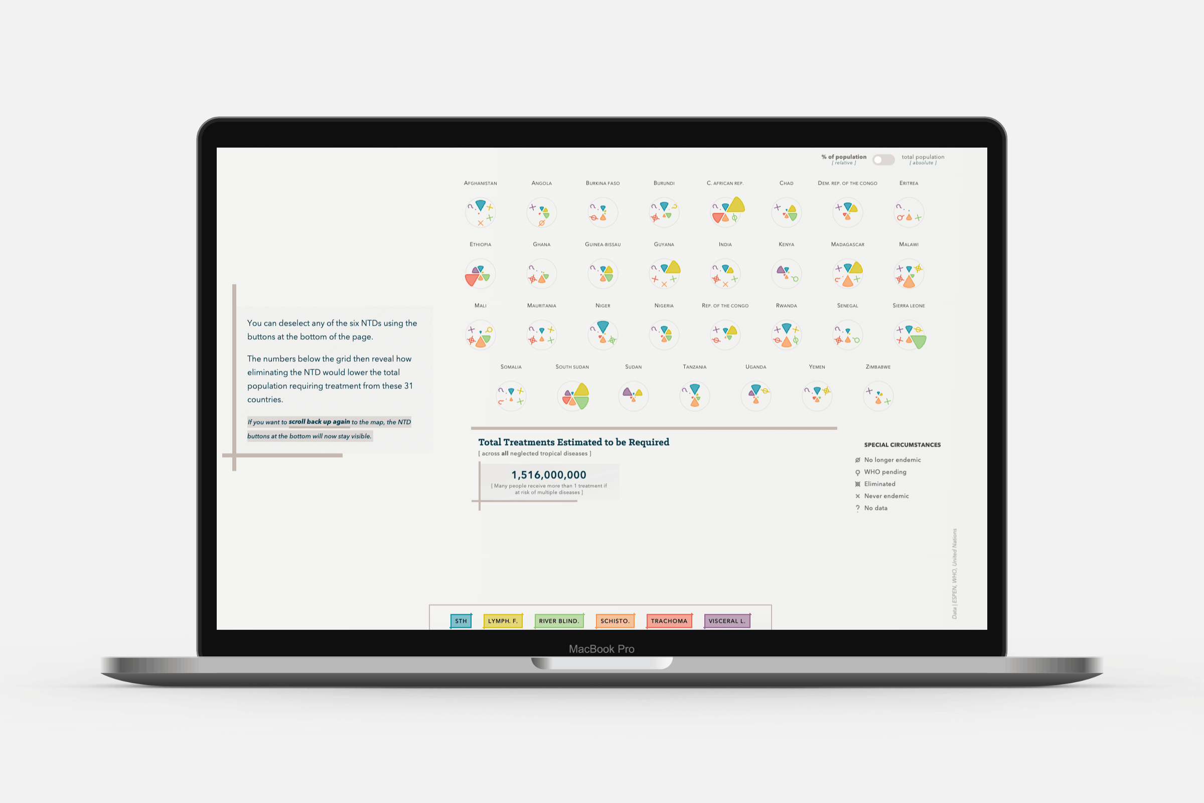
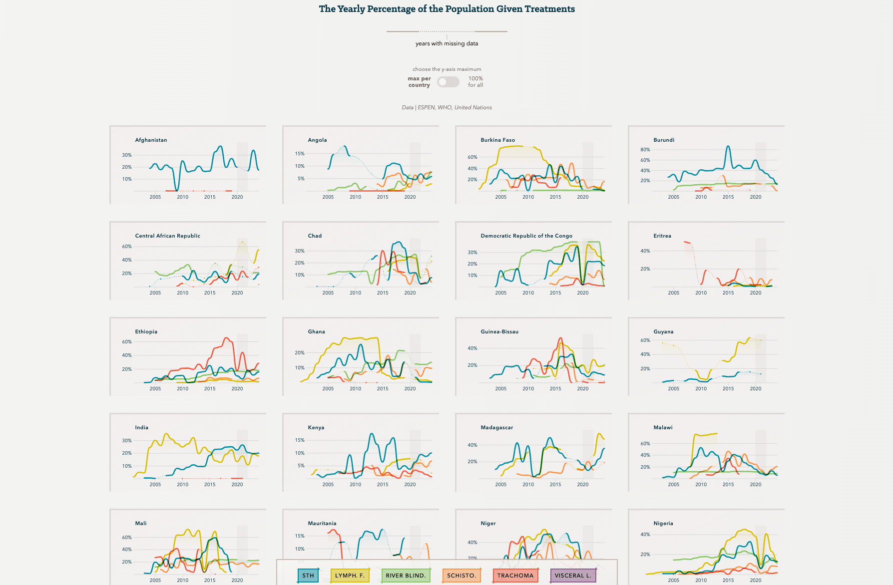
After this comes the history, showing the effort and progress that has been made. By using several countries to create a deep dive, the data is slowly introduced, after which a grid of line charts for all countries is shown to reveal the full picture.
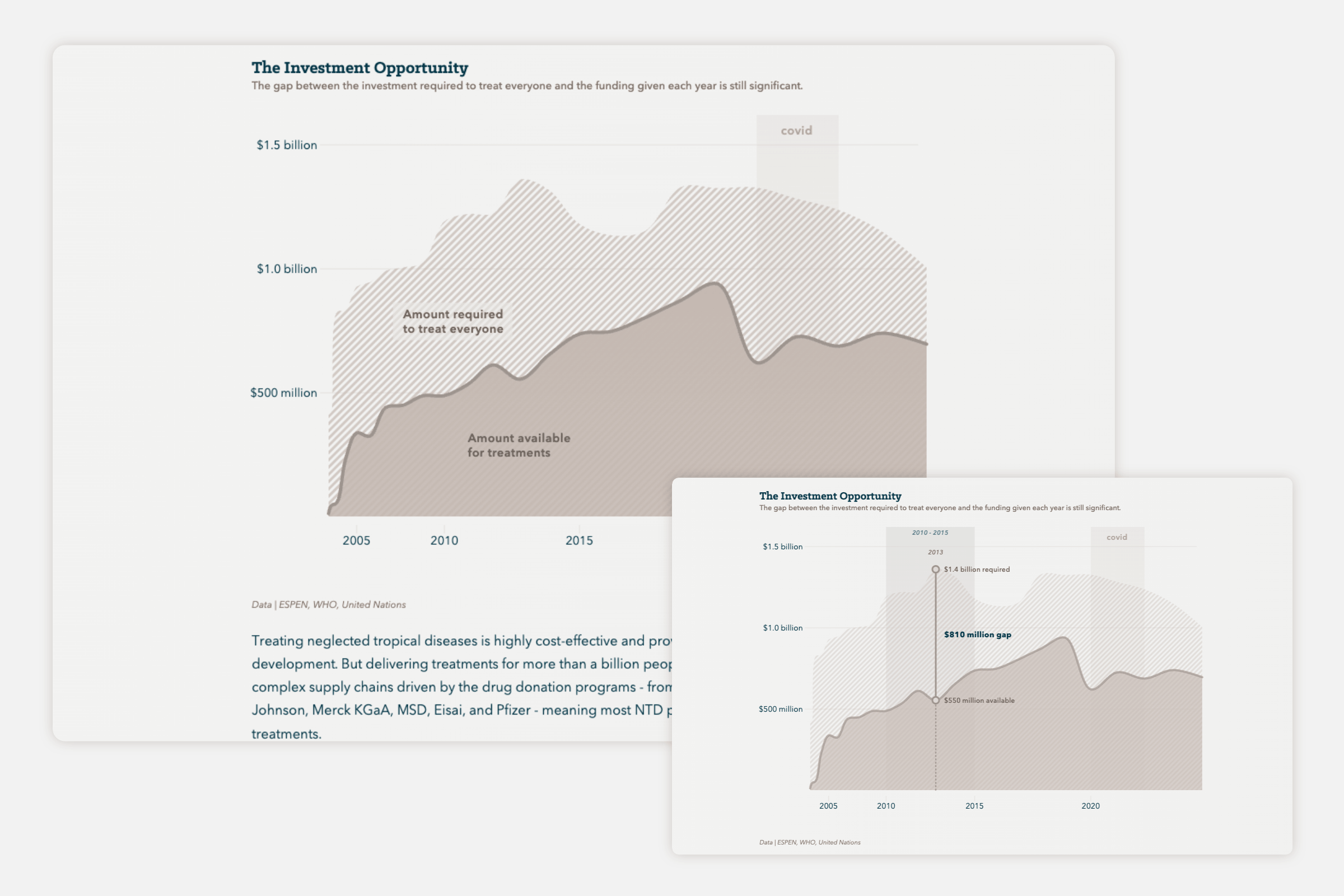
A final chart reveals the funding already given to eliminating these NTDs, but also the gap that still exists. This to show potential donors where their money can make the biggest impact.
A lot of time was spent on the details. There are toggles in several places to switch between percentages and absolute numbers. There are buttons at the bottom for most of the story so you can deselect any NTD from the visuals to focus on those the reader is interested in. A vibrant color palette is employed to make the visuals more engaging, but not so bright as to do injustice to the seriousness of the topic. And much more.
This piece shows how data visualization can move beyond dashboards to become a form of advocacy that captures the reader—helping audiences grasp why these diseases matter and how progress is possible.