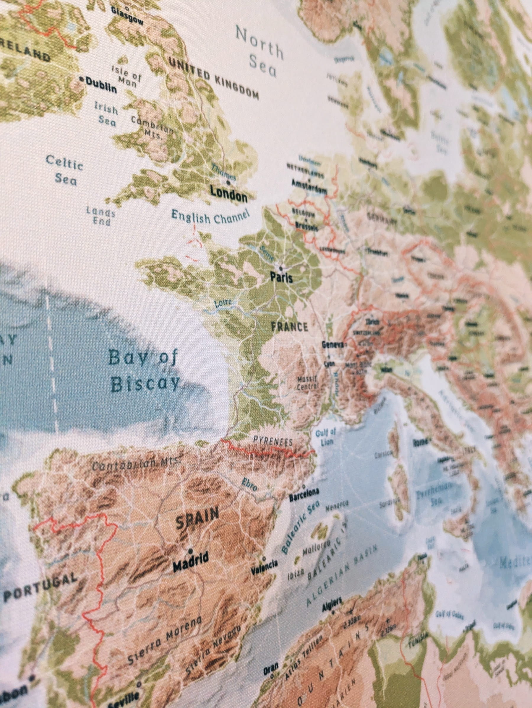
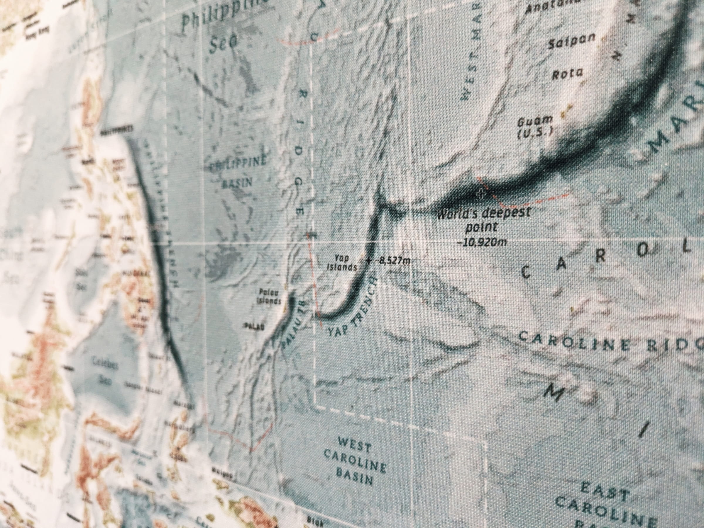
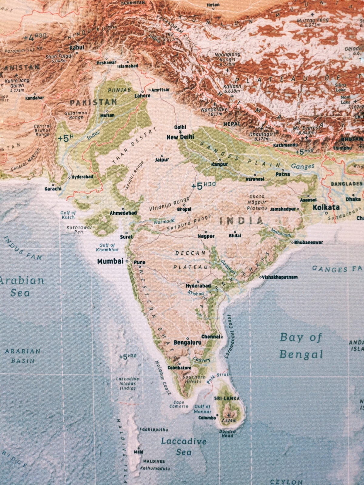
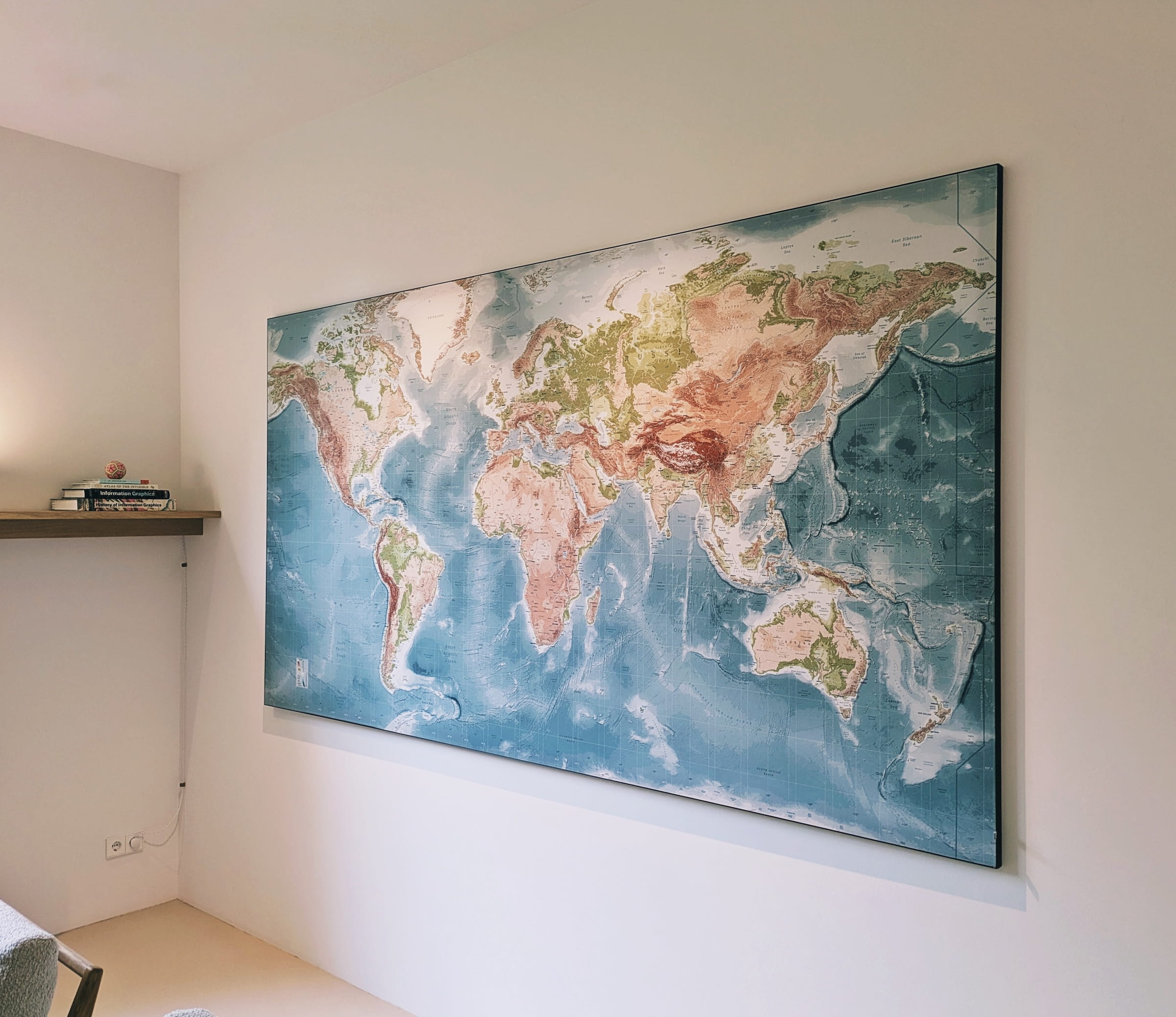
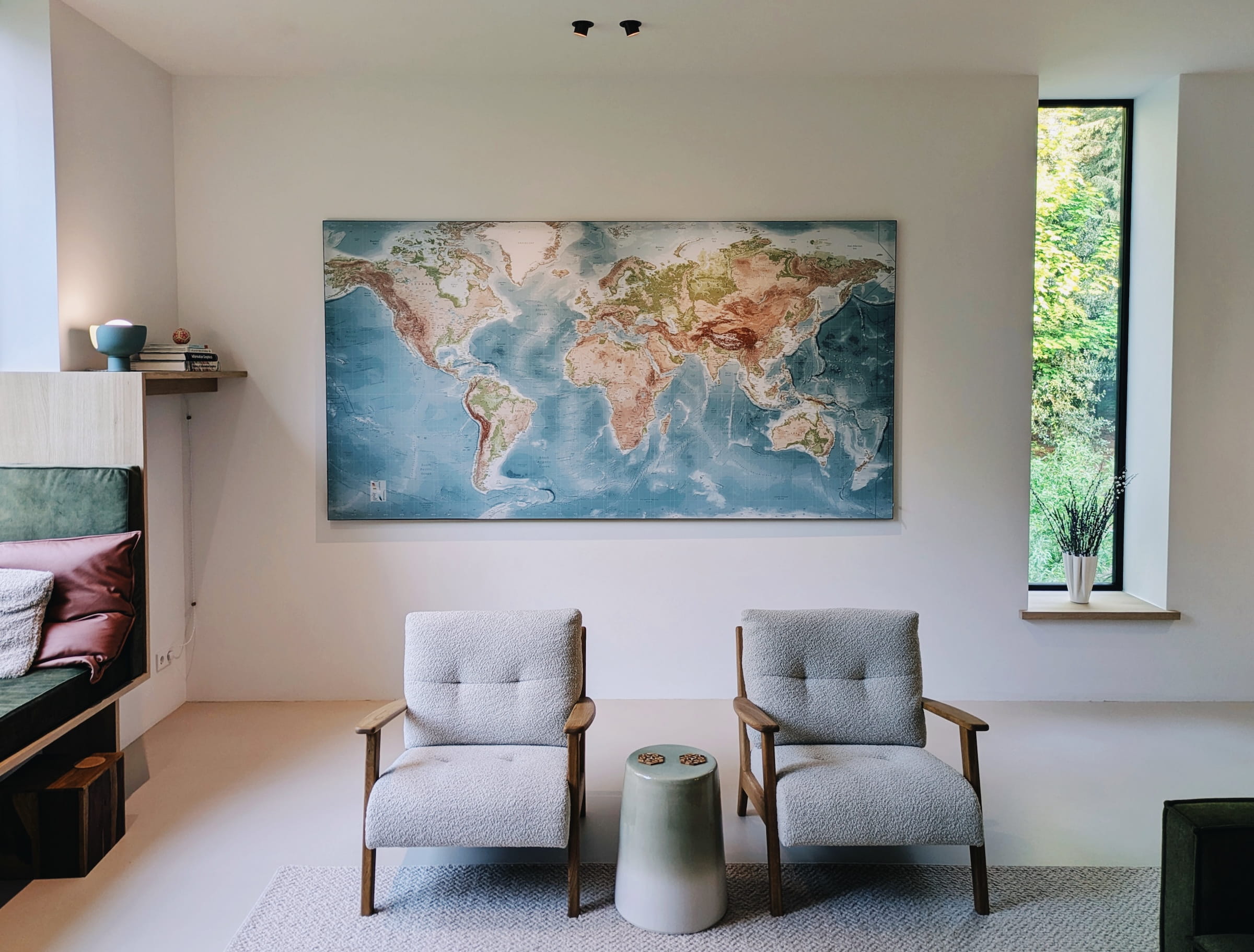
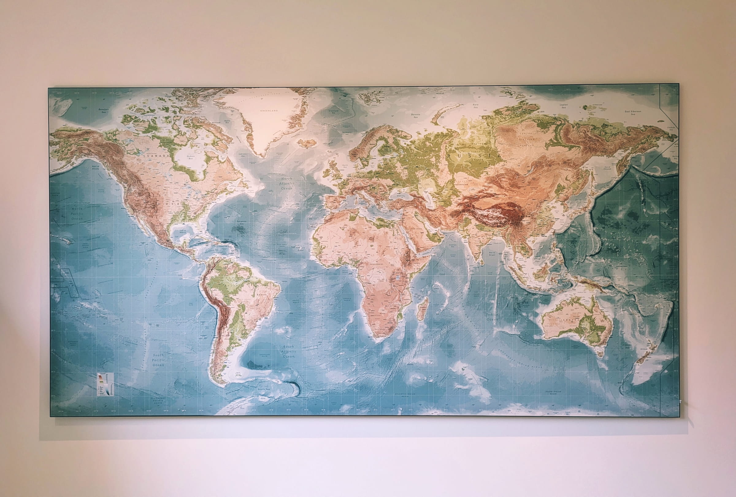
I created this very large map of the world that measures 2.85m x 1.5m (roughly 9.5’ x 5’), which takes up nearly one entire wall of my living room. The map is based mostly on the vector and shaded relief data from the Natural Earth and the colored contour areas (height lines) from Amazon Web Services Terrain Tiles. I had the map printed on an ArtFrame (by Art Heroes), which is a textile canvas that is stretched along a black aluminum frame.
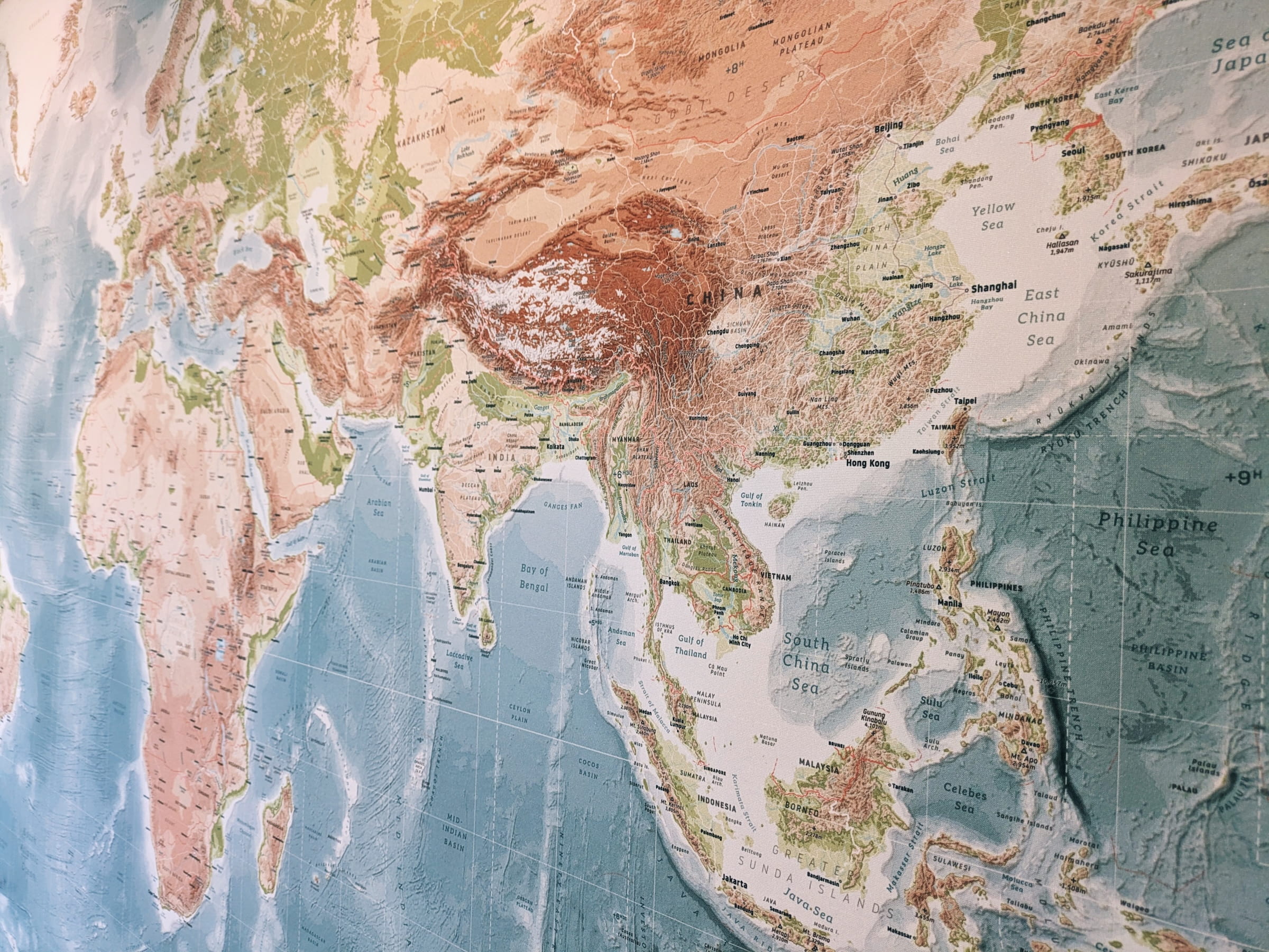
For nearly a decade I had the large IKEA world map in my living room. I loved standing in front of itand wondering what places I might want to visit one day. After I moved, there was a large blank wall in the new living room, and there were always some things that I wanted to see different (aesthetically) than the IKEA map. And so, during many evenings, I started working on my own version of a world map, an even bigger one. Adding more details (e.g. the terrain of the oceans), more labels, more data, more color.
Although I know that other types of projections are more fair to the shape of the Earth, it was very important to me that the map filled a rectangle. I ended up using the Miller Projection which gives a somewhat better representation than the common Mercator Projection I find.
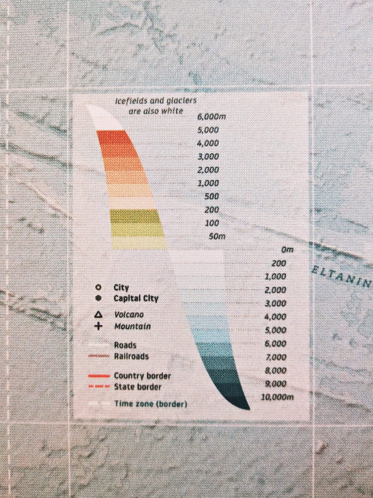
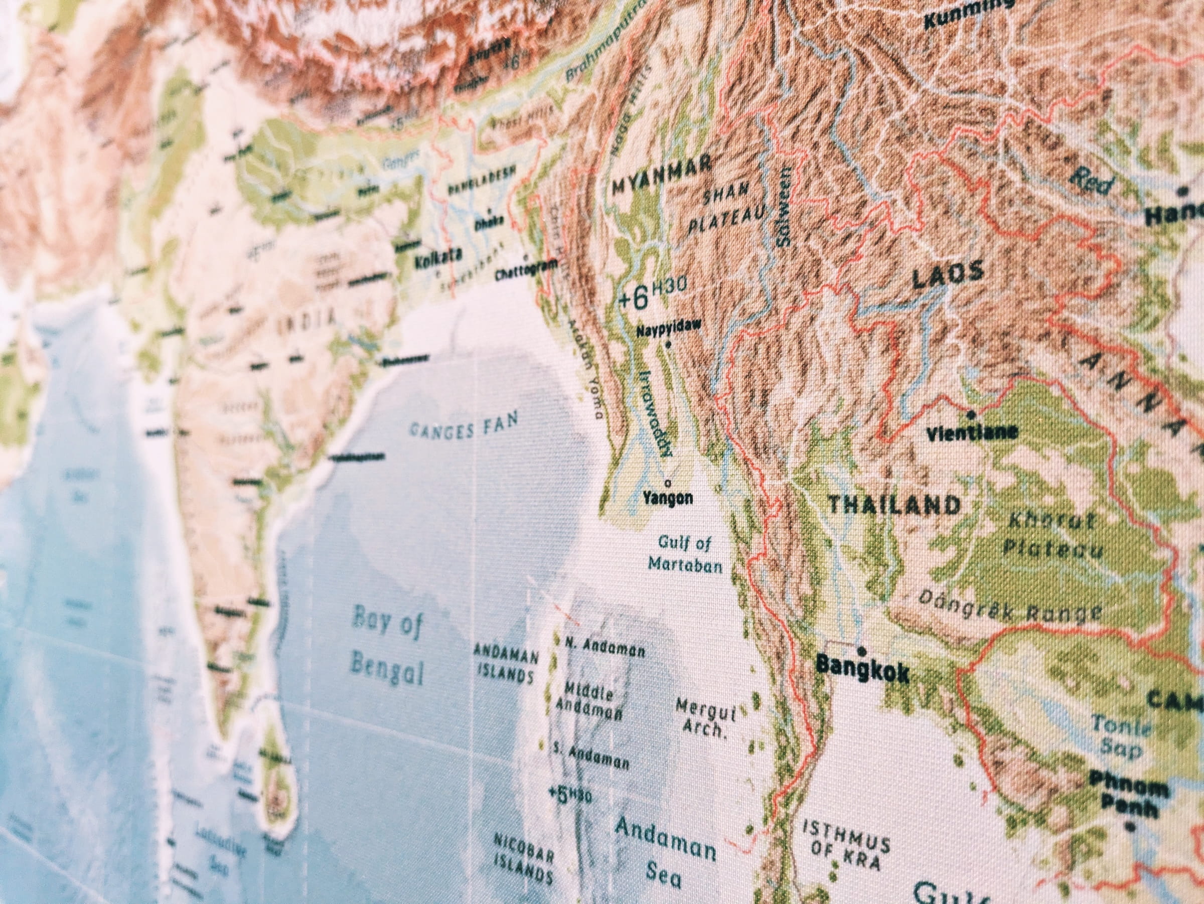
I used a collection of open-source datasets to create this map. Most of it comes from Natural Earth and I calculated the colored contour areas (height lines) using data from Amazon Web Services Terrain Tiles in R. I gathered data about volcanos from Wikipedia (as these are not in Natural Earth’s dataset). I combined this all using D3.js and JavaScript as I’m most comfortable with those tools in terms of visual creative control, although I still used QGIS often for comparisons and data checks.
There were also many evenings with Affinity Designer where I painstakingly optimized the position of all of the (several thousand) labels by hand, fixing crowded areas for overlap and making curves along which the texts of larger features (such as mountain ranges or rivers) should be written. I used other maps of the world (and of the oceans) as my guide to make sure I was placing them in the correct locations.
I cropped a small section for an initial test print to see at what size the labels became unreadable and how the colors looked in real life. This showed me a few things I wanted to change, but overall I was very pleased with the result already.
Eventually I printed the full-size map at 2.85m x 1.5m (nearly 9.5’ x 5’) on an ArtFrame, which is a textile canvas that is stretched along a black aluminum frame. I’m amazed at the level of detail you can see, which is quite important with all the textual labels on the map. I used Art Heroes (also known as Werk aan de Muur in the Netherlands) to print the map and can highly recommend them (they ship to most European countries).
This was a labor of love and I’m extremely happy with the result.
You can now also get your own version of this map! It’s up for sale on the Art Heroes website here. You can order it at any size, but please be aware that it was originally made to be 2.85m wide, so smaller sizes might not have all the labels big enough to be legible. But this map is so nature focused that not being able to read all the smallest labels of tiny rivers, capes and so on is not a deal breaker in the overall experience of the map.