I’ve created this page to share both some background on how I got into data visualization, but also share tips that have worked well for me to improve my skills and career. This is of course just my own account, your route will be totally different, but hopefully some of these tips will be helpful for you.
How I Became a Data Visualization Designer
Because I wanted to be very complete, I wrote a separate blog on how I went from studying Astronomy to becoming a freelancing Data Visualization Designer, with lots of (sometimes mildly embarrassing) images of early work.
That blog ends around the time that I started as a freelancer in 2017. Since then I’ve learned a few things about what it’s like to make a living as my own boss. If you’re interested in hearing me talk specifically about what I’ve learned from freelancing, then the interviews below (I’ve been told) are good resources:
- SuperDataScience | Episode 81 | DataViz & How to Freelance Your Passion
- Shaping Design | Designing data visualizations
- Being Freelance | Episode 213 | Documenting the process
- VizSimply | An interview that goes into my first year as a freelancer
My Tips on (Getting into) Data Visualization
The non-client related email that I get most often is people asking me advice about how they might get better at data visualization and turn it into their career. I can only give advice, but here is my (elaborate) answer.
Find your dataviz niche
Even though data visualization already feels like a niche, once you look closer you’ll see that there is a world of difference within dataviz. Some people are specialized in medical drawings, some love creating dashboards, while others enjoy creating data art bordering on generative art.
When you first realize that data visualization is a field in itself, and you’re still in that blissful state where “you don’t know enough yet to know that you know nothing really”, it’s good to try and figure out what type of data visualization speaks to you the most. For those visuals that you enjoy, that you also want to create, find out what tool it was made with (such as d3.js, or Tableau, maybe R, or Flourish). This will help you immensely to find direction. Because, eventually you’ll have to create your visuals with technology. Whether that be pens or programming.
Once I know which new technology that I want to learn, because I also want to make “cool thing X”, I personally prefer to find some sort of beginner’s tutorial or book on it. Just enough so someone has given me the bare basics intro and I can create something stupidly simple. From there on I’ll rely on the general knowledge of the internet (stackOverflow) to slowly learn more and more on my own while making personal projects. I’ve done this for d3.js, Three.js, Blender (donuts forever!), and GLSL shaders for example.
If you’re note yet sure what niche you want to dive into, then try a lot of the tools and see which one fits you best (I tried my fair share when I just started out).
Learn the best practices
You might think that we humans see the world as it physically looks, but we sure don’t! And this translates to data visualizations as well. Don’t assume that gut-feeling alone will let you create effective visuals. Therefore, learn the best practices, along the lines of “know the rules before you break them”.
In general, I find that great advice, findings from research, and guidelines are best found in book form. Something that’s well edited, written by experts, and contains a bucket load of insights. If you want some guidance, you can find all the dataviz books that I’ve read, enjoyed and reviewed here.
Create lots and lots of visuals
If there was only one tip that I could give, it would be this; create, create, create.
There’s nothing else that comes close to increasing your skills and experience (in what works and doesn’t work) than making the actual visualizations. If you’re new, try and start small. Perhaps take a (simple) visual that someone else made, and try to recreate it. Next, plug in your own dataset, change the colors. With every next visual, try and change more aspects, building upon the things you’ve learnt before.
But don’t expect this to come easily. When you’re a fledgling in data visualization, the chances are quite high that you won’t have the time during your (current) job to work on creating visuals to increase your skills. You’ll probably have to spend a considerable amount of your free time to do this; in your evenings and weekends. This requires a good amount of perseverance and responsibility. Getting better requires work, no way around that.
In my first year after discovering that I wanted to become a data visualization specialist, I almost literally spend every free moment doing something dataviz related. From reading books, to writing tutorials, and working on personal projects. That became a little more healthy after about a year, but it wasn’t until almost 3 years later, when I became a freelancer and spend my daytime hours on making visuals, that I spent most of my evenings on other hobbies again. I’m not saying that this is the only way about it, I just want to convey that learning data visualization doesn’t come for granted.
While you’re really new to creating visuals, you’re probably still more of a copycat than designing and creating your own work. That’s understandable and fine. Still, try and move on and become (at least) a remixer as soon as you can. Where people might see that it was inspired by another project (or two), but that you’ve clearly made it your own with your design choices. And only start sharing things with the outside world, and claiming it as your own, once you’ve reached that point.
Pick topics that interest you
What makes a big difference for me to be able to spend hours (after work) creating my personal projects, is the fact that I always go with topics that I am personally (very) interested in. Such as exoplanets, the Lord of the Rings, fantasy books, Dragon Ball Z, etc. I never go for the easily available, and often dry, statistical datasets that you can find on government websites.
Being a fan, I also kind of know what easter eggs I can add to my visuals for the other true fans to enjoy.
Getting some data on my niche topic typically takes more time and effort, but it’s always more than worth it in the long run. For one, because I truly like the topic, I am way more enthusiastic and it’s a joy to work on the visualization. I generally learn new things about the topic as well. But also, because I am already interested in the topic, a fan even in some cases, I have a lot of background knowledge that I can use to spot the interesting stories, and know what parts to highlight.
You might think that there’s “surely no data to be found for the topics I like”, but after dozens of personal projects, and quite niche topics, I still have to find a topic where I truly couldn’t find anything useful. You just have to be open to data coming in other forms than neatly prepared (Excel) files.
For example, no surprise that there’s some website that has a dataset on all the discovered exoplanets. There was one gem of a dataset tucked away in someone’s GitHub repo about all of the words spoken in the Lord of the Rings movies (and I found it by googling “data Lord of the Rings”). Goodreads has an amazing API from which I could request a bunch of info about fantasy books using a small script in R (which in itself used the top 100 fantasy author names that I’d scraped from the Amazon author rank pages). And the Dragon Ball Wikia pages have written out lists of every fight that happened in the anime that I just copy+pasted into Excel and cleaned manually.
Build up a portfolio (and website)
A big benefit of increasing your skills by creating personal projects is that you’re simultaneously also building up a portfolio of your work. Data visualization is a very visual work field, so if you want to attract clients, being able to show them what you can do, and what your style is, is exceptionally valuable.
I would advise you to have a website of your own eventually and not just a portfolio on Behance or some similar site.
Therefore, have a website where you can show your work. It doesn’t have to be fancy at the start (my first website was one of those free google blogs), just have something! And then spend a little time after finishing each project to add it to the portfolio page on your website. No need to program your website or anything, using a service such as Squarespace, Webflow, or even only having a Behance page are good enough.
In 2016/2017 I somehow found the time in my evenings to work on my biggest personal project/collaboration to date, Data Sketches. Although I already had a good amount of personal projects on my website before, with the sudden surplus of new projects to share, it proved to be the stepping stone I needed to be able to start freelancing and attract enough clients.
As you grow and create more projects, also make sure to curate your portfolio and remove projects that you’ve outgrown. Either because your skills have improved substantially, or because you don’t want to do that type of work anymore. Don’t promote skills that you might have if you don’t actually want to work on those kinds of projects!
Focus on design or data skills first?
It’s been a few years since I did the Harvard edX course, so things might’ve changed since then.
Some people come from a clear design background and should thus focus on learning how to handle and prepare data. If you’ve discovered that you really enjoy the data side, then you can go as far as doing a data science course. I would personally recommend doing a MOOC by a renowned university. From all the courses that I’ve done, the one given by Harvard on edX was my favorite. If instead data still feels a little scary, then I would highly suggest to read the book The Truthful Art by Alberto Cairo. This book takes you through the most important data and beginner statistics that you’ll need to know, specifically to create data visualizations.
However, in general, no matter what tool you’re going to use to visualize your data with, I would highly recommend to learn either R or python so you’ll be able to do proper statistical analysis and data cleaning. Always doing your data preparation manually through Excel might be easy and safe now, but I find that it’s not sustainable if you want to grow as a data visualization creator. There are always exceptions of course. I know a few people making wonderful visuals who don’t code in any way. Still, I would recommend even for them to try and pick up some form of programming to prepare data through scripts 。^‿^。
My tool of choice is R btw, but I’ve had to use python in a few cases.
If you’re quite interested in learning how to program, then python might be a good place to start. It will eventually give you more options than R, such as combining python scripts with your online visuals. If you’re quite new to programming, then go for R, it’s easier to learn and program with than python I find.
Perhaps “steal like an artist” works well here, but don’t be a copycat!
If instead your background already had a data aspect to it, such as I had during my astronomy and data science years, then you’ll need to focus on getting better at the design side. Here, I’m less able to give good advice though. I have to admit that much of my “design skills” come from aiming for something that I find beautiful or professional, combined with knowing when I find something beautiful, and when not. I look at the works of others for inspiration and I try to understand what part it is of their work that speaks to me. I try to deconstruct it, is it the colors? the shapes? and then perhaps use some part of that on a future project.
Like with getting better in creating data visualizations in your tool of choice and learning data handling, improving your design skills also requires effort to learn. It’s the design side that takes up a considerable amount of time on my projects, the endless iterations because I’m still not happy with the way it looks, but I don’t quite know how to improve it yet, so I keep trying many different things. Things that I’ve tried on other projects, using experience from having done hundreds of visuals already. My first visuals from years back look awful, but as I made more, I learned from each project to get closer to making an effective and beautiful visualization.
Of course, it could be that your current skills are neither in design or data, and you’re not sure where to start learning. In that case it’s a little tricky. Out of the two, I personally believe that having a base of fundamental data handling knowledge is more important. We’re not graphic designers, we’re data visualization designers. If you can’t handle data, you’re not ready yet. But, while you’re learning about data, you can always pour in some extra data visualization to keep things interesting. Does your course/book/tutorial ask you to just clean up a dataset? Why not also turn some aspect of that into a visualization at the end? And not just the simple chart option that your tool gives you. No, try and make it look professional, something that you’d be willing to show others / present to your boss. So, do a little of both, but make sure the focus is on data first.
Join the Data Visualization Society
This wasn’t around yet when I first started out, but I’m so glad that we now have the Data Visualization Society. Becoming a member is free, and you’ll be joining thousands of other people enthusiastic about data visualization. Join the Slack channel to participate in conversation going on there and ask questions (or just be a watcher, that’s fine too). Sign up for the newsletter to be able to read the Nightingale articles for free. Participate in their challenges, apply to speak at the Outlier conference, and there’s much more. Getting to know other dataviz people, even though they’re on the other side of the planet and becoming part of the dataviz community will surely make you even more enthusiastic about the field!
Bonus: Curate your inspiration
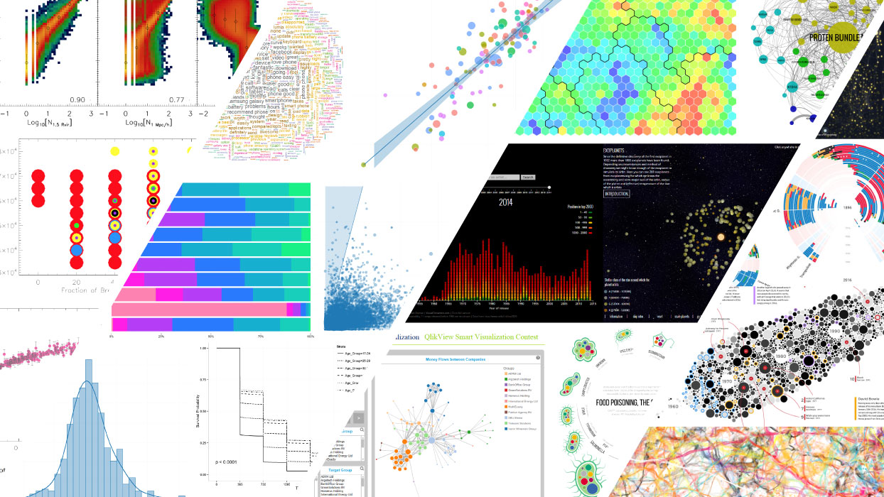
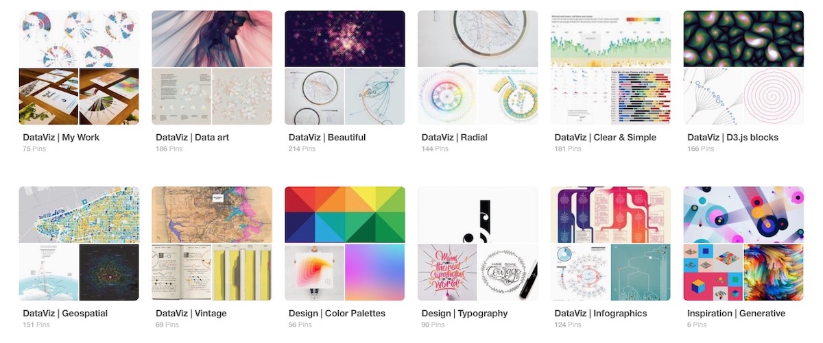
This is something very specific that works very well for me. I am very particular about curating my Pinterest boards with any kind of inspiration that I come across throughout the year. Anything that I find beautiful ends up in at least one of my boards. This can either be dataviz or images about completely different subjects, such as space or spirographs.
When I then start on the design phase of a new project, I’ll create a secret “client mood-board” and pick a few of my boards that I think could hold some inspiration, browse through them and pin everything to the mood board where I feel like it might somehow help me with my design. Once I’ve done that, I’ll have the mood board open on my screen for inspiration while I’m drawing and sketching away.
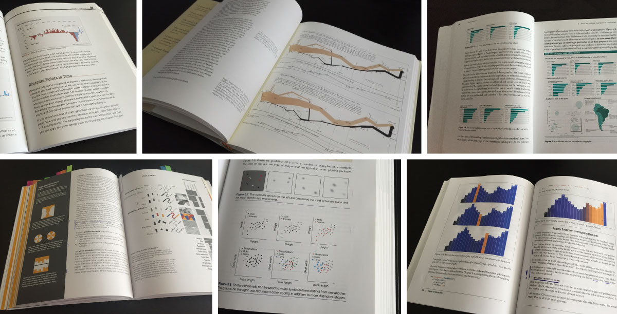
Data Visualization Book Reviews
Especially in the first year after realizing that data visualization was my passion, I read a lot of books on the topic. They really helped me to learn many best practices on making good visualizations, especially on topics such as visual perception. No internet resource can compete with a well written book I find. On this page you can find my reviews and thoughts on the content and usefulness of the data visualization books that I’ve read. I hope this will assist you to figure out which books you still want to read to learn more about data visualization.
My Design and Creation Process
None of my projects are the same. My clients range from multinationals to newspapers, NGOs and more, and the subjects of the data are even more diverse. Nevertheless, I’ve found that each project roughly follows the same process of data understanding to rough design to endless iterative creation, and some back-and-forths in there.
Understand the goal
I always start by understanding what the goals are that the client wants from the visual. What insight needs to be revealed. What should the viewers learn or be convinced of? Many clients have this clear thankfully. Some think they know, but when I ask them to phrase it in one or two sentences, they can’t just yet. Then we spend time to really condense it to a set of questions/insights together. But I also have my fair share of clients that have a dataset which they know contains some very interesting insights, but those still need to be found. In those latter cases, I need to include a clear data preparation & analysis phase to dive into the data myself and try and find some interesting angles to visualize.
For example, Physics Today asked me to make a visualization to celebrate the Hubble Space Telescope’s 30th birthday. They had access to a database that contained all of the scientific observations ever done, about 500,000 of them. There just had to be something interesting in there, but what exactly? And thus I dove into the dataset and looked at it from many angles to eventually distill it down to four possible story angles, from which we chose two to continue with.
Understand the data
After / while I am trying to understand the client’s case, I also want to get an understanding of the data. What variables are available, how complete is the data, how much data are we talking about? I generally want to see the data beforehand so I can get a feeling of what I’ll have to work with. I never work with dummy data, it’s always turned out to be a bad idea in the past. I therefore need to either get a good sample of the dataset, or even better, all the data, before I can even start on the project. Since I don’t draw graphical elements to include in my visuals (I just don’t have those skills), I do generally need a decently sized and diverse dataset to create an interesting visual with. It’s the data, and only the data, that are my tools to create with basically.
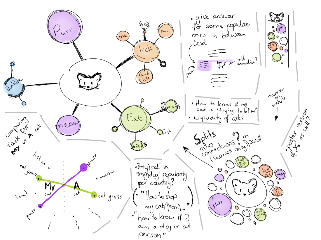
Create rough designs
With those two elements, knowing the goal/insight to reveal + understanding the data, I’ll go into the design phase. I always sketch out my designs, with plain pen and paper or with my iPad Pro and Apple Pencil. On my iPad I always use the app Tayasui Sketches. It has more options than Paper but not so many that you can get lost, which I experience with Procreate.
I often combine the design phase with some initial exploration into the data (if that didn’t already happen before), to get a better feeling for the values that each variable can take, and how the insights look. I basically create tens if not hundreds of very simple plots; bar charts, histograms, line charts, scatterplots. It slowly builds up a mental model of the dataset for me. I personally prefer to use R to perform these analyses and make charts with (always using at least the tidyverse and ggplot2 packages).
My sketches are always very rough! I will never present some pixel perfect design. Mostly because dataviz design really stands or falls with the data. I don’t think about the look part of the visual much (or at all), such as colors, layout, specific touches/effects. At this phase it’s really only about how I’ll go from numbers to visual encodings. Do I want to use a radial form? Use connecting lines? Make the entities into sized marks?
Once I have exhausted my ideas to visualize the data I’ll present my sketches to the client and express my thoughts, pro’s and con’s for each design. We’ll then discuss which route to continue with. I’ll restructure the data in R to what I need to create the visual with and then it’s time for the next phase.
Create the visualization
Next starts the most time consuming part of any project; creating the data visualization. I always program my visuals so I can easily connect data aspects to the visual elements, such as connecting a data variable to the size of the visual mark. It’s also very easy to change things around once you have the base programmed. Switching which variable you use for size and color can literally be done in a minute, no matter if you have 5 or 5000 datapoints. Programming my visuals also makes it trivial when there are (last minute) changes to the data. Update the data file and the visual updates automatically.
I prefer to use many of d3.js’ functionalities and use Visual Studio Code together with either Chrome’s or Firefox’s devTools to create my visuals. D3.js gives me a lot of flexibility to shape my visuals exactly how I want them to. You do sacrifice the fact that it’s not fast to set up a chart, but greater creative flexibility is way more important to me.
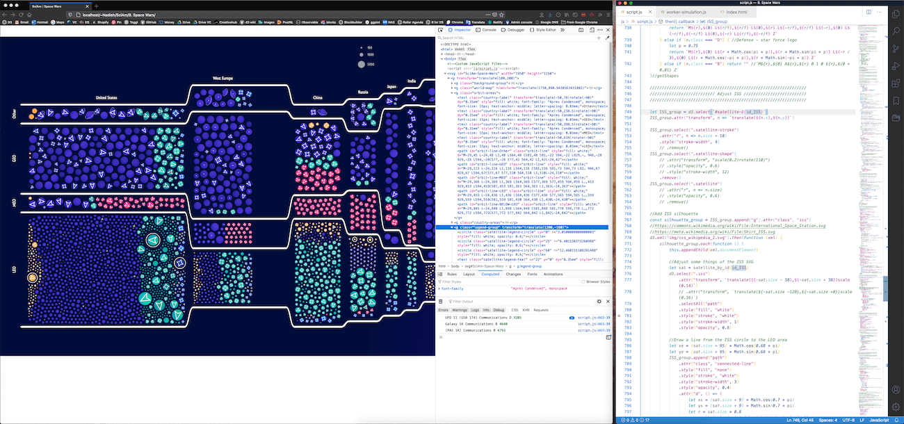
Even though I always include d3.js to prepare my visuals with, I might end up using either SVGs, HTML5 Canvas or webGL to actually visualize the data on a screen. It depends on how big the dataset is and some other technical aspects that I need/want to comply to. Each of the three options have their strengths and weaknesses that I won’t go into.
Regardless of what I’ll visualize with, the first thing I do is to get the data into the shape defined by the design. If I see that the data actually works with the design, I’ll start to think about making the visual more effective, more interesting, more beautiful. If this first phase shows that the data doesn’t work with the intended design I either need to think of a compromise, or inform my client that we’ll need to try a different route.
Once the abstract shapes of the data are on my screen and I know I can work with it, I’ll go into the, what I like to call, “endless iteration cycle”. Generally the visual will look quite ugly at this point, and figuring out how to make it look interesting and catch the attention of a viewer is something that is (almost) never a clear path for me. It’s really a long process of trial and error until I’m happy with it. I don’t know how other visualizers go about this process, but for me it’s a rather chaotic process that I can’t quite explain or structure any better.
During this period I typically set-up a hidden URL on which I show the latest result of the visual and share it with the client for a continuous feedback loop during the visual’s development. That way I can get feedback on early ideas, make changes if the client wants certain things different, and make sure that, once the visual is finished, the client will have seen many iterations already, and be happy with the result.
Once the visual is finished I’ve either already wrapped it into a visual function that the client’s developers can then embed within their systems. Or, for static visuals, I often take the visual from my browser into Illustrator to add some final tweaks that are much easier to do there than programming them, such as legends and annotations, and share the final image files.
Differences when working on a personal project
In general the process that I described above still holds, except that there’s a new section at the start about coming up with an idea and finding the data somewhere (usually online). I’m also my own boss in those cases, so I don’t need to discuss anything for approval or hold to any styleguide, and I can often try some more out-of-the-box ideas or try my hand at a new tool for example.